
Brand Vision developed a bold identity and campaign system designed to move from digital promotion to packed venues, bringing SOM to life across event creative, social media, merchandise, signage, and physical experiences.
SOM is a live music and culture brand creating events, artist experiences, and curated programming built around the energy of discovering music together.
Project Highlights
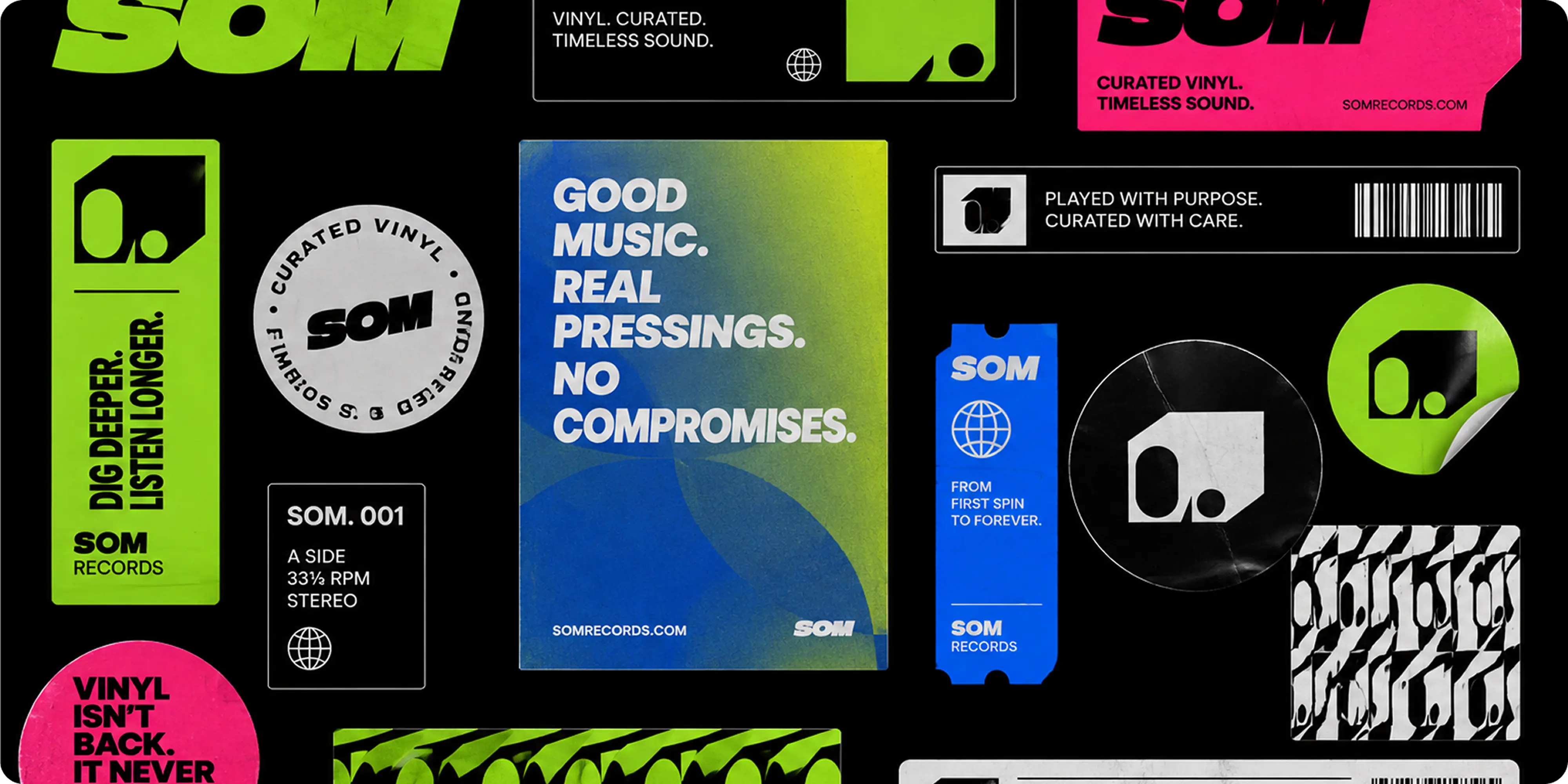
- Flexible event identity: a bold SOM wordmark and graphic system designed to remain recognizable across changing artists, genres, venues, and event formats
- Campaign system: modular layouts built for show announcements, artist features, event promotion, ticketing moments, and ongoing cultural content
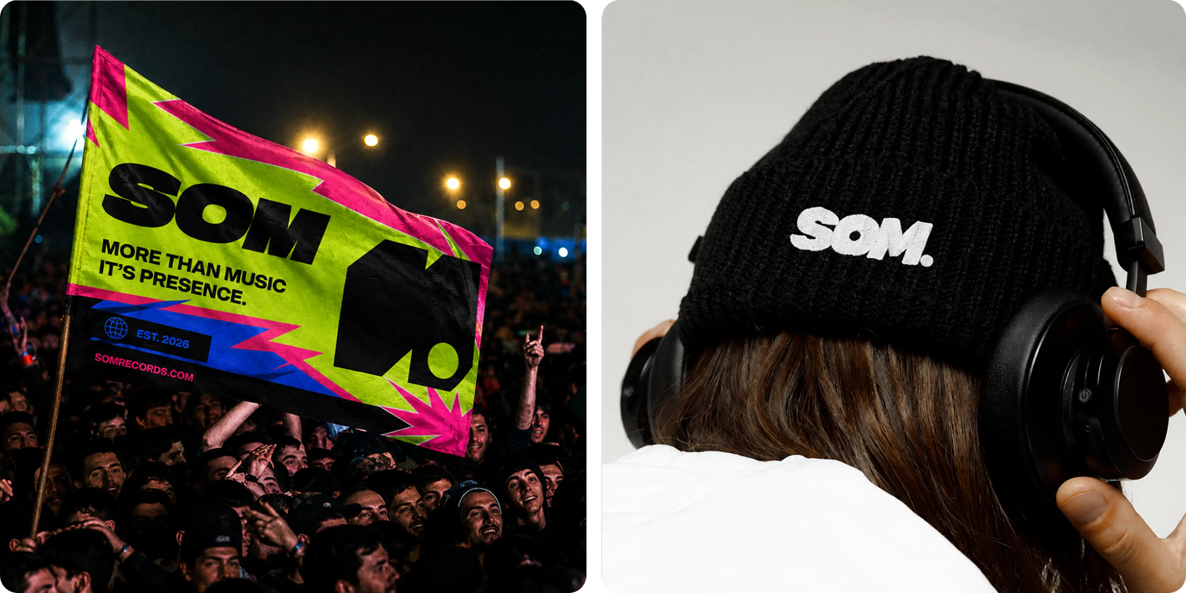
- Environmental branding: large-format posters, signage, flags, wristbands, and venue applications designed to carry the identity into physical spaces
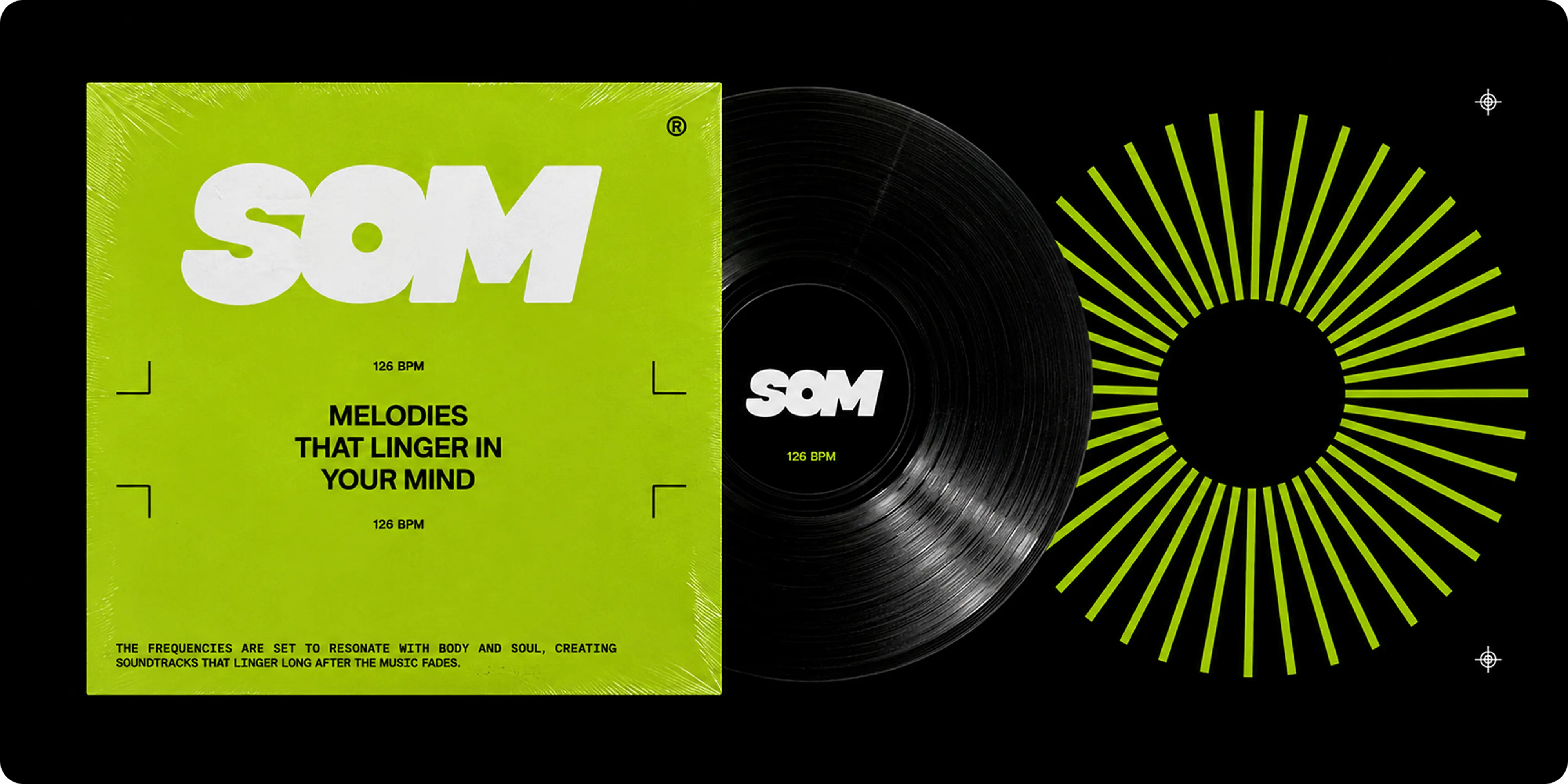
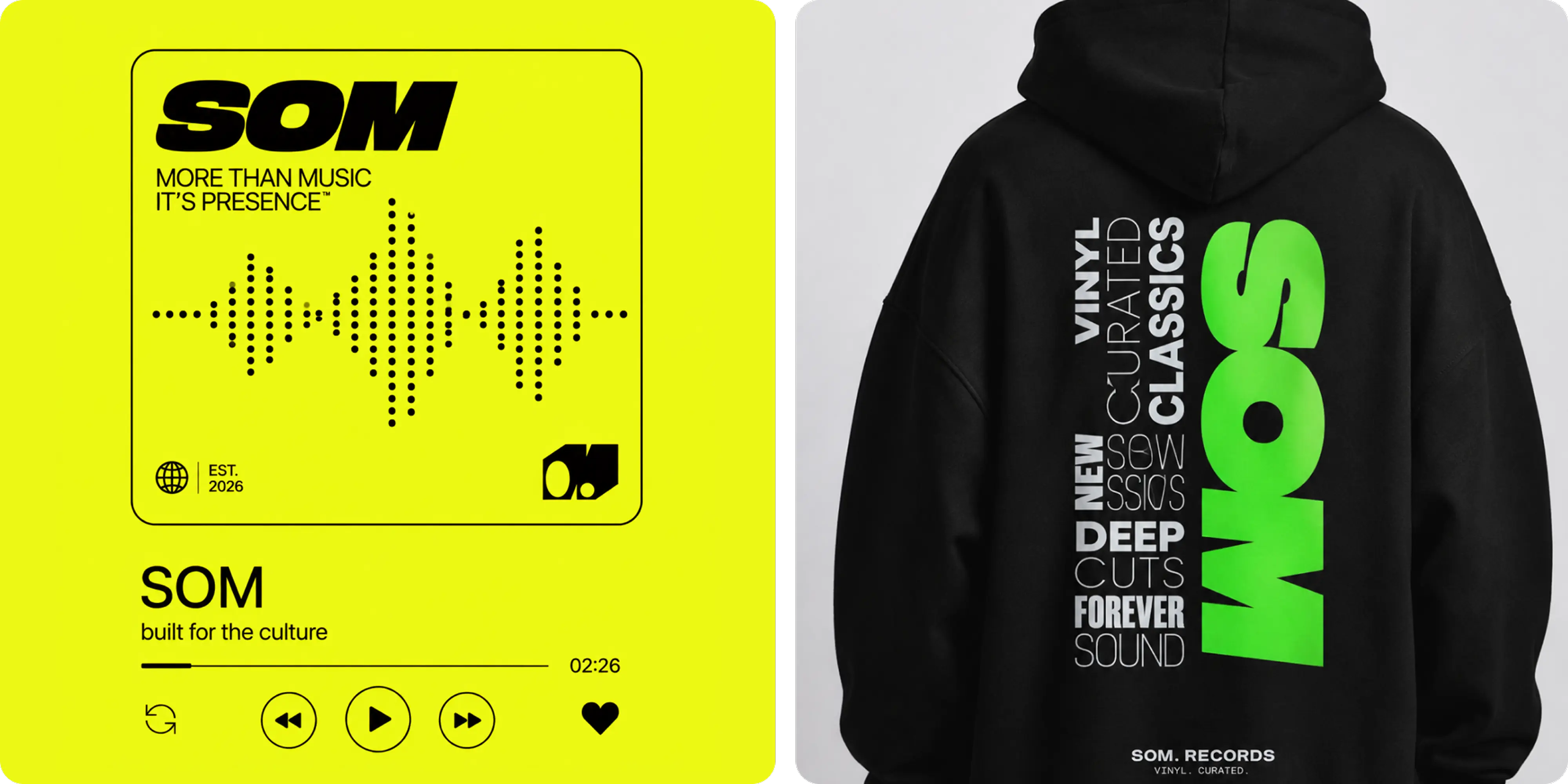
- Merchandise: apparel and accessories developed as extensions of the culture around SOM rather than conventional promotional pieces
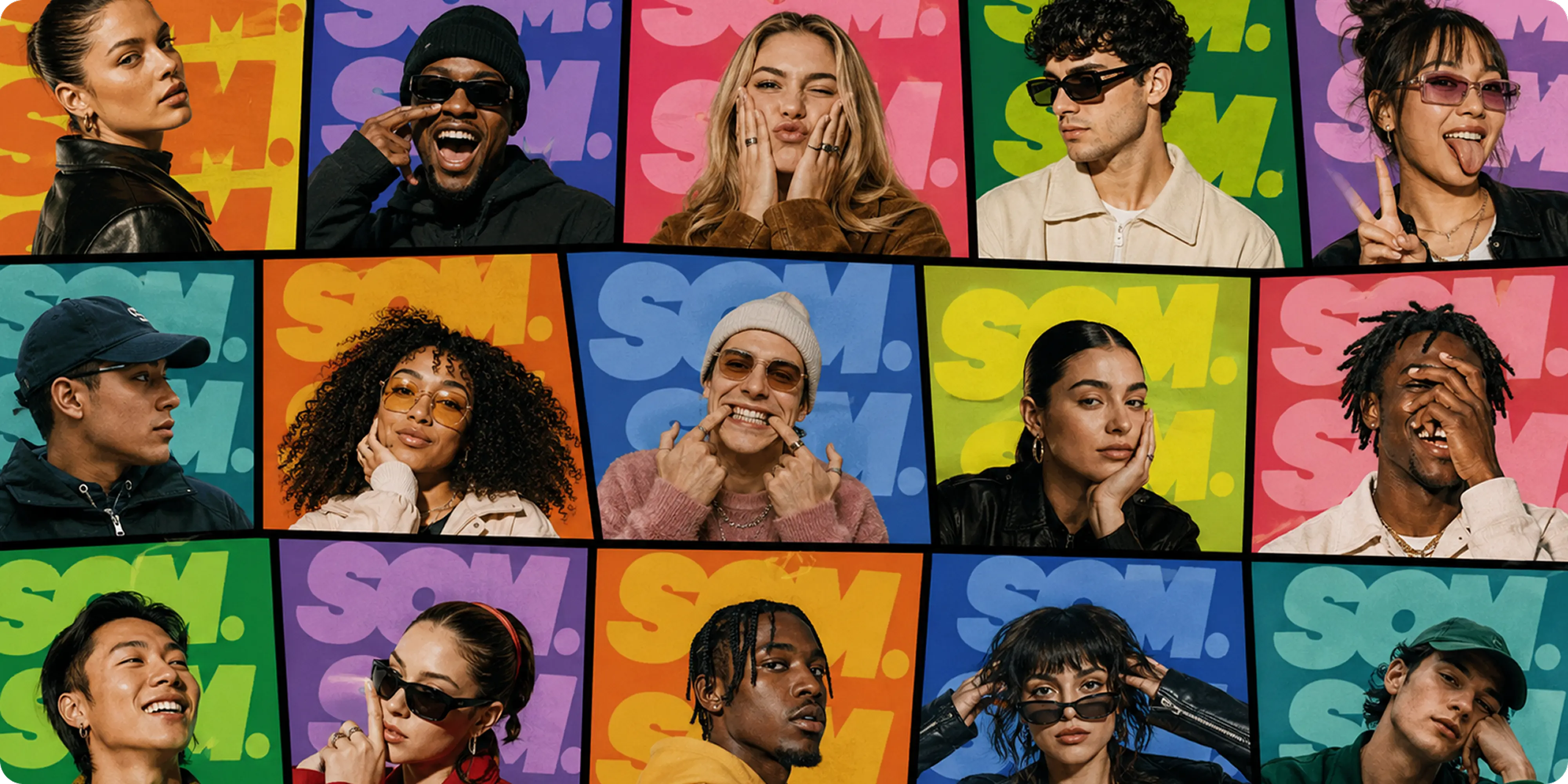
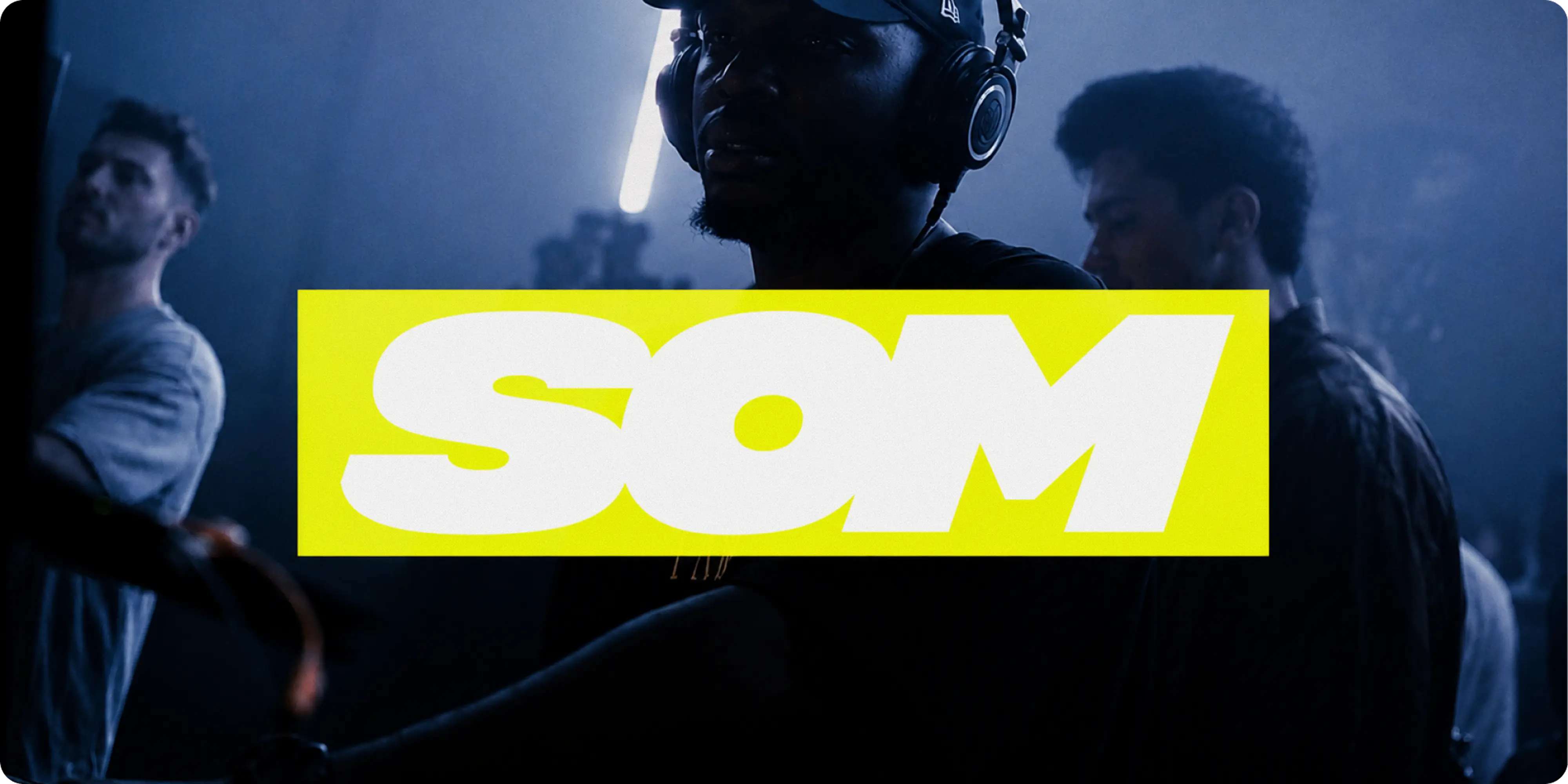
- Artist-led photography: expressive portrait art direction that puts performers and audiences at the center of the brand
- Social content system: high-impact templates that can change constantly while maintaining a recognizable SOM presence
Challenges
Live music brands have to compete for attention long before anyone reaches the venue. Every event arrives alongside a constant stream of artist announcements, ticket drops, nightlife promotions, festivals, and social content, making recognition just as important as individual campaign creativity.
SOM also needed to work across a wide range of musical styles without becoming visually tied to one genre or scene. An identity that felt right for one artist could easily feel wrong for the next, so the system needed enough personality to be recognizable while leaving room for each event to develop its own energy.
The brand also had to survive a dramatic change in scale. The same identity needed to work on a social post viewed for seconds, a wristband worn all night, merchandise people would keep, and a large-format graphic seen across a crowded venue or city street.
Approach
We built SOM around the idea that live music is about more than what people hear. It is atmosphere, anticipation, movement, identity, and the feeling of being present when something happens.
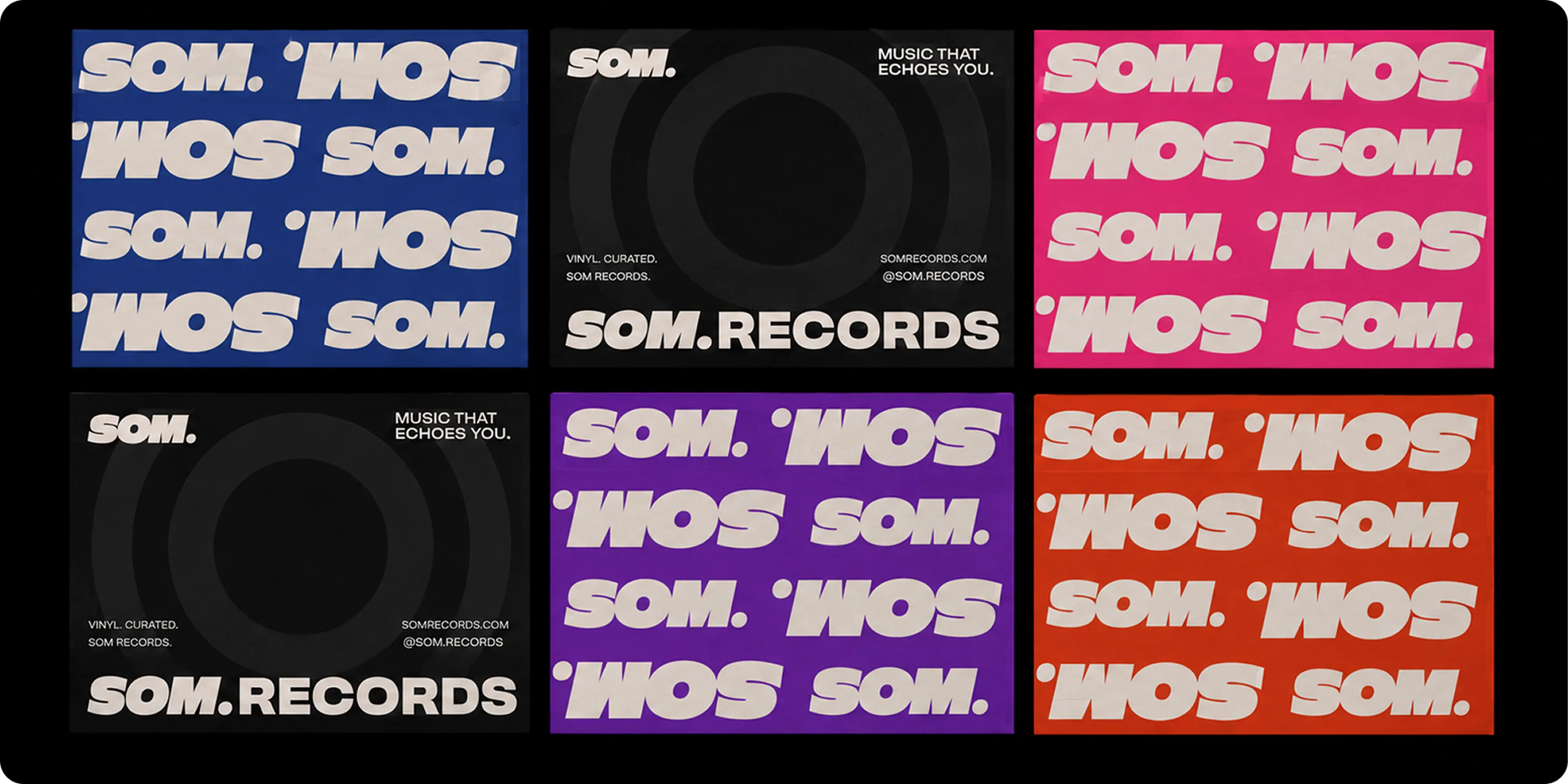
The SOM wordmark became the constant within a deliberately flexible visual system. Its bold, compact form can be oversized, repeated, cropped, or reduced to a small stamp without losing recognition, allowing the surrounding creative to change significantly from campaign to campaign.
Rather than limiting SOM to one signature colour, we developed a high-energy palette of acid green, hot pink, electric blue, orange, black, and white. That range gives individual events their own visual temperature while typography, composition, and the SOM mark keep the overall brand connected.
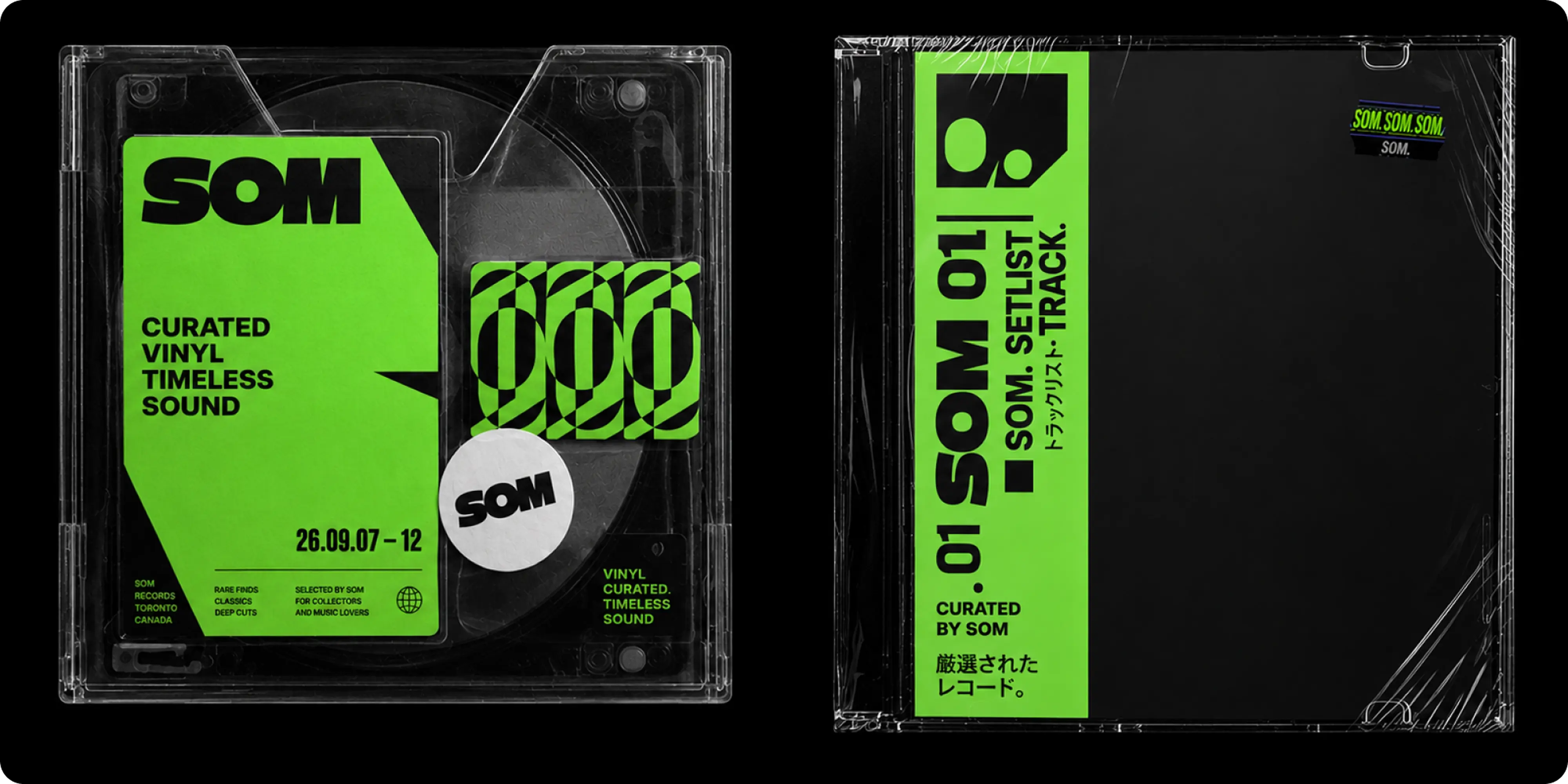
The supporting graphic language draws from the environments surrounding live music: wristbands, tickets, venue signage, audio interfaces, waveforms, track listings, stickers, stage graphics, and physical media. We used those references as building blocks rather than nostalgic decoration, giving the identity a tactile quality that works naturally in both digital and physical settings.
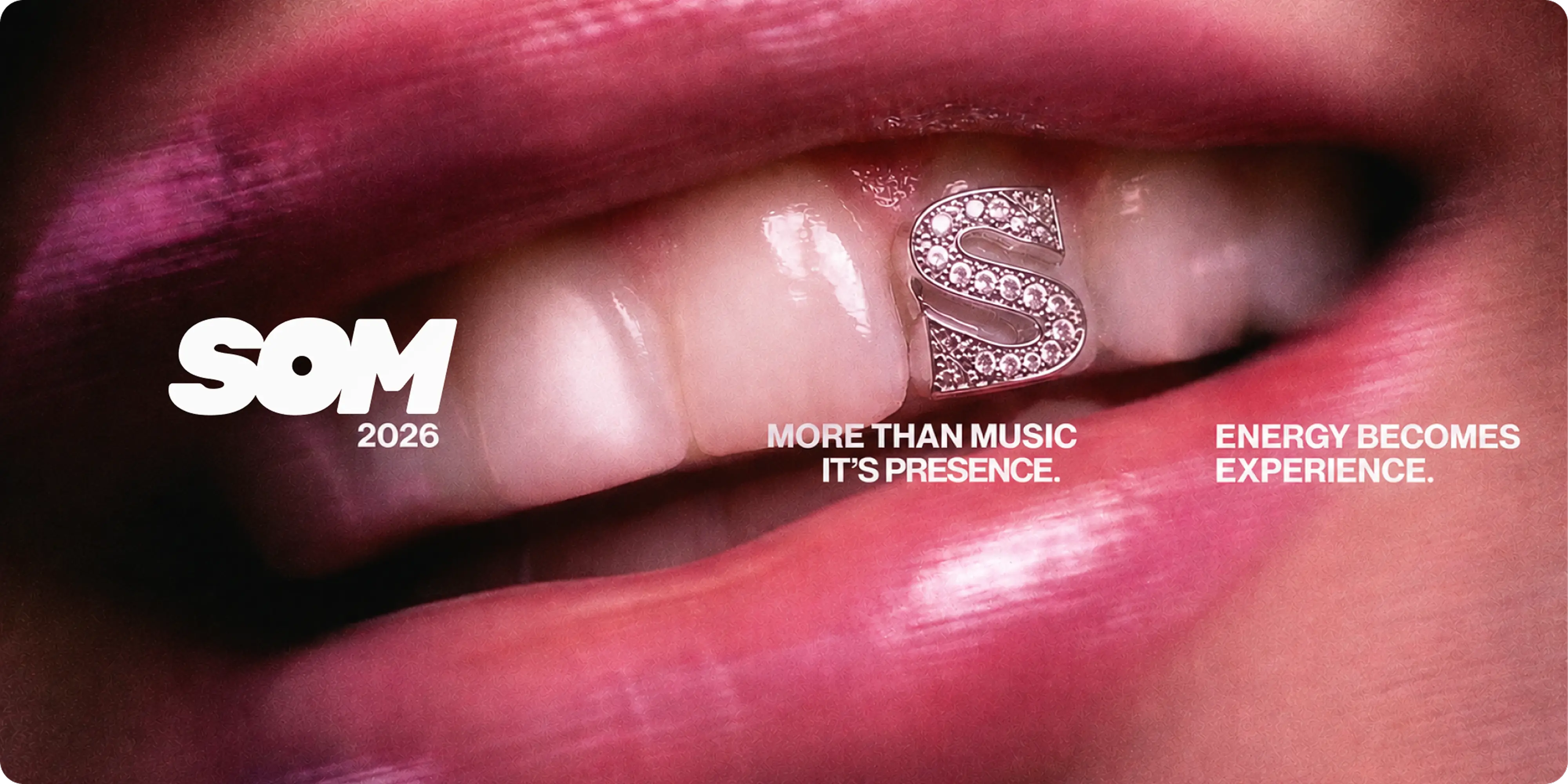
Photography puts people at the center of the system. Artist portraits and audience imagery are direct, expressive, and personality-led, allowing each campaign to feel specific to the performers and community involved.
We extended the identity across outdoor campaigns, show graphics, event signage, merchandise, social media, physical passes, and venue applications. Short lines such as “More Than Music. It’s Presence.”, “Dig Deeper. Listen Longer.”, and “Energy Becomes Experience.” gave SOM a voice that could connect individual events to a broader cultural point of view.
Outcomes
SOM emerged with an identity built to perform before, during, and after an event.
The system gives each artist, lineup, or experience room to feel distinct while maintaining enough visual consistency for audiences to recognize SOM immediately. From a phone screen to a venue wall, the identity can change in colour, imagery, and composition without losing its core character.
Merchandise, environmental graphics, social content, and event campaigns all work as parts of the same culture rather than separate marketing assets. The result is a live music brand designed not simply to promote events, but to create a recognizable world people can participate in.

.webp)



.webp)



.webp)


.webp)
.webp)

.avif)



.png)