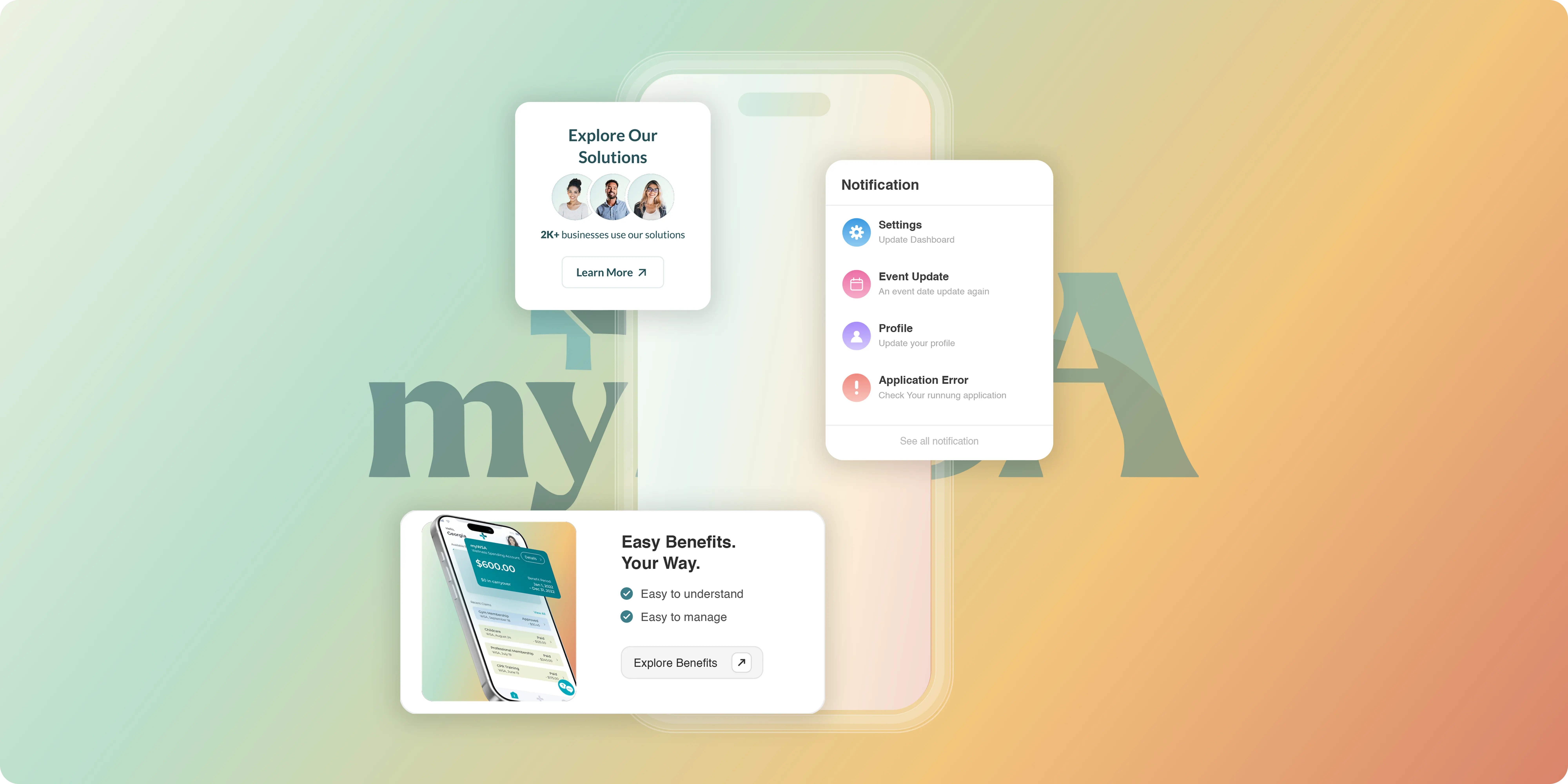
A full Webflow rebuild that gives a benefits platform a visual language as clear as the product it sells.
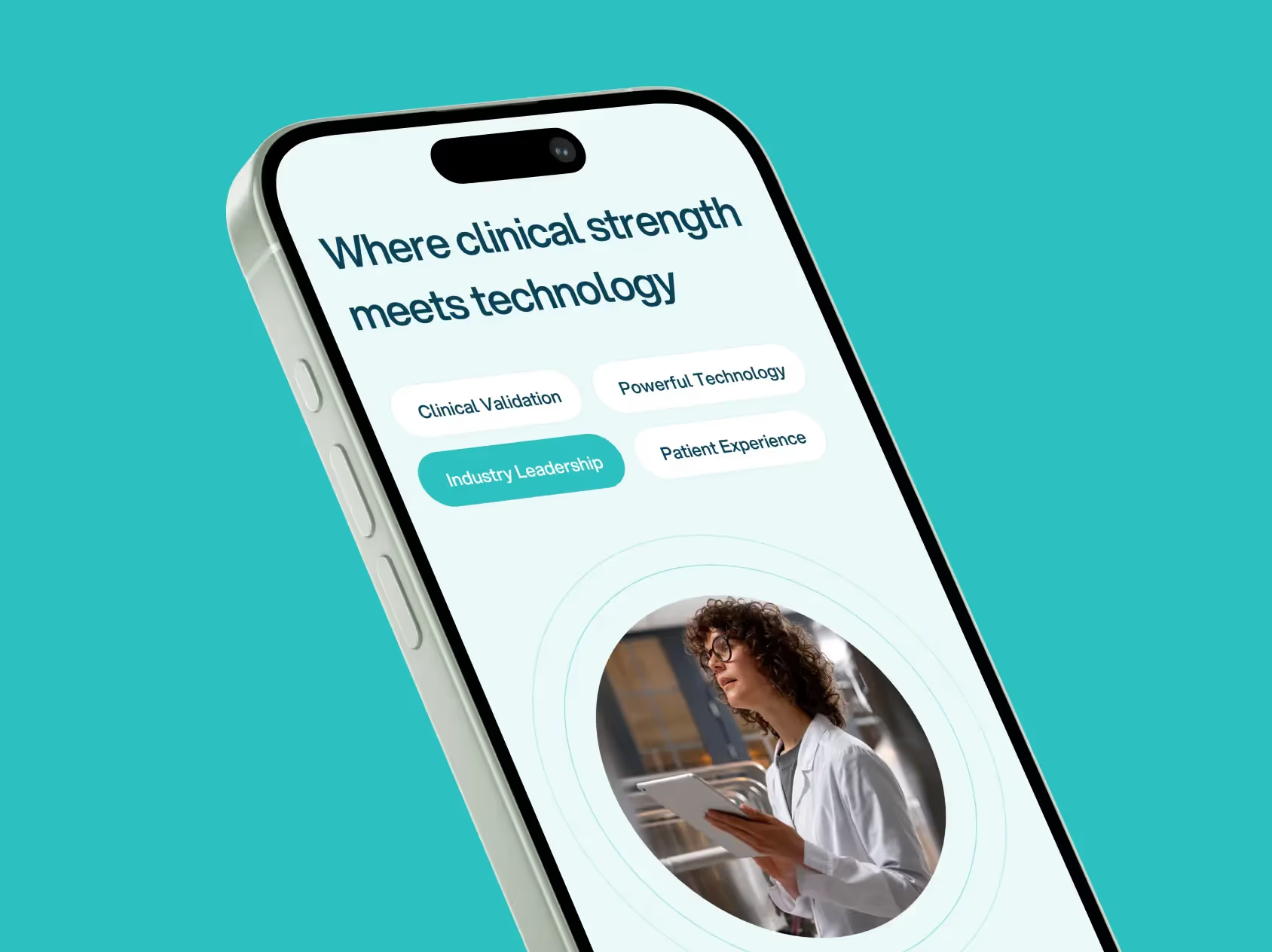
myHSA is a Canadian employee benefits technology platform specializing in Health Spending Accounts and Wellness Spending Accounts, helping businesses and benefits advisors offer flexible spending through a digital expense management system.

Project Highlights
- Webflow website: a full design and build on Webflow, replacing a site that no longer reflected how far the product had moved.
- UX and information architecture: one site structured to answer three different sets of questions, from advisors, employers and employees, without making any of them wade through the others.
- Advisor pathways: the advisor story given its own route through the site, since advisors are the ones bringing plans to their clients.
- Visual design system: type, color, layout and component rules built to carry the new look consistently across every page.
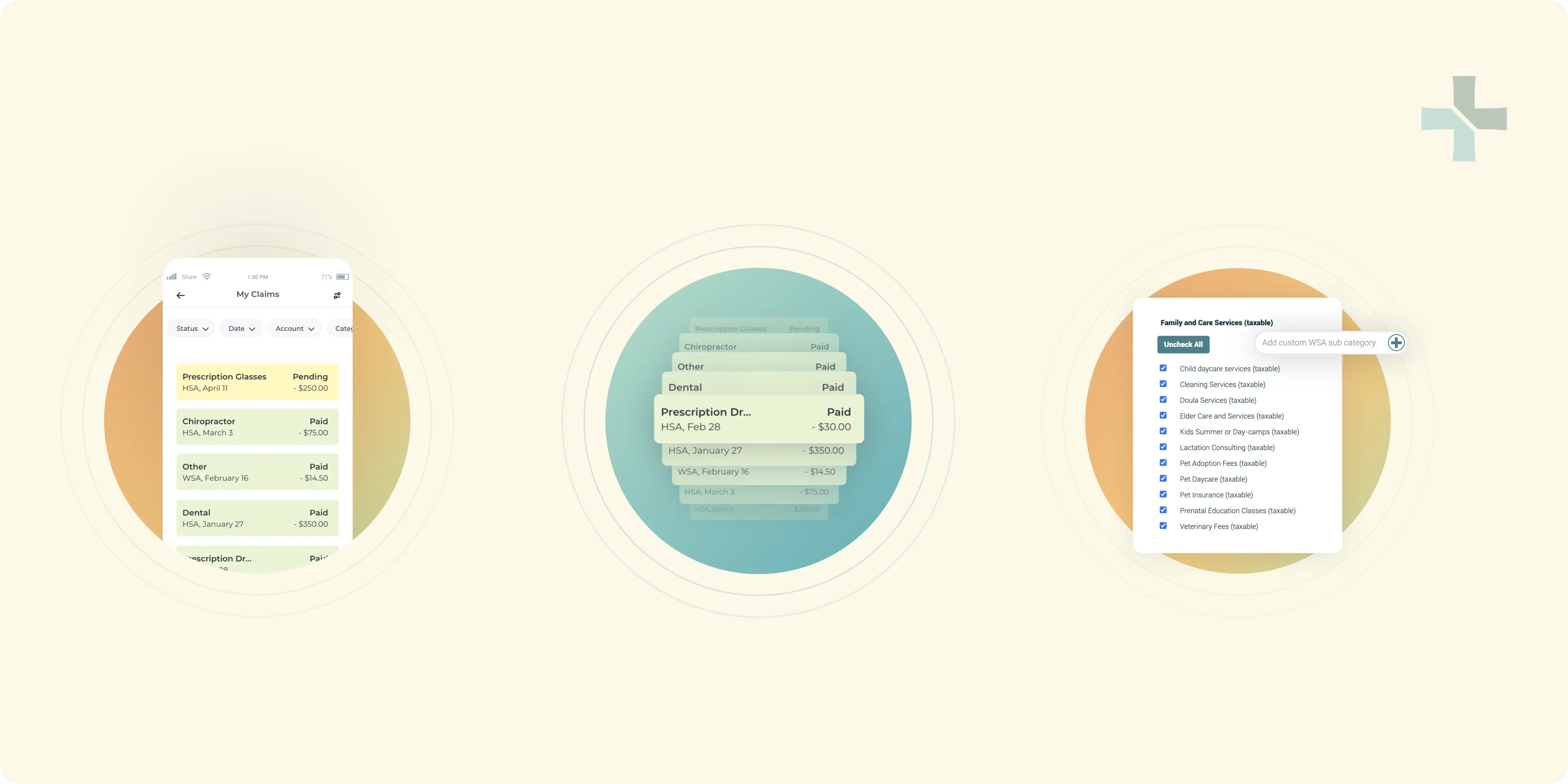
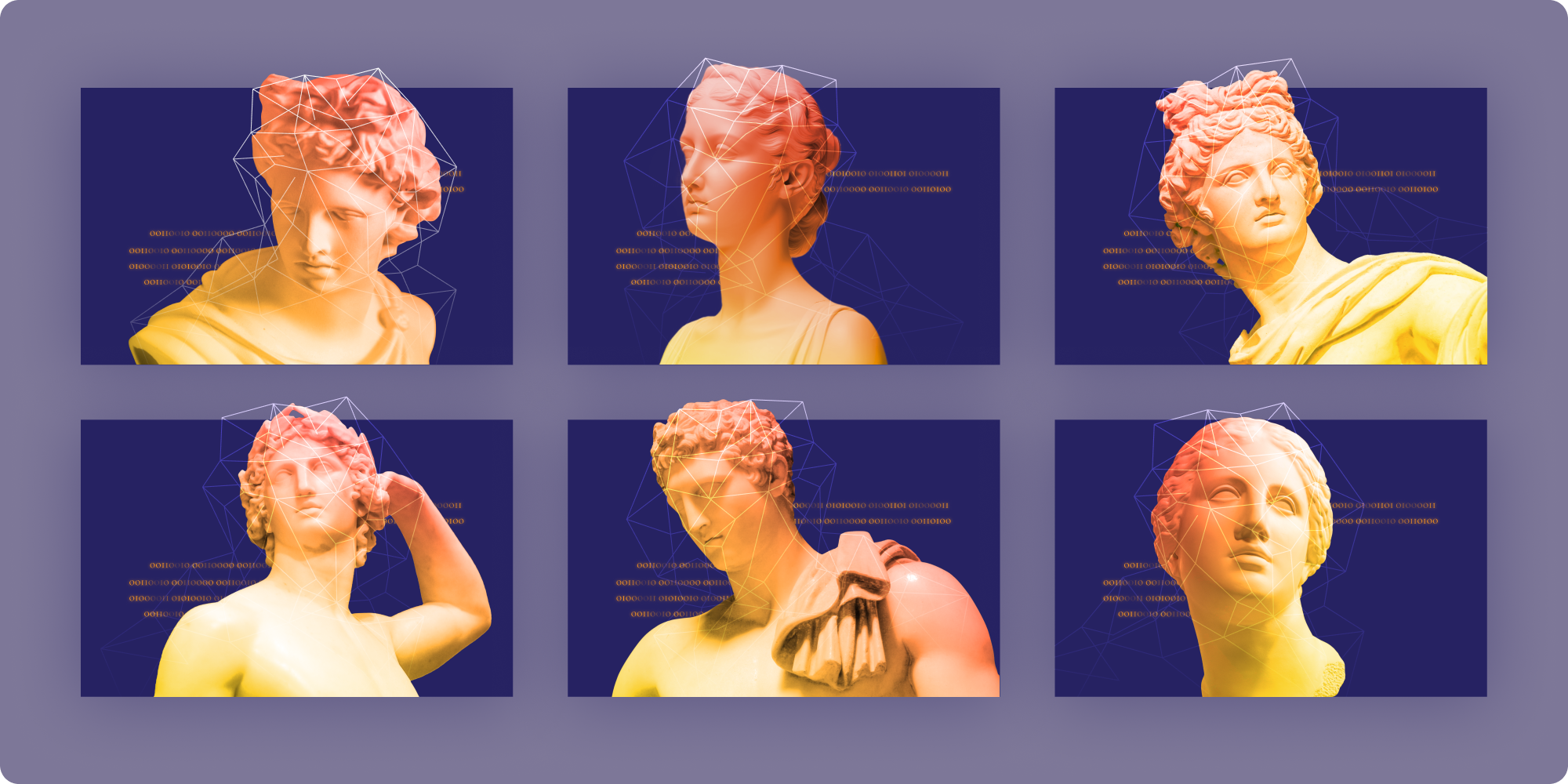
- New visual elements: original illustration, iconography and graphic treatments drawn for this brand rather than pulled from a library.
- Performance optimization: image handling, page weight and load behavior tuned so the site stays fast on the devices people actually open it on.
- On-page SEO: titles, headings, internal linking and content structure set up properly across every page.
- Technical SEO: crawlability, indexation, schema and site health handled as part of the build, the way we do on every client project.
- Editable system: a component library the internal team can extend without going back to a designer for every new page.

Challenges
Employee benefits is a category people avoid reading about. The product itself is simple, a spending account with fast claims and CRA-compliant adjudication behind it, but the language around benefits is not, and the old site carried more of that heaviness than the product deserved.
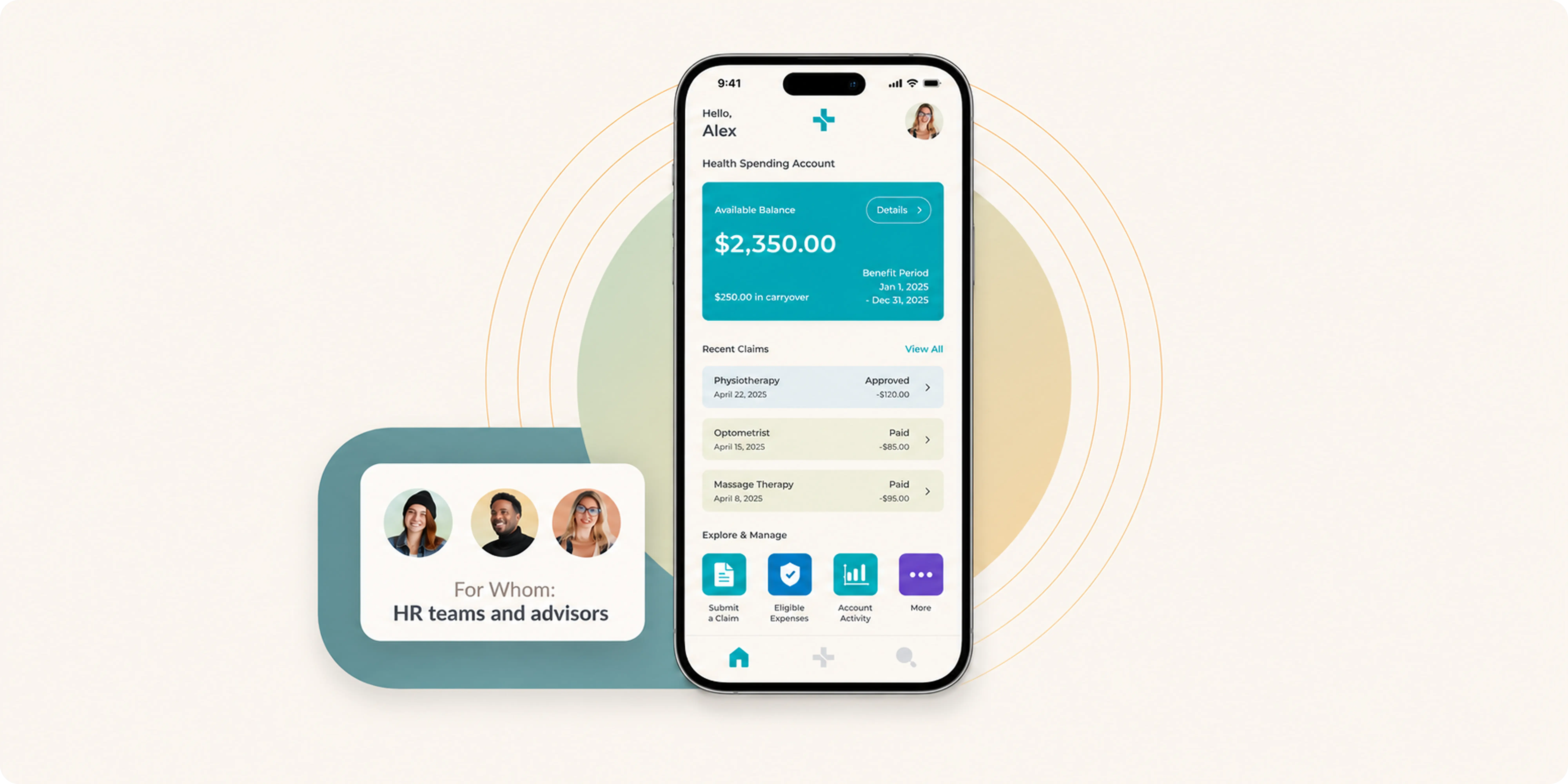
The site also had to serve three audiences at once. Advisors are deciding whether to bring myHSA to their book of clients, employers are comparing cost and setup effort, and employees just want to know how a claim gets paid. Each needs a different level of detail, and none of them should have to read past someone else's answer to find their own.
Approach
We started by separating the three audiences and mapping what each one needs to see, in what order. That drove the information architecture, giving advisors, employers and employees their own routes through the site instead of one page trying to satisfy everyone.
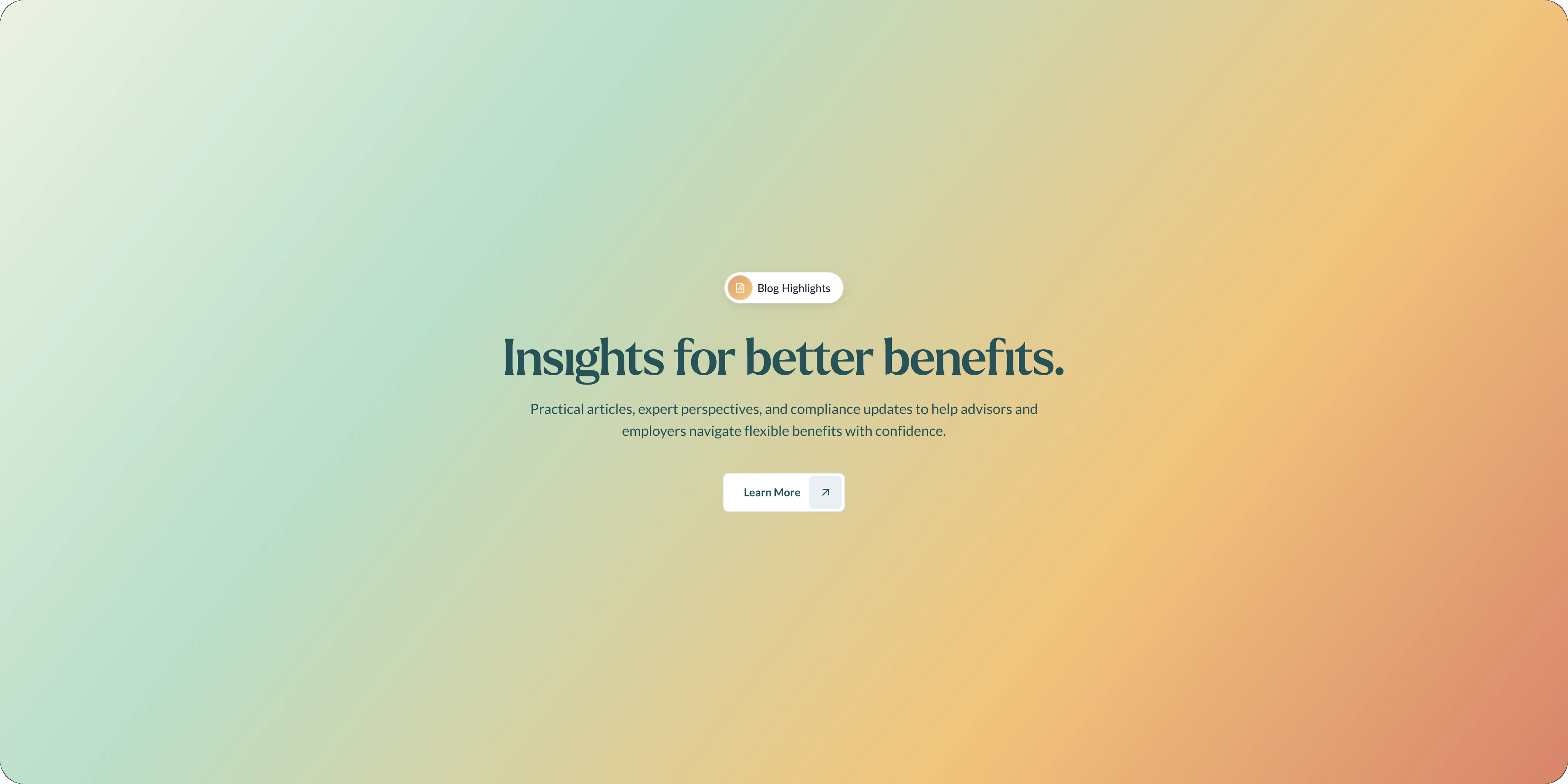
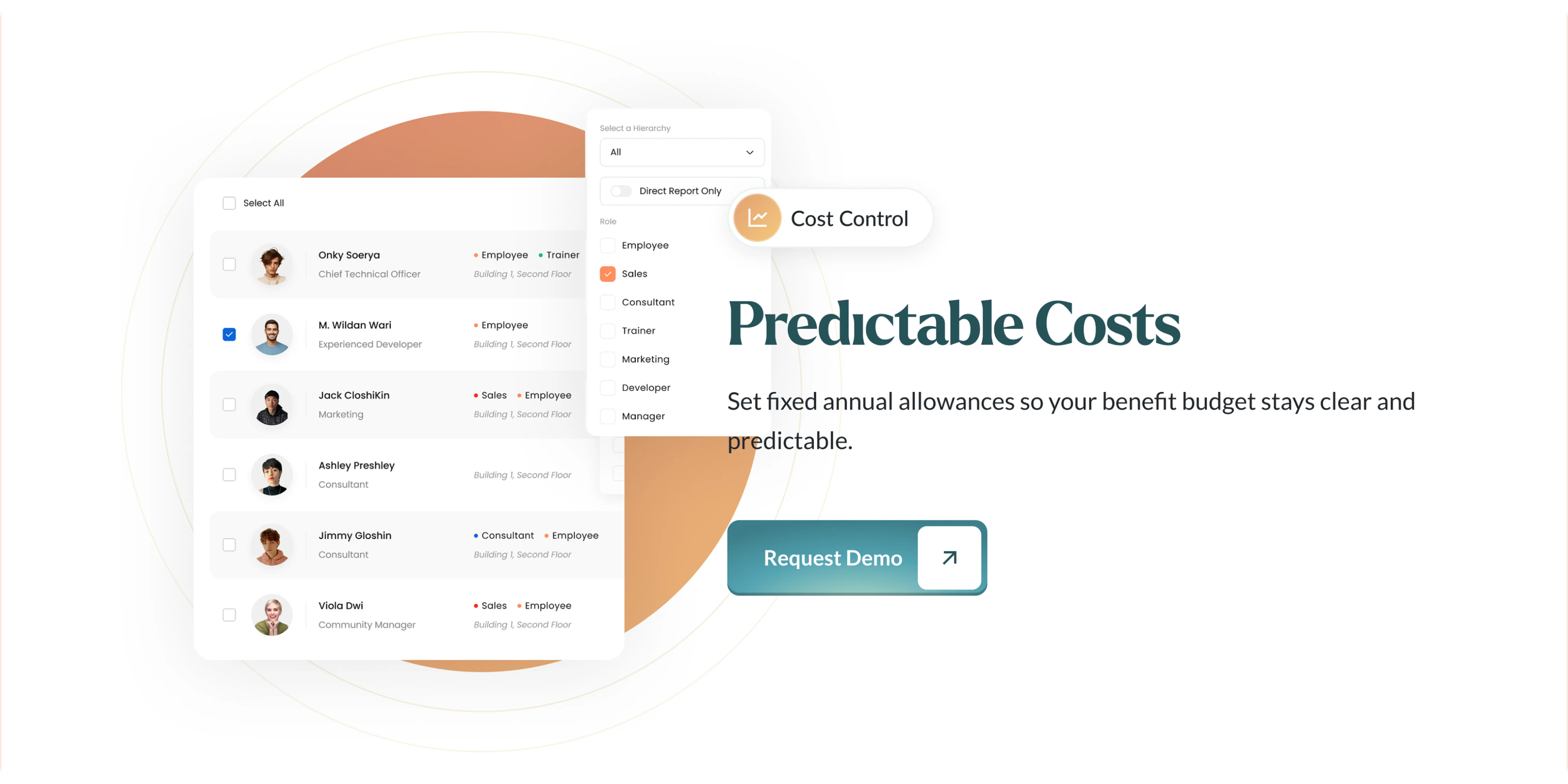
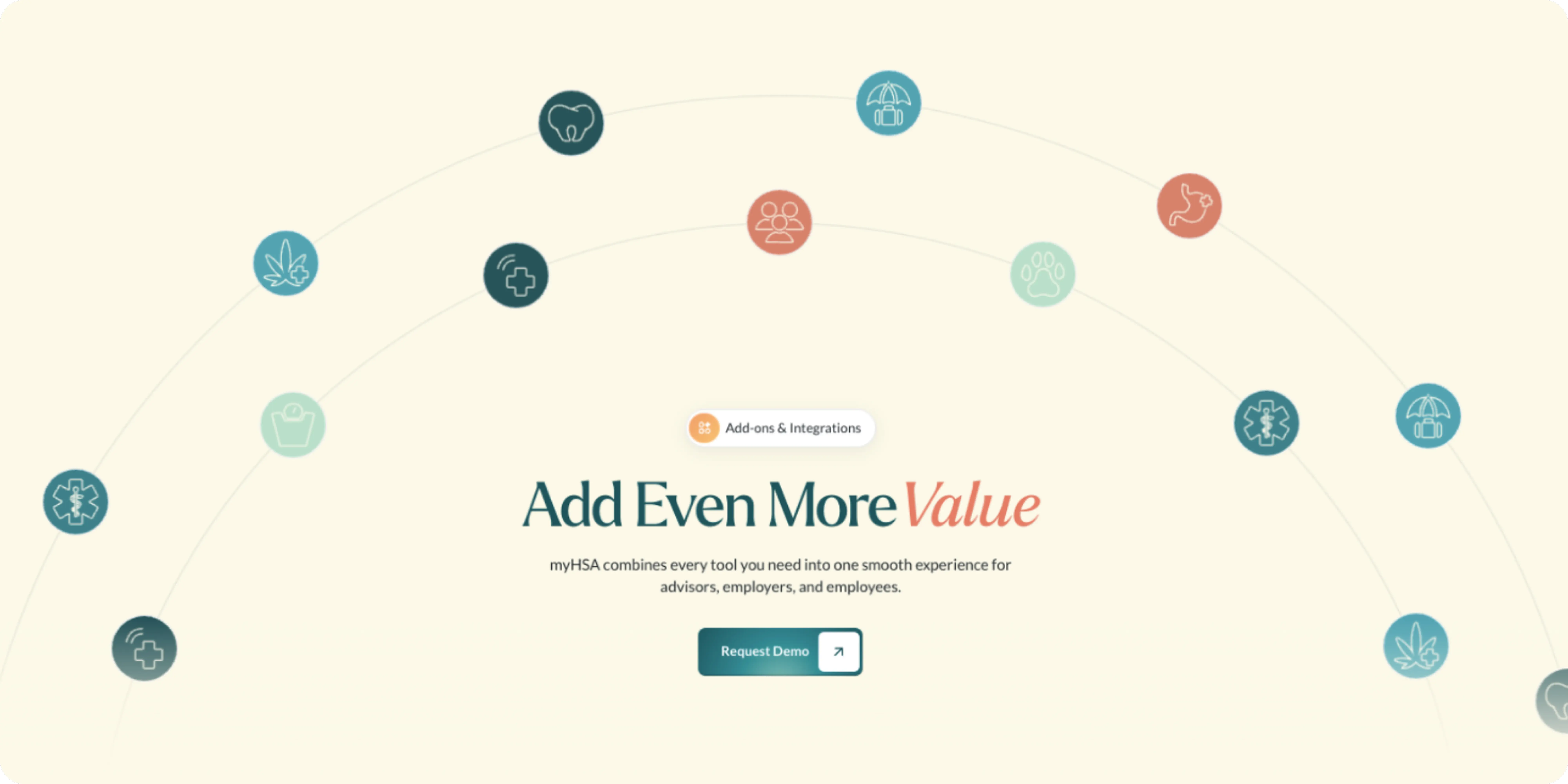
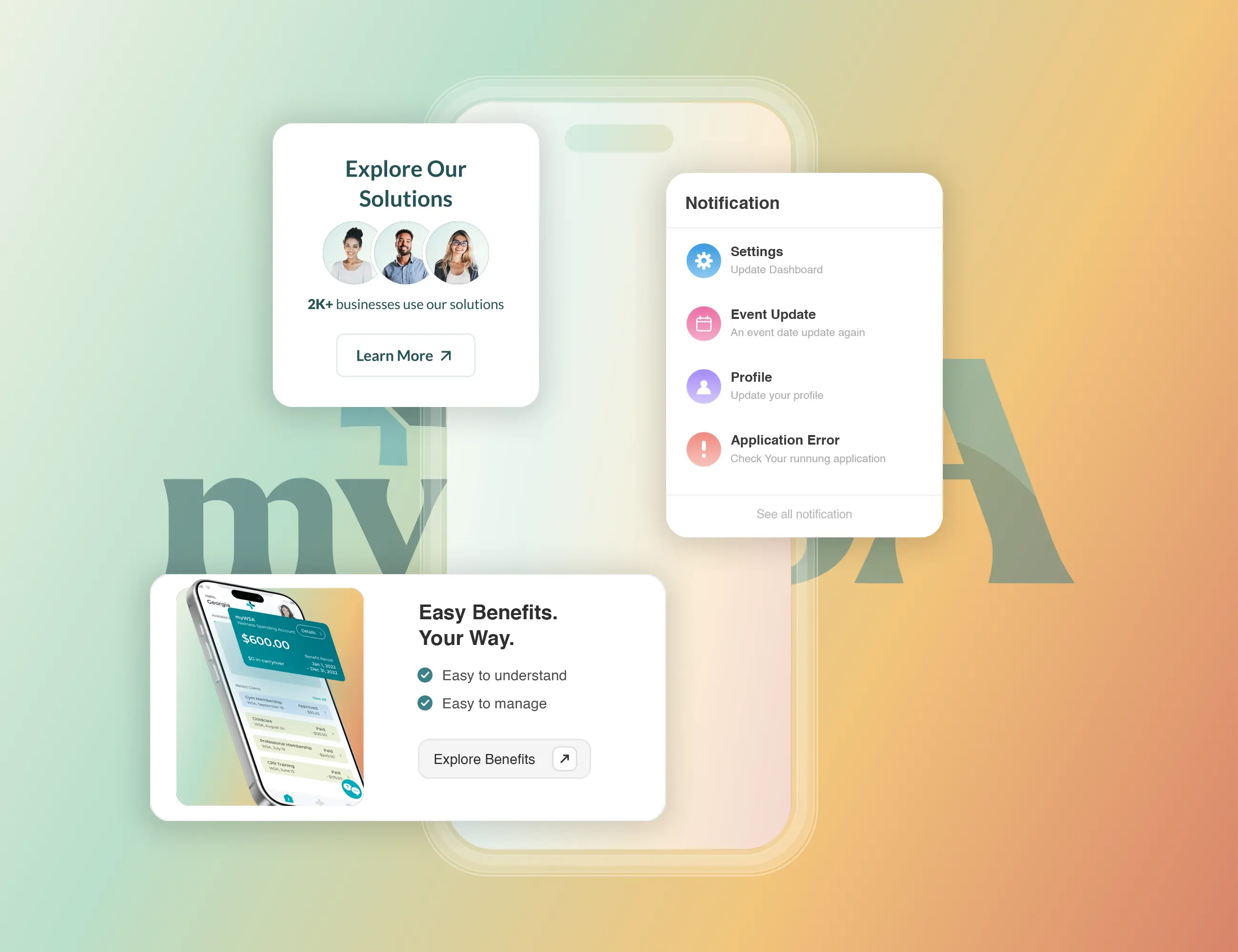
The UI/UX and visual work then gave the new look something to run on. We built a design system around the refreshed direction and drew new illustration, iconography and graphic elements specifically for the brand, so the site could feel current without reaching for stock.
The build itself was Webflow, chosen so the internal team can add pages and update content without a developer. Performance came out of image handling and page weight, and SEO was handled at both levels, on-page structure and technical health, which is standard on every project we build.
Outcomes
myHSA now presents like the product it sells, straightforward, current, and quick to get through. Advisors, employers and employees each get a clear route to the answer they came for, and the new visual elements give the brand something recognizable of its own.
The Webflow build leaves the team able to publish and adjust pages themselves, with the SEO structure and performance work already in place rather than bolted on afterwards.





.webp)








.webp)






.webp)



.webp)


.webp)


.avif)











.png)