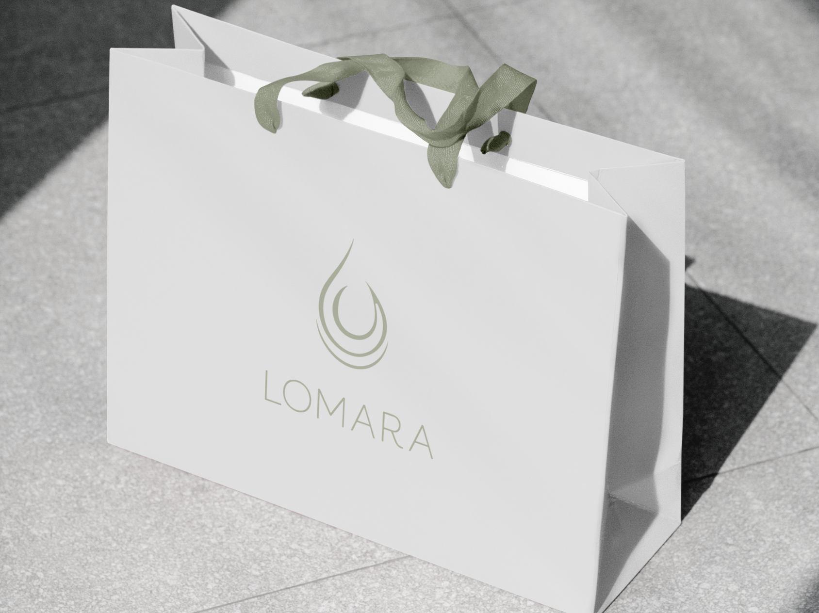
A luxury spa identity drawn from Middle Eastern heritage, built to hold on signage and packaging as well as it does on screen.
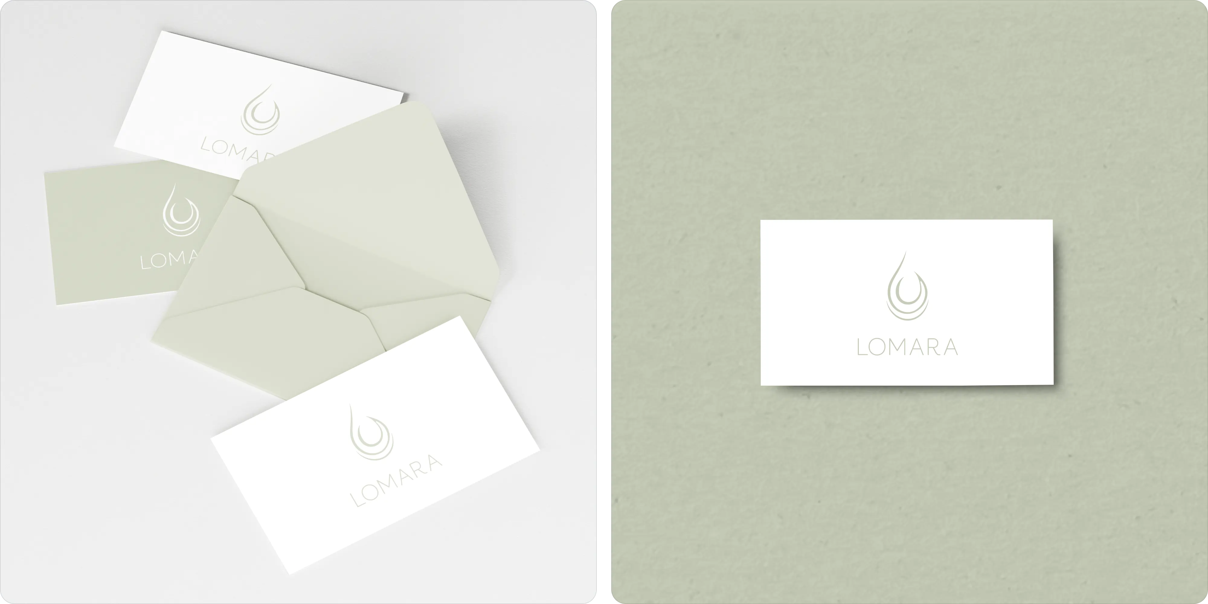
Lomara collaborated with Brand Vision to upgrade its logo and branding to match its modern and aesthetic business.
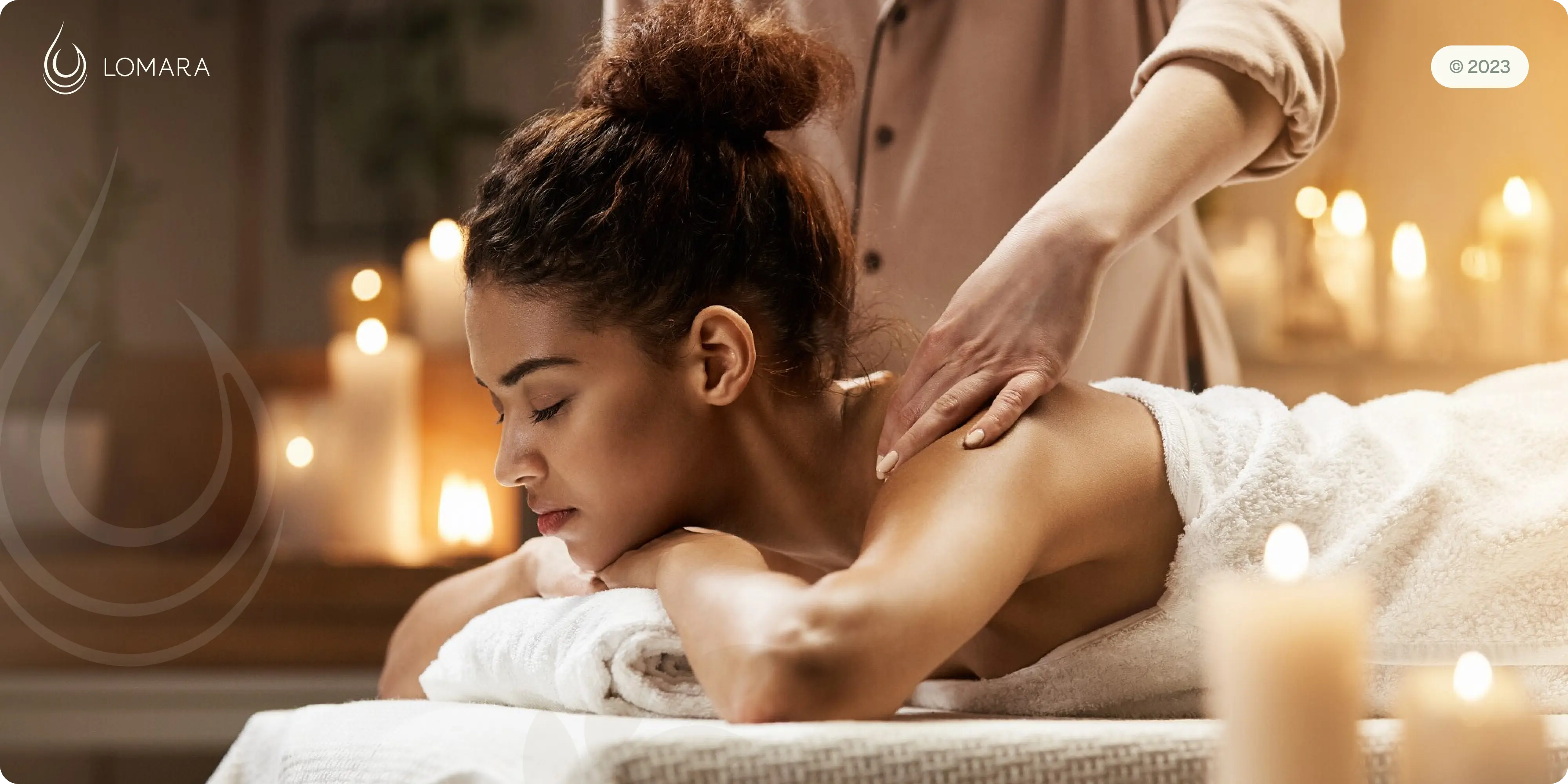
Project Highlights
- Brand identity: a refined visual system for a luxury spa and wellness brand.
- Logo design: an elegant mark built for premium wellness positioning.
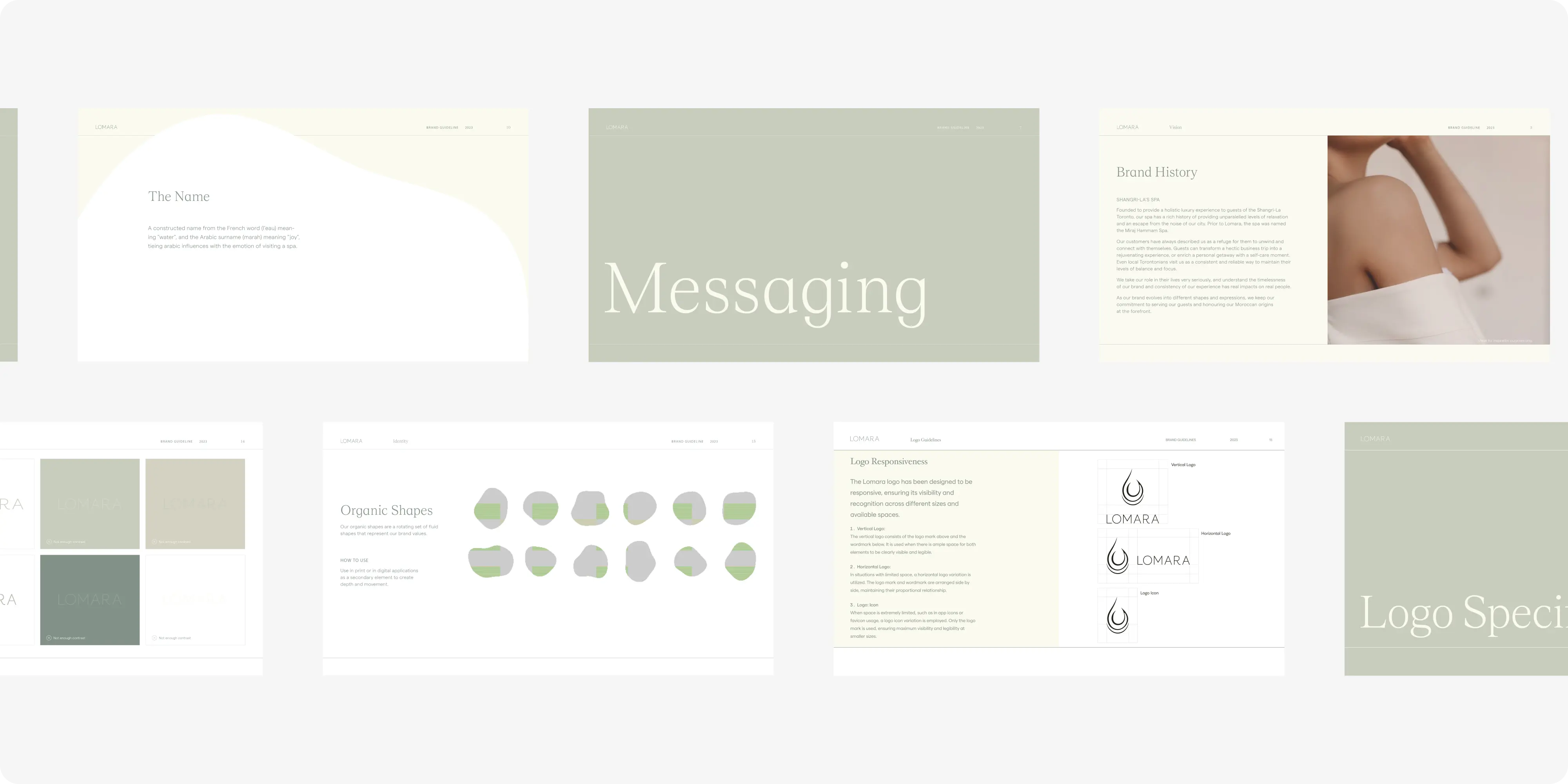
- Colour and typography: a restrained palette conveying calm and quality.
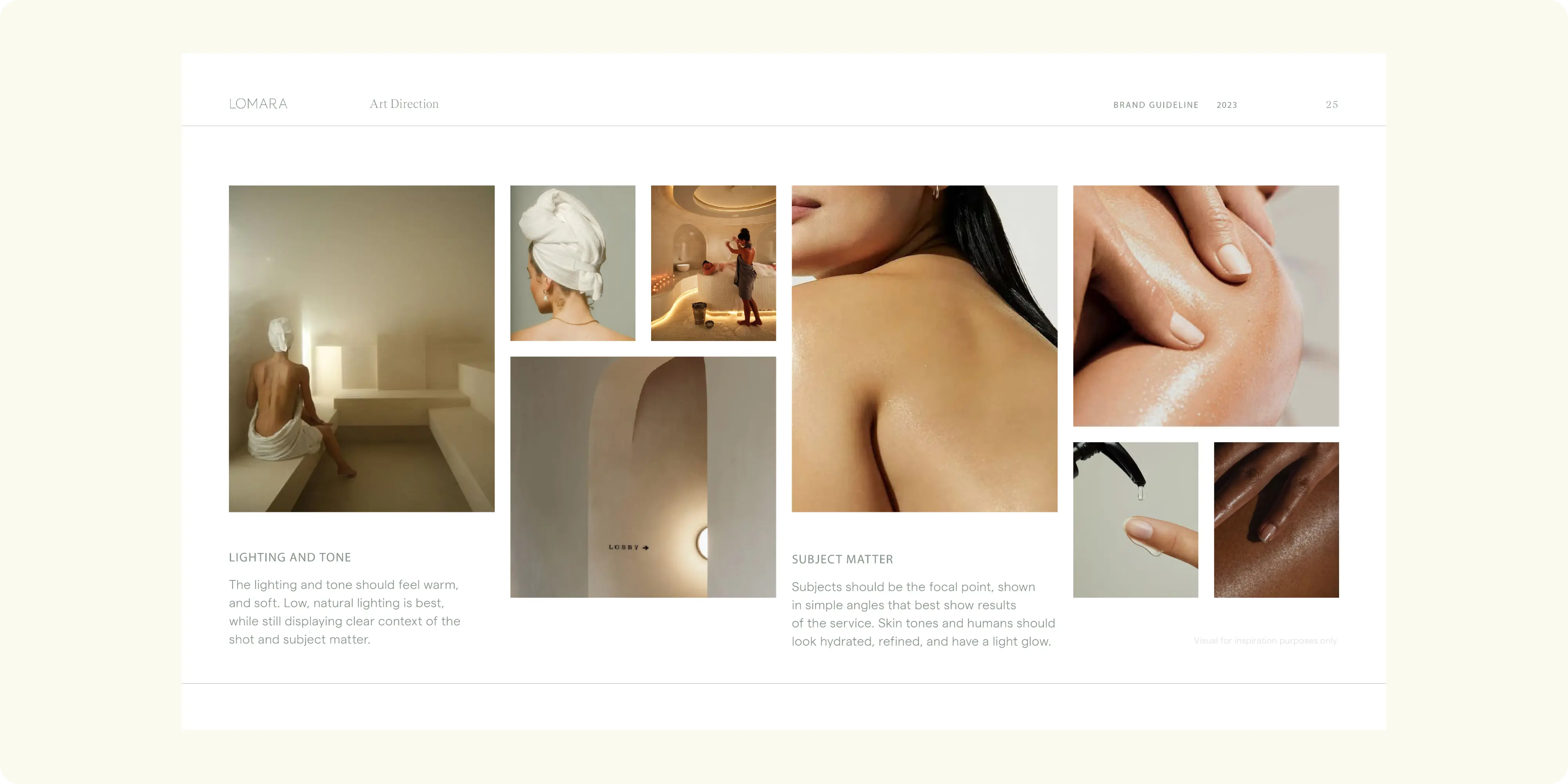
- Custom graphic elements: bespoke visuals distinguishing the brand in a crowded category.
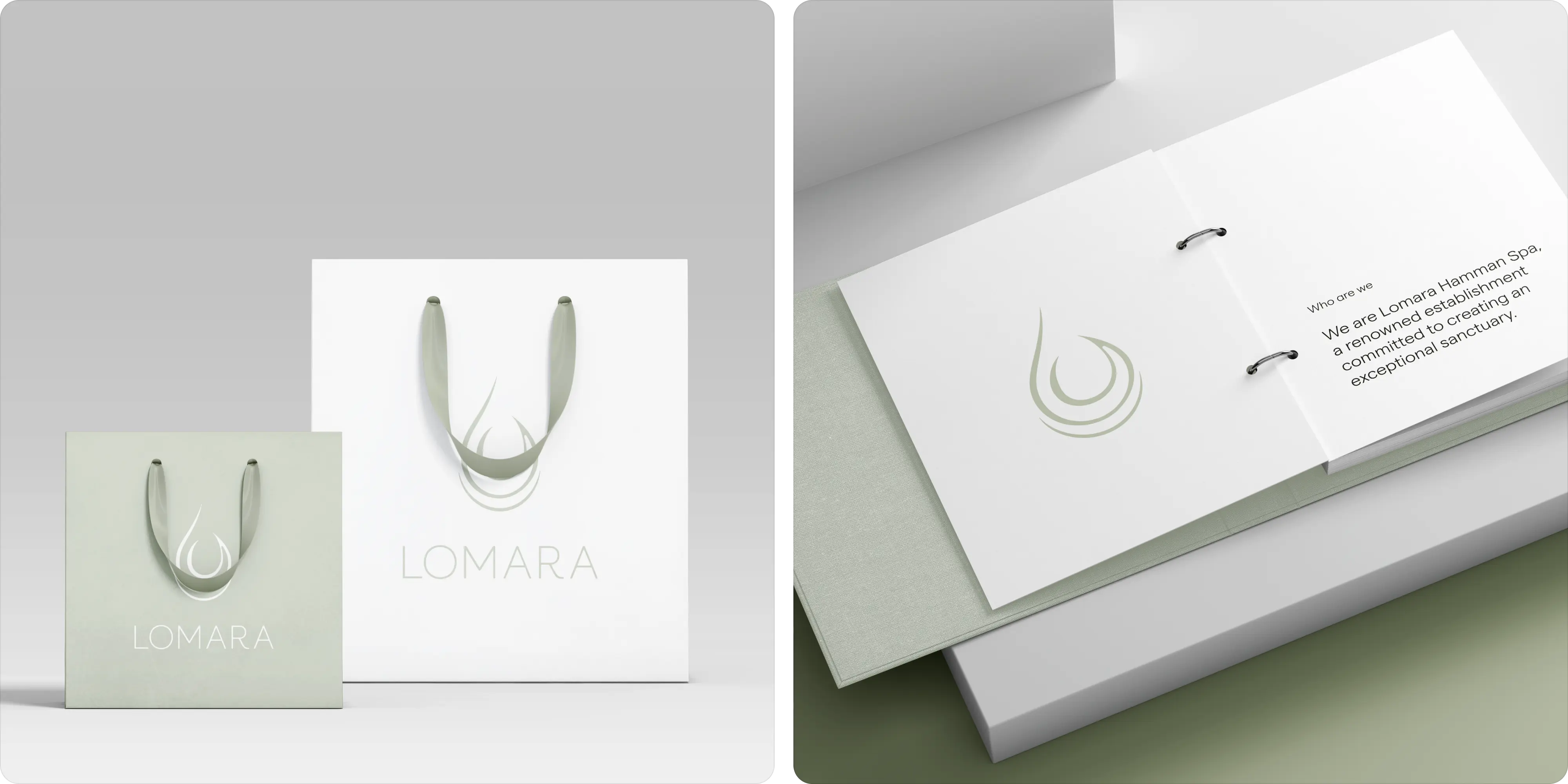
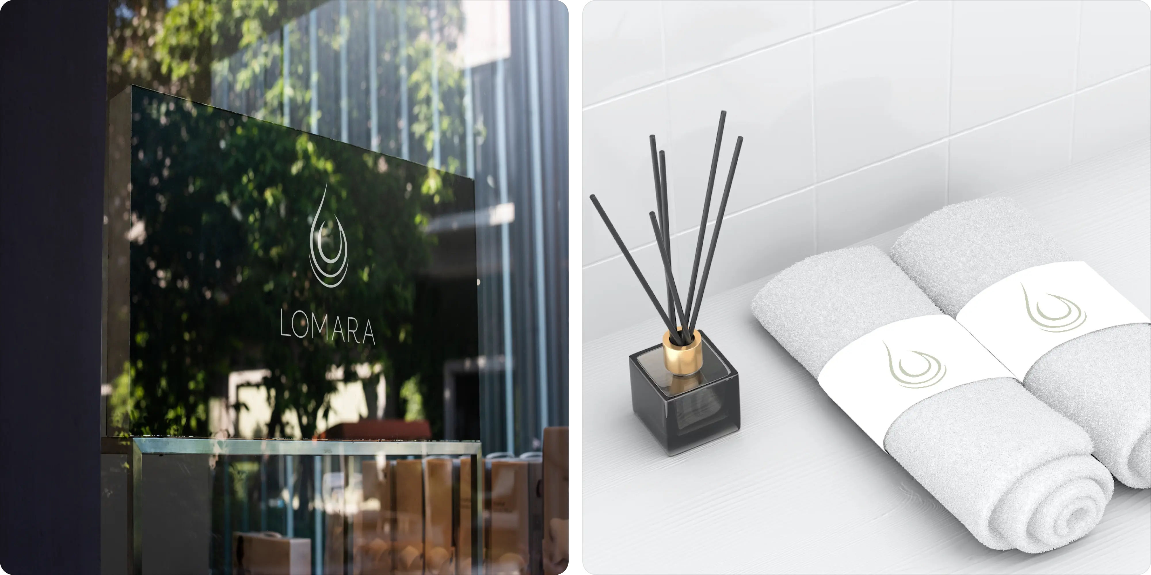
- Brand applications: identity extended across treatment menus, signage, and packaging.
- Brand guidelines: usage standards keeping execution consistent.
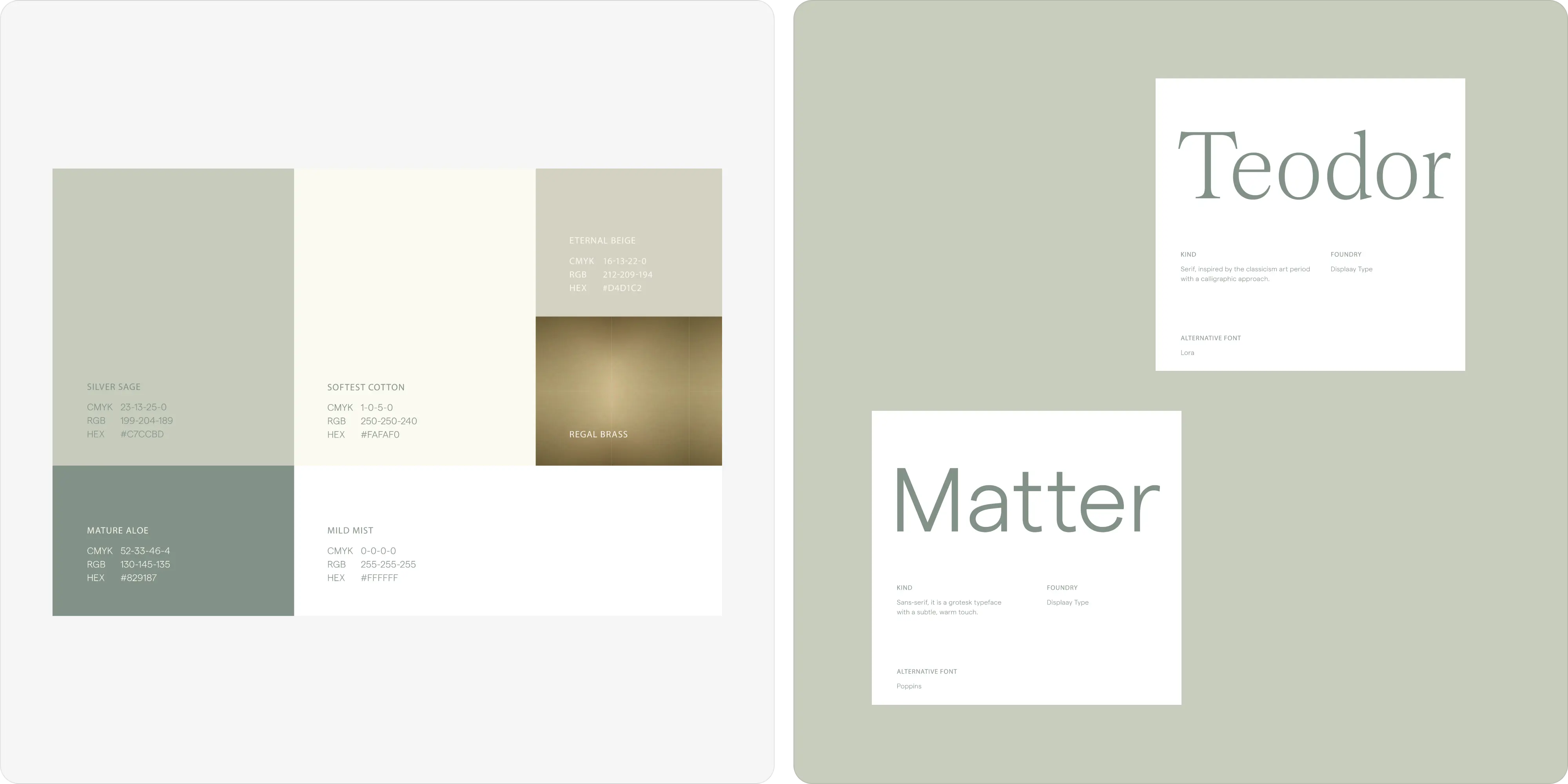
Challenges
Wellness branding is crowded with the same soft palettes and calm typography, which makes genuine differentiation difficult. Lomara needed an identity that felt premium and distinctive and translated cleanly into a physical spa environment, not just onto a screen.
Approach
We built the identity around calm and quality, using a restrained palette and elegant type to establish premium positioning without excess. Custom graphic elements gave the brand distinctiveness within a crowded category, and the system was extended into treatment menus, signage, and packaging so the brand holds in the physical space.
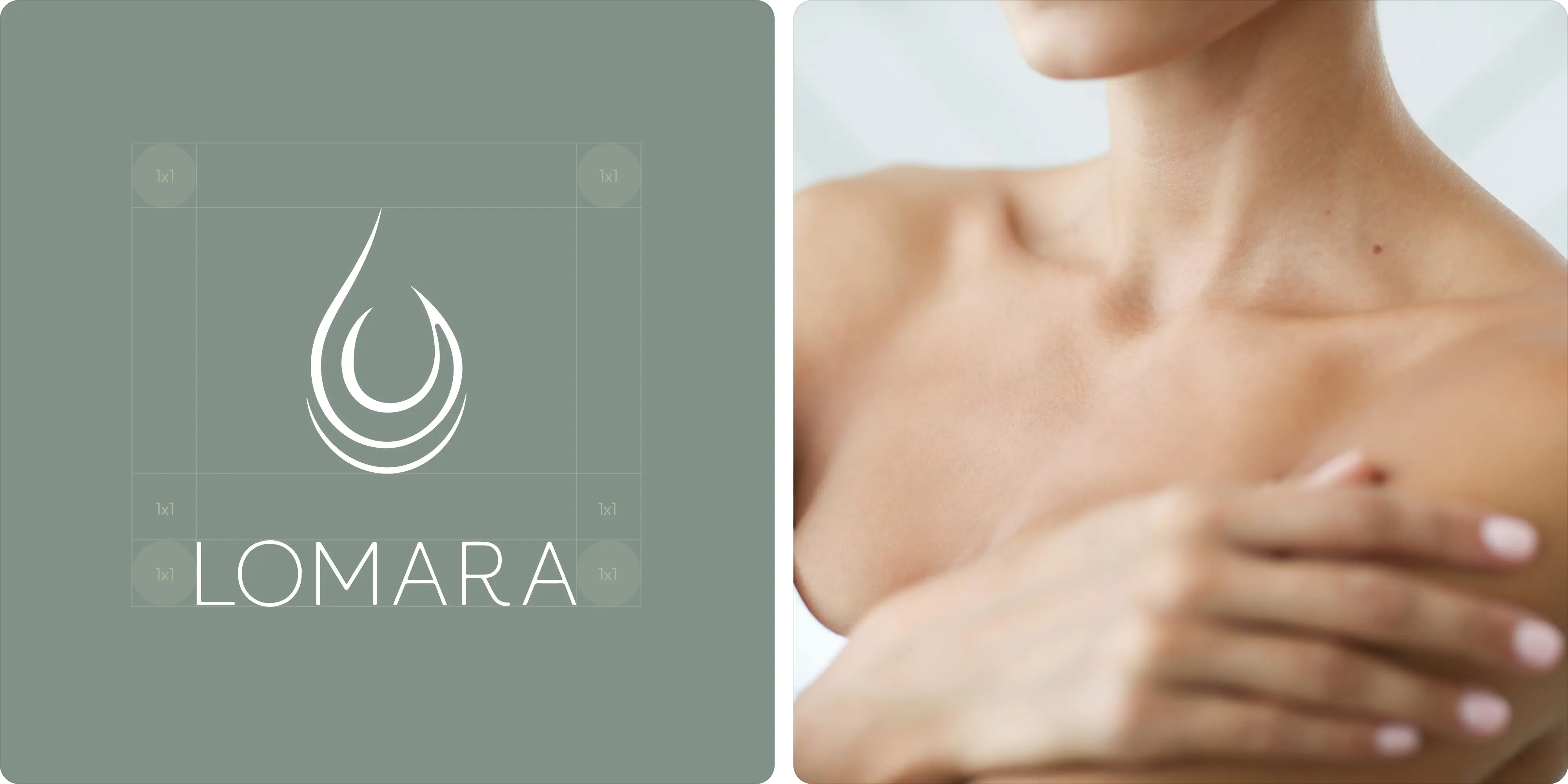
Outcomes
Lomara has an identity that reads as genuinely premium and works as well on signage and packaging as it does on screen. It stands apart in a category where most brands blur together.
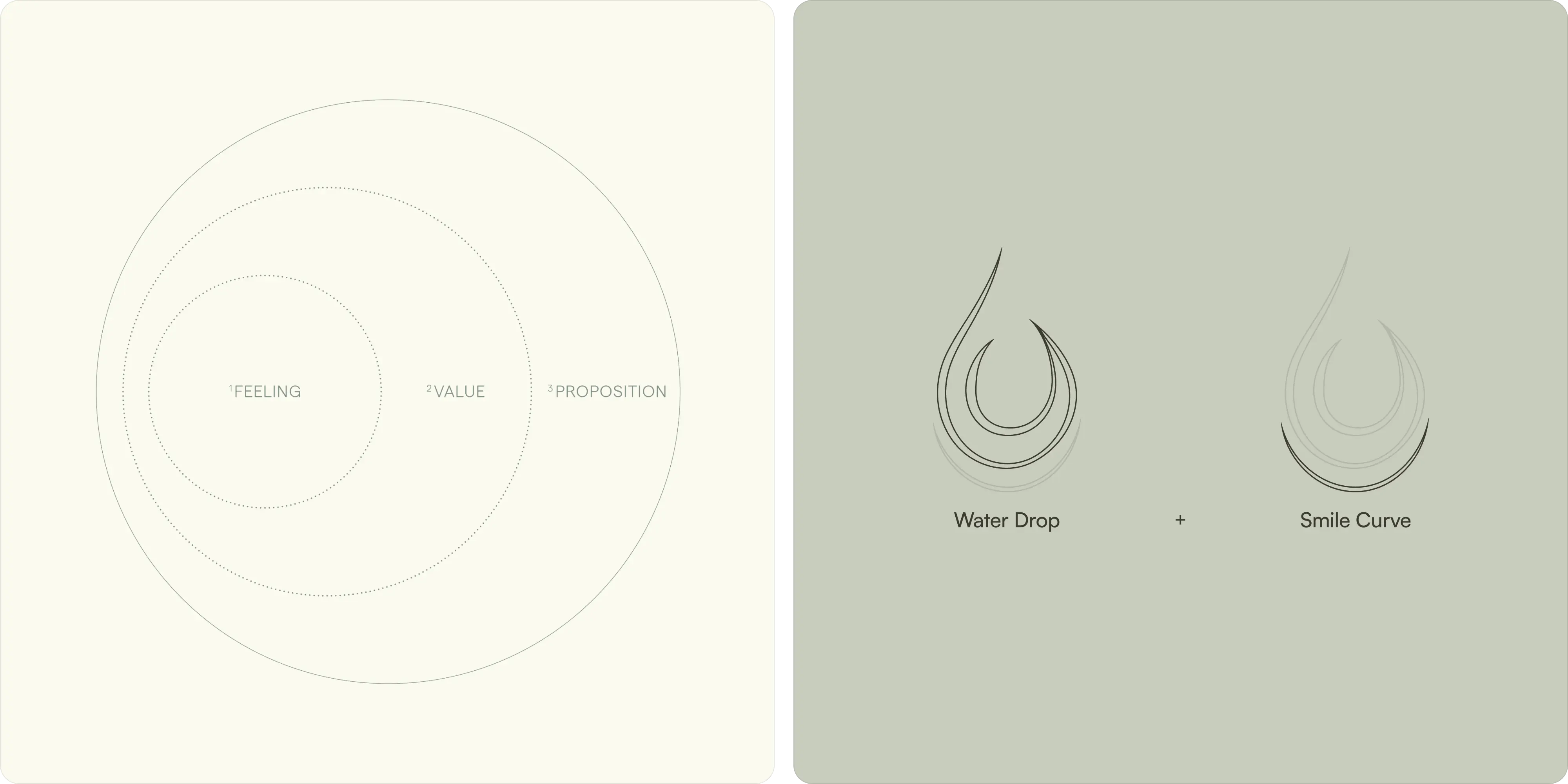


.webp)







.webp)








.webp)




.webp)


.webp)


.avif)







.png)