(Updated on )
Leaside Blvd

A pre-construction sales site that puts floor plans, location, and registration first

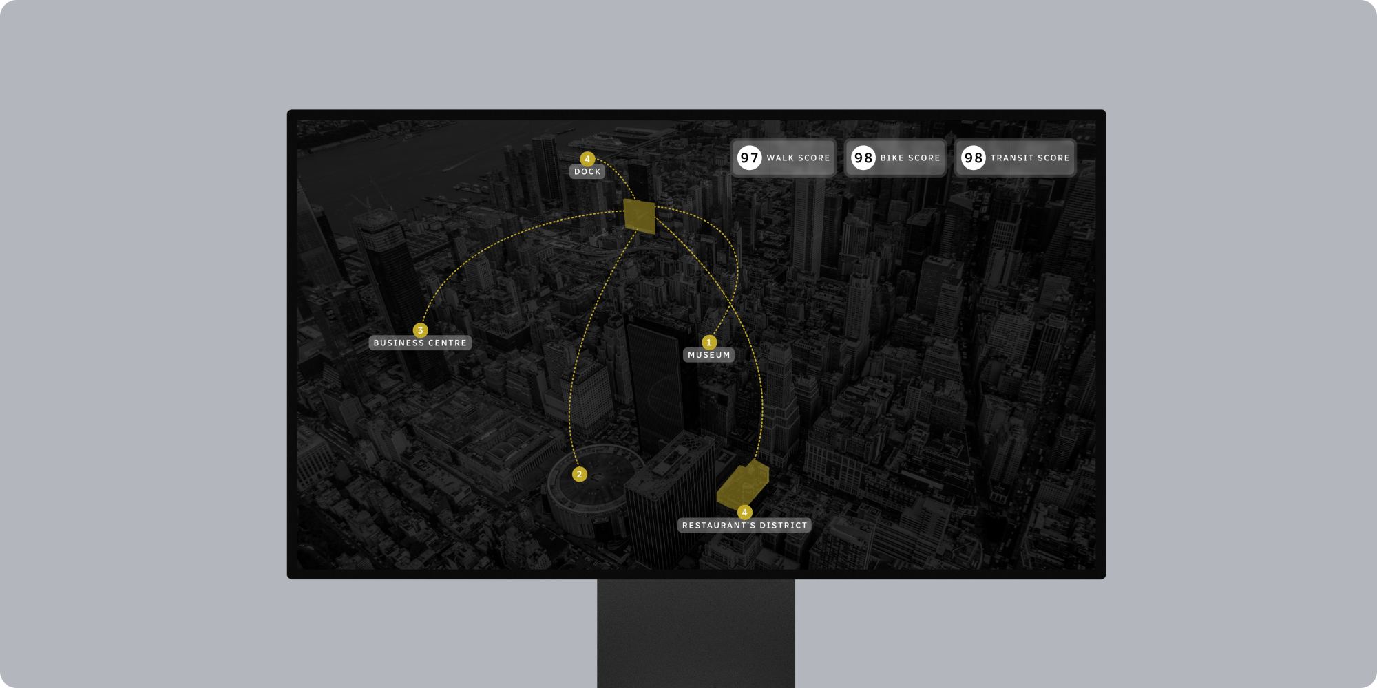
Leaside Blvd is a pre-construction project aimed at buyers and brokers who need details fast.

The goal was clear: make floor plans simple to browse, show real location value, and drive VIP registrations with as few clicks as possible.

Project Highlights
  • VIP registration funnel with a short form, sticky Register CTA, and a clear confirmation step. Leads are tagged by audience type (buyer, investor, broker) for smarter follow up.
  • Floor plan discovery with filters for beds, size range, and view, plus quick downloads of plan PDFs and a simple compare view.
  • Pricing signals and incentives using updateable “from” prices, limited-time banners, and a clean matrix for fees and key dates when ready to publish.
  • Launch cadence and key dates displayed on a simple timeline: sales phases, occupancy targets, and milestone updates.
  • Location and lifestyle proof via a map, 5–10 minute walk times, nearby transit, and a highlight reel of area amenities.
  • Media built for speed with lightweight render guidelines, poster frames for video, and CDN caching so launch traffic loads quickly on mobile.
  • Conversion UX with a persistent header CTA, short step-by-step registration, and clear privacy language.
  • Search readiness using on-page SEO basics, structured headings, internal links, and an XML sitemap to help people find plans, location, and FAQs.
  • Ad-ready landing pages tailored for paid campaigns, each with tight copy, social-proof snippets, and a single action.
  • Analytics that matter tracking plan downloads, registration starts and completions, video plays, and scroll depth so sales teams know what resonates.
  • Accessible design with readable contrast, larger tap targets, and keyboard access that meets WCAG AA.
  • Clear disclosures with standard pre-construction disclaimers, availability notes, and image usage guidance placed near calls to action.
  • Challenges

    Pre-construction buyers and brokers move fast. If plans and pricing signals are hard to find, they leave. Heavy renders slow pages, forms with too many fields reduce sign-ups, and missing disclosures create friction. The site needed to convert launch-day traffic while staying clear and compliant on mobile.

    Our Approach

    We mapped the path people take: explore plans, check location, register. Navigation and page models were rebuilt around those tasks with clean filters, a sticky CTA, and progressive disclosure for details like fees and dates. We set performance budgets for media, tuned mobile speed, and added event tracking that ties directly to sales actions. Search basics were set up so plan pages and FAQs surface quickly, and we used calm, direct copy to keep focus on the next step.

    Final Outcome & Why Brand Vision

    The result is a sales-focused site that makes plan browsing easy, shows real location value, and lifts VIP registrations. We combined conversion-first web design, clear UI/UX, and practical launch SEO so the project can build interest before launch and keep momentum through each phase.

    More from Project

    Project Visuals & More

    Explore more
    These Cases Might Also Interest You