



















Branding
B2B Branding Strategy: Positioning, Proof and Buying-Committee Trust
Sep 6, 2026
/ By Hamoun Ani

Brand Vision is an award-winning web design agency building custom websites that make a stronger case for the organizations behind them.
A website is often where a business must make its case without anyone in the room. Its position should be clear within seconds, the experience should earn trust, and the technology should support the work without drawing attention to itself. As a web design agency, Brand Vision begins with research and strategy, then translates that understanding into website architecture, content, UX, visual design, development, SEO, and accessibility.

Building real partnerships with top global brands. Delivering results that last well beyond the launch.











Our web design agency combines strategic thinking, UX, content, visual design, web development, accessibility, and search to create websites shaped around the business, its audience, and the decisions the experience needs to support.

A custom website should feel unmistakably connected to the company behind it, not the template or platform beneath it. Our custom web design services begin with the brand, audience, and commercial role of the site, then define the architecture, content, visual system, and functionality around those needs. The platform is selected after the strategy is clear, whether the right solution is Webflow, WordPress, or fully custom web development.
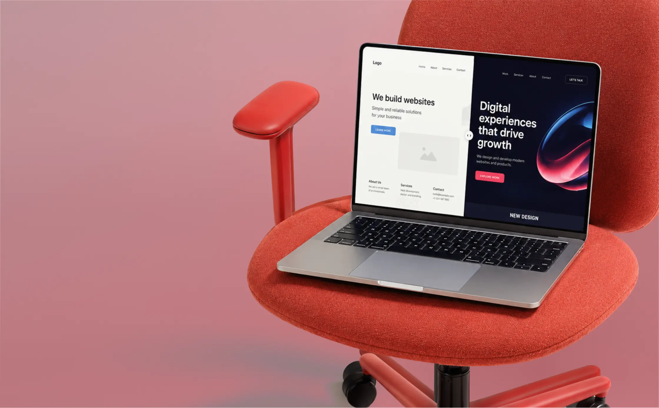
A website redesign is not simply a replacement. It should preserve what already creates value, including search visibility, useful content, analytics history, and familiar user journeys, while resolving the structural, visual, and technical issues holding the site back. Our website redesign services cover auditing, content planning, information architecture, migration, UX, design, and development so the new website improves the experience without sacrificing hard-earned equity.
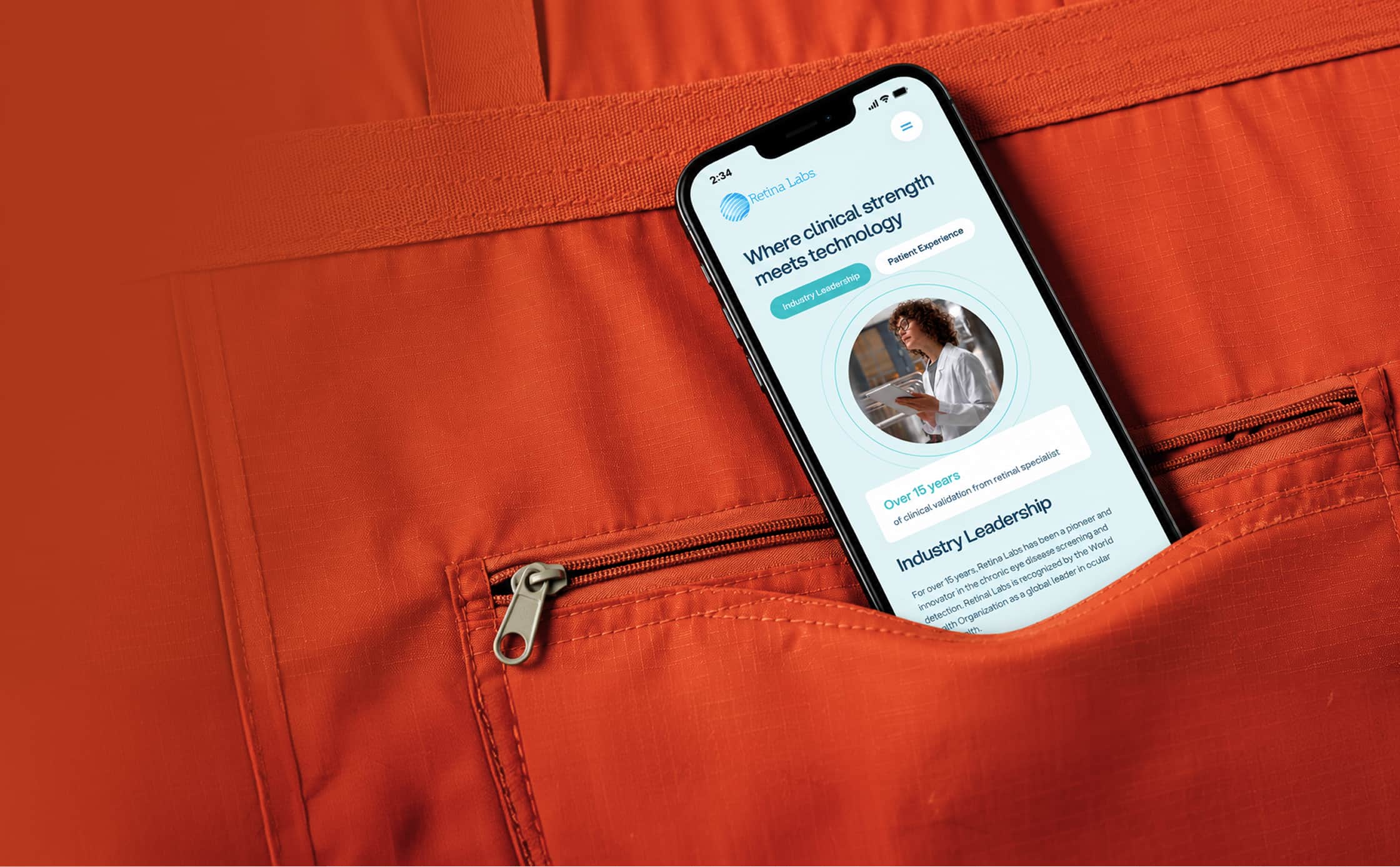
Responsive web design should not be treated as a desktop layout compressed for smaller screens. We design responsive websites as flexible systems that adjust hierarchy, pacing, navigation, content, and interaction to the device and context. Every page, including campaign landing pages, is considered mobile-first so clarity, performance, and conversion remain consistent from phone to desktop.

Accessible web design is most effective when it shapes the experience from the beginning. Our web design agency considers semantic structure, keyboard navigation, contrast, readable content, focus states, and interaction patterns throughout design and development, with WCAG standards and applicable ADA and AODA requirements in view. The result is a clearer, more resilient website that works for more people without treating accessibility as a final compliance exercise.
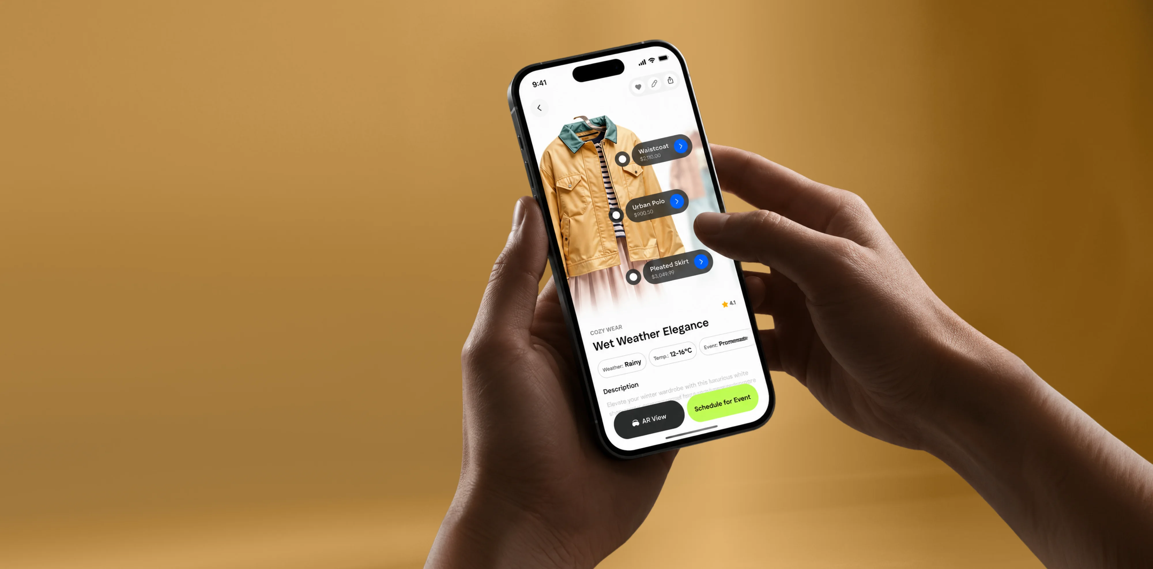
Effective ecommerce web design reduces uncertainty at every stage of the buying journey. We design product discovery, collection pages, product detail pages, cart, and checkout around the information customers need to make a confident decision. Whether the store is built on Shopify, WooCommerce, or a custom ecommerce platform, our web design agency balances brand expression, usability, performance, and conversion without making the experience feel formulaic.

A small business website has to establish credibility quickly and contribute to the business in practical terms. Our small business web design services focus on the actions that matter most, whether that is a call, booking, inquiry, visit, or sale. We give lean teams a polished, manageable website with the right content and functionality, without adding features that increase cost and complexity without improving the outcome.
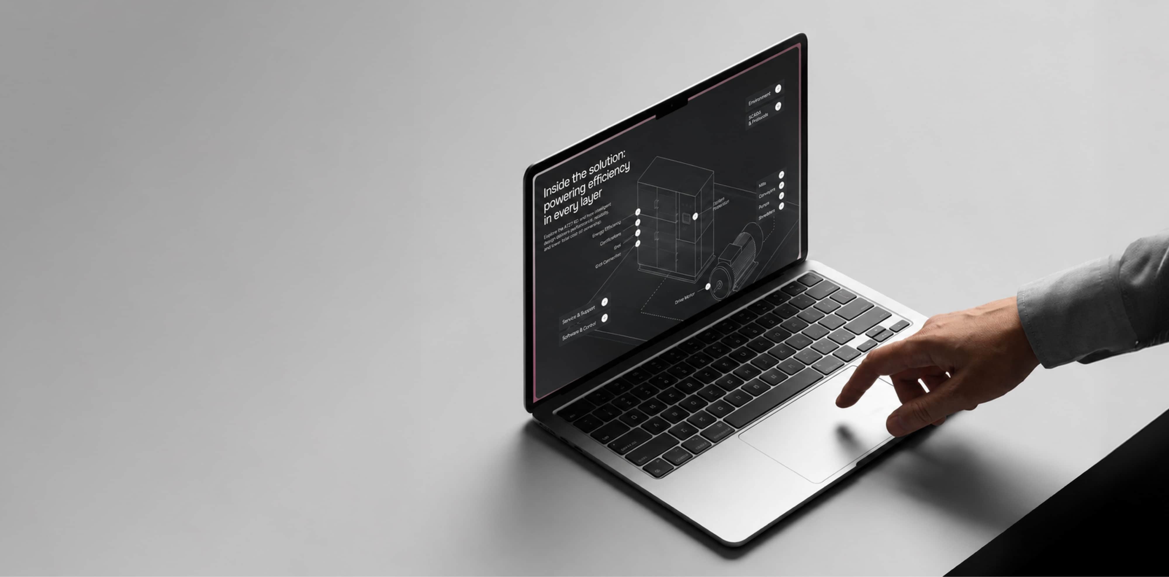
B2B website design must support decisions that often involve multiple stakeholders, longer research cycles, and greater scrutiny. As a web design agency experienced in B2B, Brand Vision clarifies complex offers, organizes proof, and creates pathways for different audiences to find the information they need before they are ready to speak with sales. For larger organizations, our corporate website design approach also accounts for governance, content scale, accessibility, integrations, and consistency across teams and markets.
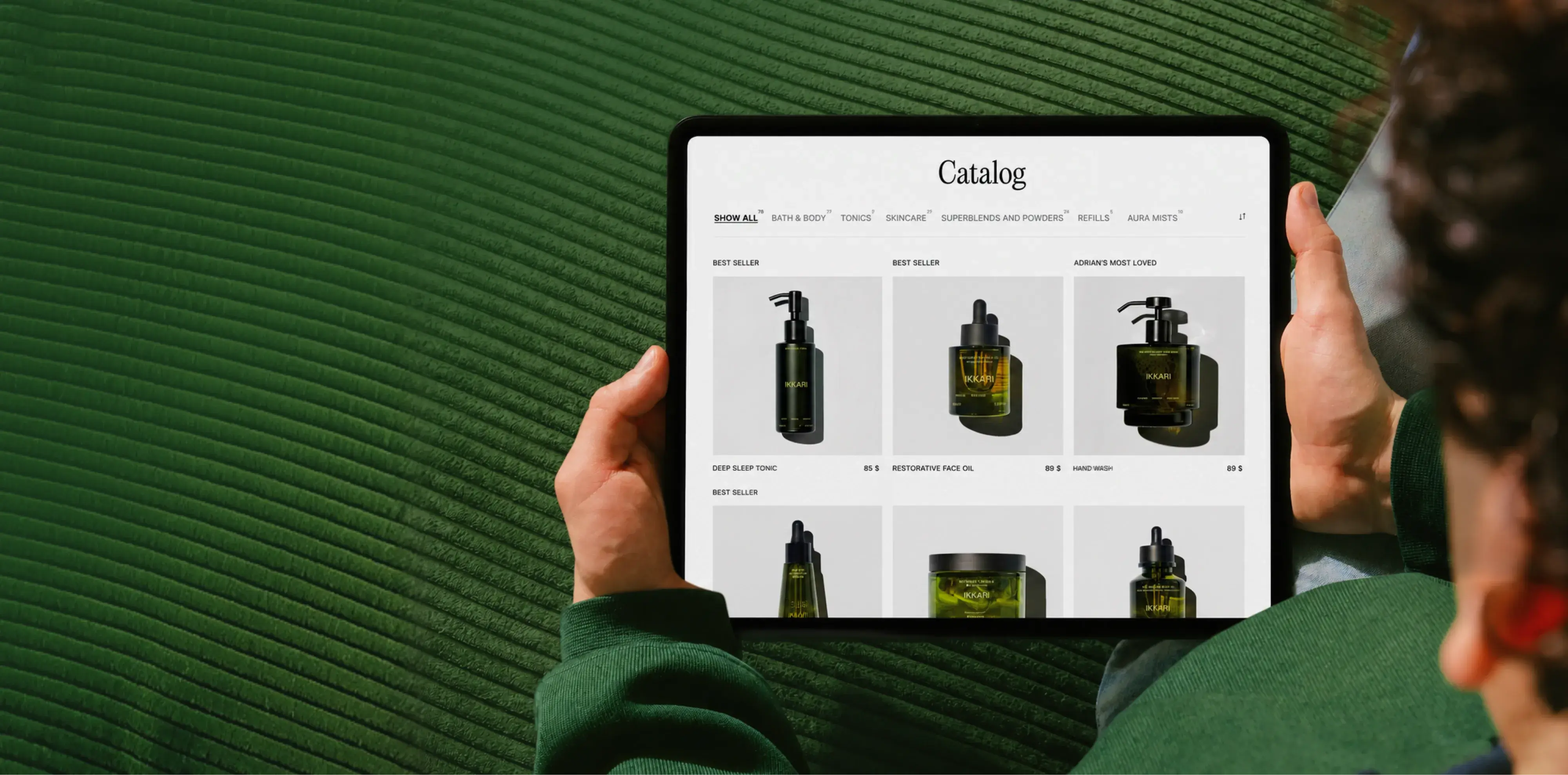
UX-led web design starts with how people understand information, compare options, complete tasks, and recover when something is unclear. Our UX web design work uses research, audits, user flows, information architecture, interaction design, and design systems to shape the experience before visual styling is finalized. The result is a website that feels intuitive because the underlying decisions are sound, not because the interface has to explain itself after the fact.
We're not tied to one platform. We recommend the one that fits the project and how your team will run it day to day, then design and build it properly, from a no-code system your team can manage to a fully custom stack.


.webp)
A structured design process shaped by insights, analytics, and research, measured against clear success metrics.
We align on goals, study the audience and competitors, and audit what's already there. Research and analytics shape the sitemap, the content priorities, and the standards the finished site has to meet.
We turn strategy into page models, components, and responsive layouts. Interactive prototypes put the design in context, so the decisions that matter get made early, before anything is built in code.
We build on a clean, well-structured CMS and implement the design system, with accessibility, performance, and analytics handled from the first line rather than bolted on at the end.
We run full QA, set up redirects, and prepare a clear handover, then map the first round of improvements so the site continues to earn its place well after go-live.
Recent website design and development projects, shown through the business problem, the decisions behind the build, and the results that followed once the work entered the market.
A website has to understand the world it is entering. The proof that builds trust in healthcare is different from what moves a B2B buyer, a real estate audience, or an ecommerce brand. We adapt the strategy, structure, content, and design to the expectations already shaping each market.












Product depth shouldn’t slow the story down. We partner with SaaS, platform, and enterprise software teams to translate technical capability into focused narratives. Clear paths to demo, trial, or contact serve both buyers and technical evaluators. Systems are built for product-led growth with composable components, editor guardrails, and instrumented analytics that tie directly to pipeline.
Complex services sell on clarity, not volume. We help consulting, financial, and advisory firms structure their digital presence around buyer tasks: understanding capabilities, comparing options, and starting a brief. Every touchpoint earns trust through specificity and proof. Content is organized by audience need, so the people making the hiring decision find answers quickly and move to contact without friction.
Patients and practitioners make high-stakes decisions under pressure. We design trust-first experiences for healthcare and wellness brands, keeping clinical accuracy intact while making it simple for people to find the right provider, service, or next step. Accessibility, privacy-compliant forms, and plain-language content are standard. Local visibility for practices and clinics is built into the foundation, not bolted on later.
Prospective clients searching for legal help are often under pressure and comparing firms quickly. We help law firms present practice areas with credibility, surface the right contact paths, and build a digital presence that earns trust before the first conversation. Clear structure, plain language, attorney profiles, and consultation flows make it easy for people to take the next step with confidence. Ethical advertising compliance is built in from the start.
Buyers, investors, and project owners move on trust and timing. We work with brokerages, developers, general contractors, and property management firms to present listings, projects, and capabilities with clarity. Content is organized around what prospects actually need: proof of work, service scope, location context, and a direct path to inquire. Pre-construction launches and trade portfolios get the same strategic rigor as resale platforms.
Conversion lives in the details. We work with consumer and ecommerce brands to build fast, clear shopping experiences where product pages explain value quickly, checkout flows reduce friction, and the entire system scales with the catalog. Promotional templates, collection architecture, and performance monitoring keep the storefront sharp as demand and inventory shift with seasons. The result is a store your team can run day to day without developer dependency.
Early-stage companies need focus over flash. We help startups define positioning, build a credible identity, and launch a conversion-ready presence that clearly communicates what the product does, who it’s for, and how to get started. Everything is built to scale: component systems, content structures, and analytics foundations grow with the roadmap instead of needing a rebuild at Series A. The pitch and the website tell the same story.
Students, parents, and administrators all need different answers from the same site. We help schools, universities, and training organizations structure digital experiences by task: apply, visit, inquire, enroll. Accessible design and plain-language content serve diverse audiences without alienating any of them. A manageable CMS means internal teams keep program pages, event listings, and admissions information current without outside help or bottlenecks.
Nonprofits compete for attention, funding, and volunteers simultaneously. We build accessible digital experiences that make programs clear, donation paths intuitive, and calls to action specific enough to drive real participation and support. Content governance is designed for lean teams, so pages, campaigns, and impact reports stay current without bottlenecks. The organizations doing the most important work deserve a digital presence that matches their mission.
From restaurants to packaged goods, this industry sells on quality and convenience. We help food and beverage brands connect story with logistics: clear menus, product lines, ordering options, and wholesale paths that make it obvious how to buy and reorder. Identity and digital experience work in tandem so visitors see quality and know exactly what to do next, whether they’re a consumer walking in or a distributor placing a first order.
Audiences decide in seconds. We work with labels, venues, talent agencies, and event companies to build media-rich, performance-optimized experiences where the work is front and center. Booking, inquiry, and ticket paths stay visible and fast across devices. Campaign templates and component systems let teams launch content for new shows, releases, and events without starting from scratch each time. The creative comes first; the infrastructure stays invisible.
Guests research and book across multiple touchpoints. We help hotels, resorts, tourism brands, and event venues present their experience with clarity, connecting visual storytelling with practical booking flows, local discovery, and seasonal content that stays current. The systems we build make it straightforward for teams to update rates, packages, and promotions without depending on a developer for every change. The experience starts online, and it should feel as considered as the stay itself.













Original research and expert perspective on design, branding, and the strategy behind both.
Still have questions? Contact us to discuss.
A web design agency works out what a website has to accomplish, then makes every structural decision that follows from it. The visual layer is the last part of that job instead of the whole of it, which is the biggest misunderstanding buyers arrive with.
Strip the label away and the practice is four judgements in this order.
Design and development are two different trades and the distinction is worth holding. Design settles what the site says, how it is organized and how it looks. Development is the engineering that turns those decisions into something that runs, meaning the code, the content system your team logs into, and the connections to your other software. A design can be admired and impossible to build sensibly. A build can be flawless and unusable.
What an agency owns that a template or a lone freelancer does not is the argument between those trades. A template is somebody else's answer to all four judgements above. One freelancer, however good, is one opinion with nobody to disagree with it, and no individual covers strategy, copywriting, interface, engineering, accessibility and search at a senior level at once. An agency holds those specialists in one room and loses the arguments internally instead of on your site. The people who would do it are worth meeting first, and the mix of roles we recruit into is the shape of that answer.
The honest case for not hiring one. If you are pre-revenue and still testing whether anybody wants the thing, a template you set up over a weekend is the right decision and you will hear that from us. If you need four pages that load quickly and say plainly what you do, a good freelancer is cheaper and the outcome similar. Agencies earn the fee when a site must serve several audiences, carry real traffic, or survive a year of a marketing team editing it. Below that line, the wider practice has cheaper places for your money.
Brand Vision is an award-winning web design and branding agency, headquartered in Toronto and staffed across Chicago, San Francisco and Miami as well. Trading since 2018, past 500 projects delivered, with four Awwwards and a Webby standing against the design work.
Credentials are the easy part. What matters on a website build is narrower, and it comes down to four things.
The brand and the build sit in the same building. Most websites are designed by a studio that received the strategy as a PDF and read the first four pages of it. Here the people who settled your positioning inside the branding practice sit down the corridor from the people laying out your homepage, so the argument the brand makes and the argument the site makes are one argument. Commission the two separately and the site becomes a decorated version of a strategy nobody read.
One senior team from sitemap to handover. No research passed to a second group, no junior team executing somebody else's pitch, and no account manager standing between you and whoever is building. The senior people on it are named before you sign anything.
Developers are in the room while it is still being drawn. Which sounds procedural and is the reason nothing gets approved that turns out to be expensive or impossible three weeks into the build.
Search, accessibility and performance are build decisions here. All three get settled while the structure is drawn, because retrofitting any of them costs several times what doing it once costs. Work already shipped tests that better than this page can.
The honest ceiling. Awards measure craft at a moment in time and say nothing about whether a site sold anything, so read the recognition above as evidence of execution and nothing more. Average lift in leads across past programs has been 250%, a figure pooling engagements of wildly different sizes and starting conditions that forecasts nothing about yours. And breadth only counts where every practice is strong, so the fair question to put to us is which of ours is thinnest for your project.
Who should hire somebody else. A company needing a single-platform specialist for a genuinely unusual build, meaning something like a headless commerce stack with bespoke fulfillment logic behind it, is better served by a shop that does only that. So is a company whose budget sits under the bottom of the ranges further down this page, where a freelancer gets closer to the outcome for the money. And if the address on the invoice matters more to you than the work does, the Toronto studio is where the practice was built and where most of it still runs.
A custom website design engagement covers the complete build, from research through launch, delivered by one team instead of assembled from separate vendors. The scope covers strategy, structure, content, design, development, accessibility, and search, and the reason those sit together is that separating them is where most websites lose their argument.
What a full engagement includes.
Two of those carry more weight than their position on the list suggests. The wireframe stage, because a layout everybody has already argued about is cheap to change and a built page is not. And the content plan, because a design approved against placeholder text gets rebuilt the week the real copy lands.
What a web design project does not include is worth naming, so nothing arrives as a surprise at invoice stage.
Every proposal itemizes which of these your project includes and which it does not, so you can compare it honestly against another web design company instead of comparing one lump sum to another.
A template is a set of design decisions made for a different company. Custom web design starts from your business and your audience instead. That distinction sounds abstract until you look at what it costs on either side.
A template arranges your content into a hierarchy built for someone else's offer. Which is why template sites so reliably bury the one section that would actually convert, and why the page order rarely matches how your buyers make a decision. It also ships with code paths you'll never use, which is a common and invisible cause of poor Core Web Vitals scores, meaning main content that takes longer than 2.5 seconds to appear and a layout that shifts while somebody is reading it.
Then there's the second year. Customizing a template means fighting it, and the accumulated workarounds usually cost more than the original build did. Meanwhile a competitor can buy the same one. Once the workarounds outgrow the thing they were patching, what you are really buying is a replatform, which is a second project nobody put in a budget.
What the template argument gets right is speed and certainty. You see the thing before you pay for it, it launches in days instead of months, and it costs a few hundred dollars against several thousand. For a business testing whether a market exists at all, that trade is correct and we will say so out loud. Same for a single-purpose page that has to exist by Friday.
The result is easy to spot from outside, once you know what you are looking at. Six or seven sections in an order nobody chose. A hero image that means nothing. Three button styles, because two of them came with the theme. And a phone layout that technically works while asking a visitor to scroll past four irrelevant blocks to find a phone number. If that describes your current site, the template is not the only problem, but it is the thing setting the ceiling.
Custom means the architecture, the components, the content structure, and the visual system are built for the work your site has to perform. It doesn't mean expensive for its own sake. Where a smaller scope is the right answer, a focused custom build still beats a stretched template, because the decisions underneath it were made for you.
Worth saying plainly. Custom is not the same as building everything from nothing. We build on established platforms all the time. The portfolio shows what that looks like across very different businesses, and the argument behind each build is the part worth judging.
You decide on our recommendation, and the recommendation follows your requirements instead of what we prefer to sell. Every one of these platforms is the right answer for somebody and the wrong answer for somebody else, so here is the honest version of each, including what it costs you.
Webflow. Strongest for marketing sites where design control matters and a non-technical team publishes often. In favour, hosting and security are handled, output is clean, and a marketer can build a page from approved components without a developer. Against, it is a hosted platform with published content limits worth designing around, since a collection list displays up to 100 items unless pagination is turned on, a page can carry up to 40 collection lists and 10 nested lists, and there is no server-side code, so genuinely custom back-end logic has to live in an external service. Cost is a monthly site plan, which is predictable and not free.
WordPress. Right for large content libraries, real editorial workflow, and cases where a specific plugin is doing load-bearing work. In favour, you host it wherever you like, the five built-in roles from administrator down to subscriber map neatly onto a publishing team, and almost anything can be built. Against, it is genuinely yours to maintain, meaning core updates, plugin updates, backups, and security, and every plugin added is another dependency that can break or slow the site down. Sites we inherit in poor condition are overwhelmingly on this platform, and it is nearly always the plugin stack rather than the platform.
Shopify. The default for most stores, because payments, tax, fraud, and inventory infrastructure stop being your problem. In favour, checkout is reliable and converts well without being rebuilt. Against, a product supports up to 2,048 variants and only three options, which catches out anybody selling by size, colour, material, and finish at once. URL structure is fixed around product and collection paths, which matters on a migration, and the deepest checkout customization sits behind the top plan.
WooCommerce. Right when the shop needs to behave unusually, or when commerce sits inside a larger WordPress build. In favour, complete control over product logic, pricing rules, and checkout flow. Against, the hosting, the performance, the updates, and your share of payment-security responsibility all sit with you, which is a real operating cost rather than a footnote.
Custom development. React, Vue, Django, Node, and headless setups, for portals and applications where an off-the-shelf platform will not hold. Maximum freedom, permanent developer dependency, and only worth it when the requirement is genuinely there.
Preference is the last input, and a hard constraint beats it every time.
A focused site runs $7,000 to $15,000, a full marketing site $15,000 to $30,000, and larger builds start above $50,000. Ranges below, so you can tell quickly whether we're in your budget.
The real driver is not the number of hours spent designing. It's how many decisions the site has to support. How many audiences you address. How much of the content already exists. How many people approve direction before it's locked, which is the variable companies underestimate most.
The build figure excludes platform and hosting fees, font and stock licences, photography or video where the site needs it, and any ongoing program after launch, all of which get quoted on their own lines so the number stays comparable between agencies.
Two honest things sit at the bottom and the top of that list. Below roughly $7,000 there is no version of this an agency can do well, and you will be pointed at a freelancer or a good template instead of being sold a thin engagement. And a quote at a third of these ranges is usually one of three things, meaning a template with your logo on it, one junior covering all four disciplines, or a scope that quietly omits content, accessibility and the redirect map. Ask which of the three it is and the answer usually arrives quickly.
Every proposal is itemized line by line, so you can question any component and remove what doesn't earn its place. Book a call and we'll tell you which range applies before you commit to anything.
Most projects run 8 to 12 weeks. A focused build with ready content and one decision-maker can land in 6. Larger builds run 4 to 5 months.
Where the time goes.
Ecommerce, complex integrations, or migrating a large legacy site extend the development phase considerably, which is where the 4 to 5 month range comes from.
Your schedule is decided on your side of the table, not by our availability. It's content readiness and how fast feedback comes back. Projects almost never stall in design. They stall because the copy arrived three weeks after it was promised, or because six reviewers filed contradictory notes and nobody in the room could overrule anybody.
The arithmetic of feedback is worth stating, because it is the whole variable. A ten-week schedule assumes each review round comes back inside three working days as one consolidated set of notes. At a fortnight per round with three reviewers who disagree, the same scope lands nearer sixteen weeks and nothing about the work itself got harder.
That's why the content plan is built in week one instead of discovered as a problem in week ten, and why decision-makers and review dates get locked at kickoff.
Where a date genuinely cannot move, the scope moves instead. Usually that means launching a smaller site that is finished, then adding sections in a second phase, which beats launching everything half-done on the day. You get shown both versions and you pick. If you're working toward a fixed date, say so on the first call and you'll get a straight read on whether that date and that scope can coexist.
We do both, and a website redesign is its own discipline, not a cheaper version of a new build. The job is to carry forward what already works while correcting what doesn't, and that requires knowing which is which before anything gets designed.
What disappears in a rebuild nobody audited is pages that were quietly earning search traffic, integrations that were quietly working, form flows that were quietly converting, and years of accumulated URL equity. The site looks better and performs worse, and the diagnosis usually arrives three months later when lead volume hasn't recovered.
So the work starts with an inventory.
A rebuild is justified by structure and not by appearance. Where the information architecture no longer matches what the business actually sells, where the platform cannot do what the next two years require, or where the technical floor is low enough that every fix ends up fighting the build, replacing the site is cheaper than defending it. Wanting the site to look current does not belong on that list, and on its own it is usually satisfied by new typography, new imagery and one rebuilt homepage.
Sometimes the inventory produces a full rebuild. Other times the recommendation comes back far smaller. A few pages rewritten, the navigation restructured, and a technical cleanup, at a fraction of a full rebuild. We've talked clients out of redesigns they arrived asking for.
Worth knowing before you plan the calendar. A redesign frequently takes longer than a new build of the same size, because the inventory work is real and because every decision has an incumbent version to argue with.
We also take on sites we didn't build. If you'd rather have the diagnosis before committing to anything, a UX audit or a marketing audit is a standalone engagement, and the findings carry into whatever follows.
Online stores are a full part of the practice, on Shopify, WooCommerce, or a custom stack depending on how the business actually runs.
Ecommerce web design is a different problem from a marketing site, because a store is a sequence of decisions and every unnecessary one costs a sale. So the work treats discovery, product evaluation, cart, and checkout as one connected path instead of four screens designed separately.
Where the attention goes.
Where stores quietly lose money is narrower than most teams expect, and it is nearly always one of these.
Platform choice is practical. The hosted route takes payments, tax and inventory infrastructure off your team permanently, at the cost of living inside somebody else's rules. A self-hosted store makes sense when the shop needs to behave unusually or when commerce sits inside a larger content site, and it hands you the hosting, the performance and your share of payment-security scope. A custom stack is right when the catalogue or the business logic genuinely exceeds what either supports, and that is a smaller group of businesses than the group that asks for one. We will talk you out of it where a hosted store would win on cost, uptime and payment risk for years.
Search matters more here than almost anywhere, since product and category pages are where discovery happens. Ecommerce SEO is built into the architecture instead of added afterward, and the same applies to how the store reads to consumer audiences arriving from paid channels.
The foundations are included on every build. Ongoing search work is a separate program, because it's continuous rather than a launch task.
Included in every site we ship.
The site launches ready for search instead of needing remedial work, which is a lower bar than most agencies clear and a lower bar than it sounds.
One technical point belongs in the build conversation and not the search one. Several of the larger AI crawlers will download a page's script files and then decline to run them, so anything your site assembles in the browser after load is not there as far as those systems are concerned. A site rendered entirely on the client can rank in Google and still be absent from the answers ChatGPT and Perplexity produce. Where that content gets rendered is a decision made once, early, and expensive to reverse later.
What sits outside the build is the ongoing discipline. Keyword and intent research, content production, technical SEO beyond launch state, authority building, and monthly reporting. That runs as a monthly program because rankings compound over months rather than arriving on a delivery date.
Foundations shorten the wait without removing it. A competitive term moves in a window measured in months, commonly four to twelve of them, and any firm quoting you page one inside a month has either mistaken luck for method or picked words with no buyers behind them. And once a program is running, what gets reported is enquiries, pipeline and revenue. An impression count is not a result and it will not be presented to you as one.
The two are designed to fit together. Sites we build have the structure a search program needs, so scaling visibility later never means rebuilding what you just paid for. And if you'd rather run search internally or with another partner, everything is documented well enough for them to pick up.
Only if the migration is handled badly, and that is the single most preventable way a strong-looking redesign turns into a lost quarter. Handled properly, rankings usually improve, because the new site is faster and better structured. Done without care, organic traffic slides and the drop often goes unnoticed until the next reporting cycle.
Rankings drop for three reasons, all preventable.
What we do about it on every project.
Knowing what normal looks like afterward is what lets you tell a wobble from a failure. Some movement across the first two to six weeks is expected while search engines recrawl the new addresses and reassess them. A dip that closes inside that window is the system working as designed. A dip still sitting there in week eight is a diagnosis, and it is usually a redirect chain three hops long, a canonical tag still naming the old address as the real one, or a template that lost its heading structure somewhere in the rebuild.
This is handled by the same team that would run an ongoing search program, which is the practical argument for keeping design, development, and search in one place. Split those across two firms and the migration plan belongs to neither of them.
Every site is designed mobile-first, not designed for desktop and then squeezed down. Those produce visibly different results, and for most businesses half or more of visitors only ever see the mobile version.
Responsive web design isn't one layout scaling. It's a system that changes what gets emphasized as the screen changes. Hierarchy shifts, because the third thing on a desktop page is often the first thing a phone user needs. Pacing shifts, because scroll length reads differently on a small screen. Content sometimes shifts too, since a table that works at full width needs a different structure at 390 pixels.
What that means concretely.
The failure mode is a site that passes every desktop review and loses money quietly. Nobody on the approving side ever sees it, because approval happens on laptops in a meeting room. Then the analytics show mobile converting at a third of desktop, and the conclusion drawn is that mobile visitors simply buy less. Sometimes that is true. More often the phone version is asking for something a phone cannot comfortably give.
Campaign landing pages get particular attention, since paid media arrives overwhelmingly on mobile and a conversion path that only holds together on desktop is money spent to lose a sale.
If your analytics show mobile converting worse than desktop, that gap is frequently the entire business case for the project, and it's one of the first things we look at during discovery. Where the deeper issue is how people move through the product instead of how it renders, that becomes a question for usability research and not for layout.
Accessibility is designed in from the first wireframe, and every site is built to WCAG 2.2 AA standards. Retrofitting it afterward costs several times more and produces a worse result, because accessibility affects structure and hierarchy, not contrast ratios alone.
What that covers in practice.
On the compliance side, WCAG conformance is the substance and the regulations reference it. For US organizations it's the most defensible position on an ADA claim, and web accessibility litigation has become a genuine and growing risk for commercial sites. For Ontario organizations, AODA obligations reference the same standard.
The ground under this moved recently and being specific is worth more than being reassuring. The United States Department of Justice rule made under Title II of the ADA names WCAG 2.1 AA as the technical standard for public entities, and its compliance date for large entities passed in April 2026 with smaller entities following in April 2027. Ontario's AODA points at WCAG 2.0 AA. Private commercial sites in the US sit outside both, governed by litigation instead of a published rule, which is the worse position of the two because the standard becomes whatever a court accepts. Building to 2.2 AA clears all three. We're not your lawyers, so anything carrying real exposure should go past counsel, but the build shouldn't be where the exposure comes from.
Where a site already exists, an accessibility pass runs alongside a usability audit, since the two surface overlapping problems and one sweep costs less than two.
The side benefit is real. The same structural discipline that makes a site accessible tends to make it easier for search engines and AI crawlers to read, so it earns its place twice. It also overlaps heavily with the UX research that tells you where people actually get stuck.
You own everything outright once the project is paid in full, and the site is configured so non-technical people can run it without a developer.
What your team can do without calling anyone. Publish new pages from approved templates, edit copy, swap imagery, update navigation, add blog posts, manage products and inventory on ecommerce builds, and update structured content like case studies, team pages, and locations.
What has guardrails, deliberately. Brand elements, image dimensions, and structured fields are locked or constrained, so a rushed Friday edit can't break the layout or push an off-brand colour into production.
What still needs us. New page types, structural template changes, new integrations, and anything requiring design or engineering judgment.
On ownership, the transfer is complete. Source and design files, custom code, your content and analytics history, and hosting, domain, CMS, and analytics accounts registered in your name with full administrative access from day one. There are two exceptions, both spelled out in the agreement where you can see them. Unselected concepts stay with us, and third-party assets like licensed fonts, stock imagery, and paid plugins carry their own terms, itemized so you know what you hold.
Nothing runs on a proprietary system only we can operate. Handover includes live training and documentation written for marketers, not developers, whether the site runs on a hosted platform or a custom stack. The test we hold that documentation to is whether somebody who missed the training session can publish a correctly structured page without asking us a question. Where they can't, the handover isn't finished.
One honest limit on the guardrails. A constrained editor is a constrained editor, so occasionally a team wants a layout the component library doesn't offer. That's a small piece of work and not a crisis, and the alternative, meaning an open editor that permits anything, is how a site ends up with six button styles inside a year.
After launch we stay involved another 30 to 90 days depending on project size, included in the engagement. Monitoring, fixes, the edge cases QA didn't surface, and an analytics review once real traffic has told you something. What follows is your choice, whether that's a maintenance plan, an ongoing search program, wider marketing support, or a clean handoff. An agency that makes routine edits difficult is protecting its retainer, not your site.

Tell us about your goals and project, and receive a proposal shaped to your brand, your timeline, and your budget.


%2520(1).png)
.png)
