We rebuilt Roncelli’s identity into a modern, practical system, then designed and developed a custom Webflow site that puts the new brand and the work behind it in front of clients.
Roncelli is a respected construction and industrial services firm with decades of proven work. The task was to rebuild the brand from the ground up so it feels modern and future-ready while still honoring the company’s heritage, then carry that identity into a custom Webflow website built to match.
Project Highlights
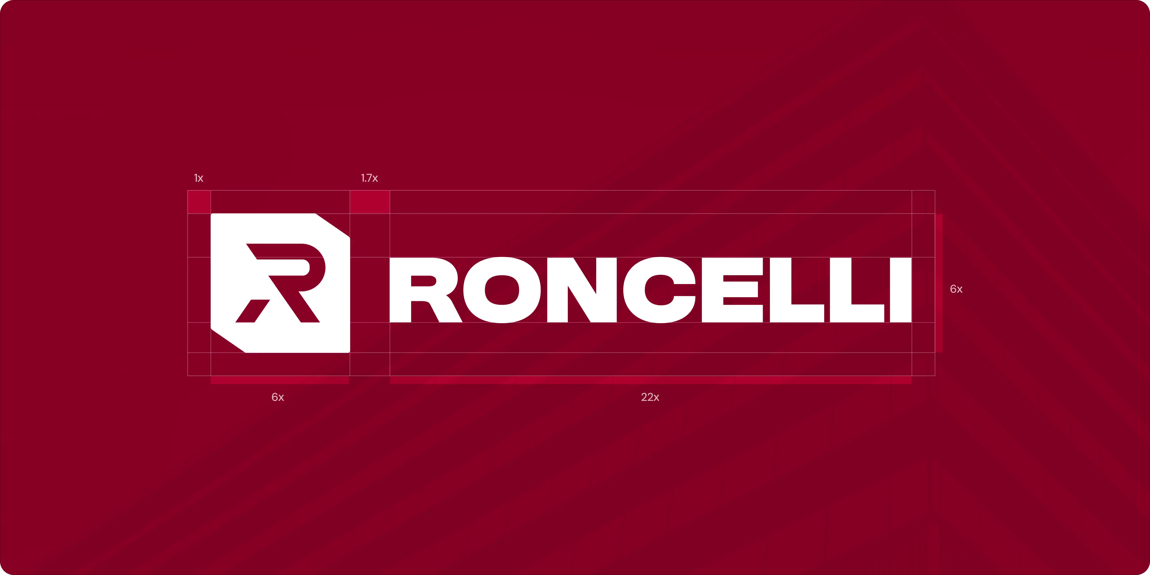
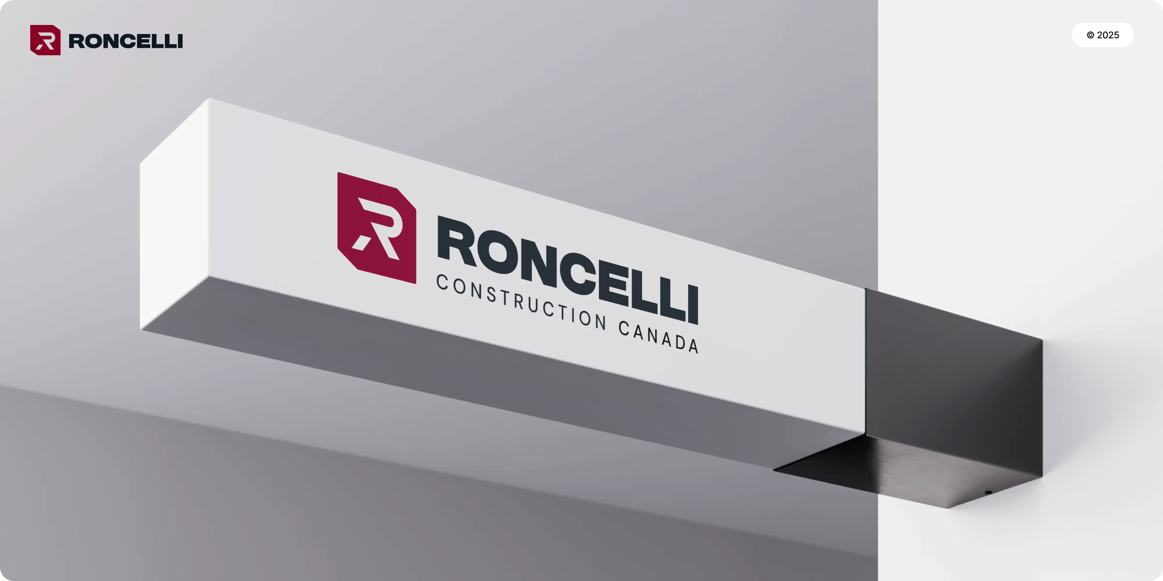
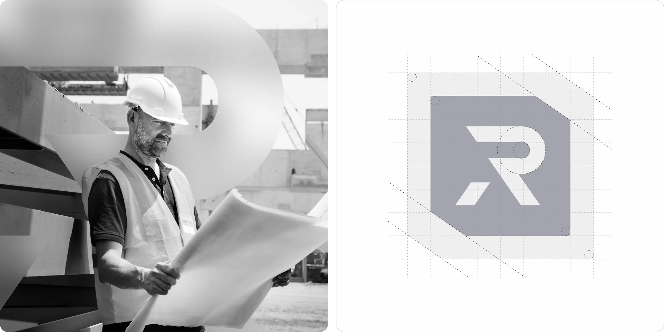
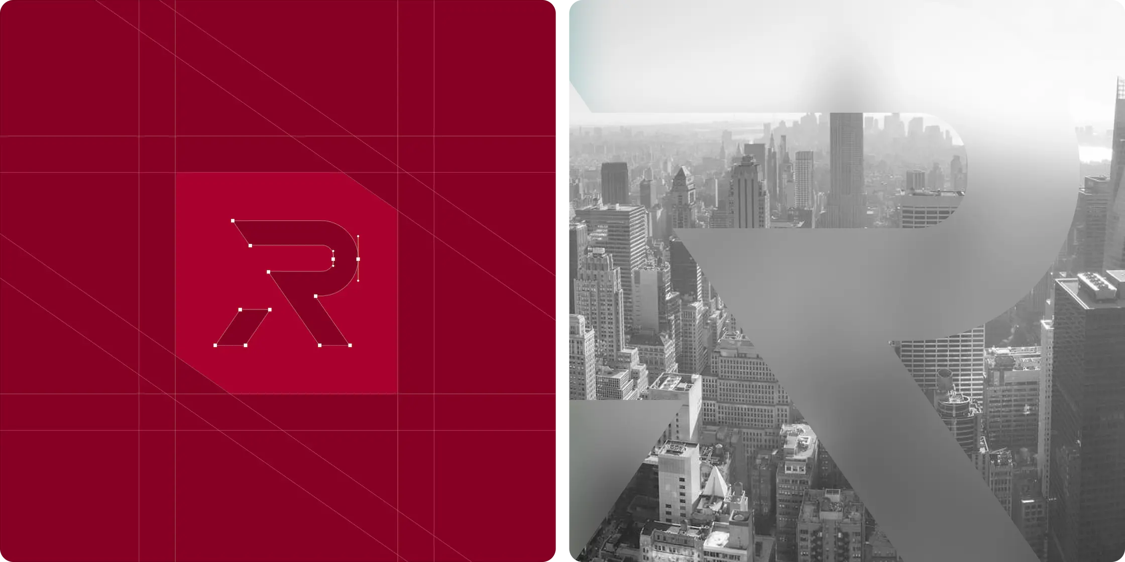
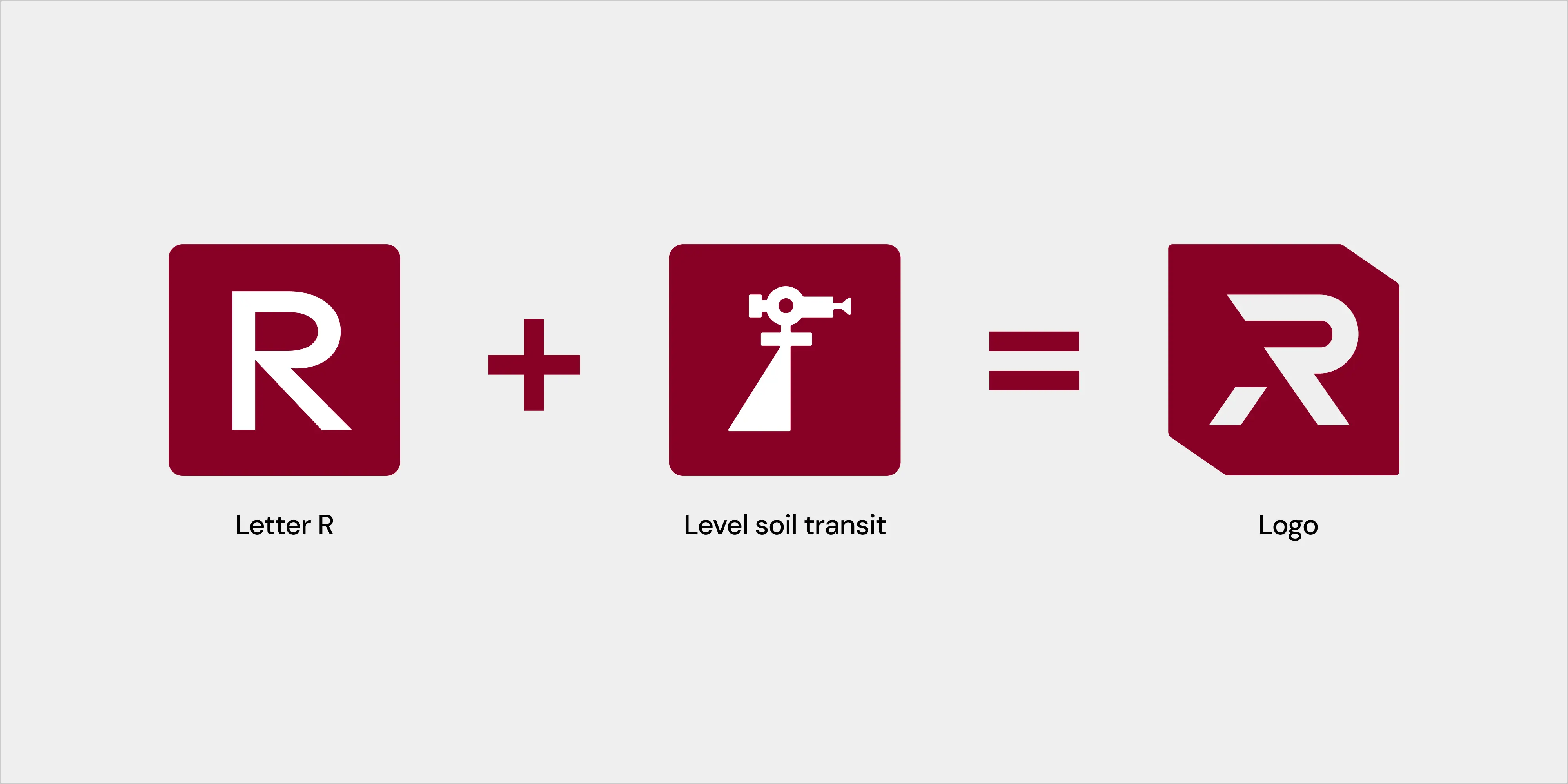
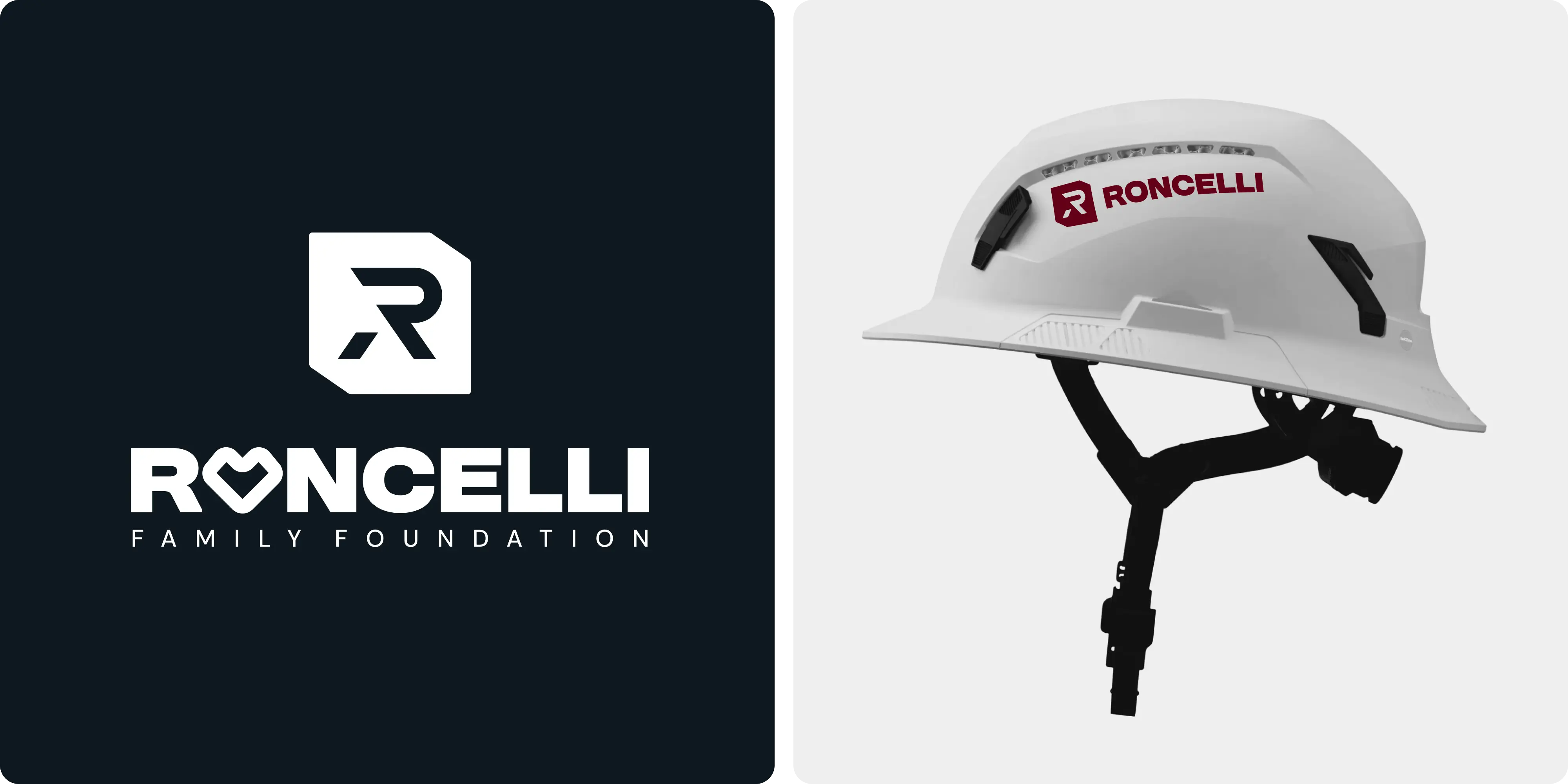
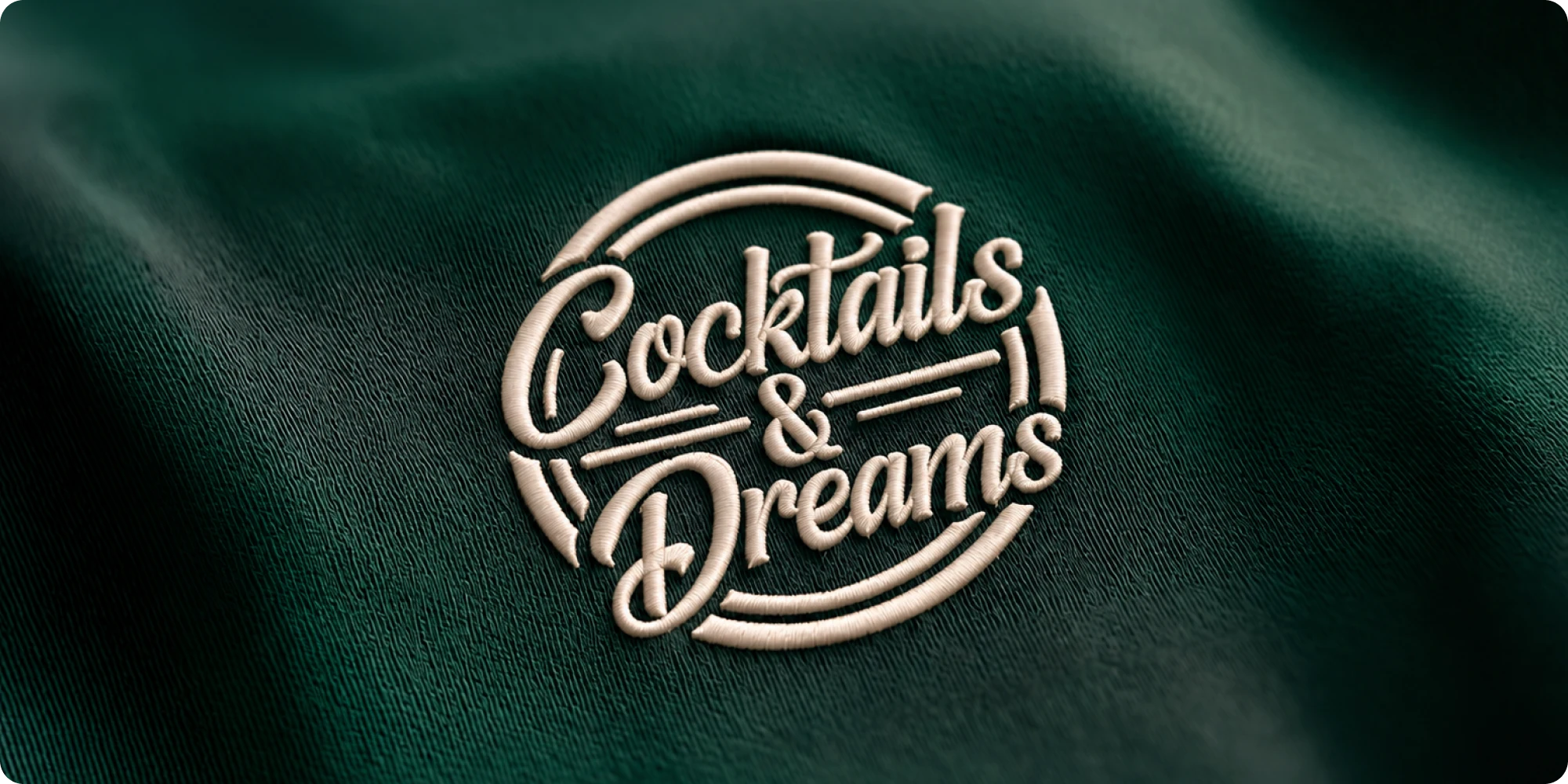
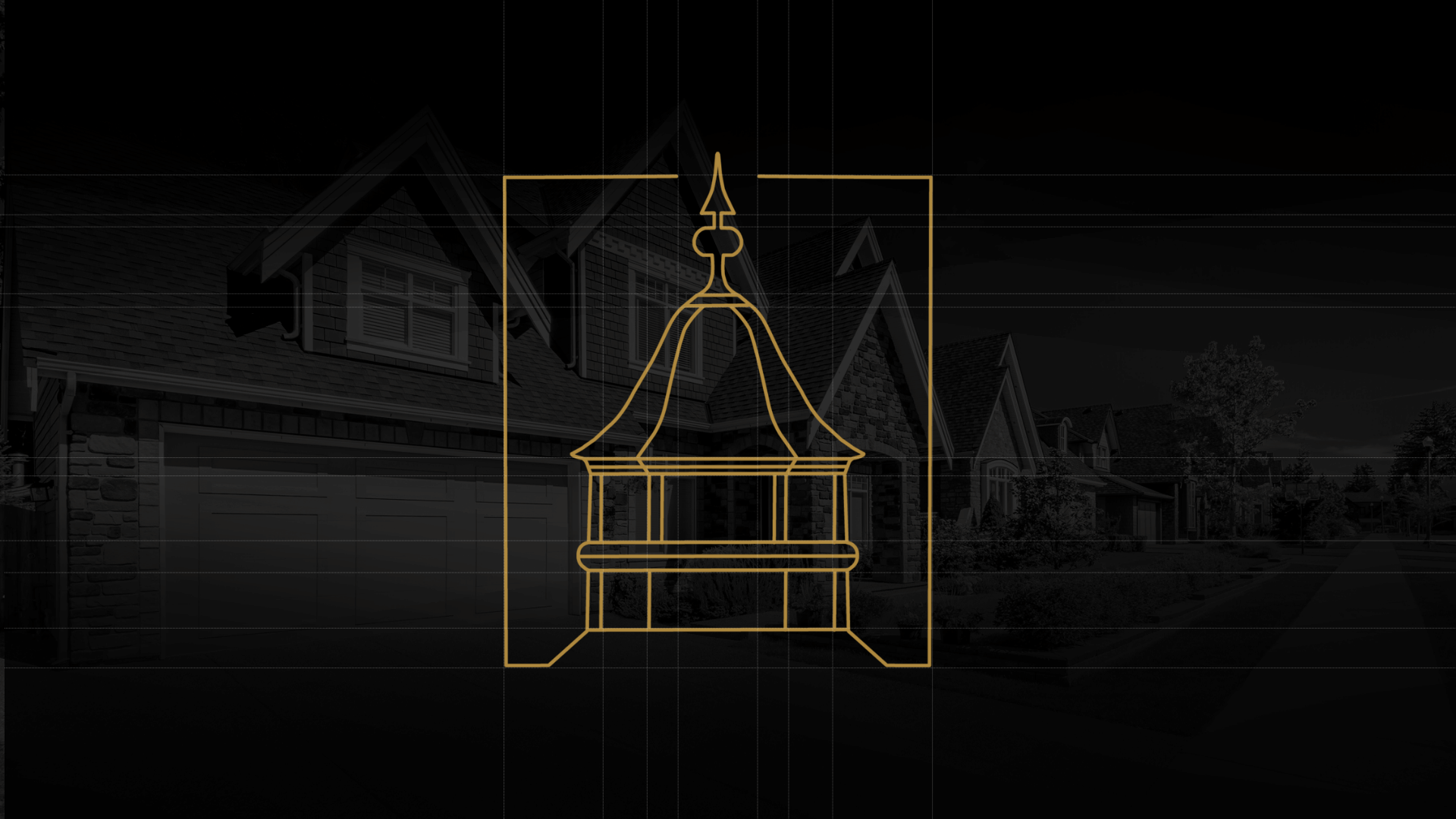
- Logo redesign: bold, clean, and versatile for both digital and physical use, holding onto the authority of the legacy mark while sharpening recognition.
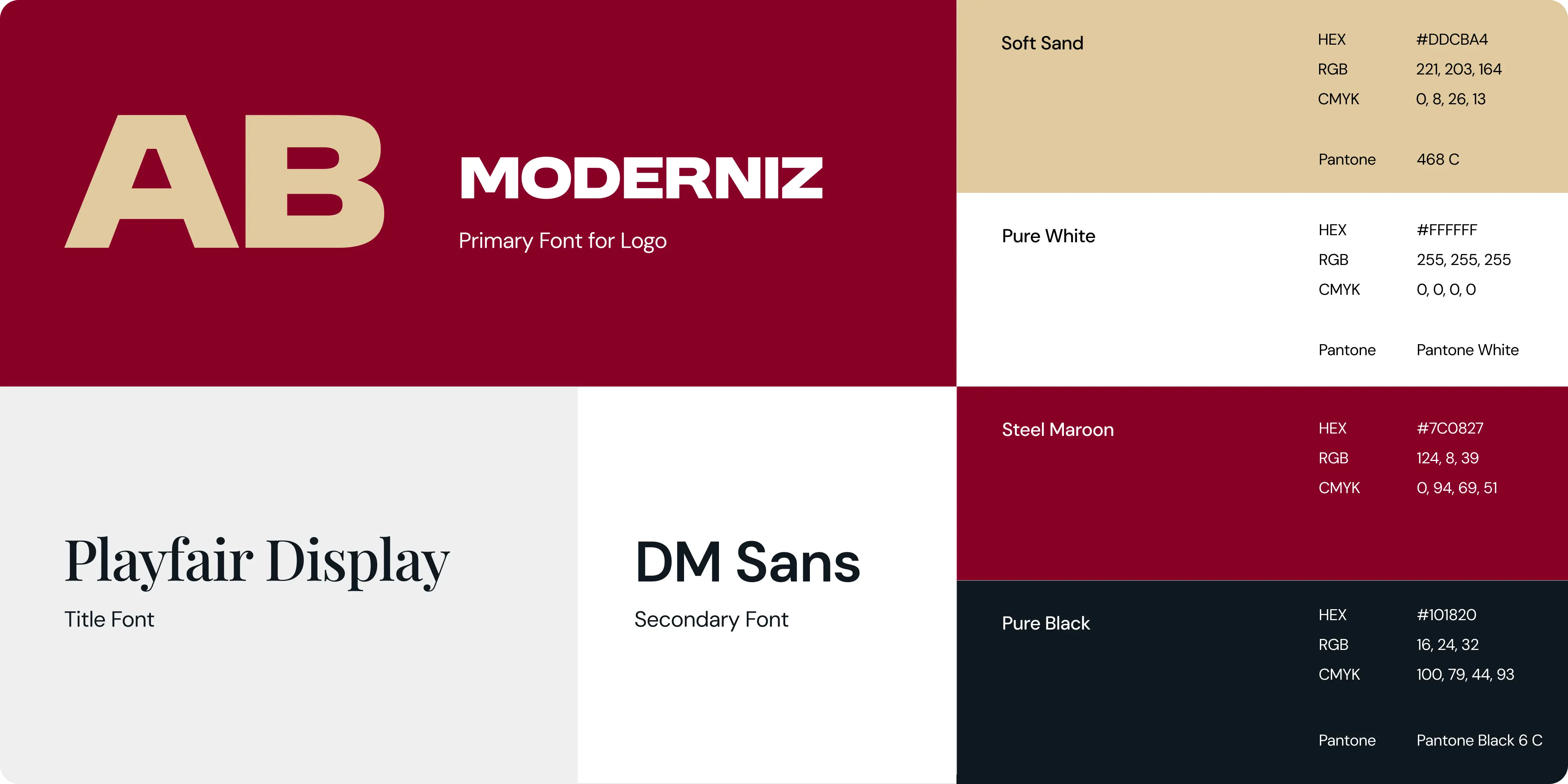
- Visual identity system: a complete branding toolkit with a primary and secondary palette, typography rules, layout styles, and subtle branded textures.
- Color and typography standards: built for clarity, contrast, and legibility in both job site and boardroom conditions.
- Design templates: covering presentations, internal documents, marketing decks, and everyday communications, so everything stays unified and professional.
- Brand guidelines: covering usage rules, spacing, color codes, type hierarchies, and dos and don’ts to keep execution consistent at scale.
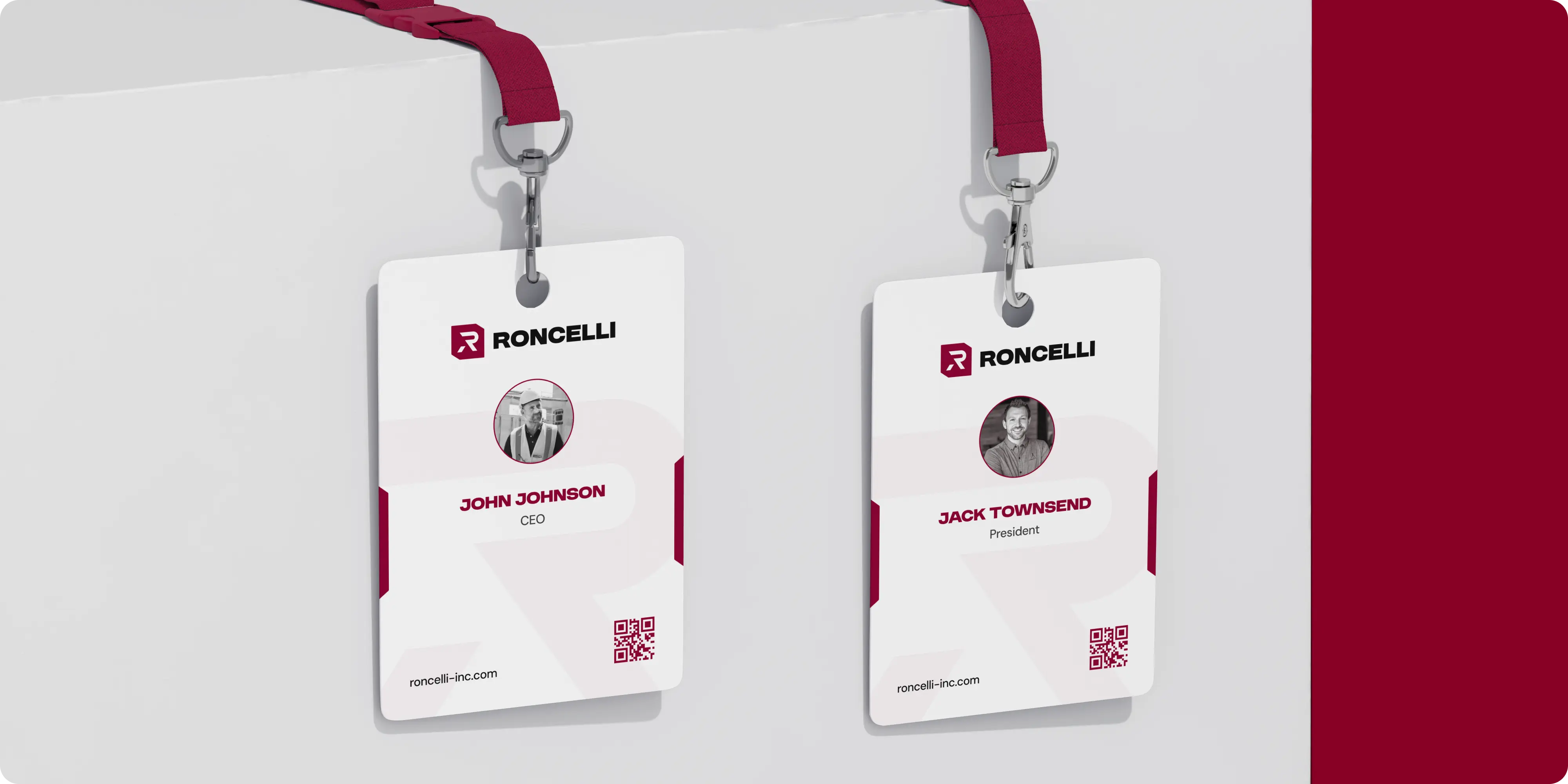
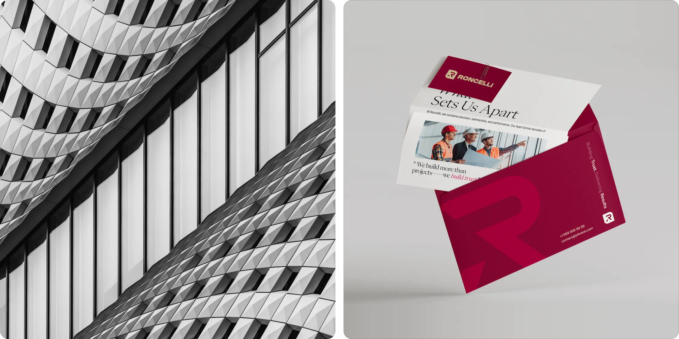
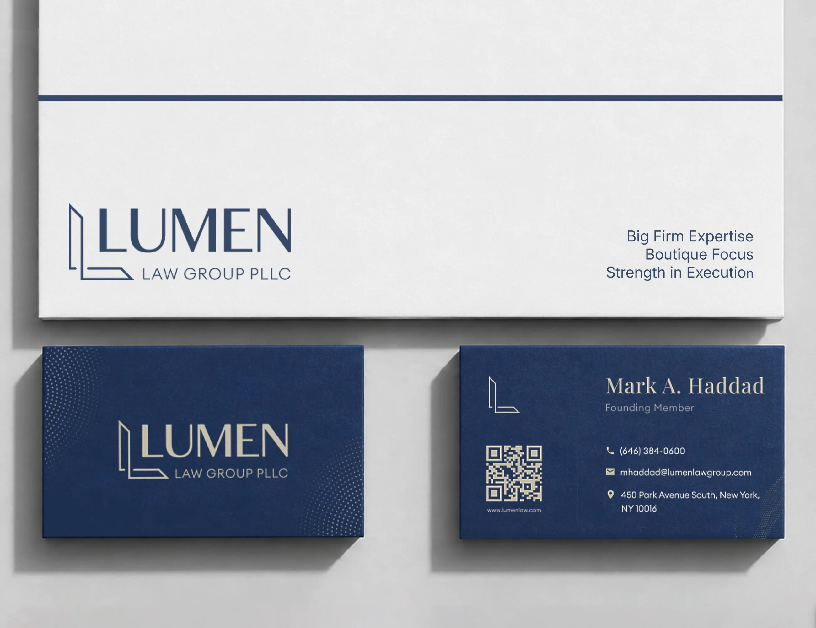
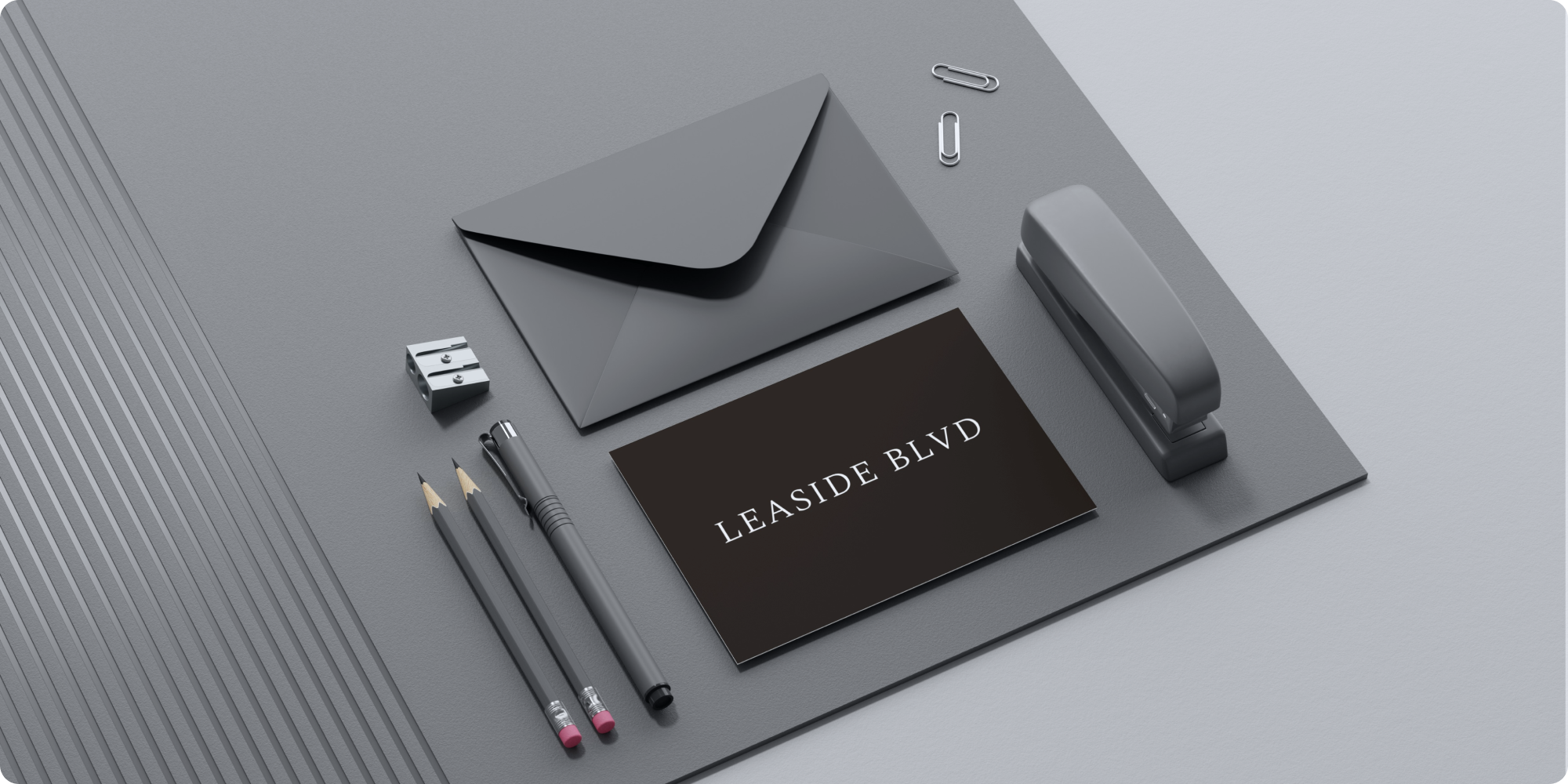
- Collateral rollout: beginning with sleek business cards that set the tone for future materials and client-facing assets.
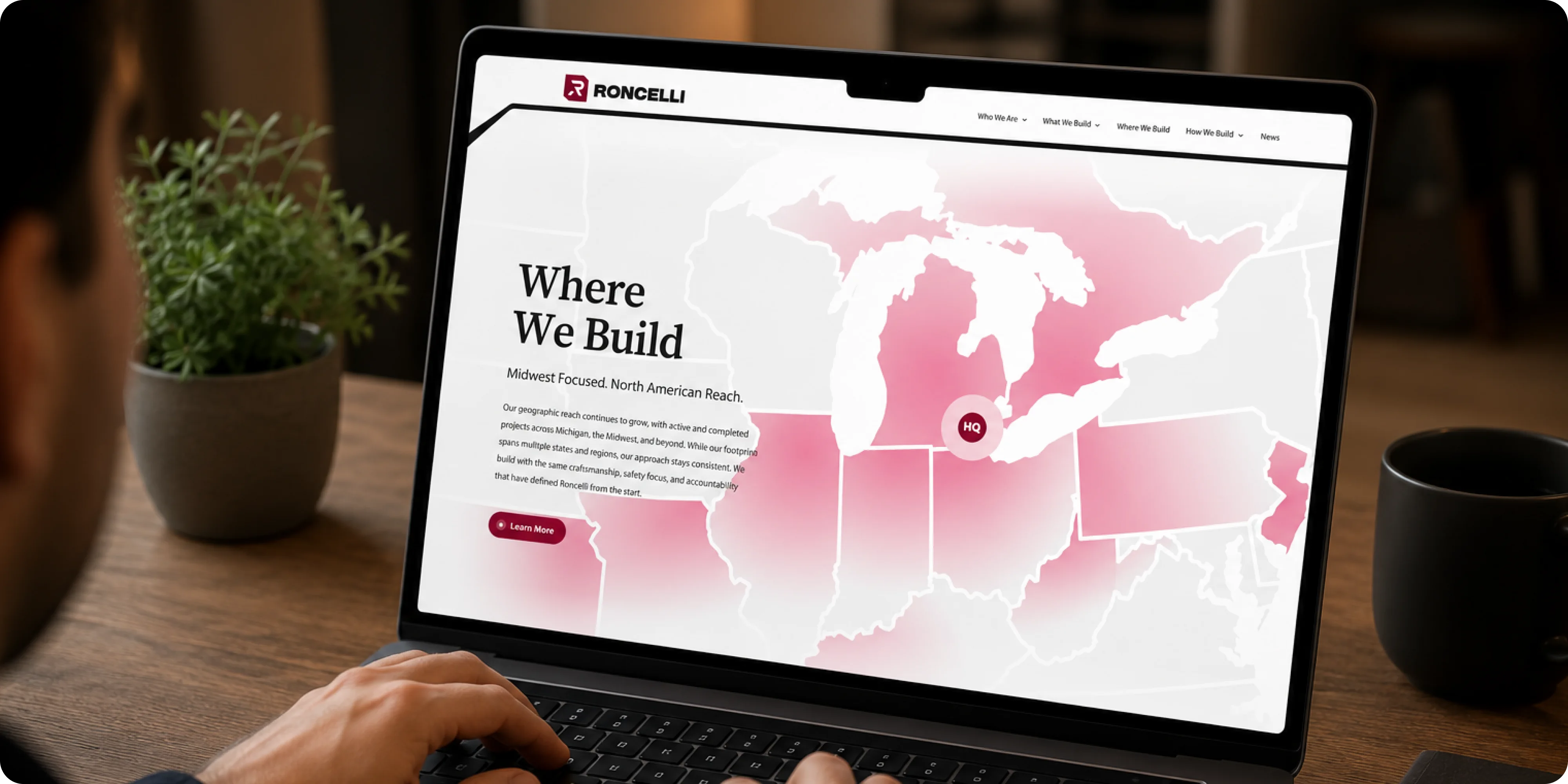
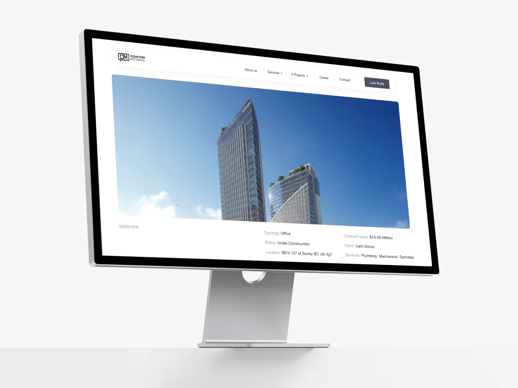
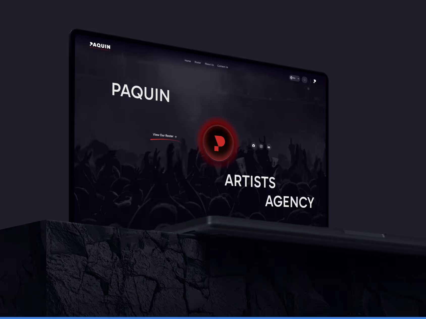
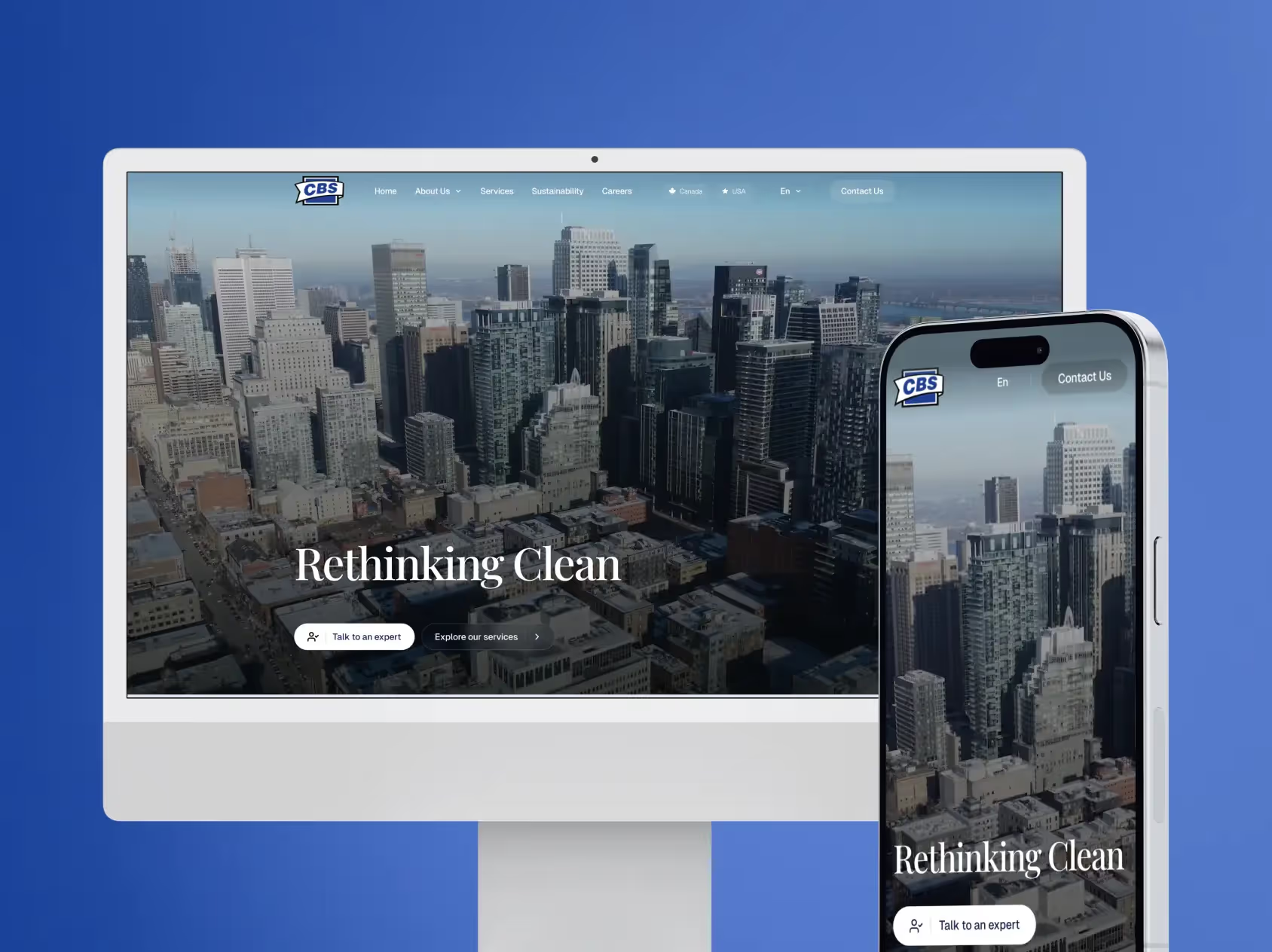
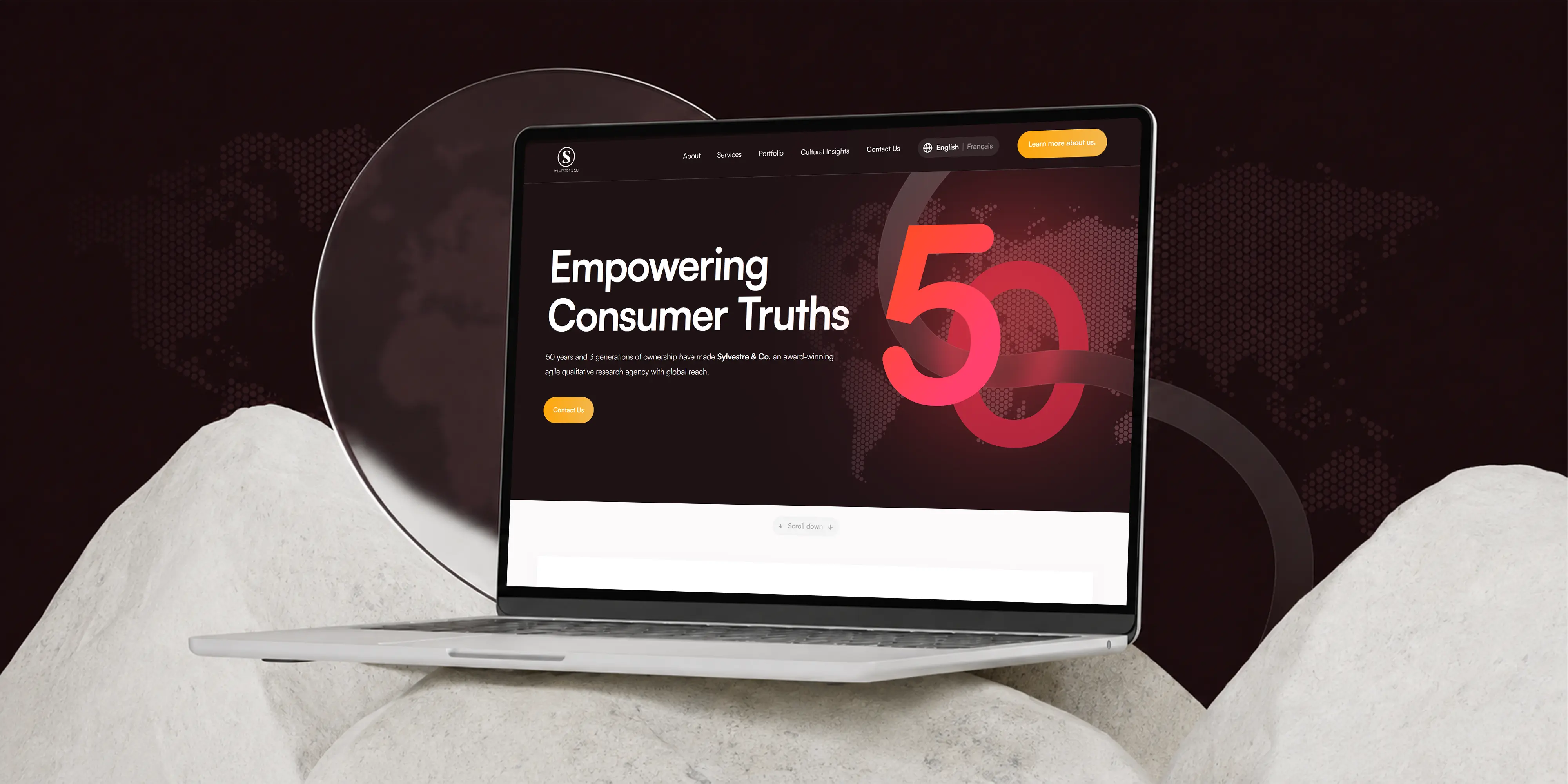
- Custom Webflow website: designed and developed from scratch rather than adapted from a template, carrying the new identity through every page.
- Motion and interaction: original animations built to give the site weight and momentum without slowing pages down or getting in the way of the information.
- Custom visual elements: bespoke graphics, textures, and section treatments drawn specifically for this brand rather than pulled from a library.
- Project and capability presentation: layouts that let decades of completed work carry the credibility, with services structured around how clients actually scope a build.
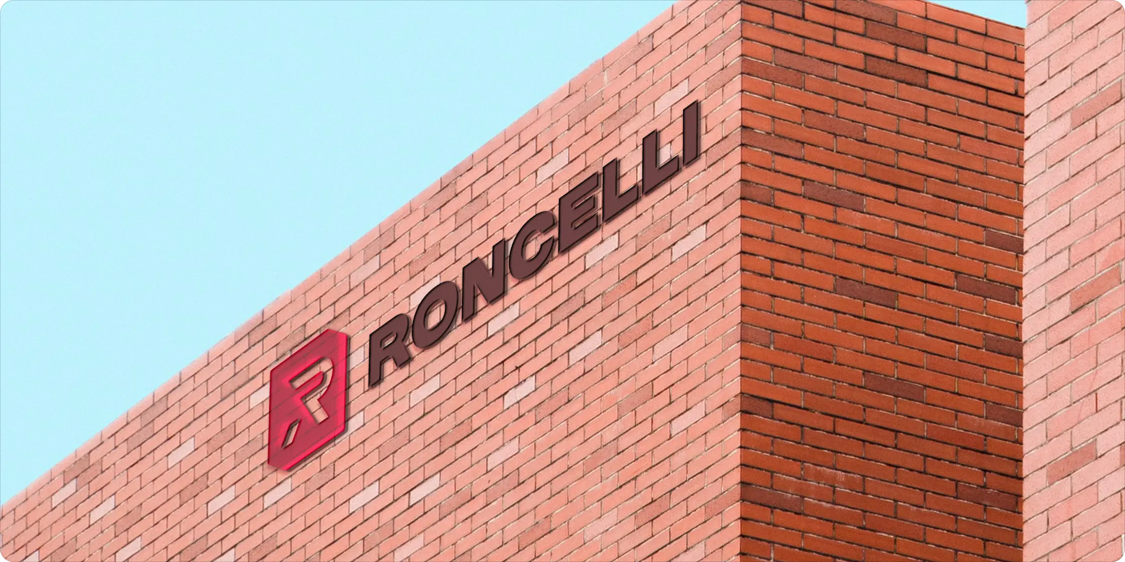
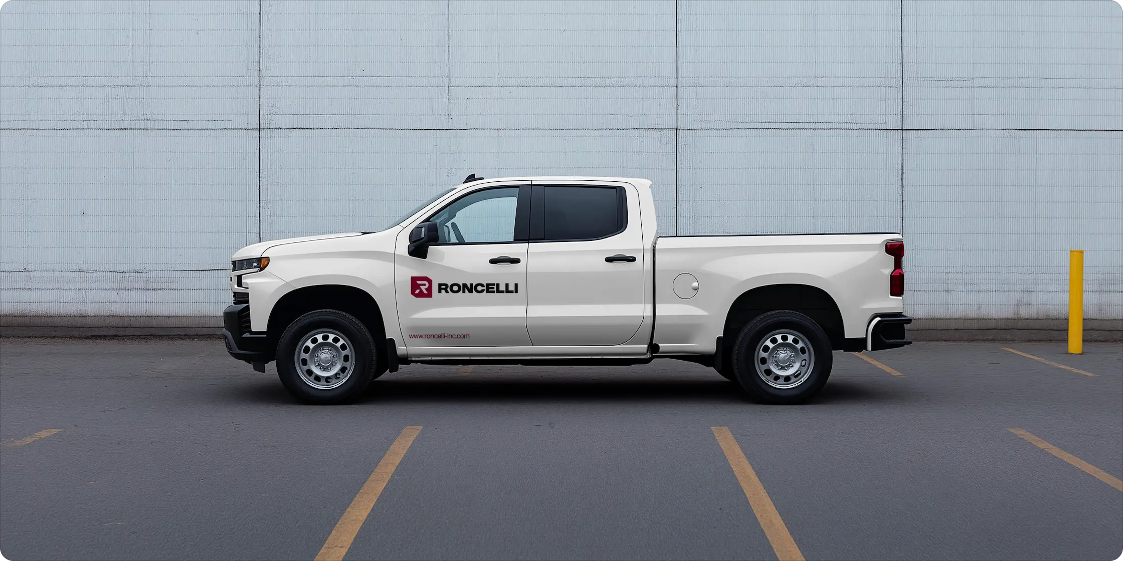
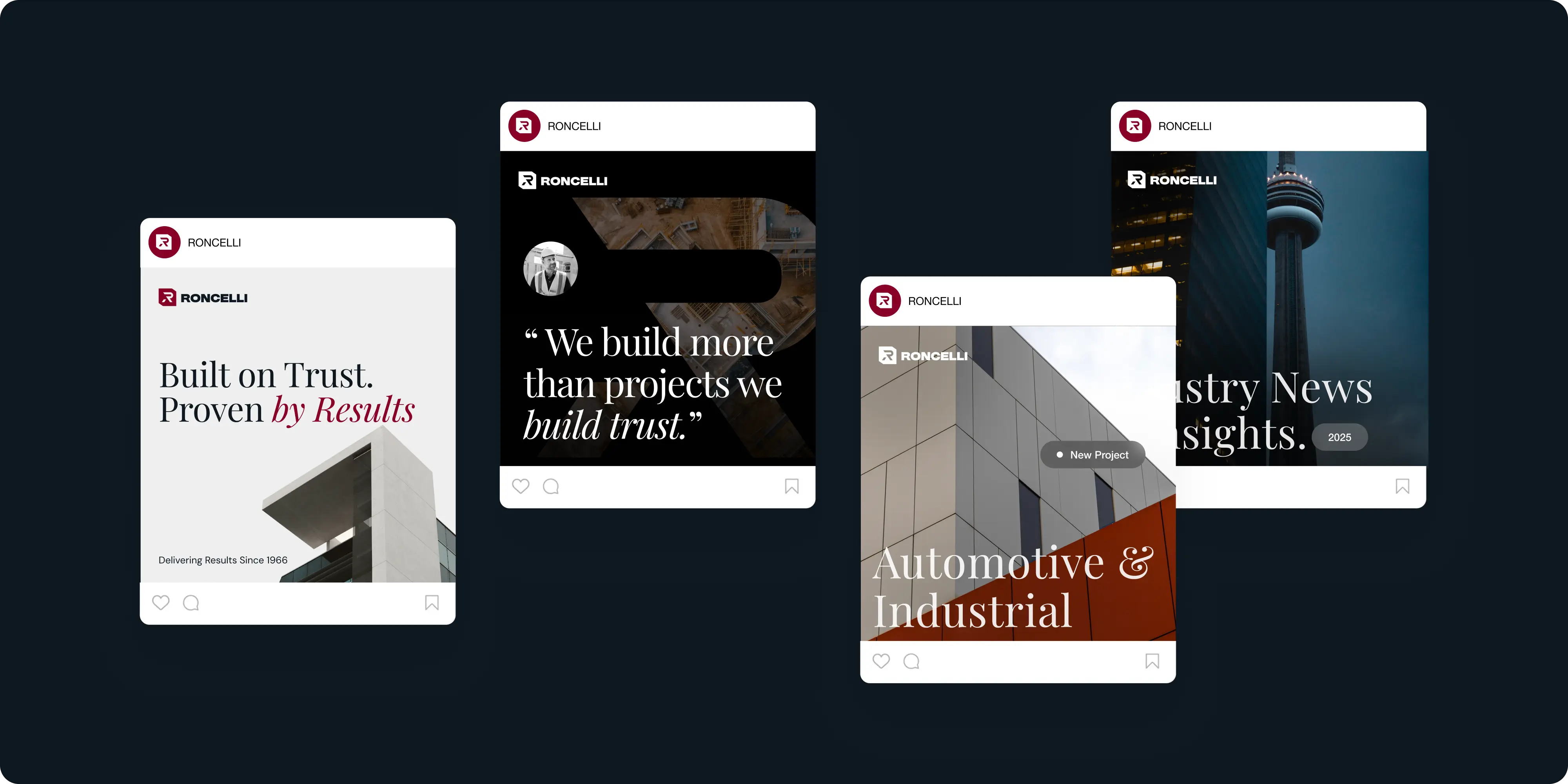
- Scalable system: built to work across web, social, proposals, RFPs, signage, apparel, and future campaigns without rework.
- Governance and handoff: covering clear file delivery, naming conventions, and a simple process for requesting new assets or adaptations.
Challenges
This long-standing brand held real equity, but it had started to look dated across channels, with visual elements shifting from one place to the next. The identity no longer reflected the firm’s strength, precision, and reliability. The new system had to honor that history, feel current, and apply easily across many contexts without losing coherence.
The website carried the same problem in a more public place. For a firm of this size the site is often the first thing a prospective client or partner sees, and the existing one did not reflect the scale or precision of the work. It also had to serve very different visitors at once, from developers scoping a project to candidates looking at the company, without turning into a brochure that says nothing to either.
Approach
We started by auditing existing materials and mapping real-world use cases, from proposals to field-ready print. From there, multiple logo and wordmark studies tested balance, proportion, and readability until we landed on the core mark. We then built out the palette, type, layout grids, and branded textures, turning those rules into practical templates. A concise brand book captured every decision and equipped teams to execute with confidence through rollout.
With the identity settled, we designed and developed the website on Webflow as a custom build rather than a template adaptation. That let the brand system drive the layout instead of being fitted around someone else’s grid, and it kept the site editable by the team afterwards.
Motion carries a lot of the work. Construction is a physical business, so the animations were built to suggest weight and momentum rather than decoration, and they were tuned to stay fast on a phone from a job site. Custom graphics, textures, and section treatments were drawn specifically for this brand, and the project and services pages were structured around how clients actually evaluate a builder, by scope, sector, and evidence of delivery.
Outcomes
Roncelli now carries a cohesive identity that reflects its heritage while projecting real leadership. The logo feels confident and flexible, the system is easy to use, and every touchpoint stays aligned.
The website carries that identity into the place most people meet the company first. The custom Webflow build gives Roncelli a site that moves and looks like the firm it represents, with the completed work presented as evidence rather than a gallery, and a system the team can extend without going back to a designer for every page.


.webp)





.webp)





.webp)

.webp)

.webp)


.avif)



.png)