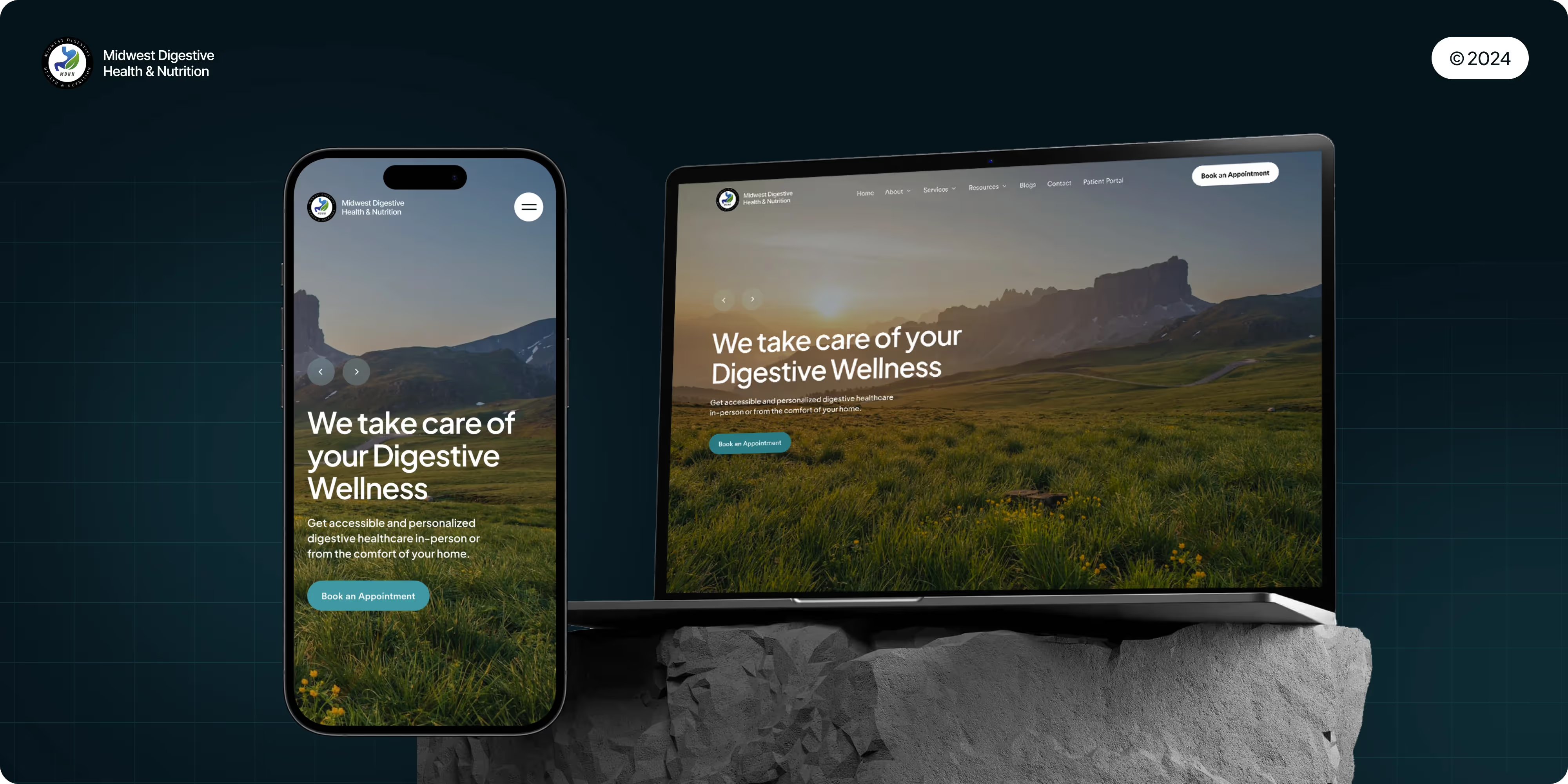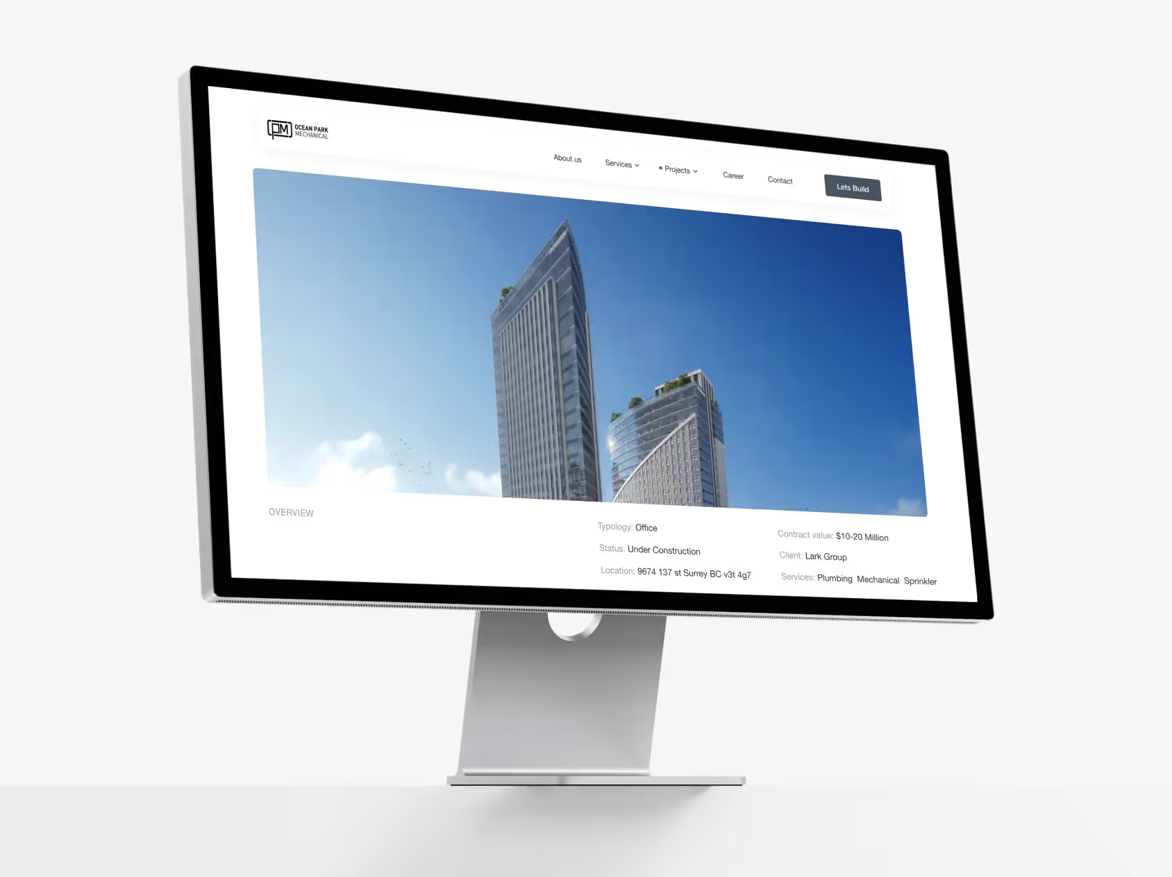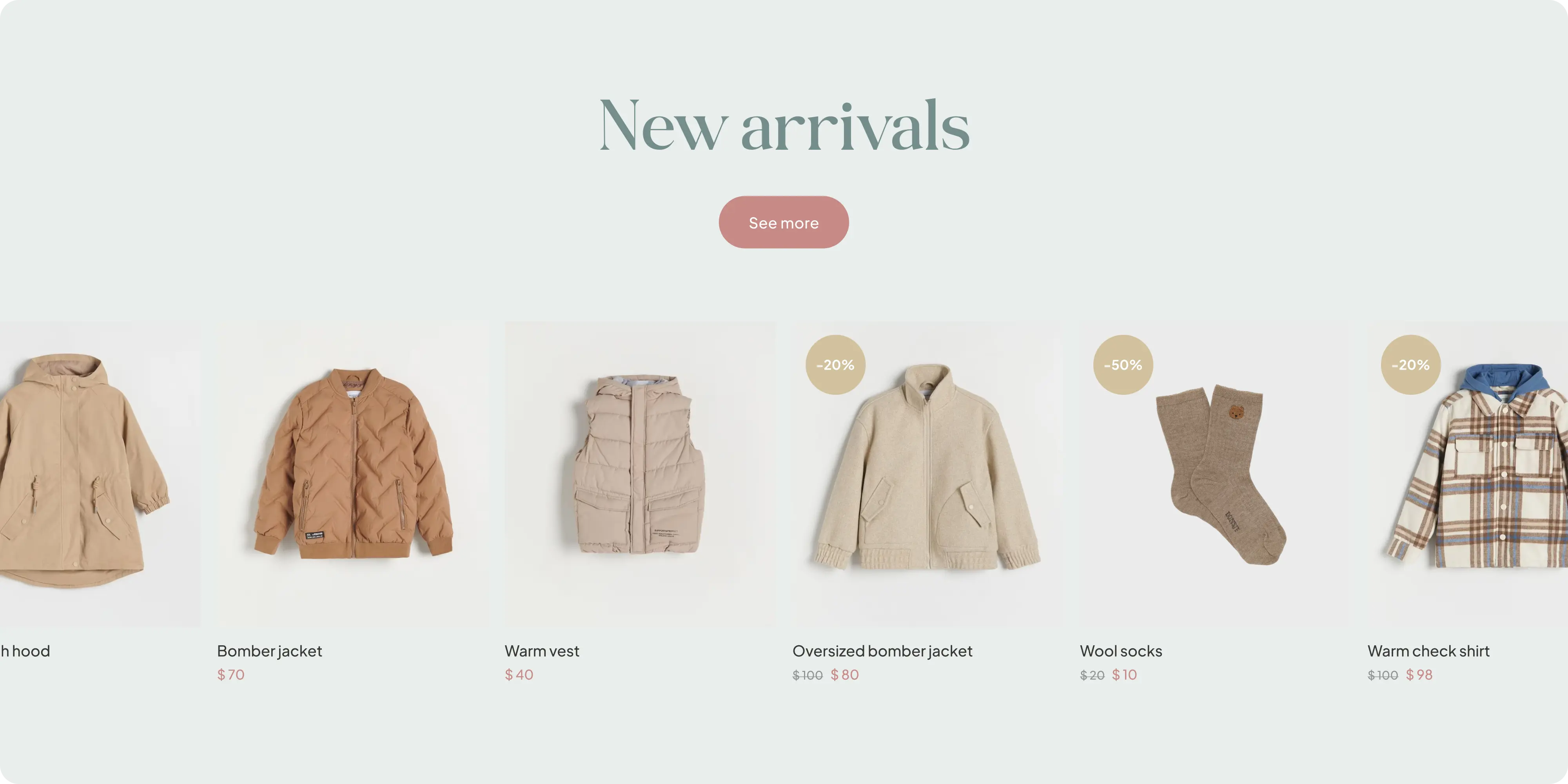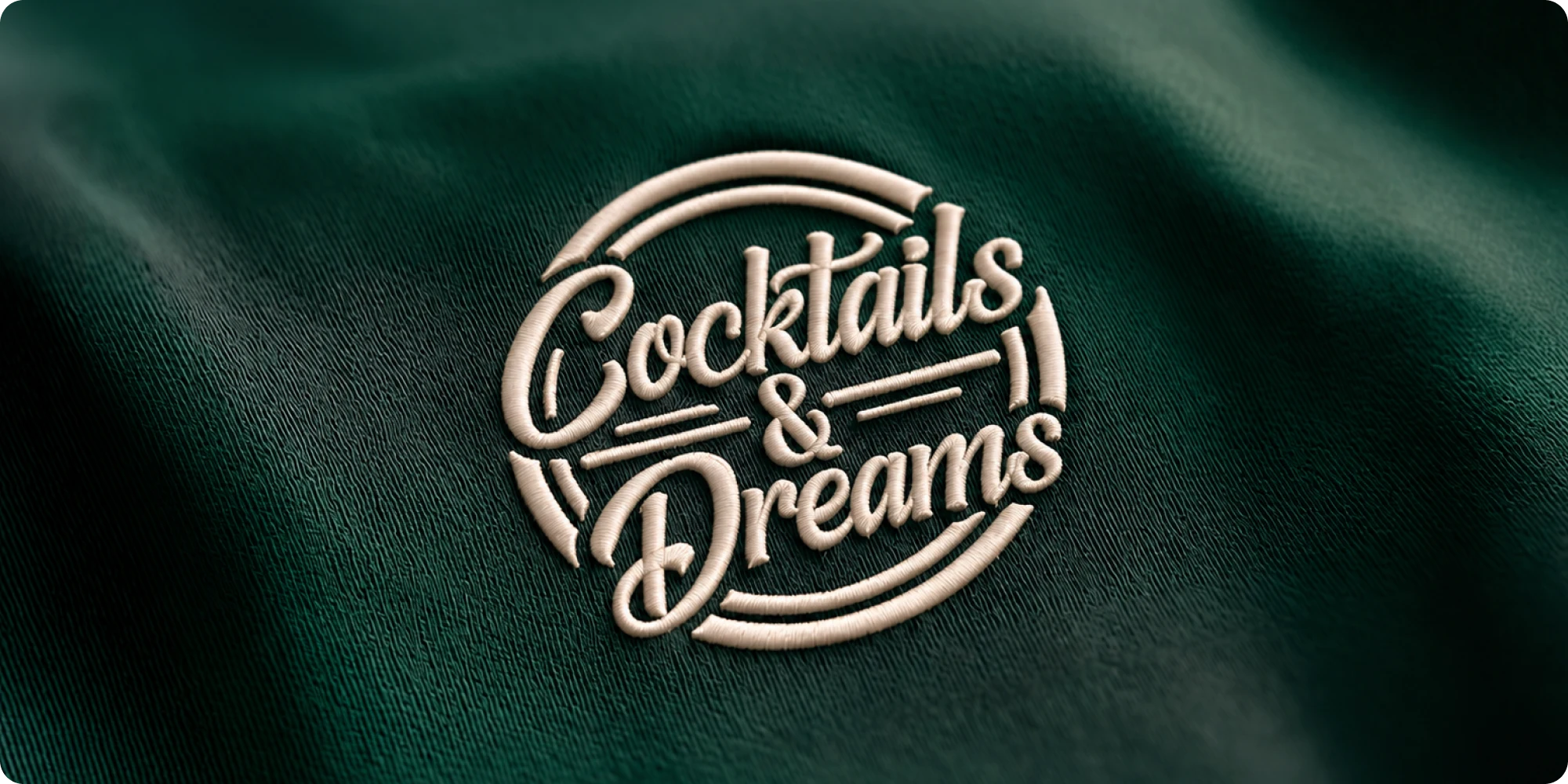
At Brand Vision, we take pride in creating unmatched web design services for our clients.
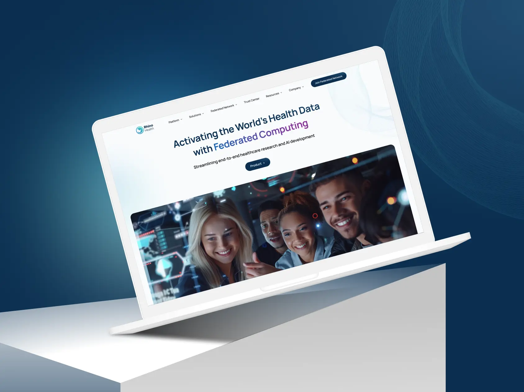
Rhino Health collaborated with Brand Vision to create a modern and forward-thinking website.
Project Highlights
- Brand identity: a visual system built for credibility with clinical and healthcare audiences.
- Website design and development: full build presenting the diagnostics offering.
- Technical content structure: complex healthcare information made navigable.
- Trust signals: clinical validation and credentials given structural prominence.
- UI/UX: navigation shaped around distinct clinical and commercial audiences.
- Accessibility and performance: WCAG-informed design with speed optimization.

Challenges
Healthcare diagnostics sells to clinicians, health systems, and investors, and each arrives with different questions and a low tolerance for marketing language. Rhino Health needed an identity credible enough for a clinical audience and content that explained the technology without overselling it.
Approach
We started with positioning, establishing an identity that reads as clinically credible rather than consumer-soft. Content was structured for a clinical audience first, with the technology explained in plain terms and validation given prominence. The Webflow build carries the identity through, and accessibility and performance were verified before launch.
Outcomes
Rhino Health presents as a credible clinical partner rather than a consumer health brand. The technology is explained clearly and the validation is easy to find, which is what this audience checks first.
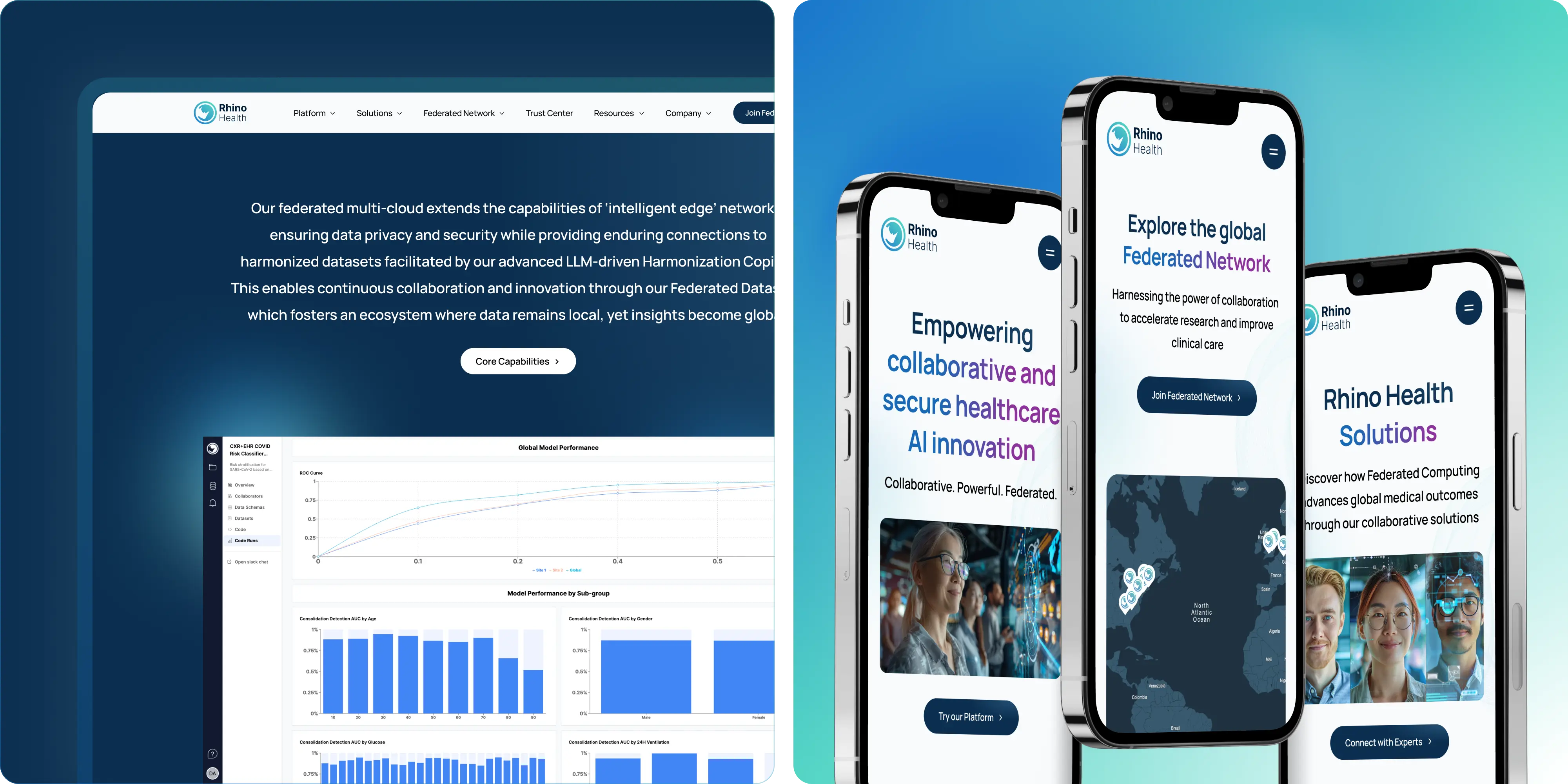
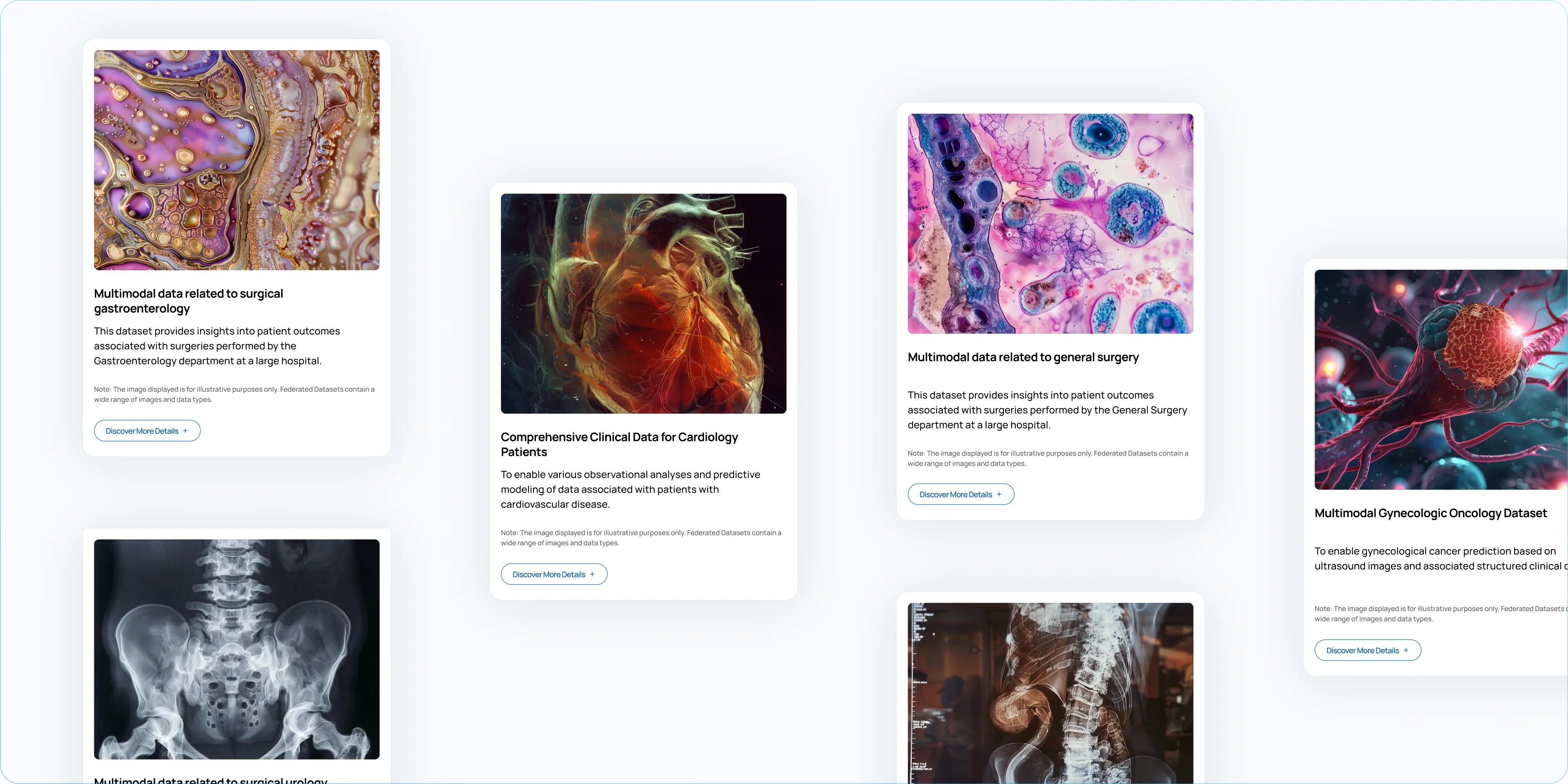
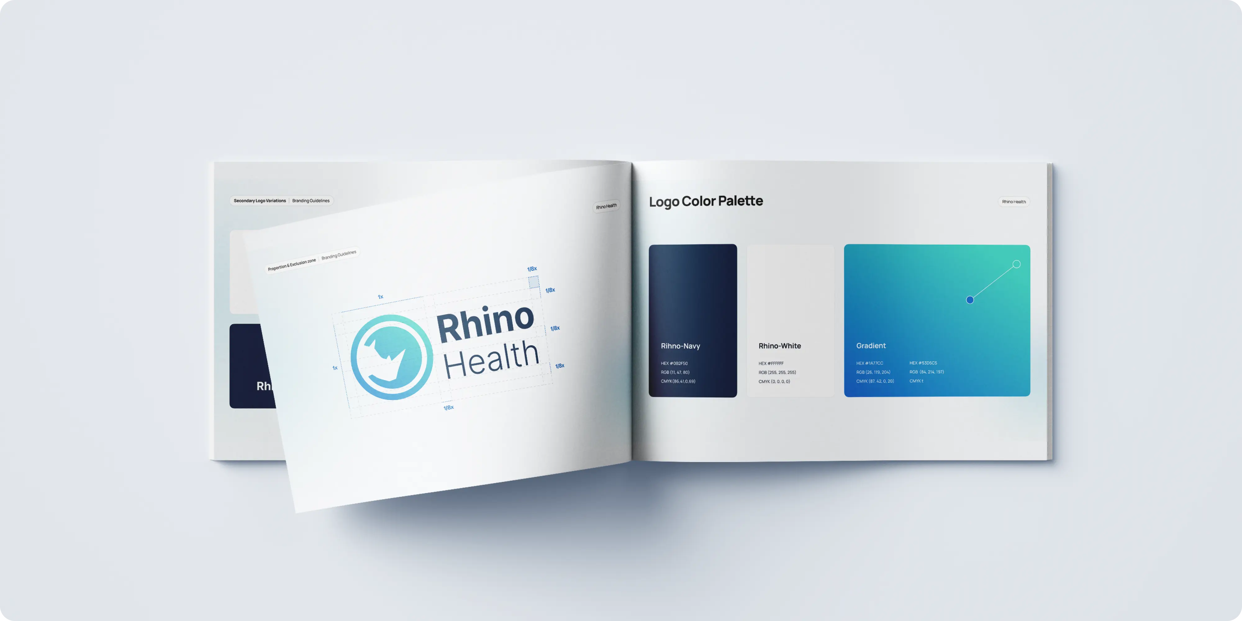
Brand Vision Marketing collaborated with Rhino Health to revamp their brand identity, focusing on a comprehensive redesign of their logo, color palette, typography, website, and custom icons. The goal was to create a visually cohesive and modern look that reflects Rhino Health's innovative approach to integrating Edge Computing and Federated Learning in healthcare AI.

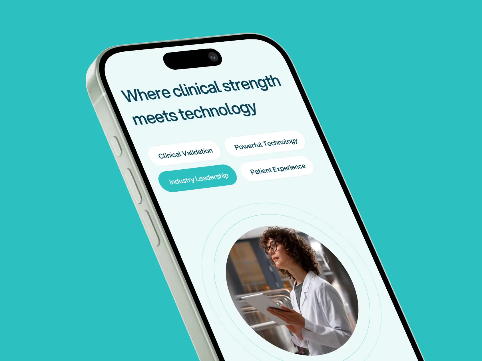
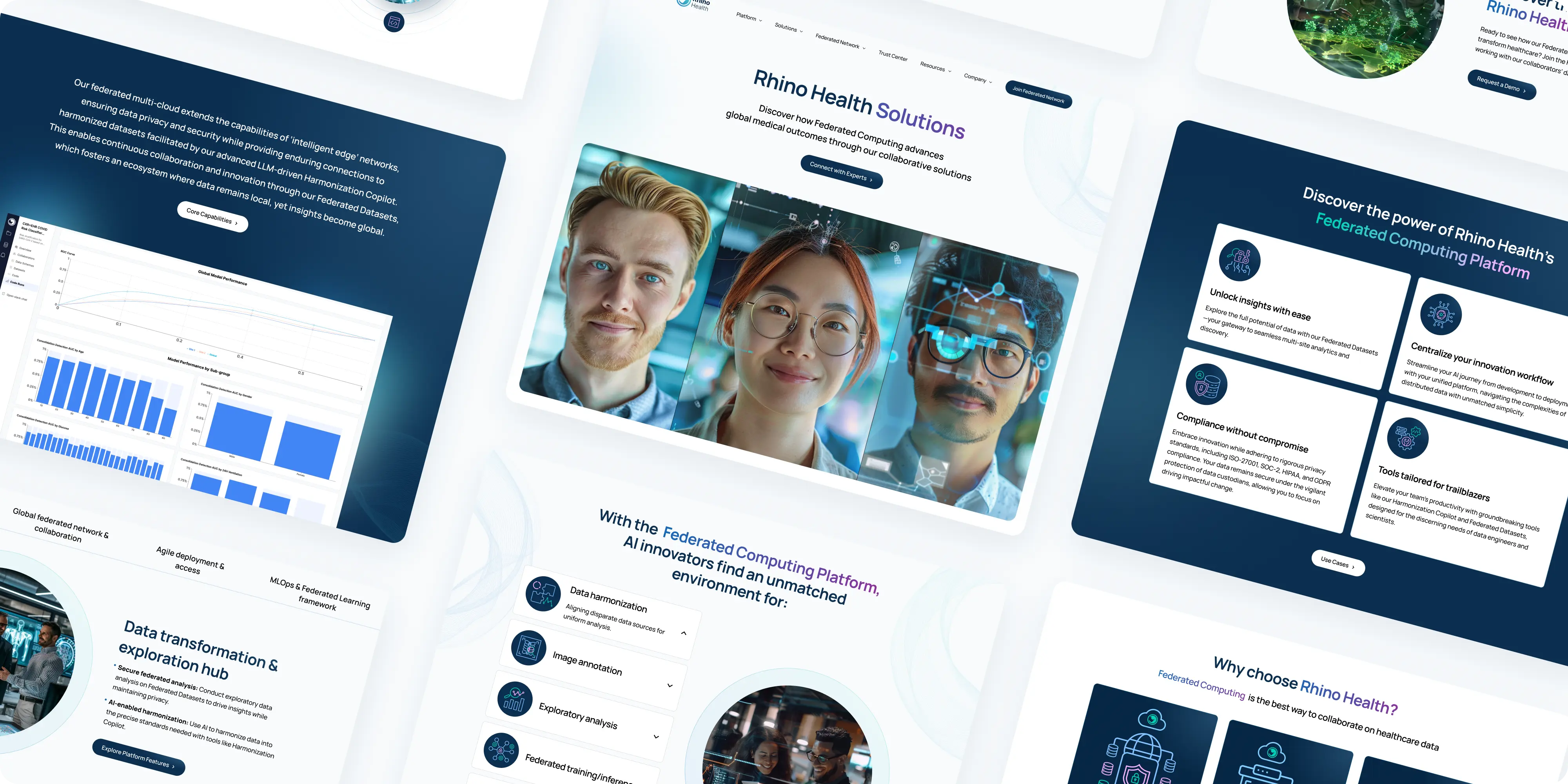
Brand Vision Marketing designed a user-friendly and visually appealing website for Rhino Health, featuring a clean homepage layout that focuses on visual elements and concise messaging to effectively communicate the company's mission and core capabilities. The website includes an intuitive navigation menu, allowing easy access to various sections for a seamless user experience. High-quality images and infographics highlight Rhino Health's innovative solutions and impact in the healthcare sector. The well-structured content balances technical information with engaging storytelling, making it accessible to diverse audiences.

Brand Vision Marketing created an intuitive and seamless UI/UX design for Rhino Health's website, focusing on user flow and engagement. The clean, modern UI uses a vibrant color palette and professional typography, while the homepage effectively communicates Rhino Health's mission. The UX ensures easy navigation with an intuitive menu and well-placed visuals that highlight innovative solutions, making complex information accessible and engaging.

The homepage layout effectively communicates Rhino Health's mission and core capabilities through strategic visual elements and concise messaging. High-quality images and informative infographics highlight Rhino Health's innovative solutions, making complex information digestible and ensuring a smooth user journey. This comprehensive web design approach reflects Rhino Health's commitment to innovation and enhances their ability to communicate effectively with their audience.


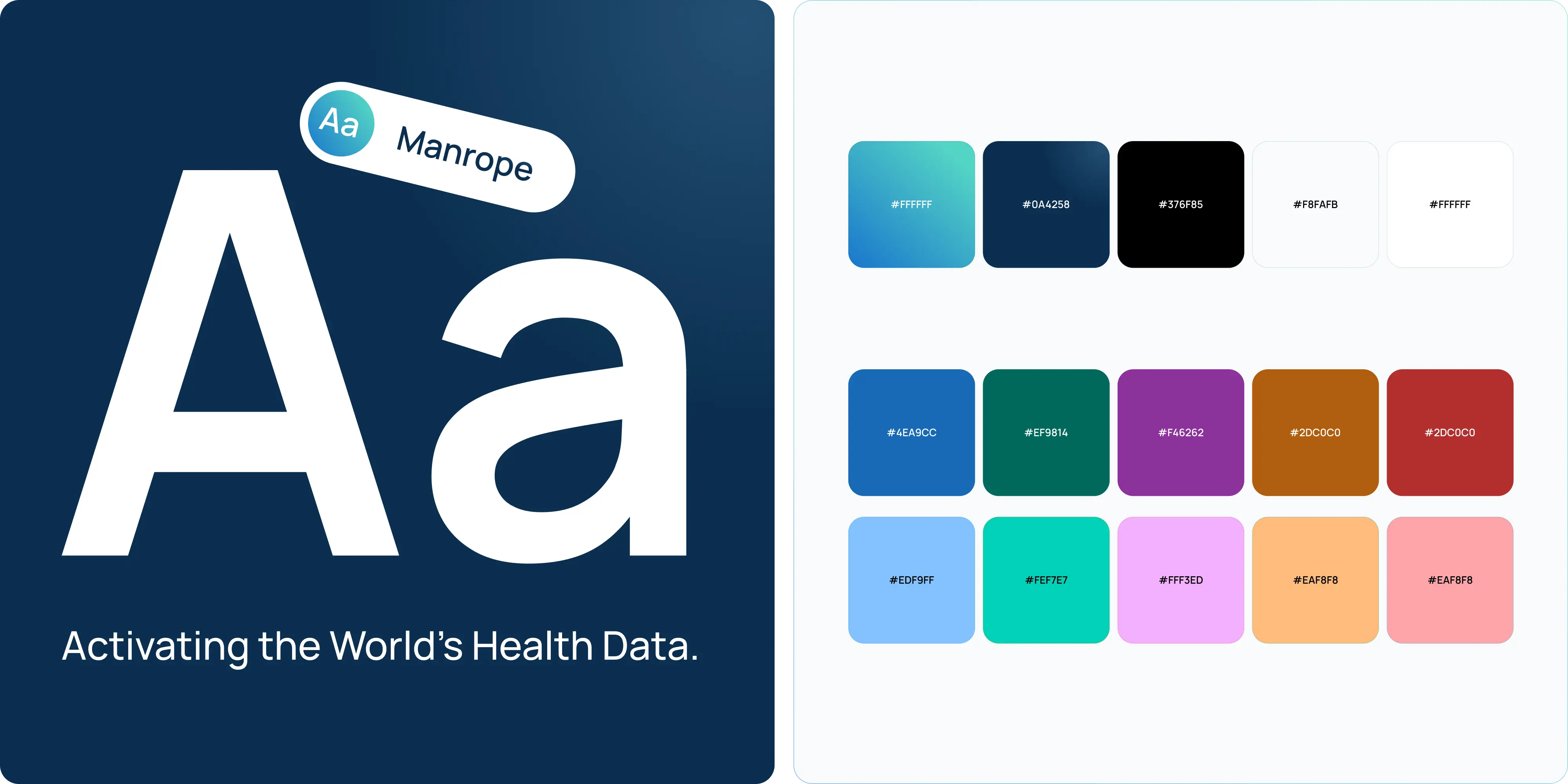
The new logo features a modern, stylized rhino head within a circular emblem, symbolizing strength and innovation. The vibrant color palette and professional typography, including the Manrope typeface, were carefully selected to convey trust, expertise, and clarity. Brand Vision also created a user-friendly website with an intuitive UI/UX design, high-quality images, and custom icons to highlight Rhino Health's innovative solutions.

These icons are designed with a modern and minimalist aesthetic, using the same vibrant color palette that defines Rhino Health's brand identity. Each icon represents a key aspect of Rhino Health's services and capabilities, such as data security, AI integration, medical research, and innovation.


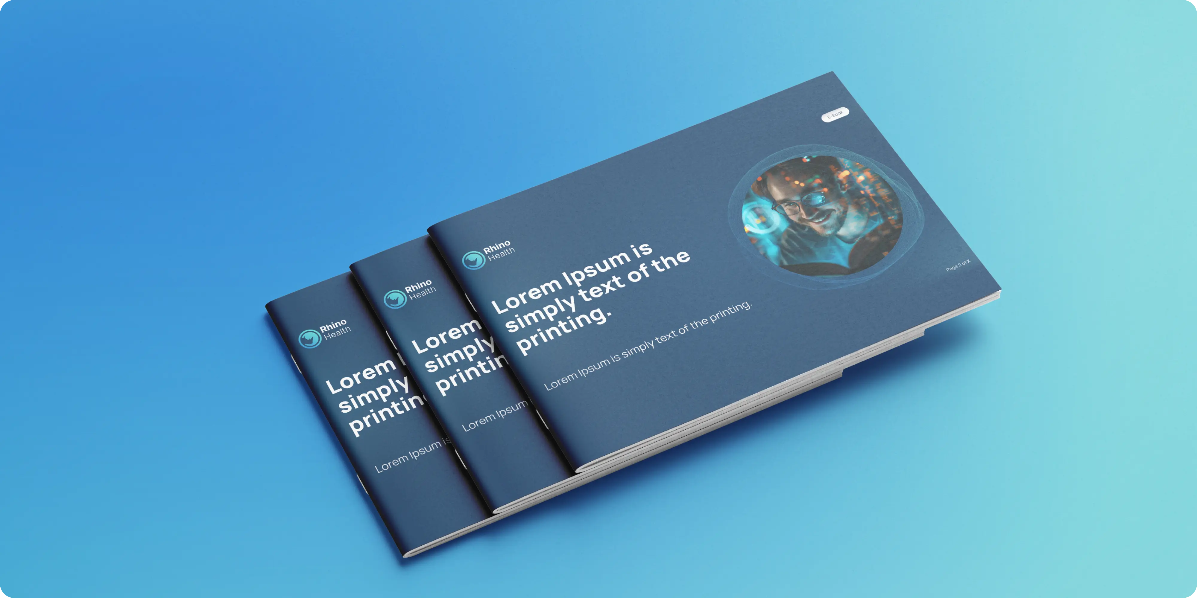
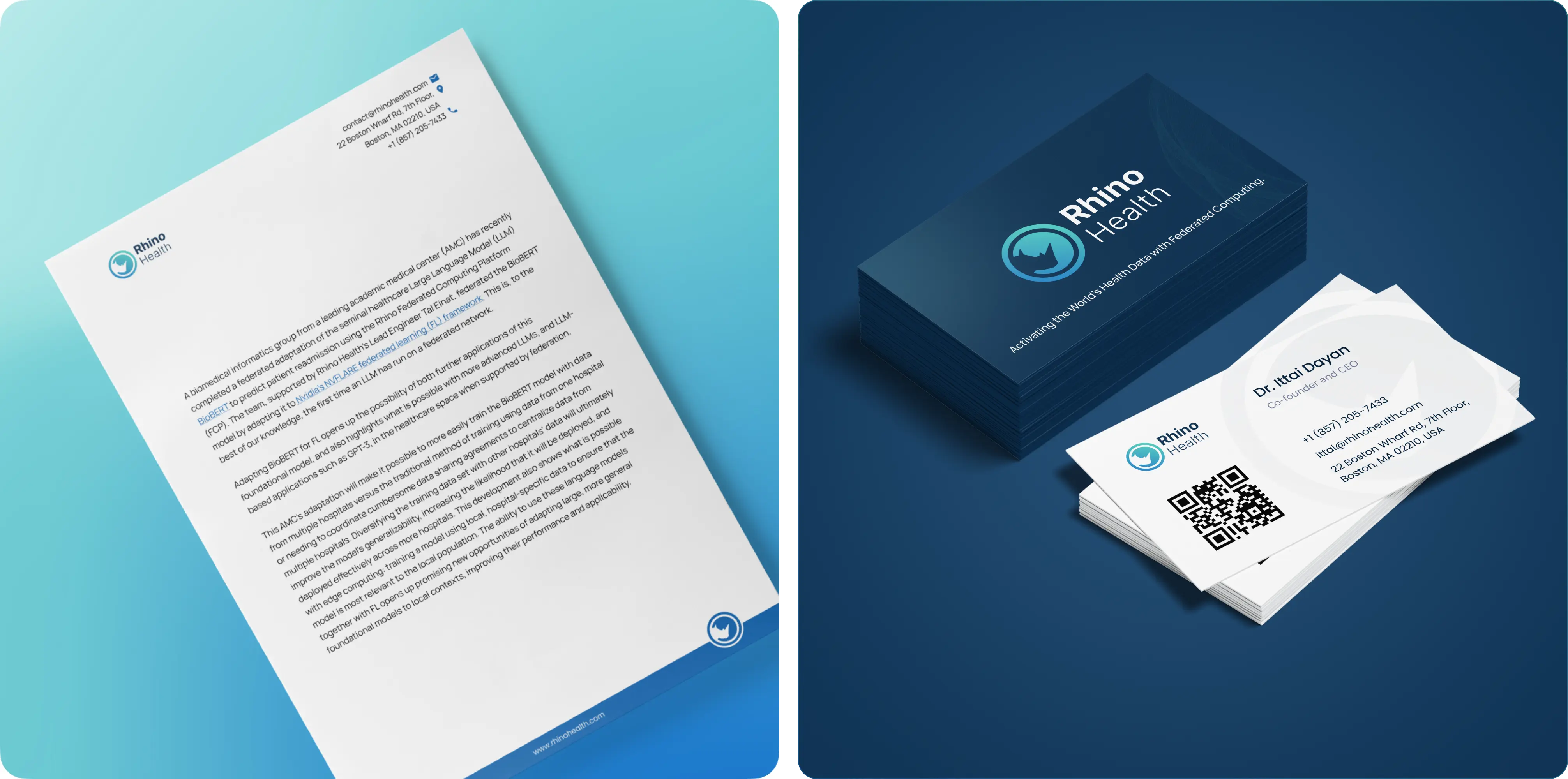
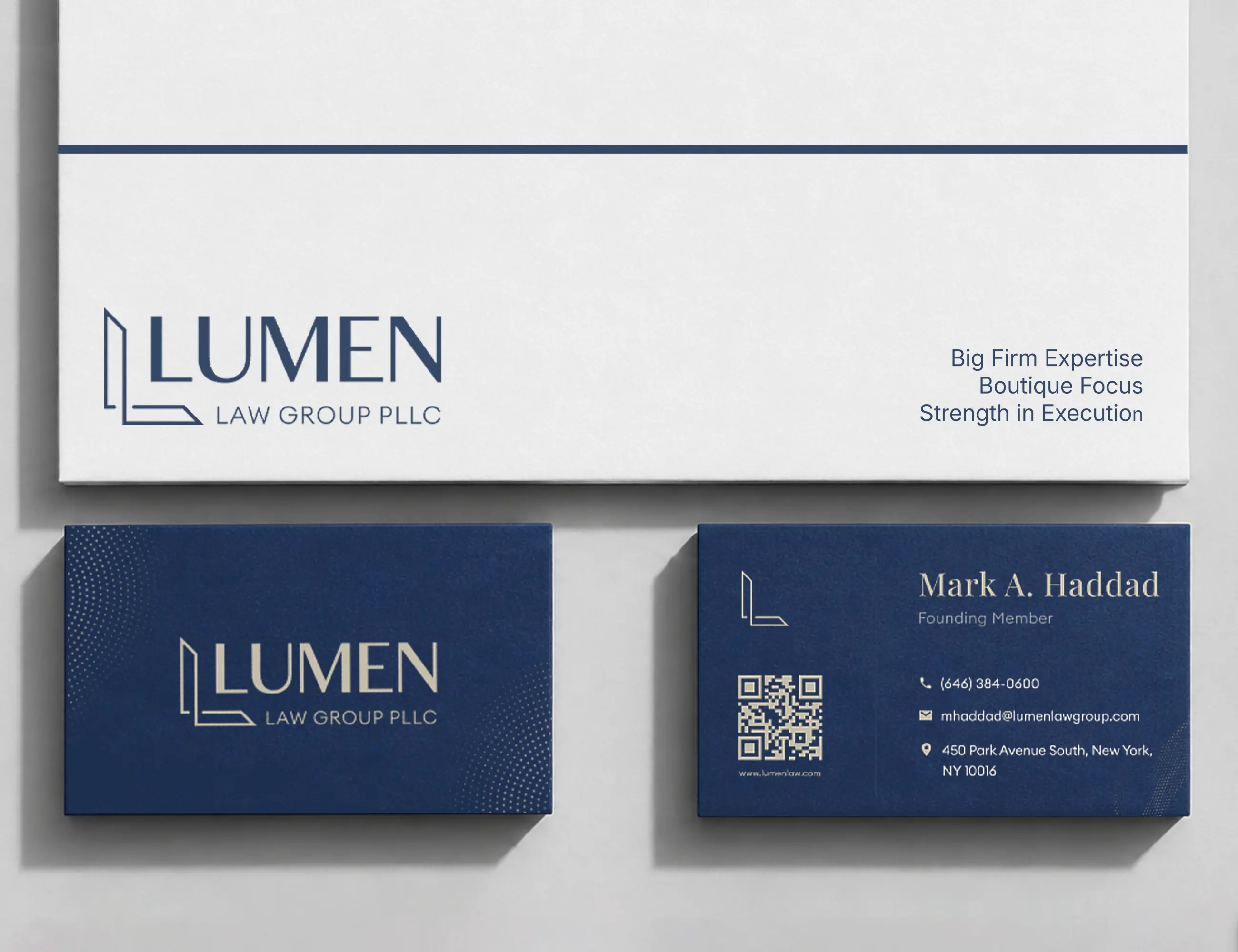
Brand Vision Marketing extended Rhino Health's rebranding to various collateral materials, including business cards, brochures, and letterheads, ensuring a consistent and professional visual identity across all touchpoints. The business cards prominently feature the new logo and vibrant color palette, with a clean layout and QR code for added convenience. The brochures combine high-quality images and custom icons to highlight innovative solutions, using a balanced layout to make complex information accessible. The minimalist yet professional letterheads maintain brand consistency, with clear typography in line with the overall design. These materials reinforce Rhino Health's new identity and make a strong impression in both digital and physical interactions.


.webp)


.webp)

.webp)



.webp)

.webp)


.avif)

.webp)
.webp)



.webp)

.webp)



.avif)


.avif)
.webp)


.avif)
.webp)


.png)