
A complete hospitality brand, from research and naming through to the menu, the door hanger, the amenities and the booking site.
Atrio Rosso is a boutique luxury hotel in Italy. We handled the market and audience research, the naming and positioning, the visual identity, the full suite of guest collateral, and the website.
Project Highlights
- Market and audience research: a read of the boutique segment and the guests who actually book it, used to decide what the property should stand for before any design started.
- Naming and brand strategy: an Italian name built around the entrance courtyard and a single deep red, giving the property one idea to hold onto rather than a list of features.
- Positioning: a defensible place for the hotel to sit against nearby properties competing on the same photography and the same amenity list.
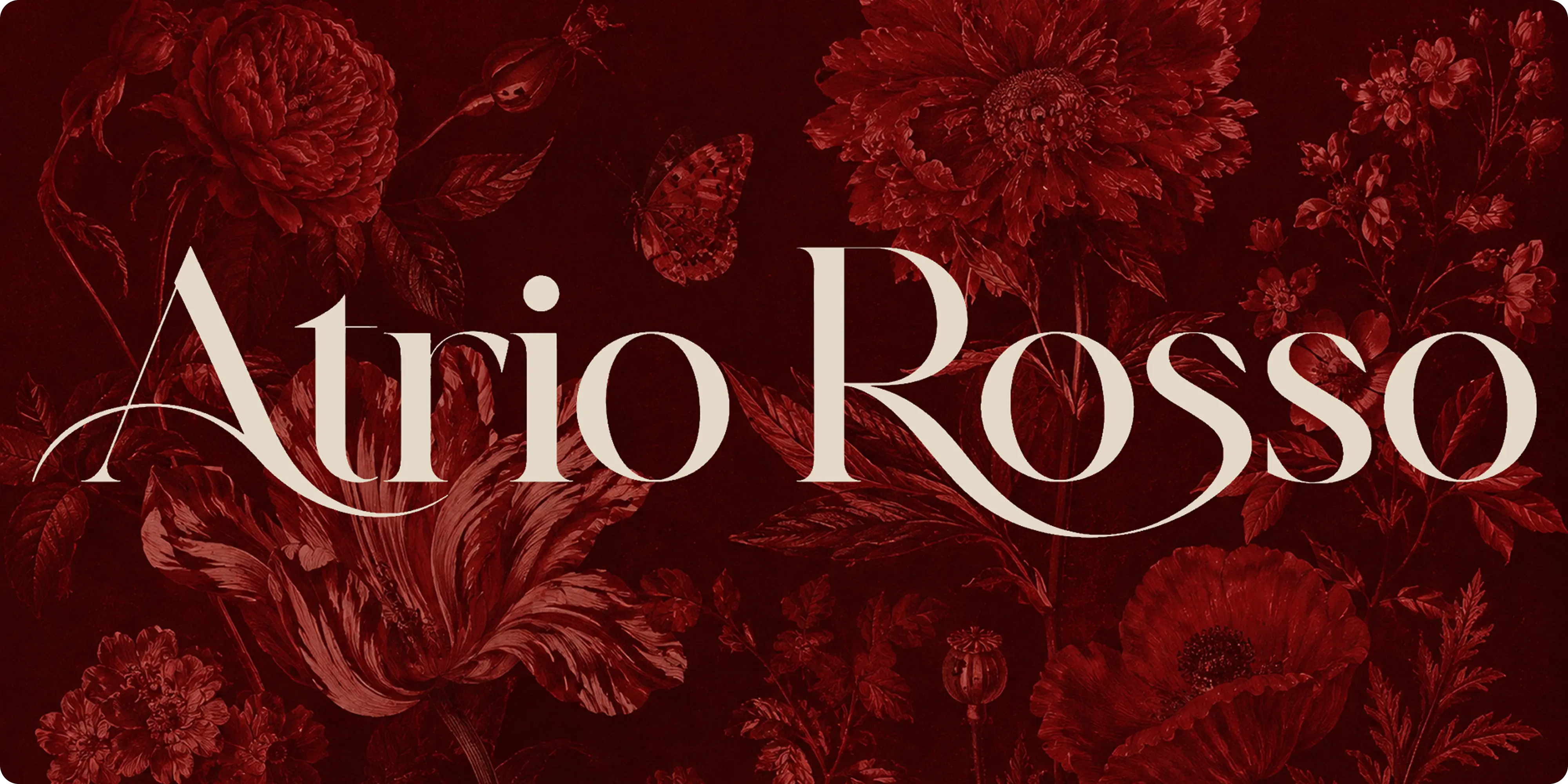
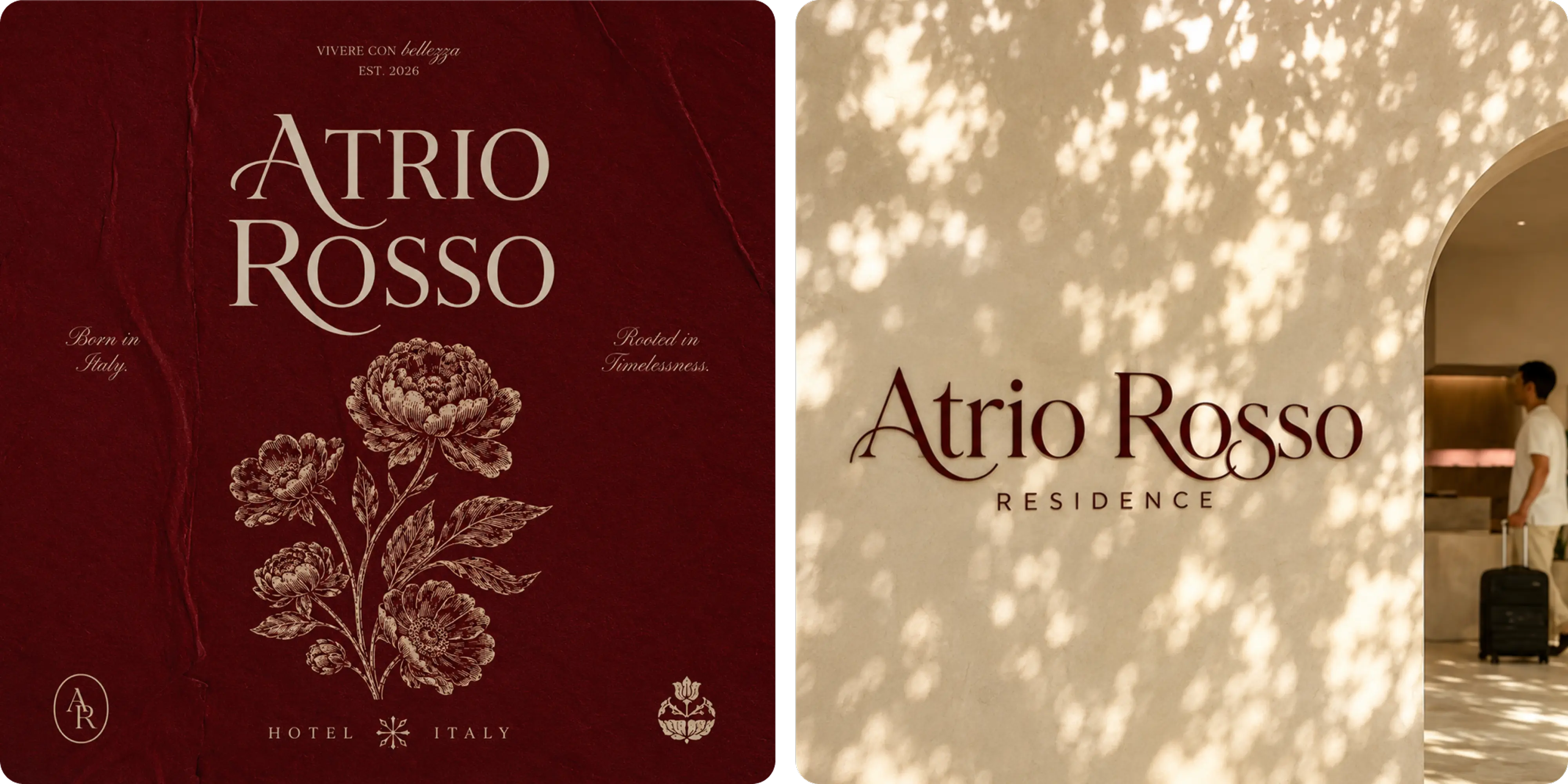
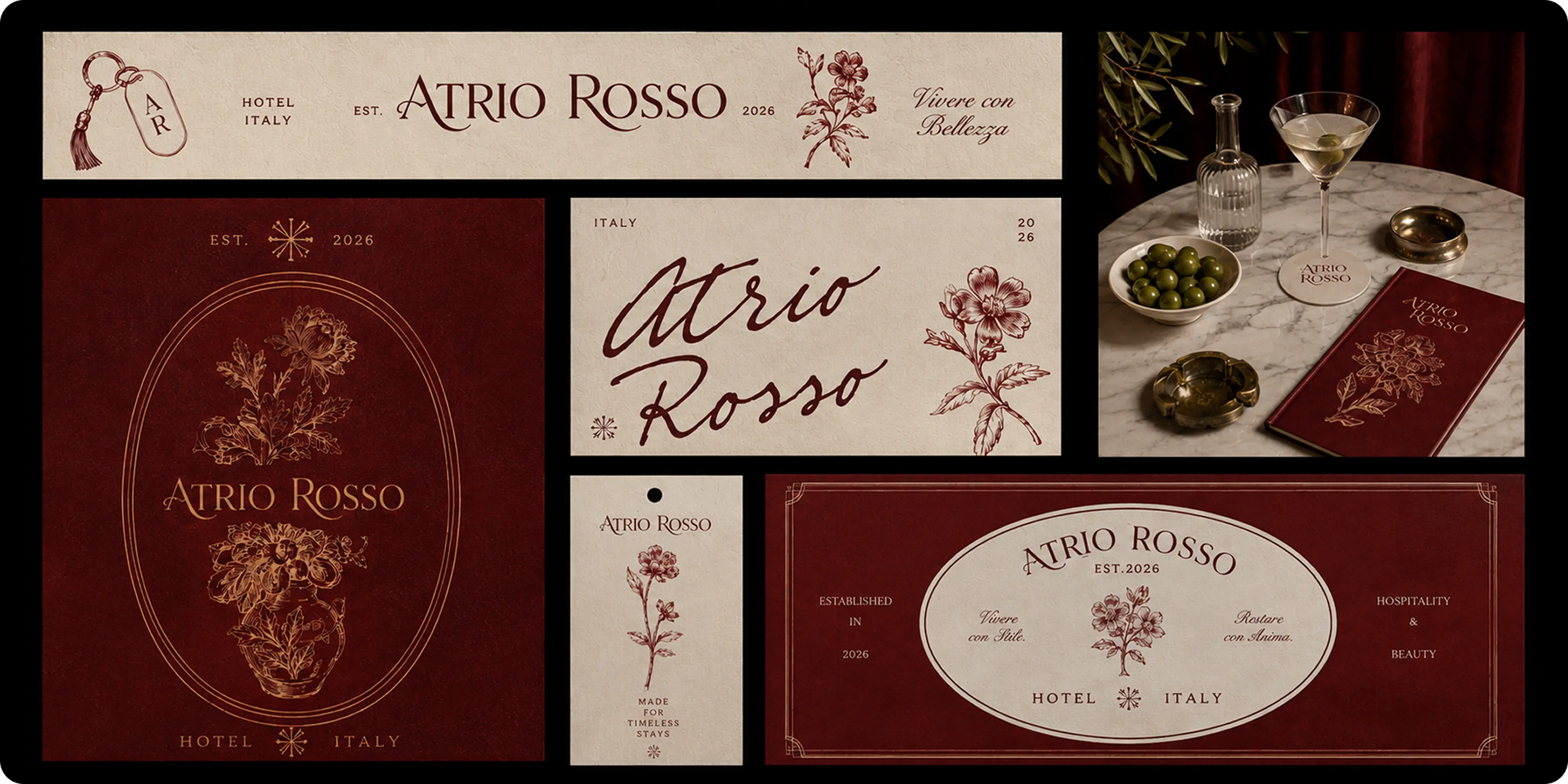
- Visual identity: a complete branding system pairing a high-contrast serif wordmark with engraved floral illustration, drawing on classical botanical printing rather than contemporary hotel minimalism.
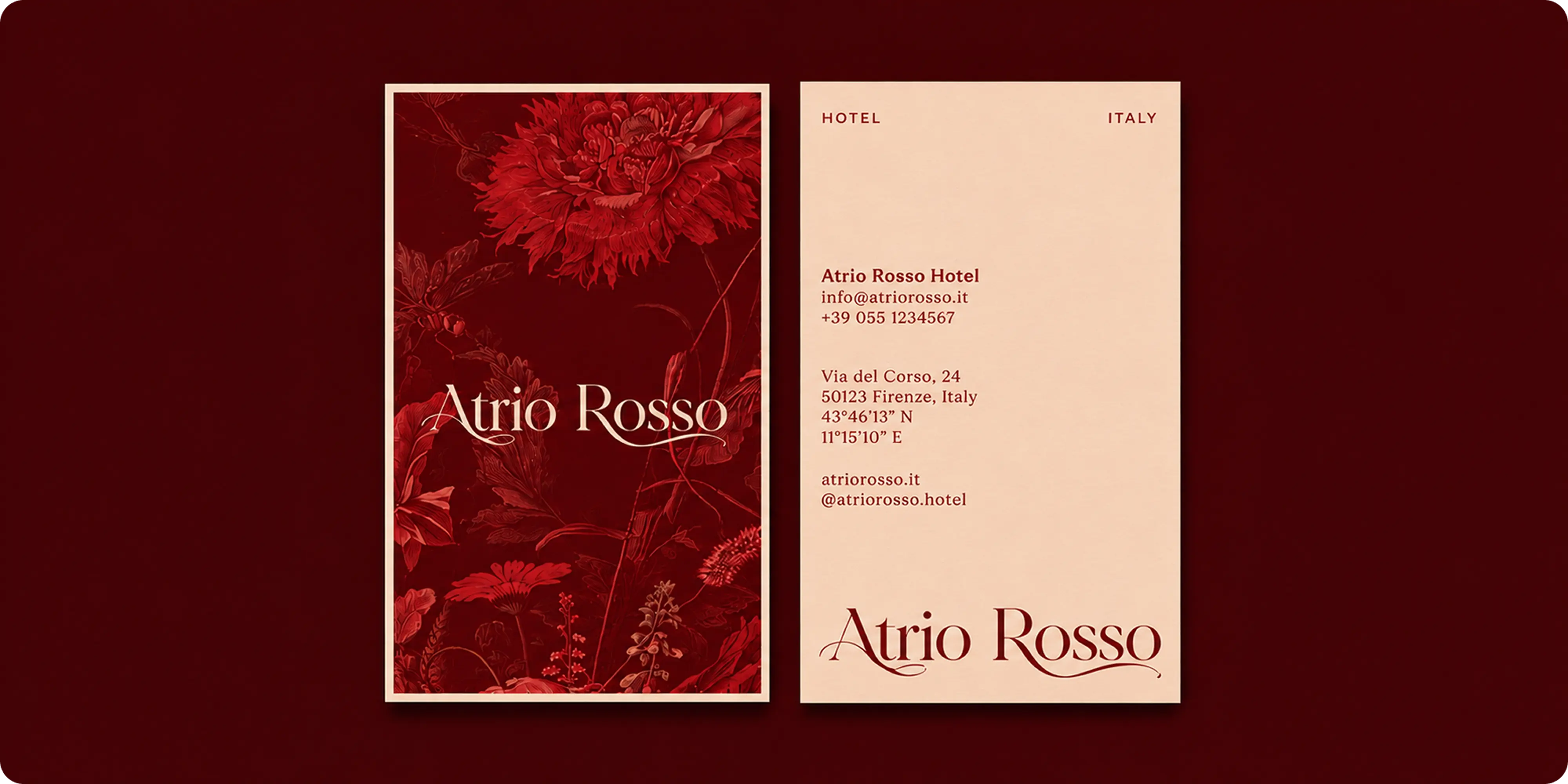
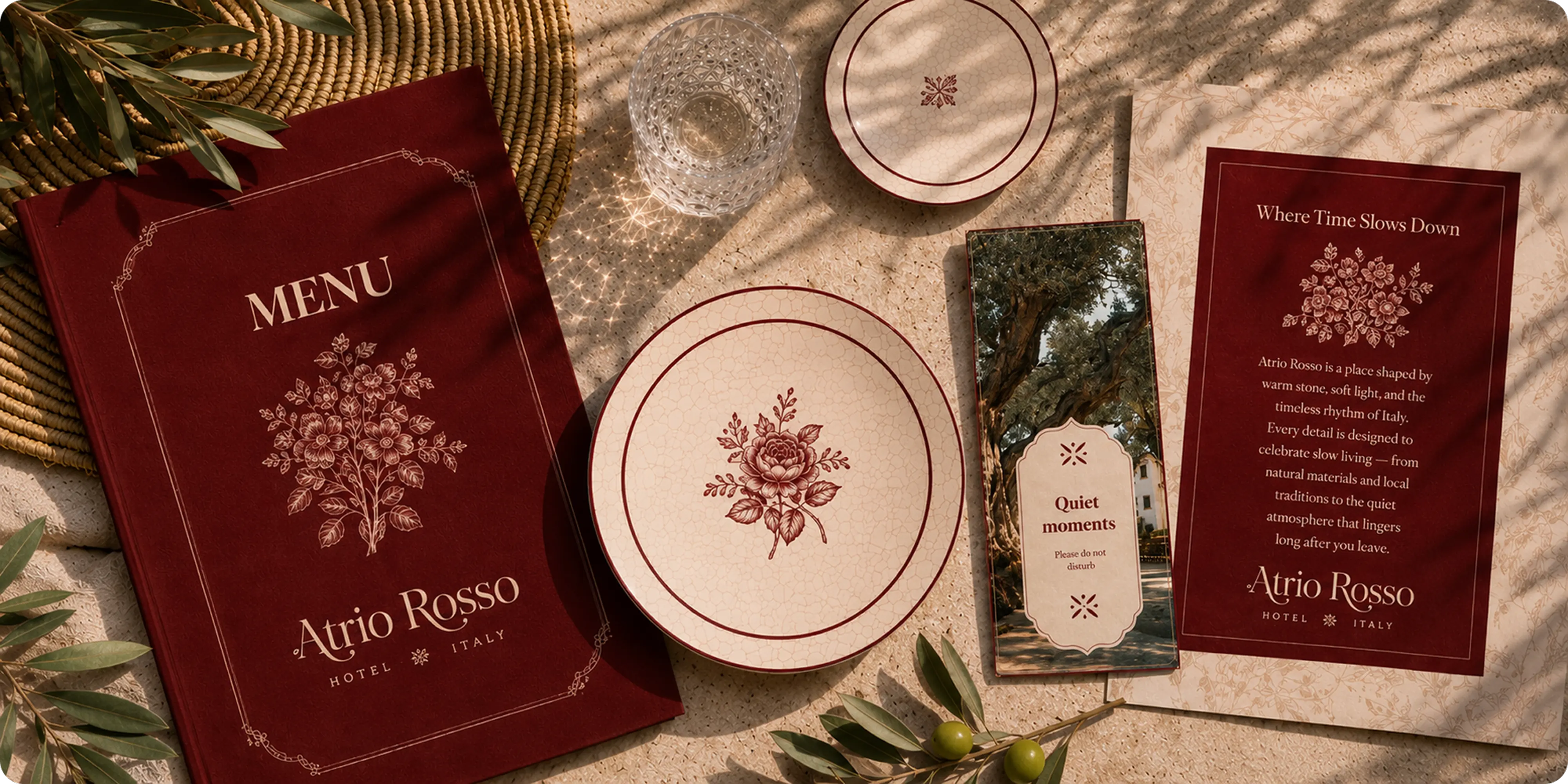
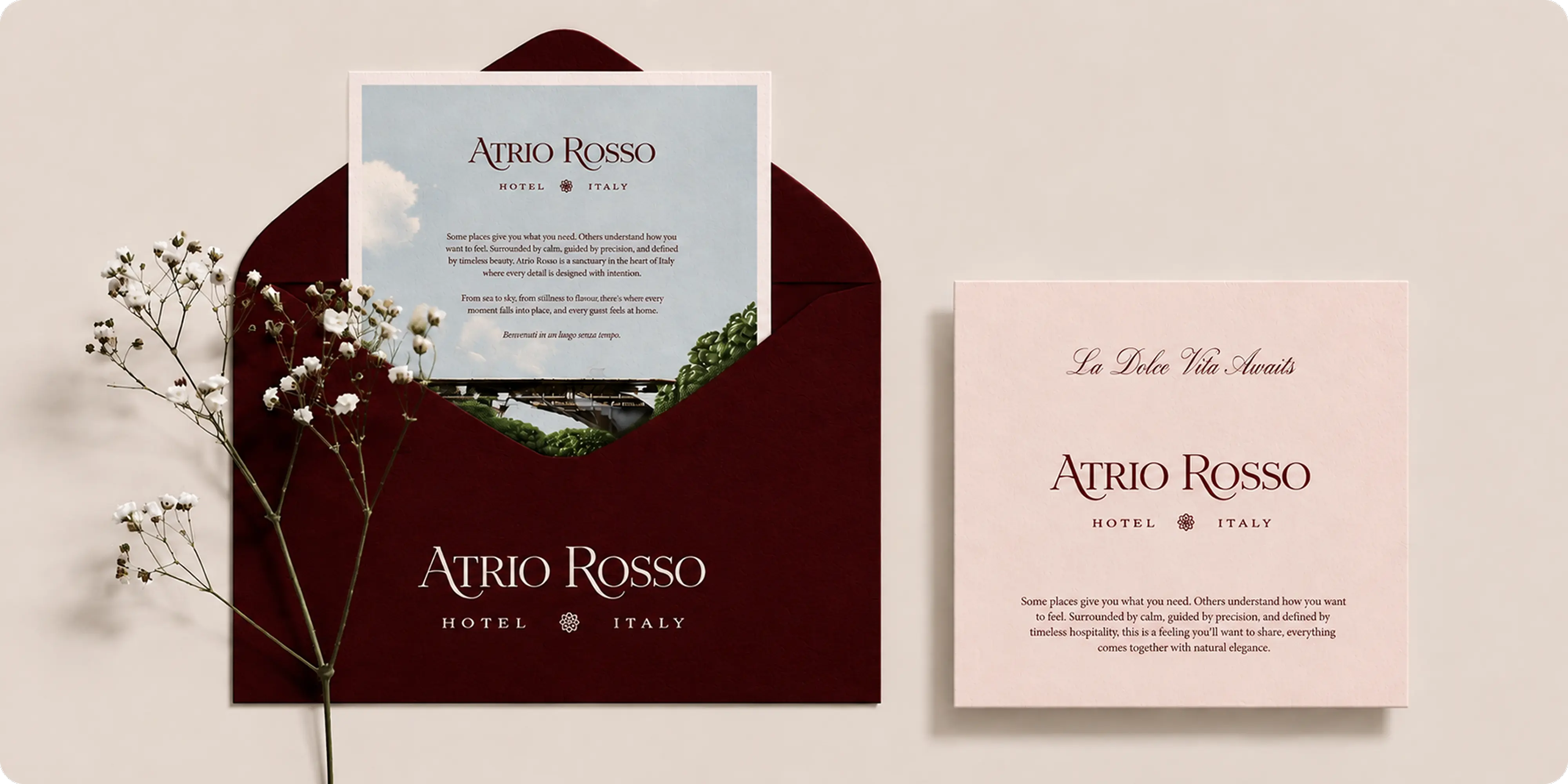
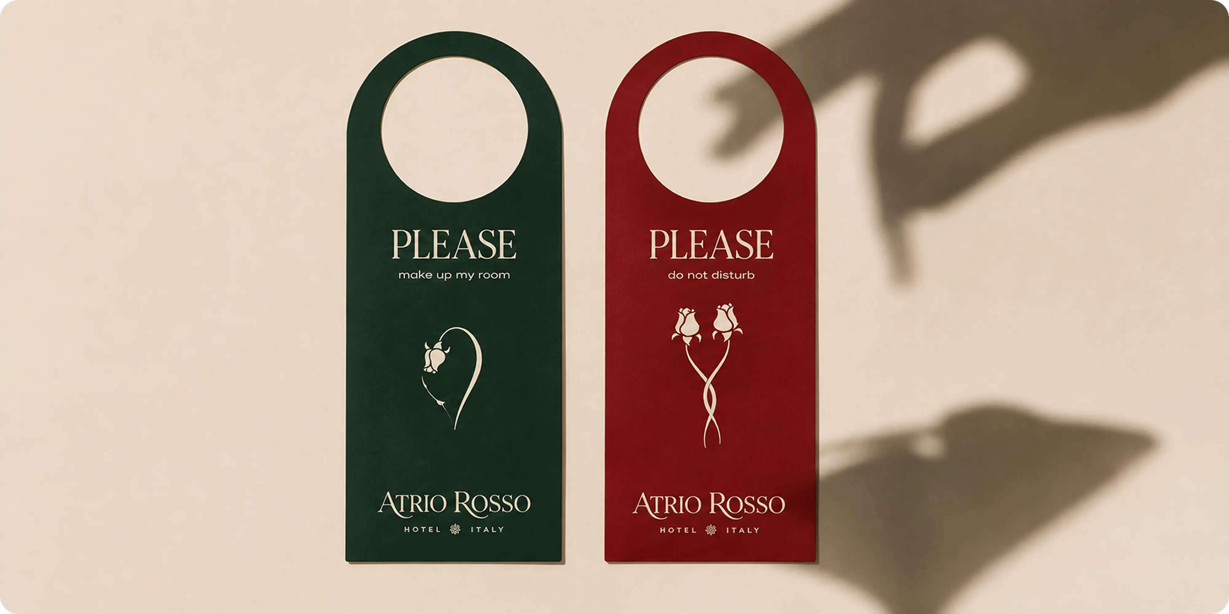
- Guest collateral: menus, door hangers, stationery, envelopes, keycards and welcome cards designed as one family.
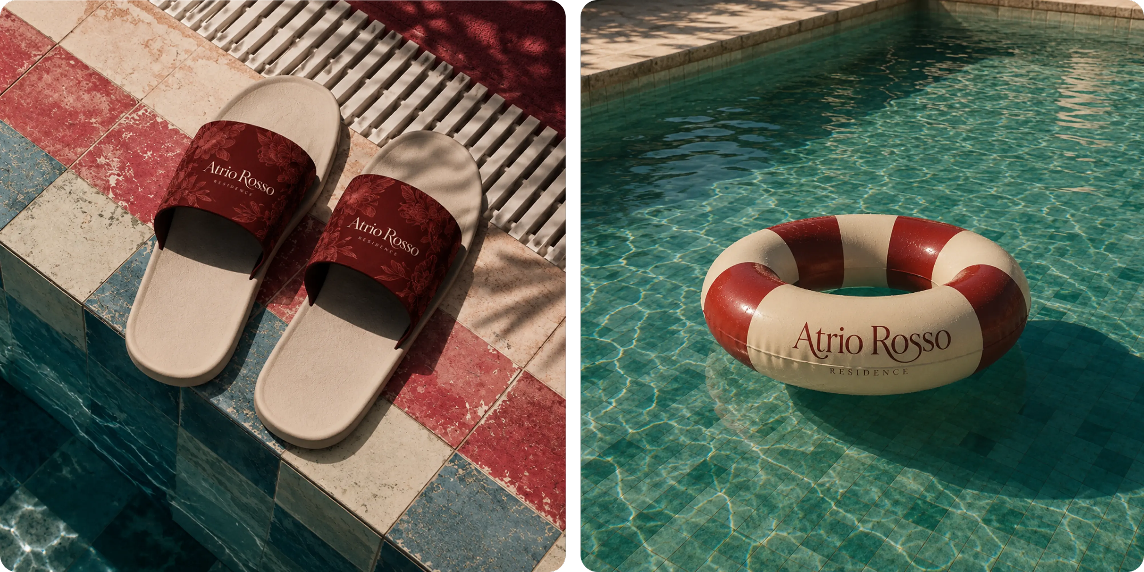
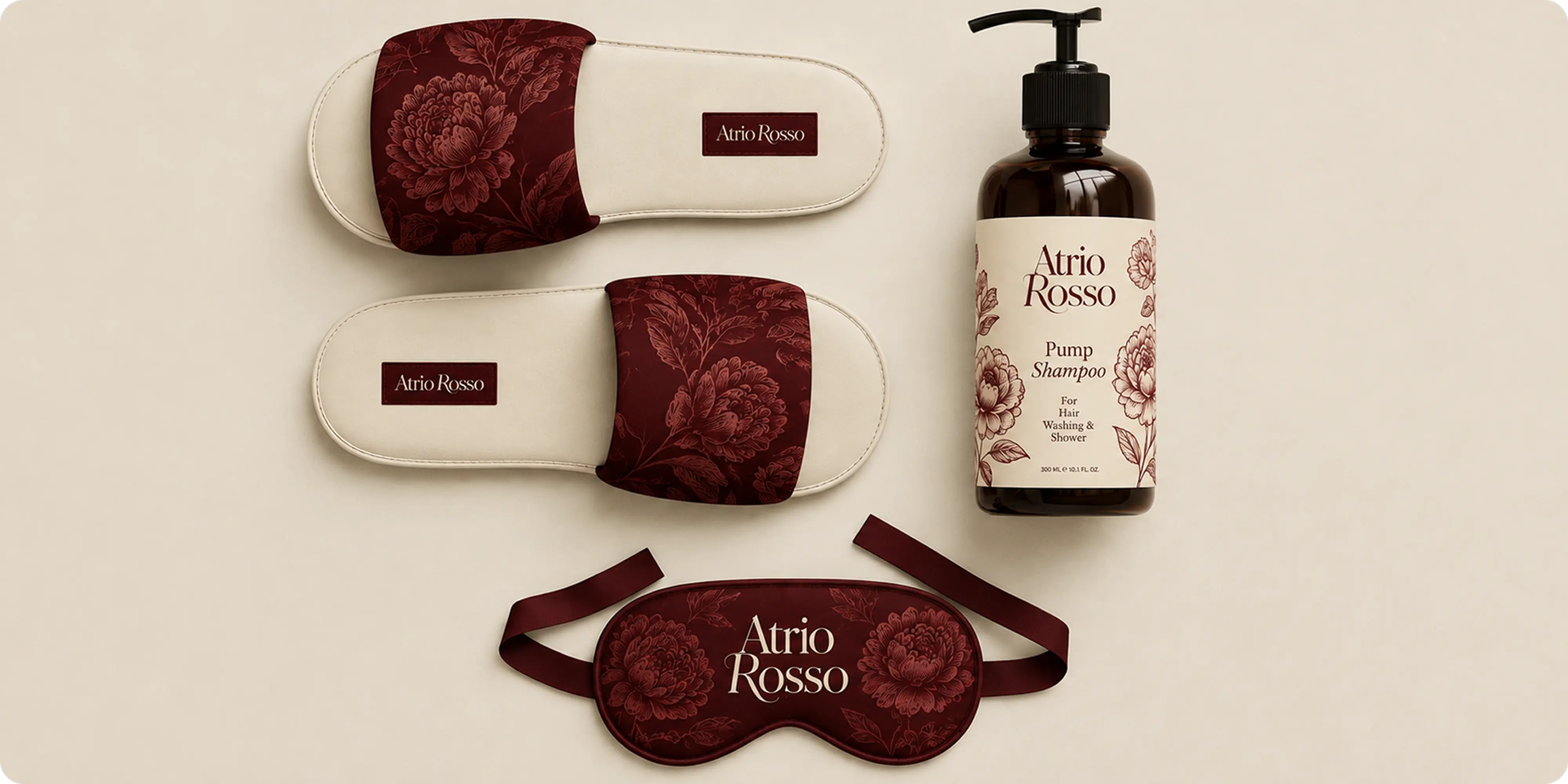
- Amenities and in-room: slippers, eye masks, bath products and tableware carrying the identity into the objects a guest handles daily.
- Marketing materials: campaign and promotional pieces built on the same system, so acquisition looks like the property rather than like an ad for it.
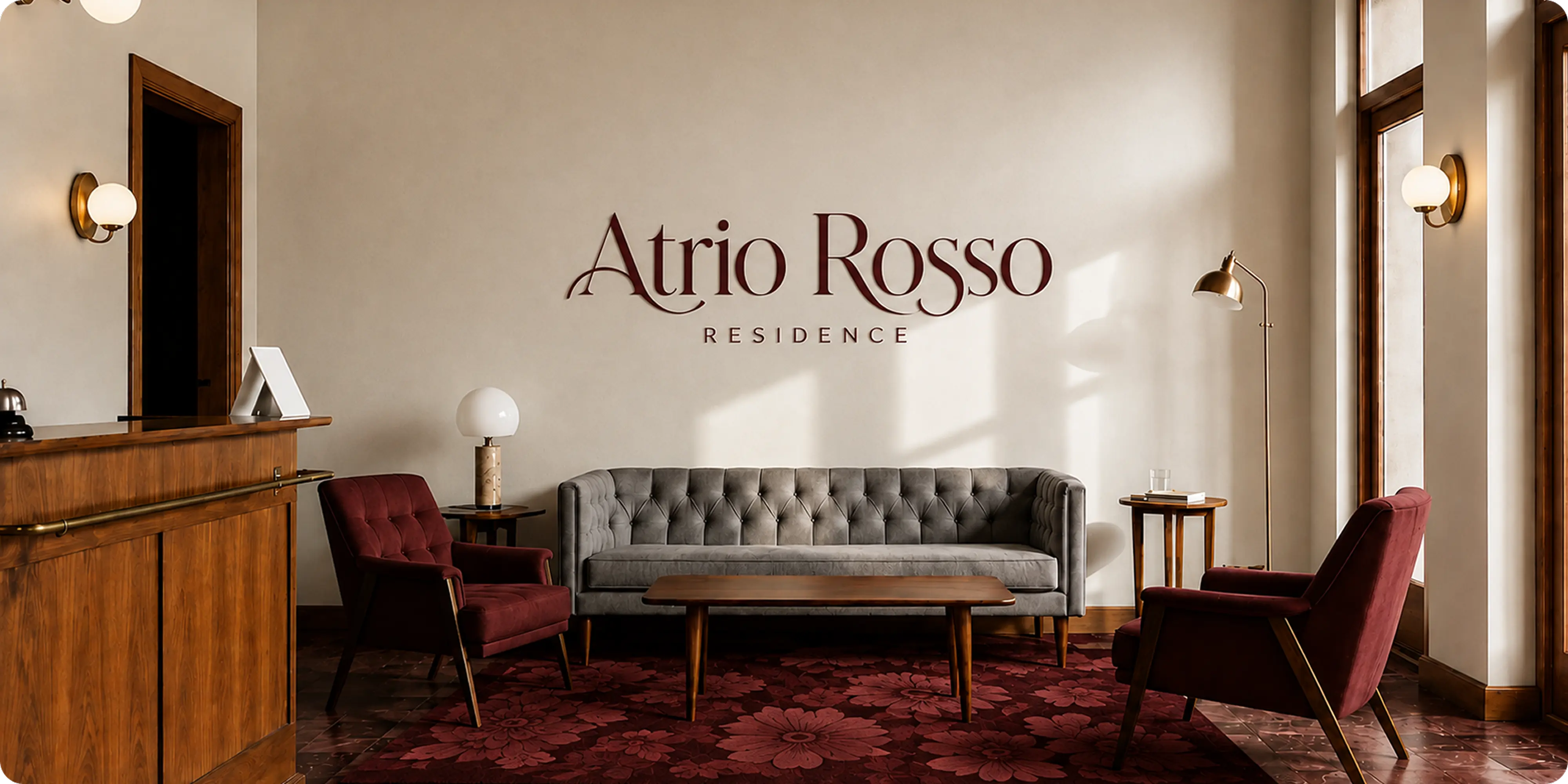
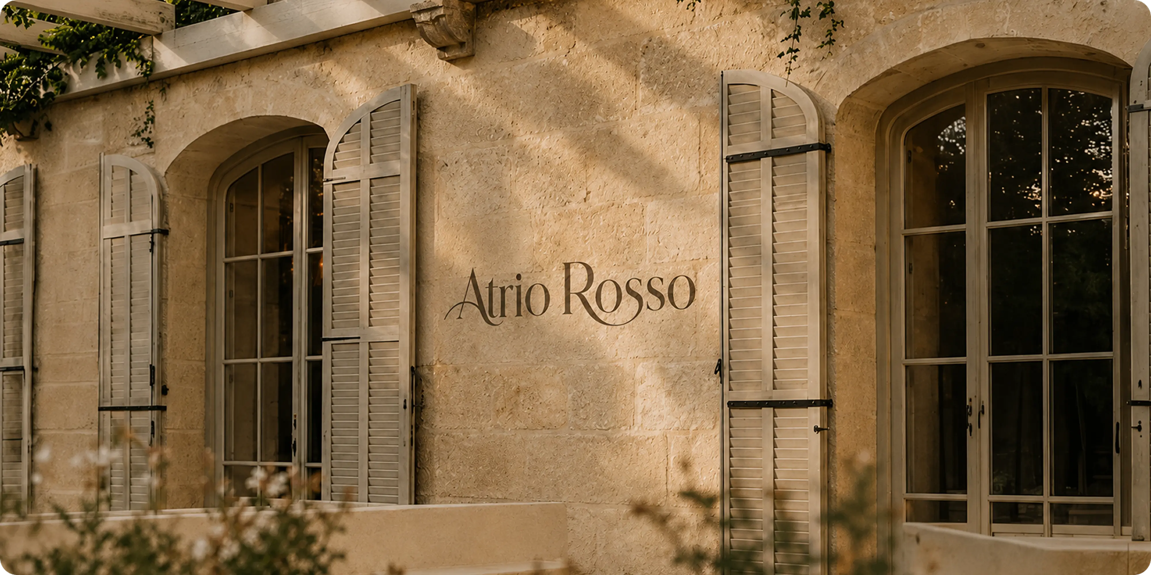
- Environmental application: exterior signage and reception treatments designed to sit against old stone without competing with it.
- Website design and development: a full WordPress build covering rooms, the property story, and enquiry.
Challenges
Boutique hotels are sold almost entirely on feeling, and that feeling is usually communicated through photography every competing property also has. Stone, light, linen and a pool photograph the same way across the whole category, which leaves the brand doing very little work.
There is also a tension specific to Italian properties like this one. The building carries real history, and a brand that leans too modern fights the architecture, while one that leans too traditional reads as dated rather than timeless. The identity had to feel established without looking like it had not been touched in decades.
Approach
We started with the market and the guest. Looking at how comparable properties presented themselves, and at what the people booking them were actually choosing on, made clear that the opportunity was not another well-photographed room but a property with a position. That research pointed us to the courtyard and to a single deep red. Naming the hotel after its entrance gave it one specific thing to be about, and committing to one color meant the brand could be recognized on a door hanger or a shampoo bottle without the wordmark being present at all.
The identity draws on engraved botanical printing rather than the minimalism the category defaults to. The floral work gives the brand ornament with a clear historical reference, which lets it sit comfortably against old stone, and the high-contrast serif keeps it from tipping into pastiche.
Most of the work went into the collateral, because that is where a hotel brand is actually experienced. Menus, door hangers, stationery, keycards, slippers, eye masks, bath products and marketing pieces were designed as one family, so a guest meets the same brand at check-in, in the room, and at dinner. The site then had to carry that restraint into booking, presenting the rooms and the property story without turning into a listing page.
Outcomes
Atrio Rosso reads as a property with a point of view rather than a set of well-photographed rooms. The red and the botanical work carry the brand across every surface a guest encounters, from the signage on the way in to the door hanger on the way out.
Because the positioning came out of research rather than taste, the system holds up against the properties it competes with, and the hotel stays recognizable even when the wordmark is not visible, which is what lets a hospitality brand work across signage, amenities, print and the site.



.webp)







.webp)







.webp)




.webp)



.webp)


.avif)












.png)