.webp)
.webp)

.avif)
.webp)
.webp)

.webp)
.webp)


.avif)

.avif)
60 Bloor St W, Suite 401,
Toronto, ON M4W 3B8
Toronto, ON M4W 3B8
Get Directions

Pharmacy.cloud operates as a fully licensed Canadian brick‑and‑mortar pharmacy reimagined for digital—offering convenient online ordering, fast shipping (e.g., XpressPost to major centres), and clinical support for minor ailments (hair loss, smoking cessation, allergy relief) without a paper prescription. Our mandate: make care pathways obvious, reduce friction on enrollment/checkout, and deliver a maintainable web system.
Brand Vision was tasked with designing a website that follows the UI/UX principles, providing accessibility and ease of navigation for its target audience.
Healthcare journeys must balance speed with trust. The legacy flow buried what patients care about: what’s treated, how to start, how quickly medications arrive, and what’s required. We needed to streamline enrollment and checkout, keep clinical language accurate without jargon, and ensure mobile performance and accessibility for patients on the go.
We mapped jobs‑to‑be‑done for new and returning patients, then rebuilt navigation and page‑level hierarchy around those tasks. A component‑driven web design and focused UI/UX system improved wayfinding and confidence (clear steps, shipping expectations, pharmacist touchpoints). We aligned a concise branding style guide, implemented pragmatic SEO, and instrumented analytics for funnel visibility.
The refreshed experience makes Pharmacy.cloud easy to choose: faster pages, clearer minor‑ailment paths, and a streamlined Enroll → Checkout → Ship flow that sets expectations upfront. It’s accessible, performance‑tuned, and simple for the team to maintain. Brand Vision was the right partner because we pair enterprise‑grade craft with enablement—combining web design, UI/UX, precise branding, pragmatic SEO, and advisory‑first marketing consultation to deliver a durable healthcare site—not just a launch.
.webp)
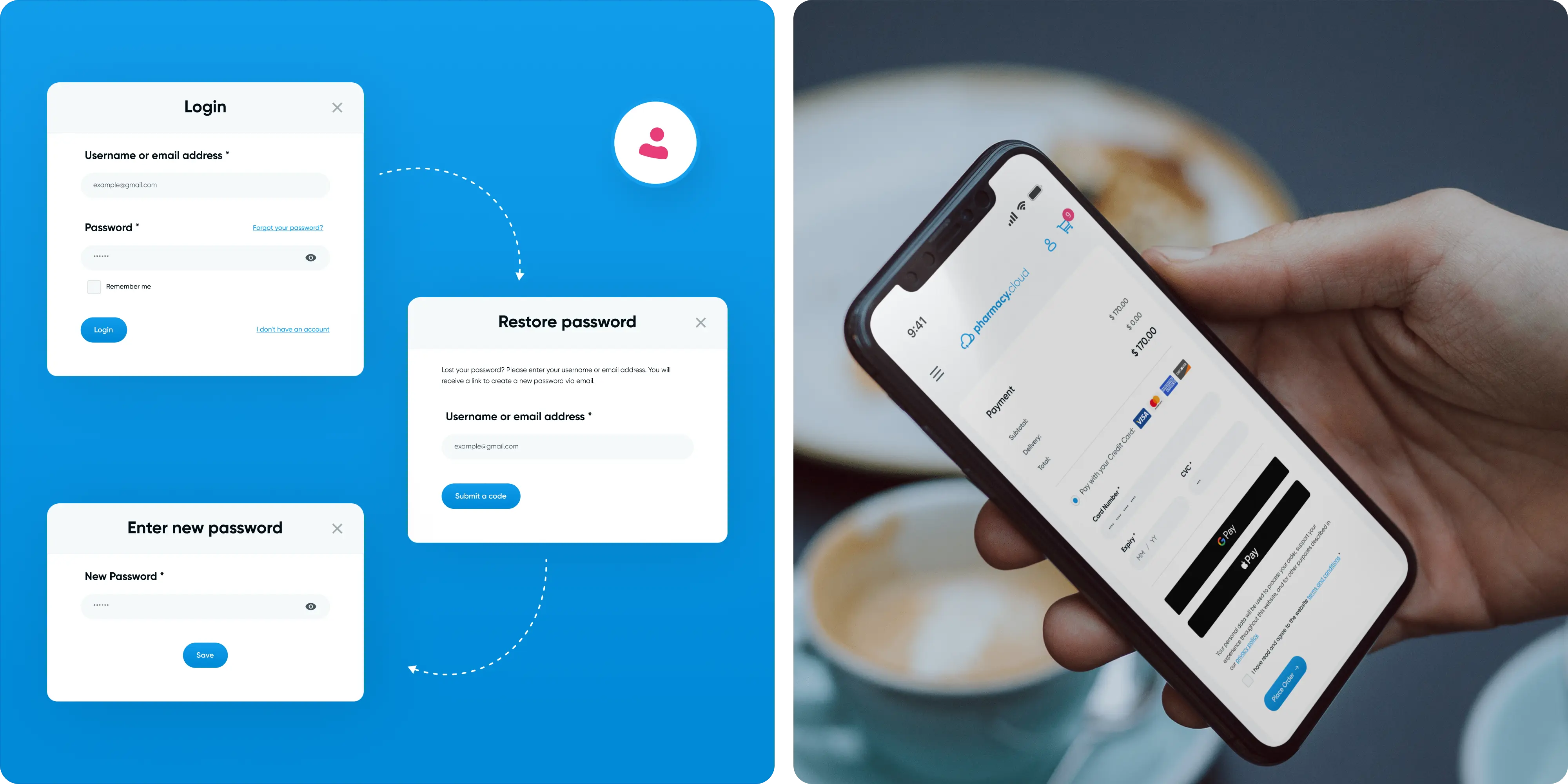
The main focus was on creating a clean and inviting aesthetic, using a light blue color palette, clear "Gilroy" typography, and custom graphics to enhance the visual appeal. The primary blue (#00A0AB) used prominently across the site shows trust, calmness, and reliability, while dark blue (#002115) provides strong contrast for text, ensuring readability. Light blue (#D0EAF1) is used for backgrounds and subtle highlights, contributing to the clean and open feel of the site. Sparingly used secondary pink (#E83C79) draws attention to call-to-action buttons and important interactive elements, and white (#FFFFFF) dominates the background, enhancing the overall modern look.
.webp)
The overall design of Pharmacy.Cloud emphasizes user-centricity. Every element, from the layout to the interactive features, was designed with the user's needs in mind. The goal was to make the user journey as smooth and intuitive as possible. This means ensuring that users can easily access information, understand their options, and complete their tasks with minimal effort.
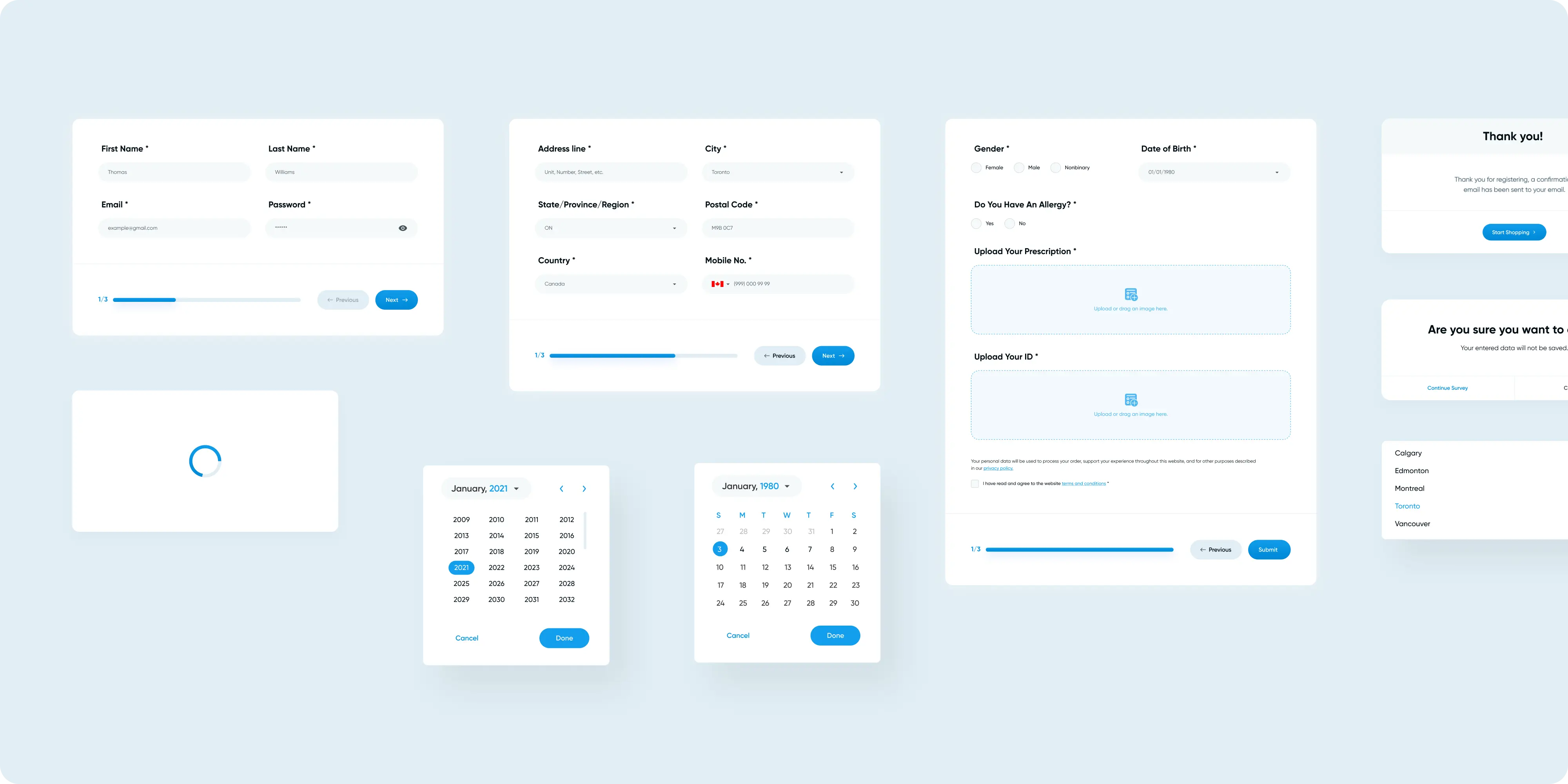
Key features implemented by Brand Vision include intuitive navigation, which ensures users can easily find the information they need. They also developed a personalized medication questionnaire that tailors the user experience based on individual health information and medication needs. Additionally, the streamlined checkout process, designed to be quick and easy, enhances the overall shopping experience.
Given the high volume of mobile users, Brand Vision ensured that Pharmacy.Cloud is fully responsive. The website adapts seamlessly to different screen sizes, providing a consistent and enjoyable user experience across desktops, tablets, and smartphones. Accessibility features are integrated to ensure that all users, including those with disabilities, can navigate and use the site effectively.
.webp)
.webp)
To make the user experience more engaging, Brand Vision incorporated interactive elements such as dynamic transitions and hover effects. These features not only enhance the visual appeal of the site but also make it more interactive and enjoyable to use. By creating an engaging environment, the website encourages users to spend more time exploring and utilizing its features.
.webp)
By combining a clean and modern aesthetic with intuitive design elements, streamlined processes, mobile responsiveness, and a strong emphasis on privacy and trust, we were able to create a digital platform that meets the high standards of this pharmacy.

.webp)


.avif)
.avif)
Our goal is to nurture your vision and provide innovative, custom solutions for all your marketing needs.