The case of Petits Vauriens serves as a testament to the power of thoughtful design in building a successful E-commerce business.
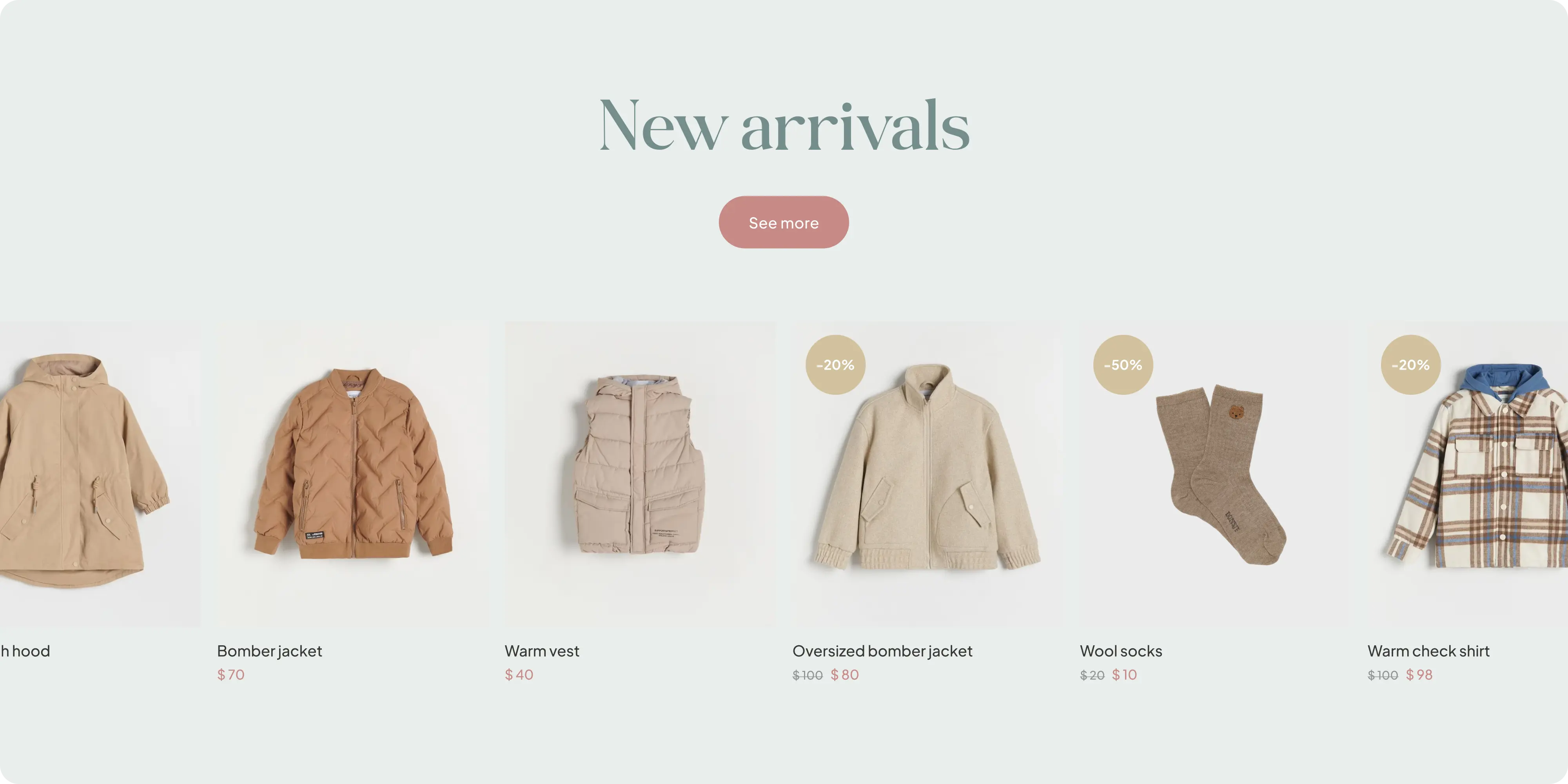
Petits Vauriens is an E-commerce start-up focused on selling clothing for babies and toddlers. The brand's vision is to create an inviting and gender-neutral shopping experience for parents and caregivers.
.webp)
Project Highlights
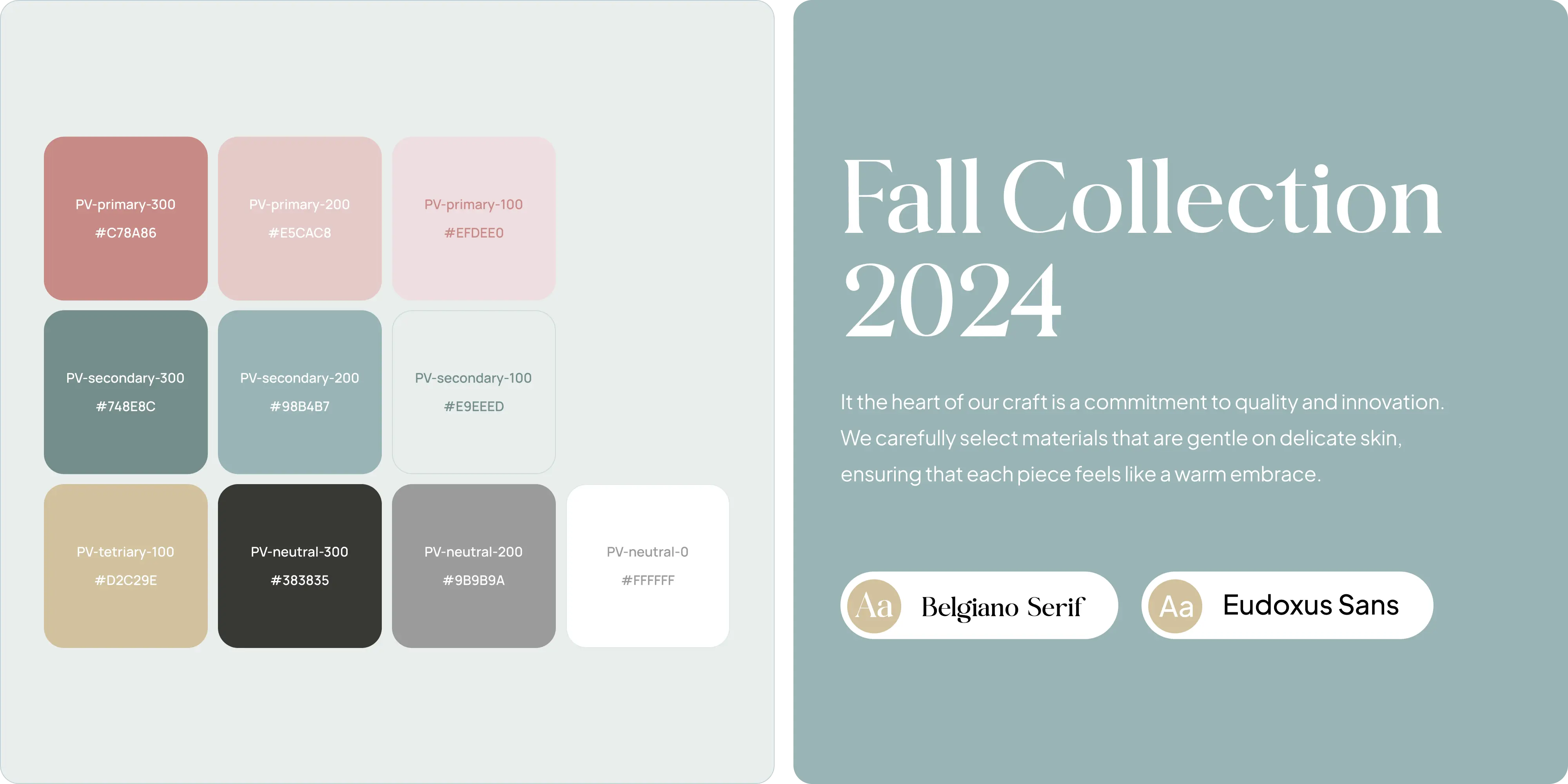
- Brand identity: a playful, distinctive visual system built for a children’s apparel label.
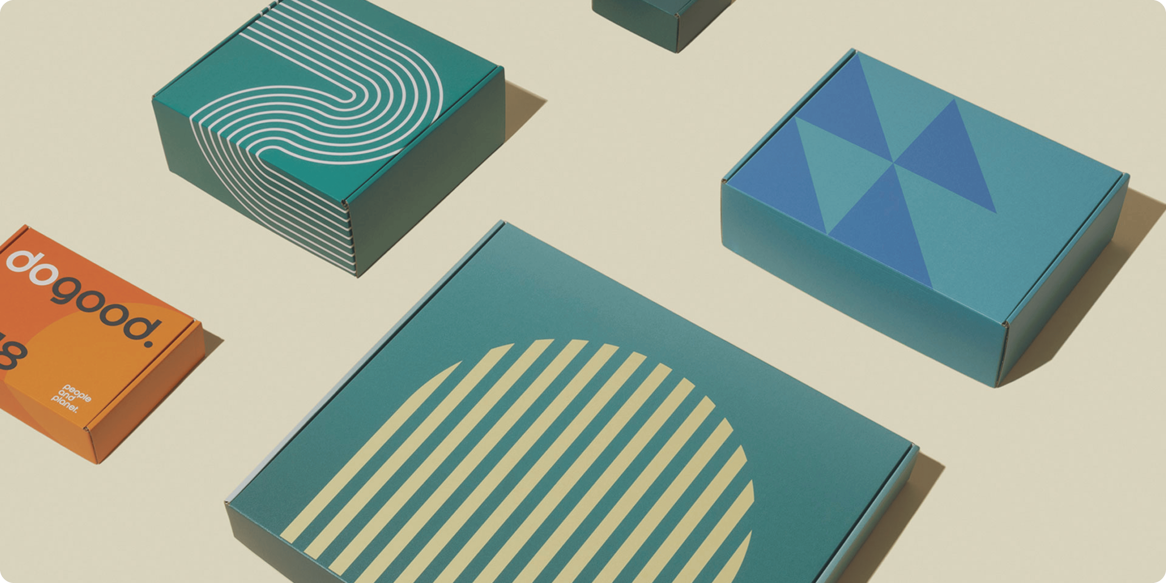
- Packaging design: product packaging and labelling extending the brand into the physical product.
- E-commerce build: a storefront designed for browsing and purchase.
- Product presentation: apparel photography and layouts that convey quality.
- Category structure: product organization by size and type for fast parent-led browsing.
- Mobile-first checkout: a short purchase path optimized for phones.
Challenges
Children’s apparel is bought by parents but designed to delight children, and the brand has to satisfy both without becoming saccharine. Petits Vauriens needed an identity that felt playful and well-made, plus a storefront where browsing by size and category was effortless on a phone.
Approach
We built the identity around a playful, child-appropriate visual language that parents would still find tasteful, then extended it into packaging and labels. The storefront was designed around browsing by size and category, the way parents actually shop, with product photography given room to carry the quality. Checkout was kept short and the whole build was optimized for mobile.
.webp)
Outcomes
Petits Vauriens launched with a brand that reads as playful and premium at once, and a storefront where parents can find the right size quickly and check out without friction.
.webp)
.webp)
.webp)
.webp)


.webp)







.webp)





.webp)



.webp)

.webp)

.avif)







.png)