.webp)
.webp)

.webp)
.webp)

.webp)
.webp)


.avif)

.avif)
60 Bloor St W, Suite 401,
Toronto, ON M4W 3B8
Toronto, ON M4W 3B8
Get Directions

Our mandate: clarify services, shorten the path to booking, and give the practice a credible, modern web presence that the in‑house team can run day‑to‑day.
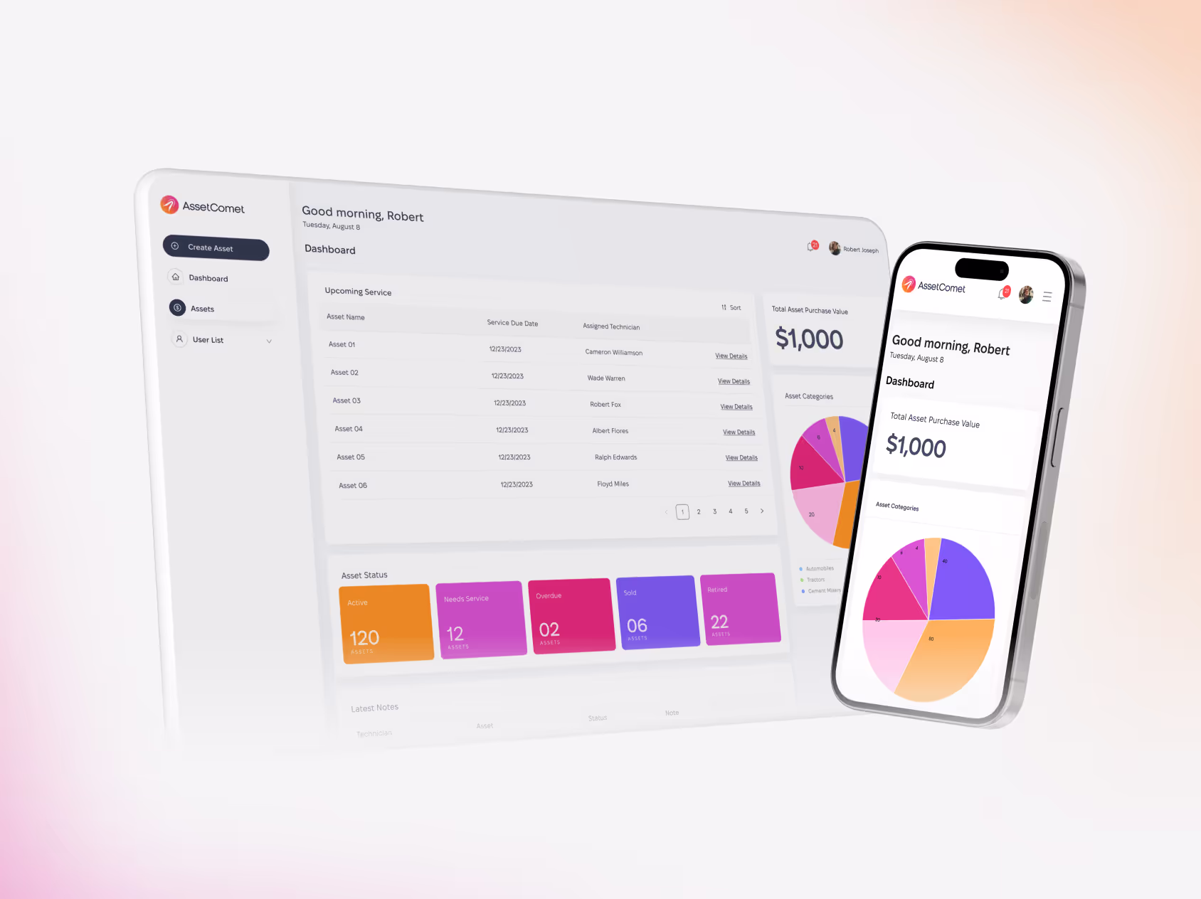
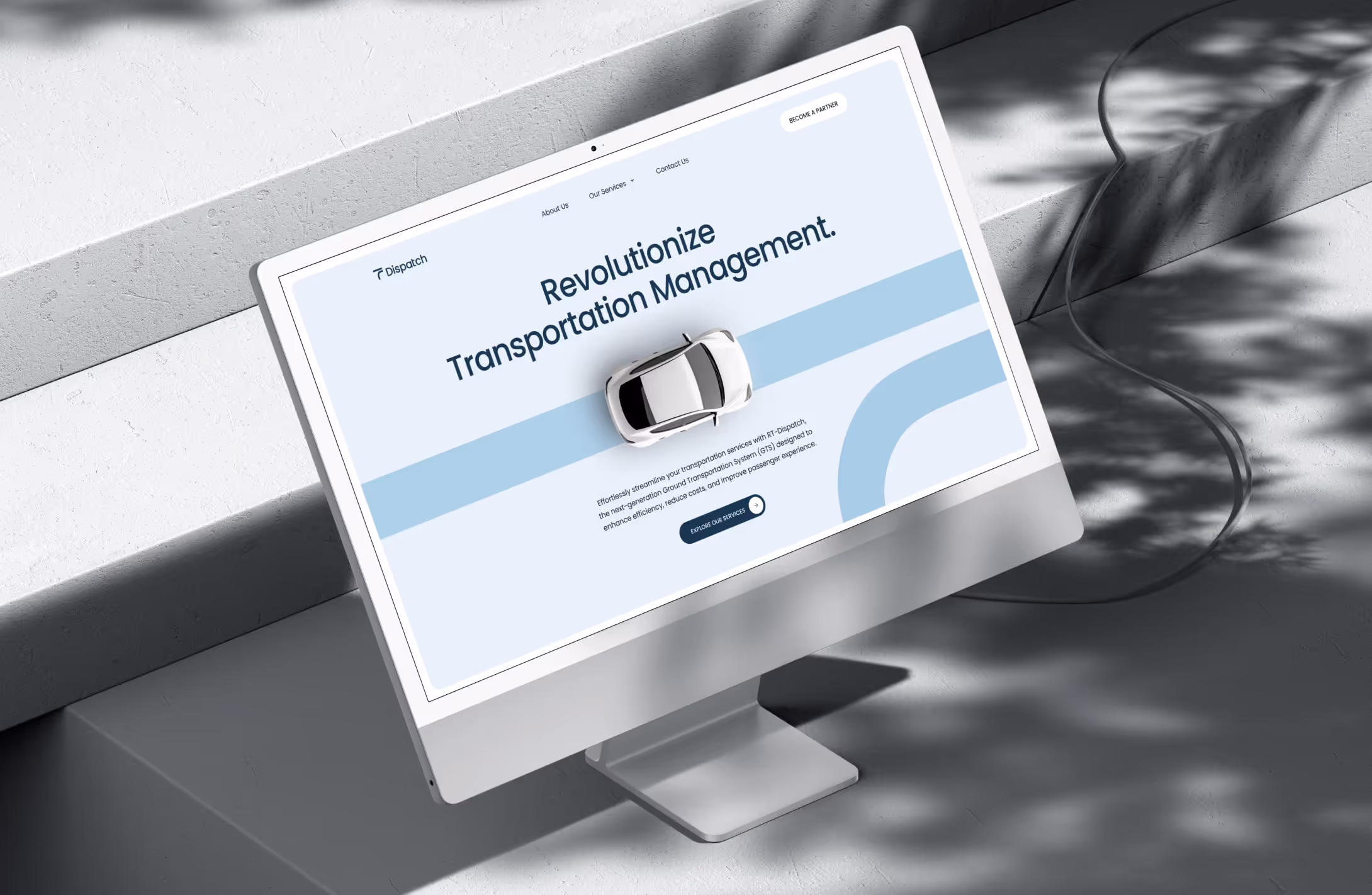
A streamlined, user-friendly online booking system was developed to allow patients to schedule appointments effortlessly, reducing the need for phone calls.
GI practices serve multiple audiences. New patients, returning patients, referring physicians, and payors. Each with different questions and urgency. The legacy content mixed clinical detail and marketing copy, making it hard to find prep instructions, insurance info, or how to book the right test. The site also needed to express clinical credibility without overwhelming users, and it had to work flawlessly on mobile where most searches begin.
We mapped journeys for common entry points (“I have a symptom,” “I was told to get a colonoscopy,” “I need a follow‑up”). From there we rebuilt navigation and page models around tasks.
A component‑driven web design + UI/UX system kept information scannable and consistent: procedure overviews, prep steps, risks/contraindications, and next‑step CTAs appear where they’re most useful. We implemented pragmatic SEO (including structured data), prioritized accessibility and mobile performance, and delivered enablement so staff can publish updates in minutes. Light branding alignment kept messaging disciplined.
The redesigned experience makes care easier to access and trust: clearer language, faster paths to schedule, stronger local search visibility, and a maintainable CMS that supports day‑to‑day operations.
Brand Vision approached the redesign of Midwest Digestive Health and Nutrition's website with a comprehensive strategy, focusing on refreshing the color palette, updating typography, incorporating custom graphic elements, and prioritizing user-friendly navigation.
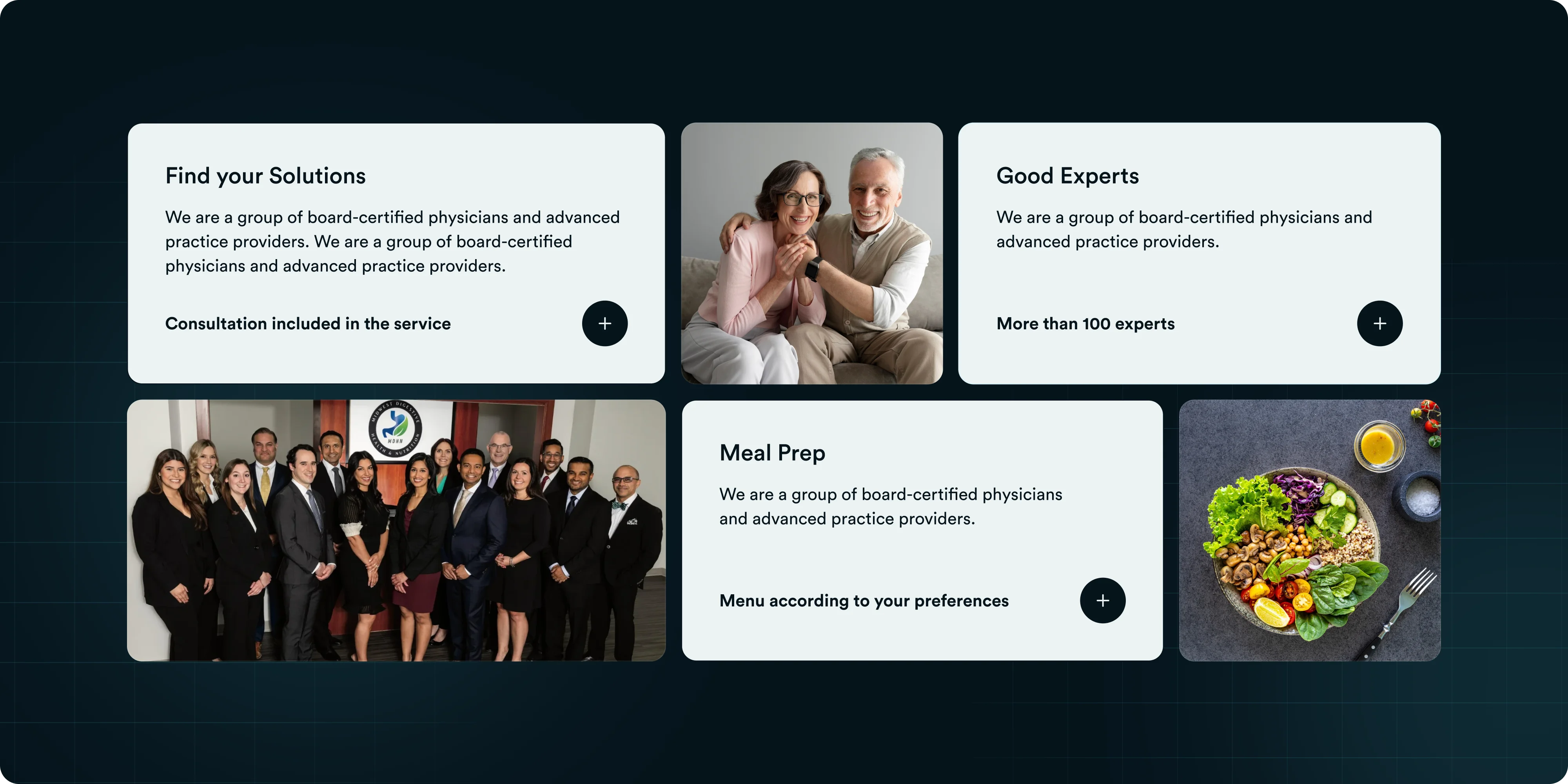
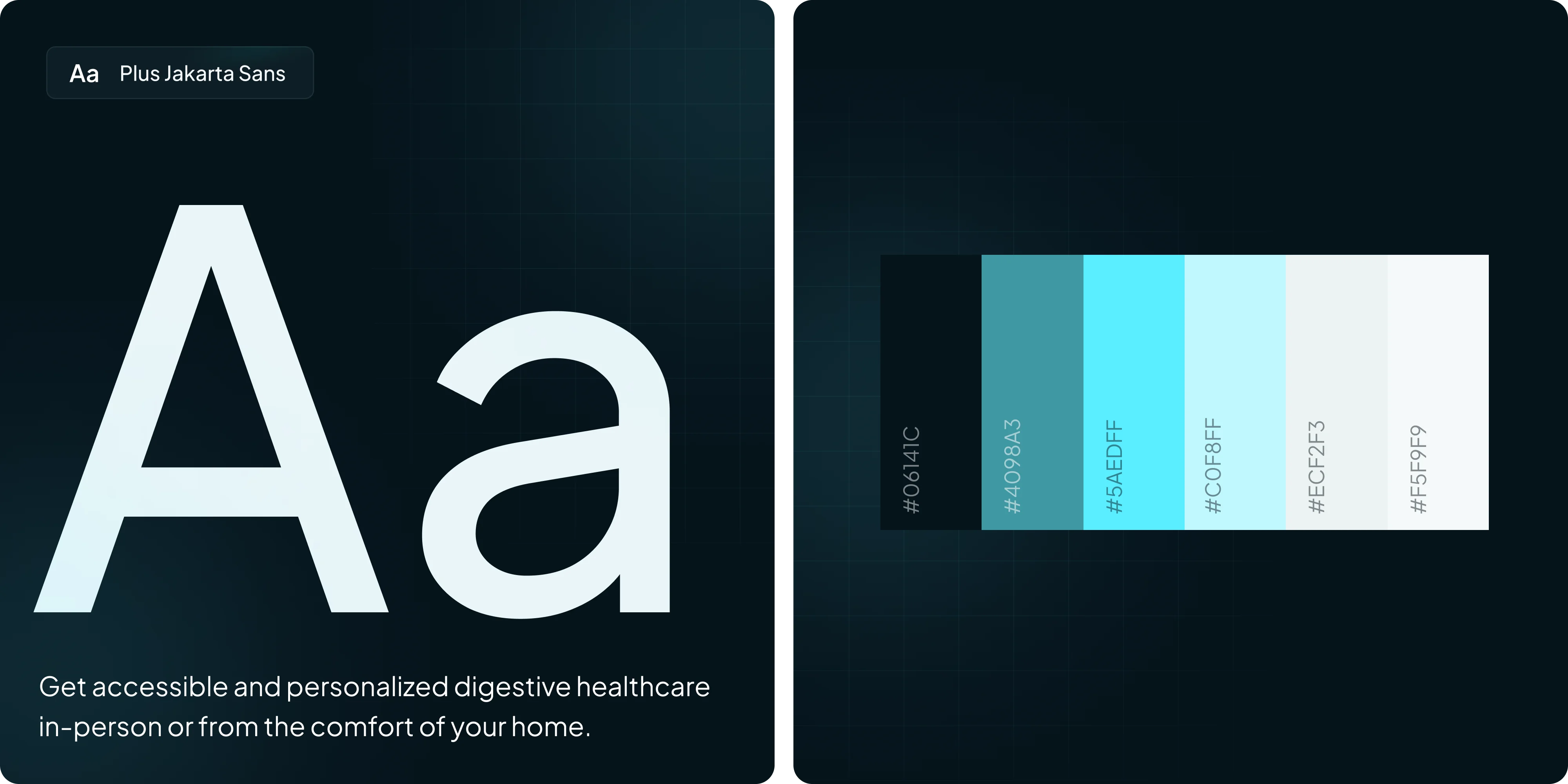
A tech-themed color scheme comprising shades of blueish-green, white, and lighter greens was chosen to impart a modern and clean look while evoking a sense of calm and trust, crucial for a medical institution. Custom-made graphics and images were seamlessly integrated to enhance visual appeal and aid in content clarity.
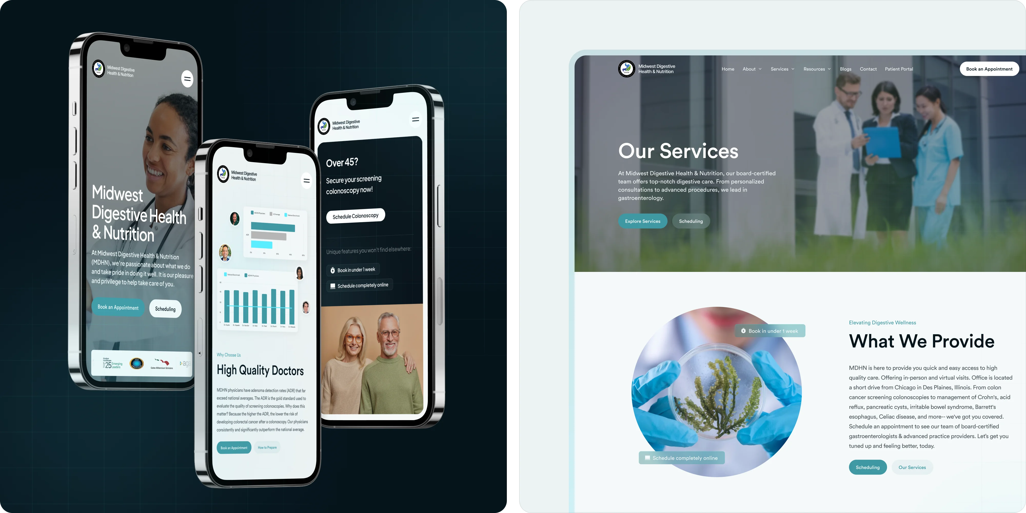
Typography was carefully updated to enhance readability and imbue the website with a contemporary feel, ensuring text was accessible to all users. The design prioritized user experience, with the homepage and navigation menu prominently featuring the institution’s services, accompanied by clear, concise information.

.webp)
A streamlined, user-friendly online booking system was implemented to facilitate easy appointment scheduling, reducing reliance on phone calls. Accessibility was a key consideration, with the website designed to be easily navigable for users of all ages, incorporating large buttons, clear calls to action, and straightforward navigation paths to enhance usability.
.webp)
The redesigned website for Midwest Digestive Health and Nutrition has led to notable improvements. There has been a marked increase in user engagement, as more patients are now utilizing the convenient online booking system.
.webp)
This has resulted in a reduction in the administrative burden, with fewer phone calls needed for appointment bookings, enabling staff to allocate more time to patient care. Additionally, the website has received positive feedback from patients, who appreciate its ease of use and modern design. Moreover, the updated aesthetic aligns perfectly with the institution’s vision of delivering advanced and compassionate medical care, further enhancing its image and reputation.
.webp)


.avif)
.avif)

Our goal is to nurture your vision and provide innovative, custom solutions for all your marketing needs.