.webp)

.webp)

.avif)
.webp)
.webp)

.webp)
.webp)


.avif)

.avif)
60 Bloor St W, Suite 401,
Toronto, ON M4W 3B8
Toronto, ON M4W 3B8
Get Directions

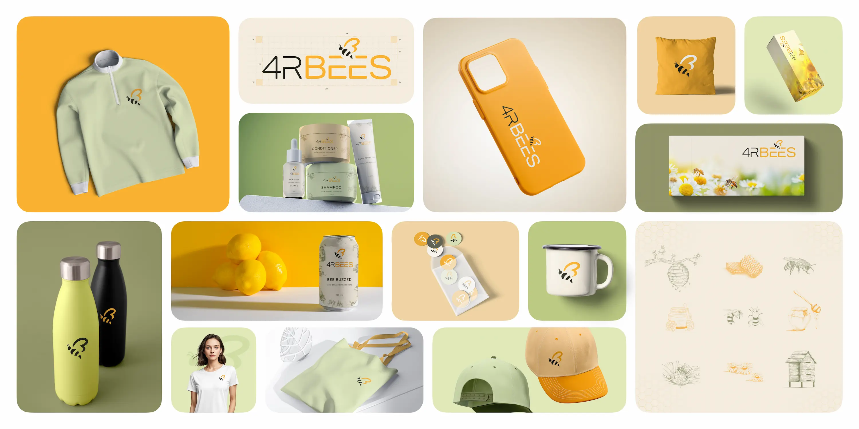
4RBees is a mission-driven organization focused on protecting and revitalizing bee populations. With innovations like PureWave™ Cells and PureWave™ Raw Energized Honey, purchases and memberships fund wildflower plantings, biodiversity projects, and support for independent beekeepers. Our mandate: clarify the mission, modernize the brand, and build an e‑commerce foundation that’s simple for a lean team to run.
At Brand Vision, we put great focus on delivering unique and modern web design and branding services to our clients.
The previous site blended complex science with a general mission pitch, making it hard for visitors to understand what 4RBees does and how to help. We needed to explain PureWave™ Cells in plain language, create a credible brand presence, and build a storefront that could handle media‑driven traffic spikes without adding day‑to‑day developer dependence.
We mapped jobs‑to‑be‑done for two core audiences mission supporters and product buyers then rebuilt the information architecture around those tasks. A component‑driven web design system and focused UI/UX patterns made the story easy to scan, while light branding refinements brought consistency across touchpoints. We implemented pragmatic SEO, instrumented analytics, and produced a Shopify build the team can manage. Finally, we delivered enablement training, documentation, and a governance checklist so updates don’t require developers. Advisory‑first marketing consultation supported roadmap decisions.
4RBees now has a credible, mission‑forward brand and a conversion‑ready storefront: clearer paths to learn, join, or purchase; faster pages;, fasterpages;, and a CMS the team enjoys using. Brand Vision was the right partner because we blend enterprise‑grade craft with enablement, combining web design, UI/UX, branding, pragmatic SEO, and advisory‑first marketing consultation to deliver a maintainable system, not just a launch.

Brand Vision worked closely with 4RBees to refine its brand strategy, focusing on aligning the company’s visual identity with its core values of sustainability and natural products. This involved extensive research and planning to ensure that every element of the rebrand resonated with the target audience.

Brand Vision led the redesign of the 4RBees logo, integrating the bee icon into the letter "B" to emphasize the brand's connection to beekeeping and nature. The agency ensured that the new logo was both memorable and symbolic of the brand’s ethos.

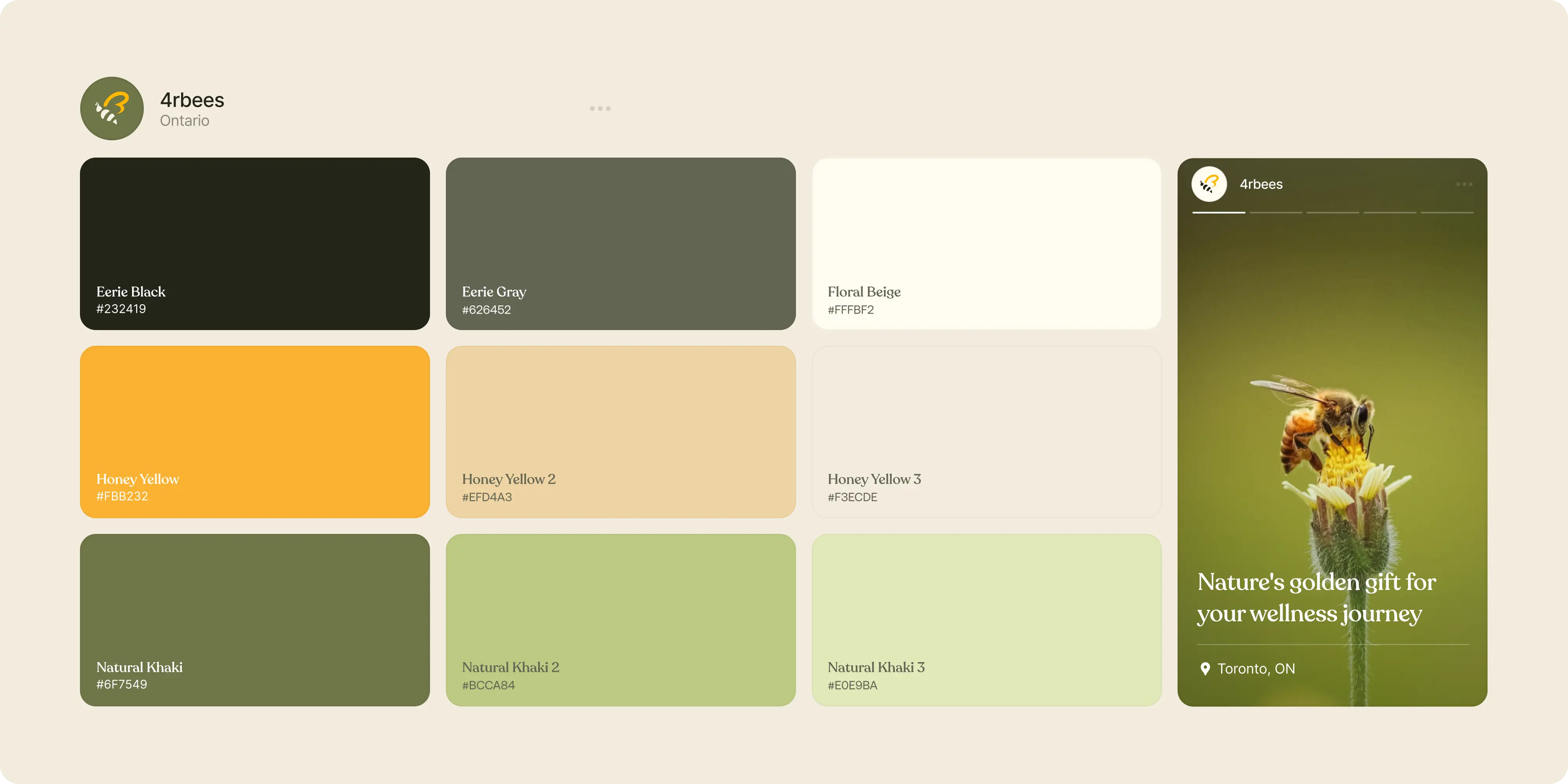
Brand Vision curated a new color palette and selected typography that would optimize the brand’s presentation across digital and print media, ensuring consistency and enhancing aesthetic appeal. Our efforts extended to the design of various collateral, including digital assets, product packaging, and promotional materials, ensuring all elements were coherent with the new branding and effectively communicated the brand’s message.
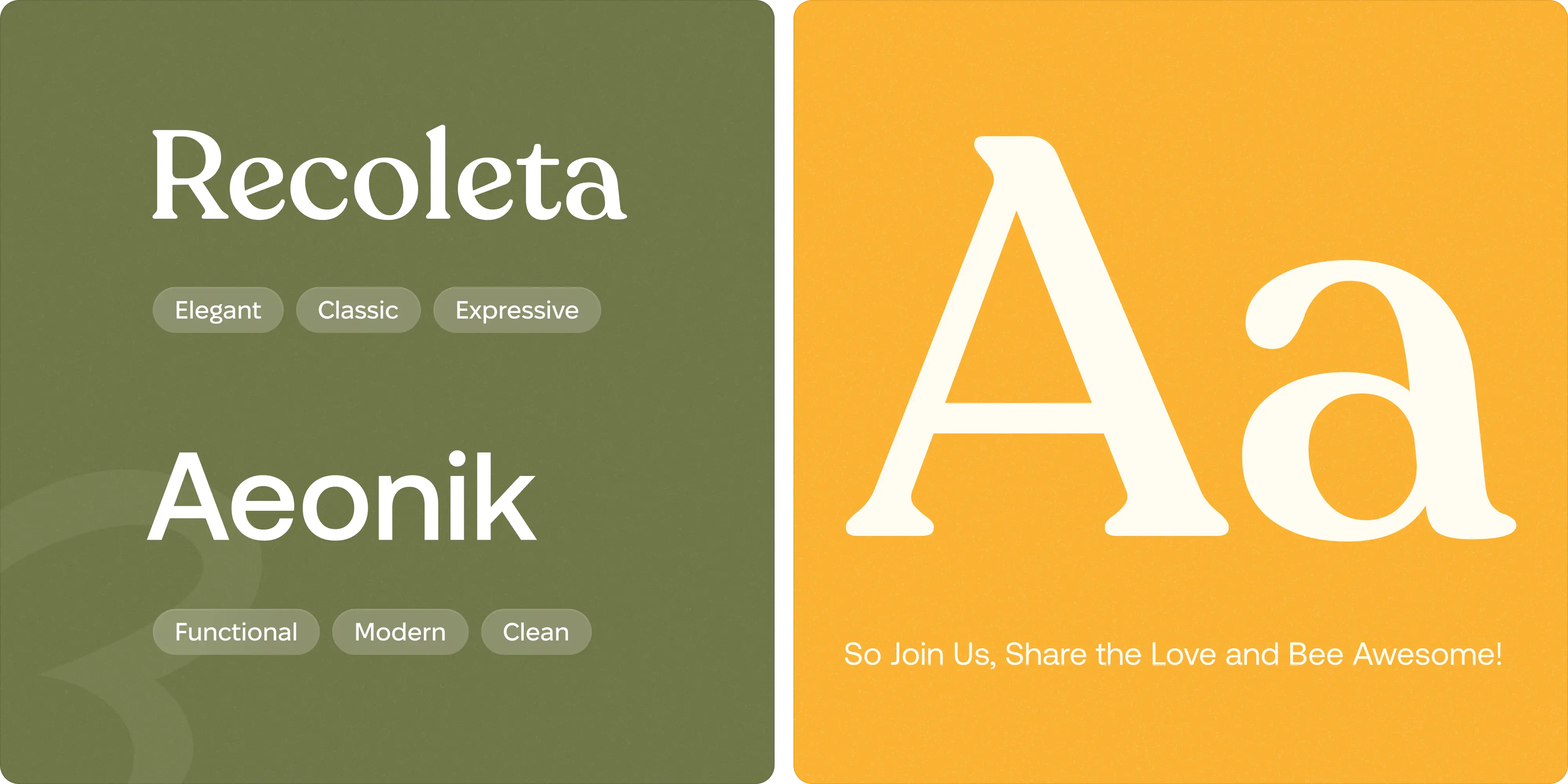
The choice of Recoleta and Aeonik as the primary typefaces for 4RBees is a thoughtful decision that reinforces the brand's identity and enhances user interaction. Recoleta, with its soft, rounded serifs and classic elegance, reflects the brand's warmth and authenticity, making it ideal for headlines and promotional materials. On the other hand, Aeonik offers a clean, modern contrast, perfect for body text across digital platforms due to its outstanding legibility and functional design. Together, these fonts are a combination of classic and modern, ensuring that the brand communicates effectively with a contemporary audience while maintaining a cohesive and appealing visual presence across all media.


In physical spaces, product packaging for items like honey jars, lip balms, and apparel adopts a minimalist design that highlights sustainability through the use of recyclable materials and organic inks. Additionally, promotional materials such as brochures, posters, and online ads leverage the soft, natural hues of the brand's color palette to create visuals that are both inviting and compelling, effectively communicating 4RBees' commitment to nature and quality.
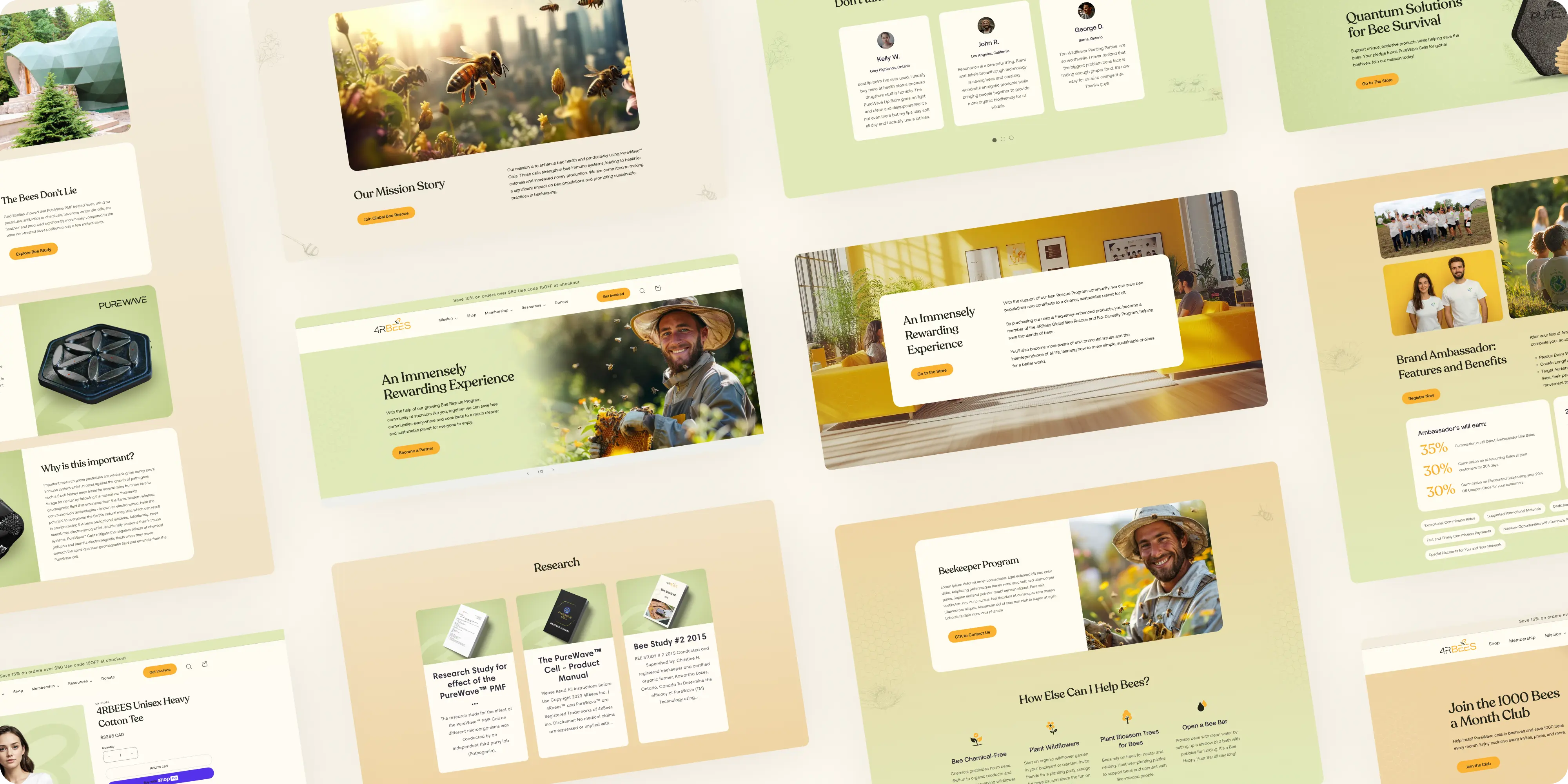

Brand Vision put great emphasis on an intuitive user interface (UI) and user experience (UX) that caters to a diverse audience. The layout is strategically clean and uncluttered, with large, high-quality images that capture the essence of the brand—highlighting beekeepers at work and the natural environments that sustain bee populations. This visual strategy not only engages users but also educates them on the importance of sustainability in beekeeping.


The website is optimized for various screens, ensuring that whether a visitor accesses the site from a desktop, tablet, or smartphone, the experience remains consistent and functional. Responsive design elements adjust seamlessly to different resolutions and aspect ratios. Navigation is designed to be intuitive, with clearly labeled menus and interactive elements that are easy to tap or click, enhancing the UX for all users.
.webp)


.avif)
.avif)
Our goal is to nurture your vision and provide innovative, custom solutions for all your marketing needs.