.webp)


.webp)


.avif)
60 Bloor St W, Suite 401,
Toronto, ON M4W 3B8
Toronto, ON M4W 3B8
Get Directions

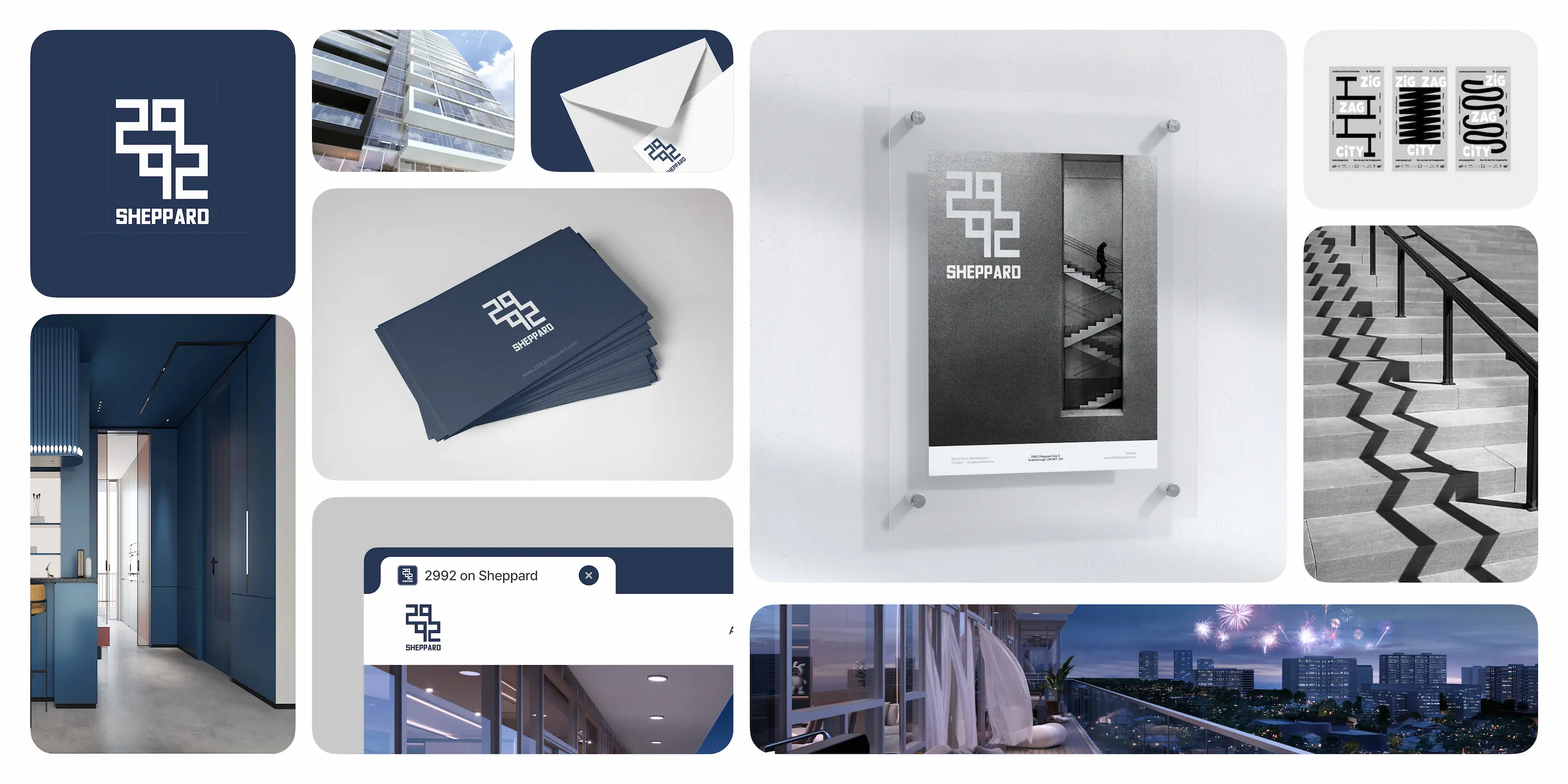
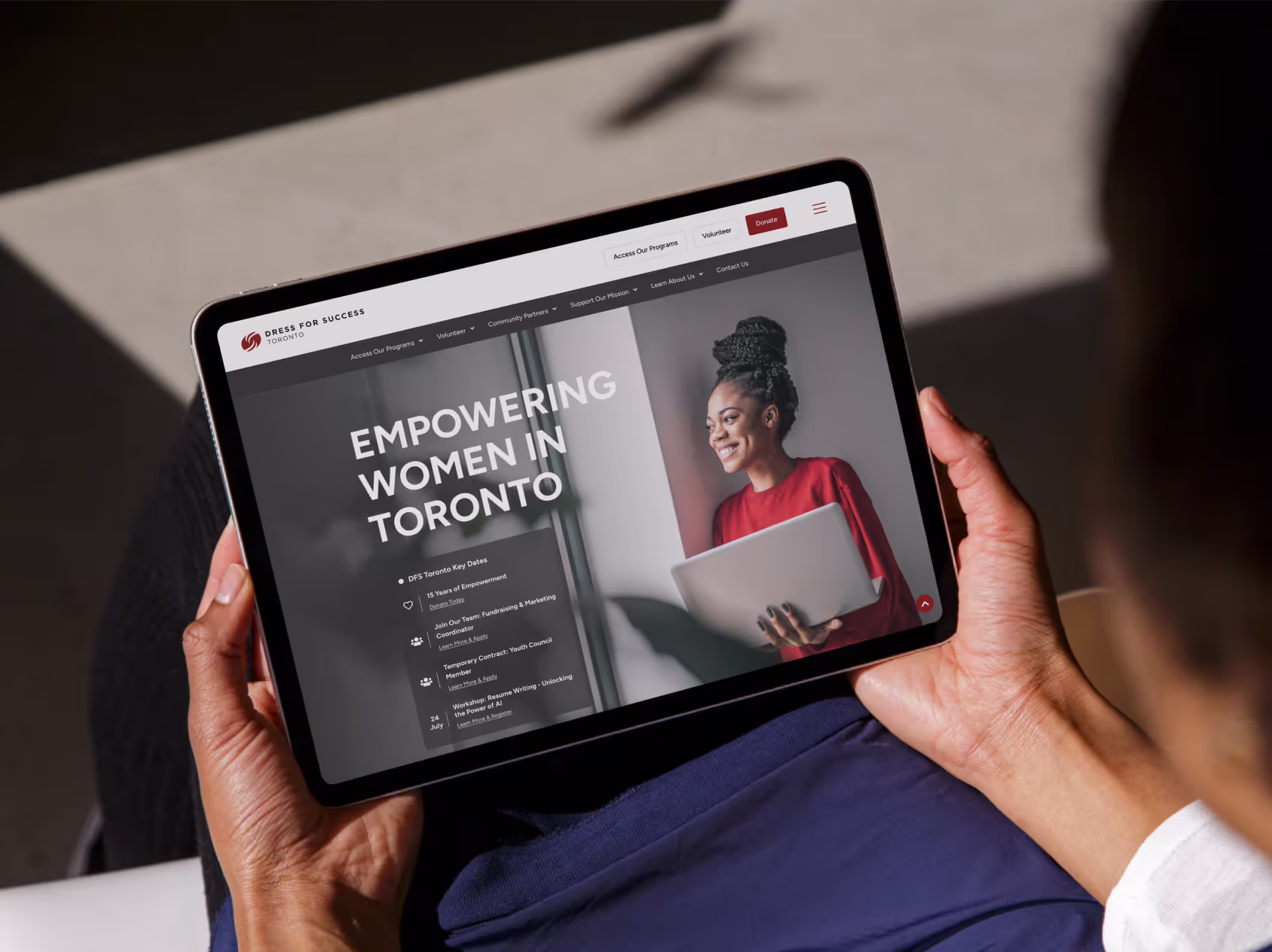
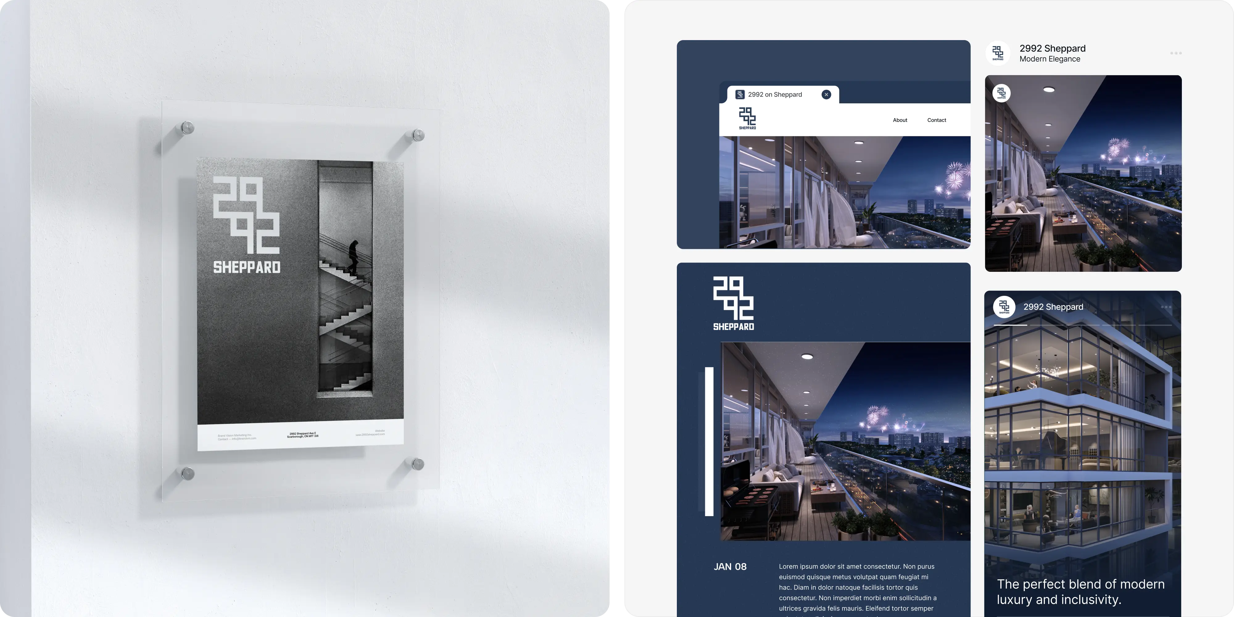
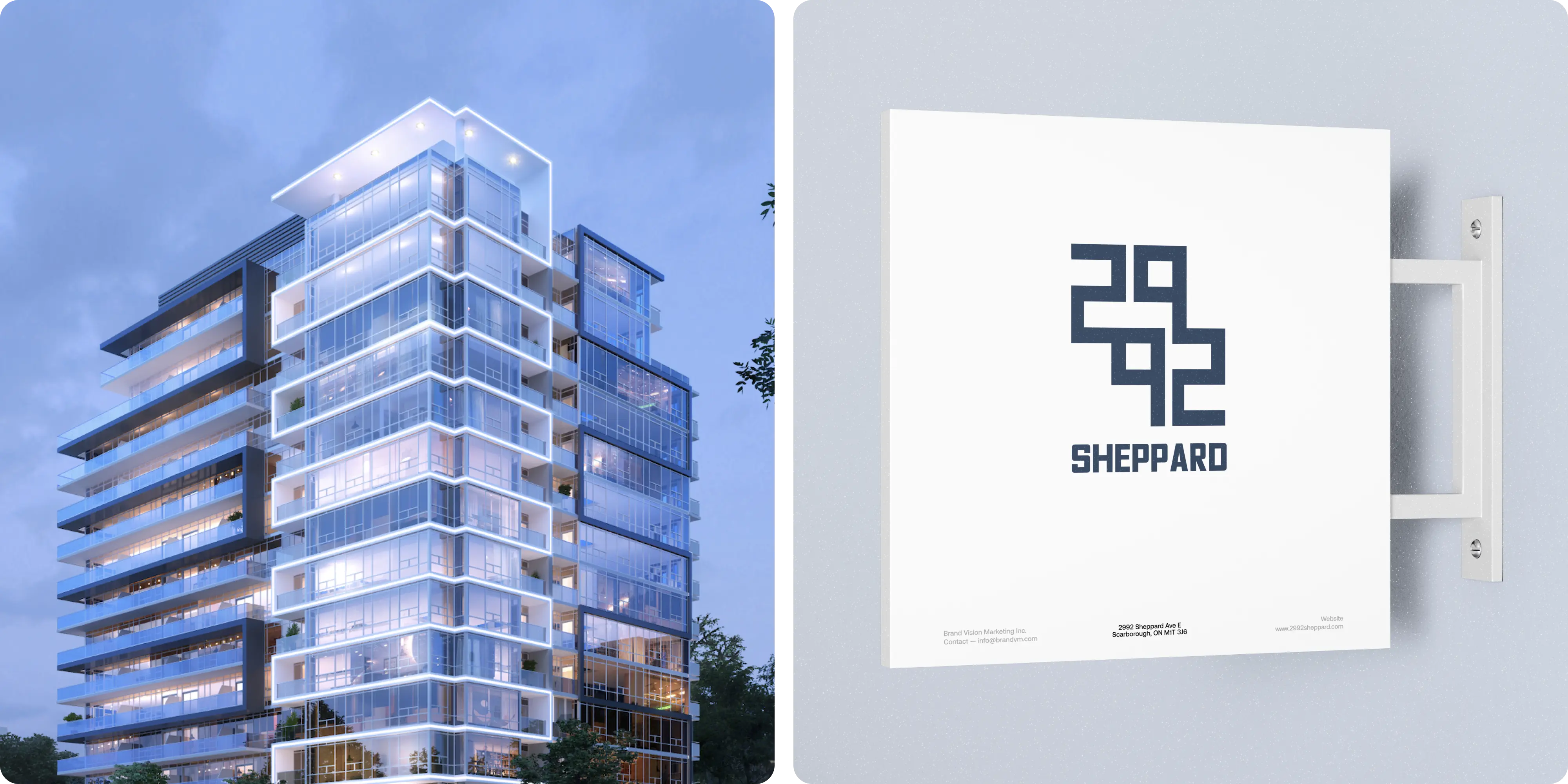
A 15‑storey, 158‑suite condominium steps from Fairview Mall and major corridors (401/404/407), within walking distance of the proposed Sheppard LRT/subway extension. We built a place‑specific brand and pre‑leasing toolkit that sells proximity, convenience, and everyday livability—without over‑promising.
To craft a distinctive brand for 2992 Sheppard that goes beyond a logo—capturing the upscale identity of this Toronto development.
Pre‑construction marketing in a competitive North York corridor must speak to multiple audiences buyers seeking value and connectivity, brokers needing facts and assets, and investors scanning fundamentals while staying precise about transit timelines. We also needed a brand that looks premium yet approachable, and collateral that complies with signage rules and scales across digital and street‑level placements.
We began with discovery and market scans to anchor the story in real, local advantages: Fairview Mall access, nearby schools/parks, and highway connectivity. From there, we shaped a component‑driven branding and web design system: a modern visual identity, clear messaging, and modular collateral that works from brochures to hoarding. We produced renderings and photography, built UI/UX patterns for a pre‑leasing page, aligned light SEO fundamentals, and equipped the sales team with templates, a broker pack, and a publishing checklist. Advisory‑first marketing consultation kept the funnel tight from interest to registration.
The development now has a cohesive, place‑aware brand that’s easy to deploy across digital and on‑site media. Registration flows are simpler, assets are consistent, and the team has what they need to market effectively before shovels hit the ground. Brand Vision was the right partner because we combine real‑estate branding craft with executional rigor blending branding, web design, UI/UX, pragmatic SEO, and marketing consultation to deliver a maintainable system not just pretty mockups.

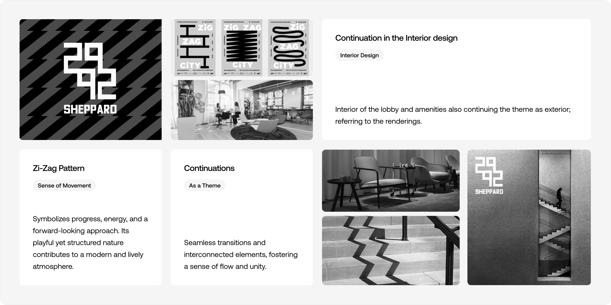
The logo was inspired from the "zigzag" pattern thats portrait on the building across the stories.
.png)
Delft Blue was chosen as the main color for the 2992 Sheppard brand because as it adds sophistication and timeless charm, perfectly reflecting our theme of "Elegance For All — Modern Community Living.
.png)
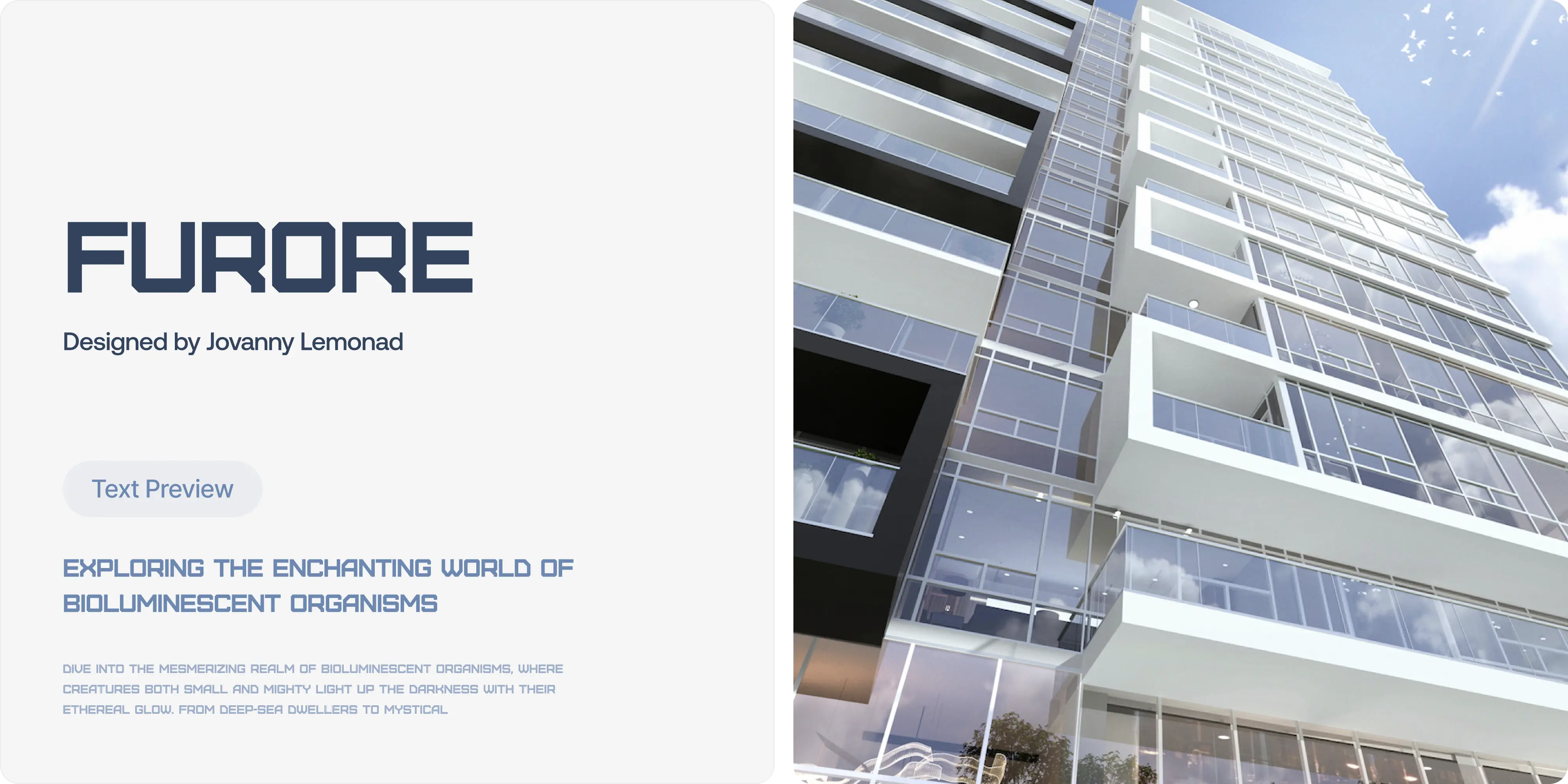
The font "Furore" was chosen because it compliments the design of the logo while keeping a modern, playful and timeless feel.


.webp)


.avif)
Our goal is to nurture your vision and provide innovative, custom solutions for all your marketing needs.