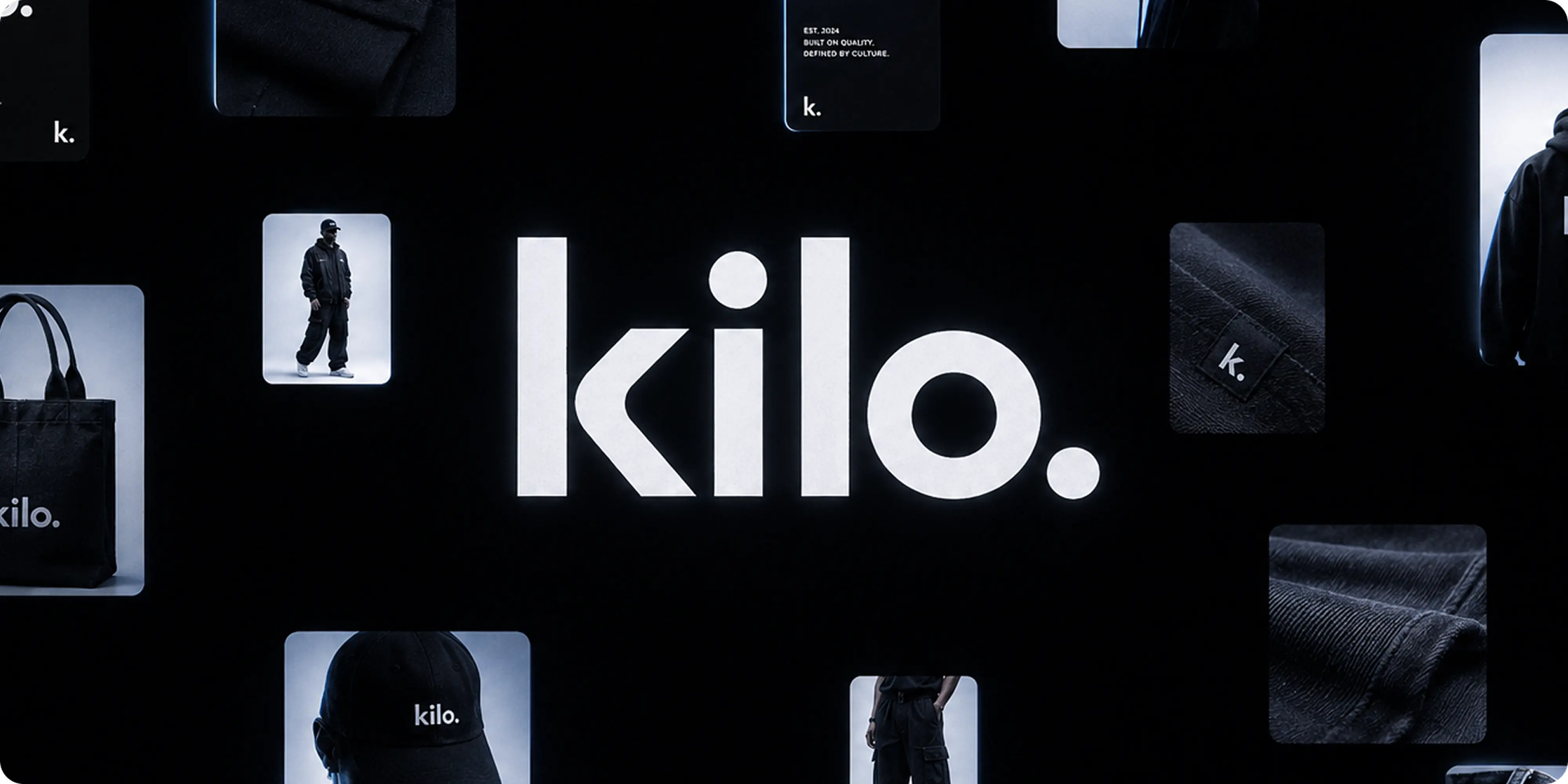
A complete streetwear brand, from the name through to the woven label, the packaging, and the store it sells through.
KILO is a US streetwear label built on restraint. We developed the name, the logo mark and identity, the merchandising and packaging system, and the WooCommerce storefront it sells through.
Project Highlights
- Naming and positioning: a short, weight-derived name that signals substance without describing a product category, leaving room for the range to grow.
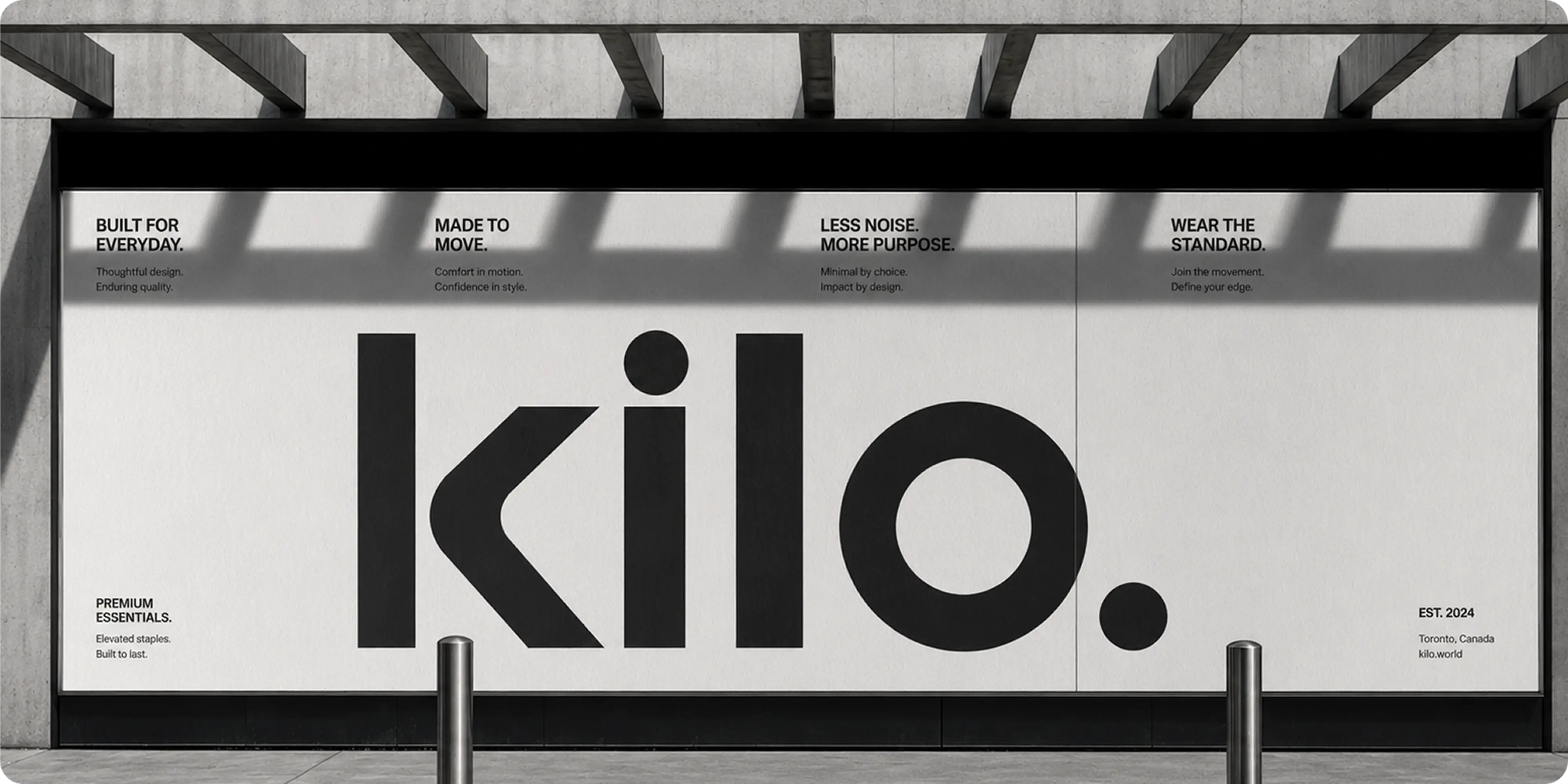
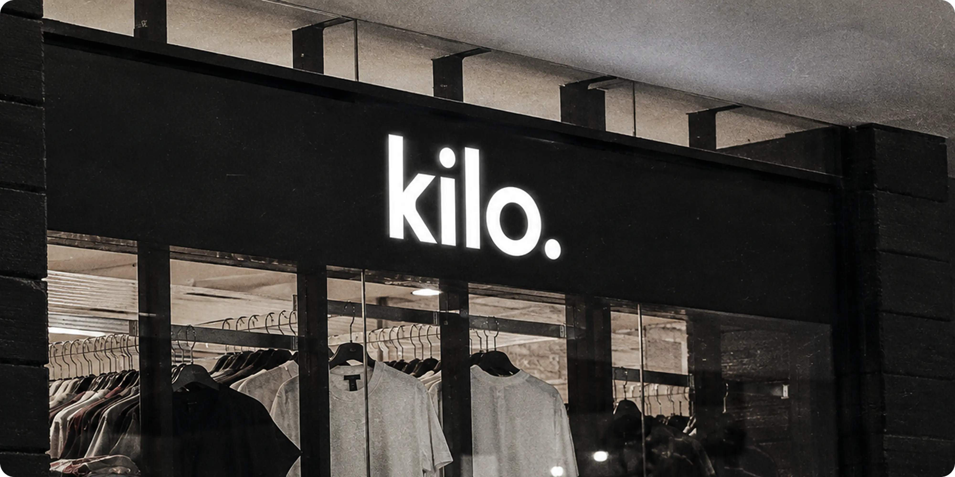
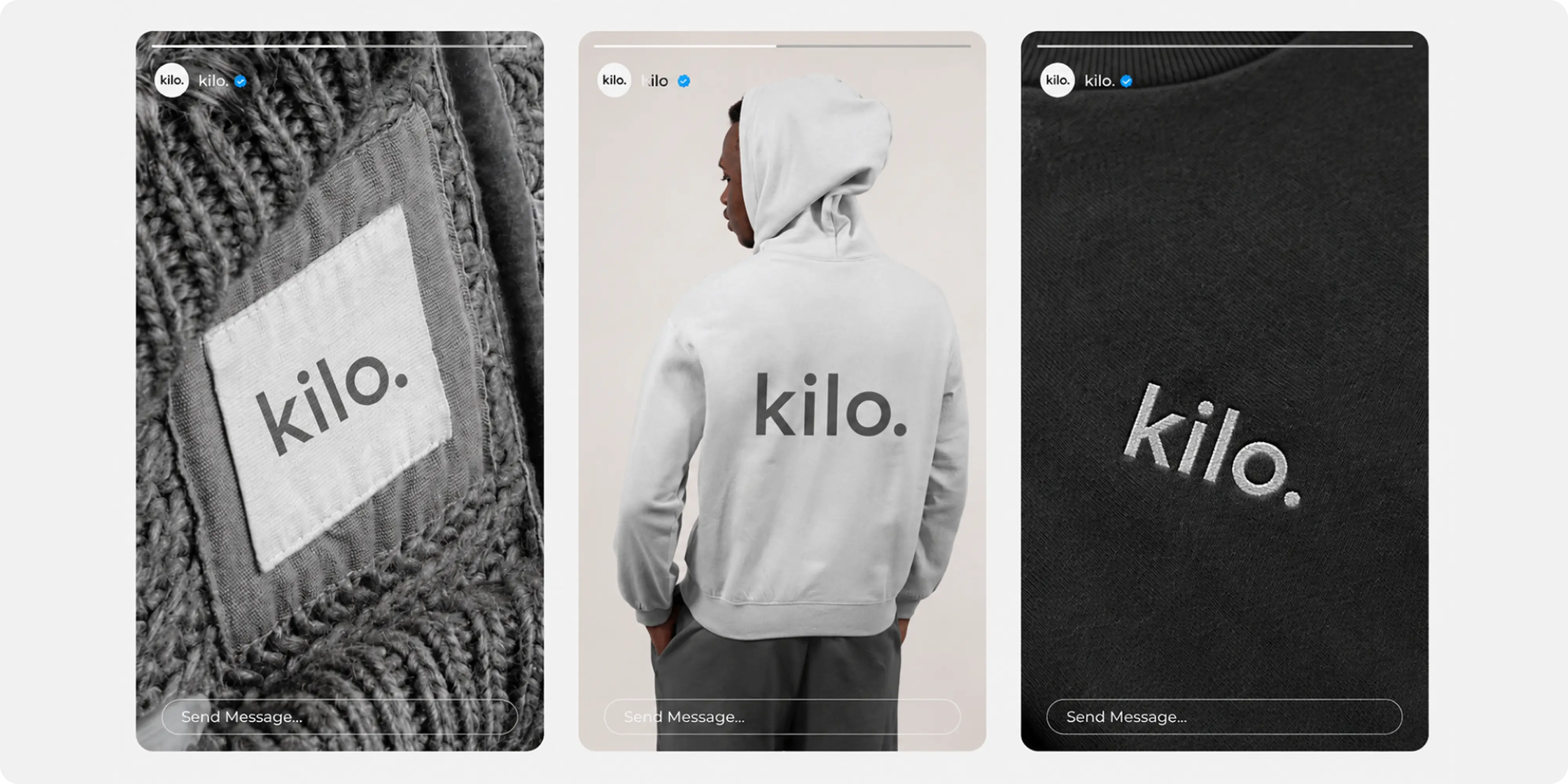
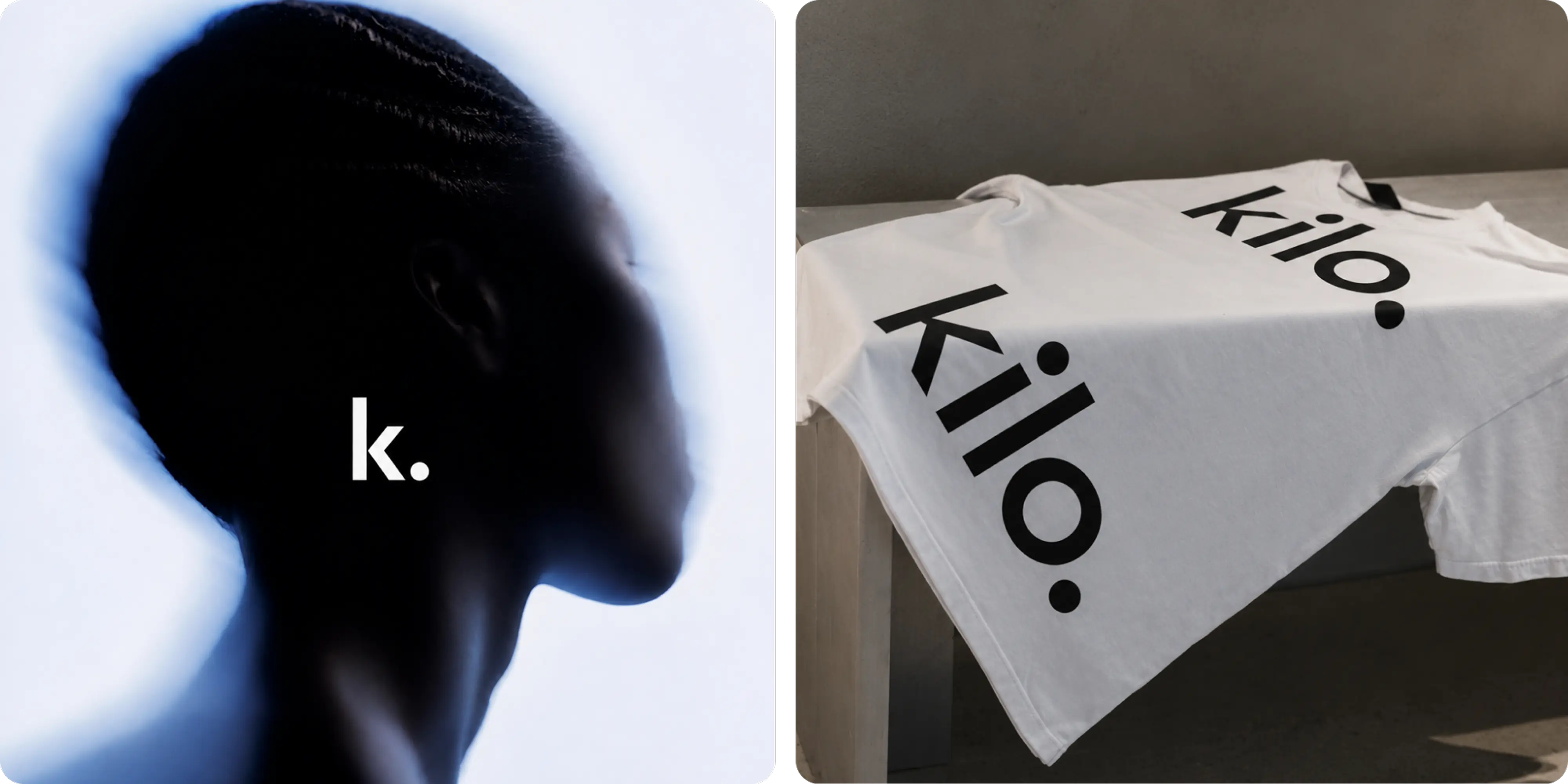
- Logo mark and identity: a lowercase wordmark with a full stop, drawn to read at the scale of a woven neck label and the scale of a storefront sign.
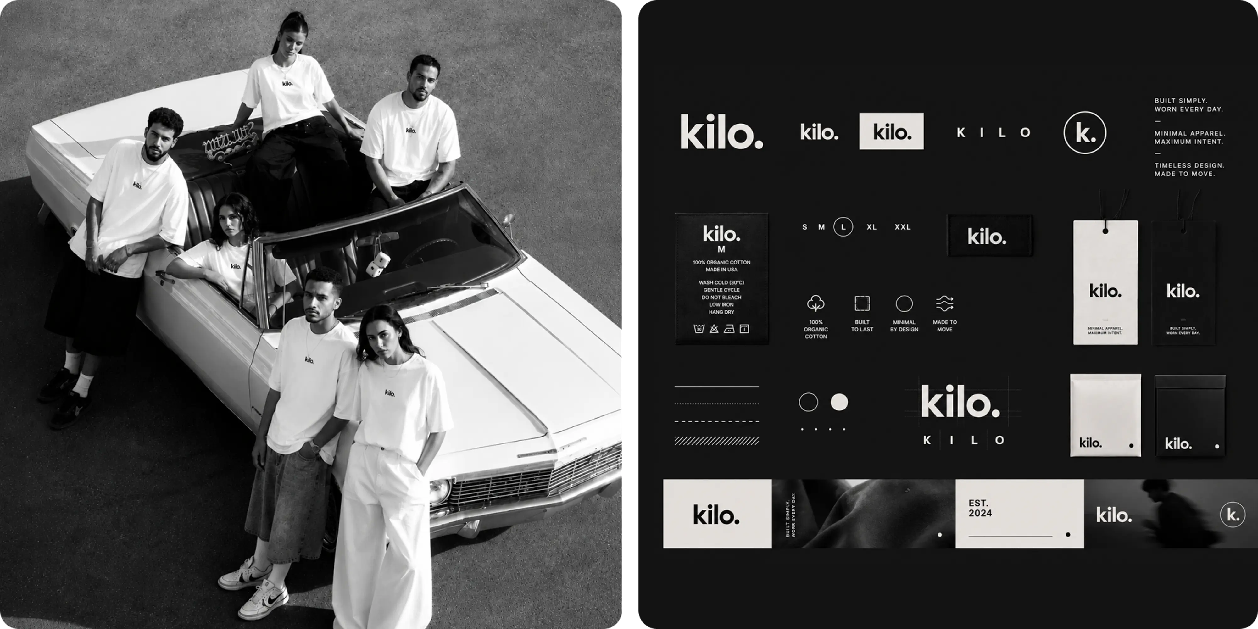
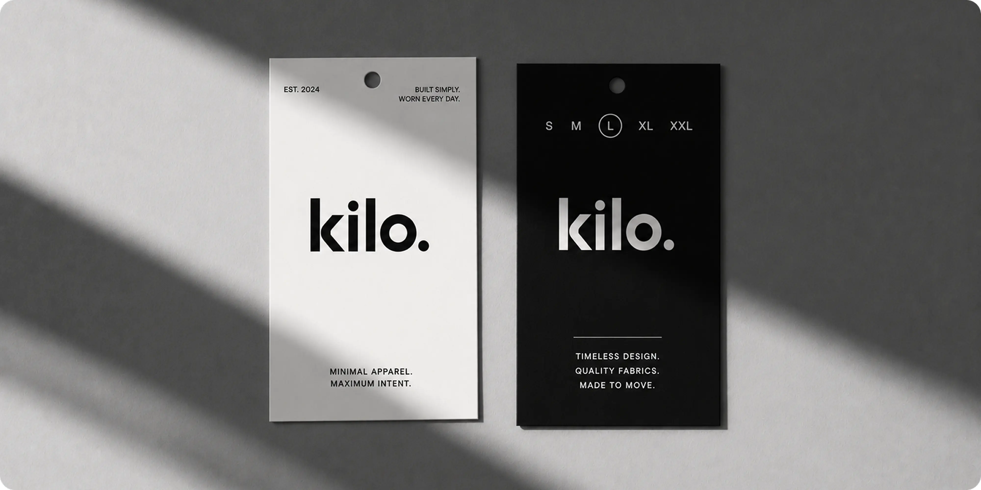
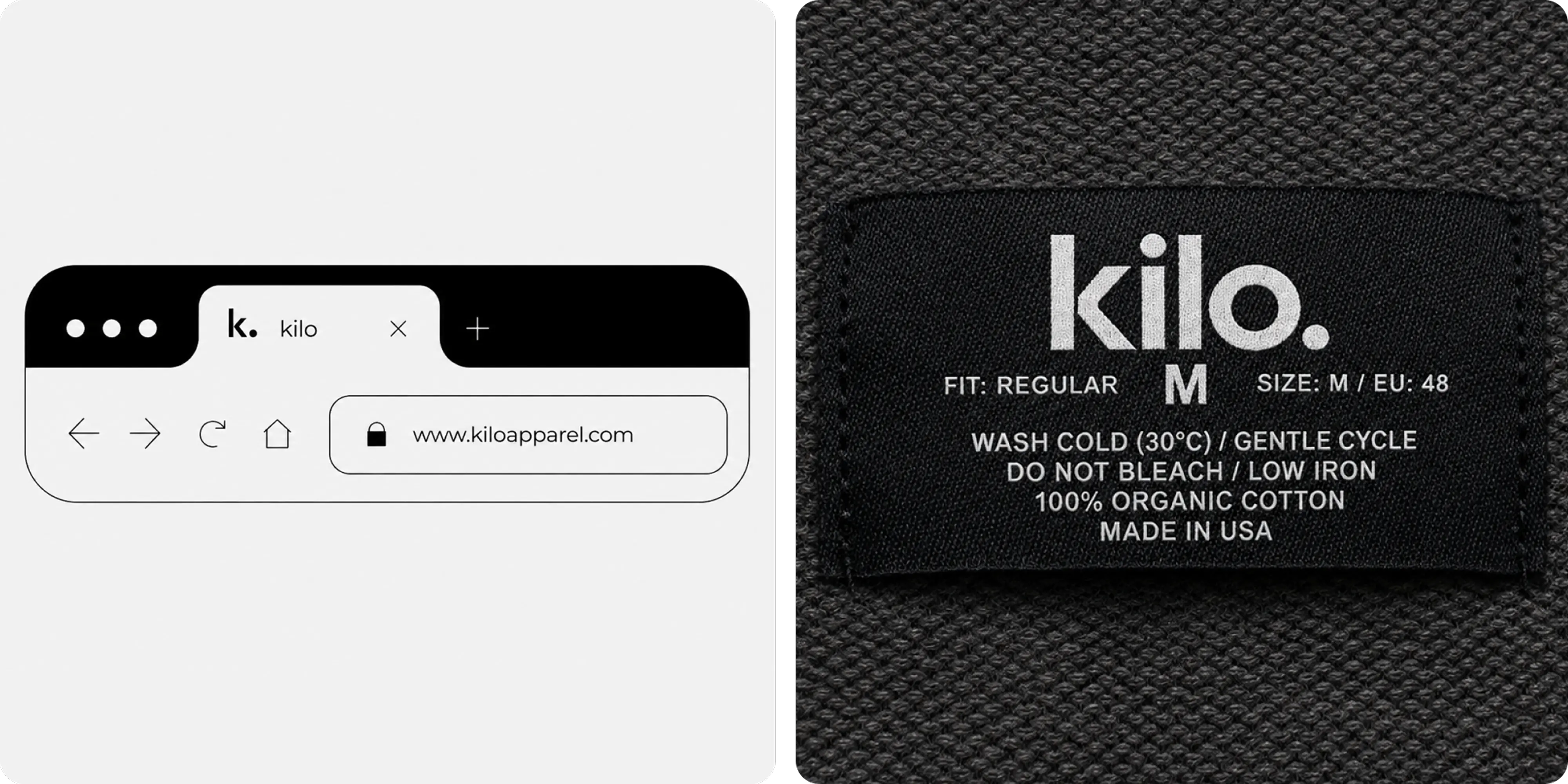
- Merchandising and labeling: care labels, size tags, neck labels and hang tags designed as part of the identity, since these are the pieces a customer handles before buying.
- Packaging: boxes, mailers and folded-garment presentation treated as a continuation of the product rather than a shipping cost.
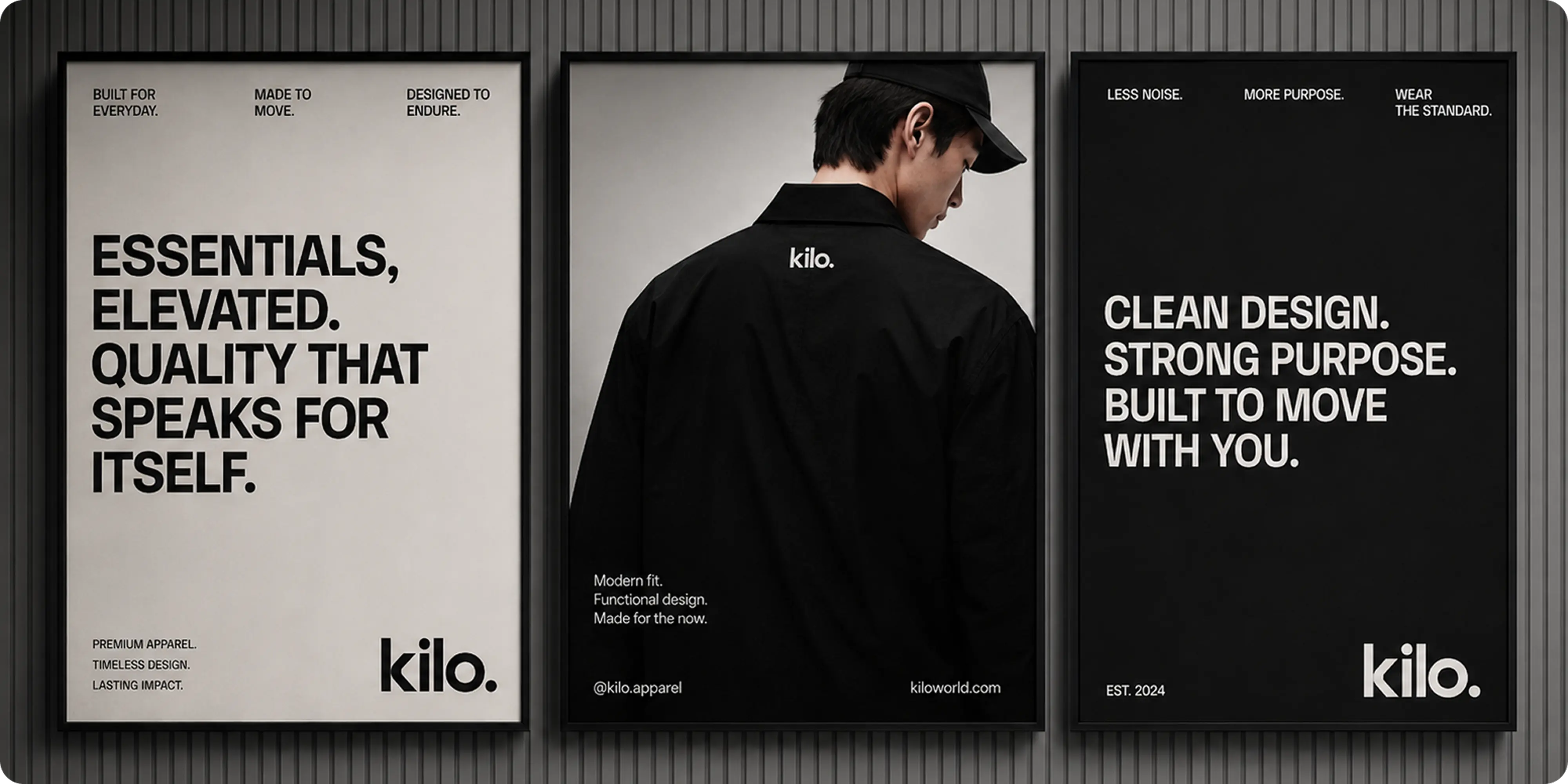
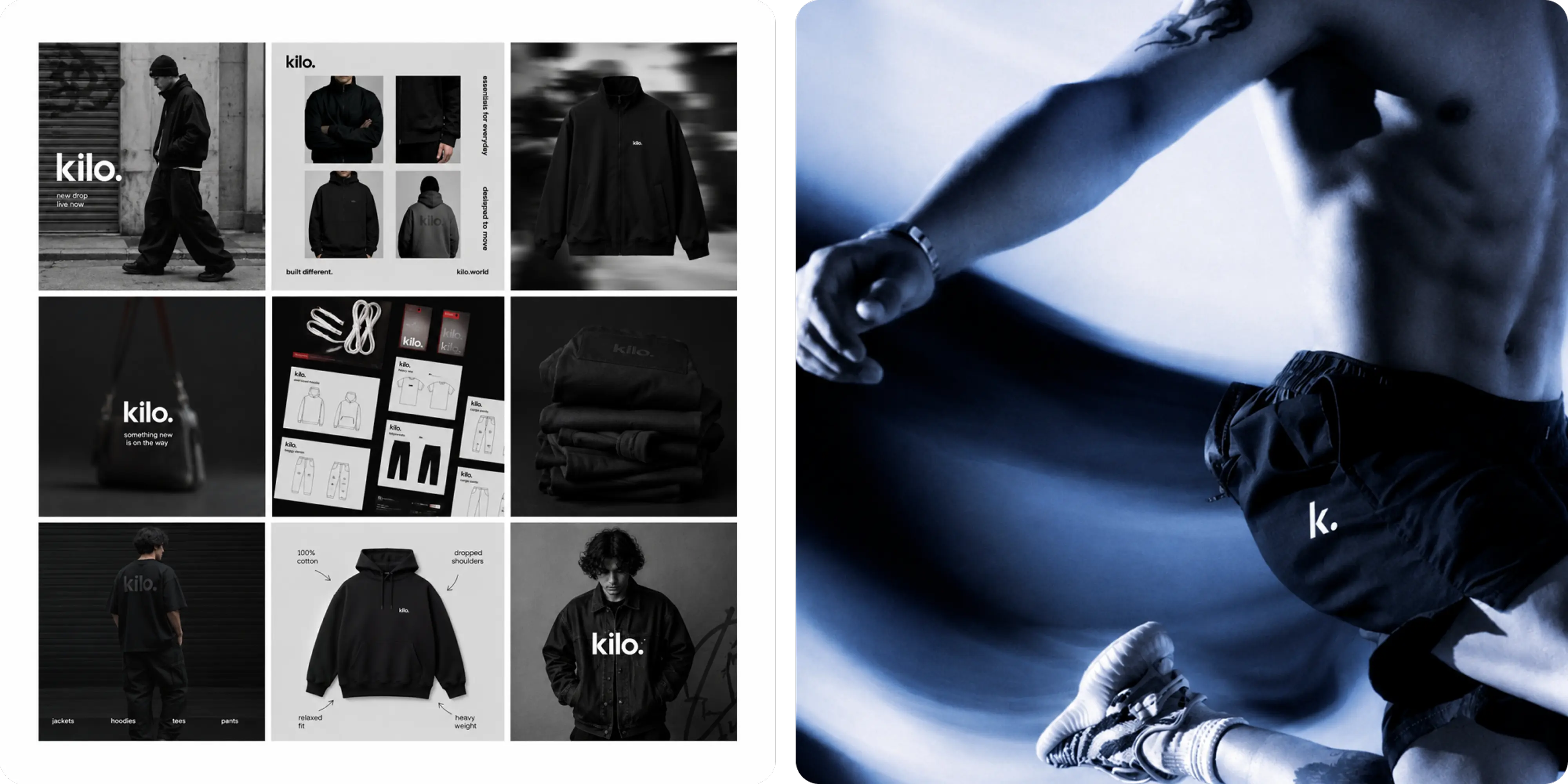
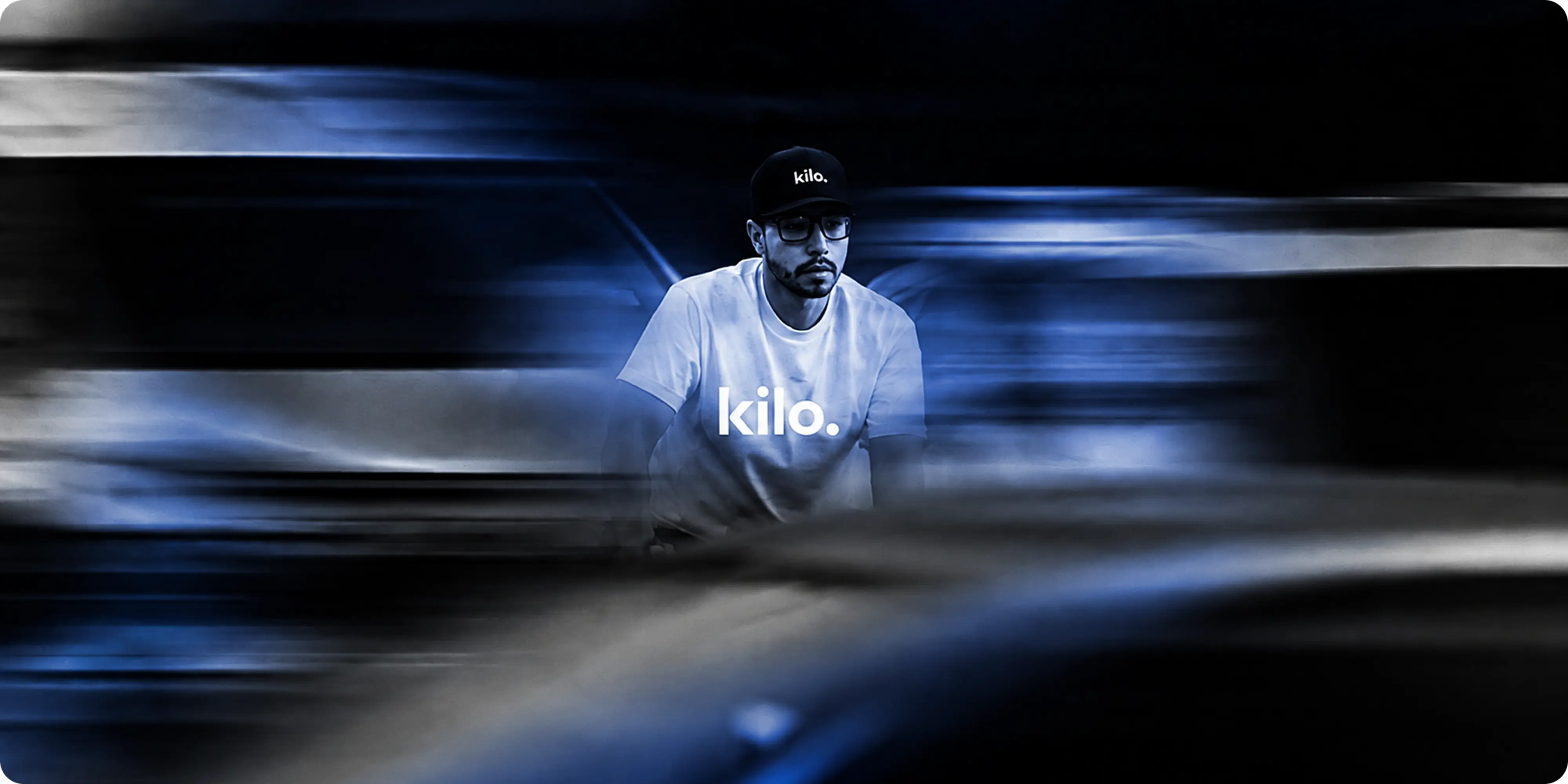
- Brand visuals: typographic poster layouts, campaign treatments and store signage that hold the same restraint at every size.
- WooCommerce storefront: a full WordPress and WooCommerce build covering product detail, fit information, and lookbook presentation.
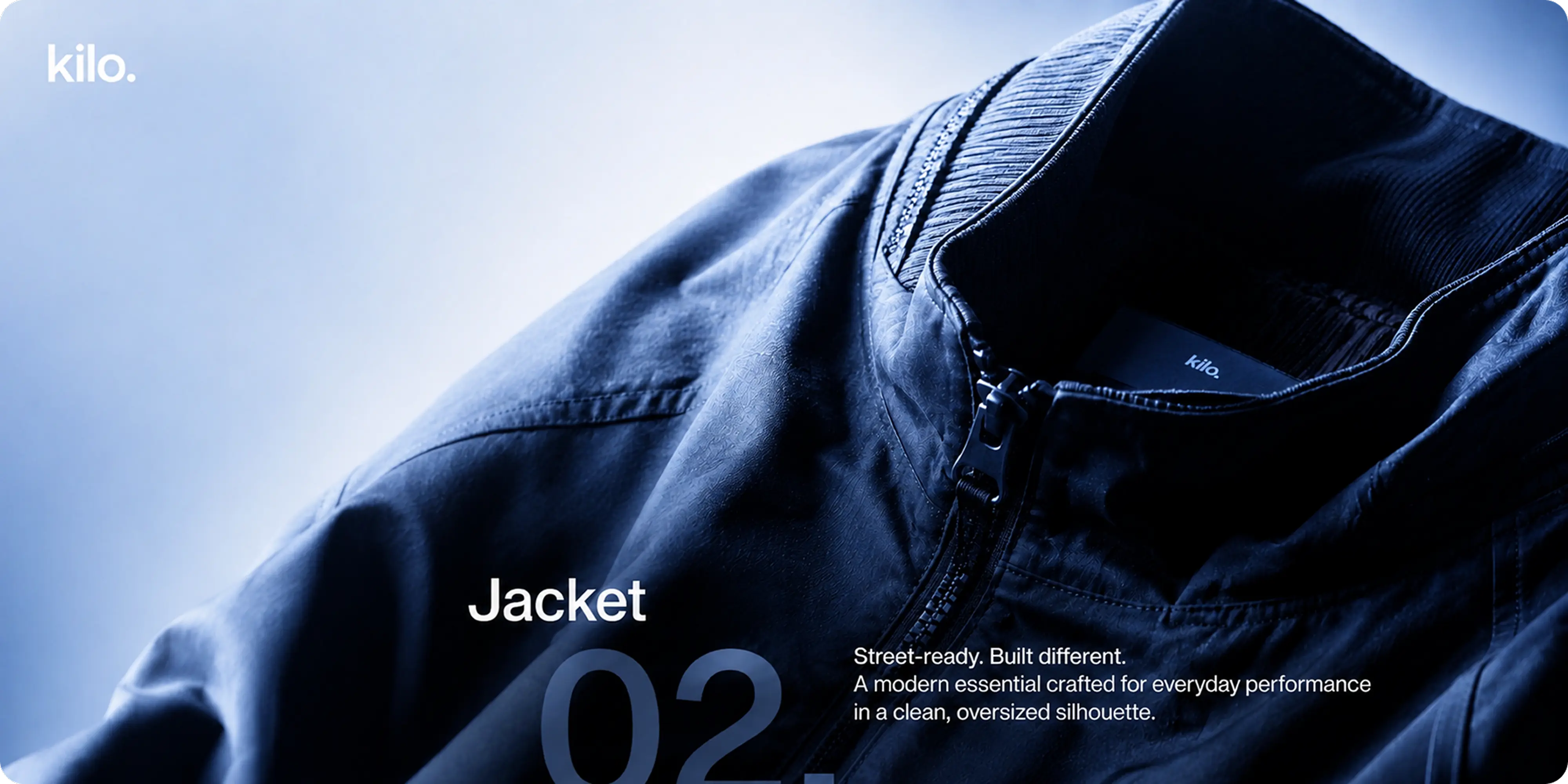
- Product presentation: photography and copy structured around construction and fit, the things this category actually competes on.
Challenges
Streetwear is one of the most crowded positions in apparel, and most of it competes on drops and logo size rather than on the garment. Leaning on either one puts a new label into a fight it cannot win against brands with a decade of hype behind them.
The category also has a credibility problem online. Streetwear buyers decide on the parts they cannot see through a screen, the weight of the cotton, the cut of the shoulder, the way a print holds after washing. The brand had to make that argument through the pieces a customer physically handles, and the storefront had to make it without the garment in hand.
Approach
We built the name first. KILO carries weight and measurement, which links the brand to material quality without ever naming a product, and it works as a spoken word and as a mark of four characters.
The logo mark is deliberately quiet, but the detail is where the work sits. The lowercase wordmark and its full stop were drawn to survive being woven into a neck label at a few millimeters and blown up across a storefront. From there we designed the merchandising and labeling system as a first-class part of the branding rather than a compliance requirement, because the hang tag and care label are what a customer inspects in the seconds before deciding.
Packaging extended the same logic to delivery, treating the box and the folded garment inside it as part of the product. The WooCommerce build then carried the fit and fabric detail the category actually competes on, with lookbook and product photography given room to show construction rather than styling.
Outcomes
KILO holds together from the woven label to the storefront sign. The restraint reads as a decision rather than a shortcut, because the detail work in the merchandising, packaging and typography gives it something to be restrained about.
The system scales across a growing range without redrawing itself, and the storefront presents fit and fabric with the same care as the campaign photography.


.webp)









.webp)







.webp)





.webp)



.webp)


.avif)










.png)