
.webp)















Branding
B2B Branding Strategy: Positioning, Proof and Buying-Committee Trust
Sep 6, 2026
/ By Hamoun Ani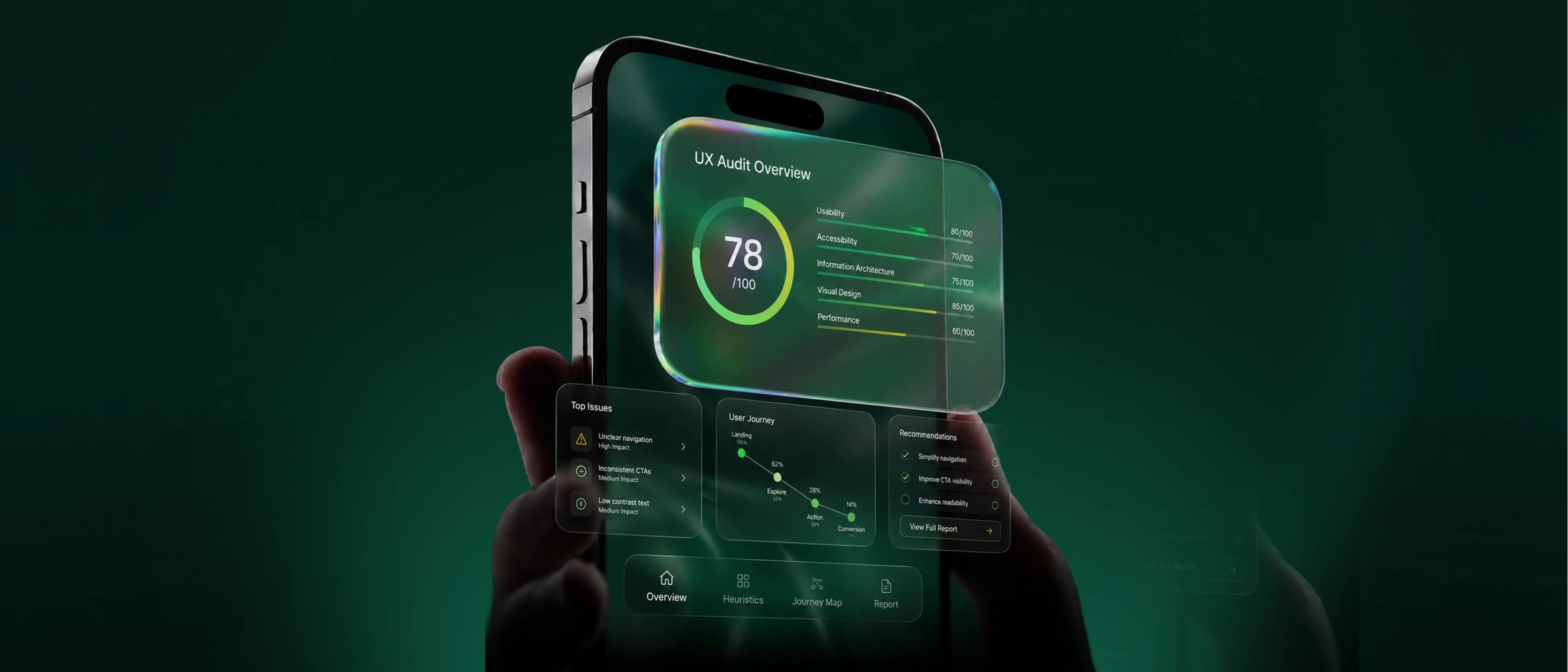
An evidence-first approach to UX audit services, delivered as findings a team can act on immediately.
Brand Vision has over a decade of experience in UX design and research, and an audit compresses that expertise into judgment. Anyone can list a hundred issues on a live product. Knowing which ones cost real money is the harder skill. Our UX audit services score each finding by business impact, so the fix list opens with what matters most.

Building real partnerships with top global brands. Delivering results that last well beyond the launch.















UX audit services covering how a product performs, who it excludes, and where it loses people.
Brand Vision runs the accessibility audit for teams under real pressure, whether a complaint has arrived or a contract requires proof. We test the product with screen readers and keyboard navigation, then review contrast and structure against recognized standards. Every barrier is documented with the criterion it breaches and the severity of the exclusion. Our UX audit services deliver the findings in an order engineering can work through, so the product removes barriers each sprint instead of waiting on a rebuild.
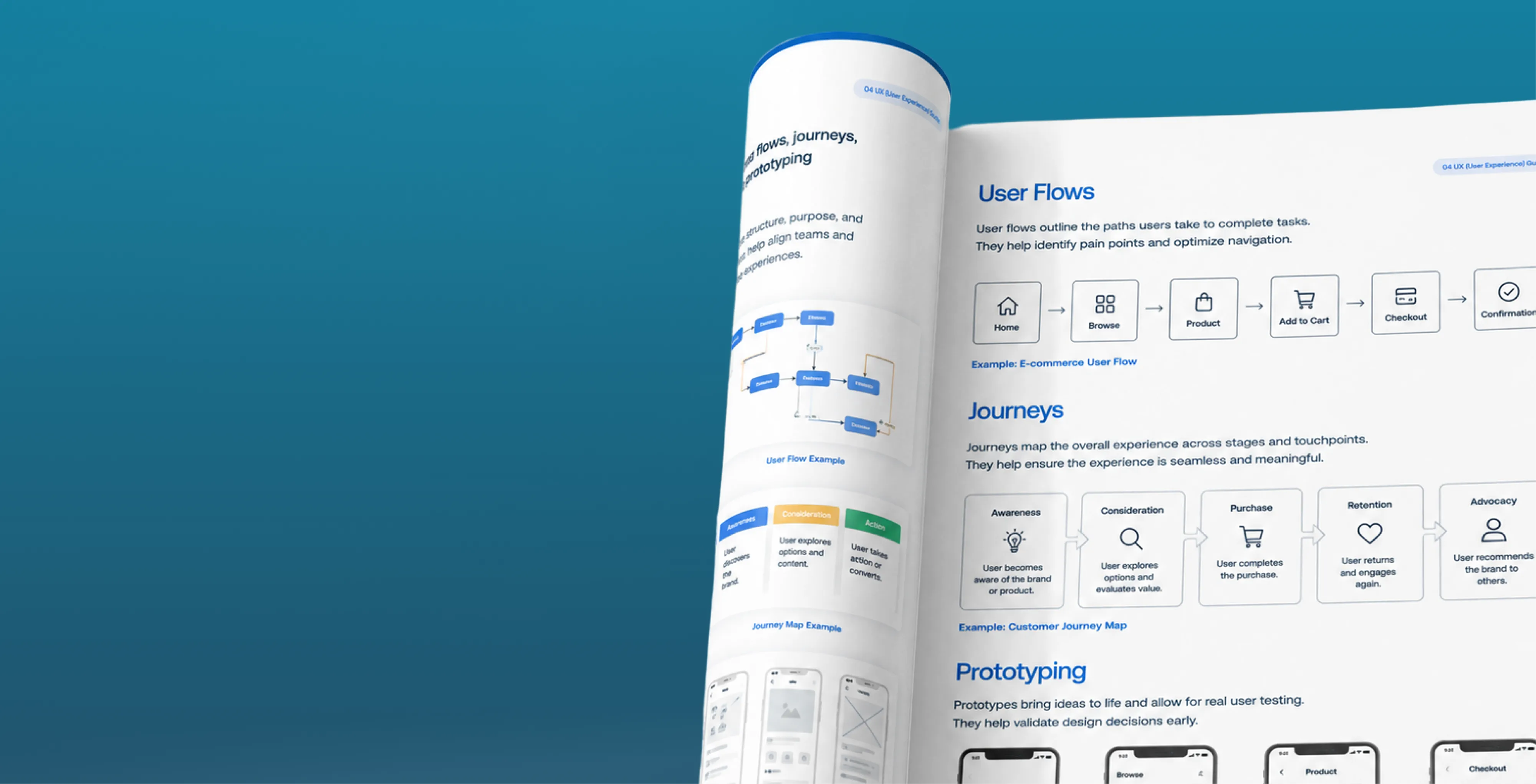
Brand Vision reviews the journeys that carry revenue, from landing to the completed action. We walk each step as a first-time user, then compare what we find against the session data. The findings name the screens costing the most completions and explain why. Our UX audit services keep this work grounded in the experience itself, so the recommendations make the product easier to use, which is what makes more visitors finish.
Our UX audit agency opens the analytics review by verifying the measurement itself, because decisions made on broken tracking are worse than decisions made on none. Once the data can be trusted, we map how visitors move through the product and where the recorded activity contradicts what the design intended. Every anomaly gets investigated to a cause. It is the plainest work inside our UX audit services and often the fastest route to the biggest finding.

Heuristic evaluation reviews a product against the established principles of usable design. Brand Vision has senior reviewers walk the core journeys independently, scoring each screen against those principles and documenting every violation with a capture and a severity rating. The method finds the problems users feel but rarely report. Our UX audit services use it as the fastest first pass, because it needs no recruitment and returns findings within days.

UX benchmarking measures the product against the competitors a customer would compare it with. Brand Vision scores the same tasks across each one, recording how long each task takes and how often users complete it, so the comparison rests on numbers instead of impressions. The result shows where the product leads its category and where it trails. Our UX audit services repeat the benchmark after changes ship, which turns a one-time score into a measure of progress.
From scope to a ranked fix list your team can act on.
We align on goals, study the audience and competitors, and audit what's already there. Research and analytics shape the sitemap, the content priorities, and the standards the finished site has to meet.
We turn strategy into page models, components, and responsive layouts. Interactive prototypes put the design in context, so the decisions that matter get made early, before anything is built in code.
We build on a clean, well-structured CMS and implement the design system, with accessibility, performance, and analytics handled from the first line rather than bolted on at the end.
We run full QA, set up redirects, and prepare a clear handover, then map the first round of improvements so the site continues to earn its place well after go-live.
Recent UX audit services completed for product teams and established businesses in a range of industries.
What an audit checks first depends on the category. An ecommerce product gets audited where money leaks, at the cart and the checkout, while a healthcare product gets audited where exclusion costs most, in accessibility and comprehension. Our UX audit services weigh the review toward the risk that rules the category.












Product depth shouldn’t slow the story down. We partner with SaaS, platform, and enterprise software teams to translate technical capability into focused narratives. Clear paths to demo, trial, or contact serve both buyers and technical evaluators. Systems are built for product-led growth with composable components, editor guardrails, and instrumented analytics that tie directly to pipeline.
Complex services sell on clarity, not volume. We help consulting, financial, and advisory firms structure their digital presence around buyer tasks: understanding capabilities, comparing options, and starting a brief. Every touchpoint earns trust through specificity and proof. Content is organized by audience need, so the people making the hiring decision find answers quickly and move to contact without friction.
Patients and practitioners make high-stakes decisions under pressure. We design trust-first experiences for healthcare and wellness brands, keeping clinical accuracy intact while making it simple for people to find the right provider, service, or next step. Accessibility, privacy-compliant forms, and plain-language content are standard. Local visibility for practices and clinics is built into the foundation, not bolted on later.
Prospective clients searching for legal help are often under pressure and comparing firms quickly. We help law firms present practice areas with credibility, surface the right contact paths, and build a digital presence that earns trust before the first conversation. Clear structure, plain language, attorney profiles, and consultation flows make it easy for people to take the next step with confidence. Ethical advertising compliance is built in from the start.
Buyers, investors, and project owners move on trust and timing. We work with brokerages, developers, general contractors, and property management firms to present listings, projects, and capabilities with clarity. Content is organized around what prospects actually need: proof of work, service scope, location context, and a direct path to inquire. Pre-construction launches and trade portfolios get the same strategic rigor as resale platforms.
Conversion lives in the details. We work with consumer and ecommerce brands to build fast, clear shopping experiences where product pages explain value quickly, checkout flows reduce friction, and the entire system scales with the catalog. Promotional templates, collection architecture, and performance monitoring keep the storefront sharp as demand and inventory shift with seasons. The result is a store your team can run day to day without developer dependency.
Early-stage companies need focus over flash. We help startups define positioning, build a credible identity, and launch a conversion-ready presence that clearly communicates what the product does, who it’s for, and how to get started. Everything is built to scale: component systems, content structures, and analytics foundations grow with the roadmap instead of needing a rebuild at Series A. The pitch and the website tell the same story.
Students, parents, and administrators all need different answers from the same site. We help schools, universities, and training organizations structure digital experiences by task: apply, visit, inquire, enroll. Accessible design and plain-language content serve diverse audiences without alienating any of them. A manageable CMS means internal teams keep program pages, event listings, and admissions information current without outside help or bottlenecks.
Nonprofits compete for attention, funding, and volunteers simultaneously. We build accessible digital experiences that make programs clear, donation paths intuitive, and calls to action specific enough to drive real participation and support. Content governance is designed for lean teams, so pages, campaigns, and impact reports stay current without bottlenecks. The organizations doing the most important work deserve a digital presence that matches their mission.
From restaurants to packaged goods, this industry sells on quality and convenience. We help food and beverage brands connect story with logistics: clear menus, product lines, ordering options, and wholesale paths that make it obvious how to buy and reorder. Identity and digital experience work in tandem so visitors see quality and know exactly what to do next, whether they’re a consumer walking in or a distributor placing a first order.
Audiences decide in seconds. We work with labels, venues, talent agencies, and event companies to build media-rich, performance-optimized experiences where the work is front and center. Booking, inquiry, and ticket paths stay visible and fast across devices. Campaign templates and component systems let teams launch content for new shows, releases, and events without starting from scratch each time. The creative comes first; the infrastructure stays invisible.
Guests research and book across multiple touchpoints. We help hotels, resorts, tourism brands, and event venues present their experience with clarity, connecting visual storytelling with practical booking flows, local discovery, and seasonal content that stays current. The systems we build make it straightforward for teams to update rates, packages, and promotions without depending on a developer for every change. The experience starts online, and it should feel as considered as the stay itself.














Original research and expert perspective on design, branding, and the strategy behind both.
Still have questions? Contact us to discuss.
A UX audit agency is hired to establish where an existing product loses people, work out which of those losses actually costs money, and hand back an order of work a team can start on Monday. Finding problems is the cheap half. Deciding which nine of eighty deserve a quarter of your calendar is the half you are paying for.
In plain terms, somebody sits with your product the way a stranger would. They walk the paths where your revenue happens, hold the interface against usability principles the field settled decades ago, read the behavioural data you already own to see how many people meet each fault, and then throw most of it away. What survives gets a severity, an effort estimate, a value estimate and a place in a sequence.
The daily work looks like this.
Why this work comes to us. Brand Vision started in 2018. More than 500 projects across roughly 150 brands have gone through it since, so most of what we find is a pattern we have met before and can price quickly. On the independent side, Clutch shows a 5.0 built out of 64 or more interviews with clients, conducted by people who do not work here, and the design shelf holds four Awwwards, a Webby, and RGD and CGD certification for the practitioners. Past programs here have raised client lead volume by 250% on average. Treat that as history and never as a forecast, since it covers programs starting from wildly unlike positions and none of them was yours. The people who write the report are the same ones who would implement it, which is why findings here read as specifications and not suggestions. Reading a funnel, running a walkthrough and judging accessibility call for three unrelated skills, so the roles we recruit for are mixed on purpose, and the Toronto studio keeps those seats beside one another.
Paying for the diagnosis puts you under no obligation to buy the repair from us.
Nine reviews, and each one is only worth what it is worth because it gets read against the other eight. A confusing label on a page nobody visits and the same label inside your checkout are one finding and two completely different decisions.
Two boundaries. This is expert review of a product that already exists, so where the real question is what people want or why they behave as they do, that is UX research and a different purchase. And where the finding is that a flow needs rebuilding instead of repairing, that becomes interaction design work with a scope of its own.
Three of the nine is a real and cheaper engagement. On plenty of products the honest answer is the funnel, the checkout and the phone.
A heuristic evaluation is an expert walking your interface against a fixed set of usability principles and recording every place it breaks one. It is the quickest diagnostic in this discipline, it costs the least, and it is the one most often oversold.
The principles are decades old and they have held up well. Whether the system tells you what it is doing. Whether it speaks your language and not the company's. Whether a mistake can be undone cheaply. Whether the same action looks the same everywhere it appears. Whether people can choose from what is visible instead of remembering something they were told two screens ago. Whether the design stops the error before it happens at all. An evaluator holds every screen against that list and writes down each violation with a severity beside it.
What the method genuinely buys you is coverage and speed. One reviewer gets through a whole product in days, catches the large majority of obvious faults, and produces something a team can begin fixing the same week. Two or three reviewers working separately catch considerably more than one alone, because evaluators miss different things, and the overlap between them is a rough signal of how serious a given problem is.
Now the limits, since this is where the technique gets misrepresented.
Which is why it never runs on its own here. It runs against your behavioural data, against the walkthroughs, and against a read of what your category has already standardized, because a pattern that violates a principle in the abstract can still be the pattern every buyer of software has spent five years learning. Breaking a convention is occasionally differentiation and more usually a tax, and telling those two apart is closer to category research than to any checklist.
Four audits get sold into the same moment of worry, they answer four different questions, and picking the wrong one is how most diagnostic budgets get wasted. Each of them opens your analytics, each of them will flag a slow page, and a customer experiences none of these divisions, which is precisely why buyers confuse them.
The search audit asks whether people can find you and pick you before the click. Indexing, coverage, site architecture, authority, demand, competitors, and what assistants say about your category when somebody asks. Buy it when search visibility is dropping, or never appeared at all, or trails whoever you compete with. That is an SEO audit, and it stops the moment a person lands.
The website audit is wide and shallow by design. It reads the whole property as a commercial asset. Whether the page delivers what the ad promised, how it loads on an average phone, whether navigation makes sense, whether the reassurance a wavering buyer looks for is on screen at the moment they waver, and whether the numbers can be trusted at all. Buy it when you cannot yet point at where the loss occurs, and it sits inside a wide read of the whole property.
The usability audit is narrow and deep. It follows the small number of paths your revenue depends on, one step at a time, from first screen to confirmation, and puts a severity on every place a reasonable person would give up. Buy it when people are clearly arriving and almost nobody finishes anything.
The marketing audit sits above all three. Wider again, it asks whether the plan holds together across audience, message, offer, channel mix and measurement. Its typical case is a company where each channel looks acceptable on its own dashboard and the business as a whole has not grown in a year, and that is a marketing audit.
A rough self-check, usually enough on a first call. Cannot be found, start with search. Found, and people leave without acting, start here. Found, converting, and the business not growing, then the problem is strategic and sits above all four.
The honest complication is overlap. A real share of what turns up in a usability review is a performance or a search fault wearing a design costume, and we hand those over instead of claiming them. We have also finished week two of this work and told a client the screens were fine and the audience arriving was wrong, which moved part of their budget to a team we do not sit in. So the brief gets written around the question you walked in with, and not around whichever service name it happens to resemble.
This is a fixed-price piece of work with an end date on it, never a monthly retainer, and most take two to three weeks between access being granted and the session where it gets handed over. Four weeks is realistic where several user roles or markets are involved. Nothing about a diagnosis needs to be ongoing, so buying one should not commit you to what it recommends.
Days one to three. Access and starting numbers. Analytics, any session recording already running, the content system, support tickets, and half an hour with whoever hears the complaints. Opening measurements get written down before any judgment is made, so the same ones can be repeated in ninety days.
Week one. Heuristic pass and funnel read. The interface against the principles, and your data for where people stop. These run together deliberately, because each says where to look harder in the other.
Weeks one to two. Walkthroughs, forms, devices and access. The revenue paths attempted end to end, the forms field by field, the keyboard and screen reader pass, then the same tasks on a real phone.
Week two. Prioritization. Each surviving finding is weighed against how many people meet it, what recovering them is worth, what the fix costs, and whether you can ship it this quarter. A long list turns into a short order of work here.
Week three. Delivery. The document, preceded by a live session with whoever holds sign-off. Findings read out loud to the people holding the budget survive the week after delivery.
What moves the number.
Two commercial points. Where this becomes a larger piece of work with us, we take the fee off the first phase of it, and that credit does not lapse, since a credit with a clock on it is a pressure tactic wearing a discount. And the audit produces no results. Execution does. Send us the product and you will hear back with a scope and an opinion on whether buying it makes sense.
An audit is expert judgment applied to a product that already exists. A study puts real people in front of it and reports what they actually did. Both produce ranked findings, and only one of them can tell you why somebody behaved the way they did.
What the audit is. People who have examined hundreds of products walk yours, measure it against principles and conventions, read your behavioural data, and commit to a judgment. It is quick, it asks nothing of your customers, it can start the day access arrives, and it will find most of the visible damage. Its ceiling is that all of it is inference. An experienced evaluator predicting where people will struggle is right most of the time and confidently wrong some of the time, and the report cannot tell you which findings fall into which group.
What the study is. Participants screened against your real customer profile, given genuine jobs to do, watched by somebody whose main discipline is saying nothing. It answers why. It settles arguments an audit can only take a side in. It costs more and it takes longer, because finding the right participants sets the pace, and it needs incentives and scheduling. That work lives in structured user research.
The sequence that wastes the least money is audit first, study second. The audit clears out every problem nobody needed to be told about, which is most of them, and it converts a vague brief into three specific unknowns. A study aimed at three named questions costs a fraction of a general discovery exercise, and the participants spend their hour on what is genuinely still in dispute.
Two situations flip that order. Where the product is still being built and there is nothing yet to review, observation is the only instrument available. And where the argument inside your company is about who the customer is instead of how a screen behaves, an audit will not settle it and should not be asked to.
The last thing worth saying is what happens when the two disagree, because they sometimes will. A finding we were sure of gets contradicted by five people attempting the task, and the five people win. Observed behaviour outranks expert opinion every time, which is the honest reason we would rather sell you a small study after the audit than a larger audit on its own, and what we have shipped has turned on that order more than once.
Every finding carries a figure for what fixing it should be worth, and that figure is the difference between a report that gets executed and one that gets filed. Nobody signs off on a line item with no number attached, so those items queue behind a budget meeting that never gets scheduled.
Here is the arithmetic, printed in the document where you can attack it. Take the step where the loss happens and the volume moving through it. Take the share of people the finding affects, which comes from the funnel and not from a feeling. Take a realistic recovery, meaning a portion of the loss and never the whole of it. Multiply by what one completed action is worth to your business. All four are assumptions, so all four sit beside the result. A range with its assumptions on show beats a single confident figure with nothing behind it, and being argued with is the point of showing them.
Three things keep the arithmetic honest.
Two habits matter more than the model does. Findings get delivered live to the people who can approve them, so the uncomfortable one gets argued about while everybody is still present and not quietly dropped once they have all left. And ninety days after the fixes ship we ask to see the same measurements again, whoever did the building, because a value estimate nobody ever checks is marketing.
The ceiling on all of it. These are estimates made two weeks into knowing your business and some will be wrong. When one is, we correct it in the open and say which assumption broke, which is not the same thing as defending the original number.
Four situations where the honest advice is to keep your money and spend it on the repair. Naming them costs us work, and a version of this page that named none of them would not be worth reading.
One product gets mistaken for this one. An automated usability score, generated by software pointed at an address and sold cheaply, is a real thing and a different thing. It will catch contrast failures and missing labels, which is genuinely useful, and it holds no opinion whatsoever about whether your checkout makes sense.
There is a smaller version of this for nearly every situation. One journey instead of three. A heuristic and funnel read alone, inside a week. Or a single working session on the one decision actually in front of you. And the conclusion is allowed to be that your interface is not the ceiling, in which case we write that down and hand it over. Describe the situation and somebody here will tell you which of those fits.
Analytics locates the problem to a step and a segment. It has nothing to say about what the person was thinking when they left, and a fix depends on that part. Which is why a Brand Vision audit runs the funnel review and the walkthroughs beside each other instead of one after the other.
Where the numbers are strong. Scale, so you learn that four thousand people met the same obstacle and not that one customer emailed about it. Precision of location, down to the step and often to the field. Device and browser splits, which is where a surprising share of the answer usually hides. Source splits, so you can see that the failure belongs to one paid campaign and not to the page it lands on. Comparison across a change. And an opening measurement worth retesting against later.
Where they run out. Explaining the loss. Choosing between four plausible causes. Telling you what somebody expected instead. Saying what they did next, including buying the same thing elsewhere. Or saying anything at all about the people who never arrived, which is a question for where the traffic comes from and not for the interface.
The pattern repeats on almost every engagement. A funnel shows most of the traffic leaving at one step. Five explanations get proposed internally, the loudest one gets built, and the step performs exactly as it did before. Causes at that level of detail are close to unguessable from a dashboard. A mandatory field asking for a reference number that lives in an email nobody kept. A total that changes at the final step for a reason no earlier page mentioned.
So the two halves run together. The data narrows eighty screens to four. The walkthroughs go to those four and read them the way a stranger would, in sequence, with only the information a stranger would have. That is what turns a location into an explanation.
Two cautions about the data itself. Consent choices and browser restrictions mean the numbers describe a portion of your visitors, so reading them as a full census makes everybody more certain than the evidence allows. And recordings show what a hand did and nothing about why it did it, which makes forty of them an excellent source of questions and a poor source of answers. Where the measurement itself turns out to be wrong, and on most products we inherit some of it is, getting enough of it corrected to judge anything is scoped openly and said out loud.
The small number of paths your revenue depends on, and nothing else, because auditing everything produces a document with no order inside it. Which paths those are gets agreed in the first conversation, and it is usually not the list a team walks in expecting.
How the journeys get chosen. From the money first, meaning whatever ends in a purchase, an enquiry, a booking, a signup or a renewal. Then from volume, so the busiest entry points are included even where nobody internally thinks of them as a journey. Then from the support queue, since a question your team answers forty times a week is a design finding you have been paying salary to absorb.
How a walkthrough runs. The task is written as a goal and never as a route, so work out whether this covers my situation and not open the third tab. Then it gets attempted with only what a first-time visitor would know, in the order a first-time visitor meets it. Every hesitation, backtrack, dead end and ambiguity is logged in sequence with the screen attached. The output is the journey itself with friction marked at the point it occurs, which is more useful than a pile of screens with problems listed under them.
Forms and checkout get a separate pass, field by field, because the most recoverable money in most products is sitting there. What is mandatory and whether it has any business being mandatory. What a field asks for against what the customer actually has in front of them. What the validation does on a mistake, and whether the message appears next to the field or at the top of a page already scrolled past. Whether an error preserves what was typed, since a form that empties itself is a cart thrown away. What a declined payment looks like. And whether the total, the delivery promise and the return terms are visible before the step where somebody commits, because a surprise at the end is the most expensive kind there is. On stores, the category and product pages feeding that checkout get judged too, and where the fix sits upstream it becomes ecommerce SEO or a merchandising decision.
The wording along the route is read as part of the same pass. Labels, buttons, errors, help text and empty screens, against whether they use your customer's vocabulary and say what happens next. Where the answer is that whole pages are answering the wrong question, that is content work and not a microcopy repair, and an implementation estimate is attached wherever the fix turns out to be structural.
Every journey gets attempted again on a real phone and again with a keyboard alone, and the two belong together for one reason. Each is a version of your product that the people who own it almost never look at. The desktop experience gets inspected by your team daily. The phone and the keyboard-only path get inspected by your customers.
The mobile and cross-device pass. The same journeys, attempted again on a real handset and not in a narrowed browser window. What surfaces is rarely a layout fault. Tap targets sitting too close together for a thumb. A fixed header eating a third of a small screen. A field summoning the wrong keyboard. A date picker nobody can operate one-handed. A sticky element covering the button it was meant to promote. A payment step that loses everything when somebody leaves the app to fetch a code. Load behaviour on a mid-range device over a poor connection belongs here too, since the fastest usability fix available is sometimes a performance fix. Where one account is used across a phone and a laptop, the handover between them gets walked as well.
The accessibility review against WCAG. WCAG is the standard the regulations point at, and the practical version of the question is whether somebody can operate your product without a mouse, without sight, or without hearing. Every control has to be reachable and usable from a keyboard, in a sensible order, with something visible showing where you are. A screen reader has to announce something meaningful at each control, since an unlabelled icon button reads out as "button" and nothing more. Contrast gets measured on text and on interface elements, including the state changes people depend on. Errors have to be announced and not signalled by colour alone. Motion has to be reducible and time limits extendable. And focus must not be trapped anywhere, which modals do constantly.
Three honest notes. Automated checking catches a minority of the real issues, so the manual keyboard and screen reader pass is where the substance is. Meeting the standard is a defensible position and it is not evidence that anybody can use the thing, which stays a separate finding in the report. And we are not lawyers. Sectors carrying their own obligations, public institutions and regulated health services in particular, should have the legal read done by counsel, and what Brand Vision can do is tell you where the exposure sits and document it. Remediation that changes how controls behave becomes focus and state work and gets scoped that way.
A severity-ranked findings report, the evidence under every finding, and a roadmap with an order and a skip list, all readable by a person who attended none of it. Nine components, and the last two get quoted back to us more than the first seven.
Two deliberate choices. The whole thing assumes somebody else may carry it out, which rules out recommendations depending on a conversation with us or on software we license. And anything that is really a project instead of a repair gets named as one and priced on its own, because a rebuild buried in a bullet point is a sale nobody agreed to. Execution can stay in house, come to the wider design practice, or be split, and the range under one roof is there if you want it. You can see what the fixes looked like afterward before deciding whether the format suits.

Our goal is to nurture your vision and provide innovative, custom solutions for all your marketing needs.


%2520(1).png)
.png)
