The work covered positioning, messaging, identity, website design, and digital applications, all built to support TeraWulf’s shift toward AI and HPC infrastructure.
TeraWulf (Nasdaq: WULF) is a US operator of vertically integrated, next-generation data centers powered predominantly by zero-carbon energy, purpose-built for AI, high-performance computing, and Bitcoin mining.
Project Highlights
- Brand positioning: research-led strategy repositioning TeraWulf from a Bitcoin miner into an AI and HPC infrastructure leader.
- Messaging framework: a language system that makes a complex energy-and-compute story legible to investors, analysts, and enterprise buyers alike.
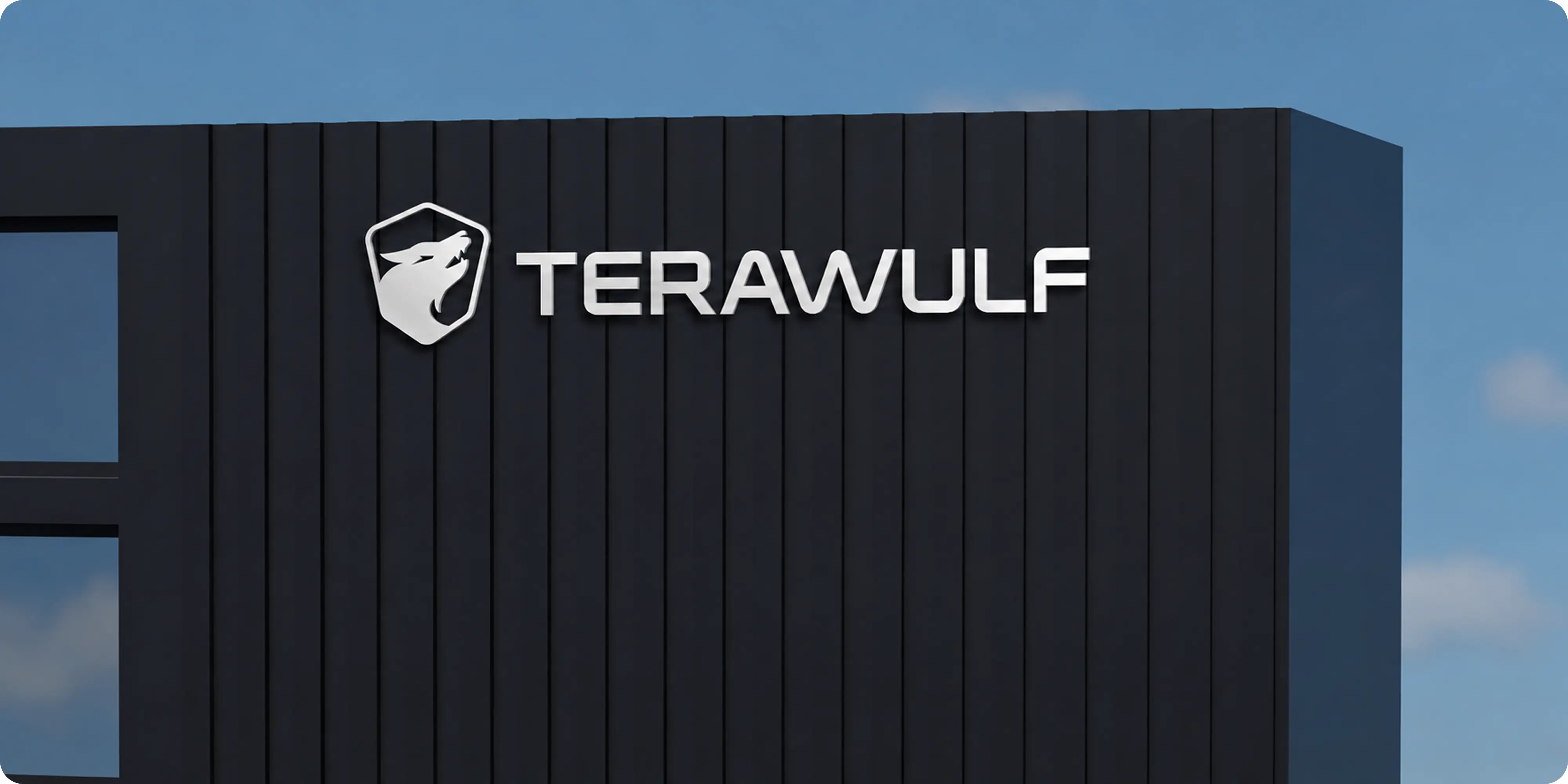
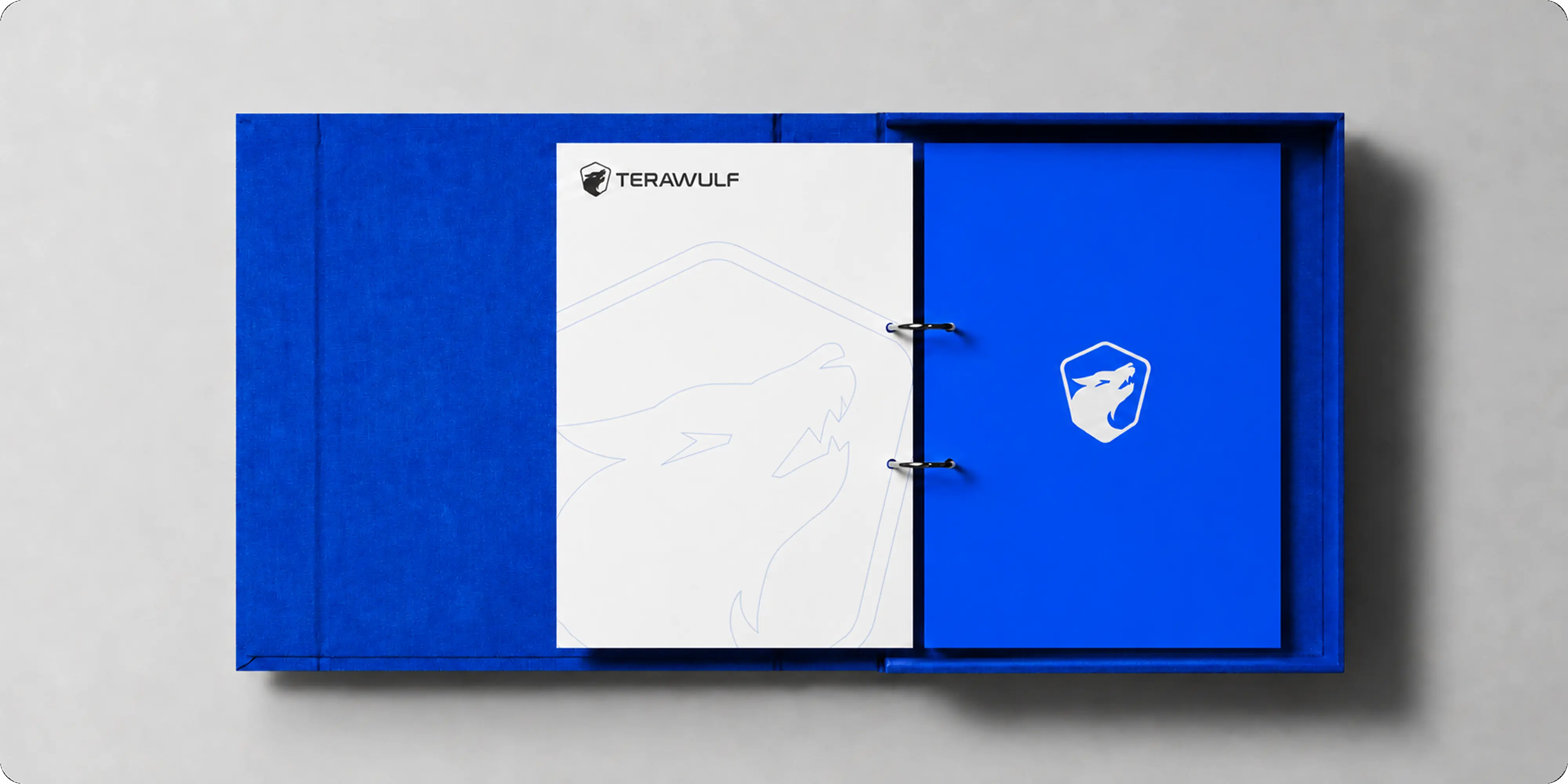
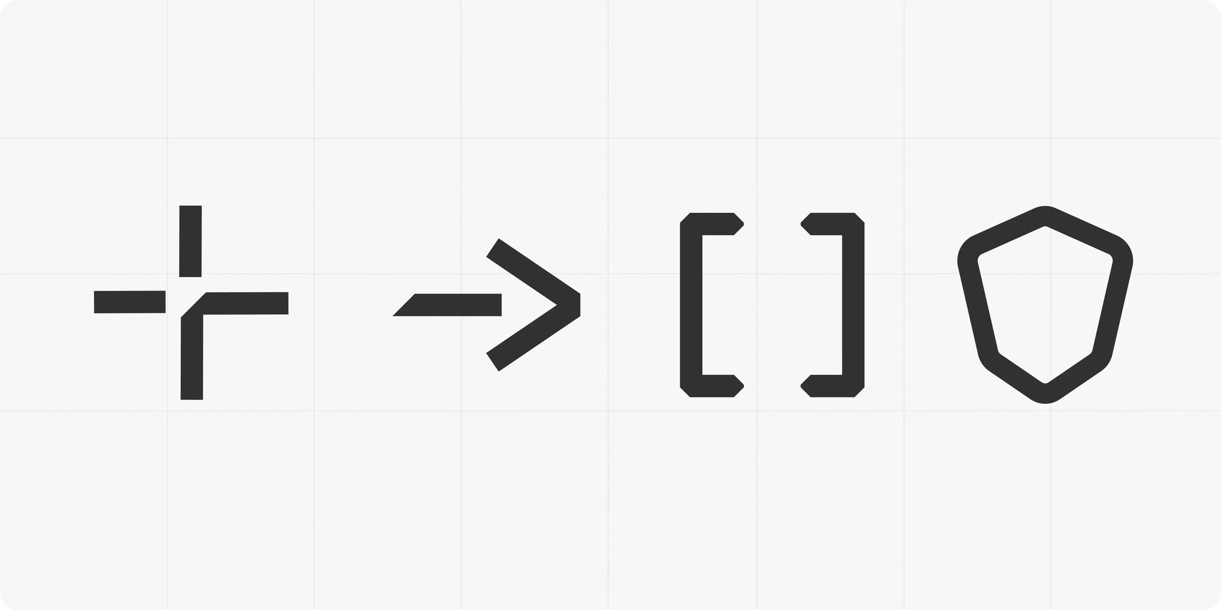
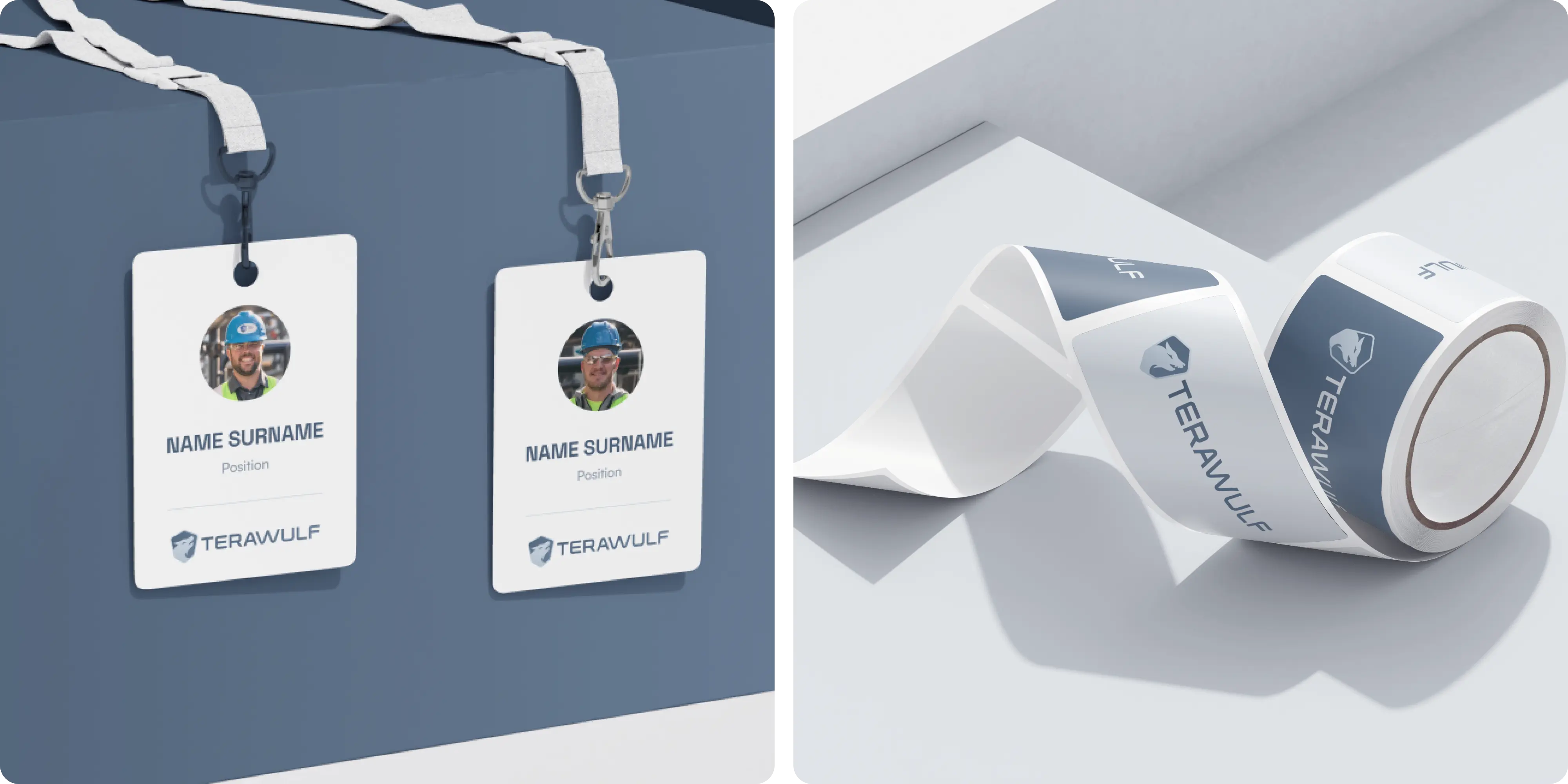
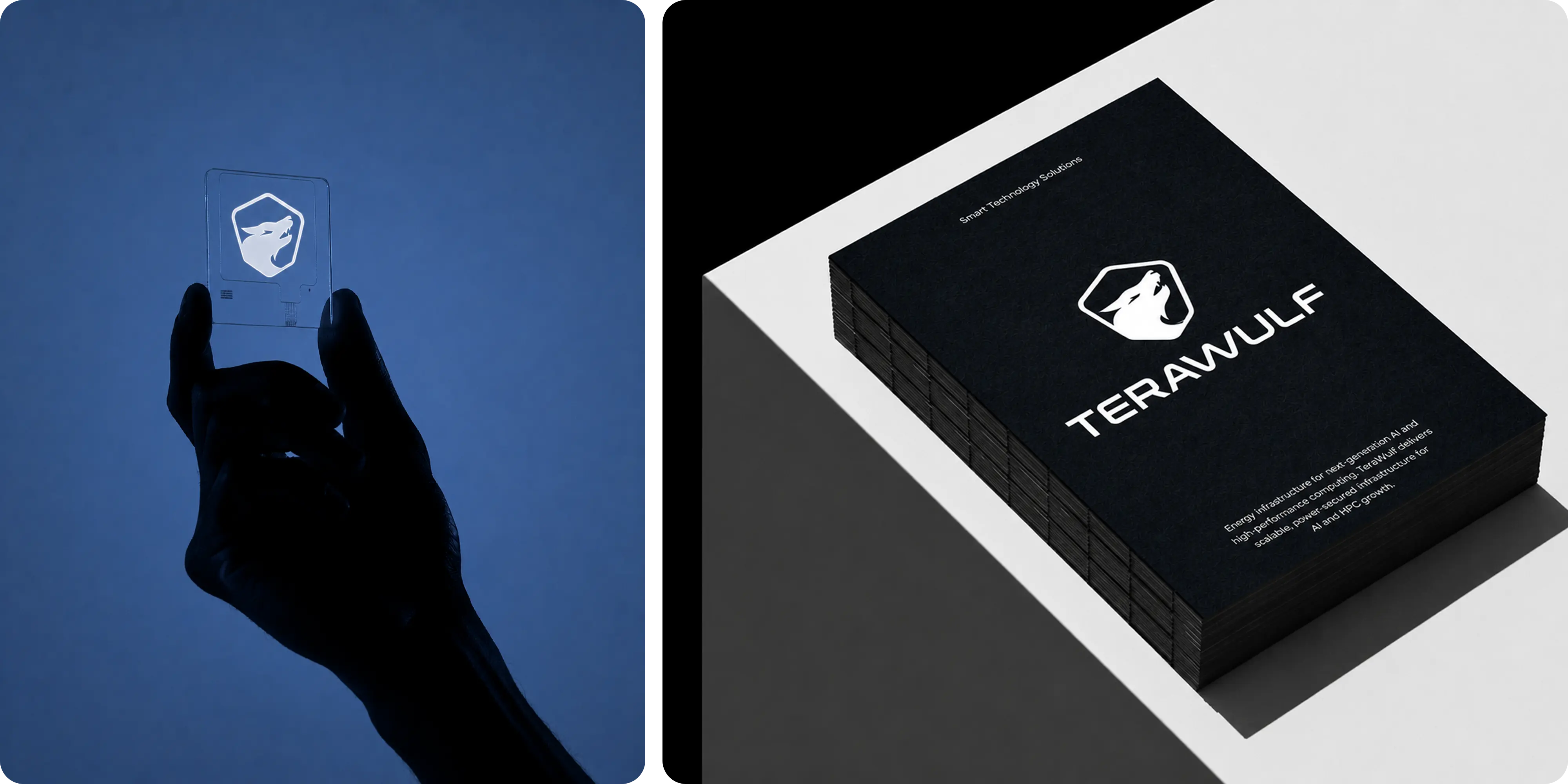
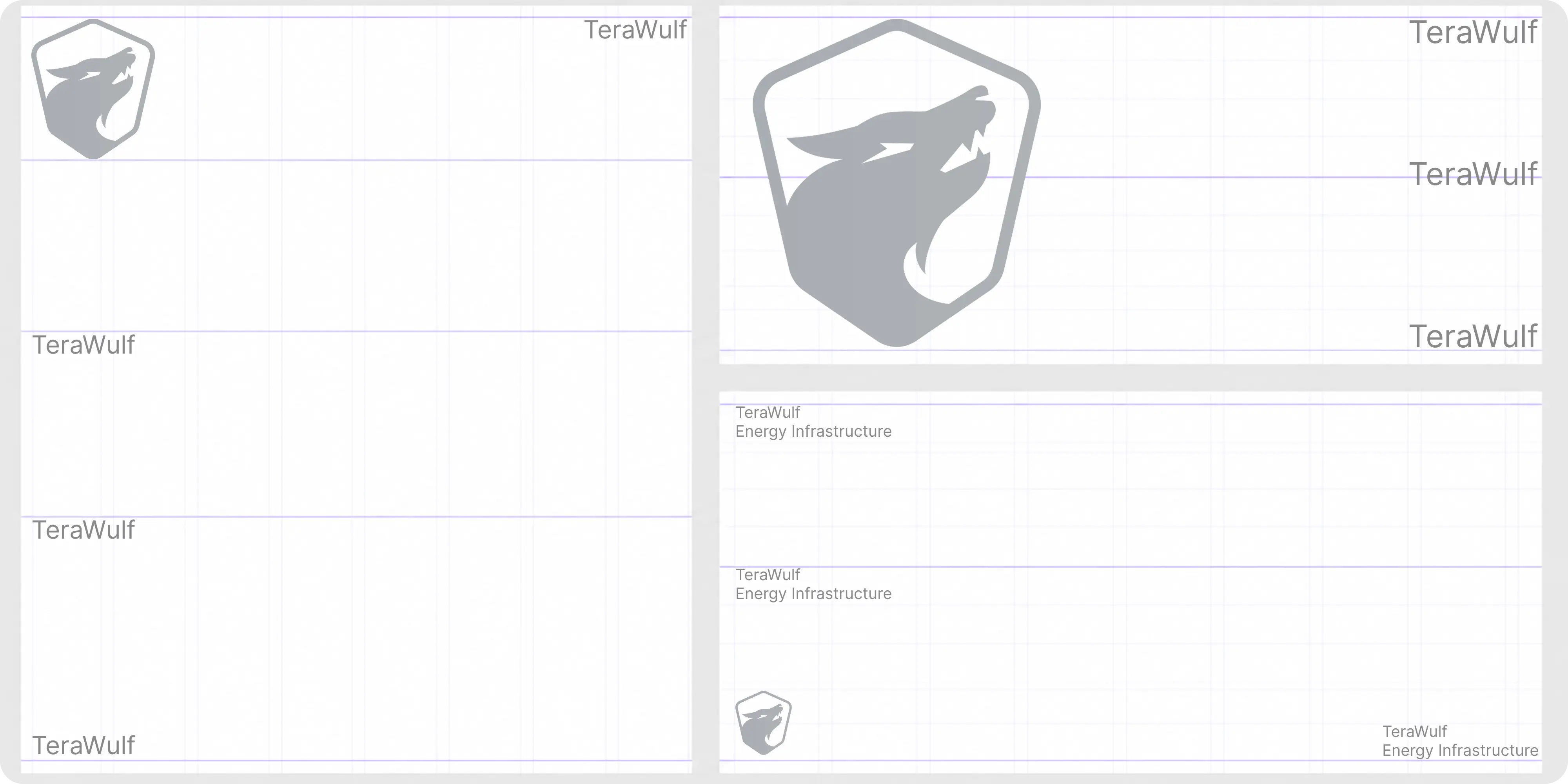
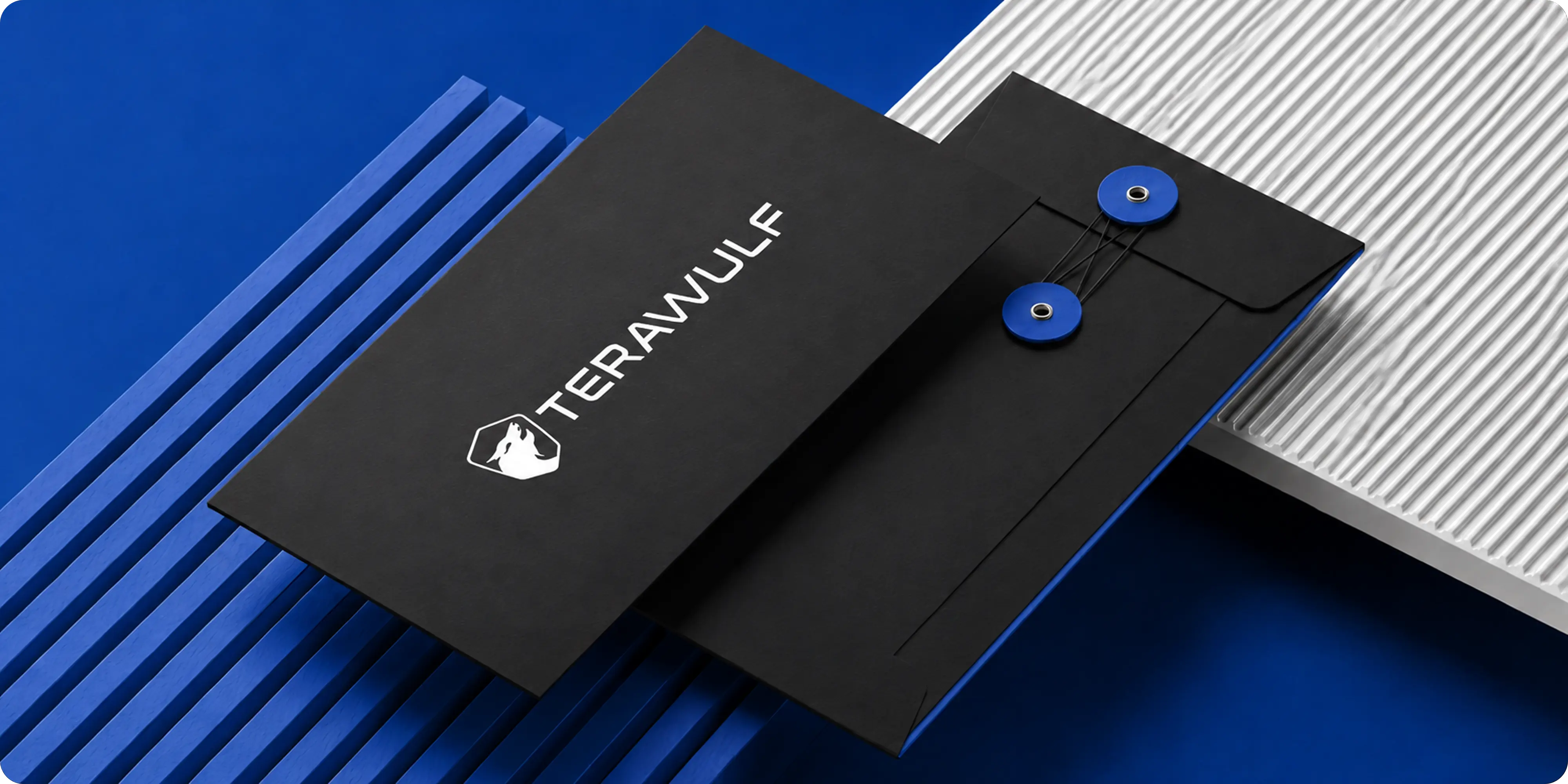
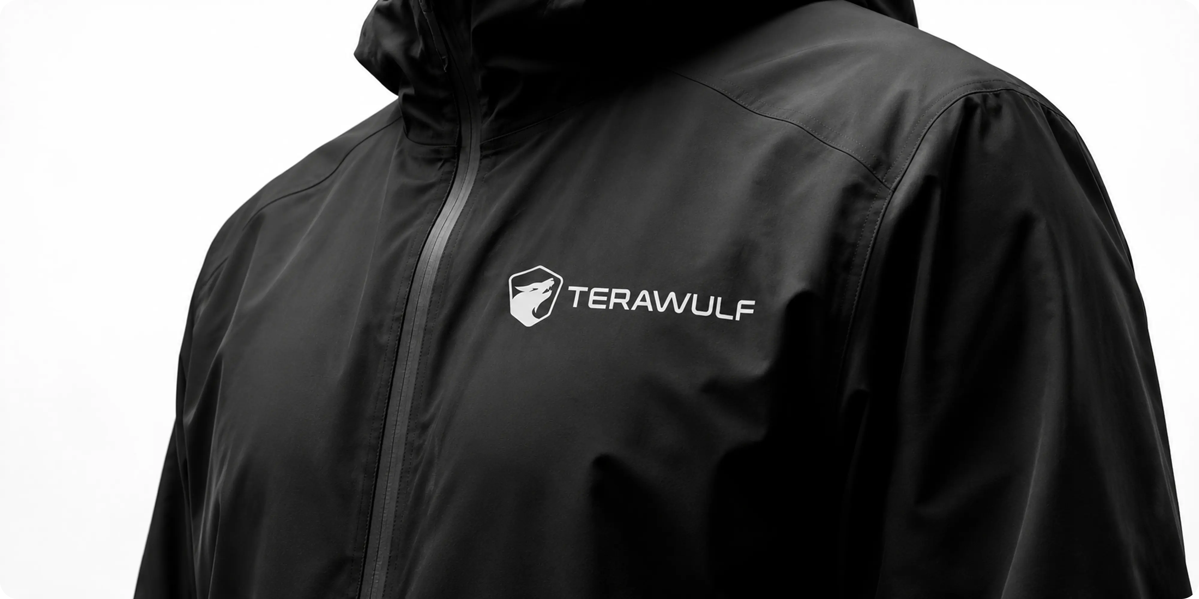
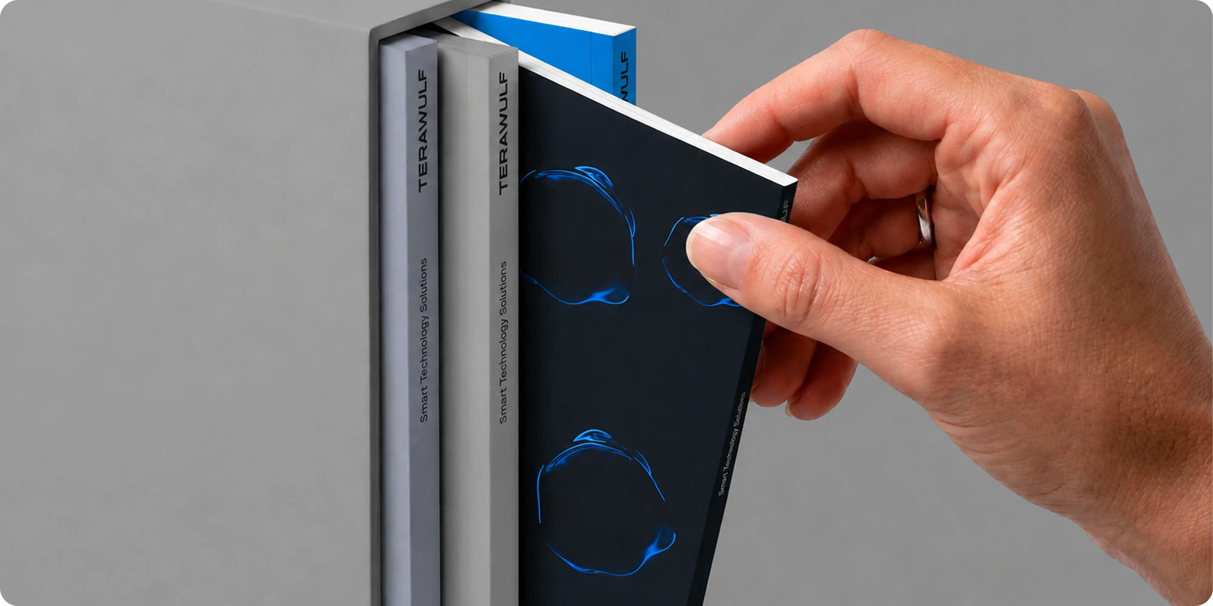
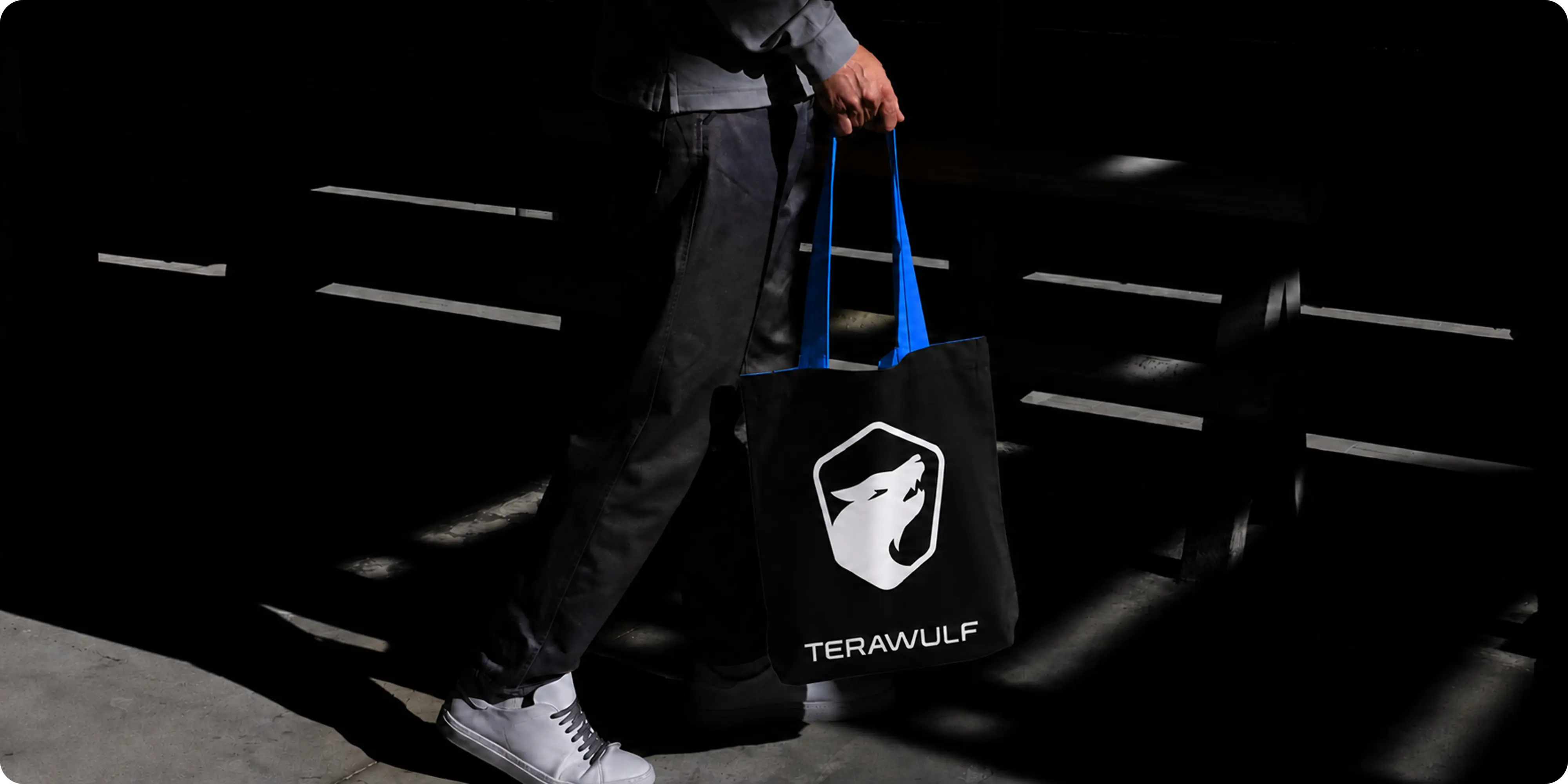
- Visual identity system: logo, palette, typography, and graphic language built to convey industrial scale and technical sophistication.
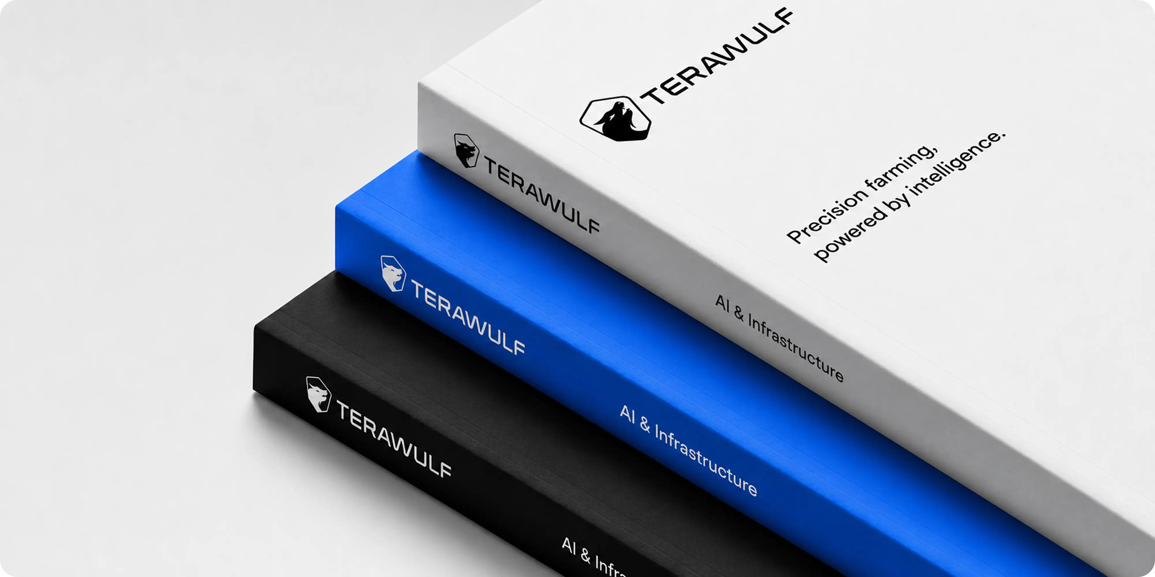
- Investor-grade applications: identity extended across earnings decks, press materials, and corporate communications where scrutiny is highest.
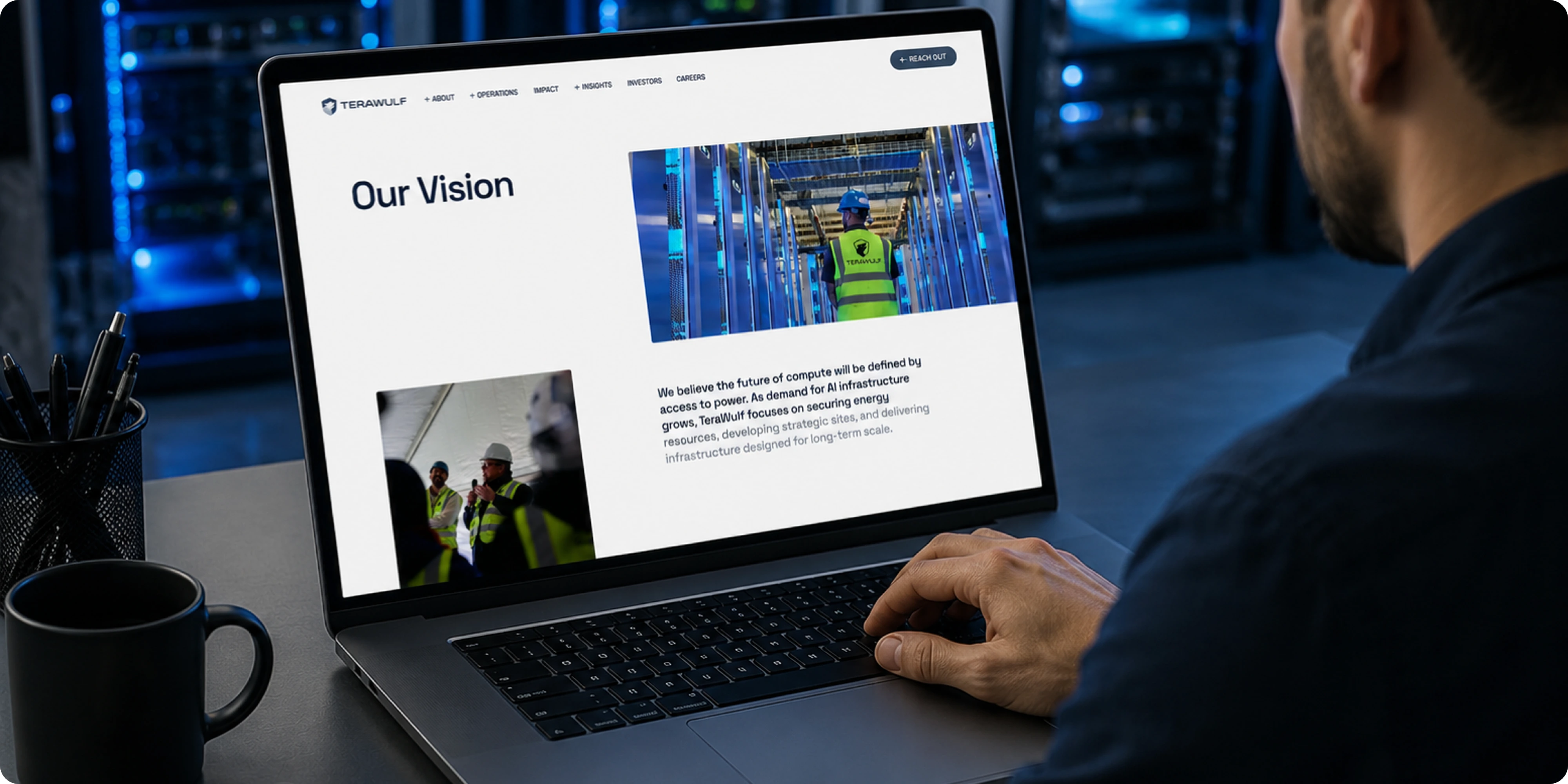
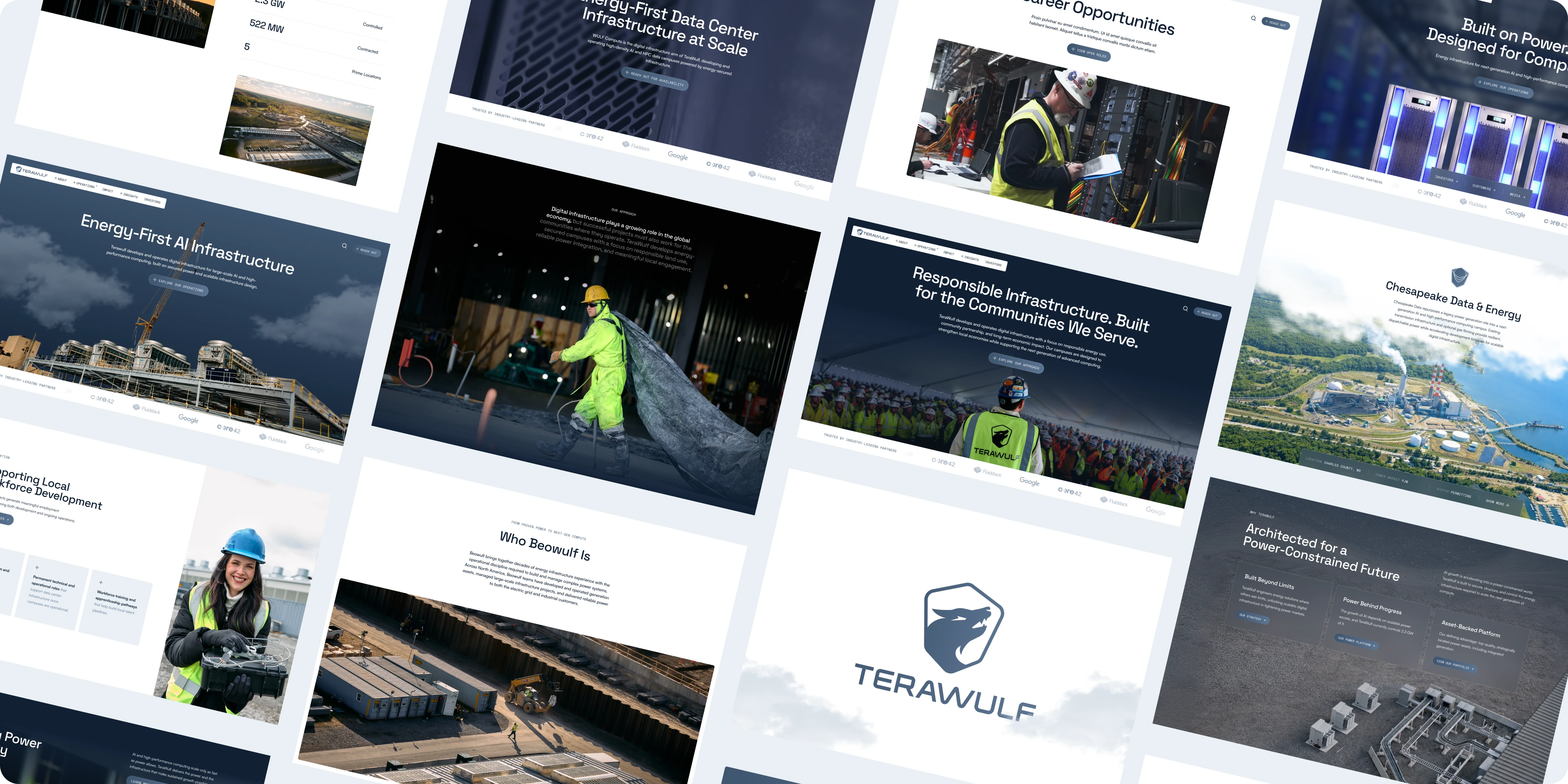
- Webflow website: a full design and build presenting campuses, capacity, and capabilities without burying the substance.
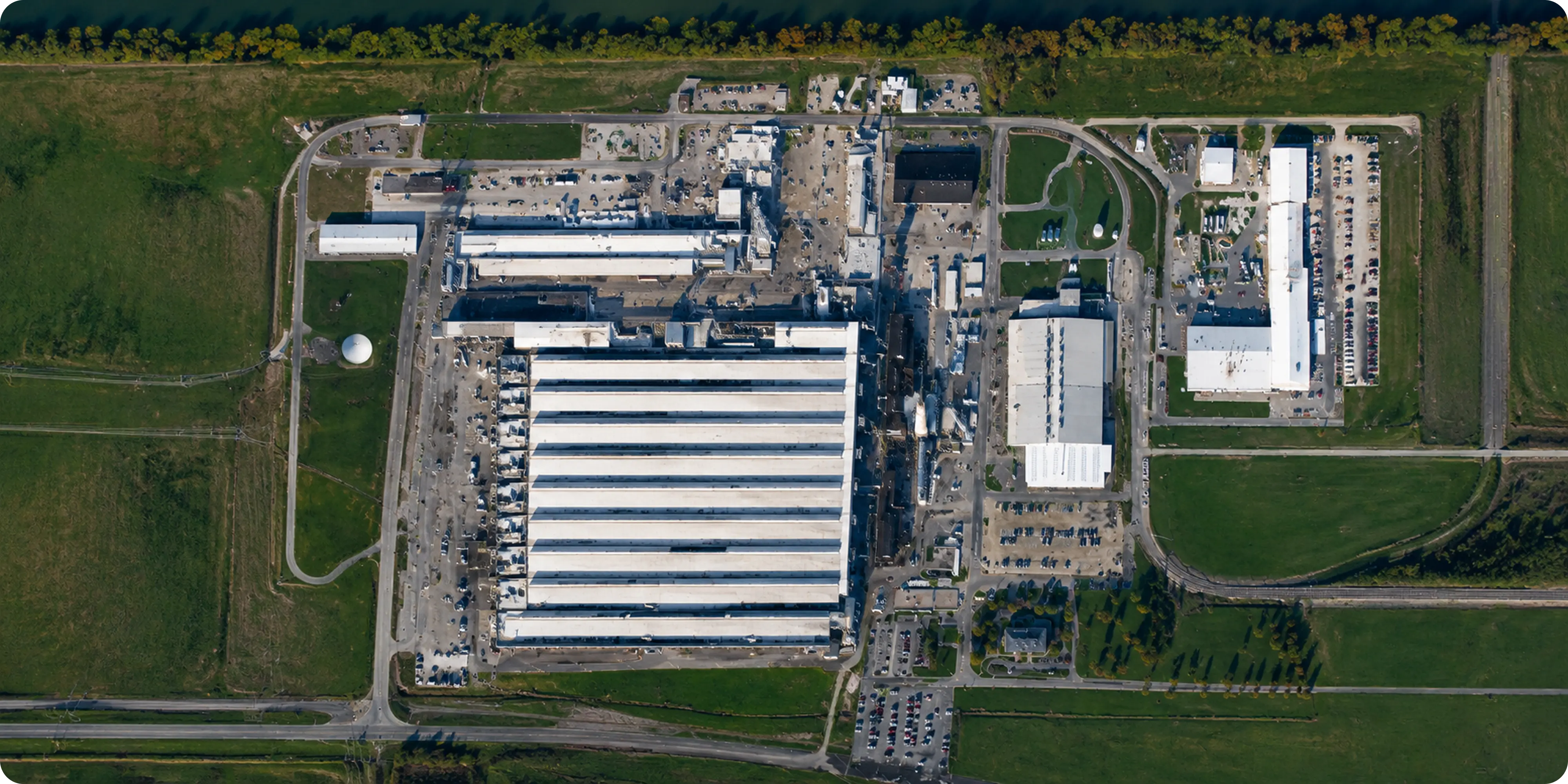
- Data campus presentation: site portfolio structured so power availability, capacity, and delivery timelines are easy to compare.
- UX/UI system: navigation and page models serving two distinct audiences, investors and enterprise compute customers, from one site.
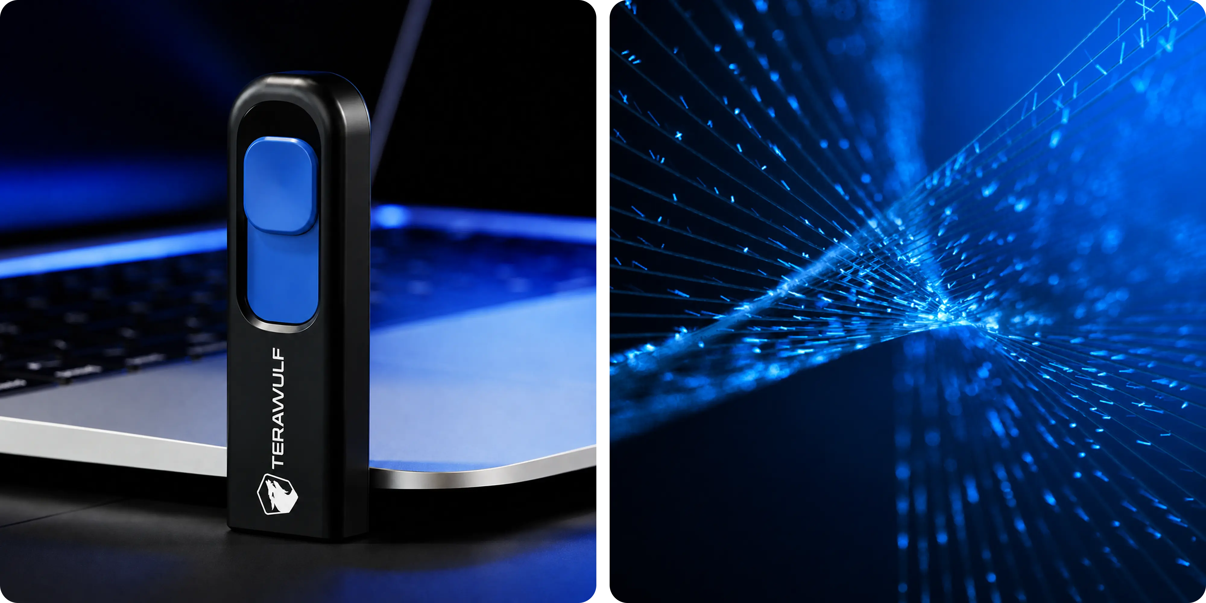
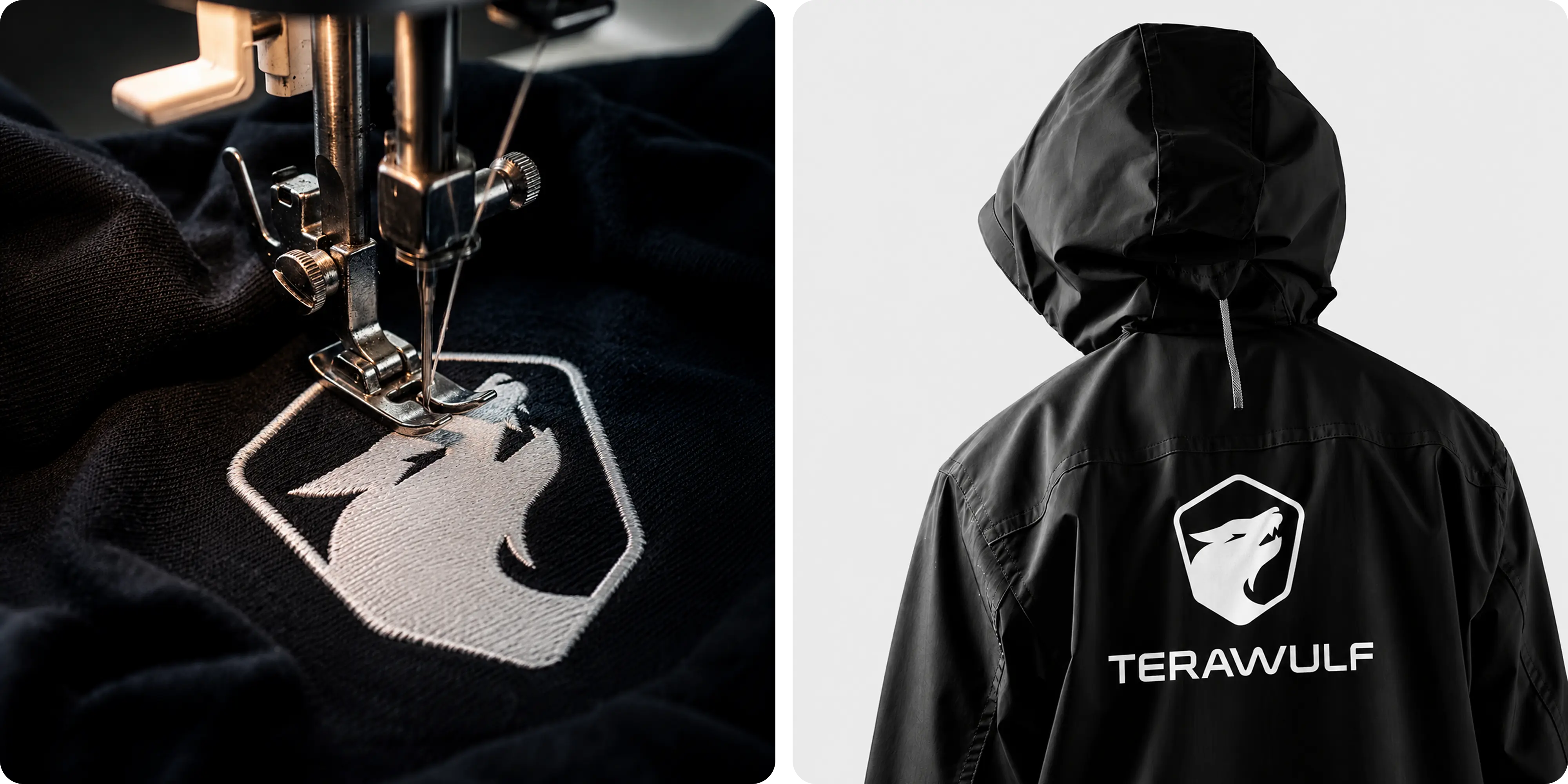
- Digital brand applications: components and rules that keep execution consistent as the company announces new sites and contracts.
Challenges
TeraWulf was undertaking one of the harder public-market repositions: moving from Bitcoin mining into AI and HPC infrastructure while both businesses remained active. The brand still read as a crypto company, but investors and enterprise buyers increasingly needed to see an energy and compute operator. The underlying story was also complex, spanning megawatts, critical IT load, colocation terms, and carbon profile. Every message had to hold up under public-company scrutiny while answering the different questions of investors, analysts, and enterprise customers.
Approach
We began with research and strategy to understand the gap between how the market saw TeraWulf and what its asset base could support. That gap shaped the positioning and messaging, translating power availability and compute capacity into clear claims without oversimplifying the business. The visual identity moved away from crypto-sector conventions and toward industrial scale and energy credibility, with investor communications used as a pressure test for the system. The Webflow site then separated the needs of analysts and enterprise buyers, giving each audience a direct path to the detail it cares about. Digital applications and clear system rules completed the rollout so the identity can scale with new sites and agreements.
Outcomes
The final brand system balances industrial scale, energy credibility, and technical sophistication across investor communications, digital experiences, and corporate applications. The identity scales cleanly from a press release to a data campus page, and the website makes a complex energy-and-compute story clear to investors and enterprise customers without diluting the technical detail either group needs.




.webp)






.webp)






.webp)


.webp)



.webp)


.avif)








.png)