.png)
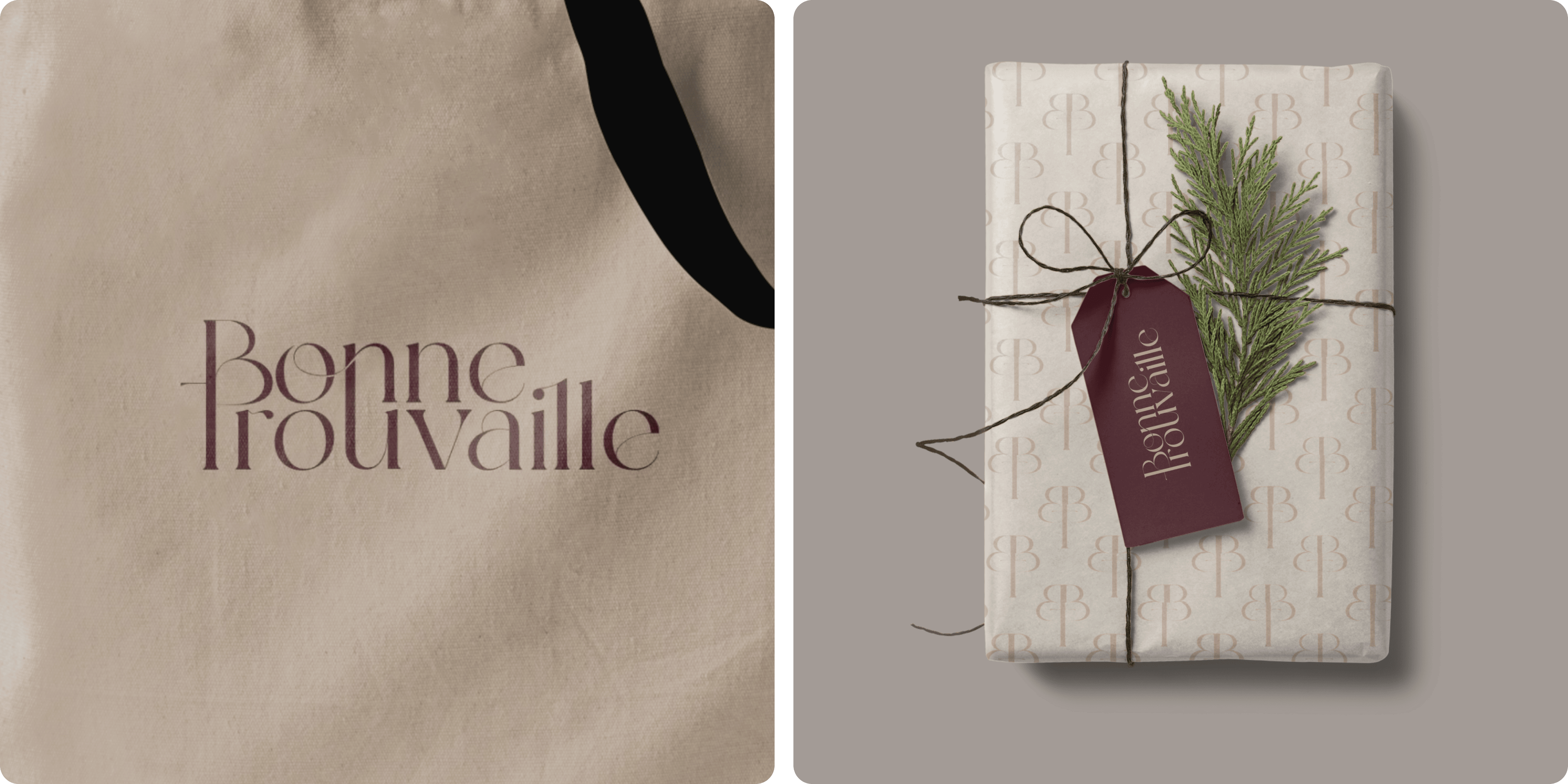
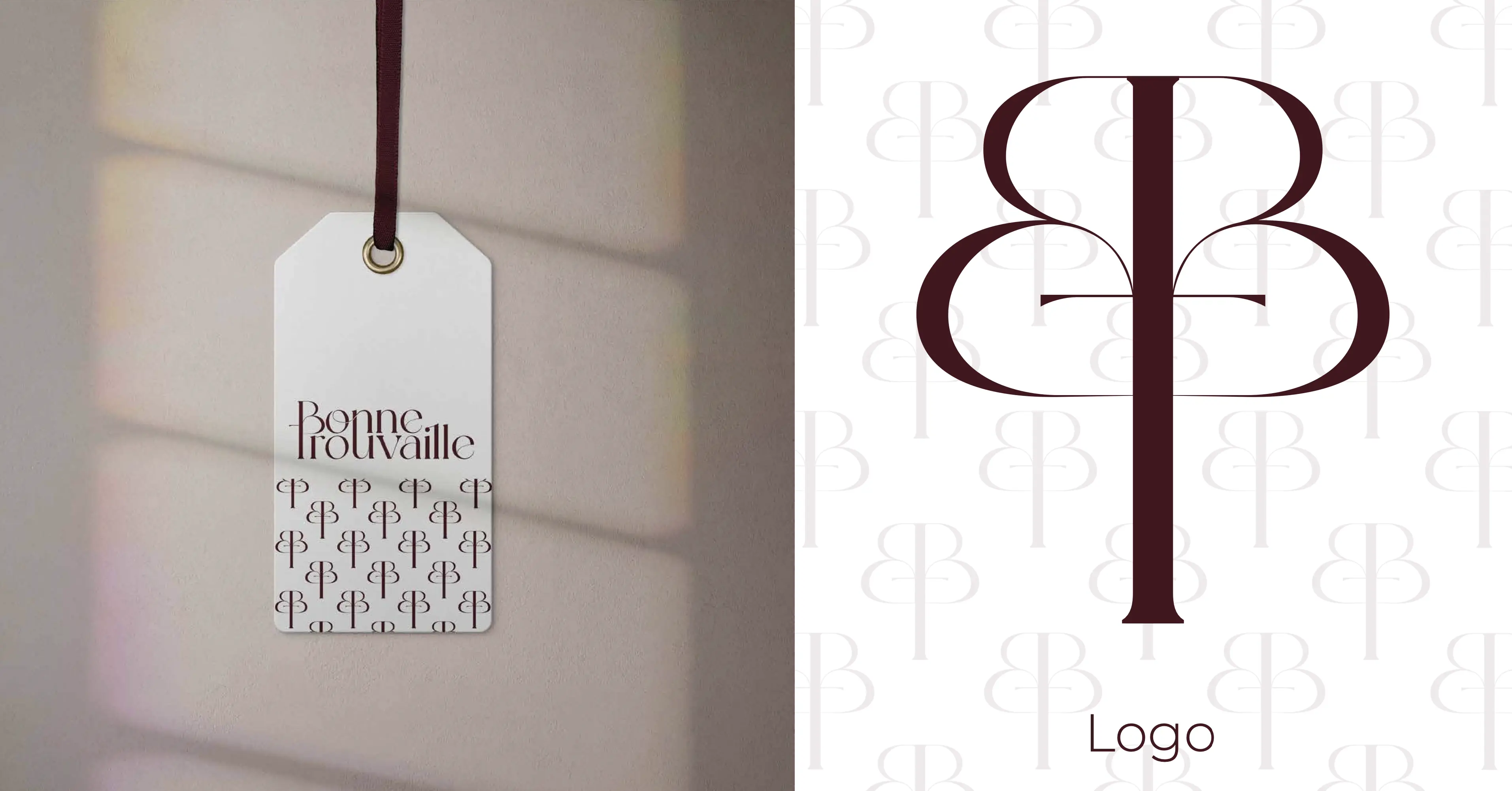
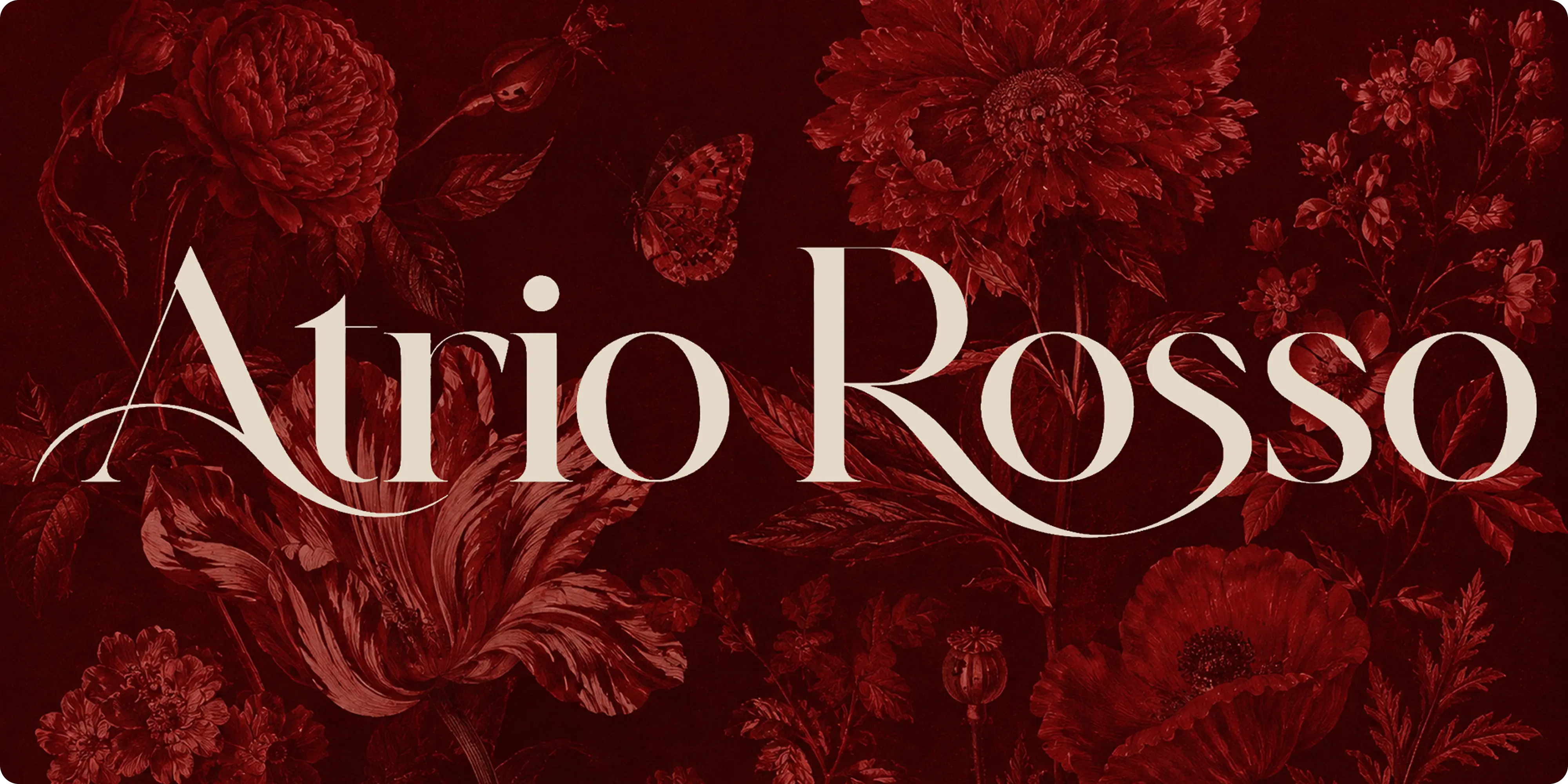
A luxury fashion identity carried from the logo through typography and colour to the packaging, built on restraint rather than ornament.
Bonne Trouvaille, a luxury women's fashion brand, has established itself as a prominent player in the industry. This case study delves into the brand's journey, its unique positioning, marketing strategies, and the key factors contributing to its success.
.png)
Project Highlights
- Brand identity: a refined visual system built for a luxury fashion positioning.
- Logo design: an elegant mark designed for premium applications.
- Typography and colour: a restrained palette and type system conveying quality.
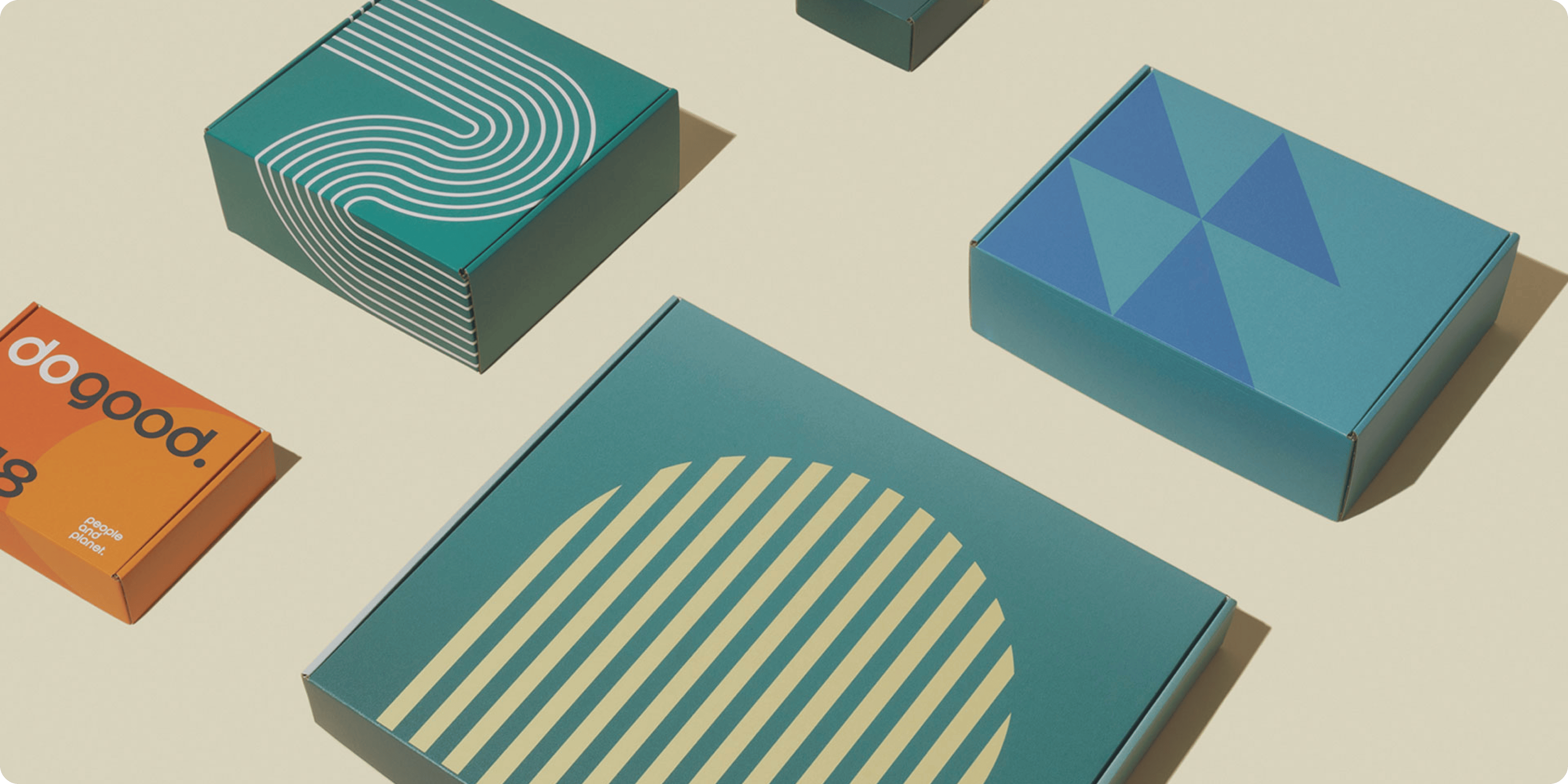
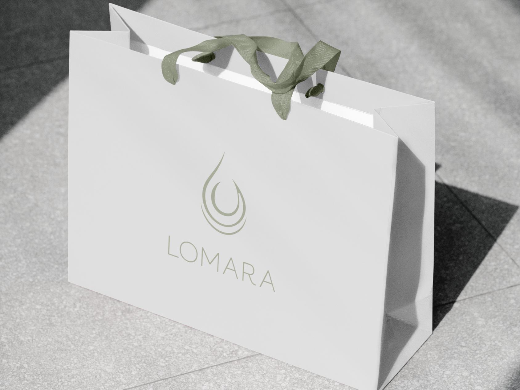
- Packaging design: identity extended onto the physical product experience.
- Custom graphic elements: bespoke visuals supporting the brand world.
- Brand guidelines: usage rules keeping execution consistent as the brand scales.
Challenges
Luxury fashion is a category where restraint signals quality and anything overworked reads as trying too hard. Bonne Trouvaille needed an identity that felt genuinely premium and distinctive, and held that standard from packaging through to every digital touchpoint.
Approach
We built the identity on restraint, using a refined palette and elegant typography to establish quality without ornament. Custom graphic elements gave the brand its distinctiveness, and packaging design carried the identity onto the physical product. Guidelines closed the engagement so the system holds as the brand scales.
Outcomes
Bonne Trouvaille has an identity that reads as genuinely premium and holds together across packaging and digital. The restraint is what makes it work.
.png)
.png)
.png)


.webp)




.webp)







.webp)




.webp)

.webp)


.avif)