Brand Vision developed the brand from the ground up, from naming and strategy to visual identity, packaging, illustration, messaging, and social content, creating a system designed to stand out both on shelf and in daily life.
Beanie Coffee Co. is a Colorado-roasted coffee brand built around simple rituals, good mornings, and a more playful approach to everyday coffee.
Project Highlights
- Brand creation from the ground up: naming, messaging, identity, packaging, and launch applications developed as one connected system
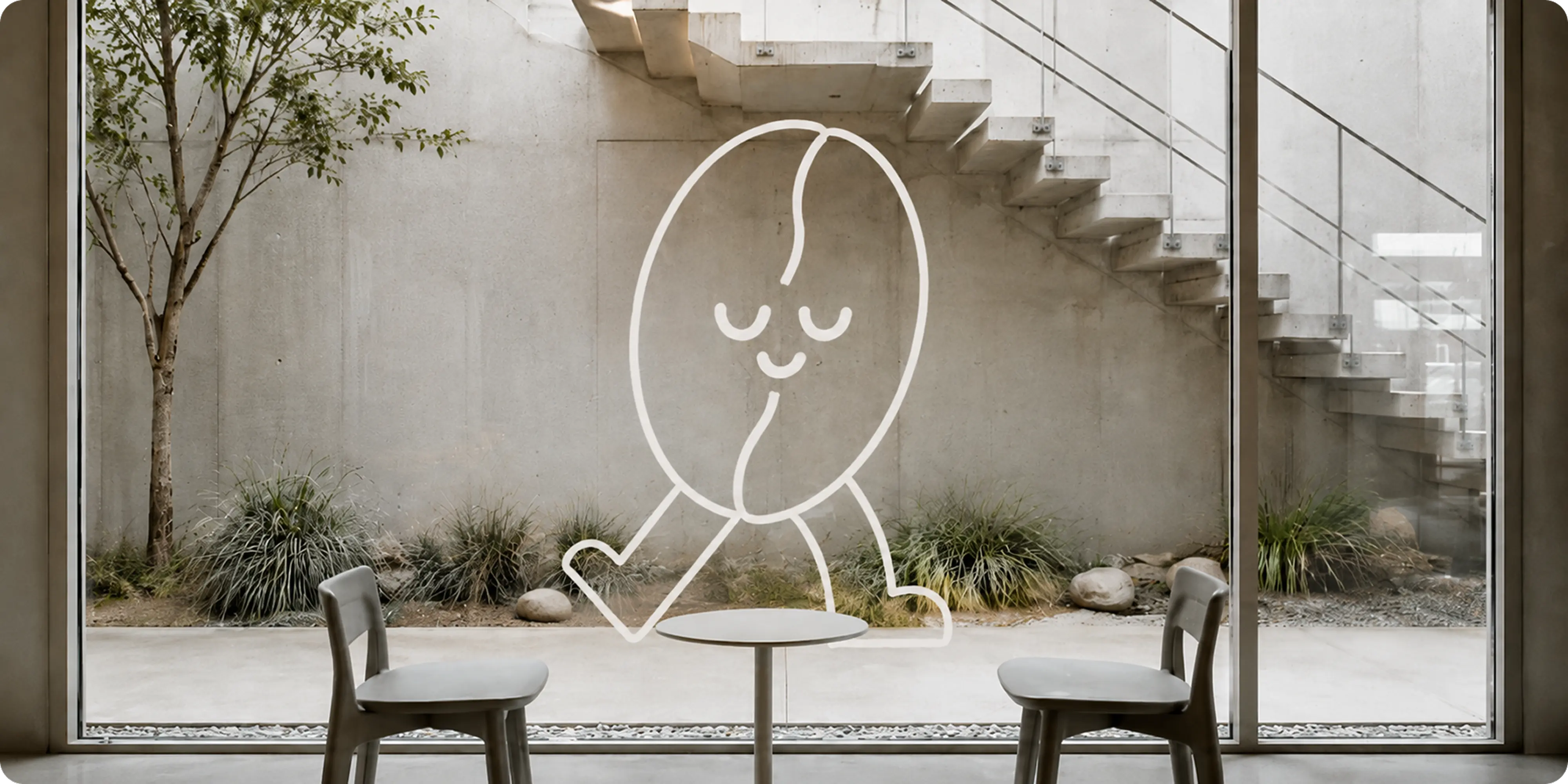
- Character-led identity: a walking coffee bean mascot created as a recognizable brand asset with enough flexibility for packaging, merchandise, signage, and social content
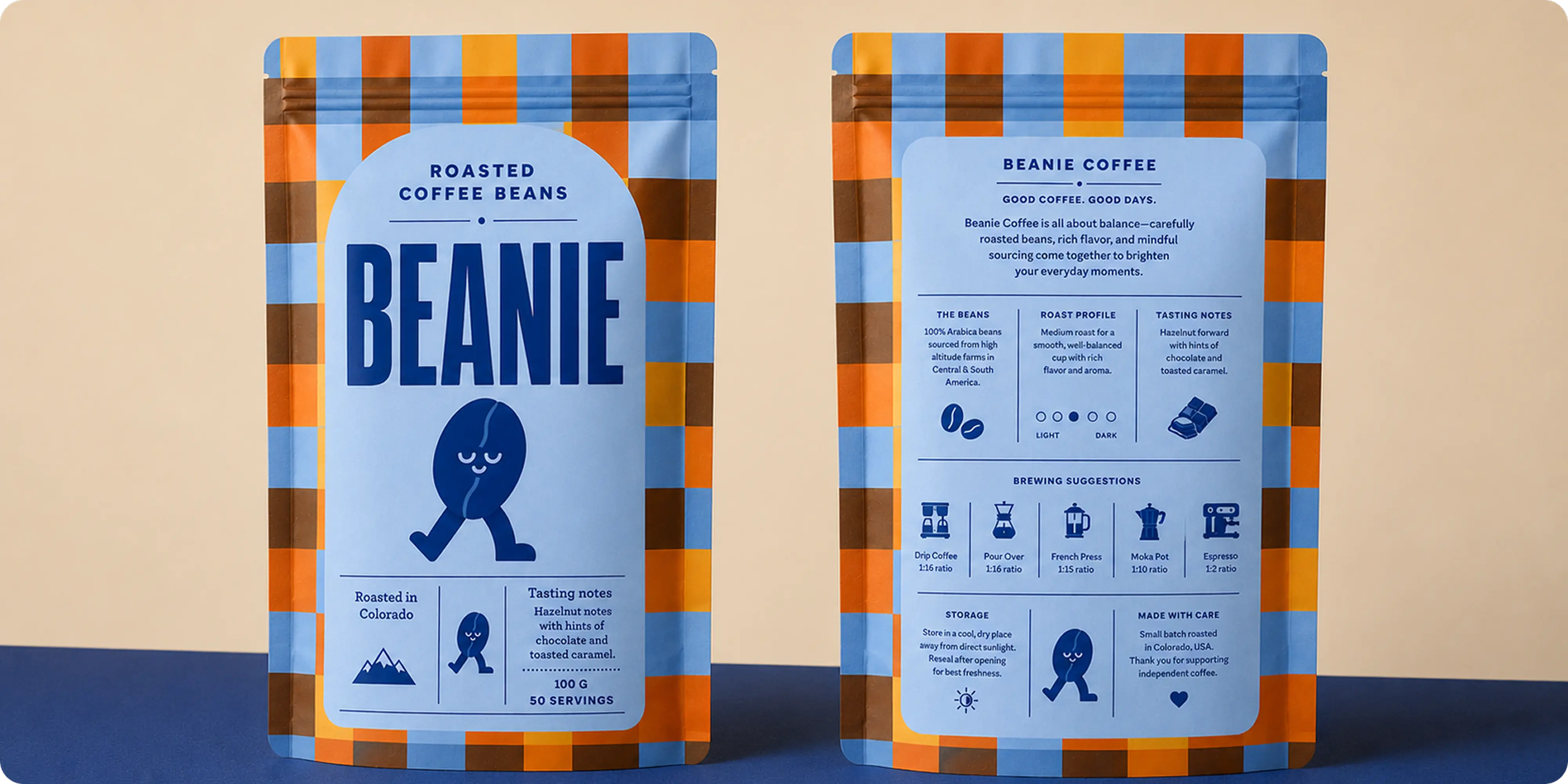
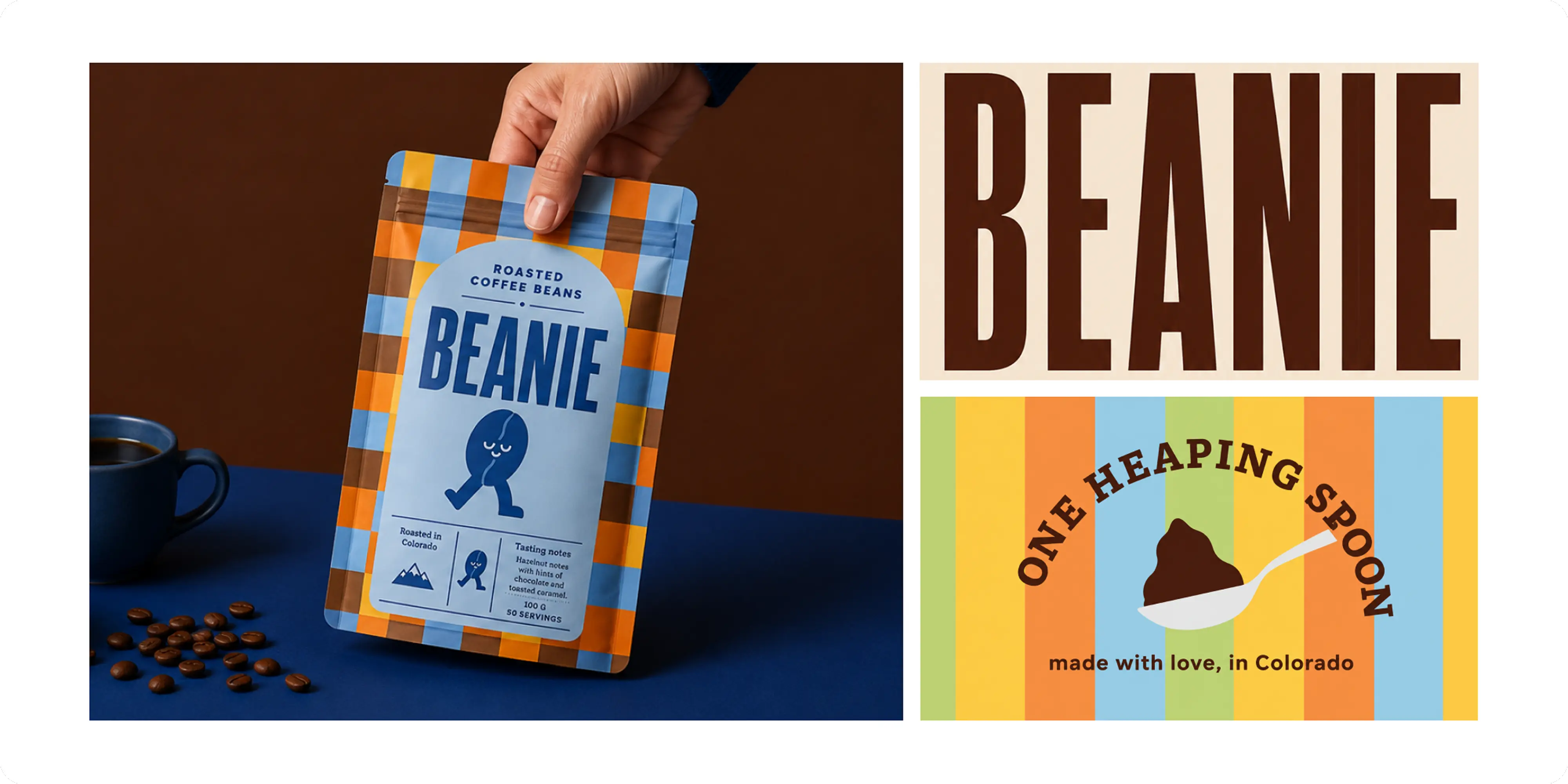
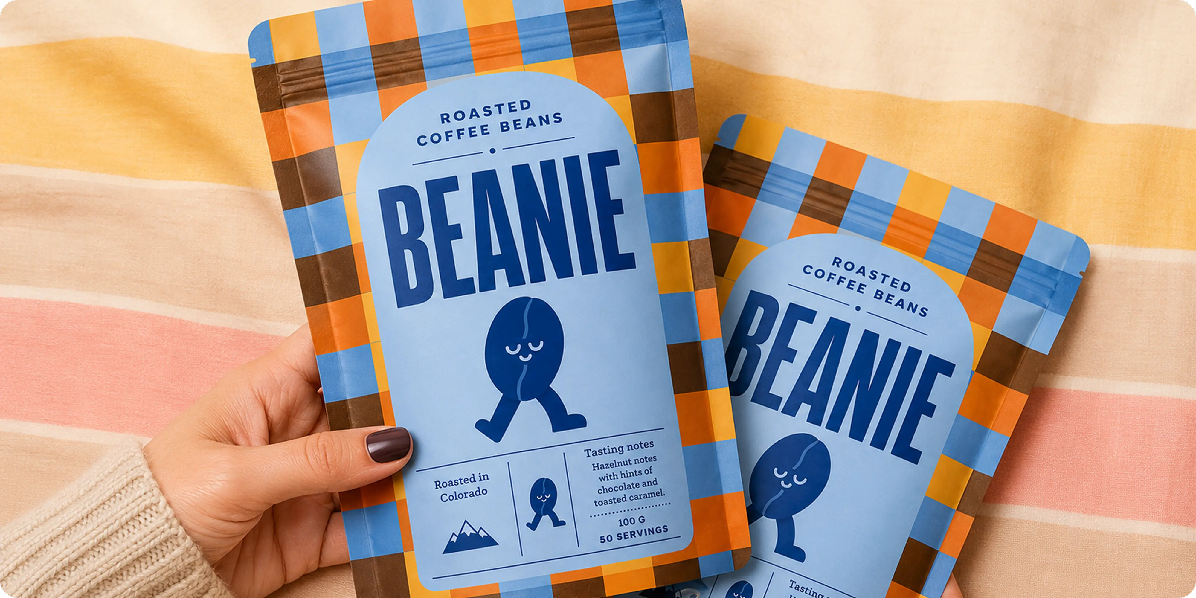
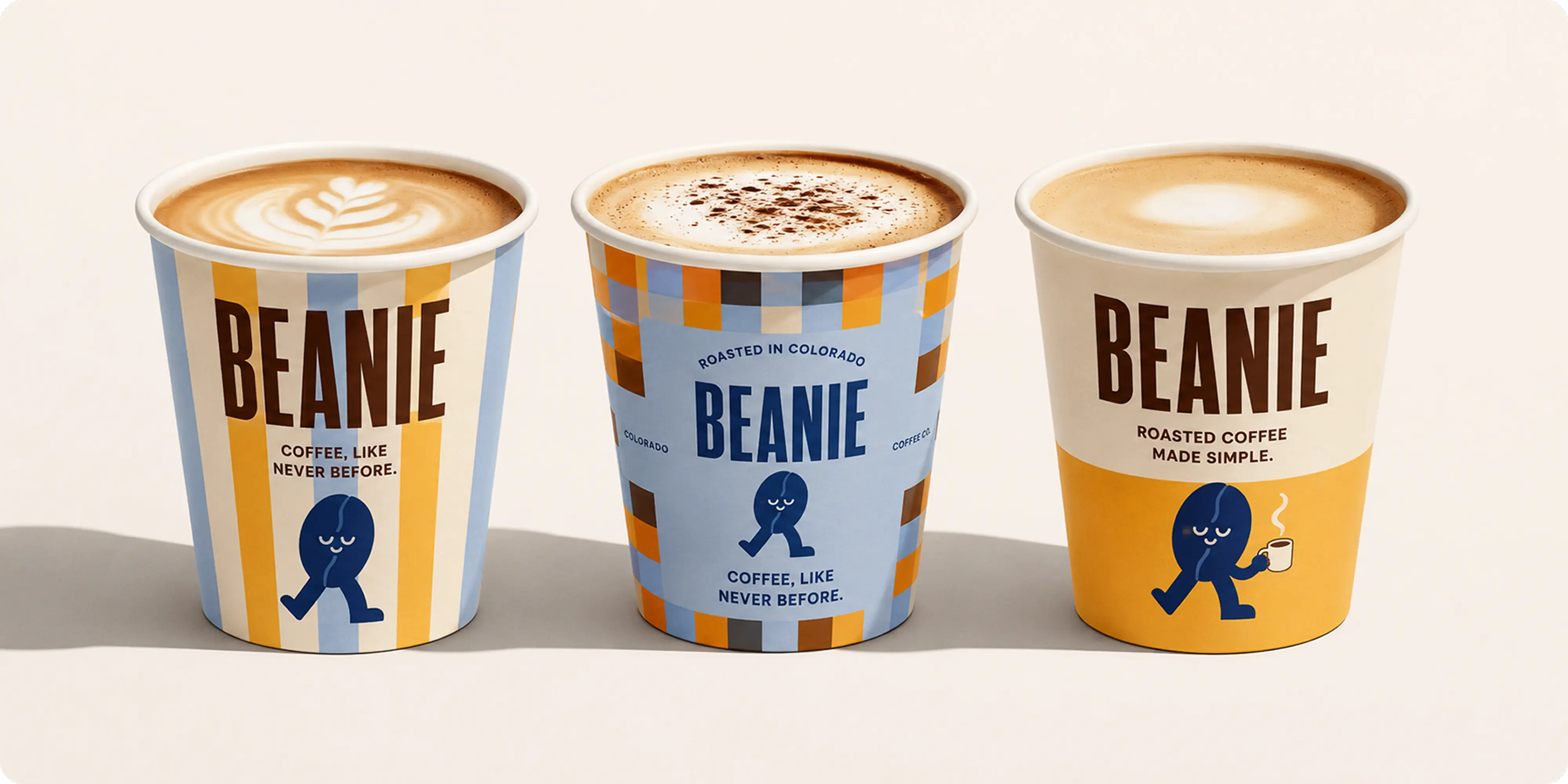
- Distinctive packaging system: bold colour blocking, oversized typography, and modular patterns designed to create strong shelf recognition across bags, cups, and future product formats
- Custom illustration language: a growing family of Beanie poses and expressions that gives the brand personality without relying on photography alone
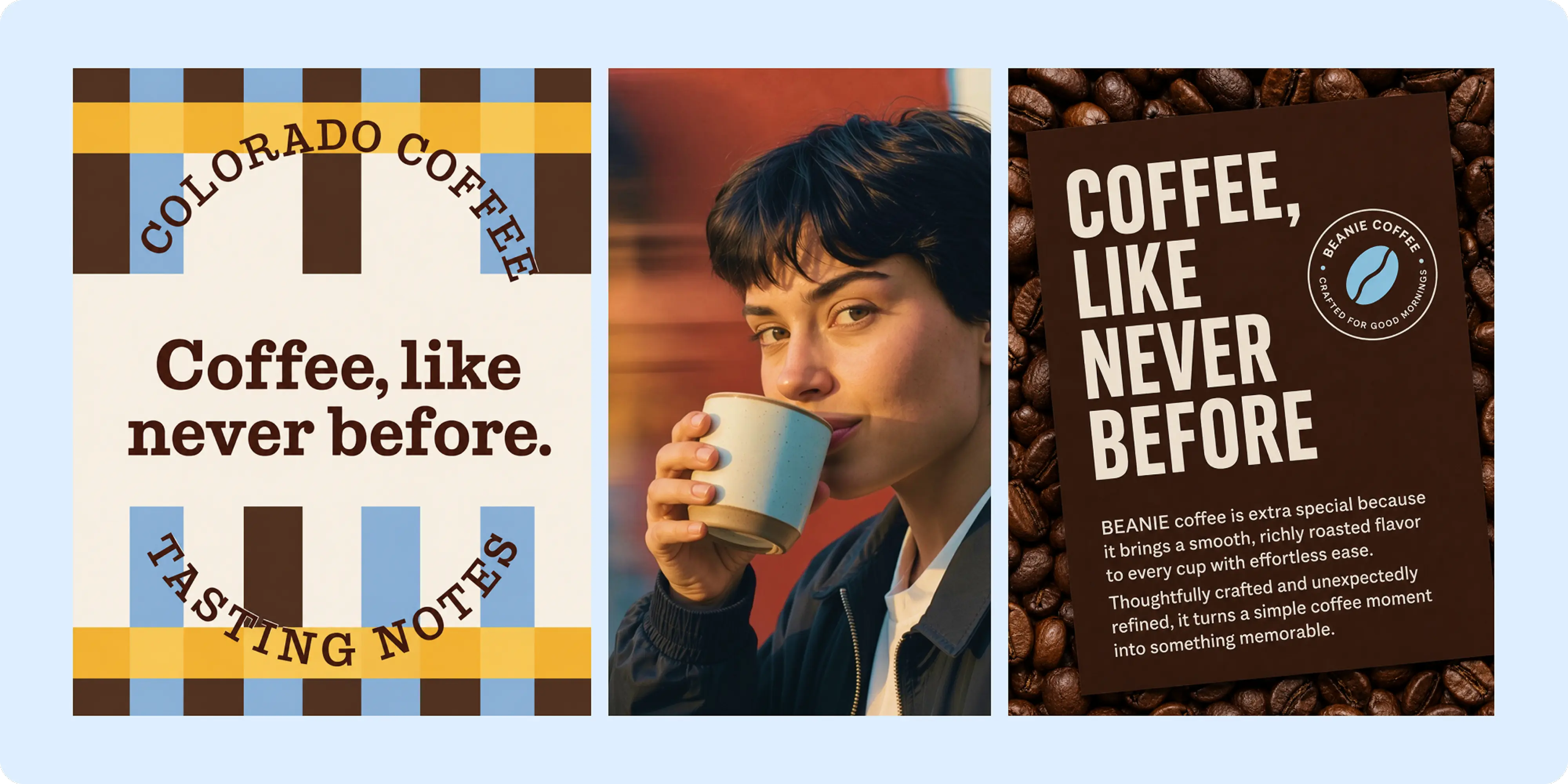
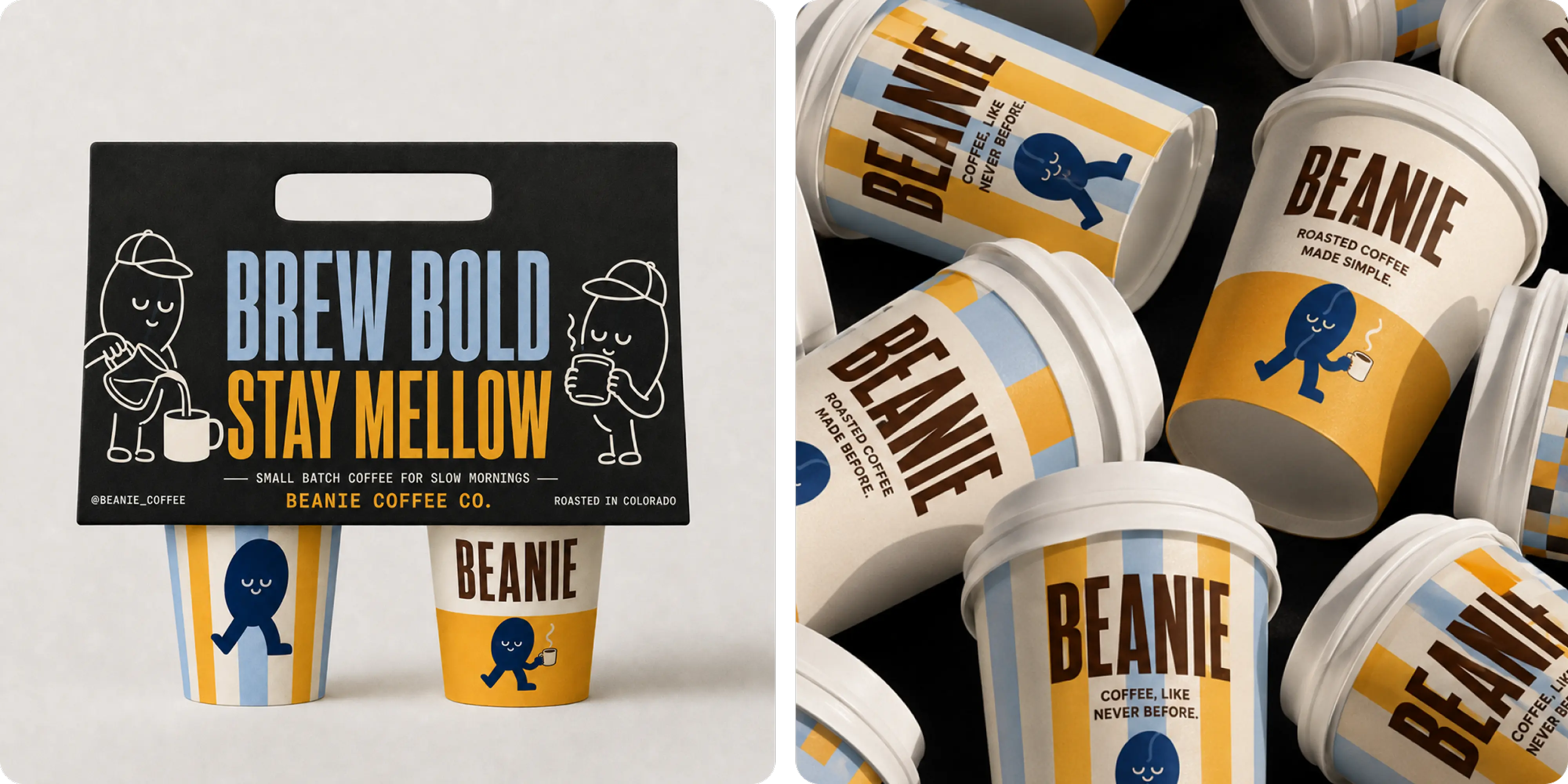
- Verbal identity: short, memorable lines such as “Brew Bold. Stay Mellow.” and “Coffee, like never before.” built to carry the brand’s relaxed confidence across touchpoints
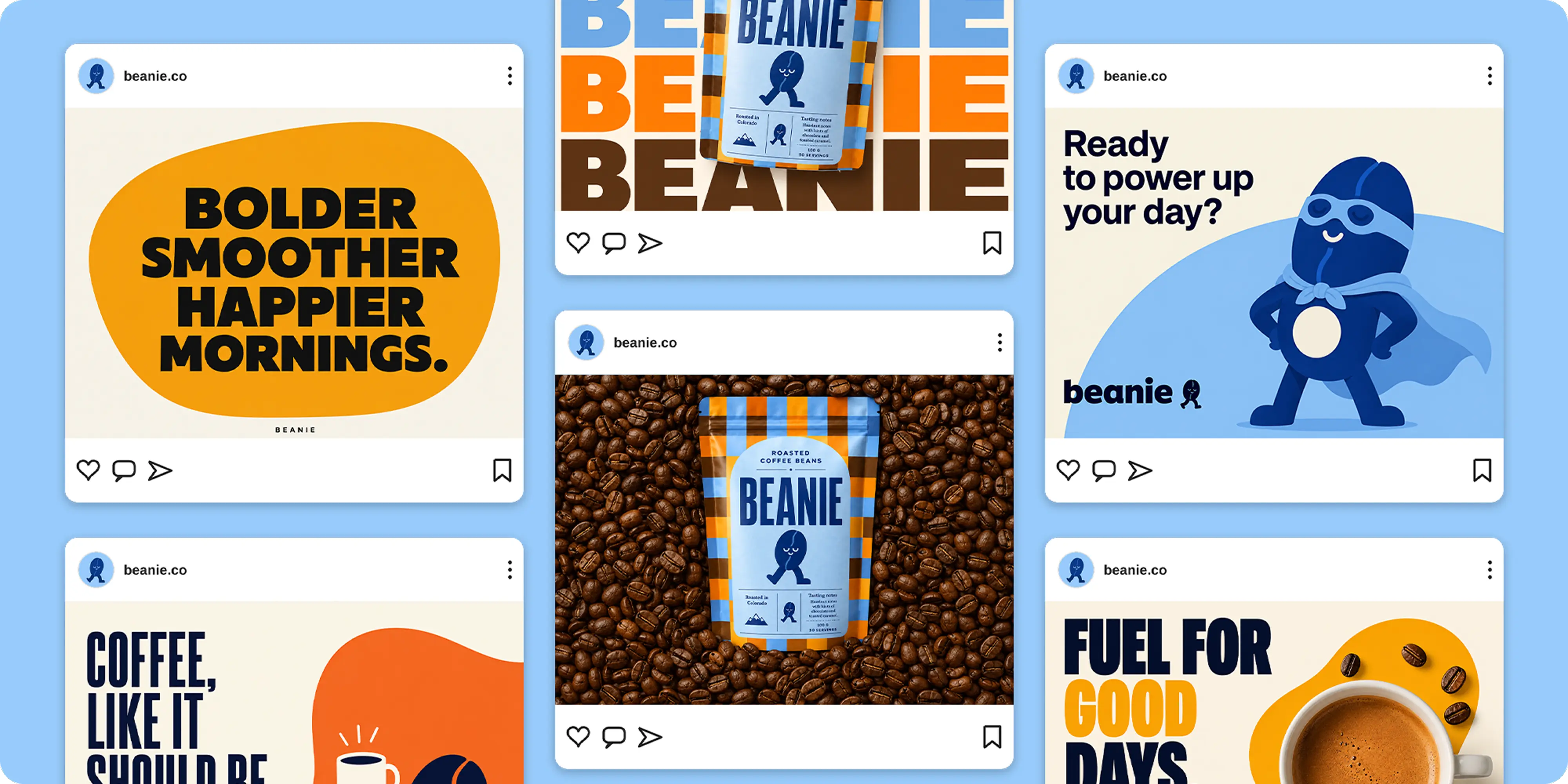
- Social-first creative system: templates and campaign graphics designed to keep the identity recognizable while allowing the content to change frequently
Challenges
Coffee is a crowded category with deeply established visual conventions. Premium brands often lean toward restraint and provenance, while more accessible coffee brands can become generic or overly promotional. Beanie needed enough personality to be immediately recognizable without making the product itself feel unserious.
The identity also had to stretch well beyond a single coffee bag. It needed to work across takeaway cups, retail packaging, merchandise, social media, signage, and future product extensions while remaining unmistakably Beanie in every format.
A final challenge was balancing warmth with energy. The brand needed to feel optimistic and expressive, but still relaxed enough to belong to the everyday ritual of a morning coffee.
Approach
We built the identity around a simple idea: coffee can have character without becoming complicated.
The name Beanie gave us a natural starting point for a visual world that felt friendly, memorable, and easy to extend. We transformed the coffee bean itself into the brand’s central character, giving it a calm expression and walking form that could shift between quiet everyday moments and more energetic campaign applications.
The visual system combines tall, condensed typography with a palette drawn from coffee, cream, sky blue, and warm citrus tones. Structured stripes and checkered patterns bring rhythm to the packaging while giving each format enough flexibility to feel distinct.
Packaging was treated as one of the brand’s primary communication tools. Large-scale typography creates immediate recognition from a distance, while smaller illustrations, tasting notes, brewing information, and origin details reward a closer look. The same system extends naturally to cups, carriers, merchandise, and environmental applications.
We also developed a concise verbal style around short, confident statements. Lines such as “Brew Bold. Stay Mellow.”, “Fuel for Good Days”, and “Coffee, like never before.” give the brand a voice that feels upbeat without trying too hard.
For social media, the identity was expanded into a flexible content system using the mascot, typography, product photography, graphic shapes, and recurring campaign lines. That gives Beanie enough variety to stay active while maintaining strong visual recognition from post to post.
Outcomes
Beanie emerged as a complete consumer brand with a visual and verbal identity capable of carrying the experience far beyond the coffee bag.
The combination of bold typography, warm colour, modular packaging, and the Beanie character gives the brand immediate recognition while leaving room for new roasts, merchandise, campaigns, and physical environments. Each application feels different enough to stay interesting, but connected enough to build familiarity over time.
The result is a coffee brand that feels energetic without being loud, premium without becoming precious, and approachable enough to become part of an everyday routine.






.webp)





.webp)





.webp)





.webp)




.webp)


.avif)









.png)