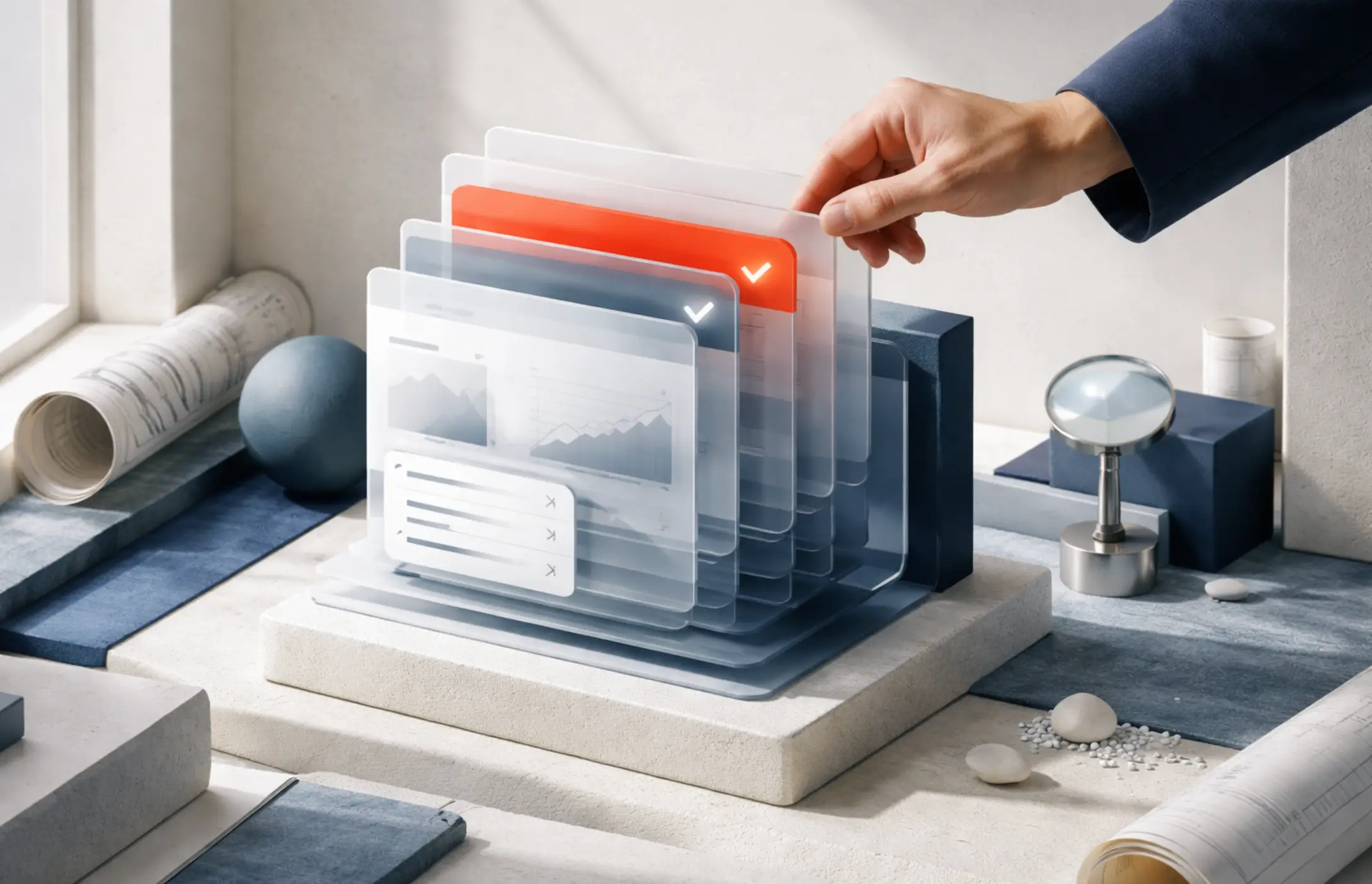
Web Design That Speaks: Crafting Visual Stories Online
Updated on
Published on
Every day, we scroll through countless websites. Some we forget instantly; others stay with us, like a favorite movie scene or a powerful photograph. What makes the difference?
It’s not just pretty colors or clever layouts. It’s storytelling.
Web design that speaks goes beyond arranging elements on a screen. It communicates, connects, and leaves an impression. It doesn’t just show people where to click—it makes them feel something while clicking.
In this article, we’ll explore how to turn your website into a living, breathing story that speaks, moves your visitors, and stays in their memory.

Why Visual Storytelling Matters in Web Design
We’ve been telling stories since the beginning of time—on cave walls, in books, around fires. Stories help us understand, remember, and relate. They simplify the complex. They shape how we see the world.
Now, the web is our new storytelling space. In a world where attention is short, a good story—told through design—can be your strongest asset.
Here’s what makes storytelling through web design so powerful:
- Emotion: A design that feels cold or confusing creates distance. A design that feels warm or curious creates a connection. Stories spark feelings, and feelings guide choices.
- Clarity: People don’t want to read a manual to use your website. They want to get the message instantly. Story-driven design guides them, without shouting.
- Memory: Stories stick. If your site tells a clear and interesting story, people will remember you and come back.
Start with a Strong Foundation: Your Message
Before you pick colors or layout options, ask this:
What’s the one message I want my visitors to walk away with?
If your website were a person, what would it say? And how would it say it?
Think of your homepage as the opening scene of a movie. People decide whether to keep watching within seconds, so clarity matters.
Your message should be simple and focused. It should not be a list of everything you offer, not buzzwords, but the heart of what makes you different and why it matters.
Example:
A wedding photographer’s website might say:
“Capturing the moments you’ll treasure forever.”
That short line sets a tone. It speaks to emotion. It makes you want to scroll.
Design the Flow Like a Story
Every great story has a beginning, middle, and end. Your website should, too.
Here’s how to think of your layout like a story arc:
1. The Hook (Above the Fold)
This is what people see first, before they scroll. It’s your headline, your top image, maybe a short sentence. It should grab attention and invite people in.
Avoid trying to say everything here. Just give them a reason to stay.
2. The Journey (Middle of the Page)
Here’s where you guide visitors through the story. Who are you? What do you offer? Why should they care? Use visuals, short paragraphs, and clear sections to move the story forward.
Don’t just list features. Show how you solve real problems or bring real joy.
3. The Ending (Call to Action)
Every story needs a good closing. What do you want the visitor to do next? Whether booking a call, signing up, or exploring products, make it obvious and easy.
Think of your CTA (Call To Action) as the final page in a short story. It should leave people with a sense of purpose, not confusion.
Use Images with Intent
Photos and illustrations aren't just decoration. They're characters in your story.
If you're a small bakery, show the bakers at work, not just a generic stock photo of bread. If you’re a fitness coach, don’t just show equipment—show real moments with clients. Real images build trust and emotion.
Also, think about consistency. If your site has bright, playful graphics on one page and moody, serious photos on another, it confuses the tone of your story.
A cohesive visual style helps people feel like they’re reading one chapter, not skipping between books.
Let Your Colors Speak
Color does more than look nice—it sets the mood. Think of how movies use lighting to create atmosphere. Web design can do the same with color.
- Warm colors like red, orange, and yellow feel energetic or inviting.
- Cool colors like blue and green feel calm or professional.
- Neutrals help balance and focus attention.
Use the color wheel to explore harmonious combinations—like complementary or analogous colors—that enhance visual impact without overwhelming the viewer. Choose a color palette that reflects your brand’s tone. But don’t go overboard. Too many colors distract from the message. A simple palette with two or three strong tones can tell a clearer story.
Typography: The Voice of Your Words
Fonts are like voices. A bold, uppercase headline feels loud, while a soft script font feels gentle. Choosing the right typography is like choosing the right narrator.
Here’s a tip: Use no more than two to three fonts on your site. One for headlines, one for body text, and maybe one accent if needed.
And always make sure your text is easy to read. Fancy fonts may look interesting, but if people can’t read your story, they’ll close the book.
Keep It Human: Tone and Language
Your website is often the first “conversation” you have with visitors. Speak like a person, not a brochure.
Avoid buzzwords, complex sentences, or phrases that feel robotic.
Instead, use natural, friendly language. Talk like you would in a one-on-one conversation.
Example:
Instead of:
“We provide cutting-edge digital transformation services.”
Try:
“We help businesses grow online with simple, smart tech.”
It’s clearer. It feels human. And it makes people more likely to trust you.
Design with Speed and Flexibility
Speed is often the missing piece as you shape a visual story online. Many great ideas get stuck in development queues or in long handoffs between designers and coders.
That’s where DhiWise’s Rocket.new comes in. It bridges the gap between design and development by converting Figma designs into clean, production-ready code.
Whether you're working with Figma to HTML for static sites, building dynamic interfaces in React, crafting cross-platform experiences with Flutter, or developing SEO-friendly apps using Next.js, Rocket.new accelerates the entire workflow.
Instead of handing off designs and waiting on lengthy code translations, designers and developers can collaborate more fluidly, bringing ideas to life faster with less friction and fully preserving the original visual intent.
With just a few clicks, your visual story becomes interactive, responsive, and ready to go live—without the long back-and-forth between designers and developers. This means your story reaches your audience faster, looks just like your original vision, and feels as polished as a handcrafted build.
Rather than redesigning the wheel, designers can focus on what they do best: crafting emotion, structure, and clarity, while the tech handles the translation.

Tools That Empower Visual Storytelling
Once your design speaks, someone—or something—needs to build what it says. That’s where these tools come in. They don’t just speed up development but change how development works.
With approaches like Vibe Coding, where you describe what you want and AI writes the code, the gap between design and execution is no longer technical—it’s conversational.
- Lovable – For people who don't code and don't want to. Let you ship emotionally engaging pages fast. No dev handoff, no dependencies. If you can design it, you can publish it.
- Bolt - Converts Figma to working UI code with minimal cleanup. It doesn’t butcher your design with auto-layout chaos. It's great if you’re tired of playing messenger between design and dev.
- Rocket - Converts full Figma files into React, Flutter, HTML, or Next.js code. Keeps your visual logic intact, doesn't second-guess your design intent. It's made to ship—not debate.
- Replit – Write, test, and deploy in one browser tab. Good for people who actually want to build something instead of configuring half a dozen tools before they can type console.log.
- Devin – Think of Devin as an AI software engineer. It doesn't just generate code—it reads docs, builds features, debugs, and explains its reasoning. If your story needs logic, data, or integration, Devin doesn’t just help—it does the job.
Movement Adds Life to Your Story
Small animations or transitions can bring your design to life if used carefully.
Think of these like gestures in a live conversation: A button that gently expands when hovered, a section that slides in as you scroll. These little touches make your site feel alive and responsive.
But be careful. Too much movement can feel chaotic or slow down the page. Animation should support the story, not distract from it.
Mobile-First: Tell Your Story on All Screens
More people view websites on their phones than on their computers, so your story must work on small screens, too.
A mobile-friendly design isn’t just about resizing—it’s about rethinking. Can the message still land clearly in a single column? Is the text still readable? Are buttons easy to tap?
If visitors have to pinch and zoom to understand your site, they might give up before the story begins.
Accessibility: Make Everyone Feel Welcome
True storytelling invites everyone in.
Ensure your design works for people with visual impairments, screen readers, or motor challenges. This means:
- Using good contrast between text and background
- Adding alt text for images
- Keeping navigation simple and logical
- Not relying only on color to show meaning (e.g., error states)
When your story includes everyone, it becomes stronger, more inclusive, and more human.
Real-World Examples of Websites That Tell Stories
Let’s look at a few types of sites that “speak” through their design.
1. Personal Portfolio (Creative Professional)
A graphic designer uses scrolling visuals to show the evolution of their work. Each section flows like a mini-chapter—from sketches to the final product. The text is sparse but purposeful, allowing the visuals to lead.
2. Nonprofit Organization
A cause-driven site leads with a powerful image of someone impacted by their work. Below, short stories, quotes, and interactive infographics help visitors connect emotionally and take action.
3. Small Business (Coffee Shop)
Their website feels like walking into their store. Warm colors, cozy photos, and handwritten fonts create a welcoming tone. The menu is easy to read, and their story is front and center: how they started, what they care about, and why their coffee matters.
Final Thoughts: Your Website Is a Story—Make It a Good One
Design isn’t just how things look. It’s how they feel. And when done right, it speaks.
Good web design doesn’t just guide visitors; it talks to them, showing them who you are, why you matter, and what they can do next.
So, the next time you design a site or redesign an old one, don’t start with a template. Start with a story.
Ask:
- What am I trying to say?
- How can I say it visually, simply, and clearly?
- Will this site make someone feel something?
Because if your website speaks like a good story, people won’t just visit. They’ll stay. They’ll remember. And they’ll come back to hear more.


