
Top 10 Marketing Rebrand Failures: Ten Rebrands That Backfired and Why
Updated on
Published on
Marketing rebrands promise a fresh chapter: new audience, new relevance, new growth. The worst rebrands, though, swap equity for novelty and expect loyalty to follow. When familiar cues vanish and the product story doesn’t evolve, customers feel loss instead of progress, exactly how many of the worst rebrands turned into costly reversals. Use these cases to pressure test your next identity shift and keep from joining the list of major rebranding failures.
At a glance
- Rebrands that backfired usually broke instant recognition (the “finder’s map”) without adding a tangible product upgrade.
- Backlash accelerates when the new identity conflicts with lived experience or adds steps, logins, or confusion.
- Protect one or two distinctive assets, pair the new look with a felt improvement, and test in real buying contexts to avoid rebrand fails.
The Data Behind The Disasters (Methodology)
- Clear evidence of failure: public reversals, material sales or valuation hits, or scrapped identities.
- Expectation vs. outcome lens: what leaders aimed to signal vs. what customers actually felt.
- Tight, credible sourcing with embedded publisher-name links on key facts only.
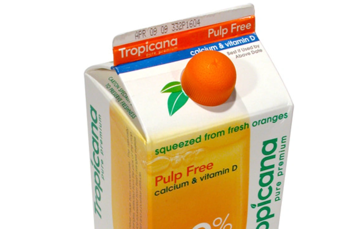
1) Tropicana’s carton overhaul - 2009
Tropicana expected a sleek, modern pack to premiumize the shelf and signal freshness. The redesign removed the famous orange-with-a-straw, softened the logotype, flipped the layout, and even changed the cap colour, erasing every recognition cue shoppers used at a glance. Loyal buyers couldn’t find “their” juice, shelf confusion spiked, and reported sales fell sharply within weeks before the brand reverted to the old design, an enduring case study among rebrands that backfired because nothing about the product improved to offset the identity shock (Packaging Digest).
- Result: rapid double-digit drop and swift reversal: pure recognition loss, not quality loss.
- Lesson: packaging is a shelf interface; keep at least one dominant anchor (image, colour block, wordmark).
2) Gap’s one-week logo - 2010
Gap wanted a clean fashion signal to feel contemporary and agile. The thin Helvetica wordmark with a tiny blue square arrived with no tie to fabric, fit, or value; customers perceived change for change’s sake and public backlash exploded. Within days, Gap scrapped the mark and restored the blue box, proof that a logo swap without a matching product story turns anticipation into rejection and lands on every list of worst rebrands (The Guardian, Vanity Fair).
- Result: reversal in under a week; even a crowdsourced fix attempt backfired.
- Lesson: launch the benefit with the look; otherwise the look becomes the problem.
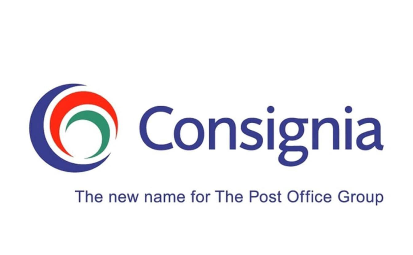
3) Royal Mail becomes Consignia - 2002
Leadership sought a global, diversified identity that transcended letters and parcels. Customers and employees read “Consignia” as abstract and evasive; media ridicule piled up, and the organization reversed to Royal Mail within roughly a year. The move showed how renaming away from a job-to-be-done can feel like cancelling what people rely on: textbook marketing rebrand failures built on language that ducks meaning (The Guardian).
- Result: costly U-turn and trust damage.
- Lesson: when the category promise lives in the legacy name, modernize around it; don’t erase it.
4) Netflix splits off Qwikster - 2011
Internally, separating DVDs (Qwikster) from streaming promised pricing freedom and operational clarity. For users, it meant two brands, two sites, two bills, and double the hassle. Outrage followed, Netflix apologized, and the Qwikster plan died within weeks, proof that brand architecture must reduce decisions, not mirror org charts, or it becomes one of those rebrands that backfired instantly (Forbes).
- Result: swift reversal, reputational bruise, and a renewed focus on simplicity.
- Lesson: separate brands only when separation removes friction for customers.
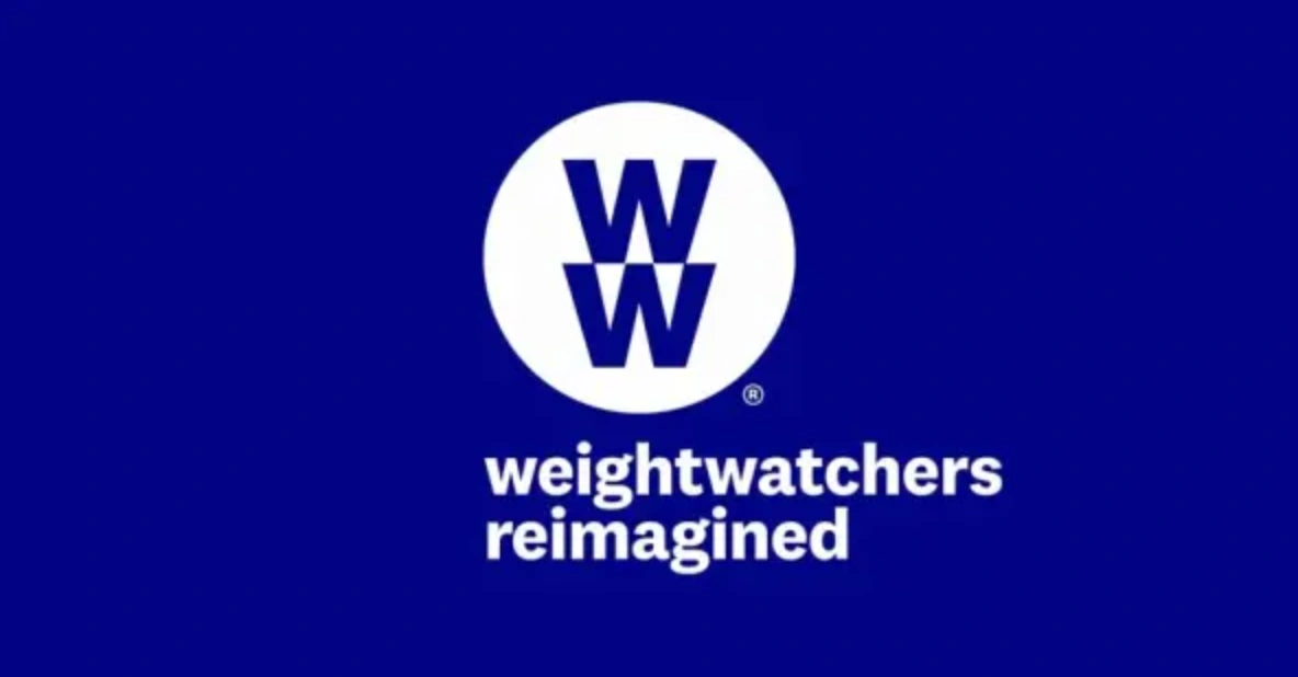
5) Weight Watchers to WW - 2018
The shift to “WW” aimed to expand from dieting to holistic wellness and attract new audiences. The new name blurred the outcome the brand was famous for, while the category pivoted toward prescription GLP-1s. Without matching product proof, “WW” struggled to land, and the company later entered Chapter 11 to restructure debt, an expectation-reality gap that turned a reposition into a cautionary tale in major rebranding failures (Reuters).
- Result: confusion about the promise amid market disruption; painful financial reset.
- Lesson: if you broaden the claim, ship new capabilities immediately or the name feels empty.
6) PwC Consulting as “Monday” - 2002
The consulting spinout wanted a crisp, ownable, minimalist name. Instead, “Monday” read as generic, meme-able, and unmoored from trust. Before the label could earn equity, IBM acquired the business and retired the name, demonstrating how B2B identities without day-one meaning or proof struggle to persuade and quickly join the canon of rebrand fails (Information Age).
- Result: no durable traction under the new brand; name scrapped post-acquisition.
- Lesson: in enterprise, brevity isn’t a strategy—load the name with narrative and evidence from launch.
7) Uber’s “bits and atoms” icon - 2016
Uber replaced its instantly recognizable “U” with a geometric symbol tied to an internal “bits and atoms” philosophy. Riders couldn’t find the app on crowded home screens, and the metaphor never translated to real-world wayfinding. Uber later returned to simpler, high-recognition assets, showing how usability beats theory when milliseconds matter (Wired).
- Result: confusion, drag on recognition, and eventual course correction.
- Lesson: an app icon is a locator first and a manifesto last.

8) BP’s “Beyond Petroleum” - 2010
BP introduced a sunny flower and “Beyond Petroleum” to signal a cleaner future. Operations and perception diverged; after the Gulf spill, critics used the identity as proof of greenwashing. The brand spent years battling the gap between promise and practice—an object lesson in marketing rebrand failures where storytelling outran operational truth (The Guardian).
- Result: reputational damage and enduring scepticism.
- Lesson: change what you do before you change what you say—or the new story becomes a target.
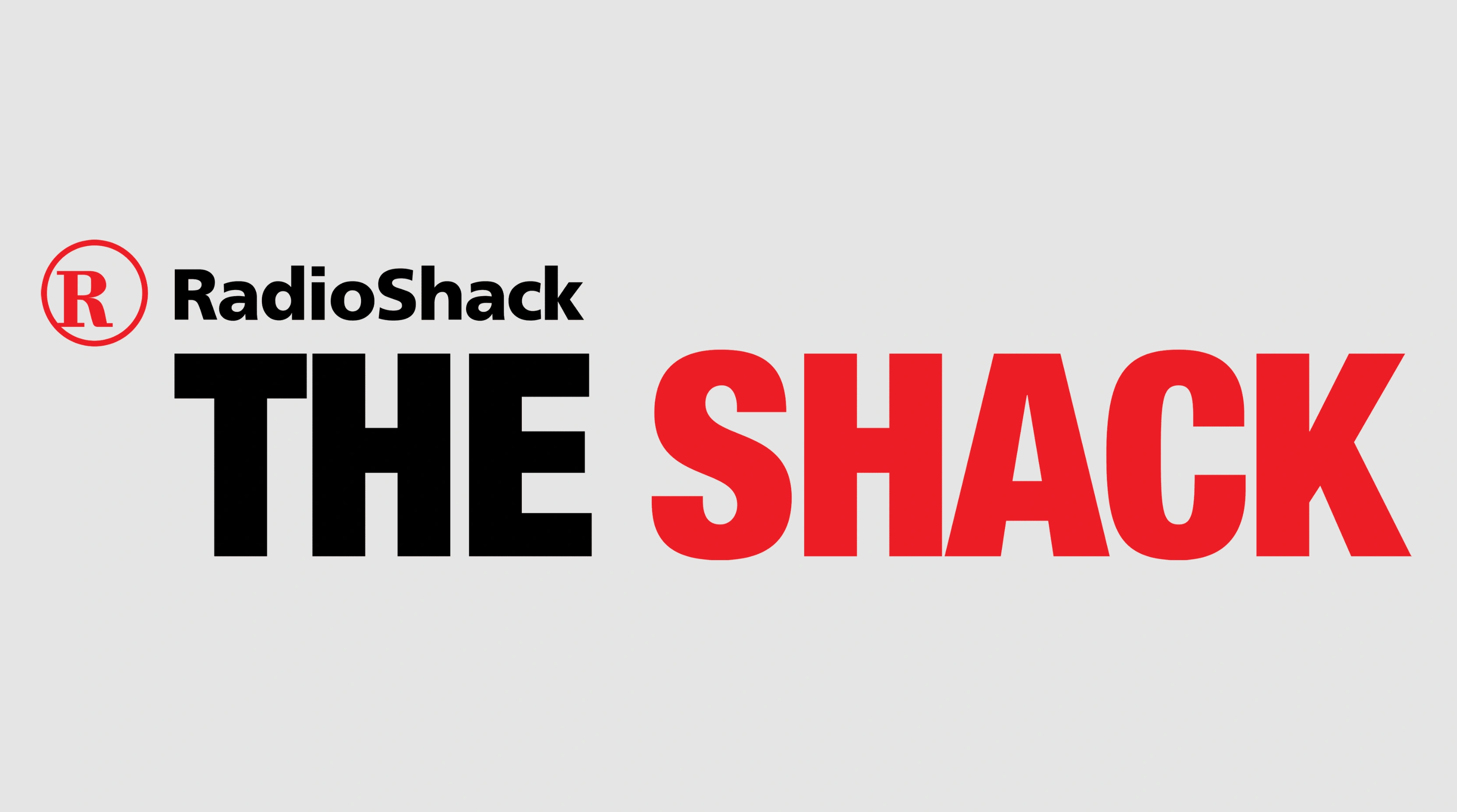
9) RadioShack becomes “The Shack” - 2009
The nickname sought youth and mobile relevance without fixing assortment or store experience. The campaign generated awareness but little persuasion; the core reason to visit hadn’t changed, and the rebrand turned into a punchline rather than a pivot, another fixture on lists of the worst rebrands because it chased tone over truth (Wired).
- Result: attention without renewal; no durable lift.
- Lesson: identity tweaks can’t compensate for product-market drift.
10) Twitter becomes X - 2023
The promise: a clean break and an everything-app future. The reality: discarding one of the world’s most distinctive names and symbols created an identity vacuum. Independent valuations estimated billions in brand value erosion after the rename, evidence that fame doesn’t transfer on command and that this remains one of the most visible rebrands that backfired in recent memory (Brand Finance).
- Result: documented brand-equity loss and widespread confusion.
- Lesson: build the new meaning first; migrate names when behaviour already matches the vision.
FAQ
What separates a smart refresh from marketing rebrand failures?
Smart refreshes preserve one or two distinctive assets (colour block, mascot, icon) and land with a felt product upgrade. Backfires remove recognition and add no clear benefit, so loyalists experience loss, not progress.
When is a rename worth it?
When the current name blocks growth or misleads new customers, and you have new capabilities ready to carry the promise.
How should brand architecture guide decisions like Qwikster?
Split only when separation removes friction. If it adds steps, bills, or mental load, keep it unified.
What’s the fastest way to de-risk a visual overhaul?
Test “findability” and “fit” before rollout: can people pick your item or app in two seconds, and does the new look feel truer to the product?
What these major rebranding failures teach
Memory is momentum. The worst rebrands treat memory like a problem to fix; the best treat it like a force to harness. Protect the cues that fund you, launch identity with an upgrade people can feel the same day, and let operations lead the story. That’s how you evolve without erasing what made the brand theirs, and how you stay off the list of rebrands that backfired.


