Google’s 2025 Logo Refresh Explained: What Changed and Why It Matters
Updated on
Published on
In May 2025, Google quietly rolled out its first major logo update in nearly a decade, refreshing the multicolour “G” icon that millions see every day. The familiar letterform stayed intact, but the rigid color wedges were replaced with a smooth gradient, marking the company’s biggest visual change since the 2015 wordmark redesign. This subtle yet meaningful shift signals Google’s effort to modernize its identity for the AI era while maintaining the recognition and trust built over decades.
At a glance
- On May 12, 2025, Google updated its “G” app icon by blending the four signature colors into a seamless gradient. The core letterform remained unchanged (The Verge, 9to5Google).
- The new icon reached Android later via Google app version 16.18 after initially appearing on iOS and Pixel devices (Android Police, 9to5Google).
- The gradient echoes the AI-enhanced aesthetic that Google introduced at I/O 2025 and in AI Mode for Search (Google Blog).
- Google's global search share remains outstanding at 89.83 percent as of August 2025 (StatCounter).
- In a February 2025 survey, 59 percent of Americans said they click results from brands they know, while 42 percent said search is becoming less useful (Search Engine Land, Search Engine Land).
- The gradient update remains accessible, as WCAG exempts logotypes from strict contrast rules. Research also shows gradients can improve icon findability (W3C, Taylor & Francis Ergonomics).
What changed in 2025
Google replaced the rigid color wedges in its “G” icon with a smooth gradient that transitions from red to yellow to green to blue. The shape stayed the same, maintaining instant recognizability, while feeling more modern and dynamic (The Verge, 9to5Google). It first appeared on iOS and Pixel, then moved to Android devices (Android Police).
This marks the first major update to Google’s app icon since 2015, when the company unveiled its current wordmark and simplified visual system. Nearly a decade later, the 2025 gradient refresh feels like the next natural evolution, balancing familiarity with modern design cues (9to5Google)

Why Google likely did it now
Alignment with the AI era. The gradient matches the AI-forward visuals Google showcased at I/O 2025 and in AI Mode (Google Blog).
Modernization without disruption. Just as the 2015 redesign prioritized clarity and scalability, this update polishes the look while preserving recognition (The Verge).
Design-system hygiene. Google often refines icons for consistency. The Chrome icon refresh in 2022 is a clear precedent (Google Blog).
A closer look at the Gemini logo refresh
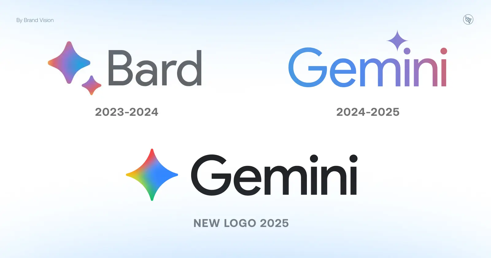
In July 2025, Google refreshed the Gemini logo to better align with the gradient aesthetic of the “G” icon. The new Gemini mark shifted from its earlier purple-blue scheme to a more vibrant gradient featuring multiple Google colors. This design coherence reinforces Google’s AI-first narrative, ensuring Gemini looks like part of the same system as the updated “G”.

By adopting gradients across both the flagship Google icon and Gemini, the company established a unified visual language. Together, these updates subtly but clearly communicate that AI is not just a feature but central to Google’s brand identity.

Where the new “G” fits in Material 3 Expressive
The “G” icon update arrives amid Google’s sweeping Material 3 Expressive refresh—a more colorful, playful evolution of Material You aimed at adding emotional depth to Android’s UI through bolder animations, richer colors, and rounded, pill-shaped components. According to Google, this change is the most research-driven update to its design system ever, with 46 user studies and over 18,000 participants informing it. The gradient-washed “G” aligns neatly with this visual language, signaling refreshed brand identity within a broader system-wide movement.
Gemini Logo Timeline
In early July 2025, Google introduced a refreshed Gemini logo that reinforces its unified branding strategy:
- July 1, 2025 — Android Authority’s APK teardown revealed a new animated Gemini logo adopting Google’s signature primary colors—red, yellow, green, and blue—replacing the older purple-and-blue palette. The updated version appears during app launch and onboarding screens, clearly signaling a shift toward brand cohesion. (Android Authority)
- By July 10, 2025 — 9to5Google confirmed the new Gemini logo had gone live on the web, applied as a favicon and visible on various UI surfaces. The gradient-style design echoes Google’s updated “G” icon, emphasizing visual unity across AI products. (9to5Google)
- Visual design details — The new logo features softer, rounded edges in the star/spark shape and uses the four-color gradient, enhancing recognizability and friendliness on small screens. CreativeBloq describes it as feeling “effortlessly integrated into the brand.”
These updates place both Google’s “G” and Gemini’s logo under a shared visual system, one that bridges the familiar with the AI-focused, reinforcing the message that Gemini is not a standalone experiment, but a core part of Google’s evolving ecosystem.
What did not change
This update is a refresh, not a rebrand. The Google wordmark introduced in 2015 remains unchanged, Alphabet’s corporate structure is untouched, and no product names or sub-brands were altered. In other words, Google has modernized a key icon without disrupting the foundation of its identity.
Rollout timeline and where it appears
- May 12, 2025: The new “G” icon appeared on iOS and Pixel devices, first spotted in the Google app (The Verge, 9to5Google).
- May 16, 2025: The Android rollout began with Google app version 16.18, delivered via the Play Store (Android Police).
Beyond the app icon
The gradient "G" is gradually appearing in more Google touchpoints, including not just the app tile but also other areas.
- Browser favicons — Seen in Chrome tabs and bookmarks.
- Search widget — Android’s home screen search bar now uses the gradient “G.”
- Notifications and launcher UI — Pixel launcher elements and notification headers show the new icon.
- Splash screens — The gradient mark appears during app load sequences.
- Web favicon for google.com — Early sightings of the updated favicon in some regions.
These gradual updates suggest Google is phasing in the gradient across its ecosystem rather than pushing a single “all-at-once” launch (Android Police).
Public perception and brand reality
Reactions ranged from “it looks sharper” to “can you even tell,” showing the typical divide around subtle design updates (Fast Company, The Verge).
Despite chatter, Google’s fundamentals remain strong. StatCounter shows 89.83% global search share in August 2025. Meanwhile, Search Engine Land reports 59% of users prefer clicking familiar brands, but 42% feel search is less useful. This duality frames the environment any refresh must live within.
Accessibility and legibility
Contrast rules. WCAG exempts logos from strict contrast ratios, but good practice is still to ensure figure-ground clarity (W3C, WebAIM).
Gradients and findability. Peer-reviewed research shows gradients can help icons stand out and be located faster (Taylor & Francis Ergonomics).
Marketer’s evaluation: Is it a successful refresh?
Distinctiveness. The “G” shape remained intact, which is critical for recognition (Journal of Consumer Research).
Narrative. The gradient matches AI-forward positioning and aligns visually with Gemini (Google Blog).
Flexibility. Google controls most environments where its icons appear, minimizing risks tied to gradients (Google Blog).
Impact. This update adds freshness without confusion. In a world where familiarity drives clicks, it’s strategically sound (Search Engine Land).
What to watch next
- Expansion: Will Gmail, Maps, and Drive adopt gradients? (The Verge)
- AI perception: User sentiment as Gemini evolves (Google Blog).
- Equity: Google remains No. 2 globally in Kantar BrandZ 2025 with a brand value of $944B (Kantar).
FAQ
Did Google change its wordmark in 2025?
No, only the “G” app icon was refreshed (The Verge).
Is the new icon universal yet?
It’s live on iOS, Pixel, and Android (via v16.18). Wider rollout remains unconfirmed (Android Police).
Was the update tied to AI Mode?
Yes, the timing aligns, though Google hasn’t issued a dedicated rationale (Google Blog).
Did Gemini get a new logo too?
Yes, in July 2025 Gemini introduced a gradient logo consistent with Google’s new design theme.
Are gradients accessible?
Yes, when designed carefully. WCAG exempts logos, and gradients can improve visual search (W3C, Taylor & Francis Ergonomics).
Google’s 2025 icon refresh is a subtle but smart update that visually aligns the brand with its AI-first era. Paired with Gemini’s new logo, the gradient theme signals unity across the ecosystem. It’s a move that modernizes without disruption, ensuring Google remains instantly recognizable while reinforcing its future-facing narrative.


