From Click to Stay: Comparing the Design DNA of Booking and Airbnb
Updated on
Published on
In the crowded world of travel apps, Booking and Airbnb aren’t just names, they are benchmarks. They’ve transformed how millions plan, book, and experience travel. But their success isn’t just about inventory or prices. A big part of the reason they lead is how they’re built, how they feel, how easy they are to use.
If you scroll through user-flow breakdowns or UX case studies, you’ll see time and again how design decisions, small and large, tip the balance between “meh, I’ll try another app” and “wow, I’ll book right now.” In fact, there’s even analysis out there telling designers to learn from pageflows.com for inspiration on how flows should feel smooth and intuitive (learn from https://pageflows.com/).
So let’s walk through each app’s design world, see what works, what differs, and how their user experience DNA has helped them conquer the travel industry.

Section 1: Booking – the engine behind hotel bookings
Booking (or Booking.com) is a giant in online travel and lodging. It started in 1996 and today serves millions of listings around the world.
Design & UX philosophy
Booking operates as an OTA (Online Travel Agency) more than a peer-to-peer marketplace. That means its focus is often on hotels, or more “formal” lodging, plus flights, car rentals. That brings certain constraints and user expectations.
They maintain a design system (Booking has a “design” division, with many teams contributing). Their goal: consistency across many features (search, map, filtering, deals).
They also use heavy A/B testing. One write-up mentions how Booking has slashed 75% of aggressive messages (popups, discount push) to make the buying path smoother.
Strengths and challenges
Strengths:
- Clarity of deals and urgency cues. The app highlights when rooms are “almost sold out” or “high demand” to drive action.
- Search simplicity.You enter dates, location, you filter. It’s familiar and predictable.
- Deep inventory and reliability. Because the core business is hotels and professional lodging, standards tend to be higher (photos, amenities, reviews) which makes UX decisions easier.
Challenges:
- Map interaction. A design critique pointed out that on hotel map mode, nearby facility icons (cafes, transport) are unclickable and provide low feedback, making exploration harder.
- Visual consistency vs clutter. Some parts of the app mix styles (rounded vs square UI elements) as noted by designers doing heuristic analyses.
- Customizing for complex trips. Because the app handles flights, lodging, extras, the interface can sometimes feel dense or overwhelming for users just wanting to book a hotel.
A case study reimagining Booking’s app aimed to reduce time-to-book and remove friction.
In practice, Booking’s design DNA is about reliability, predictability, and optimizing conversion.
Section 2: Airbnb – the experience-first design
Airbnb’s journey is often held up as a classic case of design-led growth. Their model is different: they connect individual hosts with guests, with a strong emphasis not just on lodging but on trust, experience, community.
Design & UX philosophy
Airbnb built its own design language system (DLS) to maintain consistency and scale. They care a lot about emotional design, micro-interactions, as well as building trust (reviews, profiles, identity verification).
In recent years, they relaunched their app to expand beyond stays: users can now book “services” (e.g. haircuts, personal trainers) alongside experiences. The challenge: keep the interface intuitive while adding new verticals.
They use data, A/B testing, user feedback actively to refine flows.
Strengths and challenges
Strengths:
- Trust and social cues. Reviews, host profiles, “Superhost” badges – all build confidence between strangers.
- Inspirational browsing. The app doesn’t just ask “where do you want to go?” – it invites discovery (e.g. “Tiny Homes”, “Earth Houses”) so users might book something they hadn’t considered.
- Sleek minimalism. After the winter redesign, the app leaned heavily into simplicity, clarity, and removing distractions.
- Seamless host-guest flow. Their messaging, check-in instructions, maps and guides get blended into the booking lifecycle. One UX case study noted that the team observed ~1.5 million photo messages being exchanged weekly to explain entry or directions, and from that insight they built a global check-in tool.
Challenges:
- Feature proliferation. As Airbnb adds experiences and services, the interface risks becoming crowded.
- Navigation complexity. With many filters, map modes, optional toggles, some users find navigation nontrivial.
- Balancing inspiration vs usability. Showing aspirational content is good, but ensuring users can get back to basics (search, book) is essential.
Overall, Airbnb’s design DNA is about emotion, trust, discovery.
Section 3: Side-by-side comparison
Here’s a table comparing key UX/UI traits of Booking vs Airbnb:
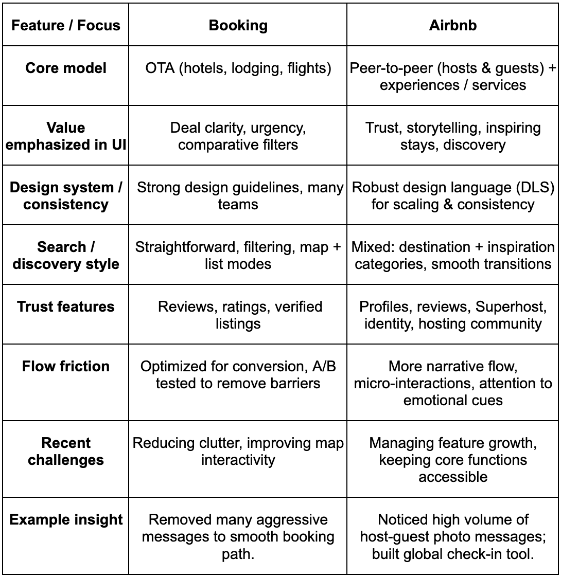
Comparing them, you see: Booking is more functional, more buttoned down. Airbnb is more expressive, more emotional. Each has trade-offs.
Section 4: Why design matters – a deeper look
Let’s tell a story. Imagine you’re planning a surprise trip for a friend. Late at night, you open both apps.
In Booking, the deals jump out. You filter by price, star level, location. You see “Only 2 rooms left” in red. You pick, you pay. Done.
In Airbnb, you scroll, pause. You see a unique treehouse in a forest, with glowing images. You tap, read reviews, see host stories. You imagine staying there. You compare. Then you book.
What tipped you? In Booking, urgency and clarity. In Airbnb, emotion and narrative.
Design matters because users decide fast (seconds). If a UI feels confusing, or a button looks wrong, people drop off. That’s lost revenue. Many case studies and industry analyses show that companies prioritizing UX see higher conversion, retention, and loyalty.

Conclusion (with a twist)
You might think a travel app is about listings, deals, or reach. But behind it all rides design: the choices about what to show, when, how many steps, which image, which button color. Booking and Airbnb didn’t become giants because they had more rooms (though that helps). They became giants because they made you feel confident, excited, and oriented.
If I were to leave you with one surprising thought: the differences in their design DNA mirror their business DNA. Booking is logic, speed, deals. Airbnb is emotion, community, discovery.
So next time you tap “search” in a travel app, pause a second and feel it: the padding around elements, the ease of back buttons, the story of the image. That’s design whispering.

