
Designing for SEO: UX/UI Essentials That Help You Rank
Updated on
Published on
People click because they are curious, but they stay because your page feels effortless and is a user-friendly experienceence. That is the promise of UX/UI for SEO. If you want to rank for seo with UX/UI, design choices must remove friction at every step so users find answers quickly and confidently. When interfaces are clear, fast, and accessible, search engines also understand them better. Get the UX/UI services right and your pages earn trust, engagement, and the rankings that follow.
At a Glance
- Core Web Vitals are table stakes for speed, responsiveness, and stability (Google Search Central).
- Mobile first rules the index, so your smartphone view is your real site for search (Google Search Central).
- Information architecture and internal links teach users and crawlers how pages relate (Google Search Central).
- Clear content design increases comprehension and keeps people on page (Nielsen Norman Group).
- Accessibility and semantic HTML improve reach and machine understanding (W3C WAI).
- Structured data and clean markup can unlock richer results when paired with clear on-page text (Google Search Central).
Methodology
- We prioritised official documentation and long-running research from sources like (Google Search Central), (web.dev), (W3C WAI), (Nielsen Norman Group), and (Baymard Institute).
- We focused on patterns that measurably affect engagement, conversions, and indexability.
- We translated technical guidance into UI decisions any product or content team can apply.
1. Core Web Vitals made simple
Core Web Vitals measure whether your page loads fast, responds quickly, and stays stable while loading. Aim for Largest Contentful Paint at or below 2.5 seconds, Interaction to Next Paint at or below 200 milliseconds, and Cumulative Layout Shift below 0.1. INP replaced FID as the responsiveness metric, which means long main-thread tasks, heavy JavaScript, and late event handlers are now the main culprits to fix. Tackle these and you improve both user satisfaction and eligibility for better visibility in search results (Google Search Central) (web.dev).
- Give the hero image priority using fetchpriority="high" or a preload and never lazy-load your LCP element (web.dev).
- Reserve image and embed space with width and height attributes to prevent layout jumps that hurt CLS (web.dev).
- Break up long tasks, defer non-critical scripts, and use passive listeners to keep INP within target ranges (web.dev).

2. Mobile first without the mystery
Google primarily indexes the smartphone version of your pages, so that is the experience that counts. Content, meta tags, structured data, and internal links must be present and usable on mobile, not hidden behind gestures or accordions that block discovery. Treat touch comfort, readable type, and scannable navigation as first-order ranking inputs because they drive real user behaviour that search systems pick up over time (Google Search Central) (W3C WAI).
- Keep tap targets large enough and maintain visible focus states for keyboard and touch.
- Make all primary content visible in the DOM on initial load rather than gated behind actions a crawler will not perform (Google Search Central).
- Use fluid, responsive typography and images so reading never requires pinching or zooming.
3. Information architecture that teaches meaning
Information architecture is how you explain your site to humans and machines. Clear hierarchies, descriptive menus, and sensible breadcrumbs reduce confusion and clarify relationships between pages. Internally link core pages with concise, meaningful anchor text that sets expectations. These patterns guide users to answers and help search engines map your entities and topics more reliably over time (Google Search Central) (Nielsen Norman Group).
- Use breadcrumbs for depth, then add Breadcrumb structured data so results can reflect hierarchy clearly (Google Search Central).
- Build lateral links between related pages to spread authority and keep readers moving through a topic.
- Keep mega menus focused and scannable rather than turning them into a wall of options (Nielsen Norman Group).

4. Content design people actually finish
Most visitors scan before they commit. Strong subheads, short paragraphs, lists, and generous white space make information easy to grasp. The inverted pyramid puts the most important facts first, which reduces pogo-sticking and improves task completion. These same patterns make your topic and answers clearer to machines that extract meaning from structure and language at scale (Nielsen Norman Group). Working with a UI/UX agency can help your organize and map out the content design through expert assisatnce.
- Aim for comfortable line length and line height so eyes do not work harder than brains.
- Use descriptive headings that echo the questions people ask rather than clever but vague labels.
- Pull key facts and definitions into lists to support quick scanning without sacrificing depth.
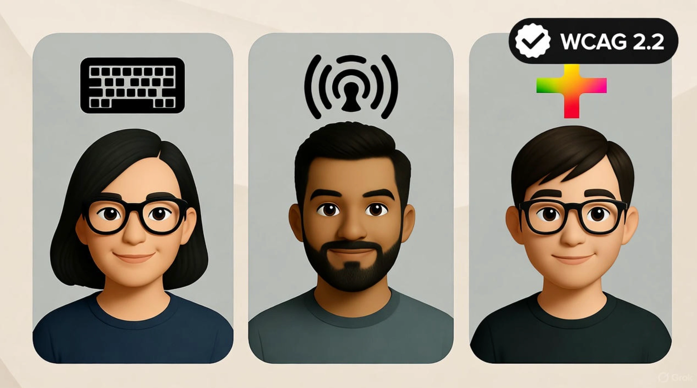
5. Accessibility that expands reach and trust
Accessible design helps more people use your site while also giving machines cleaner signals to interpret. WCAG 2.2 adds important criteria like Target Size and Focus Appearance that align with better mobile usability. Write meaningful alt text for important images, keep decorative images empty with alt="", and maintain strong colour contrast. Semantic landmarks like <header>, <nav>, <main>, and <footer> help assistive tech and also clarify structure for parsers at scale (W3C WAI) (Google Search Central).
- Ensure full keyboard access to every interactive control and keep focus visible at all times.
- Label inputs, buttons, and links clearly so names, roles, and states are unambiguous.
- Test with screen readers and simulated low-vision settings to catch hidden friction.
6. Images and media that load fast and rank well
Media often carries the heaviest bytes on a page, so optimisation is a ranking-adjacent priority. Use modern formats, compress aggressively, and lazy-load only what sits below the fold. Keep above-the-fold assets eager, especially the hero image, and always reserve space to avoid shifts. Provide accurate filenames and alt text so images can surface in image search and reinforce topical clarity (Google Search Central).
- Use native loading="lazy" for below-the-fold images and verify that important content is still discoverable (web.dev).
- Preload critical fonts and avoid invisible text by setting an appropriate font-display strategy.
- Supply width and height attributes to keep CLS within target thresholds (web.dev).
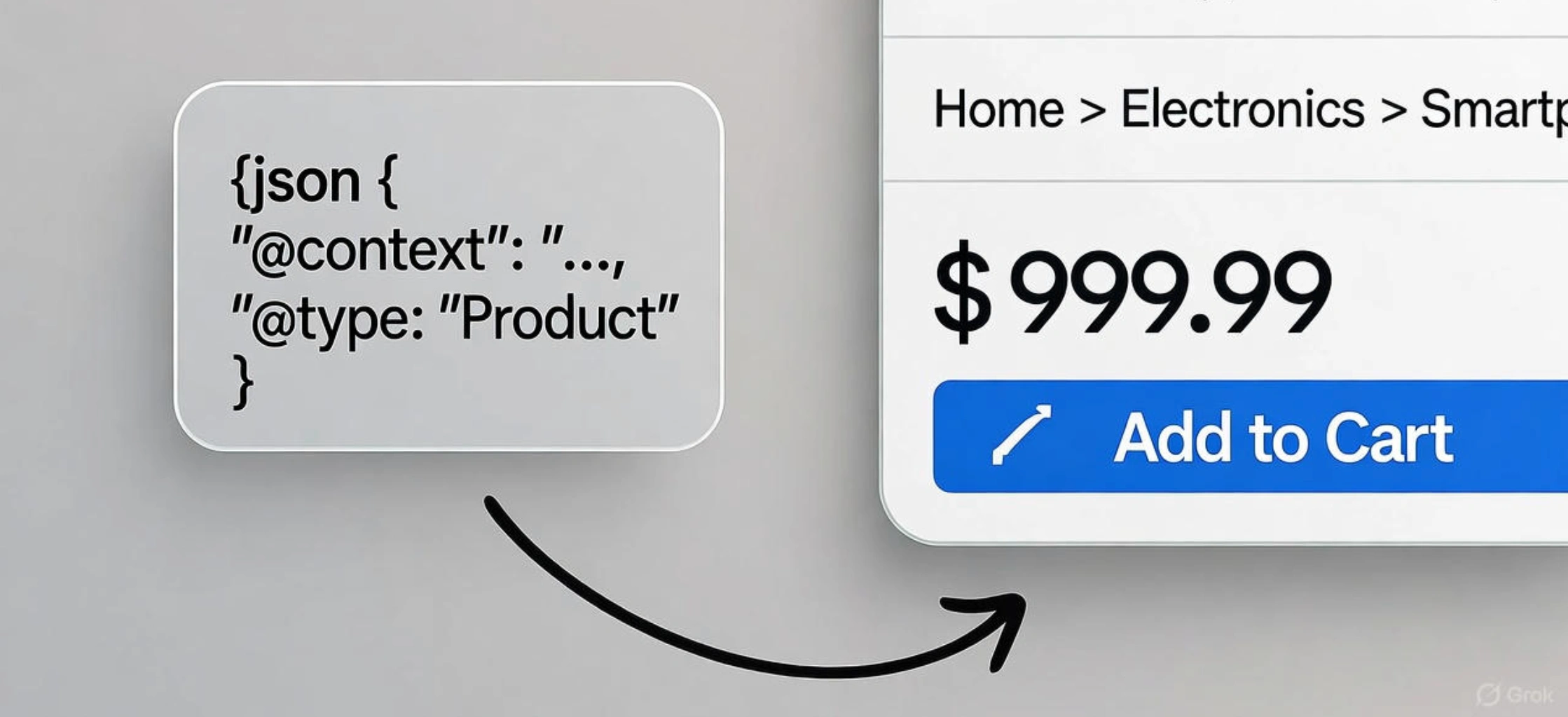
7. Structured data and semantic HTML for clearer snippets
Structured data is how you label things for machines without confusing people. Use supported schema types like Article, Product, BreadcrumbList, and FAQPage where they apply, and make sure the visible page content matches the markup. Structured data increases eligibility for rich results, although display is never guaranteed. Pair it with clean, semantic HTML so your meaning is clear even without enhancements (Google Search Central).
- Validate with the Rich Results Test and fix errors before shipping changes at scale.
- Keep site names, favicons, and logos consistent so brand signals are unambiguous across results (Google Search Central).
- Avoid spammy or misleading fields and never mark up content that the page does not actually show.
8. Dialogs and interstitials without penalties
Aggressive popups frustrate users and can reduce visibility. If you must show a dialog, make it dismissible, accessible, and timed to behaviour rather than blocking primary content on load. Cookie banners and age gates should be compact and should not obscure the main text on first paint. Thoughtful timing protects engagement and keeps you within recommended practices for search visibility (Google Search Central).
- Prefer slim banners or inline notices that do not push content around.
- Trap focus inside the dialog, then return it to the trigger on close so keyboard users are not stranded.
- Delay non-critical prompts until after a user action like scroll or add to cart.
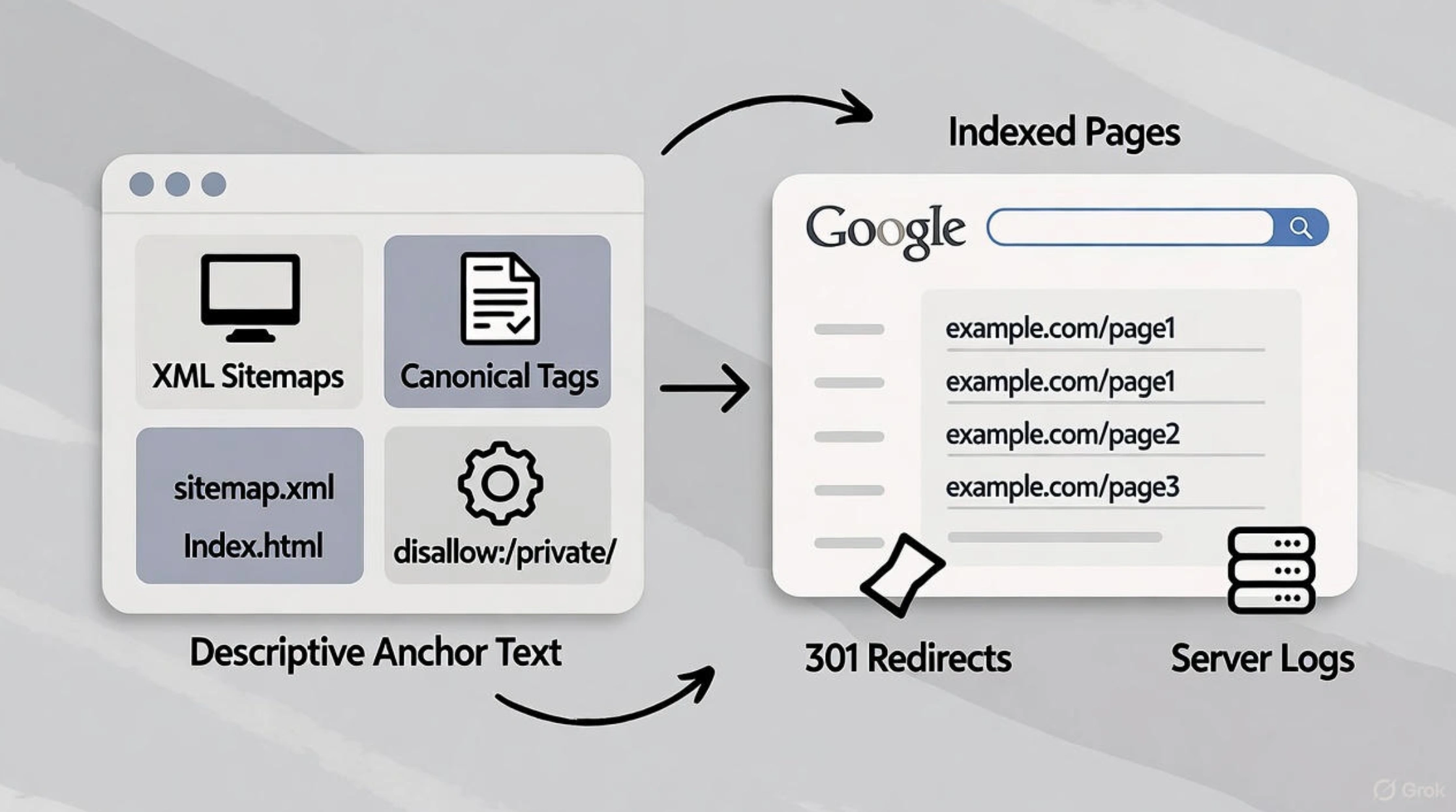
9. Crawl-friendly UI that supports indexing
Your interface affects what Google can fetch, render, and index. Submit XML sitemaps, use canonical tags to consolidate duplicates, and avoid blocking essential CSS and JavaScript. Use noindex for pages you want excluded from results and keep robots.txt for crawl control, not de-indexing. For long lists, make pagination and infinite scroll discoverable so each item is reachable by a link or an incremental loading pattern that exposes full content to crawlers (Google Search Central).
- Keep links crawlable and descriptive so meaning is carried in the anchor text.
- Use 301 redirects for permanent moves and avoid soft 404s by returning the right status codes (Google Search Central) (Google Search Central).
- Monitor server logs to confirm that important templates and assets are being fetched reliably.
10. Ecommerce patterns that reduce drop-off
Product pages and checkout flows decide revenue and many UX fixes are measurable. High quality images with zoom, clear specs, upfront shipping and returns, and short, predictable checkout steps reduce abandonment. These improvements do double duty for SEO because they increase engagement and clarify product data that search engines can display in richer listings when structured data is present (Baymard Institute) (Google Search Central).
- Show price, availability, delivery window, and return policy before the last step to reduce surprises (Baymard Institute).
- Keep form fields to the minimum required and explain why you need sensitive details.
- Add Product, Offer, and Review markup where appropriate and keep it consistent with what users see (Google Search Central).
FAQ
What are the quickest UX/UI fixes that help rankings?
Prioritise Core Web Vitals above the fold, especially LCP and INP, and remove intrusive interstitials. These two moves often unlock fast engagement gains while you improve architecture and content depth over time.
How do I use UX/UI for SEO on content pages, not just product pages?
Organise topics into clear hubs, add descriptive subheads that echo user questions, and link laterally between related articles. These simple UX/UI essentials make it easier to rank for seo with UX/UI because they improve comprehension and navigation signals.
Should I lazy-load everything for speed?
No. Eager-load the hero and anything in the initial viewport and lazy-load the rest. Always test that important content remains discoverable and that images reserve space to avoid layout shifts.
Does structured data guarantee rich results?
It increases eligibility, not certainty. Keep markup accurate, visible, and aligned with page content, then validate it before release to reduce errors that prevent enhancements from showing.
The why behind UX/UI for SEO
Search rewards pages that respect people’s time. When your design is fast, readable, and easy to navigate, visitors finish tasks and stick around. That behaviour tells every ranking system that your answer is worth elevating. Treat UX/UI for SEO as the operating system for your content. If you keep refining these UX/UI essentials, you will rank for seo with UX/UI more often and keep the wins you earn.


