What Makes a Brand Look Premium? 12 Cues People Instantly Notice
Updated on
Published on
Premium and luxury sit on a spectrum. Luxury promises rarity and exclusivity. Premium sits above the mainstream, but still feels accessible. In both cases, the experience has to justify a higher expectation, not only a higher cost.
Recent consumer research shows that people still trade up when the value feels real. PwC’s 2024 Voice of the Consumer survey found that consumers are willing to pay an average of 9.7 percent more for sustainably produced or sourced goods, even as cost-of-living pressure continues. That premium is not only about ingredients. It reflects trust in the brand and the story around the product.
In parallel, luxury research has tracked a rise in “inconspicuous consumption” (PolyU Education). More knowledgeable, affluent consumers increasingly favour subtle codes of luxury over visible logos. Status is shifting from being loudly signalled to quietly understood.
All of this reinforces a simple idea. Premium is a feeling created by a series of small signals: how an object feels in the hand, how calmly a website reads, how a support email sounds. The rest of this article looks at those signals in a structured way.
How People Instantly Judge Whether Something Feels Premium
People make snap judgments. In the first few seconds, they thin slice: stitching together small cues like weight, spacing, tone, and context into an overall impression.
Packaging research is a clear example. A 2025 study on visual elements of packaging design found that 72 percent of consumers in a global Ipsos survey believe packaging design plays a key role in their purchasing decisions (Global Newswire). Separate surveys have reported similar numbers, with roughly seven in ten consumers agreeing that packaging design can influence whether they buy. If the box or bottle feels cheap, the brand does too.
Digital is no different. People scan your homepage, product page, or pitch deck and decide whether you feel like a budget option, a safe mid-market choice, or something they are willing to stretch for.
At a Glance: The 12 Premium Cues
- Visual identity
- Cue 1: Intentional white space and visual restraint
- Cue 2: Typography that signals care and craft
- Cue 3: Colour, contrast, and imagery that feel considered
- Cue 4: Cohesion across touchpoints, not just a nice logo
- Cue 1: Intentional white space and visual restraint
- Product and packaging
- Cue 5: Materials, weight, and tactility
- Cue 6: Craft, detailing, and finishes
- Cue 7: Sustainability as a modern premium signal
- Cue 5: Materials, weight, and tactility
- Digital experience
- Cue 8: Pacing, motion, and microinteractions
- Cue 9: Editorial content, photography, and storytelling
- Cue 10: Focused flows and frictionless journeys
- Cue 8: Pacing, motion, and microinteractions
- Service and context
- Cue 11: Service rituals, policies, and people
- Cue 12: Scarcity, selectivity, and social proof
- Cue 11: Service rituals, policies, and people
Visual Identity Cues: Looking Premium Before Anyone Reads a Word
Great brands look premium before anyone reads a headline. Visual identity sets the tone from a distance.
Cue 1: Intentional White Space and Visual Restraint
Premium brands rarely try to say everything at once. They let the design breathe.
On a website or in a brochure, generous white space communicates confidence. It suggests that the brand trusts a few strong elements instead of crowding the screen with badges, buttons, and banners. Clear margins, consistent spacing, and a limited number of content blocks help your message land without stress.
You see the difference when comparing two homepages side by side. One shows a dense grid of offers, carousels, and pop-ups. The other presents a simple headline, one action, and a single strong image above the fold. Both might be selling to the same customer. Only one feels prepared to charge a premium.
Cue 2: Typography That Signals Care and Craft
Typography is often the most immediate signal of care. Sloppy type undermines a brand even when everything else is expensive.
Premium typography is not about picking a fashionable serif. It is about rhythm and intention: a small, consistent set of typefaces, clear hierarchy between heading and body styles, and careful attention to spacing and alignment. Kerning and line spacing should feel deliberate, not random.
A structured type system also makes it easier to scale your brand into presentations, product screens, and marketing materials without redesigning everything each time. This is where a strong visual identity design system earns its keep.
Cue 3: Colour, Contrast, and Imagery That Feel Considered
Many brands equate premium with dark palettes and metallic accents. That can work, but it is not required.
The common thread across premium brands is discipline. They use a tight palette and stick to it. Accent colours are used sparingly for emphasis, not everywhere. Contrast is used to guide the eye, not to shout.
Imagery follows the same pattern. Editorial style photography, material close ups, and simple compositions feel more premium than generic stock images. Product shots are lit to show texture and finish, not just shape. Lifestyle images are chosen for mood and narrative, not only demographics.
Cue 4: Cohesion Across Touchpoints, Not Just a Nice Logo
A premium logo on inconsistent materials does not read as premium. It reads as unfinished.
Cohesion means that the same visual rules show up in packaging, decks, website, app, and even internal tools. Type scales match. Colour behaves the same way. Iconography feels like part of one family. Together, those decisions create a sense of reliability.
For many teams, this is the point where working with a specialised branding agency to codify identity into a robust system is more effective than tweaking assets ad hoc. A consistent system reduces design debt and lets every new touchpoint reinforce the same premium story.
Packaging and Product Cues: Texture, Weight, and Finish
Physical products have an advantage. They can use weight, texture, and function as cues.
Cue 5: Materials, Weight, and Tactility
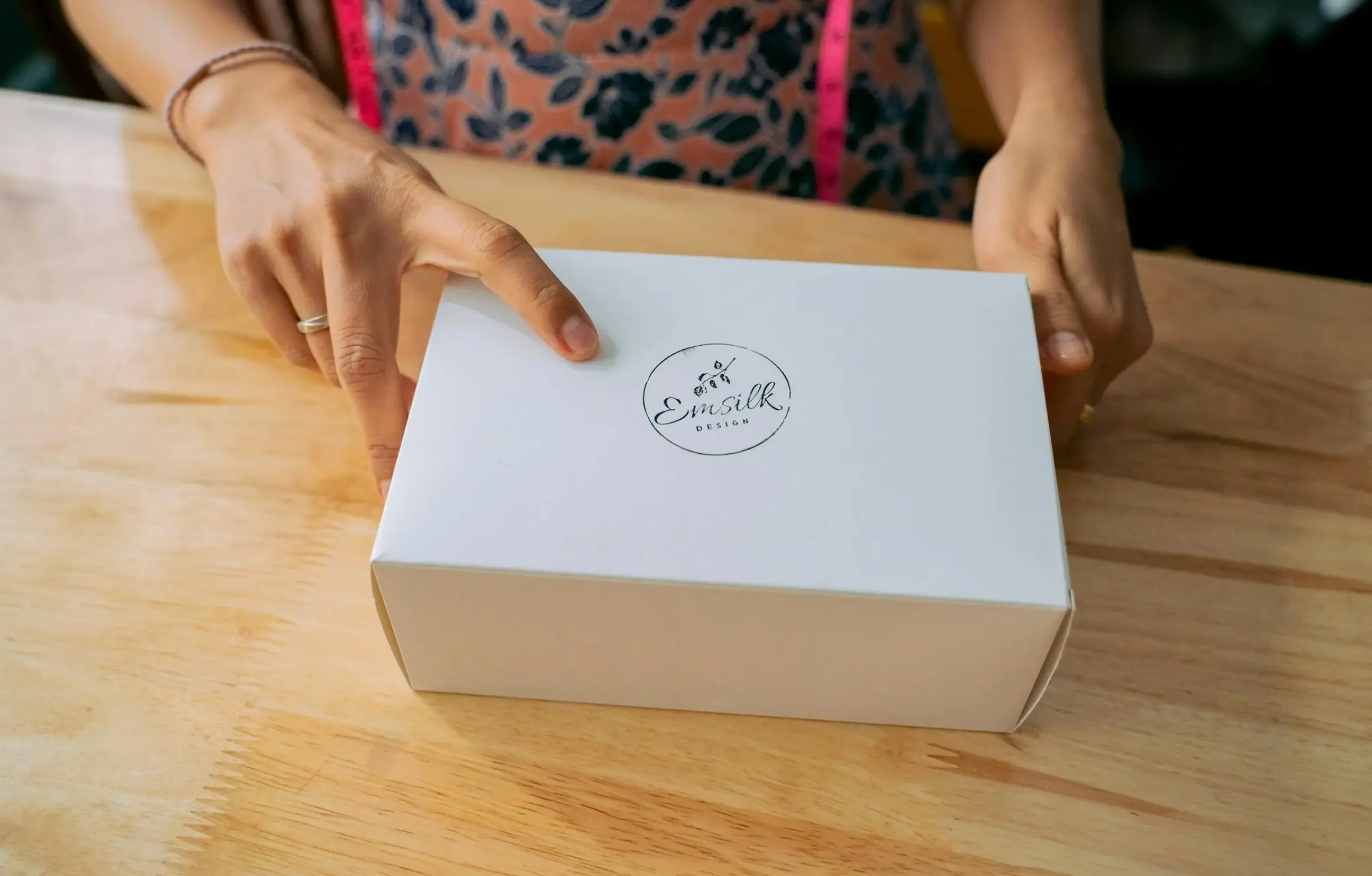
Weight and material are among the first things people notice when they pick up a product. A lid that closes with a clean click or a card that feels substantial signals that something has been invested in the experience.
Research on packaging design shows that structural elements and materials significantly influence perceived quality and purchase intent (National Library of Medicine). Heavier, more rigid forms are often read as more premium, as long as they are not awkward to use.
This does not mean everything needs to be heavy. The goal is a coherent tactile language: if the brand is about lightness and agility, materials can be thin yet crisp rather than flimsy.
Cue 6: Craft, Detailing, and Finishes
Premium brands pay attention to small details that cheaper products ignore. Embossed lettering, well aligned labels, and precise folds are all cues that someone cared.
Finishes like soft touch coatings, foils, or specialty varnishes can reinforce that impression, if they are used deliberately. Too many competing finishes can push the design toward novelty rather than premium.
A helpful lens is to ask which one or two details a customer will discover and remember. A distinctive cap, a hidden message inside the lid, or a perfectly flush join can matter more than a long list of special effects.
Cue 7: Sustainability as a Modern Premium Signal
Sustainability has moved from a niche value to a mainstream expectation. For many customers, responsible materials and production now read as a premium attribute rather than a compromise.
PwC’s 2024 Voice of the Consumer survey reports that consumers are willing to pay an average of 9.7 percent more for sustainable goods, with many saying eco friendly packaging and waste reduction influence their choices (PwC). Other studies show strong willingness to pay more for sustainable options among younger cohorts (Plastic Bank).
In practice, premium brands are shifting from heavy, mixed material packaging toward recyclable boards, refill systems, and clear sustainability claims that feel precise rather than vague. The key is to balance responsibility with tactility so that the experience still feels intentional and high quality.
Digital Experience Cues: What Premium Looks Like in UX and UI
For many organisations, the website or product interface is the primary showroom. Visual identity and content cues now live inside UX decisions.
Cue 8: Pacing, Motion, and Microinteractions
Premium digital experiences feel calm. They encourage people to look, not rush.
That calm comes from pacing. Animations ease in and out smoothly. Hover states respond quickly but not aggressively. Elements enter the viewport in a measured way instead of all at once. Even scroll performance becomes a cue; jitter and layout shifts feel cheap.
At the same time, performance still matters. Premium should not mean slow. It means that motion is purposeful and restrained, with every transition supporting comprehension rather than distracting from it. This is the kind of nuance a dedicated UI UX design agency can help define and systemise.
Cue 9: Editorial Content, Photography, and Storytelling
On a premium website, copy and imagery work together like a good spread in a magazine.
Headlines are short and declarative. Body copy respects the reader’s time, explaining what matters in a few clear sentences. Photography and video focus on materials, outcomes, and use in context. There is a clear point of view, but it is delivered with restraint.
Brands that rely on complex products often benefit from editorial style content: structured explainers, case studies, and thought leadership pieces that show how the brand thinks, not just what it sells.
-1.webp)
Cue 10: Focused Flows and Frictionless Journeys
A premium experience guides people with clarity. Navigation is simple. There are only a few primary actions per page. Forms ask for what is needed, not every possible detail.
This focus builds trust. When every step feels necessary and well designed, people infer that the brand respects their time. In contrast, cluttered menus, confusing filters, and broken responsive layouts all suggest a lack of investment.
Reworking these flows is often where partnering with a specialist web design agency pays off. Clean information architecture and considered interaction design both signal that the brand is serious about quality.
Service, Social Proof, and Context Cues
Even the best design can be undone by poor service. Premium perception lives in behaviour as much as in visuals.
Cue 11: Service Rituals, Policies, and People
How a brand behaves before and after a sale is one of the strongest premium cues.
Service rituals include how quickly people receive a reply, how informed that reply feels, and whether issues are resolved with empathy or scripts. Premium service is often quiet: clear language, fair policies, and thoughtful follow-up.
Policies are another cue. Transparent guarantees, sensible return windows, and proactive status updates suggest a brand that plans for the full journey. A confusing policy page stuffed with caveats does the opposite.
Training matters too. Staff who understand the product, know when to improvise, and treat customers with respect create the human layer of a premium experience.
Cue 12: Scarcity, Selectivity, and Social Proof
Scarcity can be a powerful cue when it is authentic. Limited runs, waitlists, and invite only programs signal that a brand is careful about who it serves, and that demand is real.
Recent work on inconspicuous consumption highlights that many luxury consumers prefer subtle, insider signals to obvious logos or heavy discounting (PolyU Education). Rather than shouting about exclusivity, brands use small markers: a specific colour, a distinctive packaging quirk, or an offline ritual that insiders recognise.
Social proof supports these cues. Expert reviews, case studies, and credible testimonials all help justify premium positioning. The strongest examples show the outcome and context, not just praise. Structured brand research and perception studies can also reveal which signals actually move the needle for your audience.
Quiet Luxury: When Premium Signals Go Subtle
Quiet luxury has become shorthand for a specific kind of premium. It is less about minimalism and more about selective signalling.
In their 2025 paper “The hidden signals of luxury,” Cho and Cho show how social connectedness and insider knowledge shape how people recognise luxury when the cues are subtle (PolyU Education). The more familiar someone is with a category, the more likely they are to value small, hard to fake details over obvious logos.
Wong and Ho’s work on the “luxury consumer knowledge effect” reaches a similar conclusion. As consumers become more experienced in a category, they often shift from conspicuous to inconspicuous displays, favouring products that “those who know, know.”
For brands, the lesson is not that everything should look plain or deliberately strange. It is that you should be clear who you are signalling to. If your buyers are already deeply engaged with the category, you may have more freedom to use subtle, even “ugly on purpose” cues that insiders recognise. If not, clarity and legibility still matter more than cleverness.
Quiet luxury also reinforces the importance of consistency. When signals are subtle, any sloppy execution can undermine the entire code.
Key Takeaways for Founders, CMOs, and UX Leads
Premium is not an aesthetic mood board. It is a disciplined set of choices about how your brand looks, feels, and behaves.
A few points to keep front of mind:
- People decide quickly whether you feel premium, often before they read a word. White space, typography, and cohesion do much of the early work.
- Product and packaging cues still matter deeply. Weight, tactility, and detailing shape perceived quality, while sustainable materials increasingly read as a premium choice rather than a compromise.
- Digital experience is now a primary showroom. Calm pacing, focused flows, and clear content are some of the strongest premium cues you can control.
- Service and context either reinforce or undermine the story. Fair policies, informed people, and credible proof support premium positioning far more than slogans.
- Quiet luxury reminds us that for many audiences, subtle, quiet signals matter more than loud displays. That shift is supported by recent research on inconspicuous consumption and consumer knowledge. (PolyU Research)
- You do not need all twelve cues. Picking a coherent subset and systemising them beats chasing every trend.
If your brand, site, or product feels a step behind the price you need to charge, this is a good moment to revisit your cue system. You can work through the framework internally or partner with Brand Vision Marketing and its branding, web design, and UI UX design services to shape a premium experience that fits your market.
When you are ready to explore that work in more detail, start a conversation with the team and request a project outline that connects premium cues directly to revenue, loyalty, and long term brand equity.
.webp)

