
WeightWatchers Rebrand: The New Visual Identity Built for the GLP-1 Era
Updated on
Published on
WeightWatchers isn’t just changing its look; it’s changing its mind. For years, the brand hid behind the vague "WW" initials, but for 2025, the full name is back, and it has a whole new attitude. In an era dominated by Ozempic and GLP-1 medications, the new visual identity replaces trendy "wellness" vibes with something much more valuable: certainty. With a logo built around a digital progress bar and a color palette that screams stability, WeightWatchers is signaling that it’s ready to lead the medicalized future of weight health without losing its human heart.
At-a-Glance
- The new logo features two W’s separated by a straight line, representing a progress bar.
- The identity leans on modern typography, a refined blue palette, and a progress-bar system tied to member journeys. (WeightWatchers)
- The creative system spotlights real members with studio-shot black-and-white portraiture. (LBBOnline)
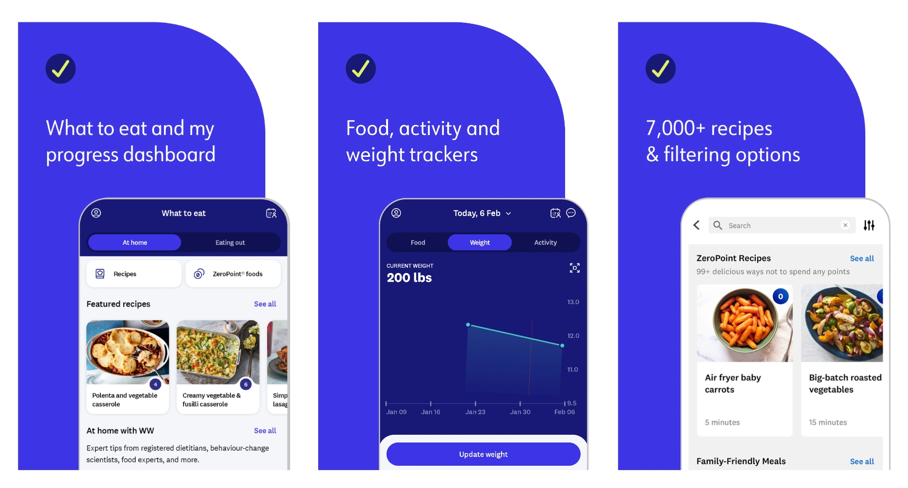
- The rollout is paired with a redesigned app experience beginning Dec. 26, 2025. (WeightWatchers)
- The platform expansion includes Med+ and a GLP-1 Success program, plus new tools like Weight Health Score and an AI Body Scanner. (WeightWatchers)
Why the WeightWatchers revamp arrived now
WeightWatchers didn’t wake up and randomly decide to redraw its logo. The category moved, hard, toward prescriptions, side-effect management, and outcomes that sound medical, which forces a legacy brand to look like it belongs in that world. WeightWatchers framed its 2025 platform as a fully integrated experience for the GLP-1 era, combining prescribing, nutrition guidance, coaching, and community in a redesigned app. When the promise becomes “evidence-based support,” the visuals have to carry that seriousness without scaring people off. (WeightWatchers)
- The brand tied the refresh directly to an integrated GLP-1 platform and redesigned app experience. (WeightWatchers)
- The rebrand is positioned around stability, trust, and sustainable outcomes, not quick fixes.
The logo is a sentence: two W’s and a progress bar
The loudest element in the WeightWatchers visual identity is the simplest. The new mark places two W’s on either side of a straight line that WeightWatchers and industry coverage describe as a progress bar, a literal nod to forward motion that also reads like a digital UI element. That’s clever because it bridges the old world of meetings and community with the new world of app-based tracking and medical support. It also gives the brand a symbol that can live anywhere, from an app icon to packaging to motion graphics.
- The brand logo design concept centers on a progress bar separating two W’s.
- WeightWatchers calls the progress bar a storytelling device drawn from member journeys. (WeightWatchers)
-1.webp)
Modern typography and a steadier blue: trust you can recognize in a second
If the logo is the headline, the type is the tone of voice. WeightWatchers describes the new logo and typography as bold and modern, built to convey stability and trust, which is exactly what you’d want when your offering includes medical pathways and physician support. Marketing Dive notes the brand is keeping a blue color scheme, but modernizing the typography, which is a classic way to evolve without breaking recognition. The result is a system that feels more structured and less “diet culture,” even before you read a single word. (WeightWatchers)
- WeightWatchers says the new logo conveys stability and trust tied to sustainable outcomes. (WeightWatchers)
- The blue scheme remains, while typography gets refreshed.
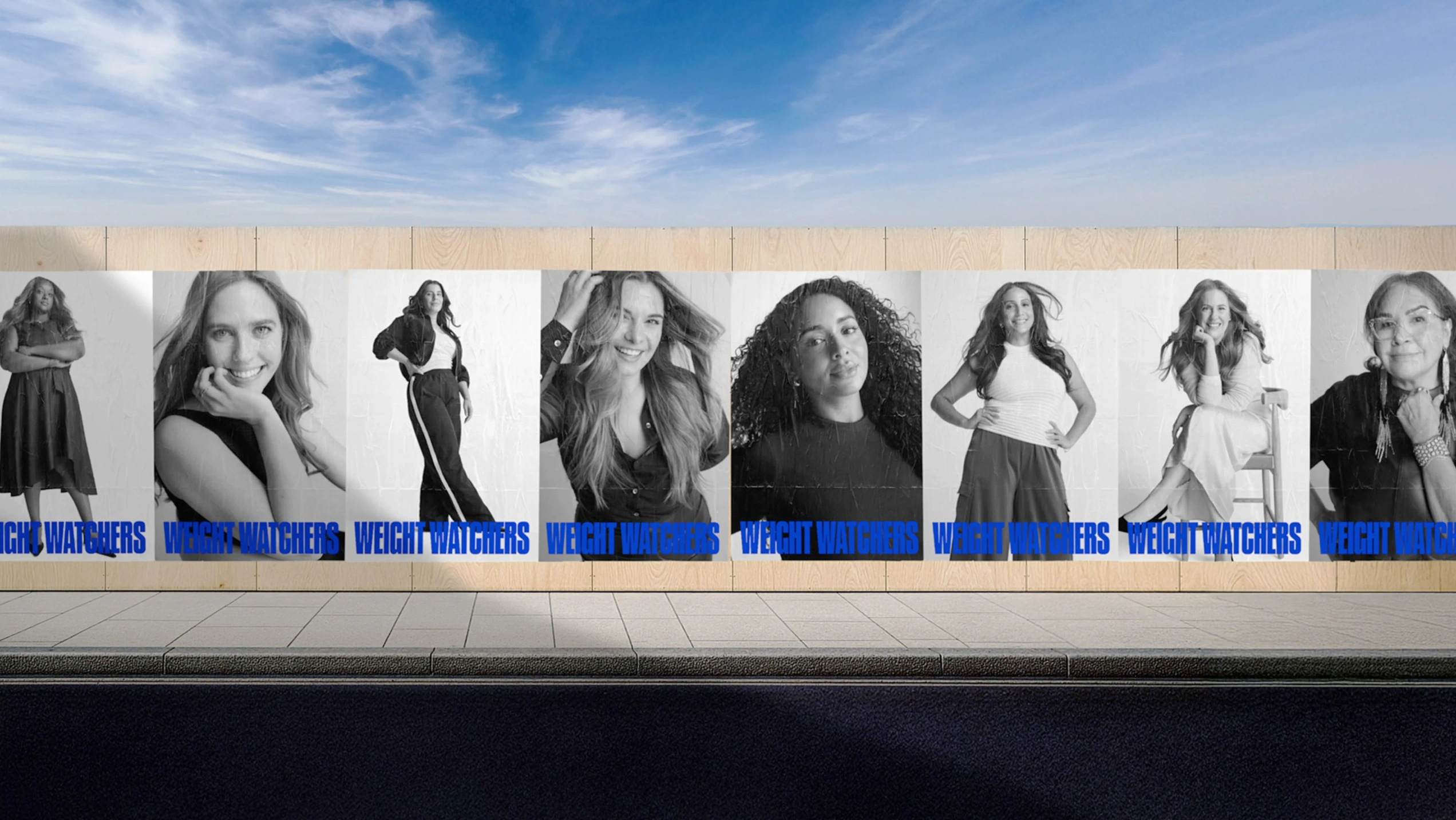
Real members, not idealized bodies: the emotional core of WeightWatchers' new branding
Here’s the part that keeps the revamp from feeling cold. The rollout leans on clean, studio-shot black-and-white portraits of real members, described as intentionally distraction-free and built to spotlight individuality, not perfection. The black-and-white editorial photography in the rollout shows candid, authentic, and powerful influence. In a moment where health brands can feel overly clinical or overly filtered, this choice is a statement: progress belongs to people, not before-and-after stereotypes.
- The visual system emphasizes real members through black-and-white editorial portraiture.
- The portrait approach is framed as deeply human and distinct from typical category visuals.
The progress bar becomes a full design system, not just a logo trick
WeightWatchers didn’t stop at a nice mark and a new typeface. The rebrand is tied to a redesigned digital experience that turns progress into a more multi-dimensional story, including a Weight Health Score that pulls from inputs like body composition, nutrition, activity, and sleep, including data from more than 60 connected devices and apps. It also introduces an AI Body Scanner designed to track changes in fat and muscle mass over time, especially relevant for members using GLP-1 medication who want more clarity than a scale provides. When the product is built around measurable signals, the visual identity has to feel like it understands measurement. (WeightWatchers)
- Weight Health Score is positioned as an evidence-based metric using multiple inputs and connected-device data. (WeightWatchers)
- The AI Body Scanner is framed as tracking fat and muscle changes over time, beyond the scale.
Who built the WeightWatchers visual identity, and why that matters
The WeightWatchers rebrand is also a message about creative credibility. LBB reports the identity was created with Mrs&Mr and Bindery, and positions the work as bringing cohesion to a platform that now spans nutrition guidance, coaching, community, and medical support. That matters because weight health is a trust category, and trust categories punish inconsistency. If the brand experience is fragmented, people feel it immediately, especially when they’re navigating medication, side effects, and long-term behavior change all at once. (LBBOnline)
- LBB credits Mrs&Mr and Bindery with the new identity system. (LBBOnline)
- The system is framed as unifying a platform that now includes medical support alongside legacy coaching and community.
.webp)
What the WeightWatchers rebrand says about society right now
This is the part that sits under the surface. Weight loss is no longer framed as pure willpower or pure lifestyle, it’s increasingly framed as biology, support systems, and long-term health, and the brand world is following that shift. WeightWatchers explicitly positions its new platform around GLP-1 prescribing plus behavioral and community support, and even cites that 90% of surveyed GLP-1 users expressed interest in joining community-based support programs like theirs. The new visual identity feels like a response to that emotional reality: people want proof, but they also want care. And maybe that’s the most honest thing about the revamp, it admits that progress is both measurable and deeply personal. (WeightWatchers)
- WeightWatchers links its evolution to coordinated medical, behavioral, and community support for the GLP-1 era. (WeightWatchers)
- The brand points to demand for community support among GLP-1 users in its own survey language. (WeightWatchers)
The quiet twist: WeightWatchers is reclaiming its name
If you remember the WW era, this will land as a reversal. After shifting to WW in 2018 and later styling itself back to WeightWatchers, it shows a return to explicitness in a time when a lot of wellness language became vague. There’s also a cultural read here: when the category gets more medical, brands often get more direct again, because directness feels safer. It’s not nostalgia, it’s clarity as a competitive advantage.
- The change reads like a move away from vague wellness language and back toward a clear promise.
FAQ
What changed in the WeightWatchers visual identity?
The WeightWatchers rebrand introduced a bolder logo and type system, anchored by a progress-bar concept that shows up as a straight line between two W’s.
Who designed the WeightWatchers rebrand?
LBB reports the new identity was created with Mrs&Mr and Bindery, and frames the work as unifying the brand across nutrition, coaching, community, and medical support.
When does the new WeightWatchers branding roll out?
WeightWatchers says the new experience will begin rolling out starting Dec. 26, 2025, as the redesigned app and platform gradually roll across global markets.
How does the WeightWatchers revamp connect to GLP-1 programs like Med+?
WeightWatchers positions Med+ as a dedicated GLP-1 medical program with access to board-certified physicians and a coordinated care team, paired with the GLP-1 Success framework for nutrition, movement, coaching, and community. The visual identity is basically the wrapper for that promise, it needs to communicate “medical-grade” without losing the warmth of real human support.
The New Shape of Progress
The WeightWatchers' new branding works because it doesn’t pretend the world hasn’t changed. The WeightWatchers visual identity is built for a moment where weight health is more medical, more data-driven, and still deeply emotional, all at the same time. A progress bar in the logo is more than a graphic, it’s a worldview: progress is gradual, visible, and personal. The smartest part of the WeightWatchers rebrand might be this: it makes the future feel structured, without making people feel judged.


