
Mobile UX Audit: 7 Mobile Interaction Flaws That Are Killing Your Revenue
Updated on
Published on
Mobile should feel effortless, whether you’re booking a table, checking a shipment, or reading an About Us page. When tap targets are tiny, search is hidden, or layouts jitter as they load, people lose trust and momentum. A practical mobile UX audit looks for these small, repeatable patterns and fixes them fast. If you improve mobile interaction across sizing, speed, clarity, and checkout, you raise task success, lower error rates, and push more sessions to purchase.
At a glance
- Tiny tap targets and crowded hit areas drive mis-taps and rage taps; size to ≥44pt iOS / ≥48dp Android with breathing room.
- Keep search visible or one tap away; show instant suggestions, recent searches, and typo-tolerant matching.
- Pass Core Web Vitals: faster LCP, stable CLS, and responsive INP correlate with higher completion rates.
- Surface total cost early on PDPs: clear price stack, delivery ETA by postal code, returns near the primary CTA.
- Kill coupon traps: defer entry to cart or auto-apply; don’t tempt code-hunting on the PDP.
- Shorten checkout: fewer fields, native keyboards, autofill, address lookup, inline validation.
- Stabilize sticky CTAs: reserve safe areas, avoid jitter on scroll, and prevent keyboard collisions.
- Expose filters as chips; keep active states visible, apply in place, and preserve scroll position.
- Lead with decisive product media: crisp first image, swipeable gallery, quiet video with captions.
- Keep navigation patterns consistent across PDP, cart, and checkout; never hijack the OS back gesture.
1) Tiny tap targets and crowded hit areas
On mobile, accuracy decays as targets shrink and cluster. When wishlist hearts overlap images, filter chips sit edge-to-edge, or the Add to Cart sits flush with the bezel, mis-taps spike and shoppers build frustration fast. A clean mobile UX audit starts with generous targets and separation: size turns hesitation into flow, and spacing prevents accidental navigation. Standardizing to platform guidance also reduces relearning when users switch devices, which directly improves mobile interaction and completion rates (Nielsen Norman Group) (Apple HIG).
- Use ≥44pt on iOS and ≥48dp on Android; add 8–12dp padding around primary actions (Material Design).
- Reduce icon clutter on PDPs; keep one clear primary action per view (Nielsen Norman Group).

2) Hidden or weak search on small screens
Search is the shortcut shoppers depend on when category labels are dense or ambiguous. Hiding it behind a small icon, collapsing it on scroll, or delaying autosuggest makes users work for basic discovery. To avoid those mobile UX mistakes, keep search persistent or one tap away, show instant suggestions, and remember recent queries. Typo tolerance and synonyms prevent dead ends, lifting product views per session and decreasing pogo-sticking across listing pages.
- Persistent, high-contrast field with autosuggest and history improves findability.
- Add fuzzy matching and synonyms to recover from misspellings.
.webp)
3) Slow loads and layout shifts
Speed silently taxes every step. When hero images pop late, buttons jump due to CLS, or taps lag, confidence drops and exits rise. Aligning with Core Web Vitals focuses your team on LCP, INP, and CLS—the metrics that correlate with better outcomes. Even small wins matter: retail experiments have linked 0.1s gains to observable lifts in funnel progression, which is why performance work is a repeat line item in any serious mobile UX audit (Google Developers) (Deloitte).
- Ship responsive images, preconnect critical origins, and defer non-critical JS; watch LCP, INP, and CLS (Google Developers).
- Validate in the real world with the Core Web Vitals report, filtered by template (Search Console CWV).

4) Unclear price, shipping, and promo handling on PDP
Ambiguity kills intent. If price stacks, stock status, delivery windows, and returns are scattered or hidden, shoppers hesitate and bounce. A classic mobile UX mistake is putting a blank coupon field on the Product Detail Page, which trains users to leave for code hunting. Consolidate total cost drivers near the primary CTA, calculate delivery ETA by postal code, and defer or auto-apply promos so you keep people moving toward the cart instead of off-site distraction.
- Show price, delivery ETA, returns, and stock near Add to Cart; avoid modal rabbit holes.
- Swap the upfront coupon field for apply-later or automatic application.
5) Forms that fight thumbs
Checkout forms are where revenue goes to die—or scale. Too many fields, unclear labels, missing masks, wrong keyboards, and disabled autofill multiply errors and abandonment. A pragmatic mobile UX audit cuts the field count, groups logically, and uses native inputs so the right keyboard appears for each field. Inline validation prevents users from submitting into a wall, while address lookup compresses effort. Baymard’s research consistently shows that field count is a stronger predictor of success than step count, so trim first, then style (Baymard).
- Enable autofill, postal code lookup, masks, and real-time validation; keep labels visible (Baymard).
- Use one column, ample line height, and a sticky progress/CTA so thumbs travel less.

6) Sticky CTAs that jump or hide
Sticky Add to Cart and Checkout bars can be powerful, but only if they behave. On mobile, bars that jitter during scroll, overlap content, or slide under the keyboard create uncertainty and accidental taps. Reserve a fixed safe area, respect OS insets, and coordinate with the on-screen keyboard so the primary action never disappears. Clear add-to-cart feedback that keeps the user on task, rather than dumping them into a dead-end modal, sustains momentum and improves mobile interaction at the exact moment intent peaks (Shopify design discussions).
- Reserve a predictable height for sticky bars; avoid covering content and handle keyboard transitions smoothly.
- Use unobtrusive confirmations and keep the path forward visible, not modal-locked.
-1.webp)
7) Filters and sort buried in deep drawers
Filtering is a decision accelerator, but only when it’s obvious and fast. If filters hide behind tiny icons or take users through multiple screens, most won’t refine at all. Surface your top facets as chips, keep active states visible, and apply refinements without full page reloads. Preserving scroll position after a filter change is critical; losing context feels like a bug and nudges users to abandon the list altogether.
- Promote 4–5 high-value facets as chips; show active filters with clear remove actions.
- Apply refinements in place and preserve scroll and sort context.

8) Product media that ignores mobile context
Great media answers questions before users ask them. If the gallery requires heavy pinch-zoom, the first image hides scale, or autoplay video starts with sound, friction jumps. Lead with a crisp, shadow-honest image that communicates material and scale, support pinch-free zoom or tap-to-zoom, and keep video quiet with captions. A mobile UX audit that prioritizes the first image and gallery ergonomics will reduce doubts and speed Add to Cart taps (NN/g on video).
- Make the first image decisive: clear angle, scale cues, material fidelity.
- Defer heavy media below first paint; keep video silent by default with captions.
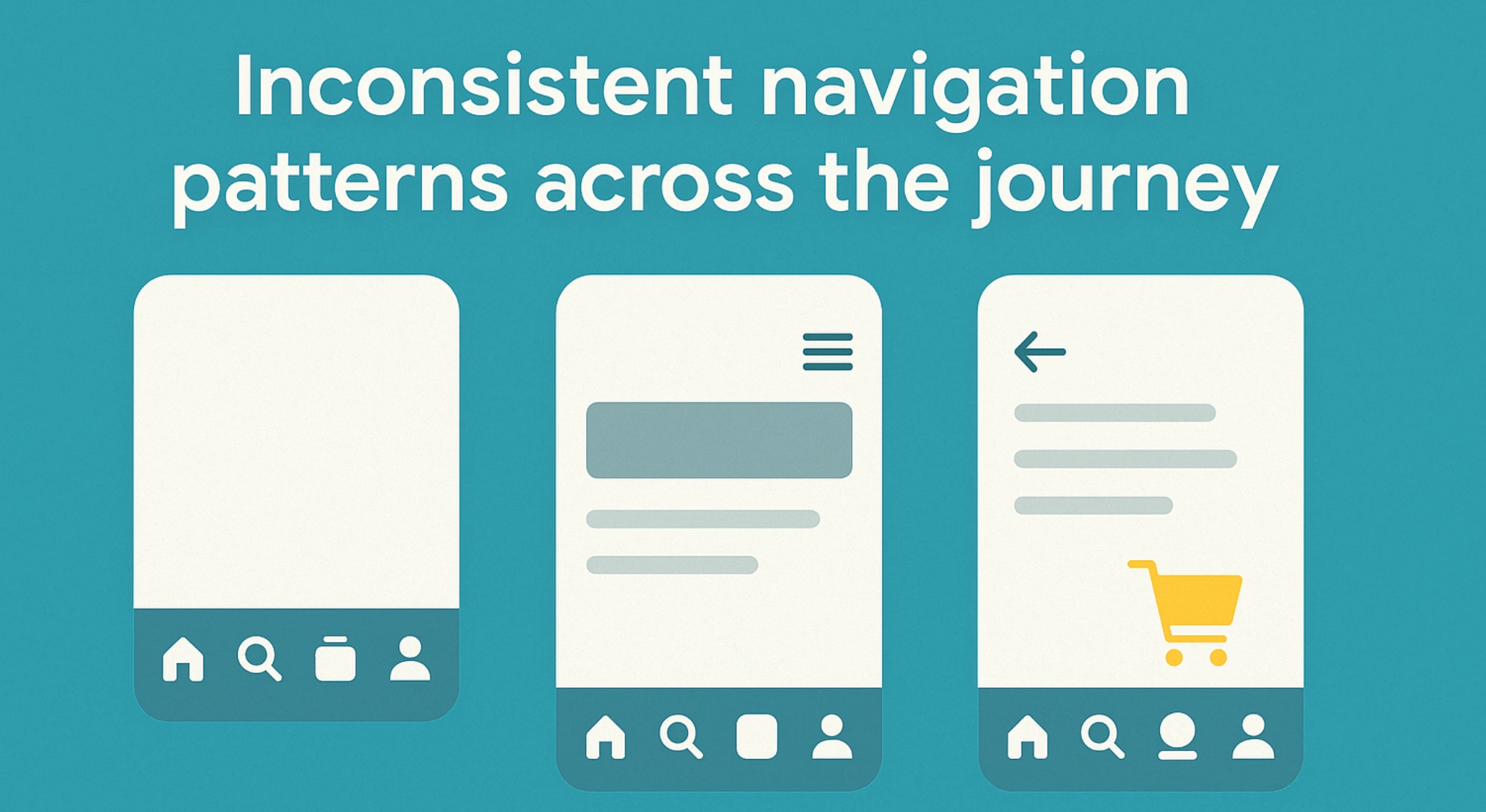
9) Inconsistent navigation patterns across the journey
Cognitive strain rises when patterns change mid-journey. If a site uses bottom tabs on PLPs, a hamburger on PDPs, and custom swipes in checkout, users relearn basic movement three times. Pick a primary pattern, label routes clearly, and never hijack the OS back gesture. Keep Home, Search, Cart, and Account one tap away so shoppers can reorient instantly without losing state—this is one of the simplest ways to improve mobile interaction without a redesign.
- Keep core routes visible and consistent from PLP to checkout.
- Preserve state on back; avoid modal traps that break OS expectations.
10) Payment and trust barriers at the finish line
Trust breaks at the last step are costly. Missing Apple Pay or Google Pay, ad-like trust badges, and looped error states are classic mobile UX mistakes. Offer region-appropriate wallets and default to the fastest trusted flow. Keep returns, delivery, and support info visible near the pay button to calm last-minute anxiety. Save state on error so users don’t have to start again; that single detail can cut abandonment dramatically (Baymard).
- Add major wallets and tokenized flows to reduce credential entry (Baymard).
- Keep reassurance copy (returns, delivery, support) near the primary action.
.webp)
FAQ
What is a mobile UX audit and why does it matter?
A mobile UX audit is a structured review of the phone journey to surface interaction blockers—tap sizing, visible search, performance stability, PDP clarity, forms, filters, and payment. Fixes here pay back quickly because they target the most common failure points.
What mobile UX mistakes should I fix first?
Start with touch targets, persistent search, Core Web Vitals, coupon handling, and checkout form reduction. These deliver fast wins with minimal design churn.
How does speed connect to revenue on mobile?
Better LCP, INP, and CLS correlate with stronger engagement and conversion; even 0.1s improvements have lifted purchase progression in retail studies.
How can I improve mobile interaction without a redesign?
Stabilize sticky CTAs, enlarge tap targets, expose top filters as chips, trim forms, enable autofill and wallets, and clarify price and delivery on PDPs. These are pattern swaps, not full rebuilds.
How do I measure progress after fixes?
Track LCP, INP, CLS, search usage, product views, add-to-cart rate, checkout completion, and wallet utilization; monitor field performance in the Core Web Vitals report.
The fix that transforms
Small screens punish small mistakes. A focused mobile UX audit strips out the predictable friction: tiny taps, hidden search, jittery layouts, vague costs, and fussy forms, so every action feels effortless. Fix one or two mobile UX mistakes and you’ll see a bump; fix all seven and gains stack across sessions and funnels. The result is simple: faster paths, fewer errors, higher completion, and a mobile experience people trust enough to return to.
.png "Best Branding Agencies in Toronto (2026)")
%20(1).png "10 Best Web Design Companies in Toronto (2026)")


