
The 7 Must-Have Elements of a High-Converting Landing Page Design
Updated on
Published on
People do not convert because a page is clever; they convert because it makes the next step feel obvious, safe, and fast. If high-converting landing page design is the goal, start by designing a landing page that explains the value in plain language, removes friction in the first screenful, and answers quiet objections before they surface. Do this well and visitors stop hesitating, scroll with intent, and click with confidence.
At a glance
- Clear promise and message match between the ad and the page sets the stage for conversion (Google Ads Help).
- Layout should follow how people scan content so key info and CTAs are seen quickly (Nielsen Norman Group).
- Mobile speed and stability influence engagement and revenue, not just UX scores (web.dev) (Deloitte).
- Forms convert best when fields are few, labels are clear, and validation is gentle (Baymard Institute).
- Real trust cues beat gimmicks: testimonials, brand logos, policies, and security signals where risk is felt (Nielsen Norman Group) (Baymard Institute).
How we built this playbook
- We leaned on long-running primary research and official guidance from (Nielsen Norman Group), (Baymard Institute), (web.dev), (Google Ads Help), and (W3C WAI).
- We prioritised patterns that measurably affect comprehension, trust, and completion rates across devices.
- We translated evidence into concrete design moves you can ship on any stack.
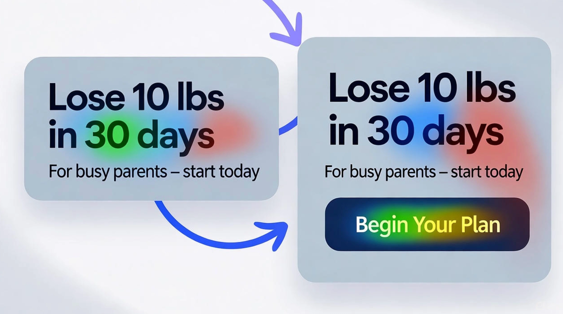
1) The above-the-fold promise and message match
What makes a landing page convert in the first five seconds is simple clarity. Your hero must restate the exact promise that drove the click, in the user’s language, then back it up with a tight subhead and a single primary action. People look first to the top and left areas of the screen, then decide whether to continue, which means the first screenful must prove there is more value below. Keep the headline specific, align the offer with your ad or email, and avoid clever labels that hide meaning (Nielsen Norman Group) (Nielsen Norman Group) (Google Ads Help).
- Write a benefit-first headline and mirror the exact offer from the ad to maximise message match (Google Ads Help).
- Use a descriptive subhead to add who it is for and what happens next, then place a single primary CTA nearby.
- Avoid vague labels like Get Started that mislead or stall progress (Nielsen Norman Group).
2) Visual hierarchy that matches how people scan
Are you missing key conversion triggers because the layout fights the way people read? Visitors skim in predictable patterns and give more attention to what is visible first, so design a landing page that guides eyes from headline to proof to action. Work with contrast, size, spacing, and position to stage information in a natural sequence. Give every section a clear purpose and make the next step visible without search effort (Nielsen Norman Group) (Nielsen Norman Group).
- Stage content top-to-bottom: promise, proof, details, then action. Keep each section scannable with strong subheads.
- Use generous whitespace around the primary button so it stands out without shouting.
- Remind users there is more to see with a visible below-the-fold cue, not a hard visual stop (Nielsen Norman Group).
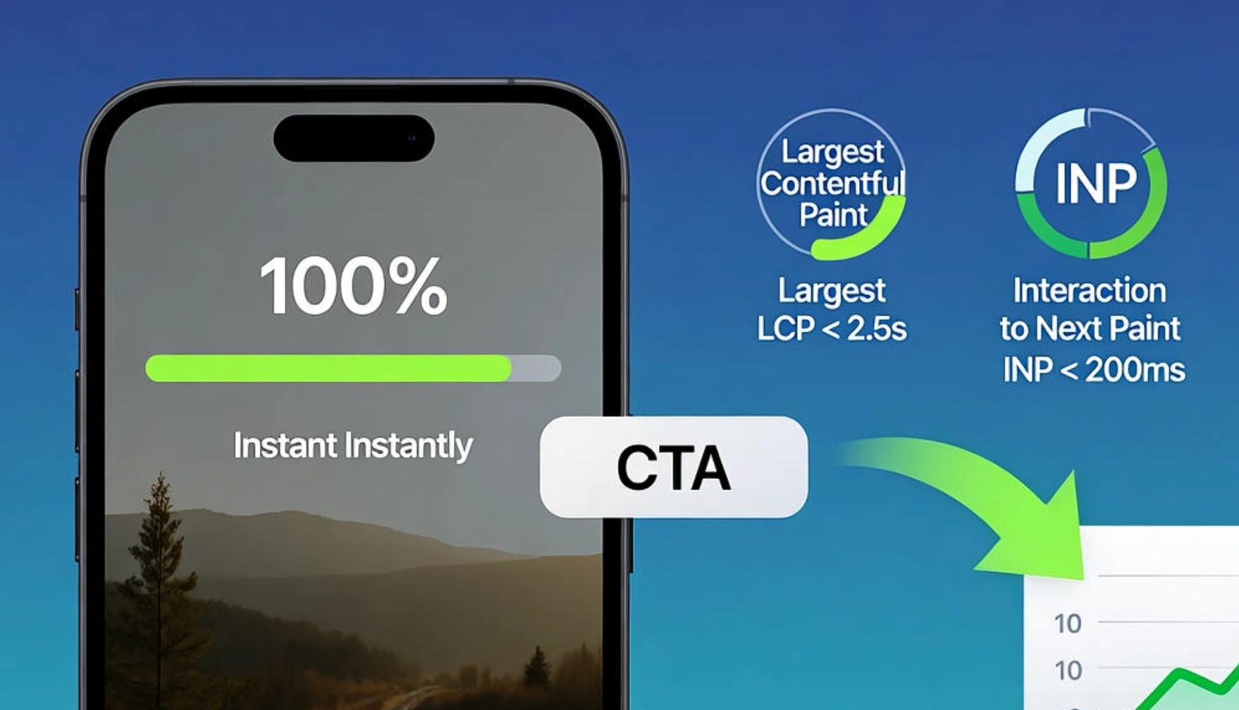
3) Speed, stability, and mobile readiness
Why your landing page is not converting often starts with performance. If the hero takes too long to paint or the layout shifts while a user tries to tap, trust erodes and drop-offs spike. Aim for LCP at or below 2.5 seconds, INP at or below 200 ms, and CLS below 0.1. Even a 0.1-second improvement in mobile load time can move conversion rates and purchase funnel progression in the right direction (Deloitte).
- Preload the hero image or set fetchpriority="high" and never lazy-load your LCP element (web.dev).
- Reserve image space with width and height attributes to prevent jarring shifts.
- Design the entire experience for smartphone first so content, links, and actions work perfectly on small screens.
4) Single, strong CTA with labels users can trust
The dissection of success often reveals a simple truth: one primary action beats five competing options. Your CTA should describe the outcome, not your process, and it should look tappable, feel reliable, and respond instantly. Pair strong visual affordance with thoughtful microcopy and make every state obvious. On touch devices, targets must be big enough and not crammed together, or you will get mis-taps and frustration (Nielsen Norman Group).
- Use plain-language verbs that promise the value of the click, like See pricing or Start free trial, not generic Get started (Nielsen Norman Group).
- Ensure comfortable target sizes and spacing to reduce accidental taps on mobile.
- Keep one unmistakable primary CTA across the page and demote secondary options to links.
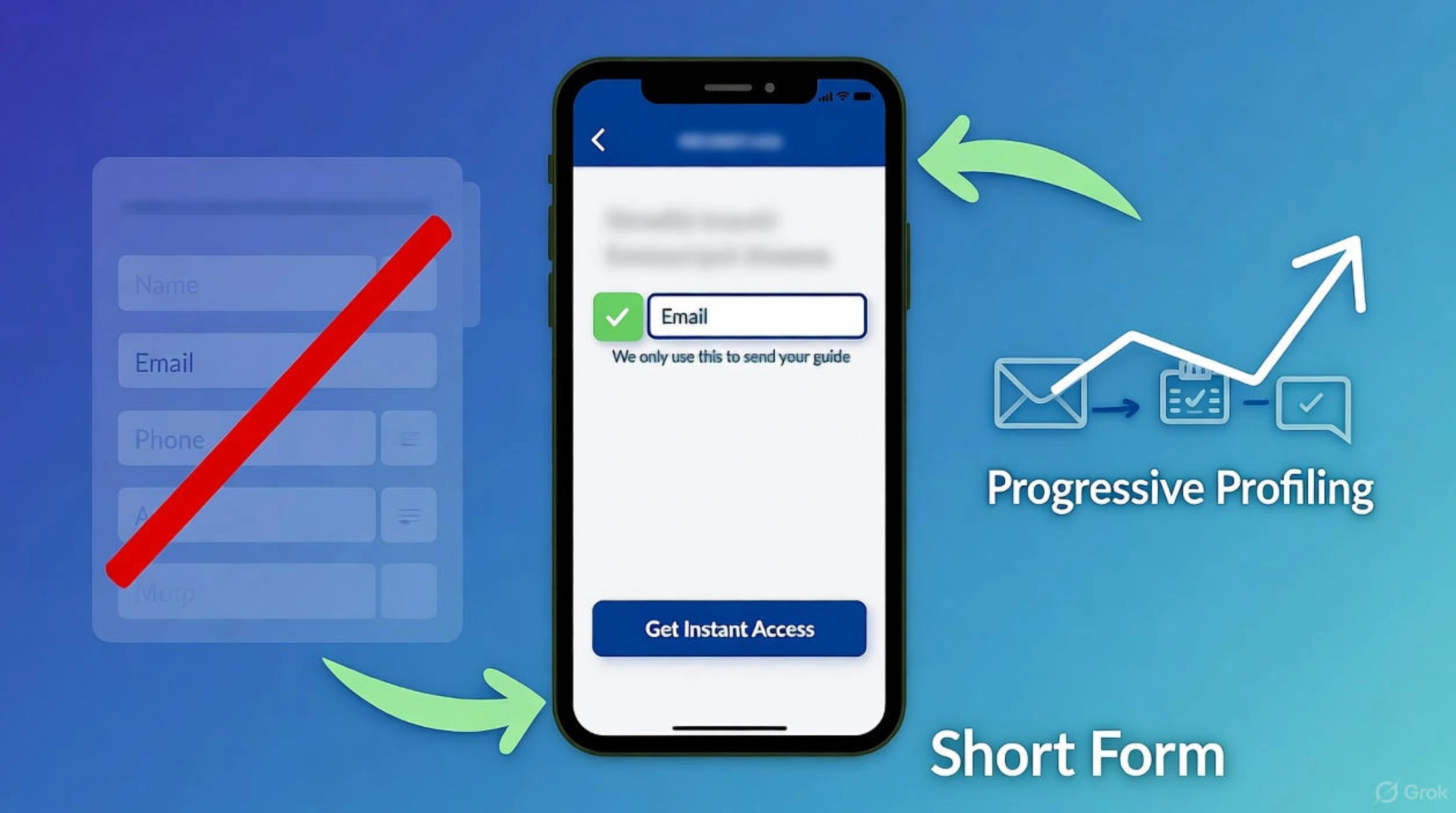
5) Forms that feel effortless
Designing a landing page UX that converts often comes down to what you ask and when you ask it. Shorter forms outperform longer ones, and the number of fields matters more than the number of steps. Use clear labels, inline validation, and help text that reduces anxiety at sensitive moments. If you need more information, ask for it later after you have earned more trust and intent (Baymard Institute).
- Remove non-essential fields and explain why sensitive inputs are required.
- Validate inline and in plain language so users can fix issues without guesswork.
- For gated content, trade an email for value first, then progressively profile over time.
6) Social proof and trust where it matters most
Are you missing proof right when users feel risk? Place testimonials, review counts, client logos, star ratings, accreditation, and guarantees near the decision points that trigger doubt. People look to others for cues, and design choices shape perceived safety, especially around payment and data entry. Make policies and support options visible and honest to move visitors up the trust pyramid more quickly (Nielsen Norman Group).
- Put proof beside the CTA, not buried at the bottom, and match proof types to the claim you are making.
- Reinforce sensitive areas with recognisable security signals and plain-English reassurance, not vague badges alone (Baymard Institute).
- Disclose pricing, terms, and next steps up front to strengthen credibility (Nielsen Norman Group).
7) Focus beats clutter: cut choices, handle objections
Why your landing page design is not converting can be as basic as too many choices. The more options presented, the longer decisions take, and the more likely users are to stall. Trim navigation to the essentials, group related actions, and use your layout to funnel attention toward one clear outcome. At the same time, handle common objections in context with short FAQs, comparisons, and risk-reversal cues so users do not need to leave to get answers (Nielsen Norman Group) (Nielsen Norman Group).
- Limit header links on campaign landing pages and keep escape hatches discreet.
- Add a compact FAQ near the CTA to answer deal-breakers like price, contract, and cancellation.
- Use section anchors for longer pages so scanning visitors can jump to what they need fast.
FAQ
What is a good conversion rate for landing pages right now?
Across industries the current median sits around 6.6 percent, with wide variance by vertical. Treat that as a baseline, not a target, and optimise against your own traffic mix and offer strength.
Where should I put the primary CTA?
Near the hero on first view and again at natural decision points throughout the page. Make the primary action visually dominant and keep secondary options as links to reduce choice overload.
What copy changes lift conversions fastest?
Replace vague headlines with specific promises that mirror your ad. Rewrite button text to describe the outcome, then add one line of risk reversal like Cancel anytime or No credit card required where appropriate.
How much should I worry about page speed?
A lot. Passing Core Web Vitals correlates with better user outcomes, and even small mobile speed wins have measurable revenue impact. Target LCP ≤ 2.5 s, INP ≤ 200 ms, CLS < 0.1.
Do long landing pages hurt conversion?
Length is not the problem. Poor hierarchy is. People will scroll when the first screen proves there is value below. Use strong section headings, cues to continue, and repeat CTAs where decisions happen.
The fix that sticks
High-converting landing page design is not a bag of tricks. It is a sequence: promise made, proof delivered, action made easy. When the first screen explains the value, the layout matches how people scan, the page is fast on mobile, the form feels light, and trust is visible where risk is felt, designing a landing page stops being guesswork and starts feeling like craft. Keep refining these seven elements and the page will earn attention, not demand it.


