.webp)

.webp)

.avif)
.webp)


.webp)
.webp)


.avif)

.avif)
99 Yorkville Ave Unit 200,
Toronto, ON M5R 3K5, Canada
Toronto, ON M5R 3K5, Canada
Get Directions

Rothman is a real estate investment firm focused on acquiring, developing, and managing income‑producing multi‑family, commercial, and mixed‑use assets. The website needed to communicate strategy, track record, and partnership pathways with clarity—so investors and stakeholders can evaluate quickly and act with confidence.
Successfully created Rothman's brand, aligning their visual identity with their strategic goals and enhancing their market presence.
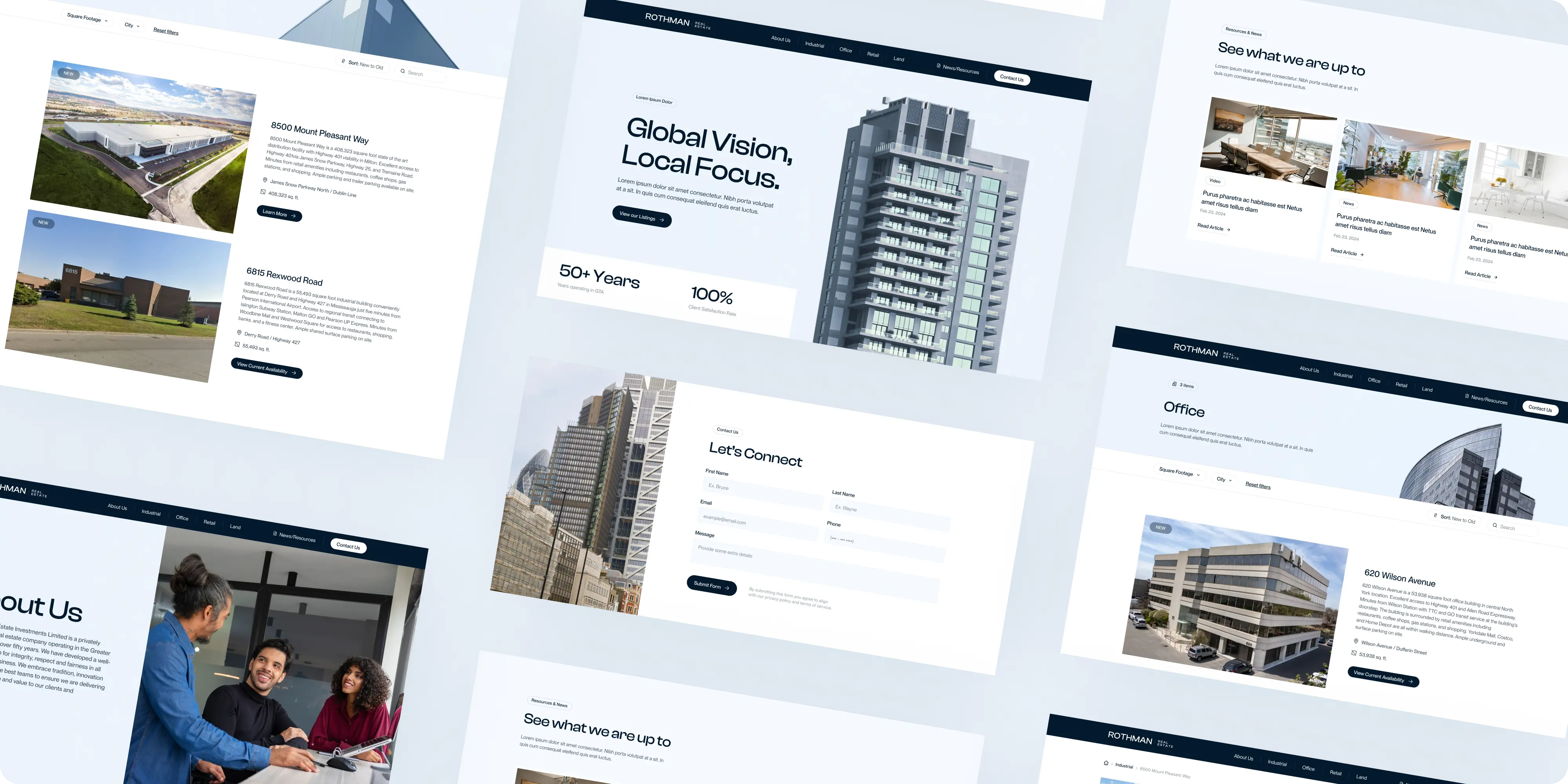
Real‑estate investment sites often bury what investors need most: strategy fit, selection criteria, track record, and the rhythm of execution. Rothman needed to differentiate from generic “leasing” or broker websites, present a consistent thesis across asset classes, make IR pathways obvious, and keep the platform light enough for the team to operate without day‑to‑day developers—while upholding accessibility and performance.
We mapped jobs‑to‑be‑done for LPs, co‑GP/JV partners, brokers, and community stakeholders, then rebuilt the information architecture around those tasks. A component‑driven web design system and focused UI/UX patterns improved scanability, credibility, and funnel clarity. We defined CMS collections for Properties, Markets, and Case Studies, implemented pragmatic SEO, and instrumented analytics. Light branding polish aligned visuals across pages. Finally, we delivered enablement—training, documentation, and governance—so updates (new assets, case snapshots, team changes) publish in minutes. Advisory‑first marketing consultation supported roadmap decisions and IR content planning.
Rothman’s site now tells a concise, credible story: clear strategy and criteria, standardized property and case pages, faster paths to Request Info, and a CMS the team enjoys using. Brand Vision was the right partner because we pair enterprise‑grade craft with enablement—combining web design, UI/UX, branding, and pragmatic SEO to deliver a durable system—not just a launch.
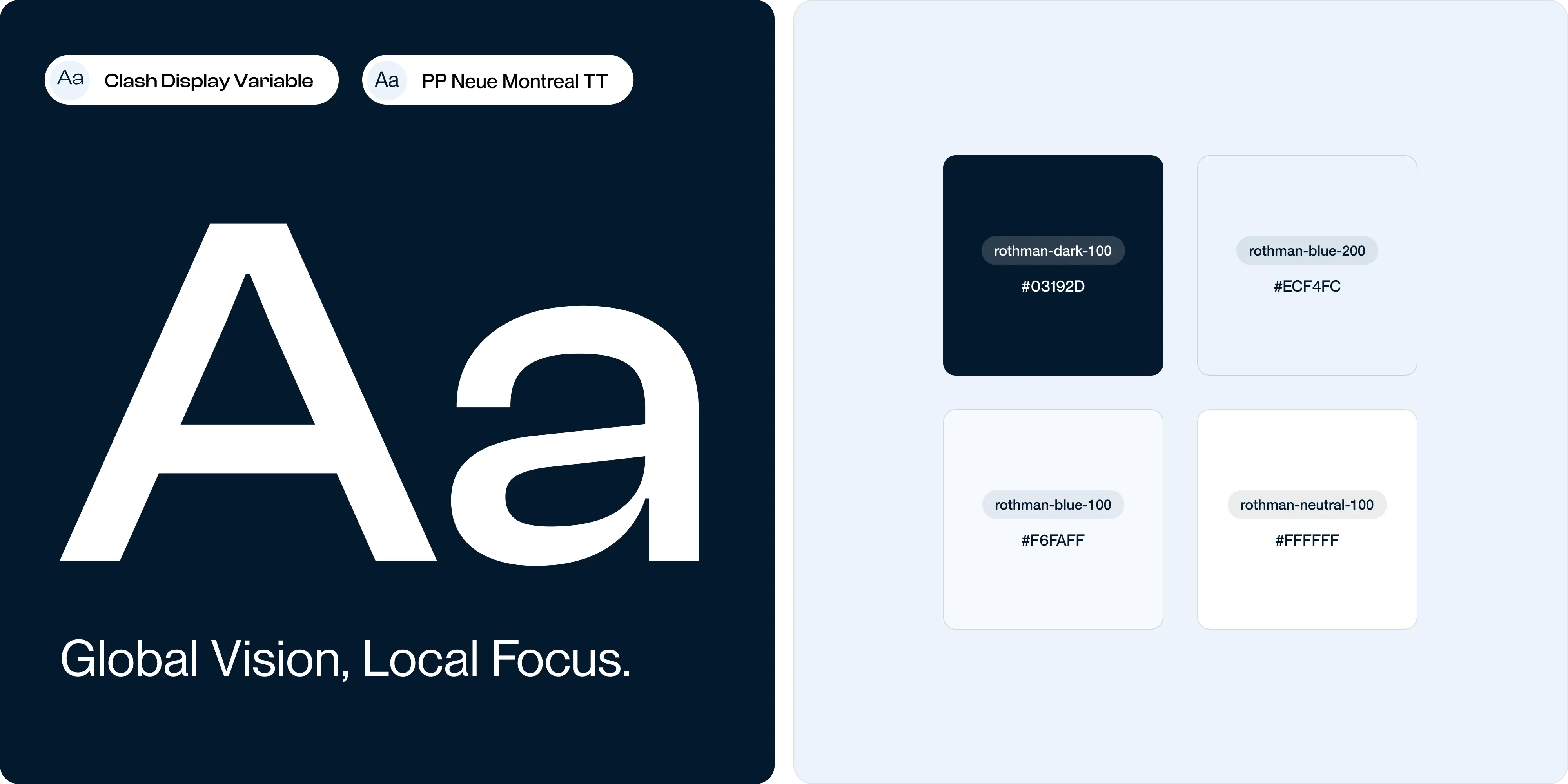
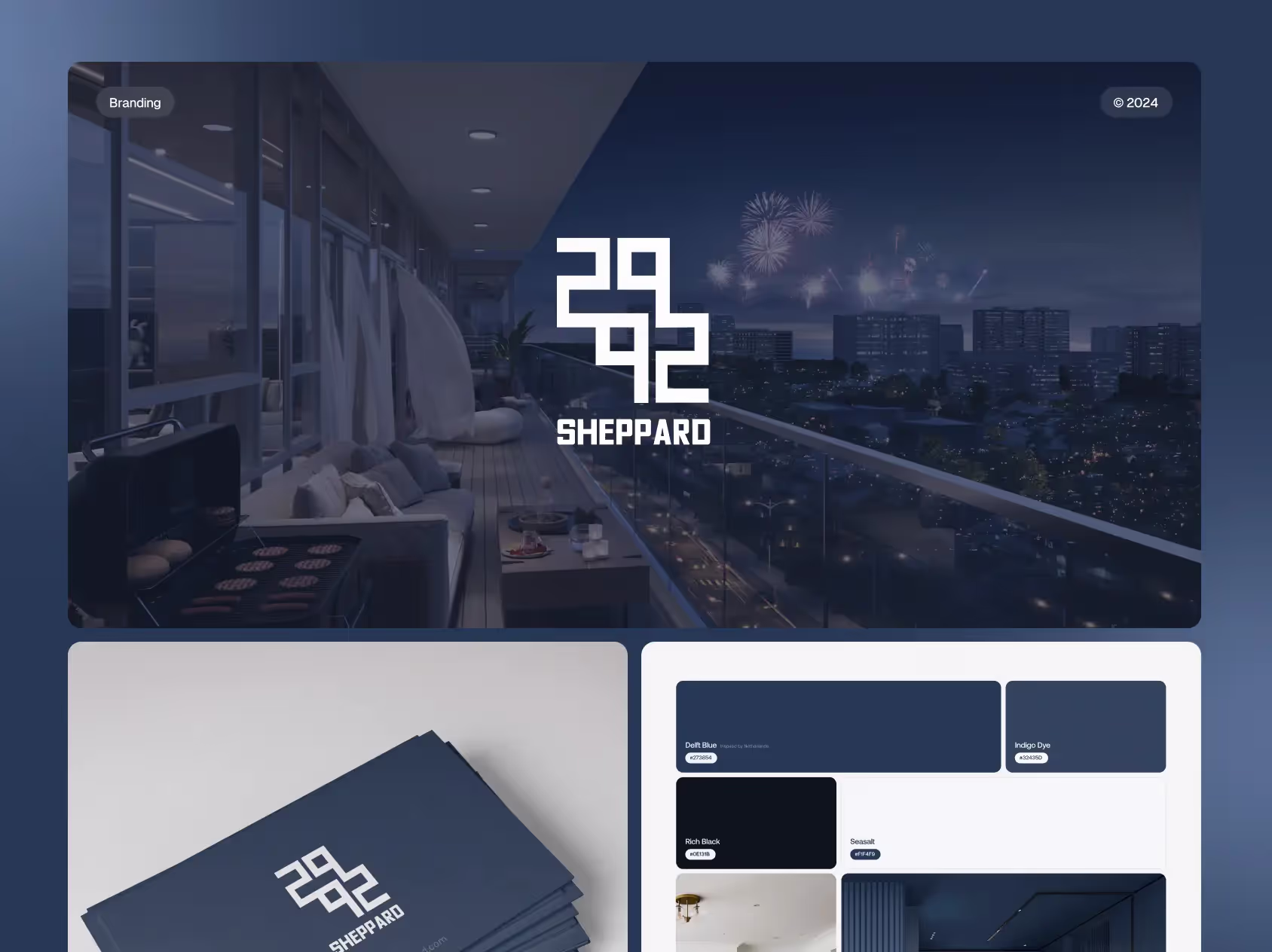
The sleek and sophisticated new logo embodies Rothman’s commitment to quality and its global reach, while maintaining a local touch. The selected color palette of deep blues and crisp whites conveys professionalism, reliability, and transparency. Additionally, the typography, featuring Clash Display Variable and PP Neue Montreal TT, adds a contemporary yet classic feel to the brand, ensuring readability and consistency across all mediums.
Given the nature of Rothman’s business, where property listings are constantly changing, Brand Vision implemented a custom CMS within Webflow. This system allows Rothman’s team to easily manage and update listings, keeping the website current without requiring advanced technical skills. The CMS was tailored to Rothman’s specific needs, ensuring that updating content is as straightforward and efficient as possible.
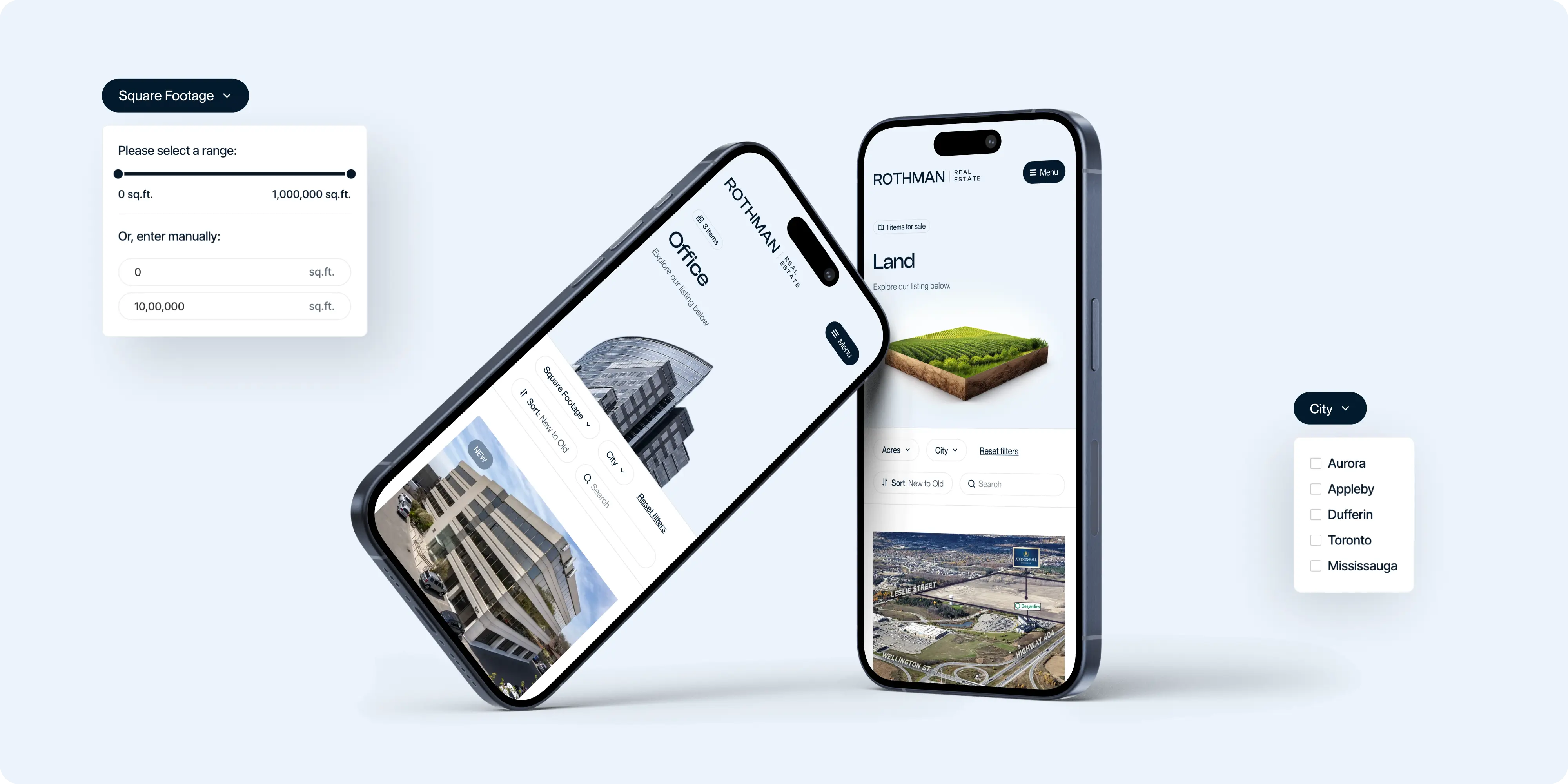
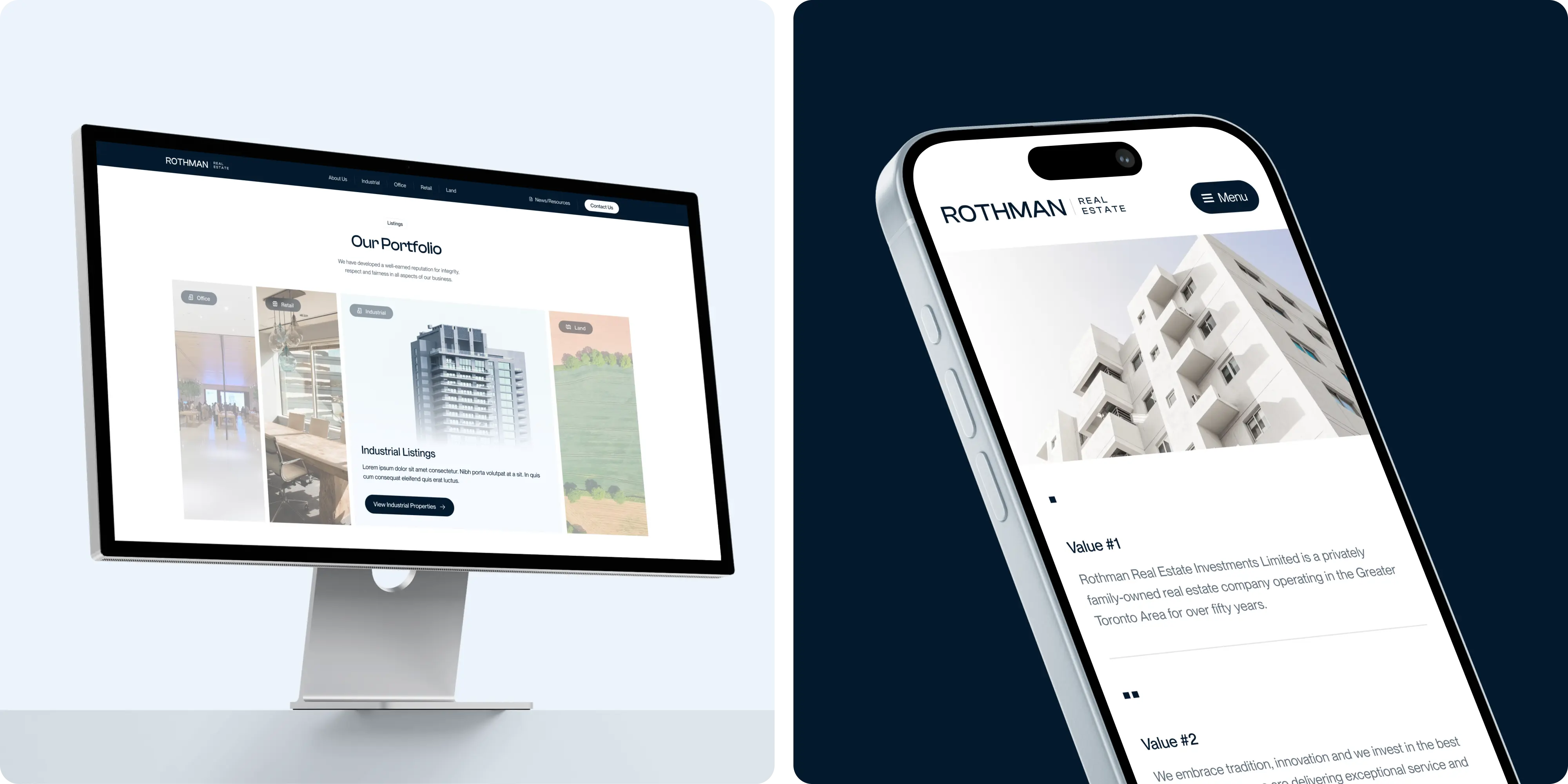
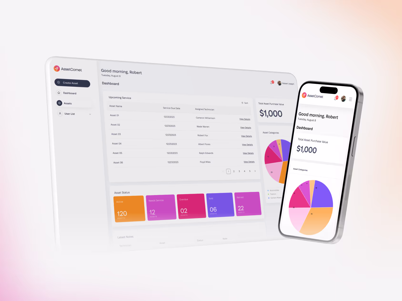
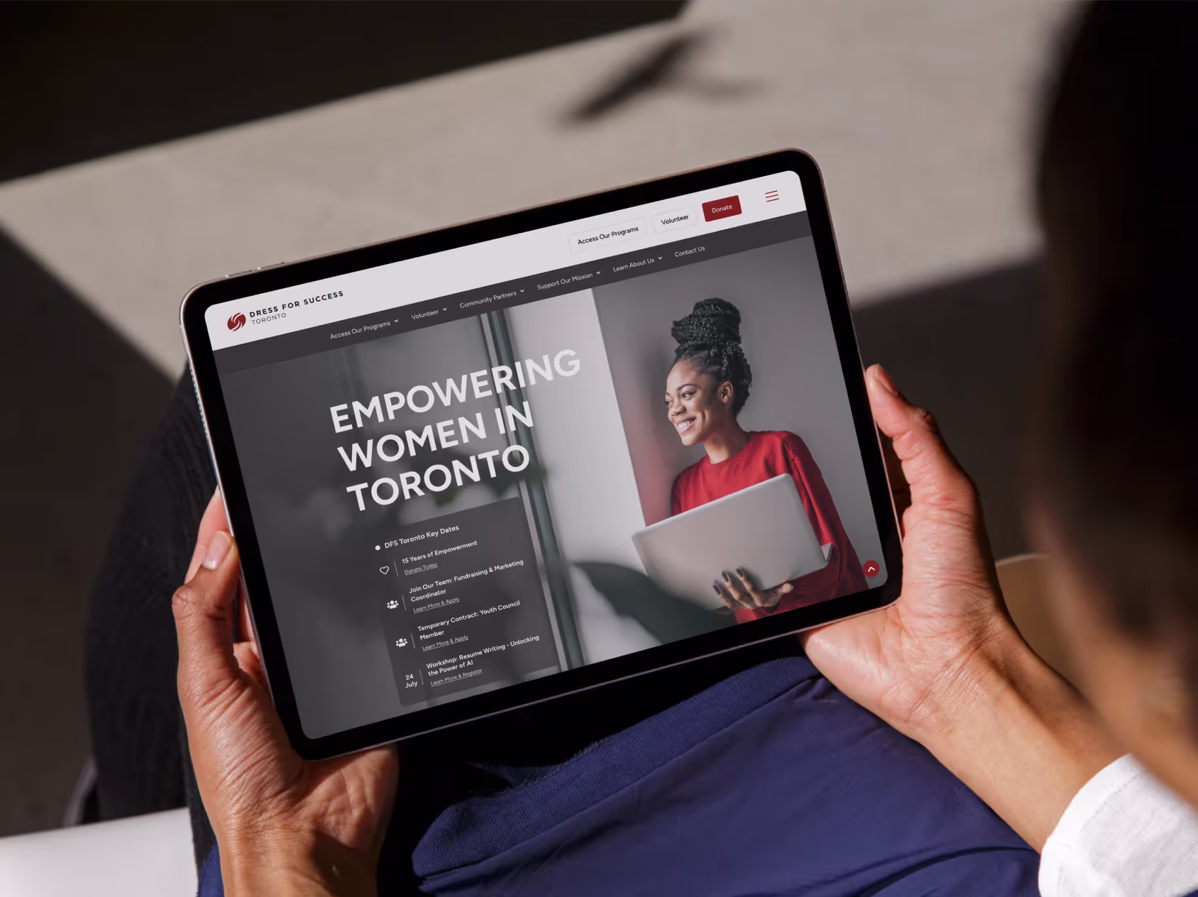
The website was designed and optimized to offer a seamless experience across all devices. Whether the viewers are viewing the site on a desktop, tablet, or mobile, the site delivers a consistent and engaging user experience, as its important for keeping visitors and converting them into clients.
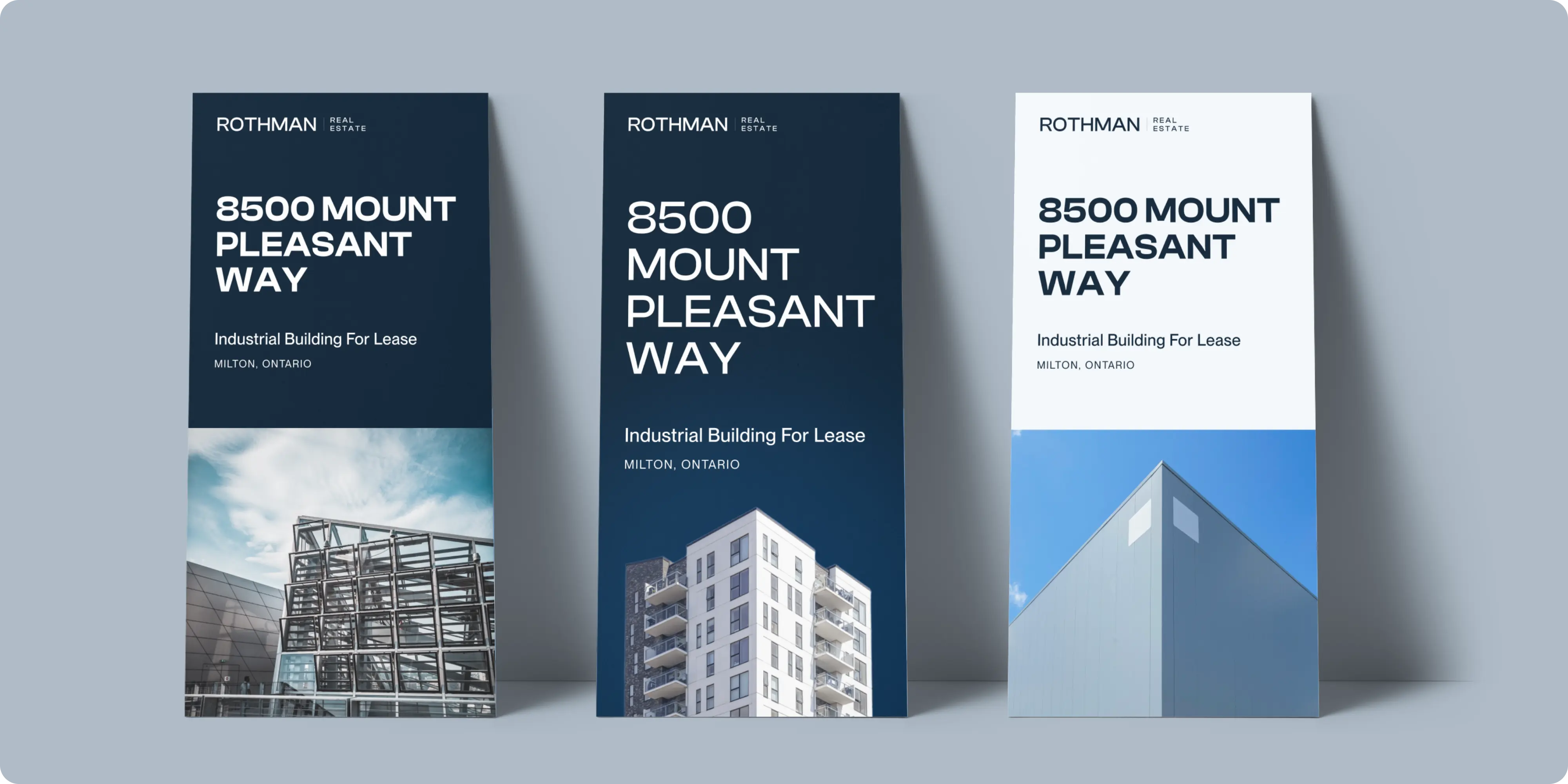
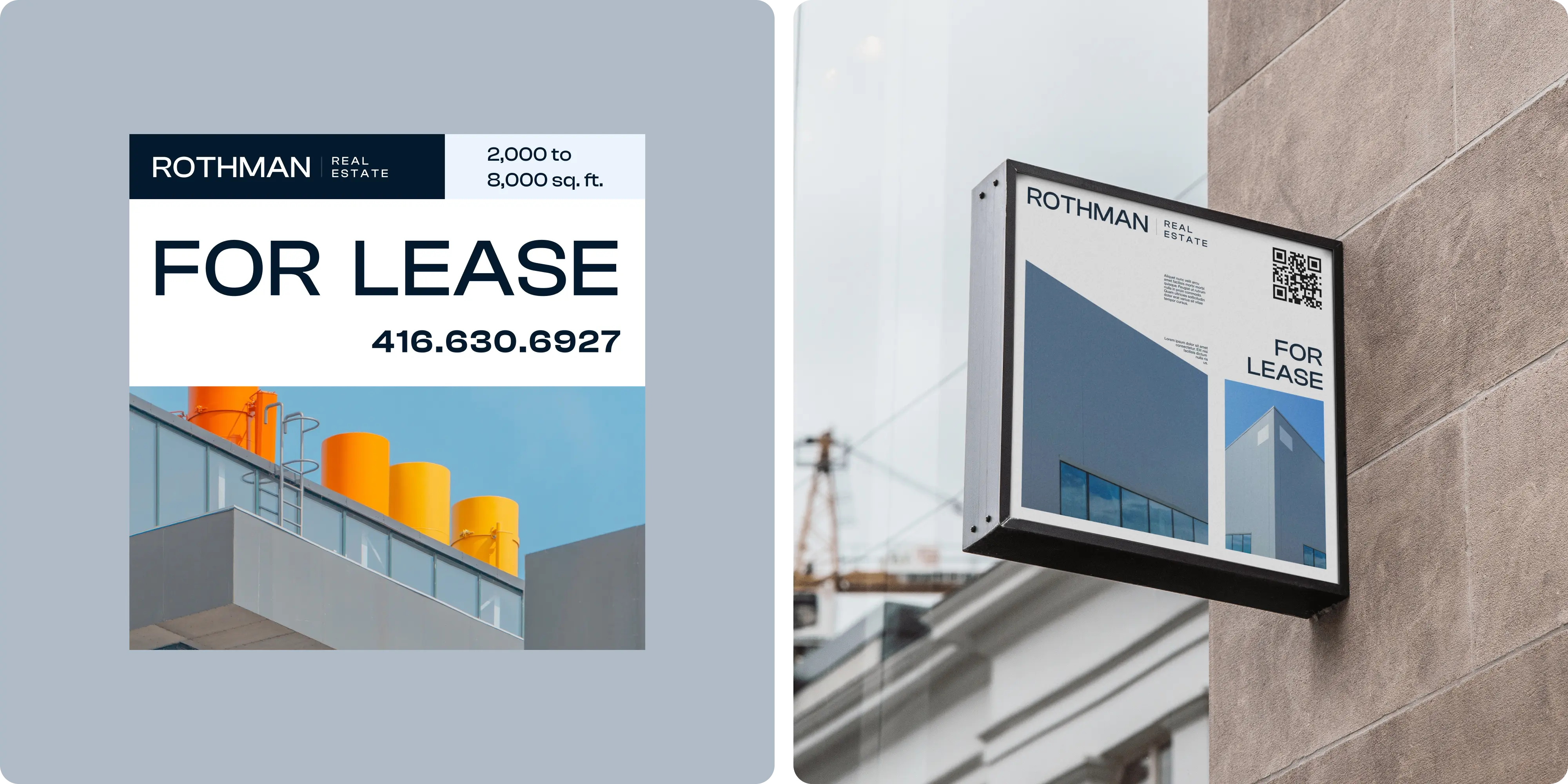
Brand Vision extended the new visual identity across all brand collaterals. Business cards, brochures, and listing signage were designed with a consistent and professional look, ensuring that every touchpoint with the client’s brand communicates the same message of excellence and attention to detail.
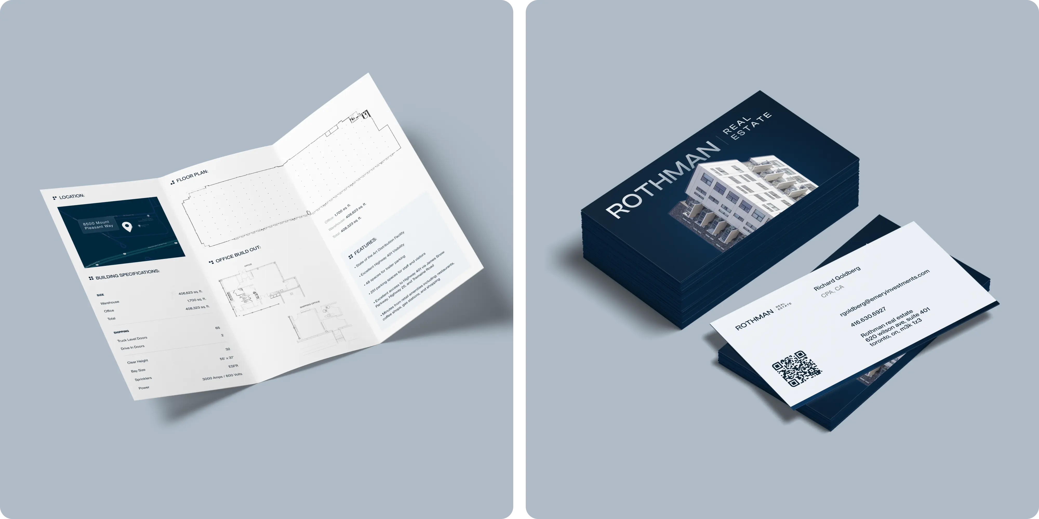
Business cards were designed to be sleek and elegant, featuring the deep blue and crisp white color palette that reflects the company’s values of professionalism and reliability.
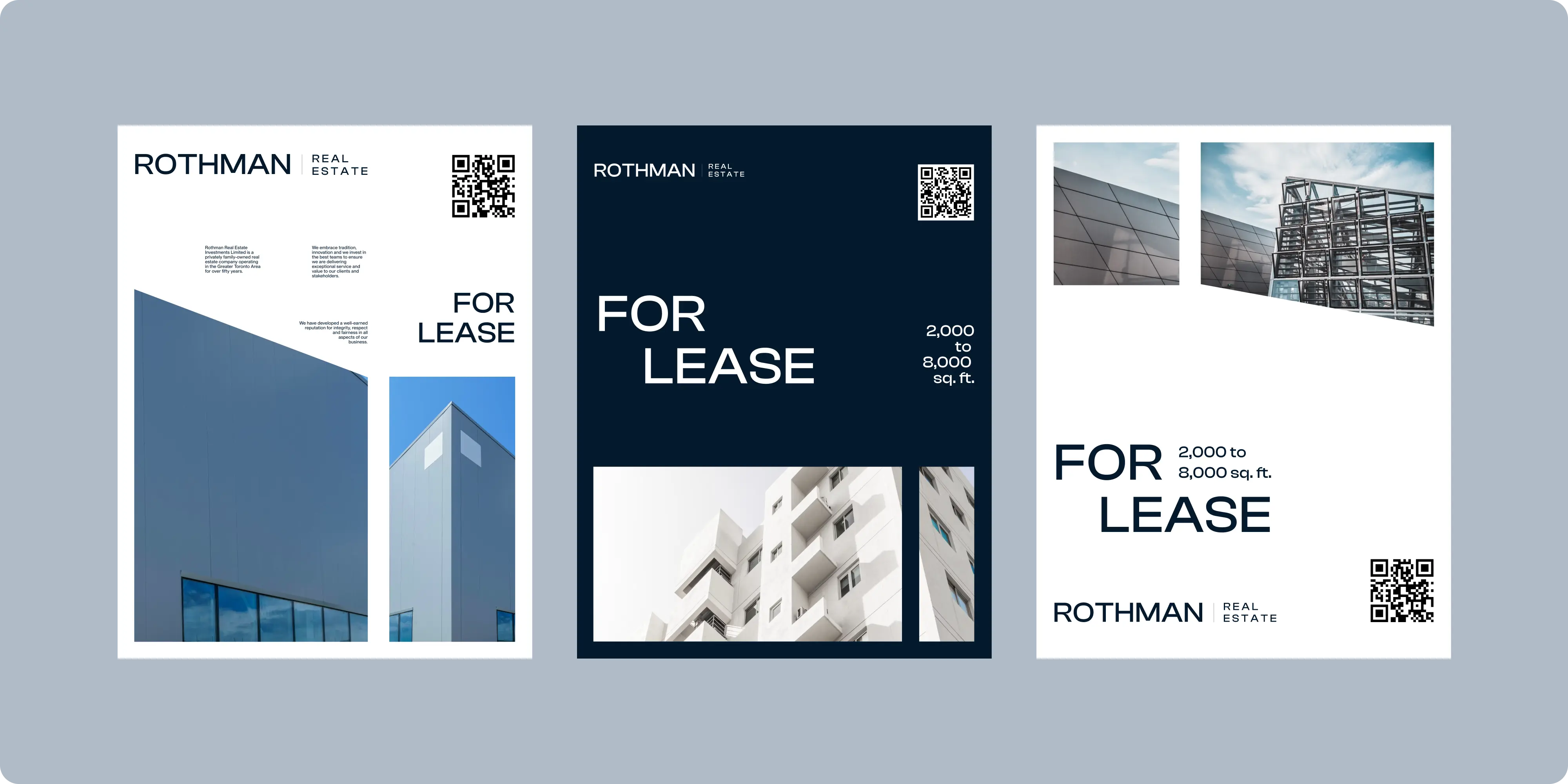
Listing signage was created with a focus on visibility and branding, making sure that Rothman’s properties stood out in the competitive real estate market.

.webp)


.avif)
.avif)

Our goal is to nurture your vision and provide innovative, custom solutions for all your marketing needs.