.webp)

.webp)

.avif)
.webp)
.webp)

.webp)
.webp)


.avif)

.avif)
60 Bloor St W, Suite 401,
Toronto, ON M4W 3B8
Toronto, ON M4W 3B8
Get Directions

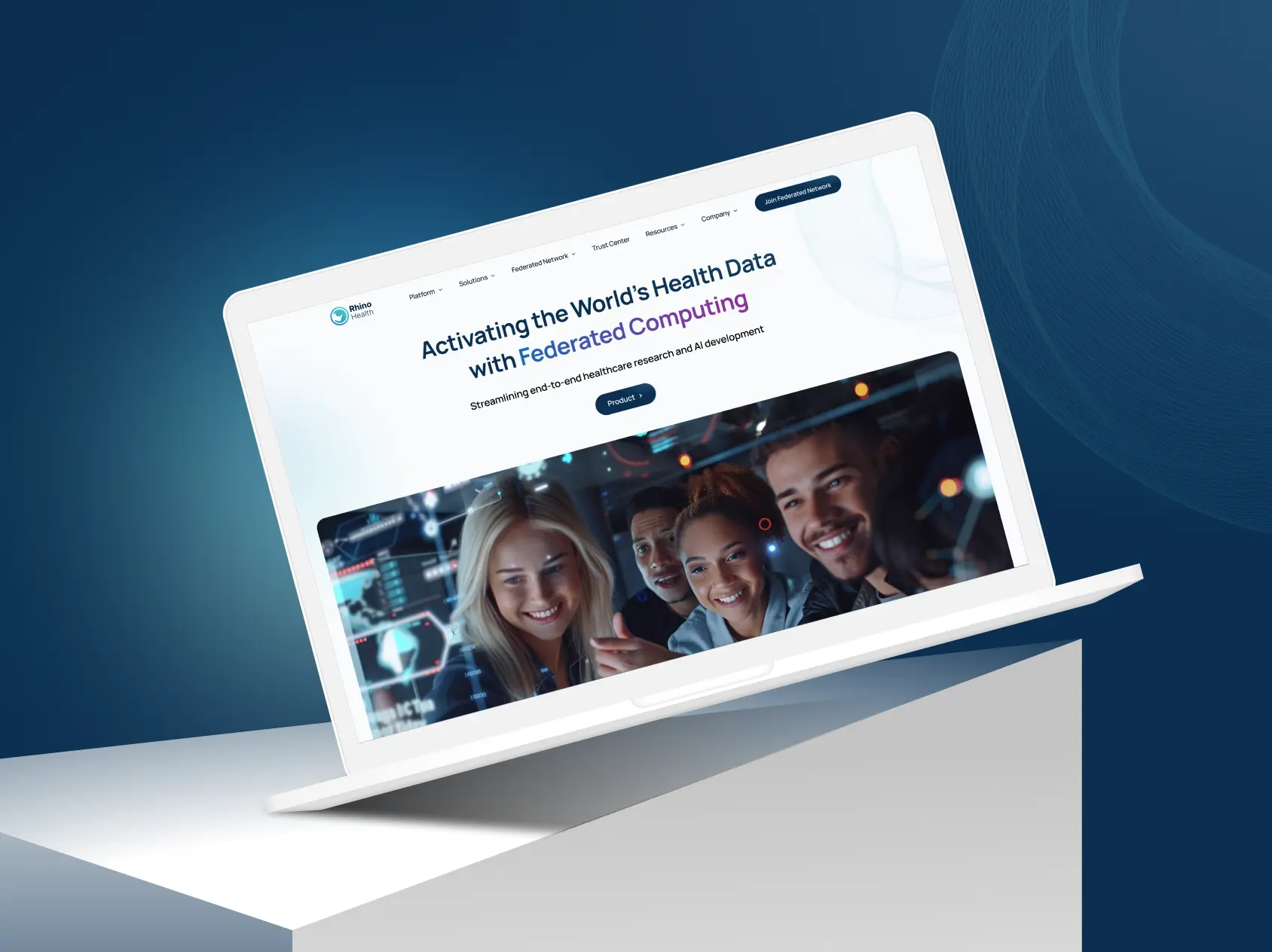
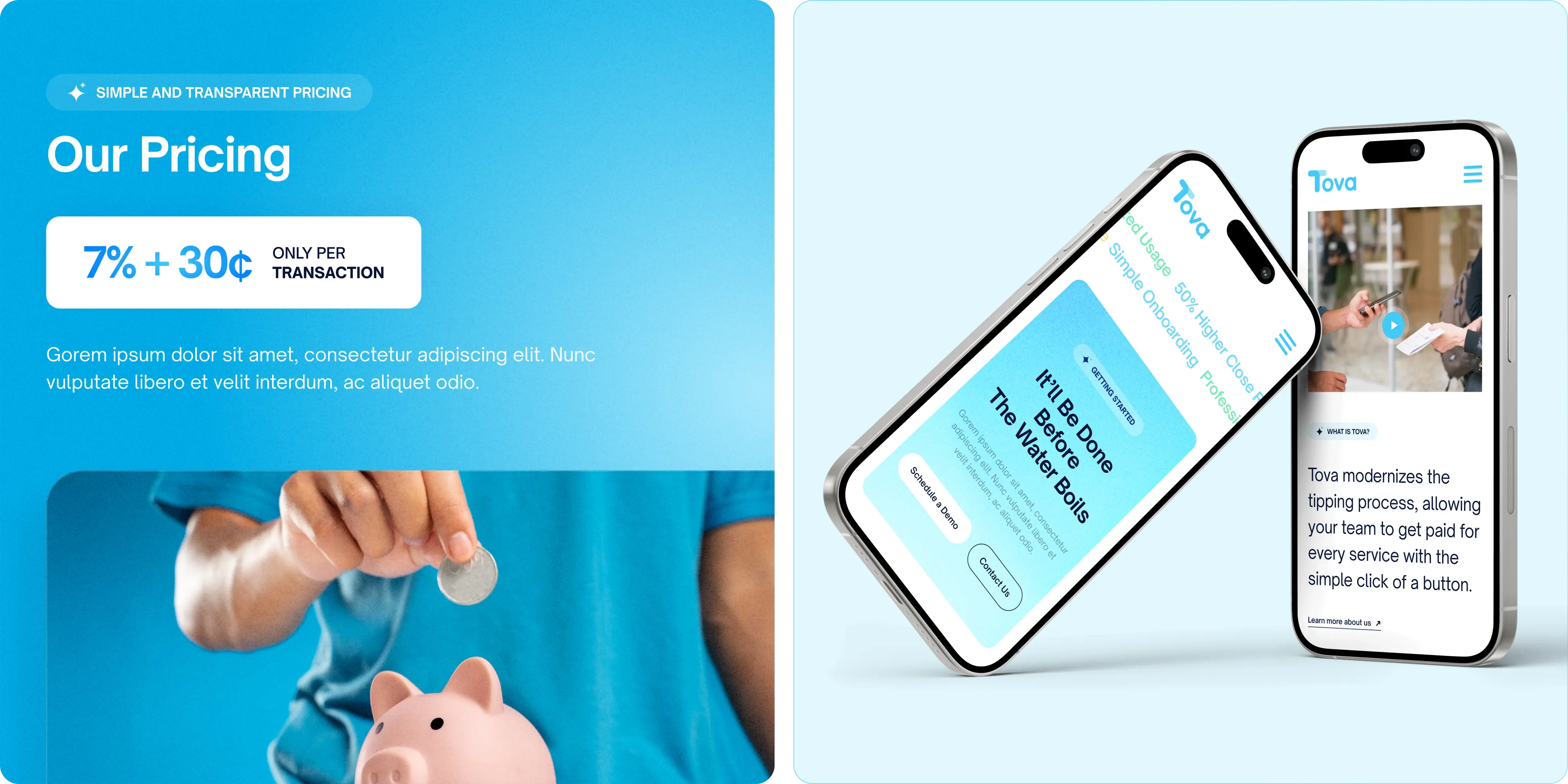
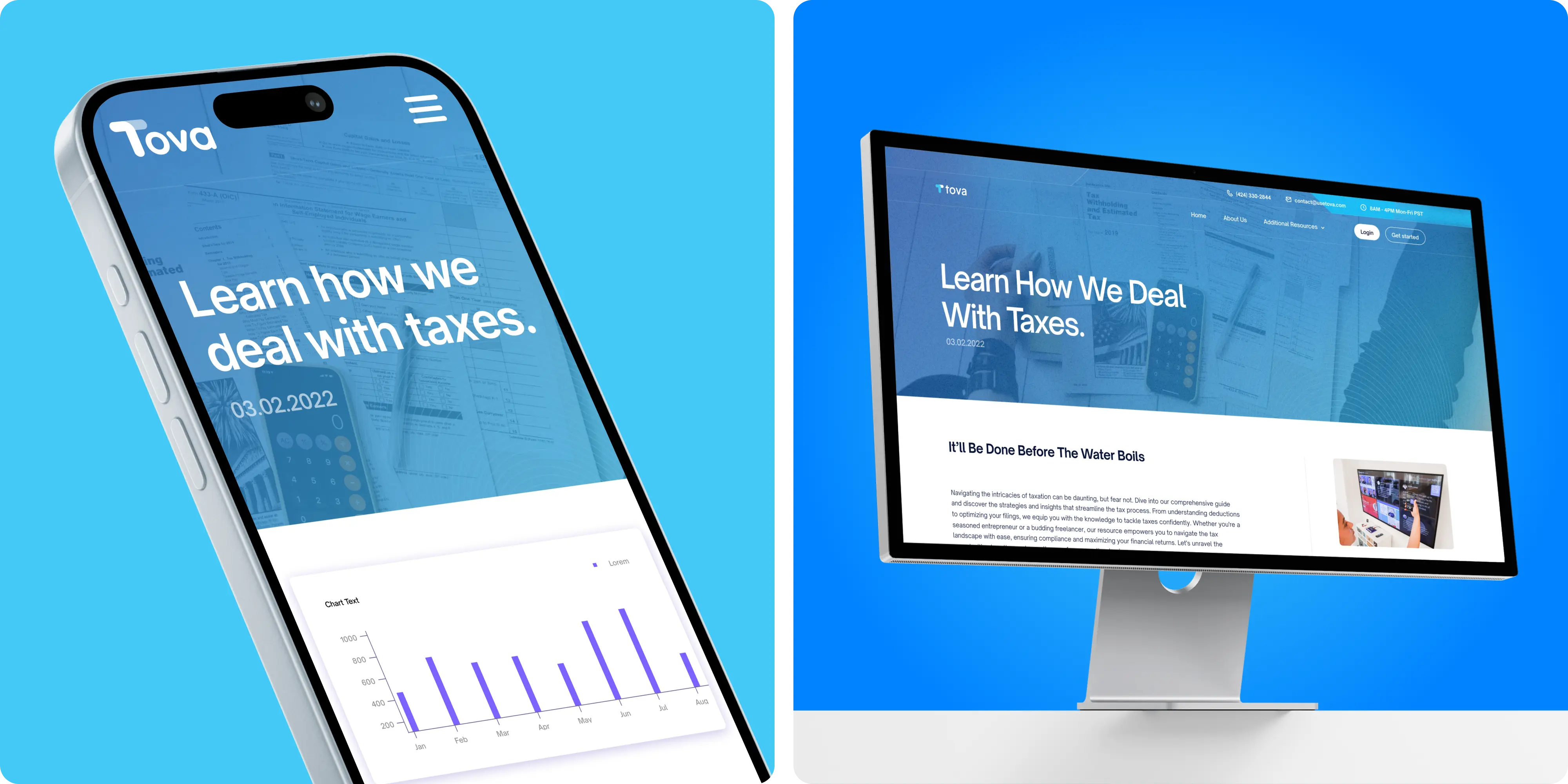
Tova enables guests to tip hotel and restaurant staff via QR codes and cashless payments. Properties can customize branded cards and signage, while managers get real‑time reporting and simpler admin. Our mandate: tell the story in plain language, reduce friction to tip or sign up, and deliver a maintainable web foundation.
For Tova, a mobile/web app for tipping, we improved their UX/UI and designed a website, ensuring a user-friendly digital experience.
Hospitality audiences are diverse (owners, GMs, F&B, HR/Payroll), and tipping can be sensitive. We needed to explain the QR/cashless flow simply, highlight staff earnings and admin benefits, and keep the experience trust‑first—while giving Tova a site they can update without day‑to‑day developer support.
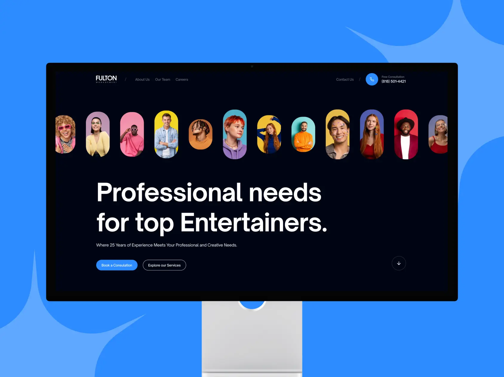
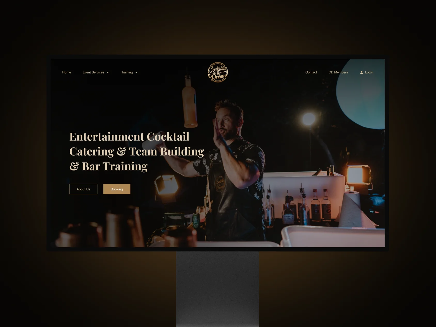
We mapped jobs‑to‑be‑done for hotel/restaurant operators and rebuilt the information architecture around those tasks. A component‑driven web design and focused UI/UX system kept pages scannable, with clear CTAs and a visual explainer of the QR flow. We implemented pragmatic SEO, instrumented analytics, and designed and built a landing‑page‑led site on a modern CMS the team can manage without developer dependence. Advisory‑first marketing consultation guided positioning and rollout.
The refreshed experience makes Tova easy to adopt: clearer value for staff and managers, faster paths to Start Free or Book Demo, and a maintainable CMS. Brand Vision was the right partner because we blend enterprise‑grade craft with enablement—combining web design, UI/UX, light branding alignment, and pragmatic SEO to deliver a durable system—not just a launch.
.webp)
Brand Vision collaborated with Tova to create QR Code card designs that met specific requirements and adhered to branding guidelines. The process involved thorough research, brainstorming creative concepts, and integrating visual design elements to reflect Tova's aesthetic. The designs were tailored for readability and aesthetics, with prominently placed, visually appealing QR codes. Iterations were refined based on Tova’s feedback, and final design files were prepared and delivered, meeting all printing specifications.
.webp)
Improving Tova's user experience involved several key enhancements. Brand Vision streamlined the website's navigation, making it easier for users to access information. They implemented a responsive design to ensure consistent functionality across various devices. By analyzing user behaviours, they created intuitive user flows with strategically placed call-to-action buttons. Accessibility best practices were also followed to ensure the site was accessible to a wide range of users. Continuous user testing and feedback facilitated ongoing improvements. As a result, Tova's website now offers a user-friendly interface that enhances user engagement and exploration of their services.
.webp)
.webp)
Brand Vision undertook Tova's logo redesign, starting with brainstorming various design directions and elements. The team selected a typography style that reflected Tova's brand personality and developed a refreshed color palette to convey the brand's attributes effectively. Careful attention was given to letter spacing and kerning to achieve a harmonious composition.
.webp)
Tova's logo design features a modern and clean aesthetic that embodies the brand's innovative and approachable nature. The primary element of the logo is a stylized "T" integrated seamlessly with the "ova" in the brand name, creating a cohesive and memorable visual identity. The bright blue background reinforces a sense of trust and reliability, while the white typography ensures clarity and readability.
The rounded, friendly font conveys warmth and accessibility, making the logo inviting and easy to recognize. The logo's design is versatile, effectively scaling down for mobile app icons while maintaining its distinctiveness and impact. This thoughtful and well-executed design aligns with Tova's brand values and enhances its digital presence.
.webp)
Tova's chosen color palette features a harmonious blend of vibrant and neutral tones, reflecting the brand's modern and approachable identity. The primary color, a bright blue, evokes a sense of trust and reliability, essential qualities for a tipping app. Complementing this are gradients that blend lighter and darker shades of blue, adding depth and visual interest. The neutral tones, such as a deep navy and a soft gray, provide balance and sophistication, ensuring the design remains professional and grounded.

.webp)


.avif)
.avif)
Our goal is to nurture your vision and provide innovative, custom solutions for all your marketing needs.