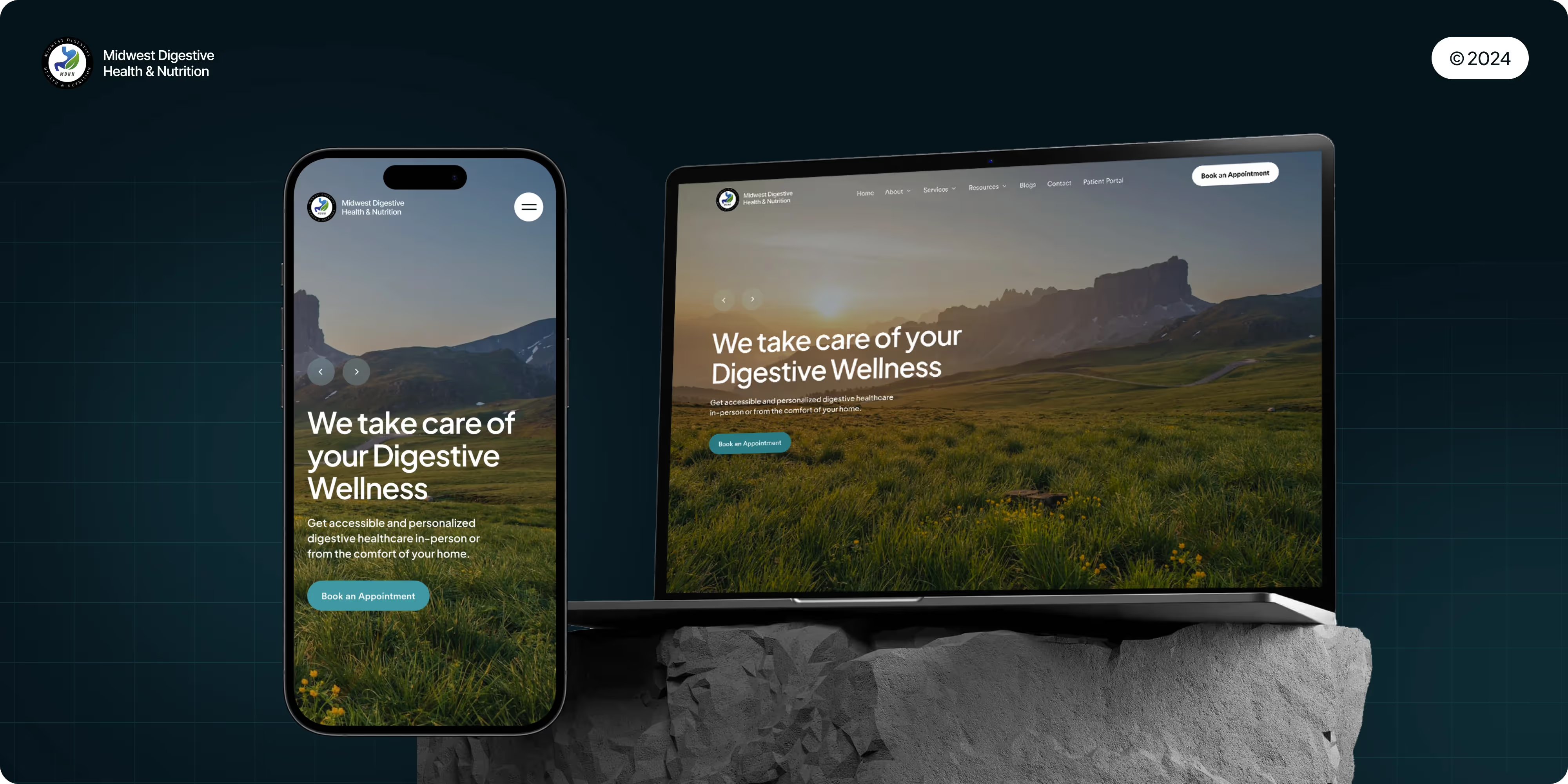
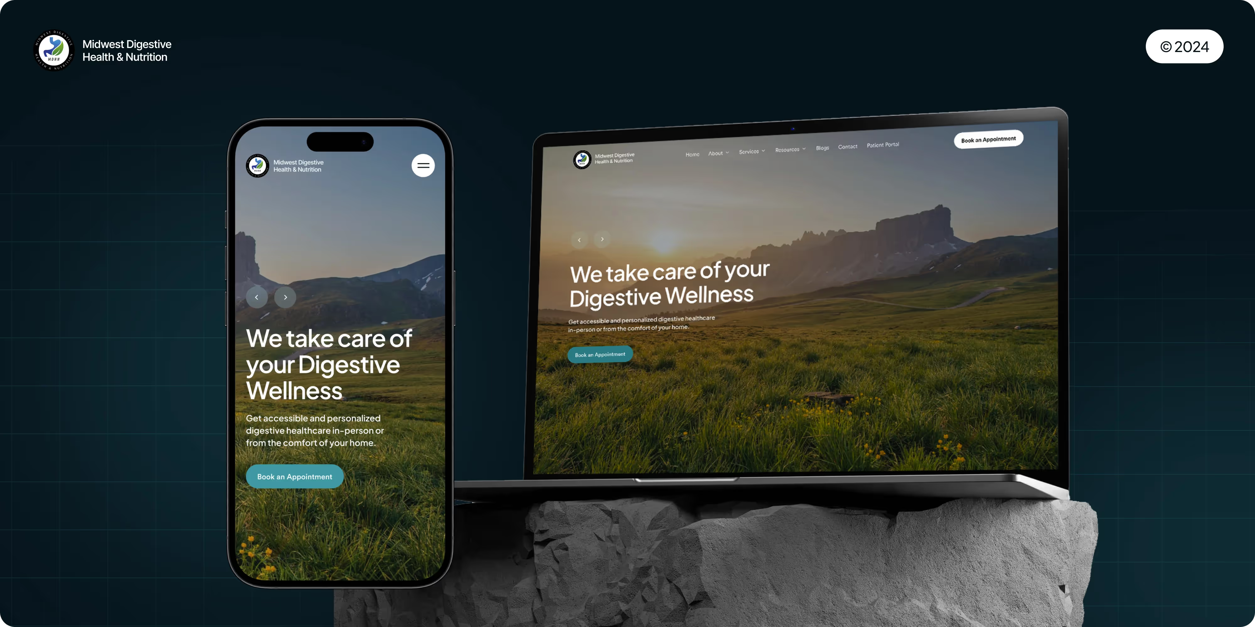
A streamlined, user-friendly online booking system was developed to allow patients to schedule appointments effortlessly, reducing the need for phone calls.
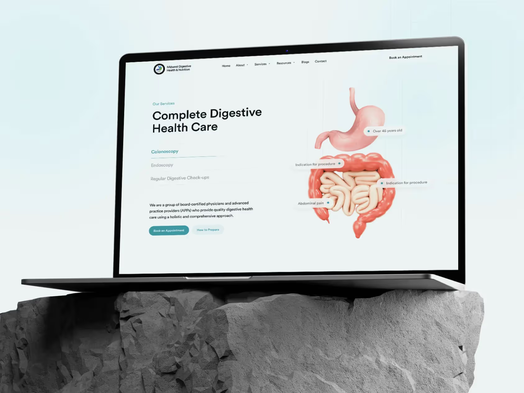
Our mandate was to clarify services, shorten the path to booking, and give the practice a credible, modern web presence that the in-house team can run day-to-day.
Project Highlights
- Modern CMS build for speed, security, and easy in-house editing (no developer dependency for routine updates).
- Sitemap & information architecture mapped to patient tasks, from symptoms and conditions to diagnostics, treatments, and Book an Appointment.
- Provider & locations directory with filters (specialty, procedure, language) and clear “call or request” options.
- Appointment pathways: persistent CTAs, short forms, click-to-call, and telehealth routing, privacy-first, HIPAA-conscious form flows.
- Insurance & referrals: coverage information, referral instructions, and downloadable prep guides organized by procedure.
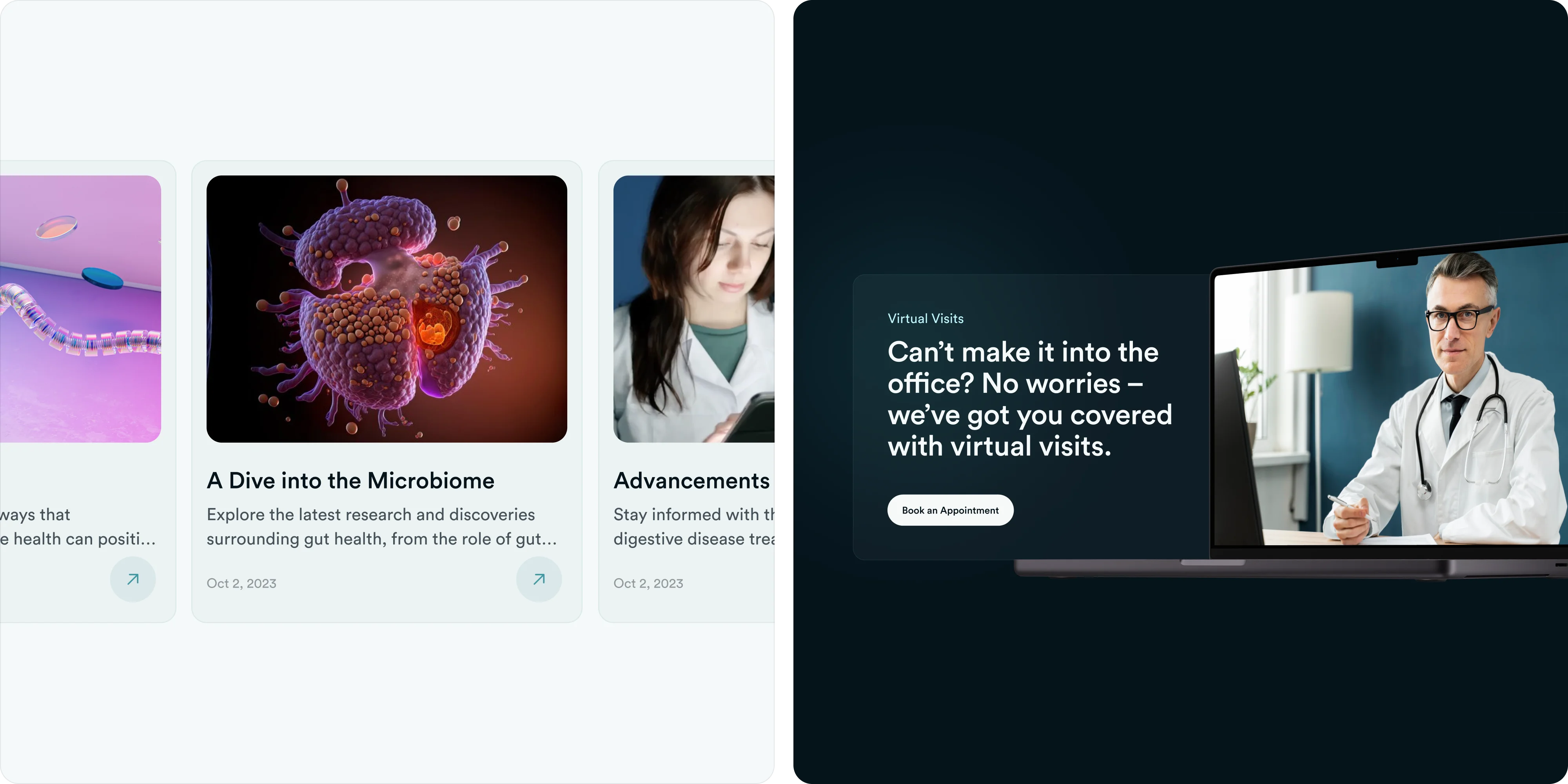
- Patient education hub (CMS) for FAQs and articles, plain language with clinical review and disclaimers.
- On-page SEO for local discovery (titles, headings, internal-link spine, schema, location pages).
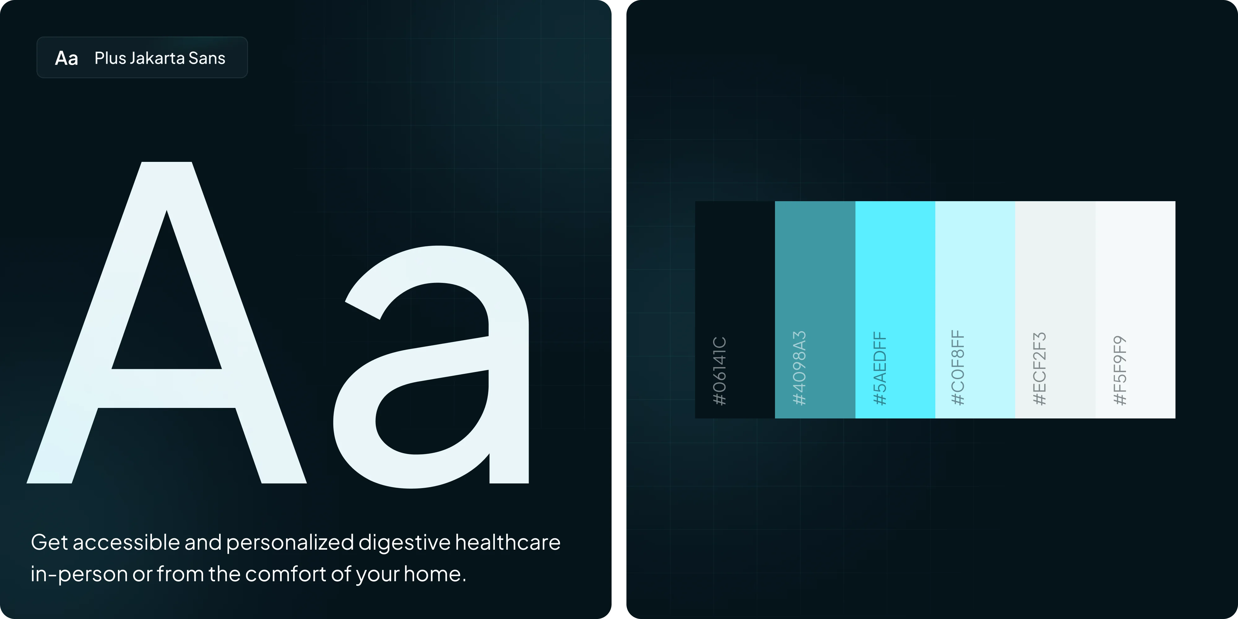
- Accessibility & performance: WCAG-informed color, contrast, and focus states, and mobile-first performance tuning.
- Analytics & events: GA4 and Search Console instrumentation, tracked phone taps, form starts and submits, and key CTA clicks.
- Training & enablement: live CMS workshop, admin guide, and governance checklist for publishing cadence.
- Post-launch support: QA window for fixes and tuning after go-live.
Challenges
GI practices serve multiple audiences. New patients, returning patients, referring physicians, and payors. Each with different questions and urgency. The legacy content mixed clinical detail and marketing copy, making it hard to find prep instructions, insurance info, or how to book the right test. The site also needed to express clinical credibility without overwhelming users, and it had to work flawlessly on mobile where most searches begin.
Approach
We mapped journeys for common entry points (“I have a symptom,” “I was told to get a colonoscopy,” “I need a follow-up”). From there we rebuilt navigation and page models around tasks.
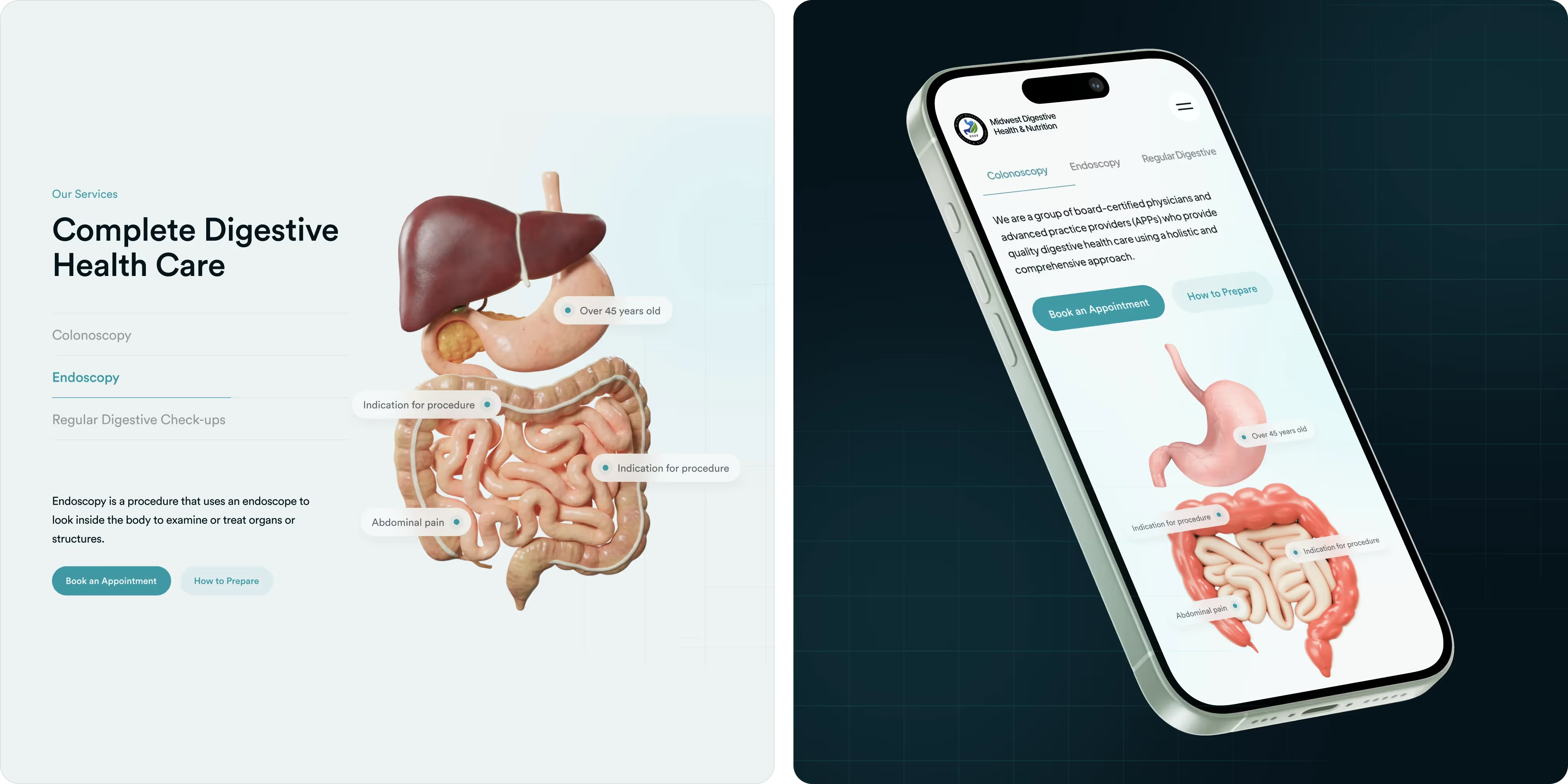
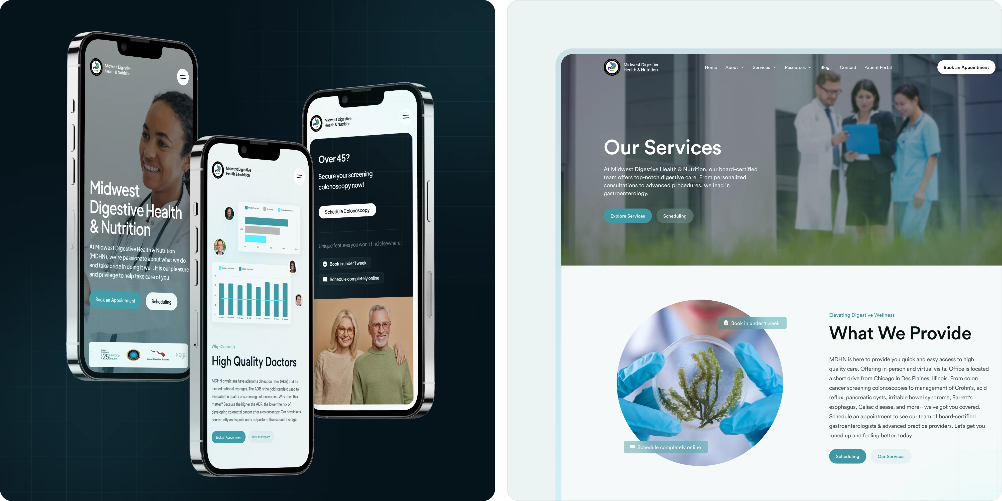
A component-driven web design and UI/UX system kept information scannable and consistent. Procedure overviews, prep steps, risks and contraindications, and next-step CTAs appear where they’re most useful. We implemented pragmatic SEO (including structured data), prioritized accessibility and mobile performance, and delivered enablement so staff can publish updates in minutes. Light branding alignment kept messaging disciplined.
Outcomes
The redesigned experience makes care easier to access and trust, with clearer language, faster paths to schedule, stronger local search visibility, and a maintainable CMS that supports day-to-day operations.
.webp)
.webp)
.webp)



.webp)









.webp)
.webp)






.webp)




.webp)



.webp)


.avif)


.webp)








.png)