.webp)

.webp)


.avif)
99 Yorkville Ave Unit 200,
Toronto, ON M5R 3K5, Canada
Toronto, ON M5R 3K5, Canada
Get Directions

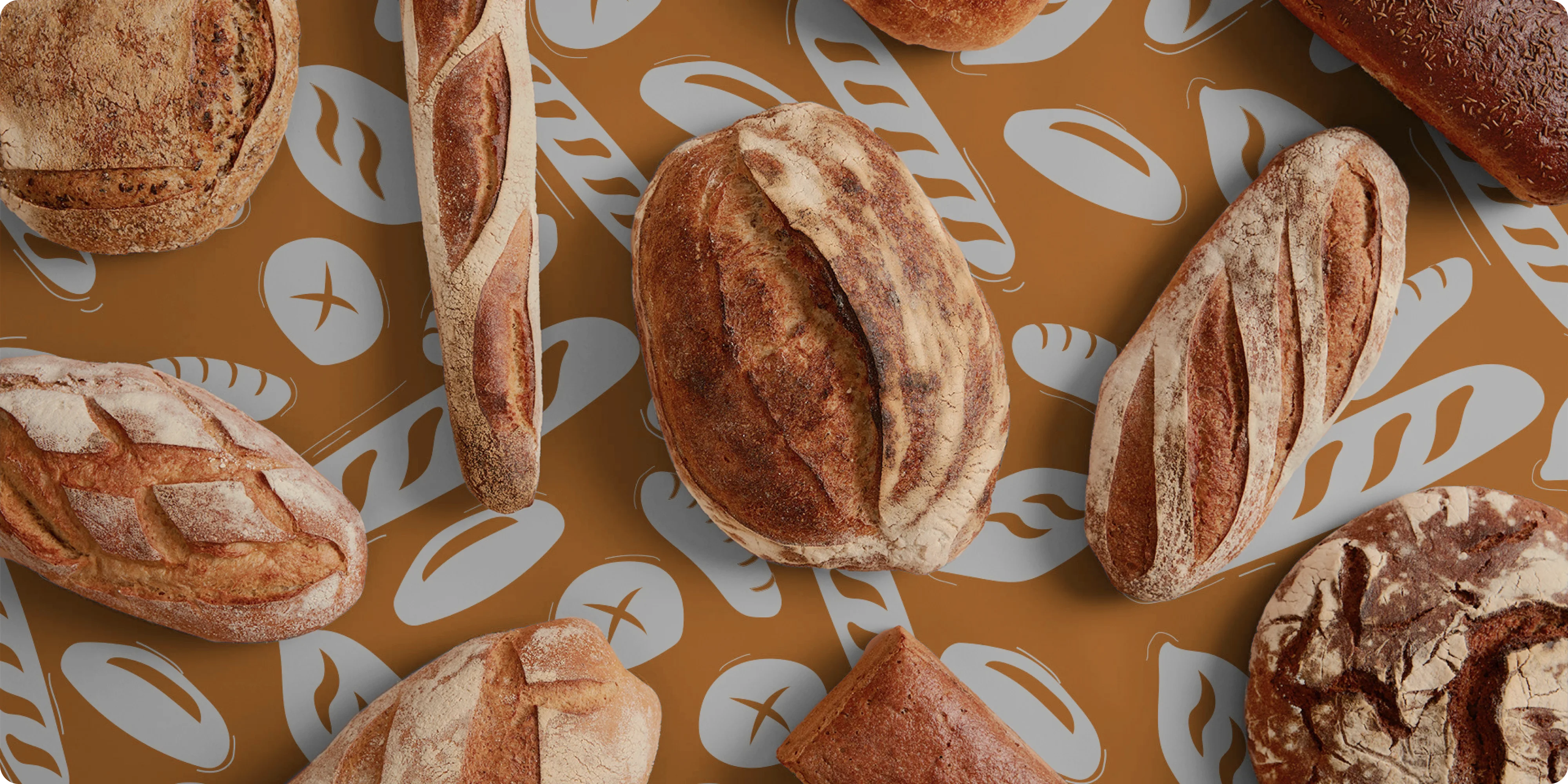
Greater than Gluten reached out to Brand Vision to create it's branding and packaging that best showcases the brand's goal and mission.
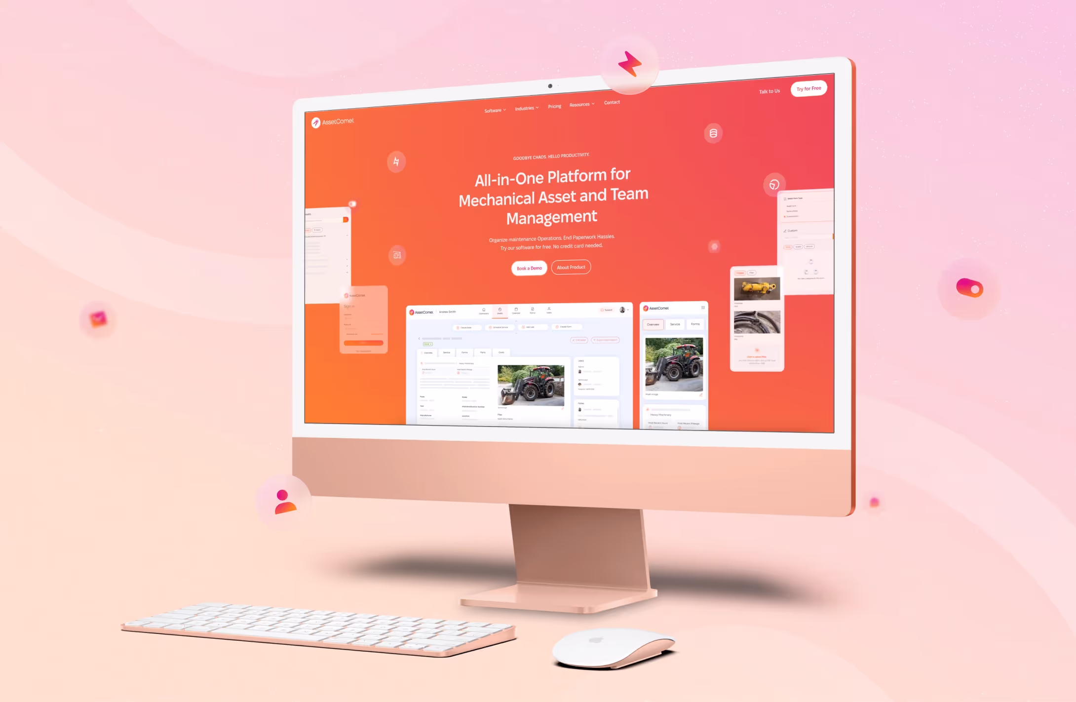
At Brand Vision, we go above and beyond to bring your vision to life and make it better by adding unique touches.
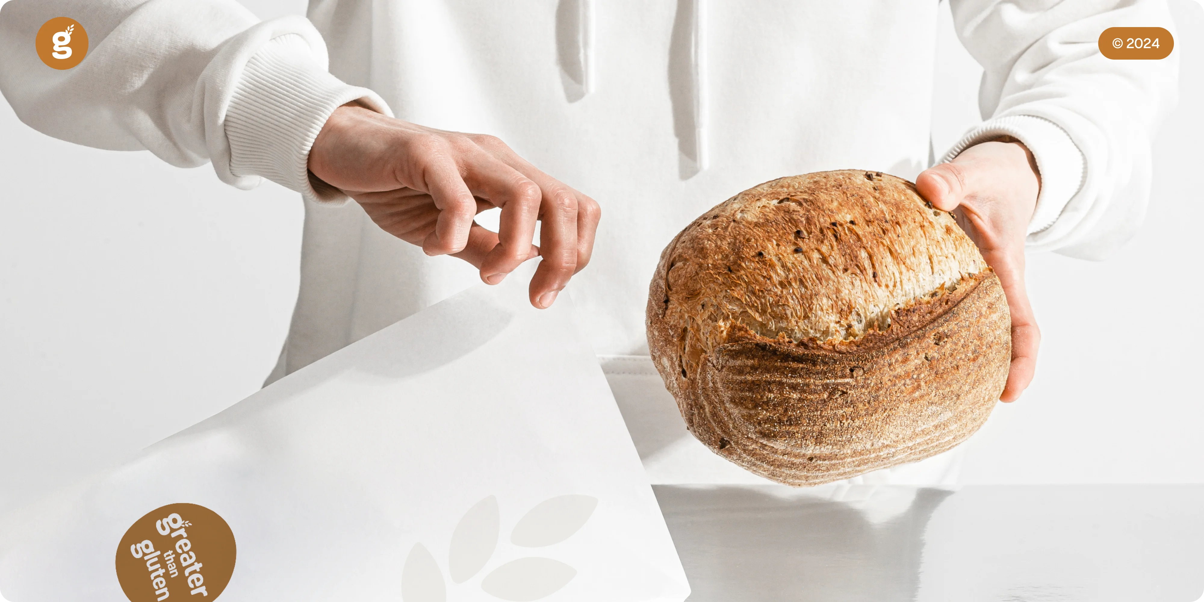
Our team at Brand Vision never miss when it comes to creating stunning and unique designs.
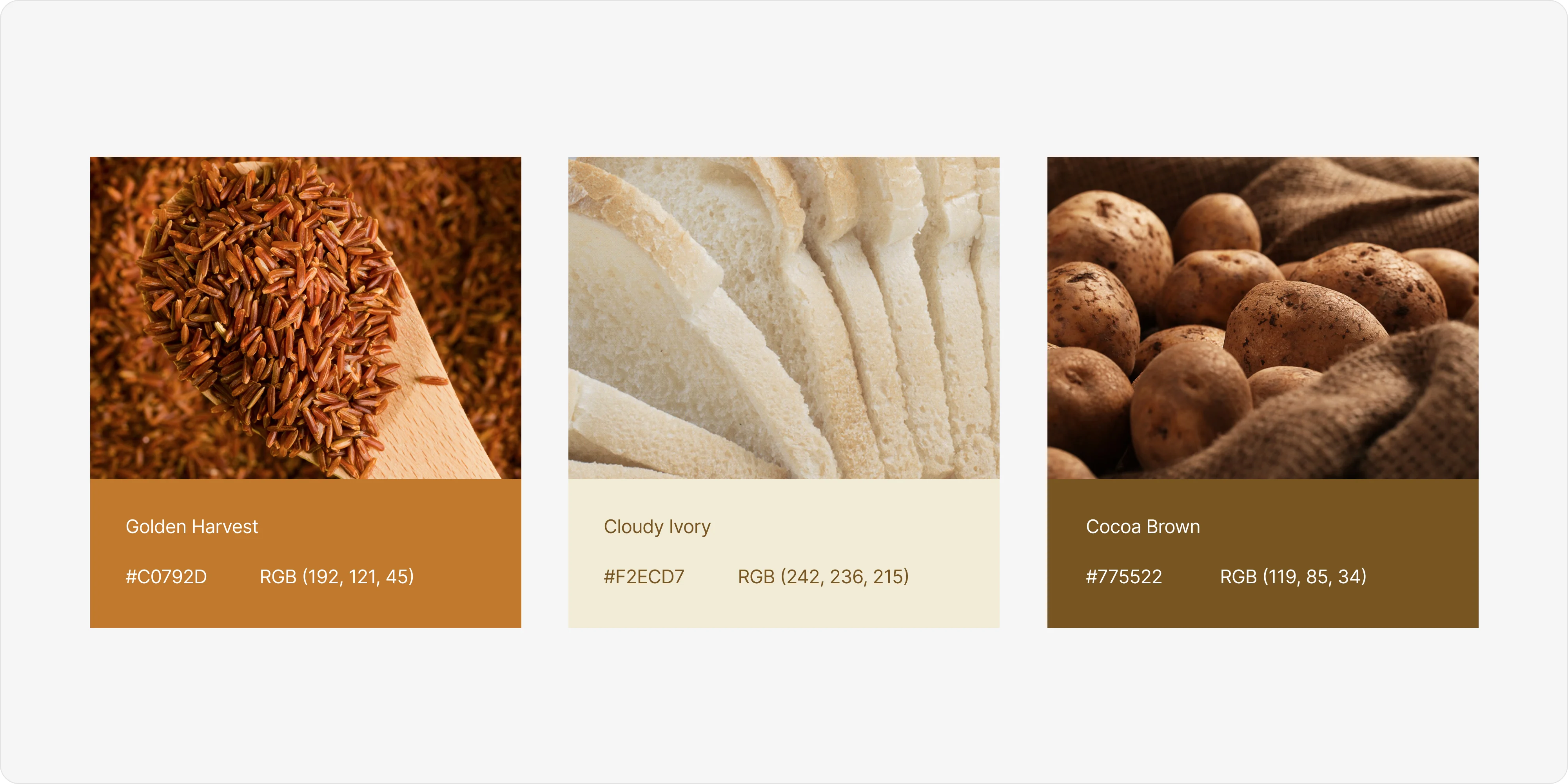
Our work for Greater than Gluten resulted in a unique, timeless and inviting branding and packaging design with custom made design pattern.

.webp)


.avif)
Our goal is to nurture your vision and provide innovative, custom solutions for all your marketing needs.