.avif)
.webp)

.webp)

.avif)
.webp)

.webp)
.webp)


.avif)
.avif)
99 Yorkville Ave Unit 200,
Toronto, ON M5R 3K5, Canada
Toronto, ON M5R 3K5, Canada
Get Directions

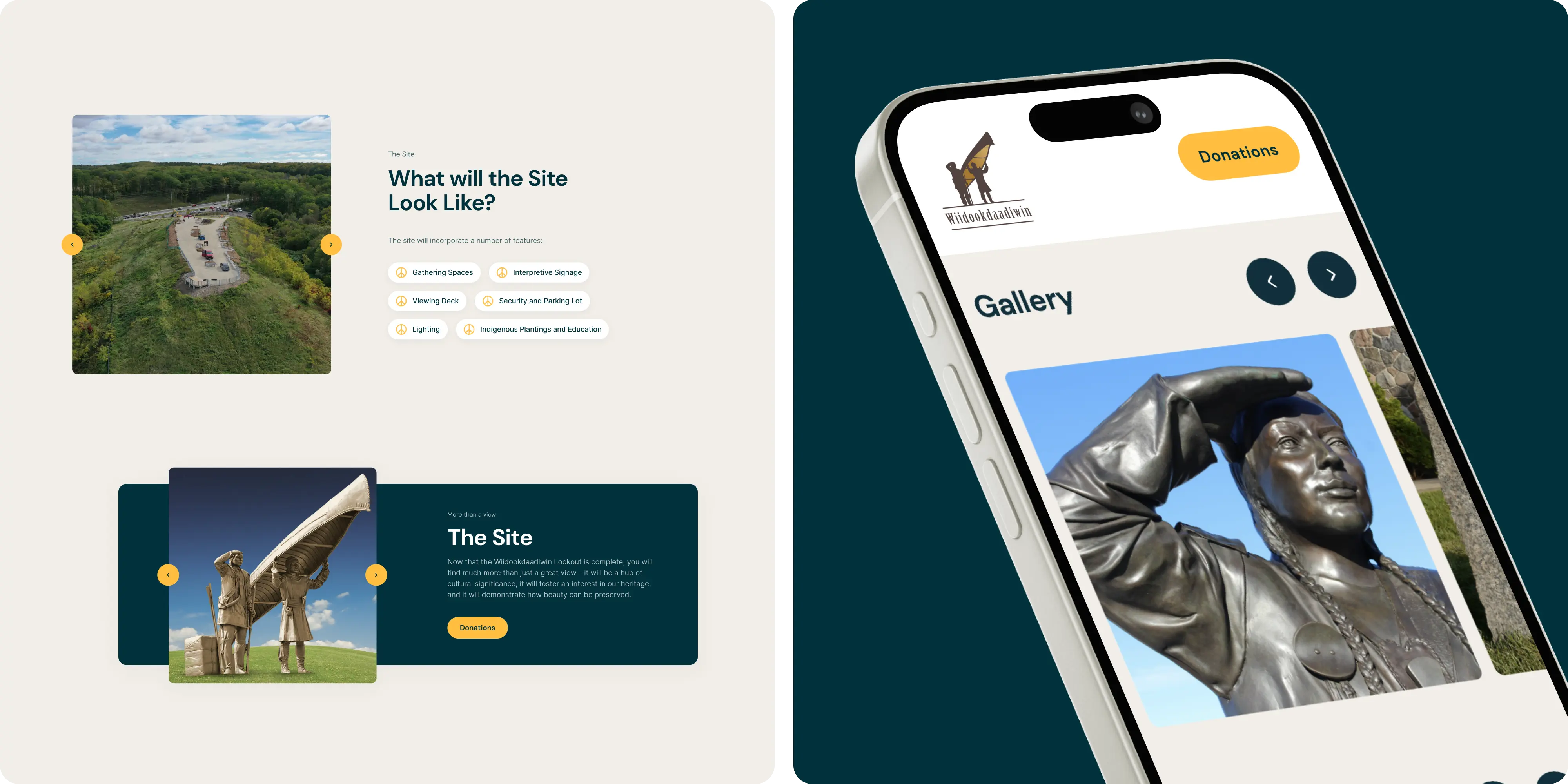
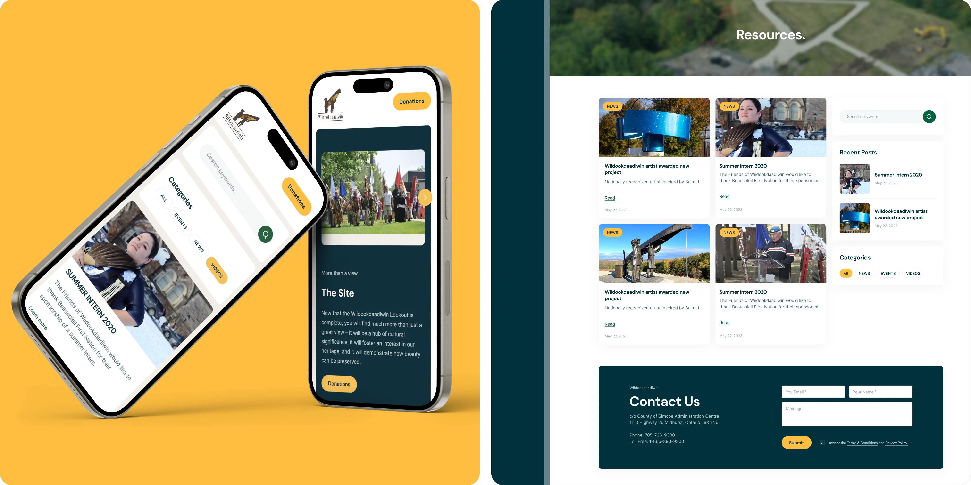
Wiidookdaadiwin is an Indigenous organization focused on community wellness, healing, and cultural connection rooted in Anishinaabe traditions.
We worked to turn a multi stakeholder mission into a clear, calm, and trustworthy web experience that supports programs, land based practices, ceremonies, and community resources on any device.
Language around wellness and crisis can be technical and sensitive. Content served many audiences but did not make next steps obvious, especially on mobile. Accessibility needed to be provable under AODA, resources lived in scattered PDFs, and staff needed a CMS they could use confidently without extra overhead.
We began by listening and mapping journeys for community members, families and caregivers, clinicians, and partners. Navigation and page models were rebuilt around tasks instead of org labels. A simple component system keeps information scannable with program cards, FAQs, step by step guidance, ceremonies and land based modules, and clear next step CTAs. We used calm, high contrast visuals that honour culture, implemented practical on page SEO, tuned mobile performance, added analytics, and documented guardrails for plain language, privacy, and image use. Finally, we trained staff and handed over a CMS they own.
The new site turns complex materials into clear next steps: faster wayfinding, accessible content, visible proof of care, and an editor workflow the team can handle in minutes. We were a good fit because we pair respectful UI/UX with clear content structure and simple editing workflows, so internal teams can support their community without getting blocked by the website.
.webp)
.webp)
.webp)
.webp)


.avif)
.avif)


Our goal is to nurture your vision and provide innovative, custom solutions for all your marketing needs.