
.webp)


.webp)


.avif)
.webp)

.webp)
.webp)


.avif)

.avif)
60 Bloor St W, Suite 401,
Toronto, ON M4W 3B8
Toronto, ON M4W 3B8
Get Directions

Clear Pathways is Peg’s Foundation’s statewide initiative to transform behavioral-health crisis care in Ohio.
We partnered to translate a complex, multi‑stakeholder mission into a clear, action‑oriented digital experience that emphasizes safety, accessibility, and real‑world impact.
Crisis‑care language is technical, nuanced, and sensitive. The existing materials served many audiences but made it hard to find “what to do next” in urgent situations. Content lived across static PDFs with limited searchability; accessibility needed to be explicit and verifiable; and stakeholders required a trustworthy way to share restricted documents without creating operational overhead.
We ran a focused discovery to map user journeys (person in crisis, caregiver, clinician, policymaker). From there, we rebuilt the navigation and page models around tasks, not org charts, prioritizing “recognize, respond, refer.” We created a component‑based design system for plain‑language content, high‑contrast typography, and calming visuals; then implemented the site on WordPress with structured CMS collections for resources. We added on‑page SEO, GA4/Search Console, form tracking, and WCAG‑aligned patterns (keyboard traversal, visible focus, heading hierarchy). Finally, we trained staff, delivered an admin guide, and documented governance for updates.
The new experience turns policy and pilots into practical next steps: faster wayfinding, accessible content, and a maintainable CMS that the team can operate confidently. Resource pages are easier to publish and share, restricted files are protected, and stakeholders have a credible hub they can reference in field‑building work across the state.
Why Brand Vision: Our team blends web design, UI/UX, branding craft, and pragmatic SEO with an enablement‑first mindset. You get a polished site and a system your team can run—supported by advisory‑led marketing consultation when priorities evolve.

Brand Vision collaborated closely with Clear Pathways, a non-profit organization, to revamp their website and color palette, focusing on enhancing trustworthiness and visual appeal. Leveraging WordPress Elementor, Brand Vision applied a strategic approach, aligning design elements with Clear Pathways' mission and values. By employing a user-centric design philosophy, they ensured seamless navigation and accessibility, bolstering the organization's online presence.

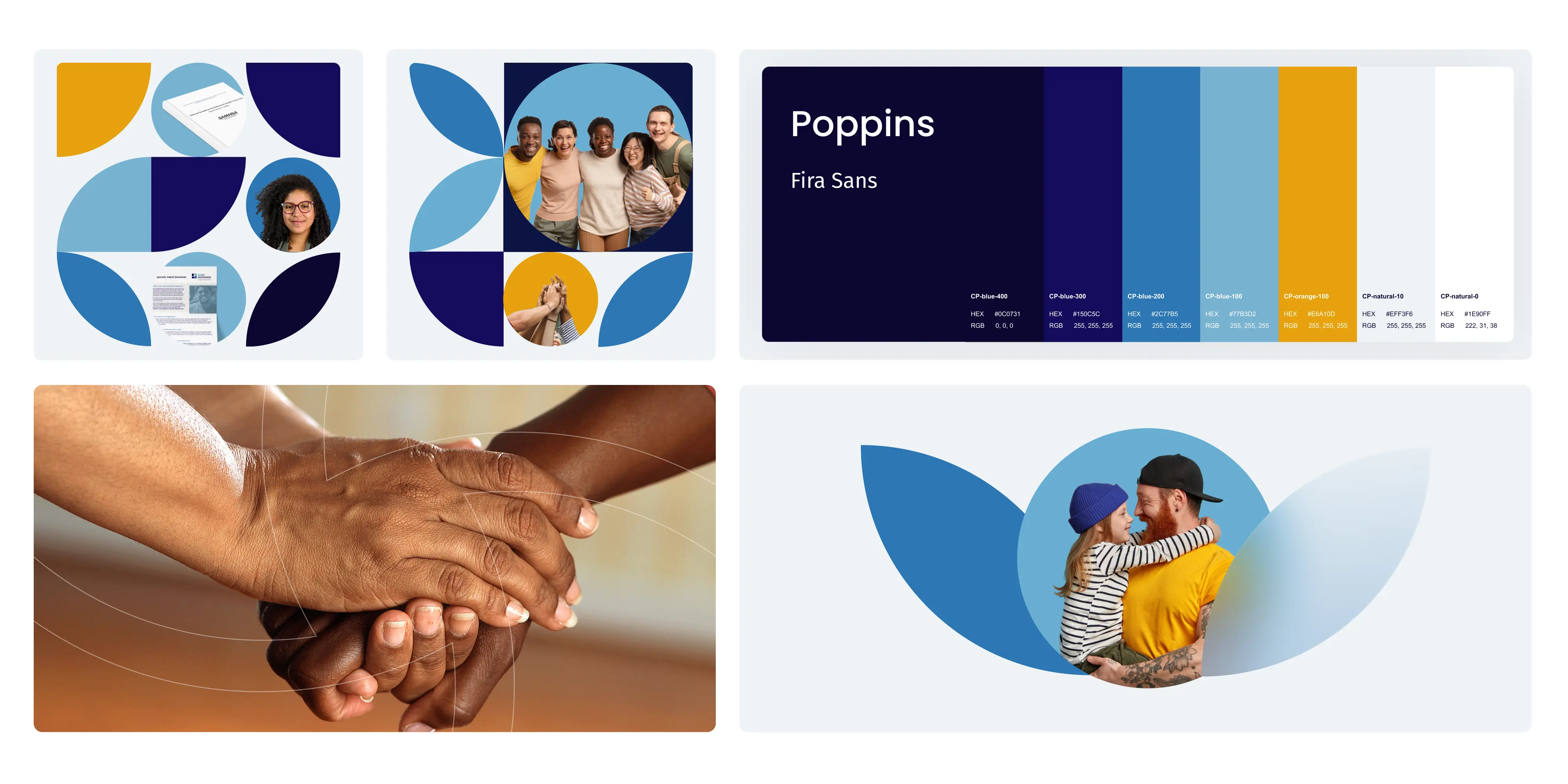
Poppins and Fira Sans were chosen as the main fonts for Clear Pathways' website redesign due to their readability, versatility, modern appearance, and web accessibility features. These fonts provide a contemporary yet professional look, ensuring clear communication of the organization's message while maintaining accessibility for all users.
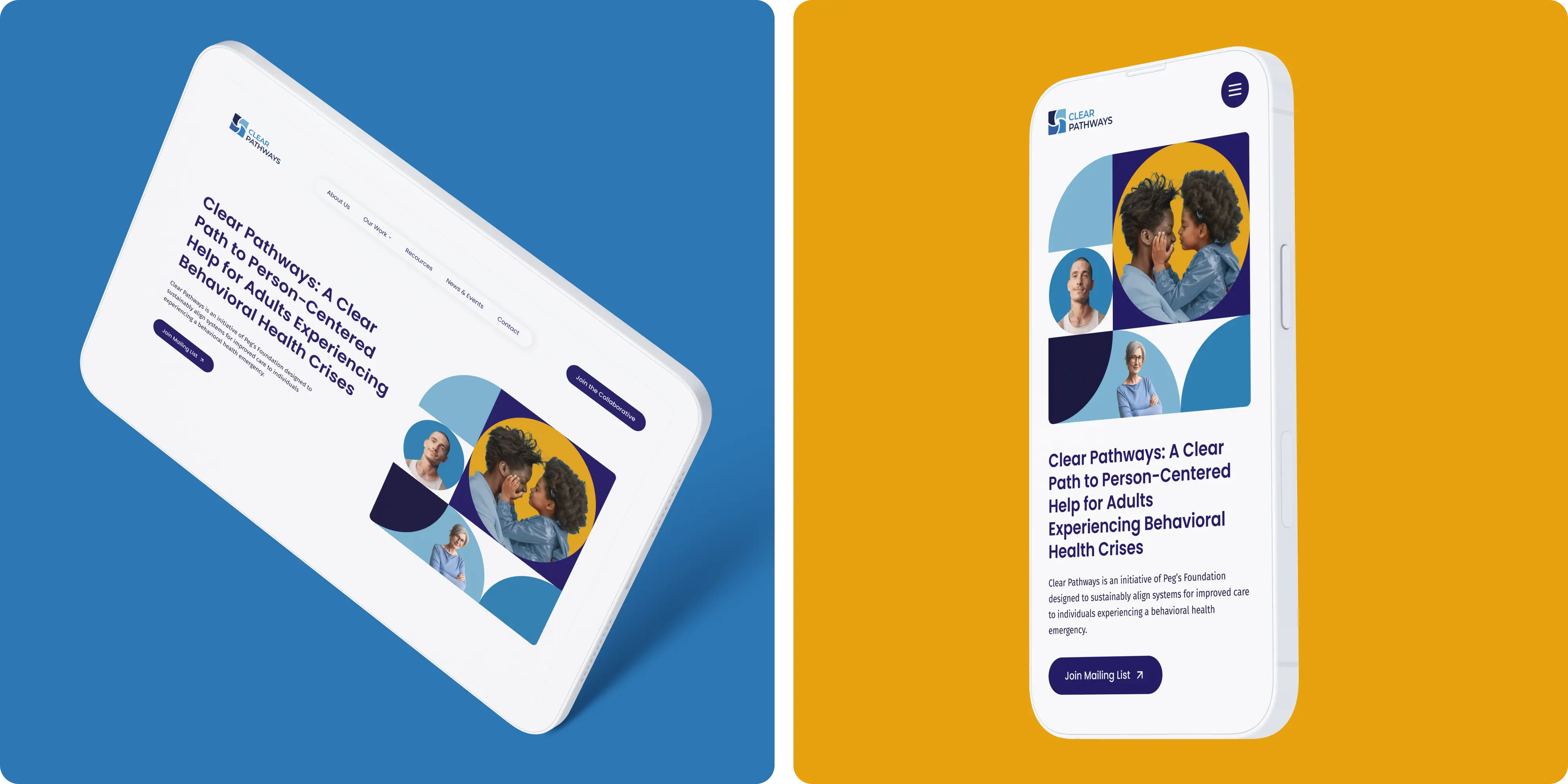
Clear Pathways' color palette features warm shades of blue and yellow, complemented by white. These colors were chosen to evoke feelings of trust, warmth, and professionalism while maintaining accessibility and visual appeal. The warm blue conveys reliability and approachability, while the yellow signifies positivity and optimism. White serves as a neutral backdrop, enhancing readability and reflecting transparency in Clear Pathways' operations. Overall, the palette creates a harmonious and inviting visual identity aligned with the organization's values.

Brand Vision crafted custom graphic elements for Clear Pathways' website to establish a unique brand identity and foster emotional connections with visitors. These elements, designed with soft shapes, soothing colors, and comforting imagery, aim to create a welcoming and supportive atmosphere. By enhancing the user experience, reinforcing trust, and maintaining design consistency, the graphics contribute to Clear Pathways' mission of providing a safe, calm, and friendly online environment.
.webp)


.avif)
.avif)


Our goal is to nurture your vision and provide innovative, custom solutions for all your marketing needs.