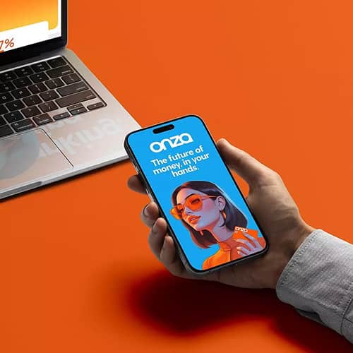
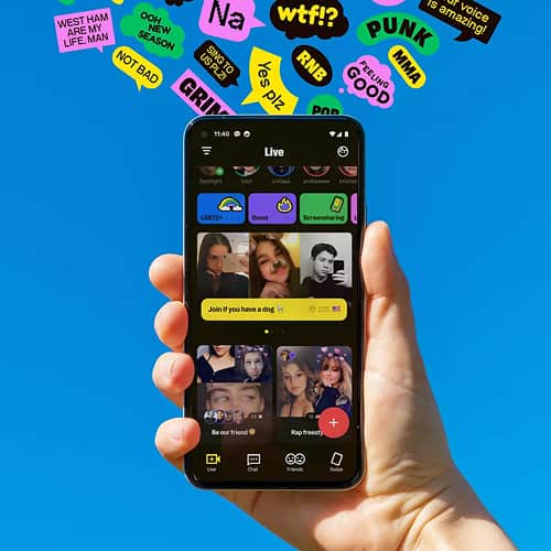
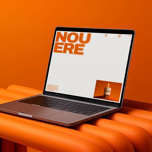
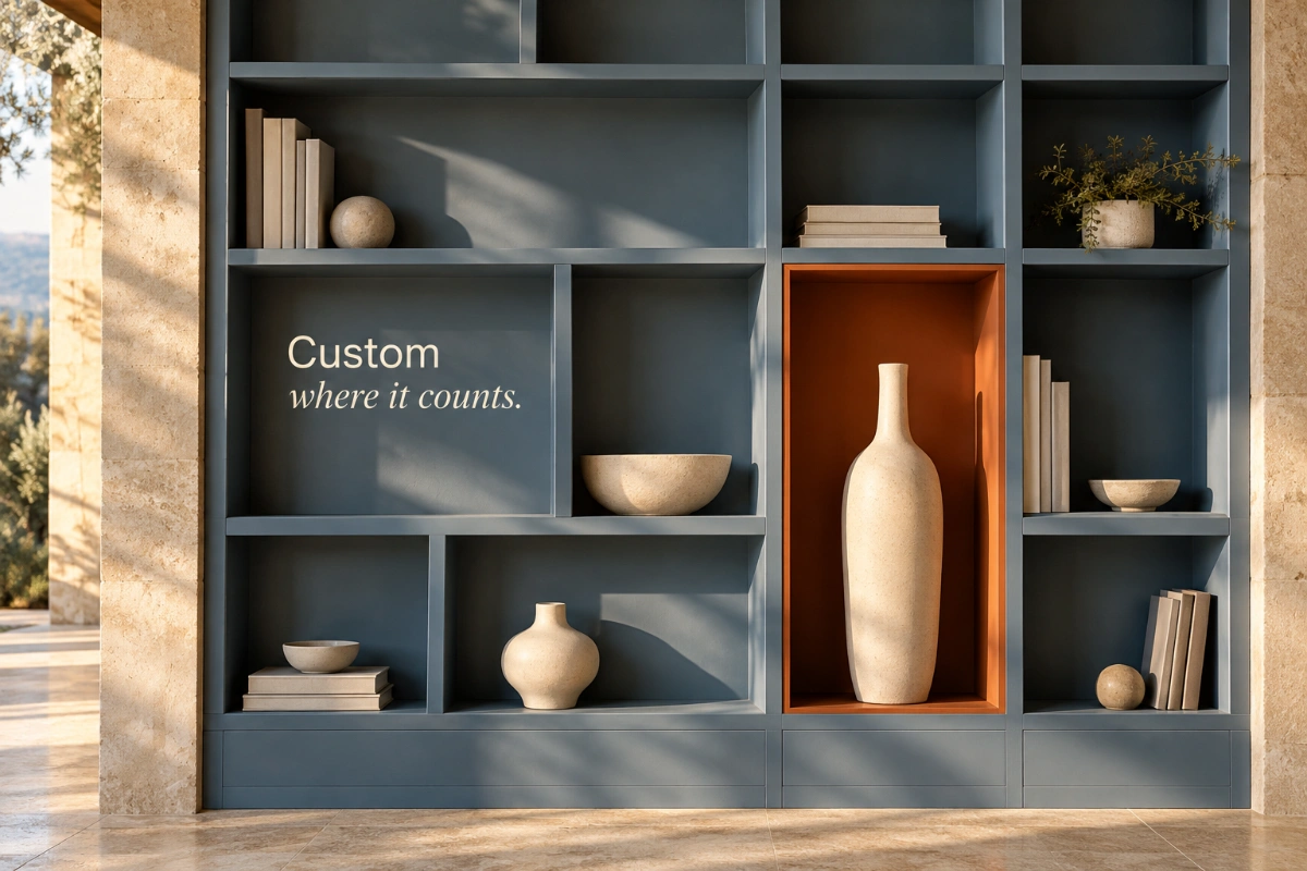
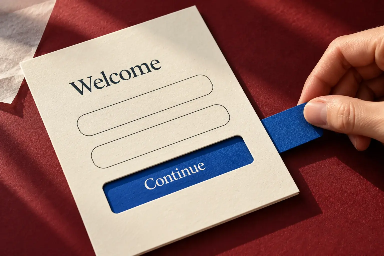
The branding trends of 2025 offered several contrasting directions: dessert-inspired imagery, hand-drawn illustration, restrained minimalism, expressive typography and fluid shapes. The useful question is not which style every business should adopt. It is which creative idea expresses your positioning, works across your materials and gives your audience a clear way to recognize you.
This guide examines ten directions as design options, not a measured ranking of their popularity. Canva's 2025 design forecast, informed by searches and design activity on its platform, highlighted handcrafted textures, modular shapes, nostalgia and motion. That provides context for the period, not proof that a particular aesthetic improves sales.
Effective branding starts with the business and audience before the visual treatment. Use the ideas below to explore a direction, then test it against your brand strategy. The reference images illustrate styles; they are not presented as a catalogue of campaigns launched in 2025.
1. Dessert-Inspired Product Branding
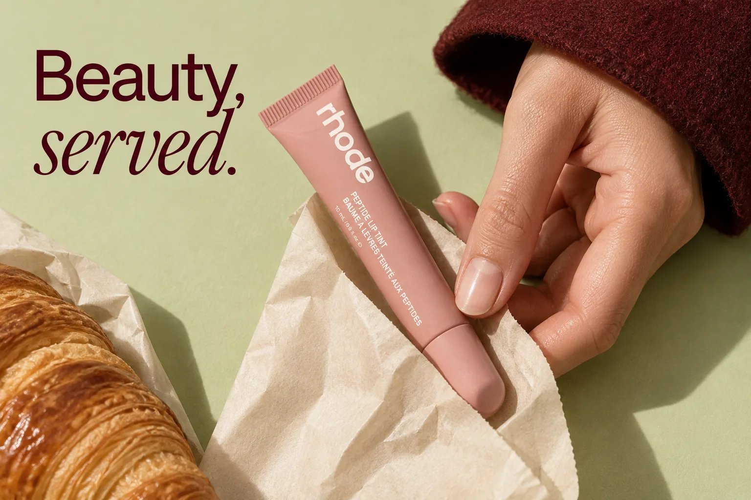
Candy colors, glossy textures and café or bakery imagery give a product a sensory setting. Think bubblegum pink, mint tones, frosting-like surfaces or a warm espresso palette. The creative connection should come from something specific about the product, such as its shade, texture or the occasion for using it.
Rhode's food-associated beauty marketing is a useful reference for this approach. Study how the product and surrounding props share a visual vocabulary rather than copying a dessert photograph. The image credit below concerns the article visual, not the creation of Rhode's brand identity.
For a hypothetical body-care launch, a cream-colored backdrop and soft lighting might communicate texture without suggesting the product is edible. Keep the product name and purpose obvious. Food imagery is not evidence that a cosmetic is safer, more natural or more effective, and the visual association does not establish why someone buys it.
Try the idea in a limited campaign before changing the permanent packaging or logo. In consumer-product marketing, the same concept should remain understandable on a product page, a shelf and a small social image. A prop that overwhelms the product is a reason to simplify the composition.

2. Hand-Drawn Motifs and the Handmade Digital Aesthetic
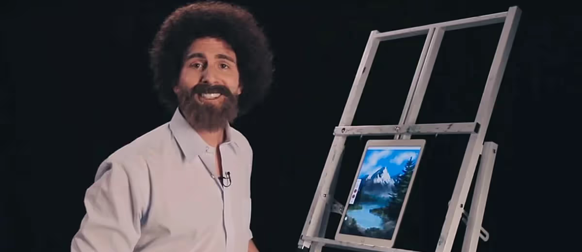
The handmade digital aesthetic fuses raw sketches, crayon-like textures, and imperfect strokes with refined typography. A loose illustration can introduce warmth or humor into an otherwise precise layout. The contrast is often the useful part: an informal drawing next to clear type, not an entire page that looks unfinished.
Define the illustration rules before expanding the style. Decide on stroke weight, texture, color, subject matter and how much imperfection is intentional. Give contributors approved examples so future drawings belong to the same family. A set of unrelated stock doodles is not a coherent illustration system.
This direction can support a personal or craft-led story, but rough lines do not prove that a product is handmade or a company is authentic. Use accurate descriptions of the actual process. Keep instructions, prices and long paragraphs in readable typography, and test fine details at the smallest print or screen size required.
Once the rules are clear, campaign graphics and packaging design can carry them into repeatable applications. The hand-drawn element should have a job, such as explaining a process or framing a message, rather than filling every empty corner.

3. Minimalism With a Recognizable Point of Difference
Minimalism reduces competing elements so the important ones have room to work. That may mean a limited palette, fewer type styles, controlled photography or a simple layout. It does not require a beige identity, an anonymous wordmark or removing information customers need.
A possible creative brief is: Clean logos or packaging emphasize calm, confident visuals that stand out in loud digital feeds. Treat that as an intended design effect, not a guaranteed audience response. Compare the result with its real surroundings: a quiet pack can be distinctive in one category and almost indistinguishable from its neighbors in another.
Decide which features still identify the business after the decoration is removed. A particular color relationship, typographic detail, crop or composition can provide continuity. Test those choices as a complete visual identity system, not only as a logo on a blank slide.
Watch for over-simplification. A product range still needs clear differences between variants; a website still needs useful navigation and supporting details. Minimalism works as a design discipline when it reduces noise without reducing understanding.

4. Naturalism Without Unsupported Environmental Claims
Earthy palettes, textured papers, botanical drawings and outdoor photography can establish a nature-led visual direction. Unlike a perfectly smooth digital finish, naturalism embraces small imperfections, including irregular edges or visible material texture. The important decision is which details connect to the actual product or story.
Photography of ingredients, landscapes or materials can suggest a brand’s alignment with nature. But a leaf icon, green palette or brown package does not verify environmental benefits, ethical production or a particular material composition. Separate the visual association from any claim the business needs to support.
For U.S. marketing, the FTC's Green Guides summary cautions against broad, unqualified claims such as “green” or “eco-friendly” and calls for clear, specific qualifications. Check the requirements in the markets where the product is sold rather than treating natural-looking design as substantiation.
Brief the design and product teams together. Confirm what the package is made from, what any certification covers and which information belongs on the label. A nature-inspired campaign can be visually appealing without making an environmental claim at all.

5. Negative Space That Still Reads Clearly
Negative space is the area around and between visual elements. In a logo, a gap can form a second shape or reveal a subtle idea. In a layout, it can separate information and direct attention without adding more lines, boxes or symbols.
A hidden detail should reward a closer look, not be necessary to understand the business name or offer. Start by checking the primary silhouette and legibility. Then ask whether the secondary shape remains visible when the mark is reduced, reversed onto a dark background or reproduced in one color.
For logo design, compare the concept at actual application sizes, including an avatar, website header and printed item. A clever gap that closes at small sizes needs adjustment. Do not add a complicated explanation to rescue a mark that people cannot read.
Negative space and minimalism are not interchangeable. A detailed composition can have well-managed spacing, and a sparse composition can still feel cramped. Judge the relationship between elements, not simply how few elements appear.
6. Wordmarks and Expressive Typography
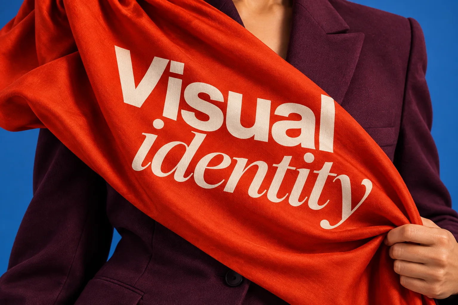
A text-only logo is still a logo. A wordmark uses the business name as its identifying form, with character coming from the letterforms, spacing, proportions or custom details. This approach shifts the design work toward the name rather than removing the need for an identity.
Choosing a name and drawing a wordmark are separate tasks. Resolve brand naming before refining letterforms; typography cannot fix a name that is unclear for the intended audience.
Separate the wordmark from the typography used for ordinary content. A distinctive display treatment may work for a short brand name but become tiring across a paragraph. Document typography rules for headlines, body copy, captions and practical information.
Check the limits before retiring a symbol. A long name may not fit a small profile image or narrow product label. Develop a deliberate compact version when needed, and define where it may appear. Neither a wordmark nor a symbol is automatically clearer at every scale.
Try unfamiliar names, numbers and required languages in the supporting type system. Review font permissions for the actual applications and contributors. The goal is a recognizable typographic system that other people can use consistently, not a typeface chosen only because it looks unusual.

7. Shape-Driven Branding as a Repeatable System
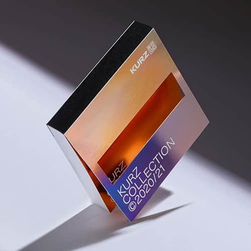
Circles, blocks, frames and repeating geometric forms can connect a brand's materials without repeating the logo everywhere. A shape might frame photography, divide a presentation or provide a consistent background for a campaign. Its usefulness comes from how the system is applied.
Define a small set of rules: which shapes are permitted, their proportions, how they overlap and when they act as decoration rather than information. Give each element enough flexibility to work on packaging, web design and print without forcing an identical composition.
A circle does not inherently prove inclusivity, and a triangle does not automatically communicate innovation. Treat those associations as creative hypotheses. Review the shapes with the name, message, audience and category to see whether the whole composition expresses the intended idea.
Test a dense information layout as well as a promotional image. If the pattern competes with text, makes charts confusing or crowds the product, reduce its role. A repeatable graphic language should help contributors organize content, not require them to fit every message into the same decorative frame.

8. Nostalgic Aesthetics, Including 1960s References
Swirling lettering, psychedelic color combinations and vintage photographic treatments offer one route into nostalgia. The 1960s album covers linked here are useful visual references, not a template for every retro identity. Identify whether you are borrowing a typographic treatment, a palette or a particular cultural association.
Nostalgia was also part of Adobe's 2025 forecast. Its explanation of the Time Warp design direction describes remixing historical eras with futuristic elements, rather than treating one decade as the only reference point. That is a helpful distinction when choosing between a faithful revival and a contemporary interpretation.
Start with the audience's relationship to the reference. A familiar brand archive and a borrowed vintage aesthetic are different creative resources. The nostalgic marketing campaigns of 2023 illustrate how an older reference can support a new campaign idea; they are historical examples, not 2025 launches.
Keep the present-day offer legible. Use expressive lettering where it can be read comfortably, and let simpler type carry essential details. Copying a past era wholesale can make a new product difficult to understand or leave the business looking like an imitation of an established brand.

9. Fluid and Liquid Visuals With Controlled Motion
Flowing shapes, gradients and liquid-like surfaces create a visual contrast with rigid grids. They can appear as static illustrations or become animated elements. A liquid aesthetic is not the same as a flexible identity system: the latter needs rules for variation, whether or not anything looks fluid.
Choose the constants before creating variations. Keep a recognizable palette, wordmark or framing rule so each execution still belongs to the same business. Test the design in a static format first; a print advertisement or an email should not need animation to make sense.
For digital work, treat motion as part of interaction design, not a layer of decoration added at the end. Define what starts the movement, whether it communicates useful information and what happens when someone needs it to stop.
W3C's Pause, Stop, Hide guidance requires a way to pause, stop or hide automatically starting moving content that lasts more than five seconds and runs alongside other content, unless the movement is essential. Review that requirement alongside reduced-motion preferences and readability. Visual energy should not make the message or controls harder to use. Include these checks in website accessibility testing before launch.
10. Anti-Branding as a Deliberate Identity Choice
Anti-branding describes an intentionally restrained or apparently unpolished presentation: plain packaging, modest typography, sparse layouts or an everyday photographic style. It is not the absence of design. The repeated choices still communicate an identity, even when they avoid conventional promotional polish.
Distinguish it from minimalism by its intended attitude. Minimalism can look highly refined; anti-branding may deliberately resemble something ordinary, utilitarian or provisional. Both need a clear hierarchy and recognizable cues.
For a less-established business, stripping away the name or distinctive features can leave people unsure who is speaking. Test whether the packaging, product page and order email still connect. A deliberately plain wrapper should not obscure the product, necessary information or the route to customer support.
Do not use an understated appearance as a claim of honesty, superior quality or lower environmental impact. Those qualities depend on the business and evidence behind the presentation. An anti-branding direction is useful only when its restraint serves the audience and the offer.
How to Choose and Apply a Branding Direction
Decide Whether You Need a Campaign, Refresh or Rebrand
Branding is more than a collection of visuals or short-lived campaigns. Before choosing a trend, name the problem: unclear positioning, inconsistent materials, weak product differentiation or an identity that no longer fits the offer. These problems do not all require the same response.
A seasonal illustration style might be a campaign treatment. Better templates may resolve inconsistency without changing the identity. Broader rebranding ideas deserve consideration when the business, audience or positioning has changed, not merely because a new aesthetic is fashionable.
Use brand and audience research to identify what customers already recognize and where they are confused. Preserve useful identifying features rather than replacing every element at once. Record which assumptions still need testing.
Compare Directions on the Same Real Applications
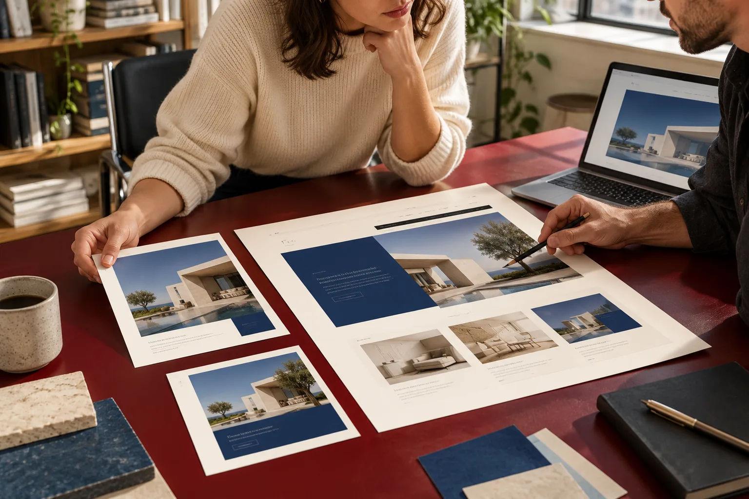
Give each concept the same copy, product and required formats. Review a small digital placement, a content-heavy page and a physical item where relevant. A moodboard can explain an idea, but it cannot demonstrate whether the design works in those settings.
For example, a fictional bakery might compare hand-drawn illustrations with a typography-led direction using the same menu, box and ordering page. Ask whether customers can find the product and price, identify the business and understand the offer. Do not judge solely by which concept looks most impressive on a presentation cover. Use task-based usability testing for the ordering page, rather than asking only which visual style people prefer.
- Check fit with the positioning and audience before considering novelty.
- Test legibility, recognition, accessibility and production constraints in the actual formats.
- Identify which elements stay fixed and which can change for campaigns or product variants.
- Record the cost and ownership of photography, illustration, templates and future updates.
- Set an observable review question, such as whether users can distinguish two variants, instead of promising a sales increase.
Document the Rules and Review the Rollout
Turn the selected direction into usable guidance for typography, color, imagery, spacing and applications. The guide to building a visual identity explains how those elements form a system. Include correct examples, common mistakes and approved files, then ask someone outside the design team to produce a routine asset.
After rollout, review customer feedback and the tasks the design was meant to support. Keep changes in price, distribution, campaigns and product availability separate from visual changes when interpreting results. A different outcome after a redesign does not, by itself, identify what caused it.
The most useful lesson from these branding trends of 2025 is to borrow selectively. Keep the parts that express the business clearly and reject the ones that only make it resemble the current moodboard.
For help connecting a creative direction with your brand strategy, visual identity and website, contact Brand Vision to discuss your priorities.