
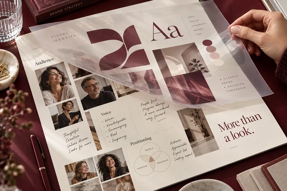
A visual identity is the system of visual elements a business uses to make its brand recognizable: its logo, colors, typography, imagery, graphics, layouts, and the rules that hold them together. It should work across the places customers actually encounter the business, from a mobile website and sales proposal to packaging or signage.
The important word is system. A logo alone cannot tell a team which photograph to choose, how to lay out a presentation, or which colors work on a button. This Brand Vision guide explains what to include, how to make the design decisions, and what to test before approving the identity. Use it to brief a designer or improve an existing system.
Visual Identity vs. Brand Identity and a Logo
Visual identity is the visible expression of a brand. Brand identity is broader: it can include positioning, values, personality, messaging, voice, and the visual system. A logo is one identifying mark within that system, not a substitute for it.
The distinction matters when setting a project scope. A company with unclear positioning needs more than a new palette. A business with a sound strategy but inconsistent materials may need better visual rules and templates rather than entirely new branding.
For a fuller comparison, read Visual Identity vs. Brand Identity: Understanding the Difference. Here, the focus is the visual system and its practical application.
Why Visual Identity Matters for a Business
Without an established identity, every website page, social post, proposal, or advertisement becomes a fresh design decision. A defined system gives contributors a shared starting point and makes it easier to keep materials related as the team grows.
Distinctive colors, typography, and graphic forms can support recognition, but consistency does not mean making every layout identical. It means retaining recognizable cues while adapting the composition to the message and format. A campaign can feel different without looking like a different company.
Visual consistency supports the presentation of a business; it does not substitute for accurate claims, reliable service, or evidence of quality. Judge an identity by whether it expresses the intended positioning and works in use, not by an assumed increase in trust, revenue, or conversions.
The 7 Core Elements of a Visual Identity
The following is a practical framework, not a requirement to commission every possible asset. Define the elements your business needs and the rules for combining them.
1. Logo System
The logo may include a wordmark, a symbol, or both. Specify the primary version and only the alternative arrangements needed for actual placements.
- Provide approved versions for light, dark, and single-color applications where needed.
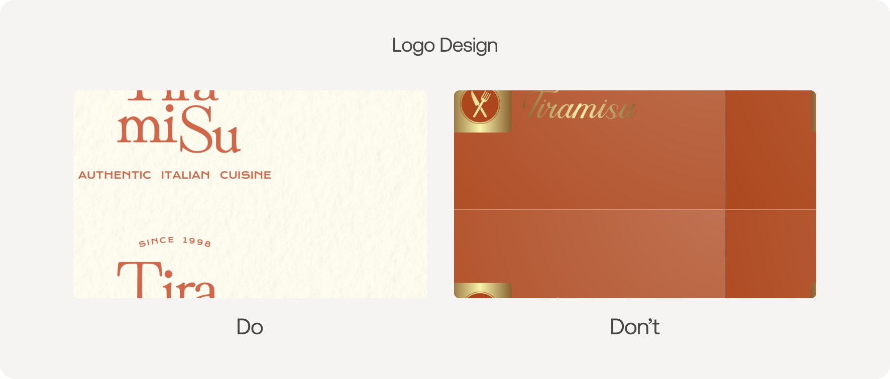
- Define minimum sizes, clear space, background rules, and prohibited alterations.
- Test a website header, small avatar, presentation, and physical application at their intended sizes.
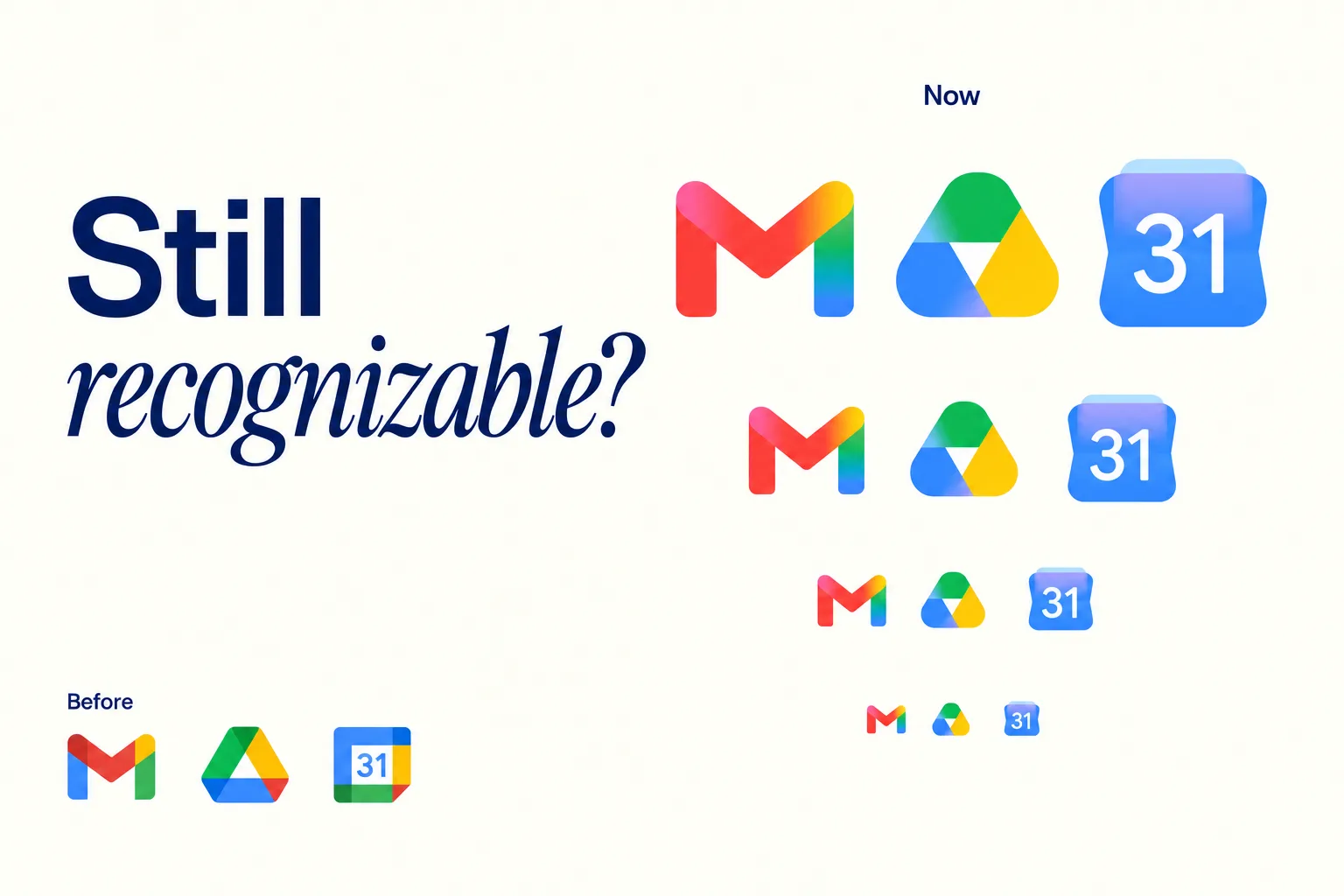
Do not assume a detailed mark will remain legible when reduced. If a small-format variant is needed, supply it deliberately rather than asking each contributor to redraw or crop the logo. A business name should remain available when a symbol alone would leave the audience guessing.
2. Color Palette
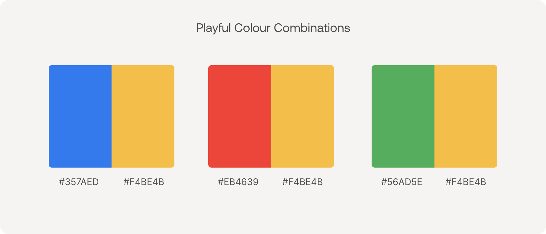
Define colors by role: primary brand colors, supporting accents, neutrals, backgrounds, and functional interface colors where relevant. A palette should explain how to use its colors, not merely display attractive swatches.
Record the values required for screen and print production. Document approved text/background combinations and distinguish brand expression from error, warning, and success states. A recognizable brand color is not automatically suitable for paragraph text or button labels.
The Web Content Accessibility Guidelines provide requirements for text and interface contrast. Check the actual combinations used in layouts, including text over imagery, rather than declaring a palette accessible in isolation.

3. Typography
Typography establishes the appearance and hierarchy of written information. Specify typefaces, approved weights, heading and body styles, spacing, and fallback fonts for the environments your team uses.
A distinctive display typeface may work well for headlines while being unsuitable for long paragraphs. Show headings, body copy, captions, numbers, and action labels together. The system needs to support expression and readability without forcing every kind of information into the same style.

4. Photography and Illustration
Describe subject matter, composition, lighting, editing, cropping, and the relationship between photography and illustration. Show several approved examples and explain what connects them.
For example, “use authentic photography” leaves much open to interpretation. A hypothetical brief could instead ask for people performing the service in real settings, with natural light and enough space for accompanying text. That gives contributors a decision they can apply without copying one photograph repeatedly.
Record usage permissions and avoid crops or edits that misrepresent a product, person, or event. Include guidance for difficult formats, such as a wide website banner and a square social image.
5. Graphic Elements and Iconography
Supporting shapes, patterns, icons, and illustrations extend the identity beyond its logo. Explain stroke weight, corner treatment, proportions, and when an element should be used. Use the same rules when producing campaign graphics and branded collateral.
Decoration should not compete with the information. Give unfamiliar functional icons a clear label, and distinguish chart series with labels or patterns as well as color. Branding should never justify changing a chart's scale or obscuring its meaning.
6. Layout and Composition
Set principles for grids, margins, spacing, alignment, image placement, and information density. Show how the reader's eye should move from the most important message to supporting information and the next action.
In web design, test these principles with real content at narrow and wide screen sizes. A proposal, mobile page, and outdoor sign cannot share an identical layout. They can share typographic relationships, image treatment, and a recognizable approach to spacing.
7. Guidelines and Templates
Guidelines document the system; templates make recurring applications easier to produce. Include correct and incorrect examples, links to approved assets, and an explanation of what contributors may change.
A social template might allow new copy and photography while keeping logo placement and text styles fixed. A product interface also needs behavior and accessibility specifications beyond a visual brand guide. Brand Vision's guide to brand guidelines covers the broader documentation process.
How to Choose Brand Colors
Start With Positioning, Not a Color Formula
Do not build a palette solely around claims such as “blue means trust.” A 2020 study of color-emotion associations asked 4,598 participants across 30 nations to associate emotion concepts with color terms. It found shared patterns alongside differences associated with language and geography. It did not test whether a particular brand palette increases purchases.
Write down the impression the identity should support, then review color in context with the category, imagery, and typography. Examine competitors to understand conventions, not to copy their palette or reject a useful color simply because someone else uses it.

Assign Roles and Test Combinations
Choose the smallest palette that handles the actual applications. Identify the primary colors, supporting tones, and neutrals. Where a website or product needs functional colors, document those separately from campaign accents.

Test a page, presentation, advertisement, and physical application where relevant. Check whether the main message remains clear when the palette is used heavily or sparingly. A hypothetical coral accent might work in large graphics but need a darker approved variant for small text on white.

For digital text, WCAG 2.2 Level AA specifies at least 4.5:1 contrast for normal text and 3:1 for qualifying large text, with stated exceptions. Review the WCAG contrast requirements. The exception for text in logos does not extend to ordinary marketing copy.
Required visual information identifying controls, states, and meaningful graphics has a separate non-text contrast requirement, generally 3:1 against adjacent colors, with exceptions. Do not rely on color alone to communicate an error or distinguish chart series.
Document Production Values
Record HEX and RGB values for screen use and approved CMYK or Pantone specifications when print production requires them. Agree on proofs with the production supplier instead of treating a screen swatch as a final print reference.
For more palette-planning context, Brand Vision's guide to brand color psychology discusses color roles and applications. Keep the approved combinations and production notes with the palette so contributors do not have to approximate them.
How to Choose Typography That Works in Practice
Start with the intended personality, then test whether the type can handle the content. There is no requirement to pair two typefaces: one versatile family may be enough. Add another only when it has a clear role.
Define Hierarchy With Real Copy
Show a long headline, paragraph, caption, price or data point, and call to action together. Specify approved weights, sizes, line heights, and spacing in the formats where the system will be used. A font name alone is not a typography specification.
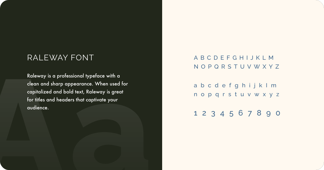
Check numbers, punctuation, and the languages your business needs. Try a long customer name, a dense proposal page, and a narrow mobile layout. Review wrapping and increased text size with your UI/UX design requirements. Do not shrink important text simply to preserve a composition.
Plan Access and Fallbacks
Confirm the permitted uses in the chosen font's license, including the environments and contributors involved. Record who manages access and how external partners obtain the fonts they need. Do not assume a font file may be freely redistributed.
Provide approved fallback fonts for web, email, presentations, and documents as needed. Test a template with the preferred font unavailable: check whether text wraps, buttons grow, or content is clipped. Resolve the fallback in the template instead of leaving colleagues to improvise.

How to Create a Visual Identity Step by Step
1. Write a Brief With Clear Decisions
Define the audience, positioning, value proposition, personality, priority applications, constraints, and decision-maker. Your brand strategy should explain what the design needs to express, not dictate a collection of unrelated aesthetic preferences.
Before changing an established identity, use brand research and an audit to identify what customers recognize and where the system fails. Record what should be retained, refined, or replaced. The broader brand development process connects this brief with the strategic work around it.
2. Develop and Compare Creative Directions
Use references and moodboards to explain a direction before polishing individual assets. State what each reference demonstrates, such as spacing or photographic treatment, rather than asking the team to copy another brand.
Compare directions using the same representative applications and content. Ask which fits the brief, which creates useful distinction, and which remains practical. Mixing the favorite element from every direction can remove the logic that made each one coherent.
3. Build the Elements Together
Develop the logo, palette, typography, imagery, graphics, and layout rules as a connected system. Review them together on actual materials. A typeface or pattern that looks appealing alone may compete with the logo or make a dense page difficult to read.
As a hypothetical example, a consultancy seeking a precise but approachable identity could combine structured proposal layouts with plain-language headings and photography of people doing the work. Test that direction on a service page and a proposal, rather than assuming one elegant logo proves the whole system works.
4. Test Before Approving
Review a small format, a dense information layout, and a physical application where relevant. Use realistic content and check the production constraints. Ask someone outside the design team to make a routine asset using only the draft guidelines and templates.
Record confusion or failures and revise the system before signoff. For a website rollout, the website design checklist extends this review into responsive layouts and launch testing.
5. Deliver the System and Plan the Rollout
Agree which assets need replacing, who approves each application, and where the current files will live. Separate design approval from production acceptance and document unfinished items.
Brand Vision's brand identity design process expands on the end-to-end workflow. Its Roncelli branding and website case study provides an applied example of identity and website work developed together. Study the relationship between the materials, not only the standalone mark.
Visual Identity Examples and Practical Lessons
These examples illustrate different design approaches. The lessons are editorial interpretations of the linked brands' own materials, not evidence that a particular design choice caused business results.
Apple: Keep the Product and Message Clear
Apple's product pages offer an example of controlled product imagery and clear typographic hierarchy. Study the relationship between a product image, its headline, and the supporting information. The transferable lesson is deliberate emphasis, not a requirement to make every business look minimalist.
Nike: Separate the Constant Asset From the Campaign
Nike's official history of the Swoosh shows the mark across products and sporting contexts. Its continuing use offers a way to examine which elements stay fixed while the surrounding photography, color, and composition change. A campaign can have its own expression without requiring a new identifying mark.
Coca-Cola: Evolve Around Recognizable Elements
Coca-Cola's July 2026 visual system announcement centers on assets including red and white, the Spencerian script, and the Dynamic Ribbon. The useful design question is what should remain recognizable during an update, rather than how many elements can be replaced. The announcement describes a rollout, so treat it as a point in the identity's evolution rather than a record of every application.
Spotify: Define What Can Flex
In an April 2026 discussion, Spotify's design team describes its green, Spotify Mix typeface, and adaptable brand elements. The practical lesson is to document both constants and permitted variation. A guideline that allows campaign expression can be more useful than one that makes every communication look identical.
Mastercard: Treat Simplification as a Contextual Decision
Mastercard's brand history records the removal of its name from the mark for many uses in January 2019. The interlocking red and yellow circles remained. That is not evidence that a newer business should remove its own name. Test whether the intended audience can identify the company before relying on a symbol alone.
Set the Scope Around Your Business's Actual Needs
A small business does not need hundreds of assets. Start with the core visual rules, essential files, and templates for the materials it produces most often. Add applications when there is a real use and someone to maintain them.
Professional Services
For B2B and professional services, prioritize service pages, proposals, presentations, and the documents supporting a buying decision. Review dense information as well as cover slides. The identity should help readers find the offer, evidence, and next step.
Ecommerce and Consumer Products
Test packaging, product photography, a mobile product page, an order email, and retail materials where relevant. Make product names and variants distinguishable without relying only on color. Define how new products join the existing system so each launch does not become a separate identity.
Technology and Software
For a technology or SaaS brand, review marketing materials alongside the product interface. A visual identity defines expression; a digital design system also needs reusable components and interaction rules. Brand colors and typography should not make navigation, status messages, or data harder to interpret.
Restaurants and Hospitality
For travel and hospitality brands, test menus, signage, photography, packaging, and booking pages as applicable. Review a menu or sign at its intended viewing distance and the booking path on a phone. The same identity needs to accommodate different reading conditions.
How to Review a Visual Identity Before Signoff
Turn broad requirements such as “flexible” or “consistent” into observable checks. Keep a record of the application tested, the issue, the owner, and the agreed resolution.
- Can the intended audience identify the business and read its name in the smallest required placement?
- Do a service or product page, presentation, and social asset share recognizable rules without forcing an identical layout?
- Can realistic copy, long names, numbers, and required languages fit without clipping or shrinking essential text?
- Do the approved color combinations work for text, controls, and meaningful graphics in their actual context?
- Can someone who did not design the identity create a routine asset without needing to invent missing rules?
- Are required production formats, permissions, and editable templates available to the people doing the work?
For digital applications, use a defined standard such as WCAG 2.2 and the website accessibility testing checklist to review implementation beyond the palette. Visual consistency is not proof that keyboard navigation, labels, or text resizing work correctly.
If the system fails, identify the reason before redesigning it. An unclear rule may need a better example; an unusable template needs a production fix; a direction that contradicts the brief needs a design decision. These are different problems.
Visual Identity Handoff and Ongoing Ownership
Store approved assets and guidance in one clearly labeled location. Separate current files from superseded versions. Brand Vision's visual assets checklist covers the files and applications teams need to organize.
Before accepting the handoff, confirm:
- Logo masters and exported variants open correctly, and filenames explain their intended use.
- Color values, approved combinations, type styles, font access, and fallback behavior are documented.
- Imagery and graphics include usable examples and relevant permissions.
- Templates work with real content in the team's actual software, with editable and fixed areas explained.
- A named owner maintains the library, approves exceptions, and communicates version changes.
- The rollout list identifies which live materials must change, who updates them, and any agreed transition period.
Show common mistakes alongside correct usage: stretching the logo, substituting an unapproved font, ignoring clear space, or applying unrelated image treatments. Explain the correction, not simply that the result is “off brand.”
Review recurring exceptions. They may reveal a missing approved pattern rather than careless contributors. Keep a short change log and update the instructions when a new channel, format, or business requirement genuinely needs support.
When to Refresh an Existing Visual Identity
There is no fixed redesign schedule. Review the system when it no longer fits the positioning, fails in important applications, or leaves teams repeatedly improvising. Do not replace recognizable assets simply because a design trend has changed.
Distinguish routine maintenance from a refresh and wider rebranding work. Missing templates or outdated file formats may require maintenance. An identity that needs better digital execution may need a focused refresh. A changed audience, offer, or market position may require strategic work before any visual redesign.
Document what should remain, what should change, and why. For an existing business, the rollout also needs to help customers connect the updated presentation with the company they already know.
Build a Visual System Your Team Can Use
A useful visual identity connects a clear brief with repeatable design decisions, tested applications, and ownership after launch. Finish with a system other people can operate, not just a presentation they approve.
For businesses planning work in the Chicago market, our Chicago branding agency page outlines the available branding and digital services.
Brand Vision's visual identity agency develops systems for digital, physical, and marketing touchpoints. To discuss the applications and guidelines your business needs, contact Brand Vision.











.webp)