To design an About Us page, start with a clear explanation of who you are and whom you help. Then arrange your brand story, people, values, and evidence in a logical sequence, and finish with a relevant next step. The layout should make that information easy to read on a phone as well as a desktop.
Your About page is a chance to step beyond products and prices and show the people and decisions behind the business. It needs to feel personal without becoming a memoir. This Brand Vision guide connects the storytelling decisions with practical web design, so you can move from a blank page to a useful content plan and layout.
What should an About Us page do?
An About page should answer a visitor’s background questions: What does this business do? Who is responsible for it? Why does it exist? What makes its approach credible? It complements the homepage’s overview and the detail on product or service pages rather than repeating them.
Keep the navigation label recognizable, such as “About” or “About Us.” You can use “Our Story” as a section heading without making visitors decipher a creative menu label. A company with extensive history can link to a separate timeline; a business hiring regularly can give careers its own destination.
The assertion that the About page is among the top ten visited sections on a site is not a substitute for your own analytics. Check how people reach yours and what they do next before deciding how much prominence it needs.
You may also encounter claims about consumers who resonate with a brand’s narrative and ethical stance are more likely to become repeat buyers. Those claims do not establish that an About page causes repeat purchases. Treat clarity and credibility as design goals, and measure commercial outcomes separately.
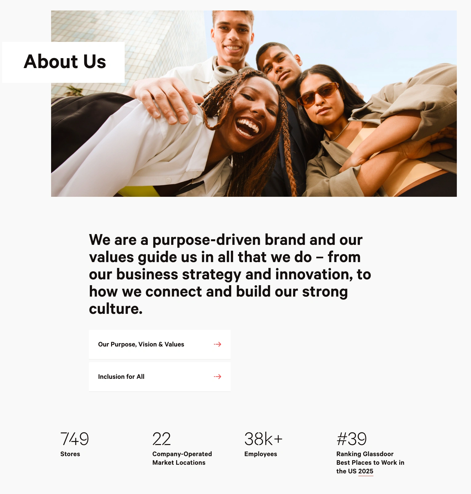
The credited screenshots in this guide are examples retained from the original article, not representations of work created by Brand Vision or proof of business results.
1. Define the audience and message before choosing a layout
Write a short brief before opening a page builder. Decide which visitor the page primarily serves and which questions that person needs answered. A potential customer assessing a supplier needs different detail from a job applicant investigating the workplace.
Use existing sales questions, support messages, and customer feedback where available. Look for uncertainty you can resolve: who performs the work, where products come from, what the company specializes in, or how the business differs from alternatives. Where evidence is missing, record the assumption rather than presenting it as research.
Complete these statements in plain language:
- We help a defined audience with a specific problem or need.
- We started because of a particular experience, observation, or opportunity.
- Our approach differs in a way we can explain and substantiate.
- We can support that explanation with these people, practices, or examples.
- The most useful next step for this visitor is a specific destination.
These choices belong to your brand strategy. Resolve disagreements about positioning here, rather than asking a headline or a photograph to settle them later. Your wider branding should connect the message, voice, and visual presentation.
Choose a voice that sounds like your business
Your About page’s tone depends on the audience and situation. A playful company can show personality; a technical service business may need a more precise explanation. Neither needs corporate filler or forced informality.
One way to express the intention is this: By keeping your ideal buyer in mind, you ensure every sentence resonates with the exact people you hope to attract. Treat that as an aspiration for relevance, not a guarantee about every reader. Use your audience’s language where it makes the explanation clearer, and avoid borrowing slang or making assumptions about everyone’s preferences.
Write as “I” for a genuinely individual practice or “we” for a team when that accurately reflects the business. A more formal third-person introduction can also work. Choose deliberately and keep the voice consistent with the rest of the site. A documented brand voice gives contributors a shared reference.
2. Build an About Us page layout around reader questions
Sketch the content order before selecting colors or animation. Use rough boxes with actual headings and near-final copy, not a polished template filled with placeholder text. The distinction between a wireframe, mockup, and prototype helps separate decisions about structure, appearance, and interaction.
Use this sequence as a starting point, then adjust it to the visitor’s priorities:
- Open with who you are, what you do, and whom you serve. Pair the explanation with a relevant image rather than a vague slogan.
- Explain why the business began. Choose the origin detail that makes your current approach easier to understand.
- Show the decisions and people behind the work. Include the turning points and roles that matter to the customer.
- Connect values to visible practices. Explain how a stated principle changes what you actually do.
- Provide evidence. Use relevant credentials, properly attributed feedback, or links to documented work.
- Offer a clear next step. Direct readers to a service, product range, contact page, careers page, or deeper explanation.
This is a flexible content outline, not a requirement to build six elaborate modules. A solo practice might combine its story and biography. An established manufacturer might put its capabilities and relevant credentials before a longer history. Keep a concise summary near the top so readers can understand the business without completing the whole page.
There is no universal About Us page word count. Keep the core explanation as short as it can be without losing useful context. Move lengthy specifications or service details to their own pages. A website copywriting framework can help decide which questions belong on the About page and which belong elsewhere.
Write an opening that explains before it persuades
Use the first heading and paragraph to orient an unfamiliar reader. A story-led opening can work, but do not hide the business behind an anecdote that takes several screens to resolve. Describe the offer before relying on atmosphere.
For a hypothetical furniture workshop, “Crafting a better tomorrow” says little. A more informative opening could be: “We design and make wooden dining furniture for compact homes. Our workshop began when we couldn’t find a table that suited our own small kitchen.” This is an invented writing example, not a claim about a real company.
The intended effect is straightforward: By writing something that addresses their desires, you make them curious enough to keep scrolling. Whether it actually encourages further reading is something to test. Avoid invented customer totals, dramatic transformations, or promises that the business cannot support.
3. Tell the brand story through meaningful decisions
Every brand, large or small, has a backstory. The useful question is not “How do we include everything?” but “Which parts explain the business we are today?” A brand storytelling framework can help connect the origin, audience need, and evidence without turning the page into a chronological résumé.
Draft a brief timeline privately, then select a few turning points. For each one, explain the situation, the decision, and its continuing relevance. The year you moved offices is not automatically important; a change that altered how you serve customers may be.
Continuing the hypothetical workshop example, a useful passage might explain why the founders moved from custom commissions to a small set of repairable designs. It would connect that choice to the present offer and show how repairs are handled. It would not claim environmental benefits without evidence or manufacture a dramatic struggle for emotional effect.
Do not worry if the origin is ordinary. A specific account of noticing a problem and choosing a practical response is more useful than an inflated founding myth. Leave out anecdotes that do not help visitors understand the company.
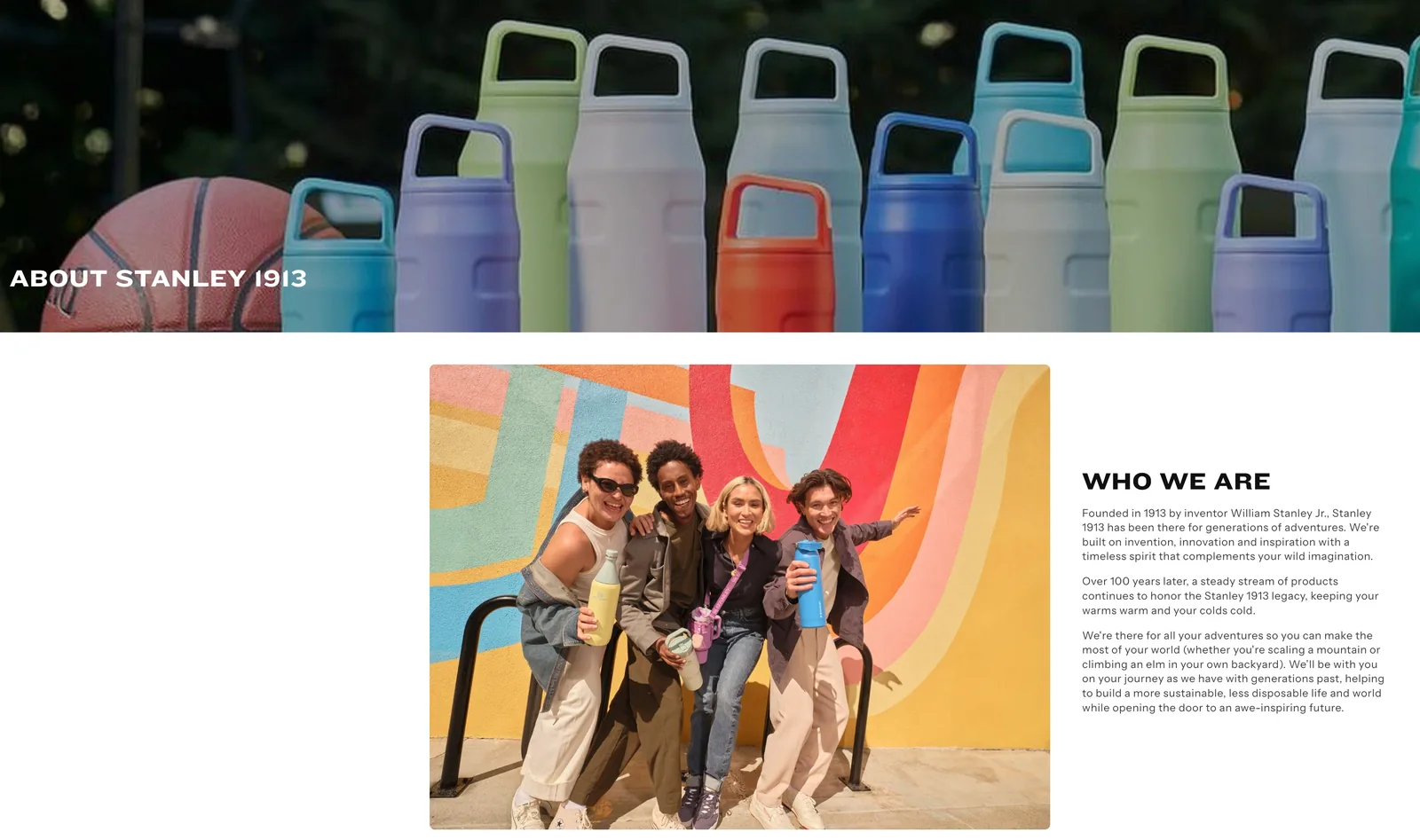
Turn values and mission into observable practices
A mission explains the work you intend to do. Values explain the principles guiding decisions. Neither becomes credible simply by appearing in a row of icons.
Replace an isolated word such as “transparency” with an explanation of the relevant behavior. A hypothetical service business might show a sample scope document and explain how it communicates changes. A product company might explain its sourcing criteria and link to supporting documentation.
Separate what is already happening from what you plan to achieve. If a claim involves a certification, donation, material, or measured result, name its scope and provide appropriate evidence. Avoid implying that a single project, product, or team achievement represents the entire organization.
4. Introduce the people and evidence behind the story
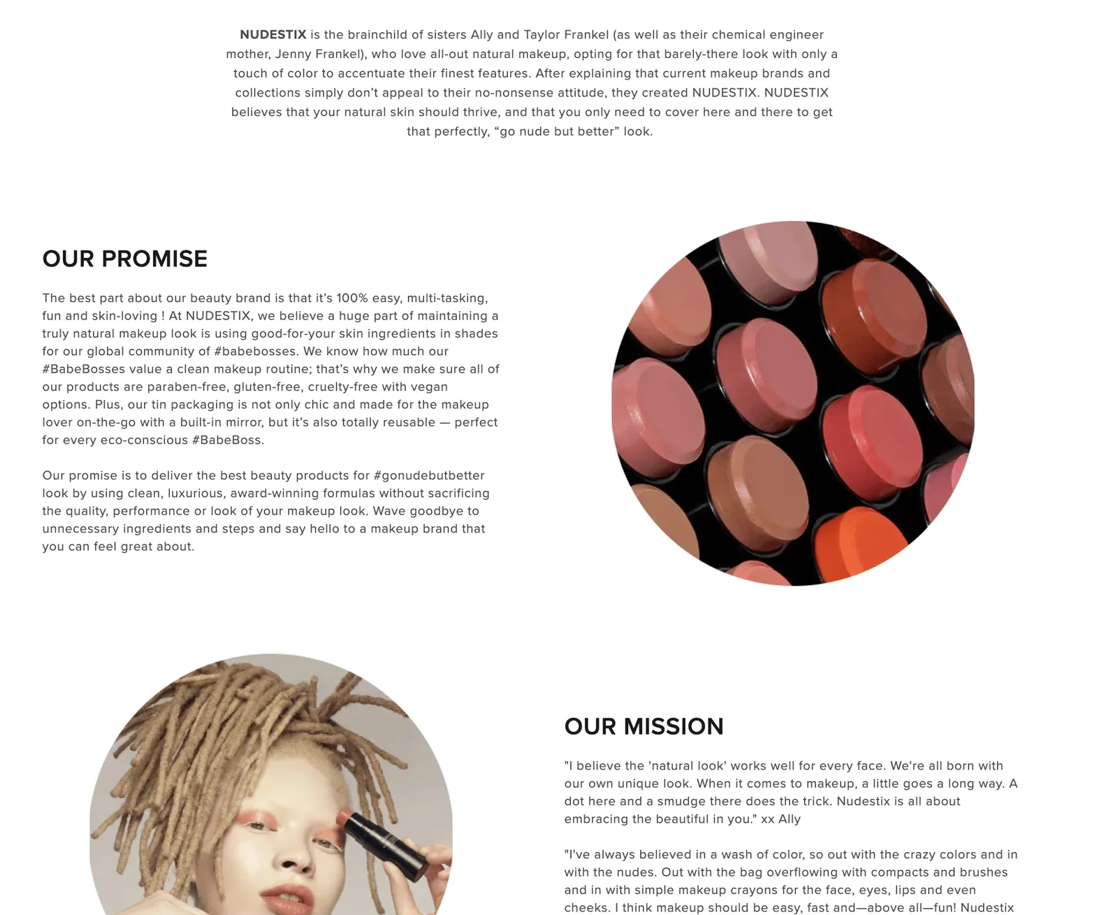
Visitors should be able to understand who is responsible for the work. A meaningful About page often spotlights the key personalities: founders, team leads, or even brand ambassadors. Choose the people whose roles answer the audience’s questions, rather than adding every biography by default.
A useful short bio explains a person’s role, relevant background, and connection to the work described. A personal detail can add warmth, but it should not displace the information someone needs to assess the business. Keep longer biographies on separate profiles when appropriate.
Use real team photographs when suitable and approved. They are an option, not an obligation to expose every employee publicly. Explain the team’s responsibilities when photographs are unavailable, and never use stock or generated portraits to imply that fictional people work for the business.

Awards, press mentions, or notable collaborations can fit neatly within the About page’s narrative when they support a specific point. Name the award and year, link to the relevant coverage, and describe the actual collaboration. A media mention is not automatically an endorsement, and a partner’s logo should not imply a relationship beyond the one that exists.
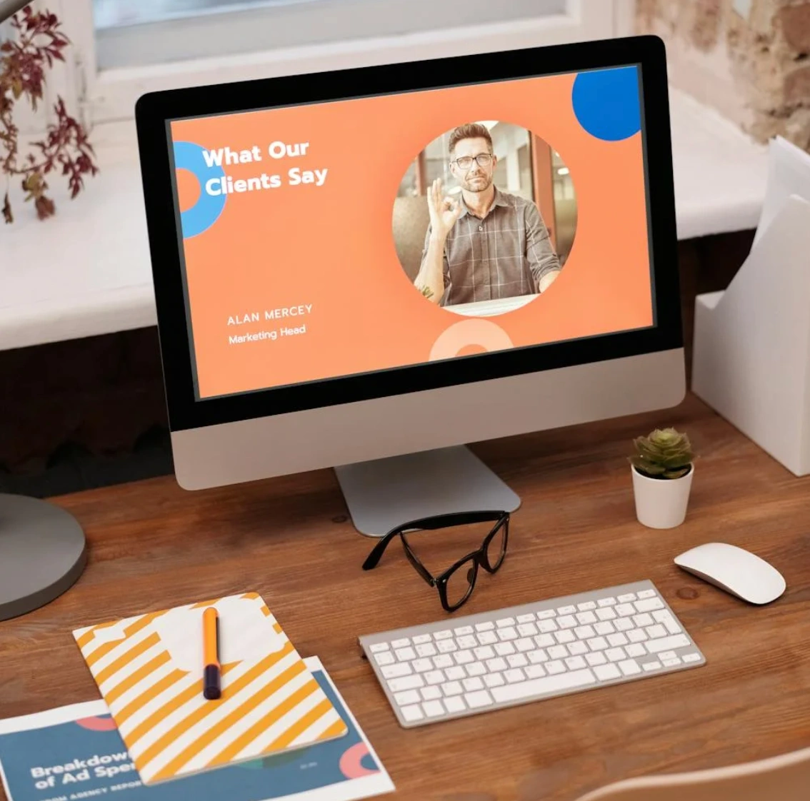
Place evidence beside the claim it supports. For testimonials, retain the speaker’s approved wording and attribution. For results, preserve the timeframe and context and link to the fuller account where available. Do not replace missing proof with decorative badges or invented customer quotes.
A new business can explain its process, show genuine work samples, and identify relevant experience without pretending to have a long track record. Specificity is useful even when there is no impressive number to display.
5. Design the page for scanning, mobile use, and accessibility
The visual design should reinforce the story rather than compete with it. Apply the existing visual identity through typography, color, and image treatment. An About page can feel more personal than a service page without becoming a separate visual brand.
Use subheadings, short paragraphs, and negative space so the page remains easy on the eyes. Give each section a clear purpose. If two sections make the same point, combine them instead of adding another image to make the repetition look different.

Choose images that add information
Behind-the-scenes photographs, early sketches, or an original workspace can help explain the story. Pair each image with the passage it supports. A decorative stock scene should not be presented as your actual team, facilities, customers, or manufacturing process.
Keep important explanations as readable page text rather than baking them into graphics. According to W3C’s image accessibility guidance, informative images need a text alternative that conveys their meaning, while purely decorative images generally use an empty alt attribute. For an image that acts as a link, describe its purpose or destination. The appropriate alternative depends on the image’s role in context.
Write alt text after looking at the actual image. Avoid keyword lists, filenames, or repeating an adjacent caption without considering what additional information is needed. Keep editorial credits and source links separate from alt text.
Preserve a clear reading order on smaller screens
Check the layout with real copy on a narrow screen. Columns should resolve into a sequence that still makes sense, with captions beside their images and a call to action near the information that supports it. Avoid forcing readers to swipe sideways through essential history or pinch to read text in screenshots.
Let images scale within their content column without stretching them. Check that faces, labels, and useful details remain legible. If an elaborate timeline becomes confusing on a phone, a straightforward sequence of headings and paragraphs may communicate the same history more clearly.
These are UI/UX design decisions, not just visual polish. A page that looks good in a static desktop screenshot still needs functional testing.
The W3C’s accessibility design guidance recommends sufficient contrast, visible keyboard focus, and identifiable controls. Check links and controls with a keyboard and verify that the text remains readable. These checks are a starting point, not a claim that the whole page meets every accessibility requirement.
Use headings for structure, not only appearance
Give the page one clear H1, then use H2 headings for major sections and H3 headings for genuine subsections. Do not select a heading level just to obtain a font size. W3C’s heading guidance explains how headings organize content and support navigation, including for people using assistive technology.
6. Handle About page SEO without keyword stuffing
The About page should identify the business accurately and answer questions about it. It should not become a substitute for service pages or a place to repeat every commercial keyword. Include the company name, its actual work, and relevant background naturally.
Avoid treating keyword wording as a promise of search visibility. Consider this overconfident formulation:
Phrases that mirror your brand identity will help Google index your page for brand-related queries.
Relevant wording can describe what the page is about, but it does not guarantee indexing or rankings for particular queries. Focus on useful company information rather than an assumed SEO shortcut. Google’s people-first content guidance encourages clear information about who is behind a website; it does not make an About page a guaranteed ranking advantage.
Use a descriptive title such as “About [Company Name]” and a concise description that summarizes the real page. Keep the visible heading and page purpose aligned. Google explains that it can generate search title links from several sources and may choose page content rather than the supplied meta description for its search snippet. Neither field guarantees an exact search-result display.
Link naturally to the relevant services, team profiles, work, and contact information. A broader SEO content strategy can assign separate questions to appropriate pages instead of overloading the About page. Broken navigation, indexing controls, or template-level metadata problems need a technical review, not more keywords.
7. Offer a next step that fits the visitor
Do not end the page abruptly after the story. The idea behind “ Including a call to action—whether it’s to shop your products, sign up for a newsletter, or learn more about your services” is to offer a useful route onward. Choose the action that follows from the information you have just provided rather than assuming every visitor is ready to buy.
After explaining a design service, “Explore our services” may be appropriate. After describing a hiring culture, “View open roles” is more useful. A product story may lead to a relevant collection or a detailed sourcing page. These are hypothetical labels; use only destinations and offers that actually exist.
Make the link text describe what happens next. Avoid vague instructions such as “Click here” and competing primary actions with equal visual emphasis. Where audiences differ, provide a clear main route and a quieter alternative rather than hiding important information behind a sales form.
8. Review the complete page and keep it accurate
Read the page from beginning to end, then review it as someone who is only scanning. Ask people outside the writing team to explain what the company does, who it serves, and where they would go next. Record what they misunderstand before explaining your intention. A focused UX research exercise can investigate those questions more systematically.
Before release, check the following:
- The opening identifies what the business does and whom it serves.
- Every section answers a useful question without filler or repeated conclusions.
- Claims have support, and names, roles, and other facts are current and consistent.
- Links lead where their labels promise, including the contact route.
- The mobile reading order, keyboard access, and image alternatives work in context.
- Any forms and other interactive elements work on both desktop and mobile.
After release, review onward clicks and relevant completed actions alongside feedback. Longer reading time is not automatically better; it can also reflect confusion. Compare periods with attention to traffic sources and other changes, and do not attribute a sales or retention shift to the About page alone.
Assign someone to review the page when team roles, products, practices, or important claims change. Keep the underlying story consistent when adapting it for other channels. On Instagram, visuals could dominate with short text captions that reference your brand values. A professional profile may need a shorter company summary. Change the format without inventing a different history or leaving outdated promises in circulation.
A useful About Us page does not need a dramatic origin or elaborate effects. It needs a clear introduction, a specific story, credible support, and a layout that helps people understand the business and choose their next step.
For help connecting your brand story with a clear, usable About page, discuss your website with Brand Vision.