
%2520(1).webp)
A Timeless Holiday Image Emerges
Coca-Cola did not invent Santa Claus, but its long-running holiday advertising helped reinforce one of the most familiar modern versions of him. In the 1930s, the company began using illustrator Haddon Sundblom’s warm, human portrayal of Santa in national advertising. The red suit, white beard, rosy cheeks, and relaxed expression fit Coca-Cola’s existing visual world and gave the campaign a distinctive character that audiences could recognize year after year.
The result became more than a seasonal product ad. Coca-Cola’s Santa strengthened the company’s brand aesthetics, became part of its wider holiday marketing, and showed how repeated visual assets can build memory over decades. For broader context on the company’s long-term approach, Brand Vision’s Coca-Cola marketing strategy case study looks at the same balance of consistency, emotion, and adaptation across other campaigns.
The Early Days: Setting the Stage
Santa already had a long visual history before Coca-Cola entered the picture. Nineteenth-century artists, including Thomas Nast, had helped popularize a bearded, gift-giving Santa, and red clothing appeared before the Coca-Cola campaign. The Smithsonian’s overview of Santa imagery describes the familiar portly, white-bearded figure as an image that developed over time, not as the invention of one advertiser.
Coca-Cola’s contribution was scale, consistency, and a particularly approachable interpretation. In 1931, the company commissioned Swedish-American illustrator Haddon Sundblom to create advertising images inspired in part by “A Visit from St. Nicholas.” His Santa was cheerful, realistic, and relaxed, often shown pausing from his work to enjoy a Coke.
- Sundblom’s Santa felt human rather than distant or ceremonial.
- The red-and-white palette fit naturally beside Coca-Cola’s existing brand colors, even though Santa had worn red before the campaign.
- Coca-Cola reused the character for decades, turning one creative direction into a durable seasonal asset.
Why the Campaign Was So Effective
The campaign appeared at a time when national print advertising could place the same creative idea in front of millions of households. Coca-Cola used magazines including The Saturday Evening Post, Ladies’ Home Journal, National Geographic, and The New Yorker, then adapted Sundblom’s paintings for store displays, billboards, posters, calendars, and other formats.
- The campaign connected the product with home, generosity, and seasonal ritual instead of focusing only on refreshment.
- Repeating the same character and emotional territory made the advertising easier to recognize from one Christmas to the next.
- The product remained present, but the story gave audiences a reason to remember the brand beyond the bottle itself.
The Power of Nostalgia and Memory
Holiday advertising has an unusual advantage because the season already carries rituals, family memories, music, food, and recurring visual cues. Coca-Cola’s Santa campaign built on those associations instead of trying to create a completely new seasonal language every year. That repetition helped the character feel familiar while allowing the brand to refresh individual scenes.
This is the same mechanism explored in Brand Vision’s guide to nostalgia marketing during the holidays: familiar creative assets become more valuable when audiences have time to attach personal memories to them.
- Consistency gave each new ad the benefit of what audiences already remembered.
- The emotional focus stayed broad enough to work across generations.
- Small changes in setting or action kept the campaign fresh without discarding its recognizable core.
Red, White, and Brand Identity
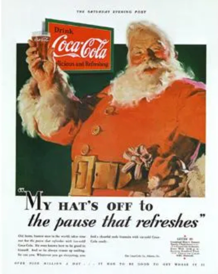
Coca-Cola’s use of red-and-white Santa imagery created a strong visual fit with the brand’s packaging and advertising system. The important distinction is that Coca-Cola did not originate Santa’s red suit. The company itself notes that Santa had appeared in red before Sundblom’s paintings. What Coca-Cola did exceptionally well was place a familiar color combination inside a repeated branded context.
- The palette created continuity between the character, packaging, store displays, and print advertising.
- Repeated scenes made the brand easier to recognize without requiring a new visual language each season.
- Sundblom’s Santa became a reliable visual shorthand for holiday cheer inside Coca-Cola’s own marketing system.
The Shift from Seasonal Ad to Cultural Icon
From 1931 to 1964, Sundblom produced Santa paintings for Coca-Cola, and the company continued using imagery based on those works afterward. According to Coca-Cola’s archive, the illustrations appeared across magazines, store displays, billboards, posters, calendars, and collectible objects. That level of repetition helped move the character beyond a single campaign and into the broader history of twentieth-century advertising.
The distinction matters. Coca-Cola did not create Santa’s mythology or every element of his appearance, but its advertising helped popularize and stabilize one especially influential commercial interpretation. That is a more useful branding lesson than the myth that one campaign invented Santa from scratch.

The Visual Language of Joy
One reason the campaign remains useful to study is the economy of its visual storytelling. Sundblom’s scenes often placed Santa in intimate, domestic moments rather than grand fantasy settings. A warm expression, a bottle of Coke, toys, fireplaces, and Christmas interiors carried much of the story without heavy explanation.
- The character remained recognizable even when the setting changed.
- The emotional message stayed simple: warmth, generosity, rest, and anticipation.
- The artwork showed how a consistent visual system can communicate brand feeling before an audience reads the copy.
Adjusting to the Modern Era
While channels and production methods changed, Coca-Cola’s Santa remained part of the company’s holiday memory structure. Later campaigns expanded the Christmas world through trucks, television, social media, digital experiences, and new creative executions, but the older Santa imagery still functions as recognizable brand heritage.
That continuity matters because heritage is most useful when it gives new work a foundation rather than forcing every campaign to look identical. Coca-Cola can reference archival imagery, familiar colors, and long-standing seasonal themes while adapting the execution to contemporary media.
Global Reach and Cultural Adaptations
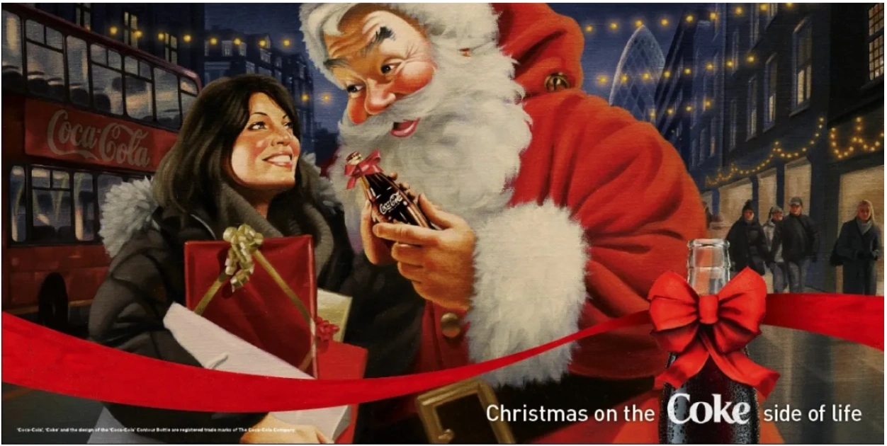
As Coca-Cola expanded internationally, the company carried its holiday imagery into markets with very different seasonal traditions. The strength of the Santa campaign was not that every market celebrated Christmas in the same way. It was that the core creative assets were simple enough to remain recognizable while local advertising could adapt around them.
- Consistency protected recognition across markets.
- Local execution could change without discarding the central character and color system.
- The campaign demonstrates how distinctive brand assets can travel when the underlying idea is clear and flexible.
The Influential Ripple Effect on Branding
Coca-Cola’s Santa remains a strong example of how brands approach seasonal marketing when they think beyond a single campaign. The most transferable lesson is not to copy Santa, red packaging, or vintage illustration. It is to build a seasonal idea that can accumulate meaning over time.
- Consistency over time can turn campaign assets into expected traditions.
- Emotional resonance gives people a reason to remember the advertising after the promotion ends.
- Brand identity works best when color, character, tone, and story reinforce one another rather than competing for attention.
Echoes in Contemporary Campaigns
Even as audiences move quickly through digital advertising, Modern advertisers tap into nostalgia because familiar characters, music, and visual codes can shorten the distance between a campaign and an existing memory. Coca-Cola’s Santa is an early and unusually durable example of that effect.
Modern holiday campaigns do not need to imitate historical advertising to learn from it. The more useful principle is to identify a small number of distinctive assets, use them consistently, and give audiences enough time to build associations around them.
Approaching New Horizons While Preserving Roots
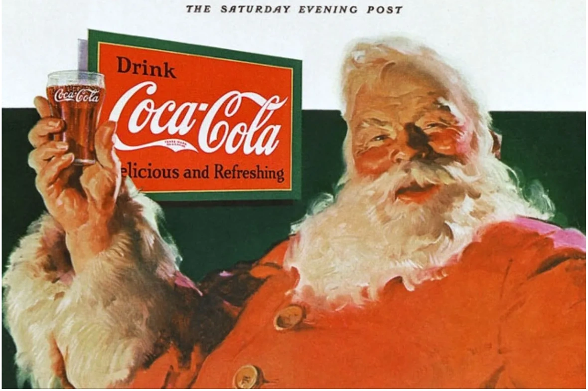
Coca-Cola’s holiday branding shows how a company can evolve its execution without abandoning the assets that made the work recognizable in the first place. The Santa paintings were not frozen into one identical advertisement. Settings, poses, media, and later campaign formats changed while the central sense of warmth and familiarity stayed intact.
- Refresh the execution, not the underlying identity, when the core still works.
- Protect distinctive colors, characters, and emotional territory that audiences already recognize.
- Use heritage as a platform for new work rather than as a substitute for new thinking.
A Legacy Built Through Repetition
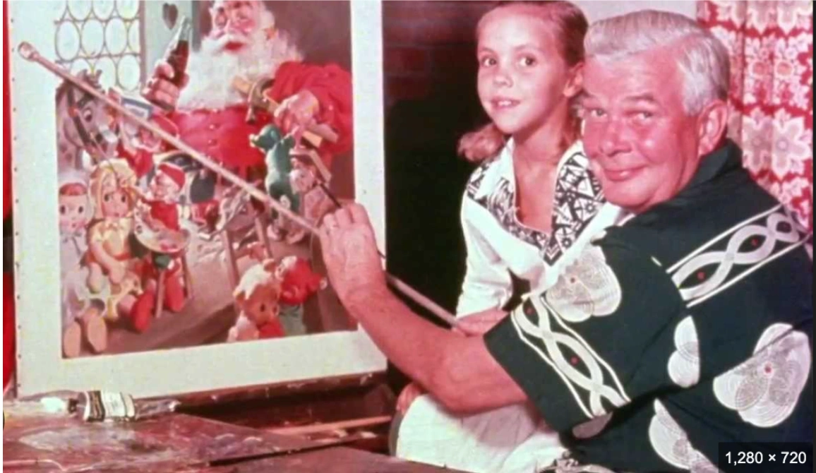
Decades after Sundblom’s first Coca-Cola Santa, the campaign remains a useful case study in brand memory. Coca-Cola did not invent the modern Santa, but it helped popularize a warm, human version of the character through unusually consistent advertising. The lasting lesson is less about Christmas than about disciplined brand building: recognizable assets become stronger when a company gives them time, repetition, and emotional meaning.
For brands trying to build that kind of long-term recognition, a branding agency can help connect strategy, visual identity, and campaign execution into a system that stays coherent as channels change.



%2520(1).png)