A trade show floor is the most honest test visual branding ever takes. Hundreds of companies stand meters apart, competing for the same walking attention with nothing but what a passerby can see. The verdicts arrive in seconds, all afternoon, from exactly the audience everyone paid to reach.
Most exhibitors prepare by rehearsing conversations. The preparation that actually moves the numbers happens earlier, in the visual branding decisions that decide whether conversations start at all. Booth space, travel, and staffing are fixed costs; the return on all of them depends on how many strangers the visuals convert from walkers into visitors.
That is why events belong to brand identity, not logistics. The booth is the brand made physical for a weekend, and every choice of color, signage, structure, and messaging either extends the identity or quietly contradicts it.
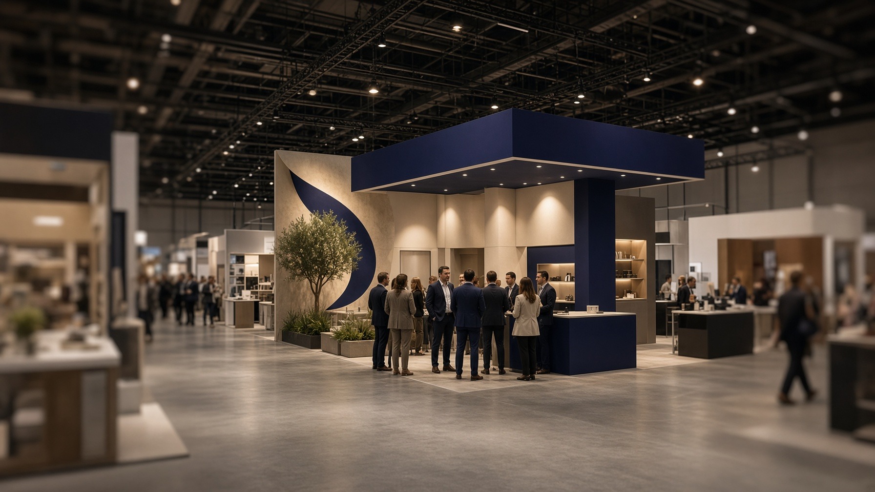
The Three-Second Audition
Attendees process a venue the way readers process a crowded page. They scan, filter, and commit attention only where something earns it. A booth gets roughly the length of a stride to say who the company is, what it offers, and why stopping is worth a stranger's time.
Visual branding carries that entire opening argument alone. Nobody at the aisle's edge has heard the pitch, read the one-pager, or met the team. For those seconds, the display is the company, complete.
The judgment formed in that stride runs deeper than taste. Decades of usability research show that people read design quality as a proxy for trustworthiness, and they form that credibility verdict long before they evaluate substance. On a show floor, a cluttered banner is not an aesthetic problem. It is a trust problem, priced immediately.
The inverse is the opportunity. Clean structure, coherent color, and readable messaging signal an organized company before a word is exchanged. That early credibility is what turns foot traffic into conversations. The visuals are not decorating the pitch; they are the audition that decides whether the pitch happens.
Consistency Is What Makes a Booth Legible
A booth's visual branding reads clearly when every element repeats the same decisions. Matched colors, one typographic voice, and imagery from a single family let the eye assemble the display into one message. Mixed styles force the eye to work, and most eyes simply decline.
The payoff extends past the aisle. Recognition compounds across encounters, and the premium a familiar name commands, its brand equity, is built from exactly these accumulated consistent impressions.
The compounding is easy to picture. An attendee who sees the same visual identity at the booth, in the follow-up email, and on the website three weeks later is having recognition deposited at every step. One who meets three different-looking companies is not, and never learns there was one company to remember.
Consistency also disciplines the design process in a useful way. When the palette, type, and imagery are settled in advance, booth decisions become faster and cheaper. The question is never what looks good in isolation; it is what matches the system, and that question always has an answer on file.
Visual branding done as a system turns every future event into an application rather than a reinvention. The first show pays for the thinking; every show after that inherits it.
The Physical Kit: Where Visual Branding Becomes Tangible
Events are the rare channel where the brand has a body. The structures carrying the visuals decide how the identity performs in physical space: signage height, sightlines, lighting, and booth architecture determine what a scanning eye meets first. That makes the hardware a visual branding decision, not a procurement one.
The order of operations matters. Structure gets chosen to serve the visual system, not the other way around. Retrofitting an identity onto whatever hardware arrived is how booths end up readable from two meters and invisible from ten.
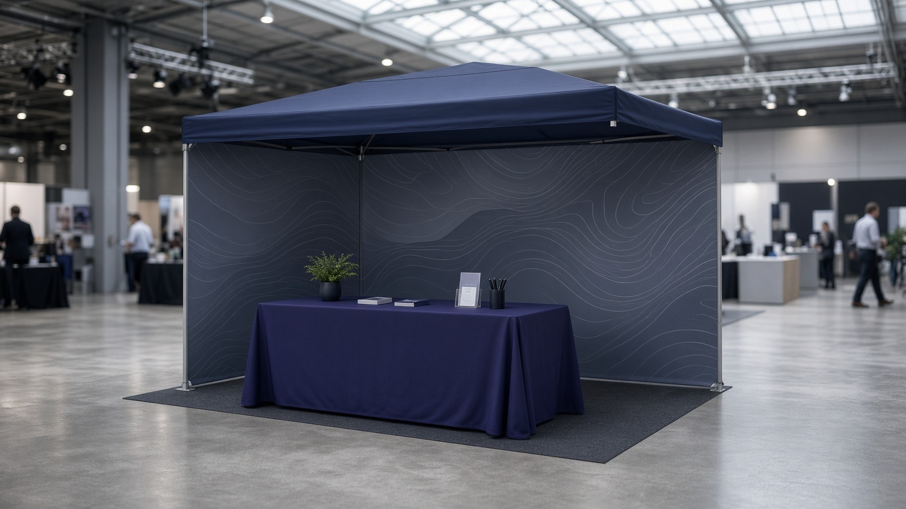
Outdoor and open-floor events raise the stakes on structure. Exhibitors working those environments often build around custom canopy tents 10 x 10 as the branded shell of the booth. The format puts the visual identity overhead and on every face of the space, and it solves the practical problems of weather and definition at the same time.
The tent becomes the booth's largest single piece of visual branding. It stays visible across a field where a tabletop banner disappears, which is exactly the sightline mathematics an open venue runs on.
The rest of the kit follows the same logic at smaller scales. Table covers, backdrops, product stands, and printed materials each carry the visual branding into another sightline. The test for every piece is the same: photographed from ten meters away, does it obviously belong to the same company as everything beside it?
Durability is part of the design brief too. Event materials live hard lives in transit and weather, show after show. A faded canopy communicates neglect as fluently as a crisp one communicates care, and the physical condition of the visuals gets read as literally as the logo itself.
Messaging That Survives a Walk-By
Event copy is the verbal half of visual branding. It fails when it asks for reading time the venue does not grant. The messaging that works on a show floor states the value a visitor gets, in language short enough to absorb mid-stride.
The substance of that line is researchable rather than guessable. The work on what customers actually value is consistent: people respond to concrete things like time saved, risk reduced, and quality gained, not to abstractions about excellence. The banner has room for exactly one of them.
The visual hierarchy has one job: sequence. The scanning eye should meet the company name first, then the one-line value statement, then a single call to action, in that order, at increasing proximity. Visual branding that respects this order gets read; visual branding that fights it gets skimmed past.
A booth that tries to say six things at banner height says nothing at any height. The discipline of choosing one message is where most event visual branding is actually won or lost, and it is a choice made in the design file weeks before the venue.
Restraint reads as confidence in visual branding, especially in this environment. Signage with one clear claim looks like a company that knows its value. Walls dense with feature lists look like a company still deciding. Attendees cannot articulate that judgment as they walk past, but they make it every time, and they stop accordingly.
After the Teardown: The Event That Keeps Marketing
A well-executed event presence keeps working after the venue empties, and the extension is worth planning rather than hoping for:
- Photograph the presence deliberately. Shots of the booth in action, staffed, visited, alive, become proof-of-presence content for the channels where prospects actually follow up.
- Match the follow-up to the floor. Emails, decks, and landing pages that repeat the event's visual identity let the recognition built in person keep compounding in consumer marketing channels afterward.
- Design materials for a second life. Backdrops, tents, and displays built on the brand system rather than event-specific themes return for the next show without redesign costs.
- Audit while it is standing. Ten minutes of viewing the live booth from the aisle, as an attendee would, reveals more about the visual branding than any pre-event mockup did.
The pattern across all four is the same: the event is a content and consistency engine, not a standalone weekend. Treat the booth as one node in the visual branding system and it pays returns for quarters. Treat it as a one-off and the investment rebuilds from zero every season.
The budget conversation changes once that pattern is visible. An event that produces a quarter of usable content, a returning physical kit, and measurable recognition is a different investment than a weekend of conversations, and a much easier one to approve twice.
Next year's plan gets negotiated on that record. Visual branding that demonstrably outlives the teardown is the easiest line in the event budget to defend. Its returns are still on screen, in the photo library and the follow-up campaign, when the meeting happens.
Frequently Asked Questions
- How far in advance should event visuals be designed? Six to eight weeks before the event is a workable floor for a full booth system, since production and shipping consume the last two. Rushed timelines tend to show up as mismatched pieces, which defeats the point of the investment.
- What matters most on a limited booth budget? The largest surface visible from the farthest distance, which outdoors usually means the canopy and indoors the backdrop. One big, coherent, readable element outperforms several small polished ones that nobody sees from the aisle.
- How many messages should a booth display carry? One primary value statement, supported by the company name and a single call to action. Every additional claim at banner height reduces the odds that any of them gets read mid-stride.
- Do event visuals need to match the company website exactly? The palette, logo treatment, and typographic voice should match; the layouts naturally differ by medium. An attendee moving from booth to follow-up email to website should feel one company at every step, since disconnected experiences are exactly what audiences notice and penalize.
- How does a company know its visual branding worked at an event? Compare booth conversations and scanned leads against prior events, and watch whether follow-up materials get recognized rather than treated as cold outreach. Recognition in the second touch is the clearest signal the first one landed.
The Booth Is the Brand, Briefly
Events compress everything visual branding is for into a few meters and a few seconds: recognition against noise, trust before conversation, and a message that survives the pace of the audience. No other channel grades the work this quickly or honestly.
The companies that win those seconds are not the loudest on the floor. They are the most coherent, the ones whose colors, structures, and words are all telling the same short story.
The preparation is unglamorous and entirely repeatable. Settle the visual system before the event, build the physical kit to carry it, cut the message to what a stride can absorb, and plan the afterlife before the doors open. Visual branding run that way makes every event a deposit into recognition. Recognition, unlike booth space, carries over to the next venue free.


%2520(1).png)