Some products arrive as parcels, and some arrive as moments. A subscription outfit is a parcel, while a wellness kit, a legal document folder or a first order from a regulated category arrives carrying the customer's privacy, their nerves and their first real evidence of whether the brand deserves the trust the website asked for.
The unboxing experience is where that evidence gets delivered. Everything the marketing promised, discretion, care, competence, professionalism, either shows up in the box or visibly fails to, and the customer forms the judgment in the first thirty seconds with the lid open.
Most categories can treat packaging as a cost line and survive. Sensitive categories cannot, because their customers open the box with higher stakes and sharper attention, and because a single clumsy detail, a crushed insert, a rattling component, a label that announces what the neighbors did not need to know, undoes months of careful brand building.
What follows treats the unboxing experience as a branding discipline, why it carries more weight in sensitive categories, what a considered kit contains, how design partners fit the launch timeline and where the printed word and the empty box keep doing brand work after the moment passes.
Unboxing Is a Brand Touchpoint, Not a Cost Line
The box is often the only physical object a digital brand ever puts in a customer's hands. A company that exists as a website, an app and a support line becomes tangible exactly once per order, which concentrates years of brand investment into corrugate, inserts and ink.
Retention math gives the unboxing experience its budget line. Repeat orders in subscription and replenishment models carry the margin, and the opening moment is the strongest nudge the second order gets that costs nothing per impression after the first production run.
The judgment an unboxing experience receives is instant and sensory. Clean die-cuts, straight glue lines, a lid that opens smoothly and components that sit where the packer placed them all read as operational competence, and the reading happens before a single printed word gets attention.
Benchmarking the unboxing experience against category neighbors keeps the standard honest. Ordering three competitor kits, opening them side by side and scoring the first thirty seconds of each shows exactly where the brand's own box wins or loses the comparison a customer never articulates.
That makes packaging a governed brand asset rather than a procurement afterthought. A documented brand identity system that records the approved colors, typography, materials and interior layout gives every production run a standard, and it keeps the third reorder looking like the first.
Repetition is what turns the moment into equity. A customer who opens the same considered unboxing experience every month learns to expect it, and the expectation itself becomes the brand, which is why consistency across runs matters more than any single spectacular box.
Measurement closes the loop on the investment. Support tickets about first use, review mentions of the packaging and repeat-order rates before and after a redesign give the unboxing experience a dashboard, and the dashboard is what defends the budget at the next planning round.
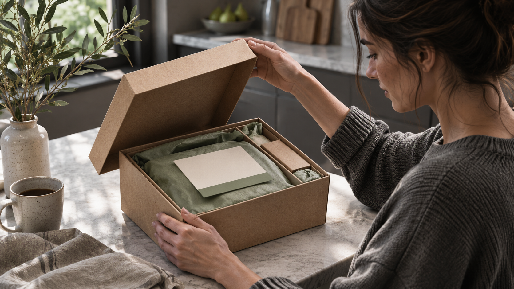
The unboxing experience also gets photographed whether the brand plans for it or not. Customers share what they open, so the interior view is public creative in waiting, and a layout designed to look composed from above earns organic reach the media budget never paid for.
Sensitive Categories Raise the Stakes
A sensitive product changes the brief before design begins. Health and wellness orders, personal care items and anything a customer would rather not discuss with a courier all demand an exterior that says nothing and an interior that says everything, in that order.
Discretion starts at the curb. A plain outer shipper with no category language, no product photography and nothing that invites a second look protects the customer at the doorstep and in the building lobby, and the restraint itself reads as respect once the lid comes off.
Household privacy extends beyond the courier. A box that other members of a household might see or open deserves the same quiet exterior inside the home as outside it, and brands that design for that second layer of discretion earn loyalty nobody surveys for.
The interior then carries the full brand load. Muted color, clinical typography and an organized first layer tell the customer a professional operation handled the order, while loud graphics in a sensitive category read as carelessness about the very privacy the plain exterior just protected.
Wellness brands feel this balance most sharply. Teams working in health and wellness marketing know the customer often arrives anxious, so the box has to lower the temperature, calm layout, plain language and visible support channels, rather than sell to a person who has already purchased.
Operational constraints ride alongside the brand work. Products with temperature or handling requirements ship inside systems the fulfillment partner validates and owns, so the design side builds around those fixed elements rather than fighting them, and the stronger interiors make the functional components feel intentional.
Returns and exchanges test the discretion promise twice. A sensitive product that has to travel back deserves the same plain exterior and simple resealing it arrived with, and a return flow that forces awkward repackaging undoes the goodwill the unboxing experience built.
Support visibility belongs on the first layer, not the last. A phone number, a message channel and a short address for questions, printed larger than any tagline, tell a nervous customer that help exists before they need it, which is precisely the moment reassurance works.
What a Considered Unboxing Experience Contains
A strong unboxing experience shares an anatomy, and the anatomy is designable.
- A welcome layer. One card in plain language sits on top, greets the customer and says what to do first
- Ordered components. Items arranged in the sequence they get used, so the layout itself gives the instructions
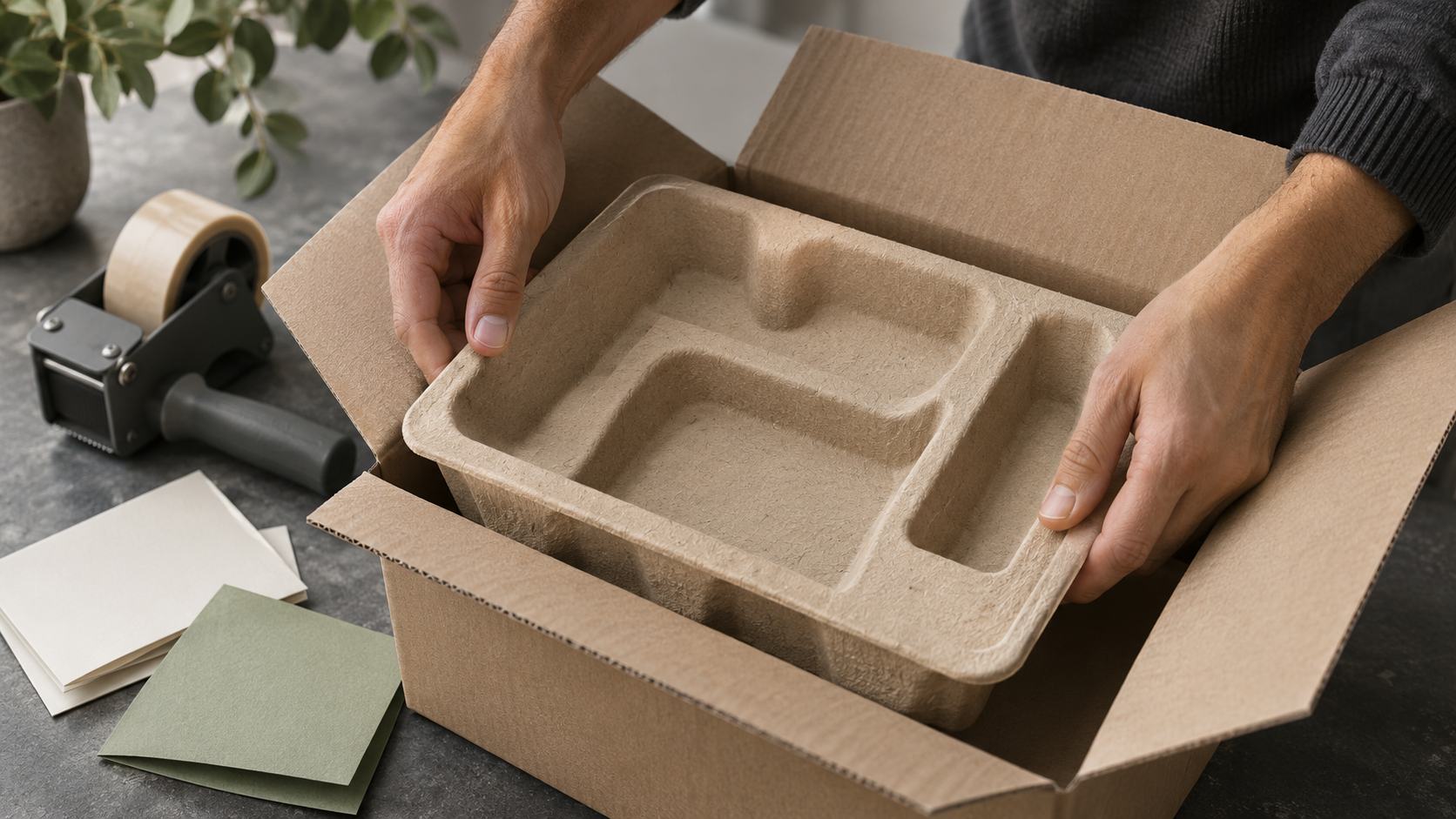
- Secured placement. Inserts that hold every component exactly where the packer set it, with nothing loose in transit
- Visible support. Contact channels printed prominently, ahead of any marketing message
- An honest finish. Construction quality consistent with the price and the promise
Order of encounter is the design decision that does the most work in the unboxing experience. The customer should meet reassurance first, instructions second and product third, because the sequence manages attention the way a well-built landing page does, and a box with no sequence makes the customer do the sorting.
The welcome card earns a rewrite more often than a redesign. The first sentence a customer reads inside the box sets the tone for the entire unboxing experience, and a sentence written for a nervous first-timer serves the confident repeat buyer perfectly well, while the reverse is not true.
The movement test keeps the promise physical. A finished kit gets closed, turned over on every side and opened again, and if anything shifted, the insert gets redesigned, because a component that arrives out of place tells the customer the brand shipped them a loose end.
Production quality holds the whole arrangement to standard. The inserts, cards and printed pieces inside a kit are branded collateral in the fullest sense, and a beautiful structural design filled with poorly printed cards lands exactly like a redesigned website running last year's copy.
Pack-time matters as much as open-time. An interior that a fulfillment worker can assemble quickly and identically hundreds of times a day is what keeps the thousandth customer's unboxing experience matching the first one, so assembly speed belongs in the design brief next to aesthetics.
Component count is a design input, not a given. Every item that can be combined, printed smaller or removed simplifies the layout and the assembly, and the leanest kit that still answers every first-use question delivers the calmest unboxing experience.
Restraint completes the anatomy. Every additional flyer, coupon and insert competes with the welcome layer for attention, and sensitive categories in particular reward the kit that says one calm thing over the kit that says six eager ones.
Design Partners and the Launch Clock
Packaging design has a supply chain of its own, and launch dates expose it. Structural design, sampling, tooling, print production and assembly each carry lead times, and a brand that starts the packaging conversation after the product is final usually discovers the calendar last.
Specialist partners exist for exactly that compression. Firms offering product launch packaging services combine structural design, engineering and manufacturing under one program and map milestones backward from the launch date, which reduces the handoffs where launch timelines usually leak.
The partnership divides naturally along regulated lines. A design partner owns the look, the structure and the materials, while the fulfillment or pharmacy side owns validated shipping systems and compliance steps, and the strongest kits come from teams that respect that boundary instead of blurring it.
Timeline honesty saves launches more often than speed does. Tooling and print production carry fixed physics, so the realistic path fits the design ambition to the weeks actually available, and the brand that learns those numbers early chooses its tradeoffs instead of inheriting them.
Sampling discipline protects both the date and the design. Physical prototypes reviewed early, under real handling rather than on a conference table, surface the problems a render hides, and each sampling round gets cheaper the earlier it happens.
A pilot run is the cheapest insurance in the program. A small first production batch, shipped through the real carrier network to real addresses, surfaces the crushed corner and the shifted insert while the fix costs a revision rather than a recall of the full order.
Budget conversations work better in unit economics than in totals. The packaging cost per order sits beside acquisition cost and product cost in the margin math, and a kit that measurably lifts retention or referral earns a larger share of that math than a cost line ever would.
The same coordination logic applies beyond the box. Teams running integrated marketing programs treat the launch unboxing experience as one asset inside the campaign system, synchronized with the site, the ads and the onboarding emails, because a customer who meets three different brands in one week keeps none of them.
Vendor evaluation stays simpler than the category jargon suggests. Real samples of past kits, a client reference in a regulated category and a straight answer about minimums and lead times tell a brand most of what the first call needs to settle.
Scale planning belongs in the first meeting. Minimum order quantities, reorder lead times and the cost curve between a pilot run and a production run decide whether the beautiful prototype survives contact with demand, and the questions cost nothing to ask early.
The Printed Word Carries the Legal Weight
Everything printed inside a kit is either helping the customer or exposing the brand. Instruction cards, claims and category language all get read in a charged moment, so the writing standard inside the box should exceed the website's, not relax from it.
Plain language is the working standard. The plain language guidelines built for public-facing writing translate directly to insert copy, short sentences, familiar words and one instruction per line, because a confused customer in a sensitive category does not reread, they call or they return.
Regulated materials keep their own lane. Any document a regulator requires travels in its own clearly separated panel, unedited and version-controlled, while the brand's friendly welcome layer stays visibly distinct from it, so warmth never reads as a substitute for the official word.
Reading conditions deserve a thought the office never has. Insert copy gets read in kitchens, bathrooms and poorly lit hallways by people who did not bring their glasses, so type size and contrast follow the worst realistic conditions rather than the designer's monitor.
Claims printed on packaging outlive campaigns. A promise on a box rides along for the product's whole shelf life, and United States law treats unfair or deceptive practices in commerce as a regulated matter, which makes the box the wrong place for the marketing team's most optimistic sentence.
Translation multiplies every printed decision. A kit serving more than one language carries each instruction twice without doubling the paper, and the layout that planned for the longer language from the start avoids the cramped second edition that always follows the successful launch.
Digital bridges need the same version discipline. A printed code linking to video guidance only helps while the destination matches the card in the customer's hand, so linked content lives under change control with the print files rather than on someone's bookmark list.
Disposal Is the Last Impression
The unboxing experience ends in a recycling bin, and customers notice how gracefully. Materials that collapse flat, components labeled with plain disposal directions and no mystery plastics close the moment with the same respect the welcome card opened it.
The empty box lingers longer than the brand expects. Customers keep well-made boxes for storage and reuse, which keeps the logo in the home for months, and a structure worth keeping is advertising that never expires.
Specific beats green-adjacent every time. A printed line saying exactly where a component goes does more for the brand than any leaf icon, and public guidance on recycling gives the copy team a sounder basis than a supplier's adjective for every claim that ends up in ink.
Reusable formats earn their keep only when the loop closes. A return label under the welcome card and a reminder after delivery turn a premium shipper into a system, while an unreturned one is just an expensive box, so the operational follow-through decides whether the sustainability story is true.
Right-sizing is the quiet winner. A smaller, denser kit costs less to ship, wastes less material and arrives feeling deliberate rather than padded, and no claim needs printing at all when the box itself is the evidence.
The Unboxing Experience Is the Brand, Delivered
Sensitive categories compress the whole brand promise into one opening moment. A plain exterior that protects the customer, an interior that calms and guides, print that respects both the reader and the law, and a disposal path that ends cleanly together turn packaging from a shipping cost into a persuasive brand touchpoint the company owns outright.
The companies that win these categories design the unboxing experience with the same rigor they spend on the website, govern it inside the identity system and test it the way it will actually travel. The box is the brand, delivered. The customer who opens a considered one orders the second with far less convincing.