Packaging decisions get approved on screens and judged on shelves, and the distance between those two places is where budgets quietly leak. A packaging design that looked finished as flat artwork meets its real test in paper weight, surface texture, and finish, and those material choices change how the printed brand actually reads.
The material conversation usually arrives late. The structure is signed off, the artwork is final, and then the stakeholders start asking how the box would look in textured stock, with a foil mark, under a matte coating, and every new idea traditionally meant another physical sample with its own cost and wait.
Digital material previews have changed the economics of that moment. A brand team can now compare surface options on the same packaging model before any sample gets printed, which narrows the expensive physical round to the finalists instead of the brainstorm.
What follows treats material testing as part of the packaging design process rather than a production afterthought, what the materials communicate, how digital previews fit the review, and where the physical proof still has the final word.

Materials Carry the Brand Before the Copy Does
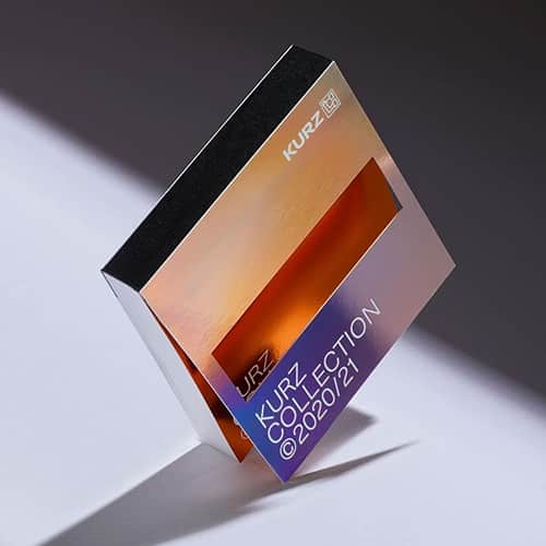
A shopper reads the surface before reading a single word. Uncoated paper suggests one kind of company, soft-touch lamination another, and a metallic mark a third, so the material palette is brand communication in exactly the way color and typography are.
That makes material selection a governed decision rather than a taste call. A documented brand identity system that records approved finishes, stock choices and the occasions for each gives every future packaging design a reference point, and it keeps a seasonal box from drifting into a different brand by texture alone.
Category conventions set the backdrop every packaging design answers to. Shoppers expect certain cues from a shelf, kraft in one aisle and gloss in another, and a brand can follow the code or break it, as long as the choice is deliberate and the whole range breaks it together.
Consistency across the range matters as much as any single box. A product family whose variants share structure and finish reads as one deliberate line on the shelf, while mixed materials across sister products read as inventory from different companies.
Material also decides how a packaging design photographs. The same box behaves differently under studio light, a phone camera and a retail fixture, and products that live on social feeds need surfaces chosen for the camera as much as for the hand.
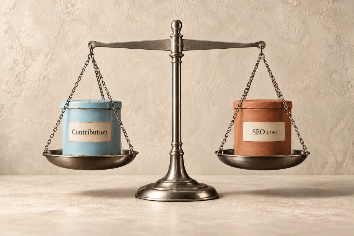
Cost discipline belongs in the same conversation from the start. A finish that doubles the unit cost has to earn that premium in perception or price point, and naming the constraint early keeps the review focused on options the margin can actually carry.
Digital Previews Change the Material Review
The traditional material review ran on physical samples alone, which meant every curiosity cost money and days. The newer workflow renders a packaging design's surface options digitally first, on the brand's own approved packaging model, and spends the sampling budget only on the options that survive the comparison.
AI texturing tools generate surface textures from written descriptions or reference images. For example, designers can use Meshy to explore paper-like, linen-like or metallic finishes on an existing packaging model, then apply the approved logo and copy separately in their design software for consistent comparisons.
The method's value depends on that constancy. The structure stays the approved structure, the logo and copy stay the approved files, and only the material varies, because a comparison where several things change at once settles nothing.
A shared preview library keeps the renders honest between meetings. Versions stored with their prompts, dates and feedback give the team one source of truth, and the comparison never depends on whose laptop held the newest file.
The discipline mirrors any other campaign review. Teams that run integrated marketing programs already compare creative options under controlled conditions, and the packaging design review deserves the same rigor, identical lighting, identical camera angle and the versions presented side by side.
Timing is what the digital round actually buys. Material questions raised in week one of a packaging design cost render time, while the same questions raised after sampling cost reprints and schedule, so the preview step moves the curiosity to where it is cheap.
Generated previews also have a boundary worth stating in the room. A render shows direction, and it cannot show how ink sits on a sheet or how a coating feels in the hand, so the digital round chooses candidates rather than winners.
What a Packaging Design Review Should Compare
The review earns its time when it asks specific questions of each material rather than inviting general reactions.
- Legibility first. Whether small copy, ingredient text and regulatory marks stay readable on a textured surface
- Artwork interaction. Whether the surface pattern competes with fine design elements or photography
- Emphasis. Whether a reflective finish draws the eye to the mark or steals attention from it
- Shelf context. How each option reads at retail distance, beside competitors, not alone on a white canvas
Fixed options keep the feedback round productive. Three materials in the first review, narrowed to a preferred direction and one backup, prevents the open-ended cycle where new variations multiply faster than decisions, and version names with recorded feedback stop settled questions from reopening.
Stakeholder count shapes the review as much as option count. A packaging design decided by committee drifts toward the safest surface, so the review names one decision owner, collects the reactions and lets that owner choose against the brand standard rather than the room's average.
Production quality holds the previews to brand standard. The renders that reach stakeholders are branded collateral in their own right, and previews assembled carelessly invite judgments about the packaging design that really belong to the mockup.
A close-up pass completes each comparison. The full-box view sells the direction, while the crop of the material meeting the smallest text is where a packaging design's practical problems announce themselves.
The Artwork Stays Fixed While the Material Moves
Generated text has no place on a packaging mockup. Rendering tools can produce lettering with wrong characters and uneven spacing, so the approved logo, typography and copy go onto every preview from the brand's own files, and the client reviews real artwork against each surface.
Clarity rules apply to the words themselves. The plain language guidelines that govern public-facing writing apply neatly to pack copy, where a shopper gives a sentence one second, and a material that makes simple copy hard to read fails the review whatever it looks like.
Color management runs alongside the wording pass. Brand colors specified for coated stock shift on uncoated paper, so each material version carries the correct color build for that surface, and the review compares intended values rather than accidents.
The mandatory elements deserve their own checklist on every version. Product identity, quantity and responsible-party details on consumer packages sit under the Fair Packaging and Labeling Act in the United States, and barcode placement and required marks have to survive every finish under consideration, not only the plainest one.
Translation and variant packs multiply the same checks. A packaging design that works in one language can crowd in another where the same sentence runs longer, so the material test includes the longest-copy variant rather than only the clean flagship version.
Placement stays constant across the material versions. Logo position, color values and information hierarchy hold still so that the review measures the material's effect and nothing else, which is also what makes the eventual supplier conversation precise.
From Digital Preview to Printed Proof
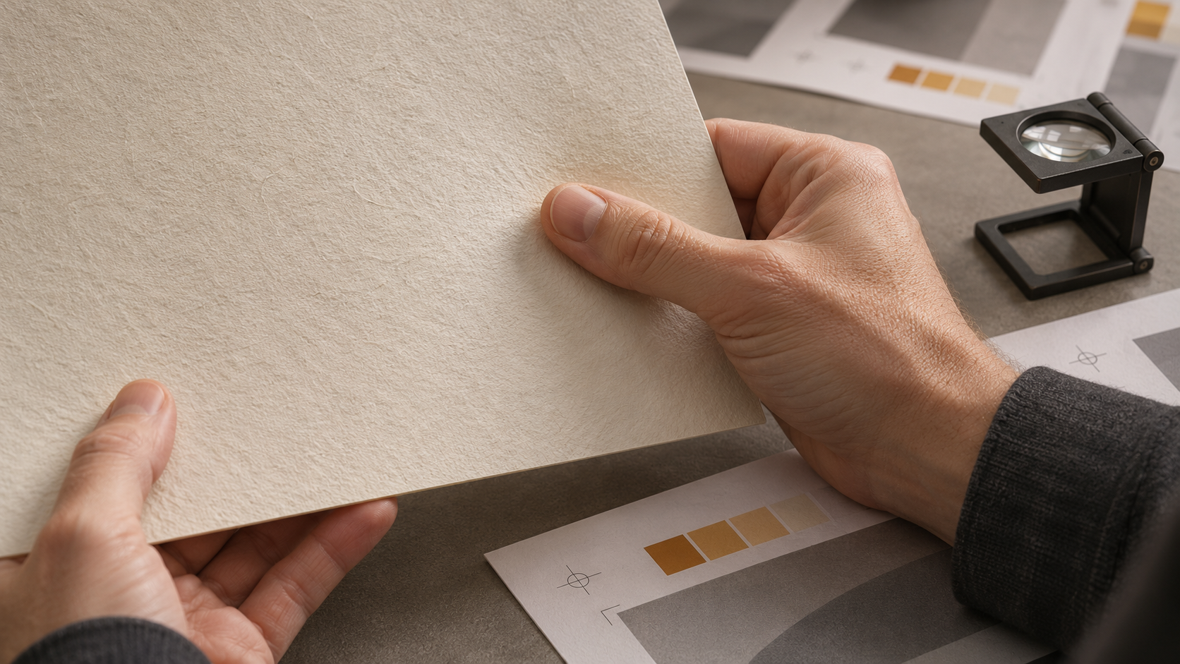
The chosen packaging design still has to prove itself on paper. Suppliers provide material samples and printed proofs against the final files, and the physical check covers what no screen shows, true ink color under ordinary light, texture in the hand, foil behavior at angles and fold quality at the edges.
Supplier capability belongs in the comparison before the heart gets set. A finish the preferred printer cannot produce sends the packaging design to a new vendor or back to revision, so the shortlist gets checked against real production options while it is still a shortlist.
Environmental claims need their evidence settled at this stage too. Recyclability depends on the actual material and local systems, and public guidance on recycling is a sounder basis for an on-pack claim than a supplier's adjective, because a printed promise is a brand commitment with a long shelf life.
The proof round is also the moment to lock specifications in writing. Stock, coating, foil position and print method recorded against the approved sample give reorders a standard, and packaging design quality stops depending on whoever happens to manage the next print run.
The budget math stays simple and worth writing down. Digital previews cost a fraction of a sampling round, samples cost a fraction of a corrected print run, and every material doubt moved one step earlier in that chain pays for the testing habit by itself.
Consumer brands feel the payoff directly at the shelf. Teams running direct-to-consumer marketing also meet their packaging a second time in unboxing content and returns, so a material tested against real artwork and real handling protects the post-purchase impression as much as the retail one.
The record of the whole process becomes an asset of its own. The rejected renders, the sampling notes and the final specification explain the decision to anyone who joins the brand later, and the next product launch starts from documented knowledge instead of a fresh argument.
Packaging Design Is a Brand Decision
Material testing gives a packaging design its honest preview, digital comparisons to narrow the field cheaply and physical proofs to confirm the finalist properly. The sequence costs less than a drawer of unused samples and far less than a shelf full of packaging that reads wrong.
The brands that handle this well treat the surface as part of the identity, governed, documented and tested with the same care as the logo it carries. A packaging design chosen that way arrives at the printer with no surprises left, which is exactly how the budget and the brand both prefer it.