Brands can spend months developing an event concept. The booth design gets approved, the signage matches the campaign, the keynote uses the correct fonts, and the staff uniforms coordinate down to the cocktail napkins. Then an attendee walks over to an interactive experience, and the branding disappears. The touchscreen looks generic, the equipment arrives white, and the confirmation text comes from an unfamiliar number.
The photo gallery looks like it belongs to another company, and the giveaway gets handed over in an unbranded bag. Individually these read as small details. Collectively they can make an otherwise carefully planned event feel disconnected from the brand paying for it.
Each of those moments is a brand touchpoint, an instance when someone interacts with, sees, hears, or receives something from a company at any point around the event. Those moments extend far beyond the primary booth structure.
The overlooked ones decide whether a carefully designed event feels whole or disconnected, and the brand touchpoints that get missed tend to cluster in five places.
Event teams usually audit the big surfaces thoroughly. Signage gets proofed, decks get reviewed, and uniforms get approved weeks ahead. The smaller brand touchpoint rarely has an owner, which is exactly why it slips, and the gaps concentrate wherever technology, communication, or handover enters the attendee journey.
The Interactive Experiences Inside the Booth
Interactive elements often get added to an event because someone on the marketing team saw the format trending. A photo moment, a game or a touchscreen appears on the floor plan without anyone treating it as a brand touchpoint in its own right.
The problem is never the idea. The problem is treating the experience like rented equipment instead of another part of the brand. The booth budget and the rental budget often live on different lines, managed by different people, and the brand standards that govern one rarely get applied to the other.
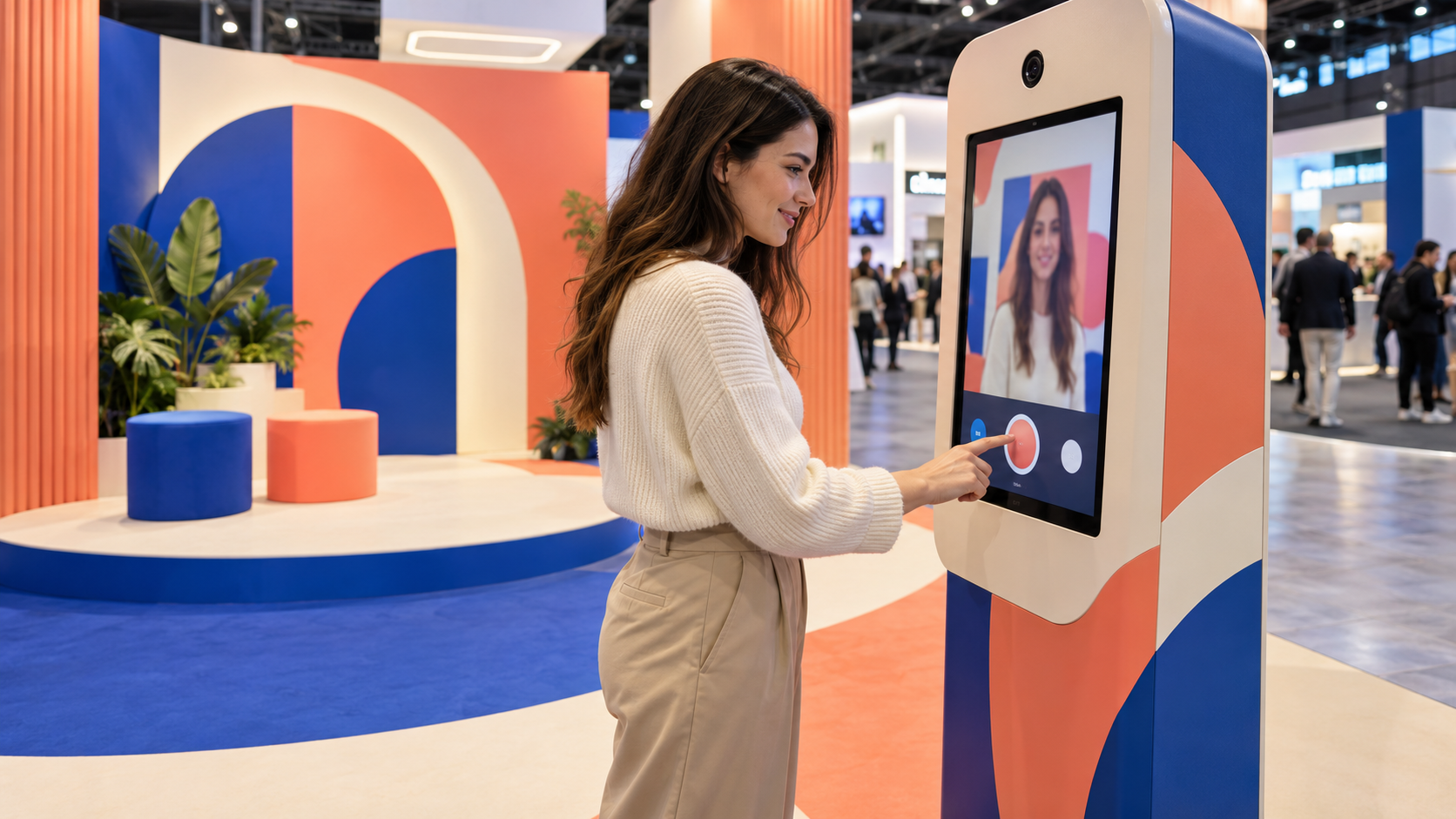
The disconnect shows fastest at the photo moment. Guests line up, the surrounding activation glows in campaign colors, and then the experience itself arrives in default white plastic with stock software and a stranger's fonts.
A standard white photo booth placed inside a highly customized activation feels disconnected from everything around it the moment a guest approaches. The stronger approach turns the rental into a photo booth activation that reads as designed specifically for the campaign rather than wheeled in from a warehouse.
Treating the rental as a design surface changes the brief entirely. The vendor conversation stops at specifications and uptime, while the campaign conversation covers artwork, voice and what the guest should remember.
That work can start with the physical hardware. The unit can be wrapped in campaign artwork and brand colors so it sits intentionally inside the space, and the surrounding scenery can give attendees a reason to create better content than a step-and-repeat ever produces. Dimensional sets, lighting and props make the resulting photo feel like part of the brand world.
The branding should continue once the guest touches the screen. The software interface can resemble a brand-native application rather than generic capture software, with buttons, typography, instructions and animations following the same brand identity system used throughout the campaign.
The session itself matters as much as the frame around it. Instead of a plain countdown followed by a picture, the interaction can carry campaign messaging, questions and personalized selections that connect the moment to the reason the brand is hosting the event in the first place. Guests notice when the on-screen brand touchpoint speaks the campaign language they saw on the signage outside.
The delivery step extends the same brand touchpoint further. A message that thanks the guest for visiting the brand's experience, written in the campaign voice, lands differently than a generic note saying a photo is ready.
The same logic applies to the digital gallery. Rather than sending guests to an unbranded page containing a grid of photos, teams can build a campaign-specific gallery featuring messaging, calls to action, product links and social handles, whatever the next desired action may be.
The difference between the two versions is subtle on a spec sheet and obvious to the guest. A photo booth takes pictures. A full activation becomes a branded customer journey that keeps working after the guest leaves the floor.
The Registration Experience
The journey starts before anyone walks through the venue doors.
For many attendees, registration is the first real brand touchpoint of the event, yet it is often treated as an administrative necessity rather than part of the experience. Generic confirmation pages, default forms and transactional emails feel disconnected from the polished event they are supposedly introducing.
Registration should establish expectations for everything that follows. The language should sound like the brand, the visual design should match the campaign and confirmation emails can introduce the experience rather than simply restating a date and time. A registration flow that feels like the event it introduces turns an administrative step into a working brand touchpoint before any money has been spent on the floor.
The form fields themselves communicate as well. What a brand asks for, how it explains why and how long the form takes all signal how the company treats people's time and information. A short and well-worded form quietly promises a considered event before the guest has seen any of it.
Button language offers the clearest example. Submit, Register, Save My Spot and Count Me In all accomplish the same task, and they do not communicate the same company.
Even the smallest form interactions carry personality. A button reading Save My Spot communicates a different brand than one reading Submit, though both accomplish the same task. Attendees begin forming impressions at this brand touchpoint long before anyone walks through the venue doors, which makes the registration flow one of the cheapest places to reinforce the campaign.
The Messages Guests Receive After an Interaction
Live events increasingly pair physical experiences with digital communication, and the pairing multiplies the places where branding can quietly drop out. Someone scans a QR code, requests a piece of content, enters a giveaway or participates in an activation, and a text or email follows.
Every one of those exchanges creates another brand touchpoint, and the communication afterward frequently receives less branding attention than anything else on the floor. The physical build gets reviewed by a creative director. The automated message ships with whatever the software vendor wrote.
The reach of this layer keeps growing because nearly every attendee carries the receiving device. Pew Research Center's mobile fact sheet reports that the overwhelming majority of American adults own a smartphone, which makes the post-interaction message one of the few brand touchpoints guaranteed to be seen.
A guest may spend several minutes inside an elaborate branded environment only to receive a message that looks generated by an unrelated software provider. That break in continuity costs more than it appears to, because the message often arrives while the guest still stands near the booth.
If an attendee cannot immediately tell which brand sent the message, something has been lost between the physical and the digital halves of the experience.
A short pre-event audit of every automated message, read aloud in the campaign voice, catches most of these gaps before a single guest encounters this brand touchpoint. Confirmation texts, content delivery, follow-up emails and landing pages should all read as extensions of the physical activation.
The fix rarely requires new technology. Most delivery platforms allow custom sender names, message templates and branded landing pages, and the gap exists because nobody wrote the copy, not because the tools refused it. One working session with the campaign copywriter usually closes the distance.
Compliance belongs in the same conversation. Automated texts in the United States fall under the consent requirements of federal telephone consumer protection law, so the opt-in flow deserves the same design attention as the message copy. A branded, clearly worded consent step protects the program and reads as more professional at the same time.
The Takeaway
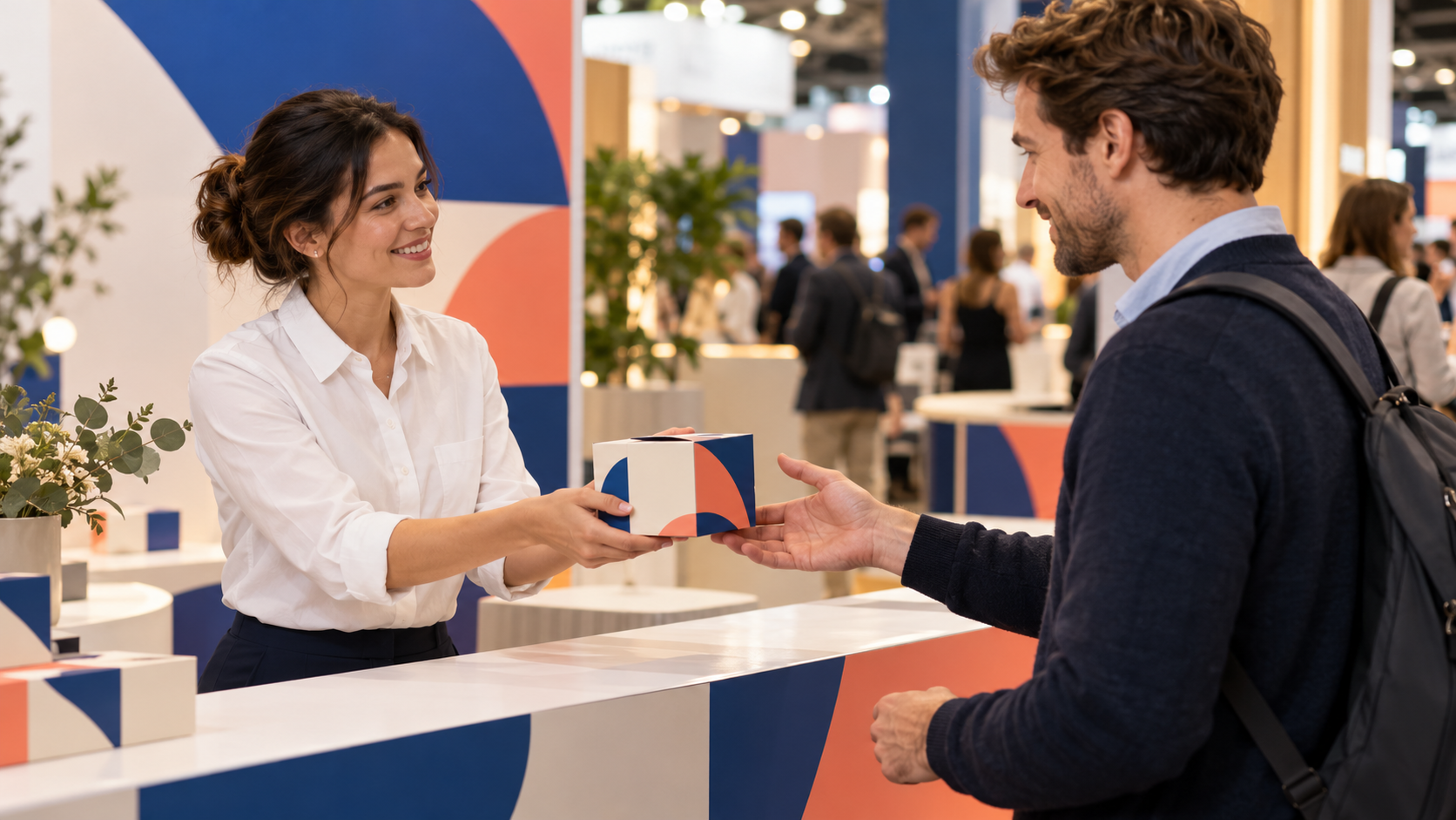
Brands spend significant money determining what attendees take home, but there is a difference between putting a logo on an object and making the takeaway feel connected to the experience. A logo alone turns an object into merchandise. Context turns it into a brand touchpoint the attendee explains to someone else later.
The strongest physical takeaways carry that context naturally. Perhaps the attendee customized the item, or the activation created it from something they did during the session, or it includes their name, photograph or preferences from the experience itself.
The packaging can continue the campaign as well. A beautifully designed object handed over in a generic plastic bag immediately loses perceived value, which is why the handoff deserves planning as branded collateral rather than an afterthought. The full handoff raises several questions worth answering before the event opens.
- What the display and packaging look like at the moment of handover
- What the attendee sees and reads when they receive it
- Whether a message, QR code, or other reason to re-engage travels with it
Packaging also travels further than the event itself. An attendee who carries a well-designed bag through a convention hall becomes a walking placement for the rest of the day, and the same object photographed on a desk extends the campaign into an office the brand will never visit.
The staffing of the handover deserves the same thought. A team member who presents the item with a line of campaign language, rather than passing it across a table, turns distribution into hospitality.
The giveaway exchange may last five seconds. The item could sit on someone's desk for months, which makes it the longest-lived brand touchpoint of the entire event.
The Final Five Minutes
Entrances get rendered in concept art months ahead of the show. Exits usually get improvised on the day by whoever is standing closest.
Brands spend enormous energy on how attendees enter an experience and surprisingly little on how they leave it, yet the exit may be the brand touchpoint that settles how the whole event gets remembered. Research on the peak-end rule in psychology holds that people judge an experience largely by its most intense moment and its final one.
The exit also measures well, which few other moments at a live event can claim. Counting how many guests take the suggested next step, whether that means sharing content or booking a demonstration, gives the team a concrete read on whether the closing brand touchpoint works or merely exists.
After someone finishes an activity, the next step deserves a plan. A staff member pointing toward the exit or a screen displaying a short message of thanks both end the interaction without direction. A deliberate closing moment can encourage the guest to visit another part of the activation, share their content, collect a product, schedule a demonstration or continue the conversation online.
Calls to action at this stage should never feel forced, but they should exist. A guest who has already spent several minutes actively engaging with the brand is at an ideal point to hear what comes next.
The experience should have an ending rather than simply stopping. Teams that choreograph this final brand touchpoint recover attention the rest of the event already paid for, and the exit becomes a bridge to the next conversation instead of a door.
Brand Touchpoints Live in the Details
Branding at an event is never limited to the largest logo in the room, and the budget behind that logo buys less than the details do. It exists in the interface someone touches, the text message they receive, the item handed to them, the screen they see after completing an experience, the environment behind their photograph and the final interaction before they walk away.
These smaller brand touchpoints rarely receive the attention the main event design commands, but together they shape how polished and intentional the overall experience feels. A beautiful booth establishes the brand visually.
The overlooked brand touchpoints determine whether that brand remains intact once people actually begin interacting with it. Teams that audit all five areas before opening day deliver the events attendees later describe as cohesive, and the audit costs far less than the booth.