
Google's Gradient Rebrand: What the 2026 Workspace Redesign Signals, and When Your Brand Should Follow
Updated on
Published on
Most of the commentary on Google's new icons has it backwards. The redesign is being read as a style change, a coat of on-trend gradient brushed over a system that was working fine. It was not working fine. The old icon set had a real, measurable problem, and the gradient is the least interesting thing Google did to fix it.
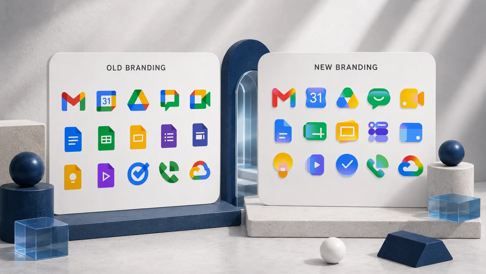
Here is what actually happened. Starting May 18, 2026, only days before Google I/O, Google began rolling out a full redesign of Gmail, Drive, Docs, Sheets, Slides, Calendar, Meet, Chat, Keep, Forms, and Tasks. The flat, hard-edged, four-color blocks that had defined the suite for nearly six years were replaced with soft, glowing gradients, rounded geometry, and in most cases no container box at all. It is the first significant change to Google's iconography in about six years, and it closes out a longer arc: the gradient "G" landed in May 2025, became the company-wide brand mark by early 2026, and the same treatment appeared on the Gemini spark in the middle of last year.
At Brand Vision we rebuild identity systems and icon sets for clients most weeks, just at a smaller scale than Google's, so we read a launch like this less as news and more as a case study. When Fast Company summed up the skeptics by calling the redesign the new "blanding," our first reaction was that the criticism is aimed at the wrong layer. The gradient is the surface. The decision underneath it, which comes down to the difference between a visual treatment and the brand system it sits on, is the part worth studying.
What actually changed
The structural calls matter more than the color treatment. There are three of them.
Google killed the four-color mandate.
The old rule was that every icon had to contain all four company colors. That single rule caused most of the previous set's problems. When every app is built from the same red, yellow, green, and blue, the only thing telling them apart is shape, and shape is a weak signal at the size icons actually live at. Under the new system, apps lead with a dominant color and their own gradient. Chat and Meet moved to a single primary color so they would stop competing with each other, and Drive dropped the small red corner it never needed.
Google removed the container boxes.
For most of the suite, the white page-container background is gone and the marks float on their own. This sounds cosmetic. It is not. Dropping the container gives each icon a larger, more distinct silhouette, and silhouette is a big part of what makes anything findable in a packed dock or a row of tabs. Sheets and Slides were even reoriented to a landscape format to push the differentiation further.
Gmail stayed the anchor.
The envelope-shaped "M" was left intact, and Gmail is the only icon in the suite that kept all four classic colors. That is a deliberate signal. The most recognized mark in the family gets to keep its equity while everything around it is rebuilt.
The official reasoning is that the gradients announce Google's AI era, using the same visual language as the Google "G," Gemini, Photos, and Maps. The more honest reasoning is the one Google says more quietly: the redesign answers a complaint people had been making for years, which is that all the Workspace icons looked the same.
Why the old set was the real problem
This is where we come down firmly on Google's side and where most of the "blending" takes place.
Nobody reads icons when they are working at speed, and we all live inside these apps at speed. You pattern-match them. The old system forced your brain to do the slow version of that job: same palette, slightly different shape, work out which is which. You would reach for Docs and open Drive. The icons carried the same colors in different shapes, so in a hurry they blurred together.
The new system hands the work back to color. Calendar leans into its blues, Drive into green and yellow, and meet into one cleaner hue. The colors carry more weight now, and because each icon owns a distinct gradient instead of recycling the shared four, they stay recognizable at a glance. That is the entire point, and it is a usability win, not a vanity one.
Blanding, properly defined, is what happens when separate brands drift toward the same safe, generic look and lose their individuality. What Google did inside its own ecosystem is closer to the reverse. It took a set of icons that had collapsed into near uniformity and pulled them back apart, while keeping a shared design language so the family still reads as Google. That is sound systems thinking. The people calling it lazy are reacting to the gradient and missing the structure.
The AI question: real signal, or borrowed fashion
Google's claim that the gradient stands for its AI ambitions deserves a harder look, because it is the kind of rationale companies attach after a decision is already made.
The association is real, at least in the culture. Ask most people what artificial intelligence looks like and the answer tends to be the same: gradients and bright, almost luminous color, the same vocabulary Apple Intelligence, a long list of AI startups, and Google's own Gemini have all landed on. So we understand exactly what Google is reaching for, and the gradient does read as fluid and generative to a 2026 audience.
The problem is that a signal everyone uses stops being a signal. Gradients are becoming overdone. An entire industry is reaching for the same effect at the same moment, which means that within a few years the gradient will read as "mid-2020s software" the way a glossy plastic button now reads as 2010, or the long shadow reads as 2014. Instagram made the same bet in 2016 and it worked because it got there early. Most of the brands reaching for it now are arriving late.
Google can afford that risk. Kantar BrandZ valued the company at roughly $944 billion in 2025 and ranked it the second most valuable brand in the world, so when the gradient eventually dates, Google will still be unmistakably Google. The cushion is the brand, not the gradient, and that kind of recognition is brand equity compounding over years of consistency. A smaller brand that stakes its identity on the same effect does not have that cushion. When the trend turns, it will simply look old.
Where the craft slips
We want to be specific here, because this is the part we would have pushed on hardest in our own studio. The problem is not with gradients. It is with gradients that throw away structure.
A good gradient still has architecture underneath it. The blend should describe a form, not erase it. The moment every color melts evenly into the next, you lose the form and you are left with a smear of nice colors instead of an object.
Look closely at the new Gmail mark. On the right side of the envelope, the yellow sits cleanly above the green, so your eye reads it as folded, layered planes, and that layering is what gives the icon depth. On the left side, the pink and red sit too close in both hue and value, and they collapse into one another. The distinction between the layers nearly disappears, and the envelope loses some of its dimension.
That small asymmetry is the whole lesson. The right side works because there is a visible edge holding the layers apart. The left side weakens because the colors blend without enough contrast to keep the form intact. App icons are not bound by the WCAG text-contrast ratios, but the same principle that governs legible interfaces governs whether a gradient holds its shape: value contrast is what your eye uses to separate one plane from another. If this were a Brand Vision project, we would push the contrast on that left transition until it read as cleanly as the right. It is a minor adjustment, and it is also the kind of detail that decides whether a gradient looks engineered or merely fashionable.
How to tell whether a gradient belongs in your brand
When Google does something like this, every founder and marketer assumes gradients are now mandatory and that flat color suddenly reads as dated. It does not. What made Google's redesign work was not the gradient. It was the decision underneath it, which is to give every product a distinct, ownable identity and let a shared design language hold the family together. The gradient was the finish, not the strategy.
We see this play out firsthand. A large share of our clients at Brand Vision are startups and tech brands, and gradients come up in almost every kickoff. The week Google's icons rolled out, we had founders messaging us to ask whether their own logo needed the same treatment. The instinct is understandable. A gradient reads as modern, technical, and AI-adjacent, and a young tech company wants to look like it belongs in that conversation. Our suggestion is almost always the same: do not lead with the gradient. Get the fundamentals of the identity right first: a strong mark, one ownable color and a system that holds up in a single color and at small sizes, and only then decide whether a gradient adds anything real. More often than not, the brands that need to look credible the most are the ones that benefit least from a trend half their competitors are already wearing. A flat, confident mark almost always outperforms a gradient that was bolted on to keep up. The way we put it to clients is that a gradient is something a brand should grow into once the foundation is solid, not the thing it leans on to look established before it is.
Before you sign off on a gradient for your own brand, run it against four questions.
Does it reinforce a color you already own? If your brand is built on one strong color, a gradient that adds depth to it is a safe, low-risk move. If you are reaching for a rainbow gradient because it looks current, you are starting from fashion instead of equity.
Does it add depth to a mark that was flat for no reason? Gradients earn their place when they give a two-dimensional mark dimension and weight. They are a liability when they are purely decorative.
Does it help separate products in a family? This is the exact problem Google solved. If you have a suite of products or sub-brands that look too similar, distinct gradients can pull them apart. If you have one product, this reason does not apply to you.
Does it survive at 16 pixels and in dark mode? Most icons spend their life small. Test the gradient at favicon size, on a dark background, and on a mid-range phone, not on the giant artboard in the design review. If it turns to mush at small sizes, it has failed the only test that matters.
A gradient has to earn its place by making a brand easier to recognize, not harder. The minute it is there just to look current, you have swapped equity for fashion, and fashion expires.
The takeaway
Google's 2026 rebrand is a more disciplined piece of work than the "blanding" headlines give it credit for. It solved a genuine usability problem, gave a sprawling product family room to feel individual without losing the family resemblance, and pointed the whole system toward where the company is heading. Its weak spots are about execution, not thinking; a handful of transitions like the left side of that Gmail envelope where the craft gave way to the blend.
That is the line we keep coming back to with our own clients. Gradients are the easy part. Structure is the hard part, and structure is what will still look intentional a few years from now, once the trend has moved on. A brand is downstream of the decisions behind it. Google mostly made the right ones. The brands that copy the surface without understanding the strategy are the ones who will be quietly redesigning again in 2029.
.png "Best Branding Agencies in Toronto (2026)")
%20(1).png "10 Best Web Design Companies in Toronto (2026)")


