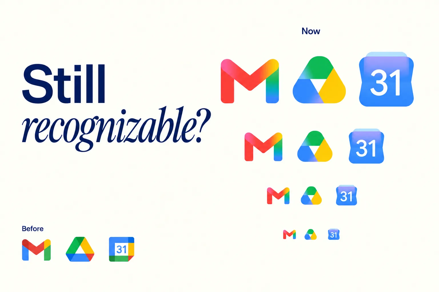
A campaign can introduce a different visual style without becoming a different brand. The difficulty sits in deciding which parts of the image can change and which signals customers still need in order to recognize the company behind the campaign visuals.
Anime-inspired illustration makes that question unusually visible. Linework, proportions, lighting, and backgrounds can all shift at once, leaving familiar material looking unrelated to the business that paid for it.
The style works as a campaign choice, never as a substitute for positioning. Teams that start from the audience, the message, and the existing identity end up with campaign visuals that feel new enough to serve the occasion and connected enough to belong to the same company.
Teams that start from the trend end up with a striking image and an attribution problem. The sections below walk through how anime-style campaign visuals get planned, produced, systematized, and tested without that outcome.

Give the Visual Change a Business Purpose
A hypothetical planning example shows how the reasoning works in practice. An outdoor accessories retailer prepares a summer member event. The business already uses a deep green palette, plain typography and photographs of everyday local outings. Its summer event invites customers to plan a short weekend trip rather than buy into an extreme-sports identity, and the invitation needs artwork that matches that modest promise.
Illustrated campaign visuals could express that sense of possibility through a warm street scene, an inviting destination or a character preparing to leave home. Before commissioning anything, the team writes down what the image needs to communicate, in one sentence everyone can test concepts against. The event is approachable, the retailer is the organizer and the next step is to view the event details.
That stated purpose does more work than an instruction to make the campaign visuals look trendy. It explains why a visual change fits this occasion, and it hands the team a basis for rejecting impressive concepts that communicate the wrong offer.
The rejection half matters as much as the inspiration half, because trend-led projects collect striking concepts faster than anyone can brief against them. Agencies that plan digital campaigns around a stated communication job reject weak concepts early, before production money follows them into formats and media buys.
Budget reasoning belongs in the same conversation. Illustration can cost less than a reshoot and travel further across formats, but only when the concept gets approved against the brief rather than redone after stakeholders see a finished piece that communicates the wrong thing.
The existing brand remains the reference point throughout. A member event does not require a new logo, a new company voice or a rebuilt website menu. If the audience expects a restrained and practical brand, an elaborate fantasy battle scene works against the message regardless of its production quality.
Placement decisions belong in the brief as well, because campaign visuals never appear in the abstract. An email header and a landing-page banner present different composition problems, so the brief names the placements, describes the intended audience response and specifies which familiar visual cues carry through every format.
A placement list written at the start also prevents the late discovery that the hero image cannot survive a square crop.
Translate the Photo, Keep the Brand Cues
Concept development explores the new style inside those boundaries, and the first decisions shape everything the campaign visuals later become.
The strongest starting point is a photograph the business is authorized to use, with a subject and setting that fit the campaign. For the hypothetical retailer, that means a team member packing a bag for a local outing rather than a stock image unrelated to its customers.
A team could run that reference through the Flova Image to Anime Converter to explore an anime interpretation, then assess the result against the brand brief. Natural-language direction can describe the palette, the lighting, the setting and the details worth keeping.
The tool belongs at the exploration stage, and it never decides whether the concept suits the brand. That judgment stays with the people who own the identity.
In a photo-to-anime workflow, the instruction separates artistic changes from reference details that anchor the campaign visuals to the brand. The team might request warm light and simplified cel shading while keeping the green jacket, the recognizable face and the everyday setting.
Specific instructions produce results a reviewer can evaluate against the brief, while vague ones produce attractive accidents. A crowded background can grow simpler without changing the basic story the image tells.
Iteration works better through language than through volume. Describing what should change about the lighting, the background or the costume produces controlled variations, while generating dozens of unrelated options invites the team to pick the prettiest image instead of the right one.
Meaning gets reviewed before polish. A useful concept review asks whether the character feels like part of the retailer's world, whether the palette connects to existing materials and whether an ordinary outing has become an implausible adventure that changes the brand's promise.
The logo and all important text stay out of the generated image entirely, living instead as separate design elements layered in afterward. Generating every part of a finished advertisement inside one picture makes spelling, mark accuracy and later adaptations harder to control. Once the direction works, focused revisions beat replacing the whole concept every time one detail needs attention.
Campaign Visuals Need Rules That Survive Different Formats
One approved concept is not yet a usable set of campaign visuals. It needs rules another designer can follow without reconstructing the original decisions, recorded somewhere more durable than one contributor's memory. That record works best written as an extension of the company's visual brand guidelines, so the campaign layer and the permanent identity stay explicitly connected.
The documented rules cover a short list of decisions.
- The approved palette and how it maps to existing brand colors
- Line treatment, shading style and background density
- Subject placement and the space reserved for messaging
- The relationship between the illustration and the brand's typography
Those rules separate the fixed elements of the campaign visuals from the flexible ones. The retailer's logo, type family and event naming stay constant while the illustrated scene changes shape to fit each format.
A wide website banner can show the full setting, while a narrow mobile card needs a closer subject and less background detail. Composing for each placement beats relying on automatic crops, which routinely cut the subject or bury the message.
The rules also travel between vendors. When an external illustrator, a motion designer or a media agency joins the campaign later, the documented decisions let them extend the system instead of reinterpreting it, which protects both the schedule and the look.
Readability gets checked against the real artwork, not an isolated swatch. A color combination that looks appealing inside an illustration may fail as a text background, and the contrast thresholds in accessibility guidance give teams an objective floor for that check.
Continuity in the campaign visuals then comes from repeated decisions rather than identical pictures. The same lighting, color relationships and visual tone connect an email header to a social graphic even when the scenes differ.
A shared filter, by contrast, creates no consistency when every asset uses different type, messaging and logo placement. One approved reference, a clear version record and a named approver keep small, individually reasonable edits from splintering a coherent direction into competing interpretations.
Keep Creative Interpretation Separate from Product Evidence
Campaign visuals can invite people into an idea, but they should never leave a customer guessing about what they will actually receive. The more an image changes a product's shape, texture, colors or construction, the less suitable it becomes as evidence of the product's appearance.
For the outdoor retailer, campaign visuals showing an illustrated character with a bag establish the mood of the event. Customers who want to evaluate that bag still need accurate photographs and clear product information, and the campaign leads into that evidence rather than replacing it. The illustration opens the story, and the product page finishes it with facts.
Pricing, availability and product claims stay in text the team controls. An illustration that happens to show three bag colors does not promise three colorways, but a caption can make that explicit before a customer reads the artwork as a catalog.
The distinction matters most when an illustration sits beside a product name or a purchase button, because a viewer may reasonably read nearby imagery as the item for sale. Placement and plain contextual wording separate conceptual scenes from factual product views. United States law treats deceptive practices in commerce as a regulatory matter, so the separation protects the brand legally as well as reputationally.
Stylized campaign visuals also never invent social proof. A fictional scene stays a creative interpretation rather than implying that a real event, crowd or endorsement occurred. An illustrated person likewise never substitutes for permission to use the underlying photograph or likeness, since the stylization changes the picture without changing whose face started it.
Rights questions close out this stage of the work. Permission to upload a photograph and permission to use the final output are distinct questions, and the evolving guidance on AI-generated material makes ownership worth confirming before commercial publication rather than after the assets are ready to launch.

Test Recognition Before Scaling the Campaign
The review of finished campaign visuals begins with the communication task. Showing the proposed material to people who resemble the intended audience, and asking what business it belongs to, what the offer means and what they would do next, surfaces confusion while it is still cheap to fix. A small review finds problems, and it never proves a wider performance lift on its own.
Open questions come before any explanation of the concept. When reviewers describe the wrong category or miss the event invitation, the team has a specific and nameable problem to address.
Enlarging the logo may help attribution, but it rarely fixes an illustration that communicates a different brand personality from the company's own. Structured brand research turns those reactions into evidence a team can act on instead of a pile of opinions.
The path beyond the campaign visuals deserves the same scrutiny. An adventurous illustrated email should not lead into a landing page where the event is hard to find or the offer changes, so the heading, message, imagery and action carry through to the destination.
Timing shapes the test as well. A recognition check run a week before launch leaves room to adjust the artwork, while one run on launch day only documents the problem, so the review belongs in the production schedule rather than after it.
Performance assessment separates attention from outcomes. Engagement helps diagnose interest, while an event campaign also needs relevant visits and registrations, and the illustration never gets credit for results actually caused by a different audience, offer, placement or delivery schedule.
Where a controlled comparison is feasible, the conditions stay as consistent as possible and the decision metric gets chosen before launch. Where it is not, the results read honestly as observations with limitations rather than proof, and the team says so when reporting them.
The campaign visuals earn their place by communicating clearly, never by the time already invested in producing them.
Let the Campaign Evolve Within the Brand
Anime-style campaign visuals are one possible expression of a brand, not an automatic improvement or a reason to redesign everything around them. The approach works when the audience and message justify the choice, when the cues connecting the work to the business survive the style change and when the layouts remain usable across every channel the campaign touches.
The retailer example closes the loop. A warm illustrated scene, the familiar deep green palette, the usual typography and an accurate product page behind the button add up to campaign visuals that feel like an event invitation from a company customers already know.
A successful brief gives the team both freedom and boundaries. The artwork can change the atmosphere of the campaign visuals while the brand's promise, accurate product information and customer journey stay intact. That is how a new visual treatment becomes part of the brand instead of making the brand harder to recognize.