.webp)


.avif)
99 Yorkville Ave Unit 200,
Toronto, ON M5R 3K5, Canada
Toronto, ON M5R 3K5, Canada
Get Directions

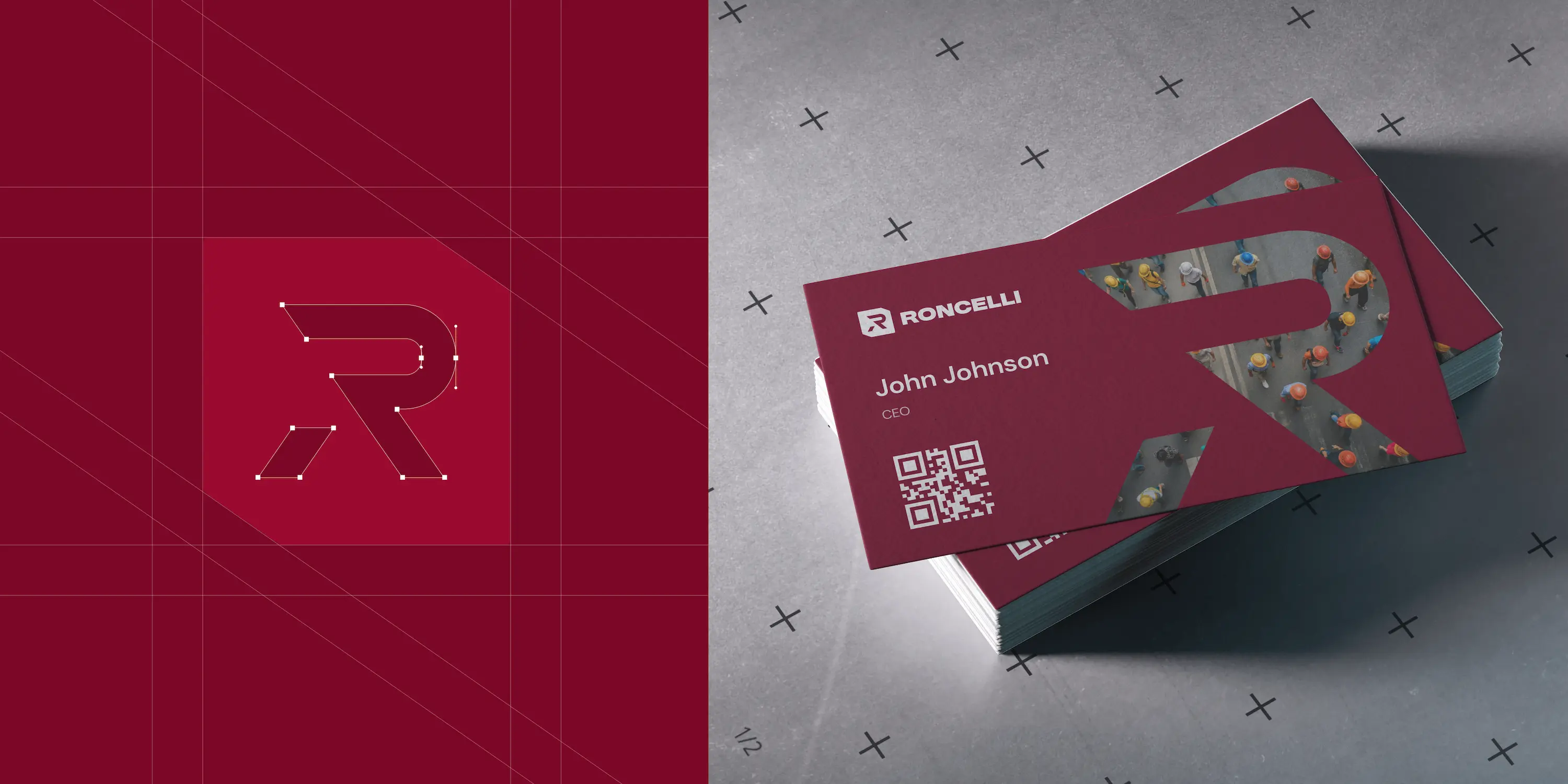
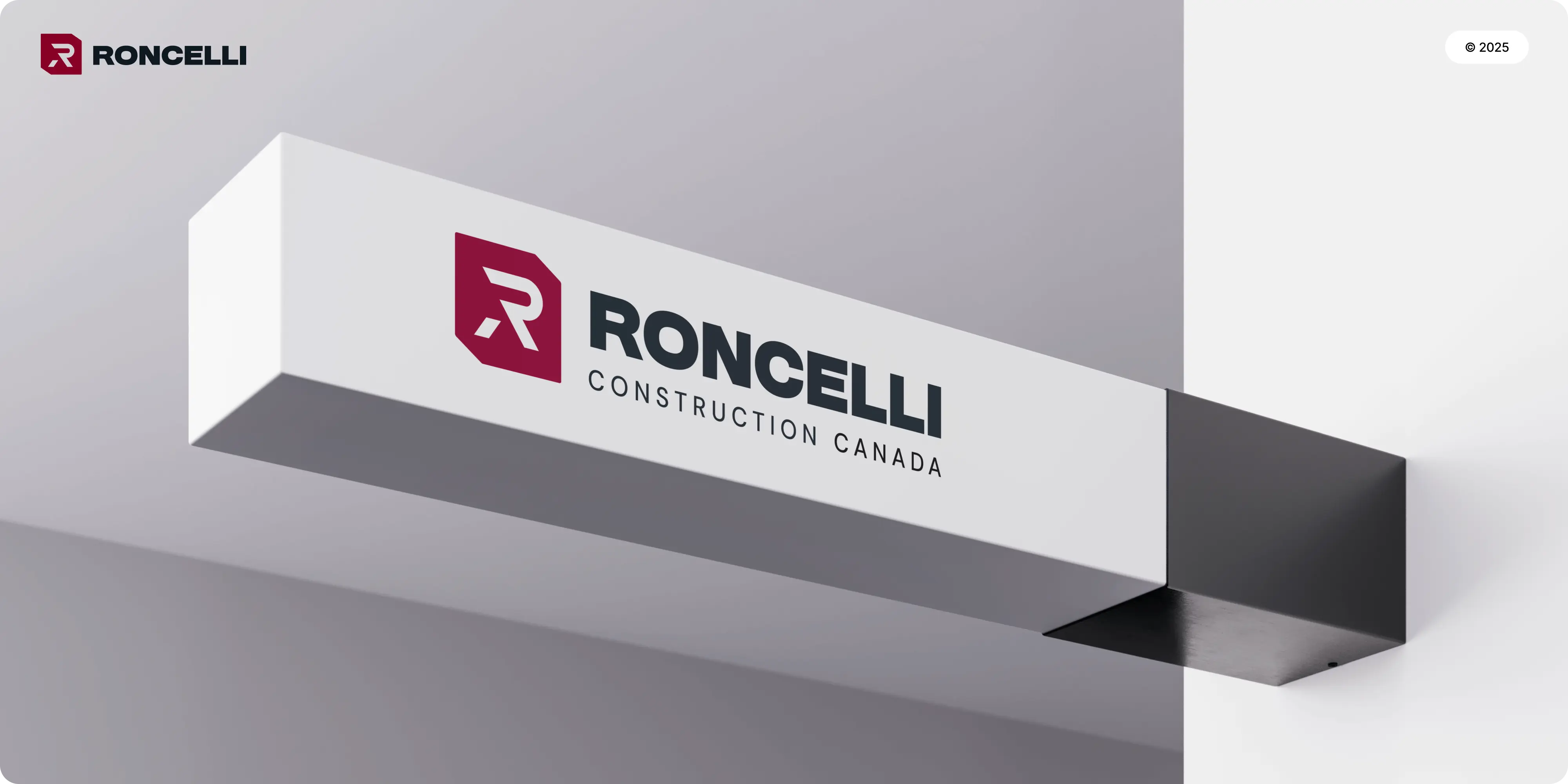
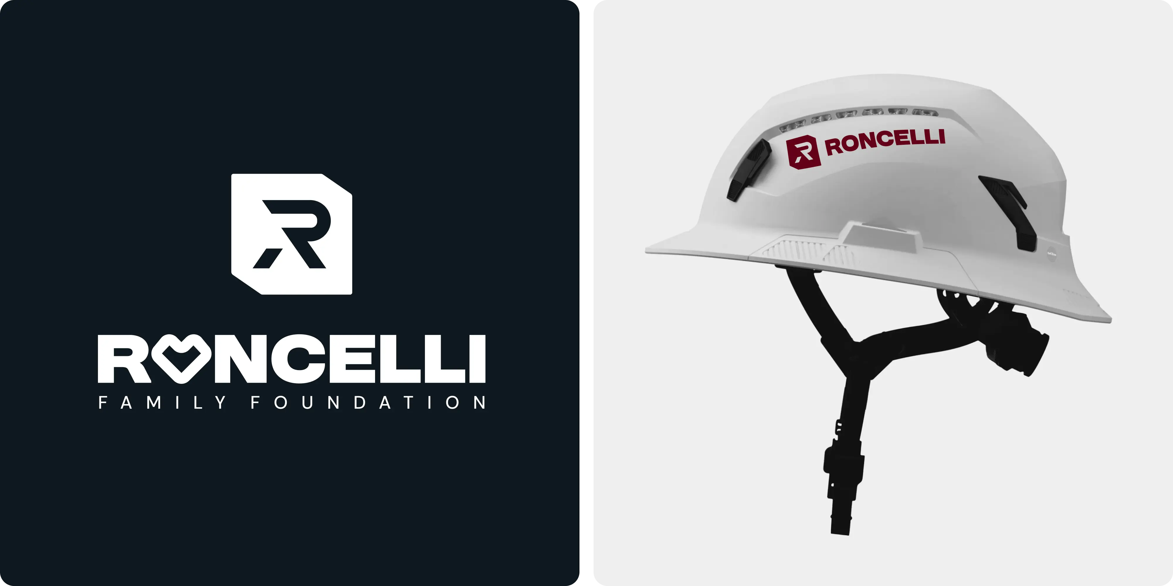
Roncelli is a respected construction and industrial services firm with decades of proven work. The task was to rebuild the brand from the ground up so it feels modern and future ready, while still honoring the company’s heritage. The result is a clear, professional identity that scales across every touchpoint and signals confidence on day one.
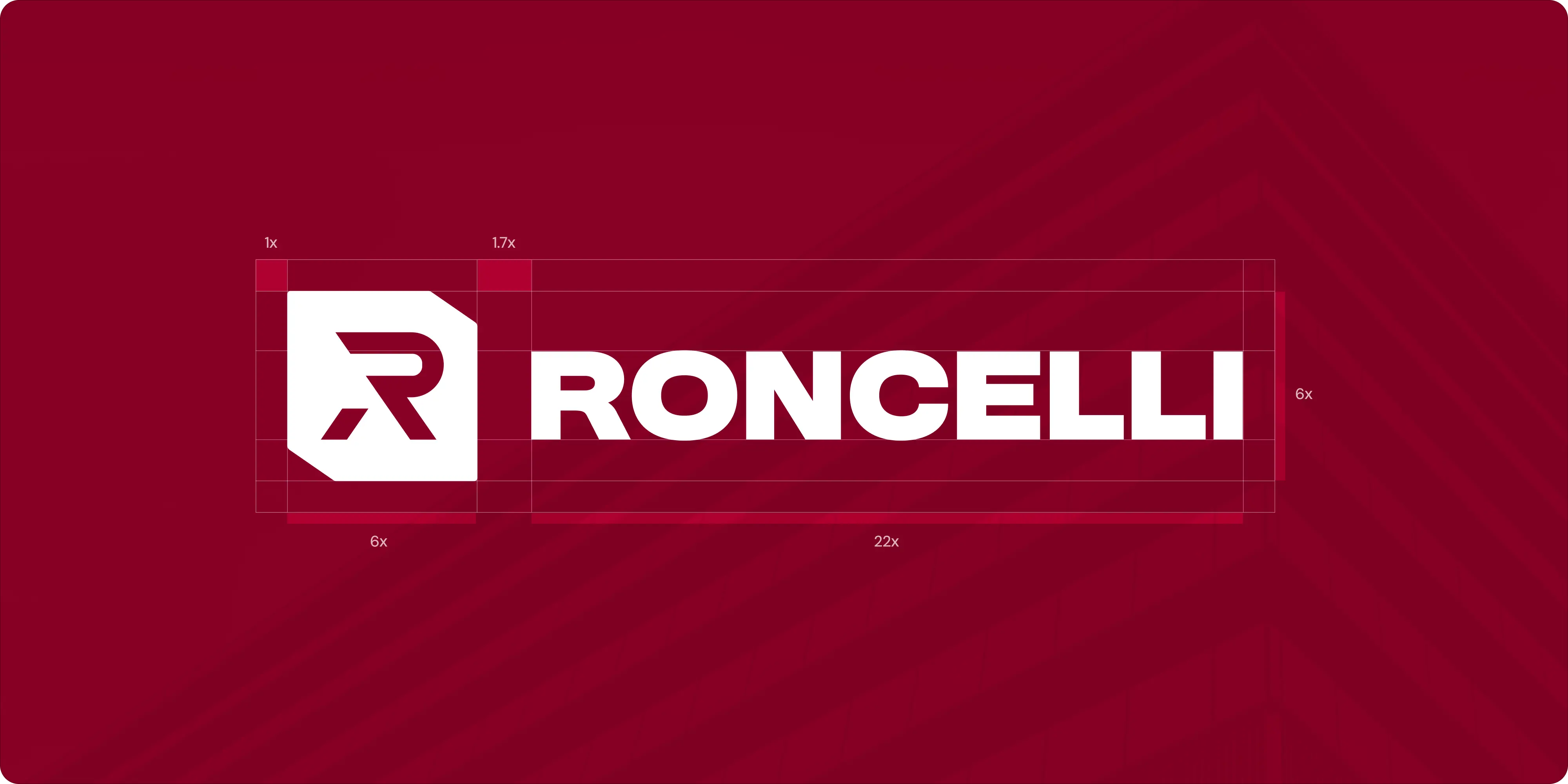
Full visual identity transformation for a legacy construction leader
A long standing brand carried equity but looked dated across channels. Visual elements were not consistent, and the identity did not fully express the firm’s strength, precision, and reliability. The new system had to respect the history, feel current, and be easy to apply in many contexts without losing coherence.
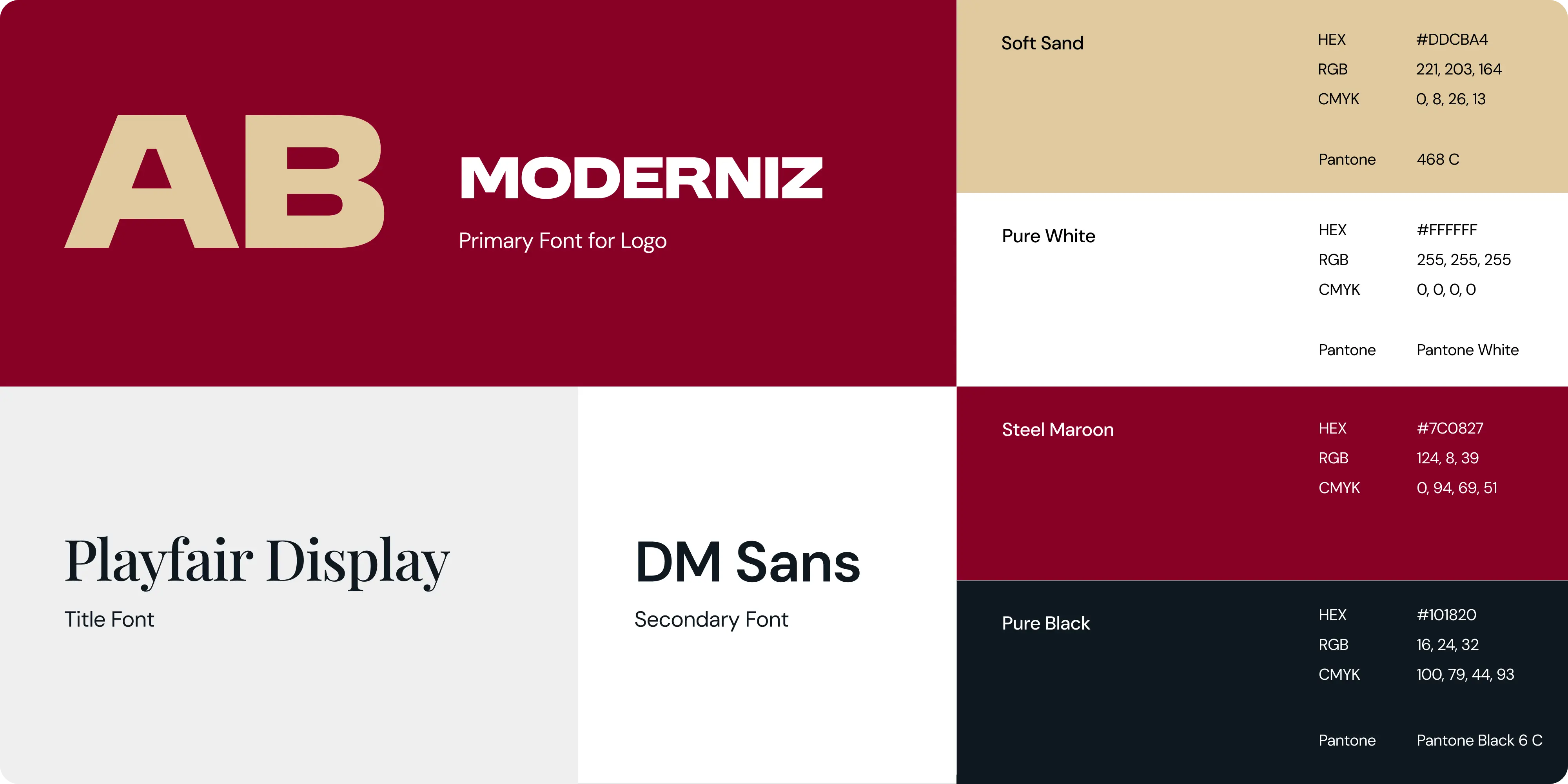
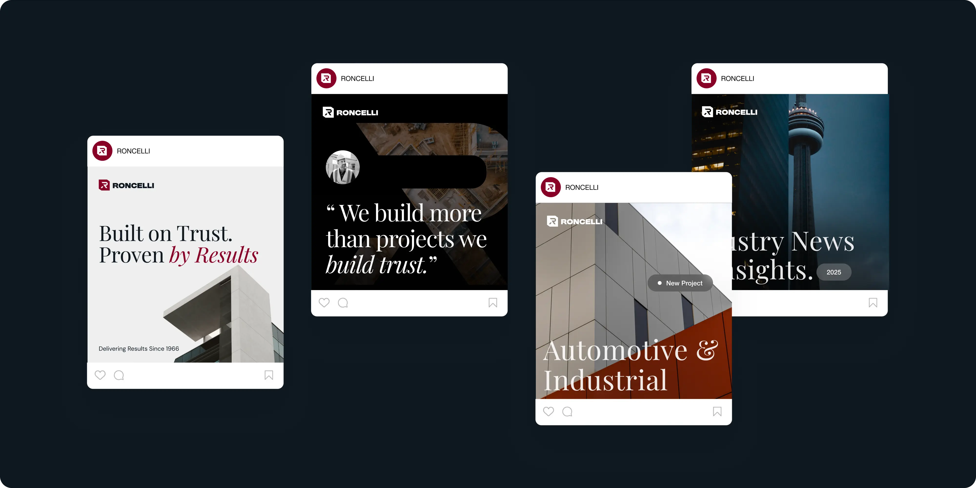
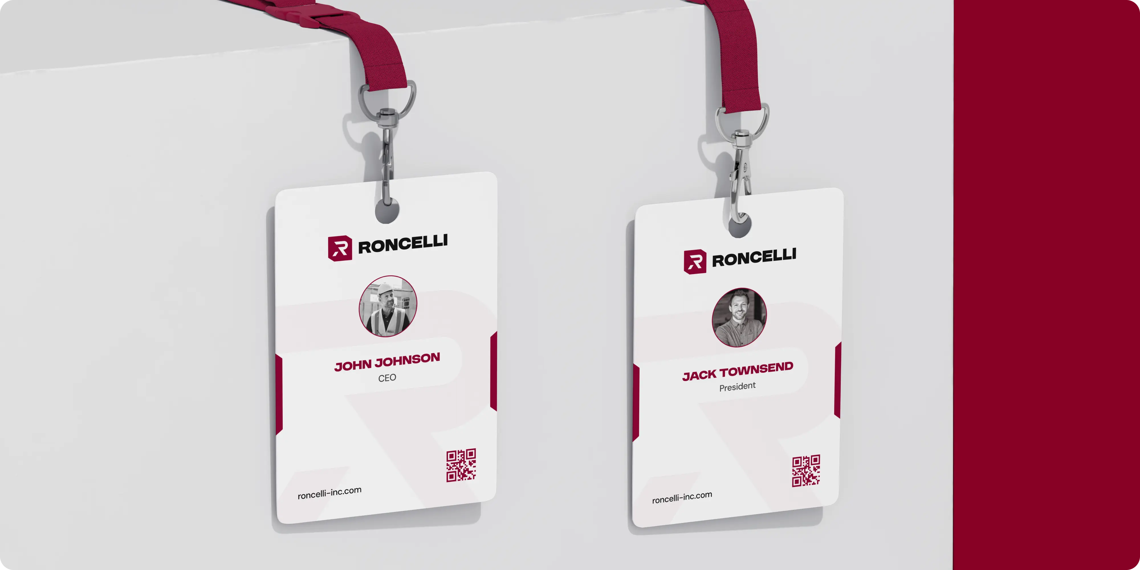
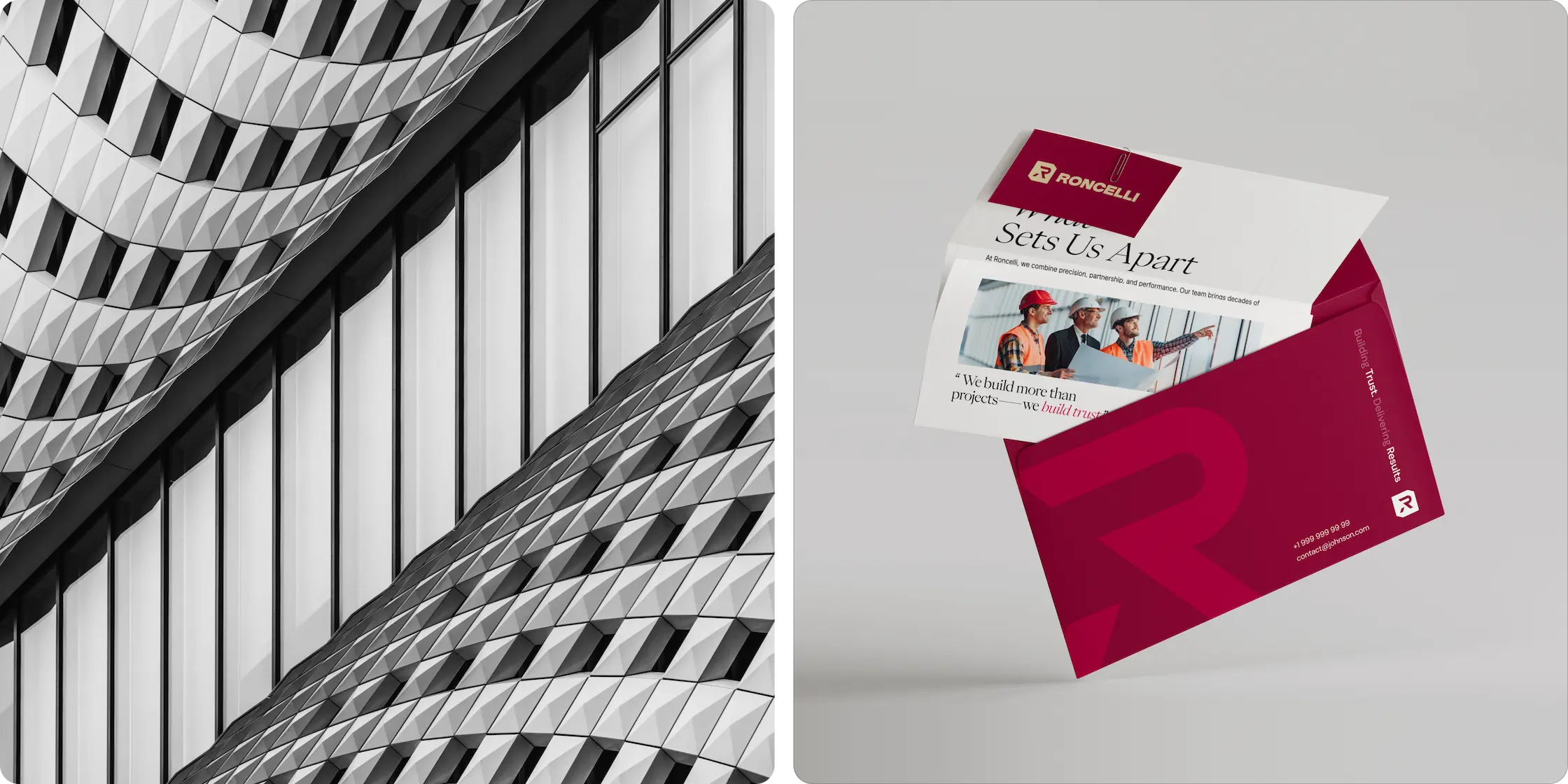
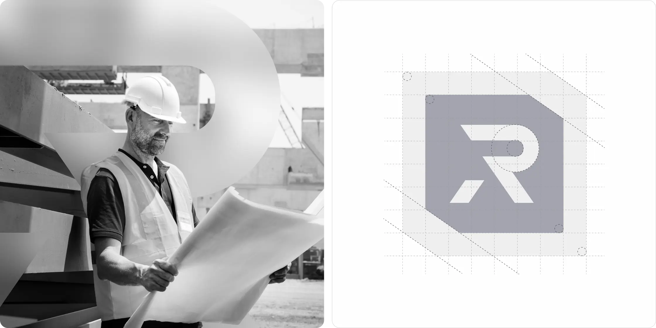
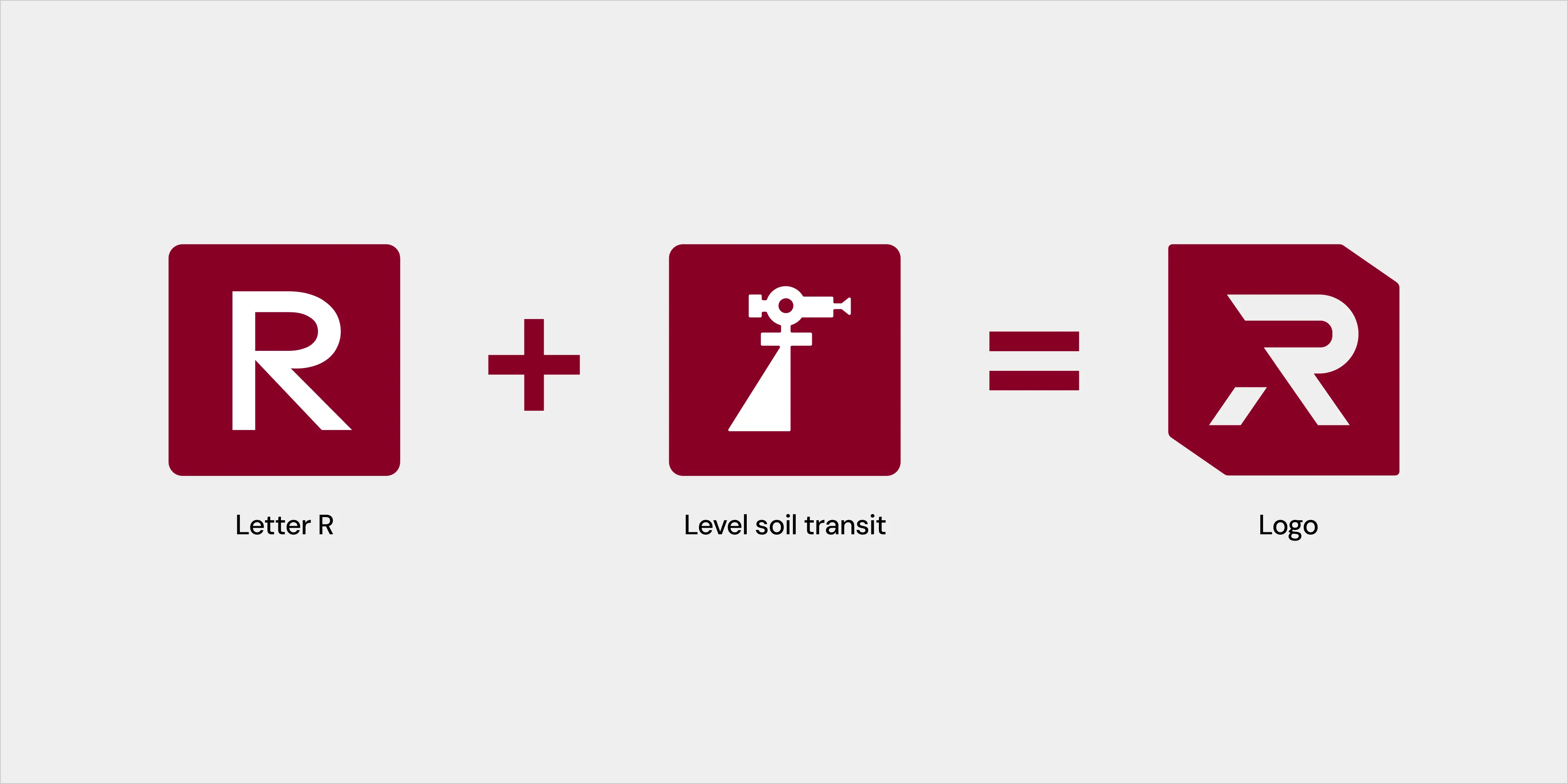
We audited existing materials and mapped real world use cases, from proposals to field ready print. Multiple logo and wordmark studies explored balance, proportion, and readability. Once the core mark was locked, we expanded into palette, type, layout grids, and branded textures, then translated those rules into practical templates. A concise brand book documented decisions and gave teams the tools to execute with confidence. For rollout planning and adoption, we provided lightweight guidance through focused marketing consultation.
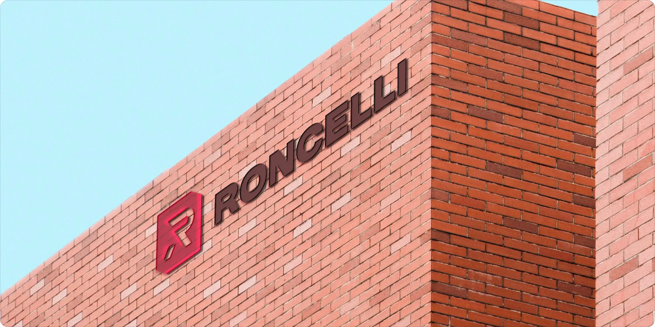
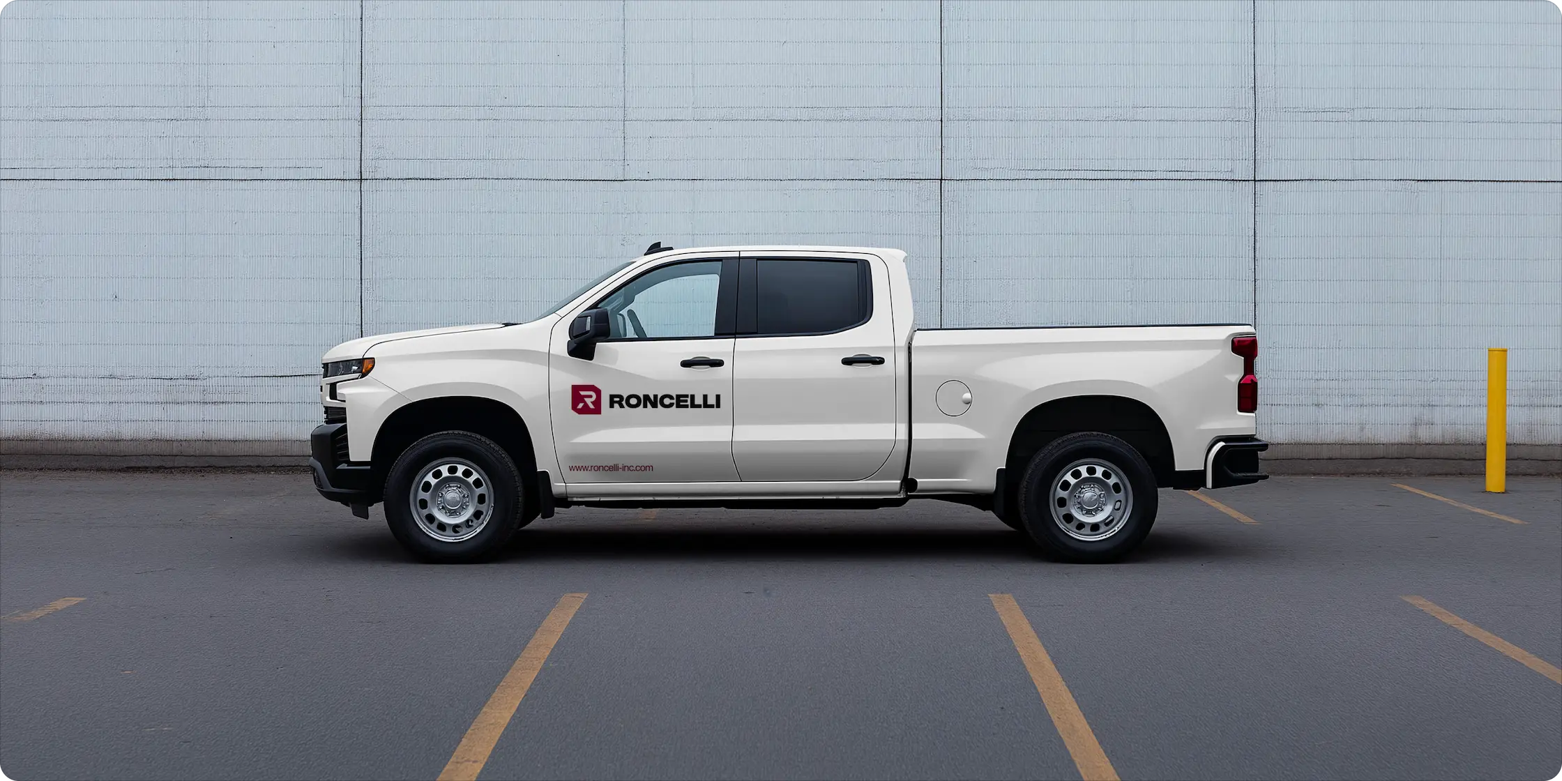
Roncelli now has a cohesive identity that reflects its heritage and projects leadership. The logo is confident and flexible, the system is simple to use, and every touchpoint feels aligned. Our strength is brand systems that work in the real world—clear rules, ready to use assets, and governance that keeps quality high as the company grows.


.avif)
Our goal is to nurture your vision and provide innovative, custom solutions for all your marketing needs.