
Best Apple Ads of All Time: Iconic Campaigns That Changed Advertising
Updated on
Published on
Apple’s advertising has delivered campaigns that sit at the center of modern marketing history. The best Apple ads of all time don’t rely on feature lists or flashy claims; they build a point of view, then express it with disciplined storytelling, sharp creative choices, and a consistent visual language.
Across decades of Apple ads, a few patterns show up again and again:
- One clear idea per campaign, repeated until it becomes cultural shorthand
- Product benefits shown through human moments, not product lectures
- Minimal copy and strong art direction that let the message land fast
- A tone that feels confident without needing to shout
-1.webp)
1. “1984” (1984, TV Commercial)
A one-minute television commercial introduced during Super Bowl XVIII, directed by Ridley Scott and shaped by George Orwell’s dystopian world. A lone runner bursts through a grey, controlled crowd and shatters a massive screen preaching conformity. The closing text teases: “On January 24th, Apple Computer will introduce Macintosh. And you’ll see why 1984 won’t be like ‘1984.’”
Why It Worked:
- A Single, High-Concept Metaphor: The story makes the “challenger” role instantly legible without naming competitors.
- Cinematic Craft: Lighting, pacing, and production quality signaled seriousness and scale, elevating a product launch into an event.
- Instant Memorability: The visual of the hammer throw became the takeaway; simple to remember, easy to retell.
- Brand Identity in One Stroke: It positioned Apple as the brand for people who resist sameness, a thread that continued for decades.
“1984” didn’t just promote a machine; it introduced a stance. That’s why it’s still discussed as one of the best Apple ads of all time: it made a product announcement feel like a cultural moment.
2. “Think Different” (1997, Integrated Campaign – TV & Print)
Released during a turning point for Apple, Think Different used black-and-white portraits of iconic creators and leaders: Albert Einstein, Pablo Picasso, Mahatma Gandhi, paired with spare copy and the line “Think different.” The TV spot’s narration (“the crazy ones, the misfits, the rebels”) reframed Apple as a home for people who build, question, and create.
Why It Worked:
- Values Before Products: It rebuilt desire and trust without needing to show hardware.
- Borrowed Cultural Equity: The portraits carried instant meaning, letting Apple “stand beside” greatness without saying it out loud.
- A Simple Line With Range: “Think different” was short, repeatable, and flexible enough to stretch across product eras.
- A Clear Audience Signal: It spoke directly to creative-minded buyers who wanted tools that matched their identity.
This campaign remains a model for brand repositioning: when the story is strong, the product has more space to win later.
3. iPod “Silhouettes” (2003–2005, TV & Outdoor Posters)
A run of bright, high-contrast ads showing black silhouettes dancing against bold color fields while listening to iPods—always punctuated by the unmistakable white earbuds. The ads leaned on movement, music, and mood, often anchored by a single track that made the creative feel current.
Why It Worked:
- Iconic Visual System: Silhouettes + white earbuds became an instantly recognizable signature across screens and billboards.
- Experience Over Specs: It sold the feeling of having your own soundtrack, not storage capacity.
- Product Visibility Without Clutter: The iPod and earbuds popped because everything else was reduced.
- Cultural Momentum: The creative mirrored how people wanted to live, mobile, expressive, always with music.
The “Silhouettes” era shows how a consistent visual system can carry an entire campaign. It’s one of the best Apple ads of all time because it made the product a symbol, not just a device.
4. “Get a Mac” (“Mac vs. PC”) (2006–2009, TV Commercial Series)
A long-running series of short spots set in a clean white space: an easygoing “Mac” (Justin Long) and a stiff, error-prone PC (John Hodgman). Each scene turns a technical point (viruses, crashes, compatibility) into a simple personality contrast that anyone could understand.
Why It Worked:
- Comparative Messaging Without Jargon: Personification turned complicated differences into everyday language.
- Repeatable Format: Same setup, endless variations—perfect for a multi-year run without creative drift.
- Humor With a Purpose: The jokes carried a point, so the message landed even when viewers weren’t “shopping.”
- Cultural Stickiness: Catchphrases and parody-proof characters extended reach beyond the paid placements.
“Get a Mac” proved that clarity scales. It kept the tone light while still making an argument—one reason it’s consistently listed among the best Apple ads of all time.
5. “Shot on iPhone” (2015–Present, Digital/Outdoor Campaign)
A global showcase of user-created photos and videos made with iPhones, then elevated into billboards, galleries, and minimalist layouts labeled “Shot on iPhone.” Instead of telling people the camera was good, Apple let the results do the talking.
Why It Worked:
- Proof, Not Promises: Real images made the product claim credible in a way copy never can.
- Community as Creative Engine: The campaign made customers feel seen, which encouraged participation and sharing.
- Museum-Level Presentation: The layout treated everyday work like art. Simple framing, strong curation.
- Brand Consistency: It reinforced a philosophy where product output becomes the brand story.
- Modern Reach: It translated seamlessly across outdoor, social feeds, and digital placements.
At its core, this is advertisement as curation. The campaign keeps working because it’s built on a renewable source: people making impressive work with the product. It also reinforces Apple’s design approach: reduce the noise and spotlight the output.
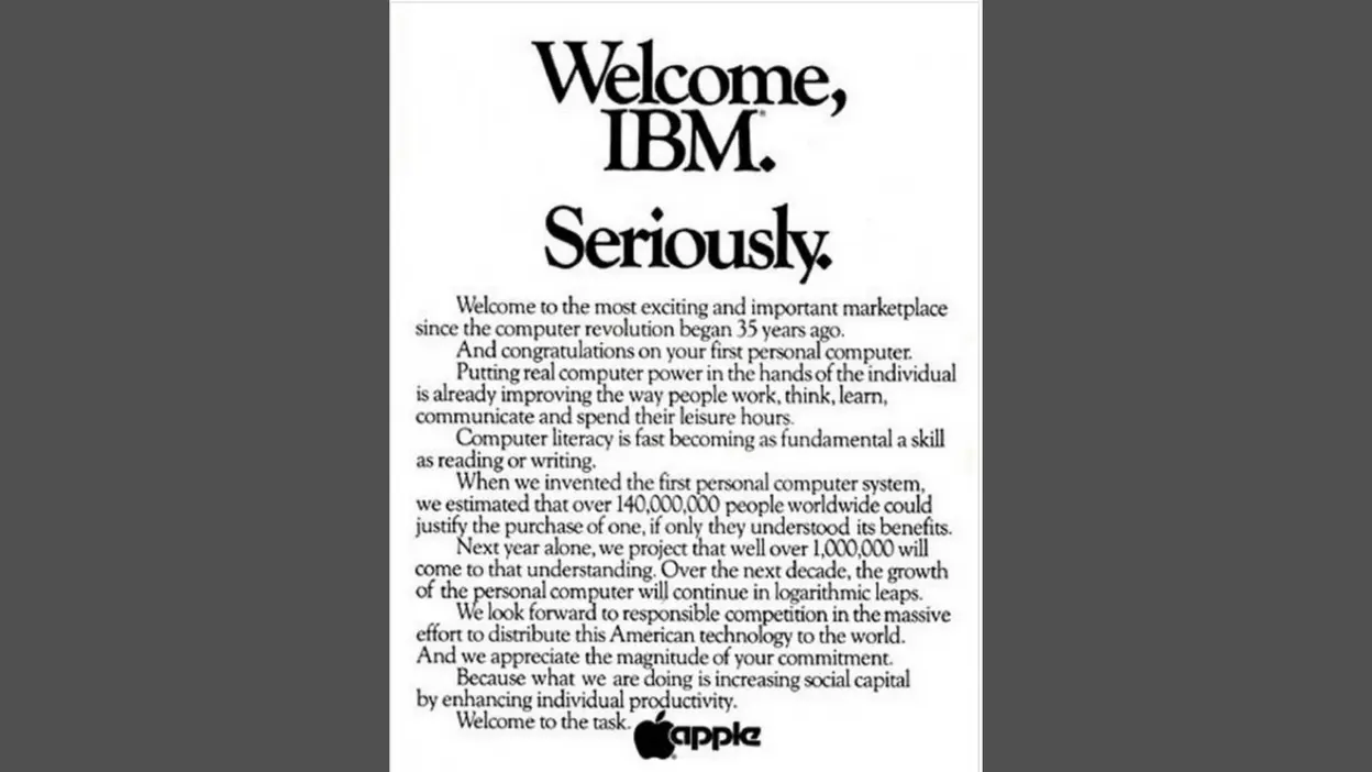
6. “Welcome, IBM. Seriously.” (1981, Print Ad)
A full-page newspaper ad from Apple that greeted IBM’s entry into personal computers on the same day IBM launched its first PC. Written like an open letter, it congratulated IBM and framed Apple as a serious pioneer, calling for “responsible competition.”
Why It Worked:
- Unexpected Confidence: A smaller competitor speaking directly to a giant created instant intrigue.
- PR Built Into the Placement: The ad functioned as news, not just promotion.
- Tone Control: It stayed polite and self-assured, which made the confidence feel earned.
- Challenger Identity: It reinforced Apple as bold, present, and unafraid of the biggest names in tech.
This print moment is an early example of Apple turning a competitor’s headline into its own narrative advantage; without needing to attack or overexplain.
7. “There’s an App for That” (2009, TV Commercial Series)
A run of bright, simple TV spots that made the App Store concept instantly practical. Each ad showed an iPhone user solving a real problem: translation, parking, learning, then ended with the line “There’s an app for that,” implying the phone could adapt to whatever life demanded.
Why It Worked:
- A Repeatable Line: The tagline was short enough to spread and flexible enough to fit endless use cases.
- Use-Case First: The ad sold outcomes—what you can do—rather than how the device works.
- Category Education: It helped normalize the idea of a phone defined by software, not just hardware.
- Everyday Relevance: The examples made the value feel immediate, not abstract or futuristic.
The genius here is how quickly it made a new behavior feel normal. The phrase became a cultural shortcut for “a tool exists for that problem,” which is exactly what a great campaign aims for.
8. “Misunderstood” (2013, TV Commercial)
A warm, emotionally grounded holiday ad for the iPhone 5s. A teenage boy looks disengaged at family gatherings, seemingly lost in his phone. The twist lands when he shares the video he’s been filming and editing the whole time—revealing attention, care, and craft that everyone missed.
Why It Worked:
- Modern Tension, Human Resolution: It confronted a real fear (devices pulling people away) and flipped it into connection.
- A Clean Story Arc: Setup, misread, reveal: simple structure that rewards attention.
- Product as Enabler: The iPhone is present, but it’s a tool for making something meaningful.
- Emotional Aftertaste: The ending leaves people feeling something, which is why it gets remembered and shared.
“Misunderstood” shows how Apple ads often win: they don’t argue that technology is good, they show what good use looks like.
9. Apple Watch – “Dear Apple” (2017, Online Video Campaign)
A series of video testimonials built from real letters written to Apple, read by people whose Apple Watch helped improve or even save their lives. The stories center on emergency alerts, heart and activity tracking, and the everyday motivation that comes from gentle nudges.
Why It Worked:
- Specific, Human Proof: Real outcomes beat vague claims; viewers remember details and moments.
- Trust Through Voice: Letting users speak made the campaign feel grounded rather than scripted.
- A Broader Meaning: It positioned the Watch as part of health and safety, not just tech or fashion.
- Community Effect: It made people imagine themselves in the story, which deepens relevance.
“Dear Apple” shows a different kind of persuasion: quiet, personal, and rooted in lived experience, an approach that tends to age well.
Why These Apple Ads Stand Out
From “1984” to “Shot on iPhone,” Apple’s strongest marketing work stays consistent in the way it communicates:
- They simplify without dumbing down. One idea, expressed clearly, repeated consistently.
- They treat the product as a tool for identity. Creativity, rebellion, connection, self-improvement: Apple ads attach products to who people want to be.
- They build campaigns as systems. A recognizable format (“Mac vs. PC,” silhouettes, user galleries) makes the work scalable and coherent.
- They value craft and restraint. Strong concepts paired with minimal copy and controlled visuals keep attention on the message.
That consistency is why the best Apple ads of all time continue to influence how brands think about storytelling, creative direction, and long-term brand building.
.webp)
Final Thoughts
Apple’s marketing legacy is tied to campaigns that do more than promote products. They shape perception. Each of these ads made a clear promise about what Apple stands for, then reinforced it through story, tone, and a recognizable creative signature.
The best Apple ads don’t chase attention with noise. They earn it with focus: one message, delivered with discipline, repeated until it becomes part of culture.
Check Out Our Other Reports
- Top 10 March Madness Ads of All Time: Iconic Campaigns That Scored Big
- History of Tobacco Marketing: From Early Ads to Modern Laws
- The Best Starbucks Ads of All Time
- The Best McDonald’s Advertisements of All Time
How Business Owners Can Learn From This and Apply It
From Brand Vision’s expert point of view, the most transferable part of Apple’s playbook isn’t budget—it’s structure. The best Apple ads of all time follow repeatable principles that work for local businesses, startups, and established brands alike.
1) Build one sharp message, then protect it
Pick a single idea your audience should remember after five seconds. If the message needs a paragraph to explain, it’s not ready for an advertisement. Tight creative starts with tight strategy.
2) Show the benefit through a human moment
“Misunderstood” doesn’t list camera specs. It shows a family reacting to a story. Translate that into your business: show the before-and-after experience, not just the feature list. That’s what turns marketing from information into persuasion.
3) Create a campaign format you can repeat for months
Apple builds systems: silhouettes, “Mac vs. PC,” “Shot on iPhone.” Business owners can do the same with a simple template:
- a consistent opening shot
- a single problem
- a clear result
- a recognizable closing line
Consistency lowers creative effort over time while increasing recall.
4) Use proof you can’t fake
“Shot on iPhone” works because it’s real output. “Dear Apple” works because it’s real voice. For your business, proof can be:
- customer stories (short and specific)
- real results with context
- behind-the-scenes craft
- user-created content you curate carefully
5) Let restraint do the heavy lifting
Clean layouts, fewer words, and stronger visuals tend to communicate confidence. Strong design is often subtraction: remove anything that doesn’t support the message.
6) Compete with clarity, not bitterness
“Welcome, IBM. Seriously.” is a reminder that competitive positioning can be direct without being messy. If your category is crowded, define what you do differently in plain language, then keep showing it consistently.
Business owners don’t need Apple’s scale to borrow Apple’s discipline. A clearer message, a repeatable creative format, real proof, and consistent execution can elevate almost any brand’s advertising outcomes.
.png "Best Branding Agencies in Toronto (2026)")
%20(1).png "10 Best Web Design Companies in Toronto (2026)")


