
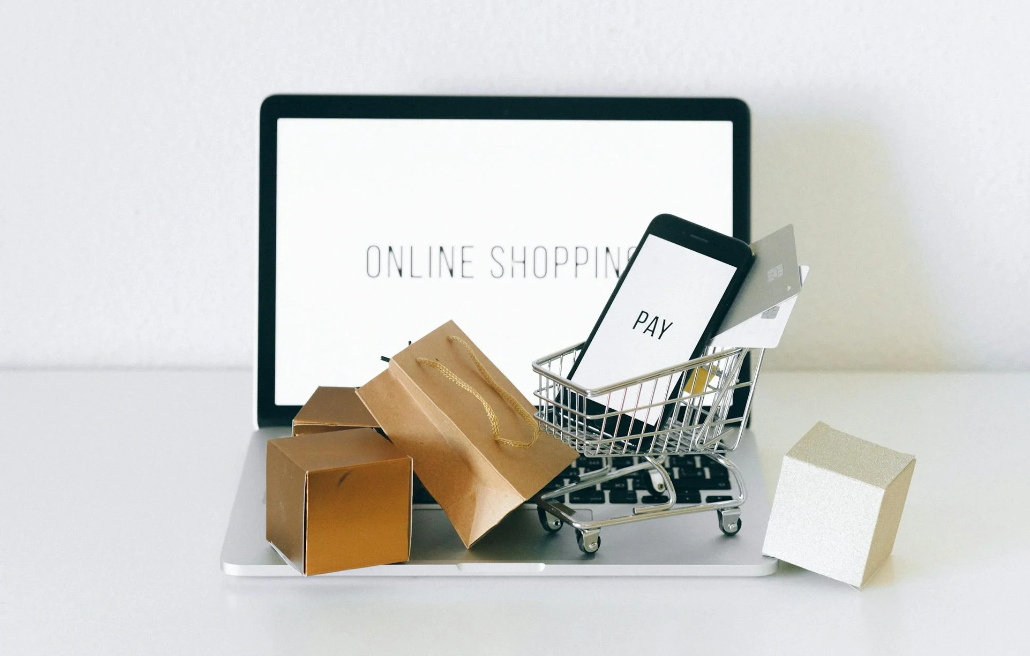
Ecommerce Product Page Design: Layouts That Increase Add to Carts
Updated on
Published on
Conversion pressure rarely starts at checkout. It starts the moment a shopper lands on a product page and decides whether the product is for them, whether the price is fair, and whether the brand feels safe to buy from. When ecommerce product page design is treated as a template problem rather than a merchandising problem, add-to-cart rates rise for the right reasons: clarity, fit, and confidence.
For leaders, ecommerce product page design is a compounding lever. Ecommerce product page design also shapes perception of your brand, even when the shopper does not buy on the first visit. Improve it once, and every product benefits. Leave it inconsistent, and every acquisition dollar works harder than it should.
Why Add to Cart Drops Before Checkout Starts
Baymard’s benchmark research suggests that many top ecommerce sites still ship product pages with avoidable UX issues, even in mature categories (Baymard Institute). Those issues show up as hesitation: a shopper cannot confirm sizing, cannot understand delivery timing, or cannot trust reviews. The cart never happens.
Baymard’s cart research is a useful reminder that the cart is only one step in the funnel (Baymard Institute). A strong product detail page reduces uncertainty before checkout, which protects both add to cart and downstream conversion rate.
The mistake is treating the page as a brochure. A product detail page is a decision engine. The product detail page has to work for first-time visitors, returning shoppers, and people comparing options in multiple tabs. Your product page layout must do three jobs in sequence: make the product understandable, make it feel right for the shopper, and make the purchase path frictionless.
At a Glance: The Product Page Layout That Drives Add to Cart
Ecommerce product page design that increases add to cart tends to share a stable structure. The page makes key facts visible early, answers objections before they form, and keeps purchase controls close at hand.
Here are the priorities that matter most:
- Put the purchase decision elements above the fold: price, variants, availability, and the primary add to cart button.
- Make the media stack work like a product demo: clear hero image, zoom, context shots, and one short video when it adds clarity.
- Use the copy to answer real questions: what it is, who it is for, what is included, how it fits, and how it holds up.
- Reduce risk where the shopper is deciding: shipping cost and delivery estimate, returns, warranty, and customer support access.
- Ensure the mobile product page layout keeps buying controls reachable without scrolling fatigue.
- Protect speed and stability. Core Web Vitals and accessibility issues often show up as conversion friction (Google, W3C).
A Simple Method for Evaluating Ecommerce Product Pages
A practical audit does not start with pixel details. It starts with whether the page helps someone decide in one pass. Nielsen Norman Group’s guidance on ecommerce product pages maps well to a simple evaluation: can a shopper identify the product, assess it, and buy it without hunting (Nielsen Norman Group).
Use this three-step method. It is the foundation of product page optimization for teams that need repeatable decisions.
- Can the shopper confirm fit in under 10 seconds?
Look for price clarity, variant selection, availability, key dimensions, and a visible add to cart control. - Can the shopper build confidence without leaving the page?
Look for reviews that feel authentic, shipping and returns details, trust cues, and complete specs. - Can the shopper complete the decision on mobile with one thumb?
Look for sticky controls, tap-friendly variant UI, and predictable scrolling.
If ecommerce product page design fails any step, the fix is usually structural. Adjust the product page layout before you adjust copy.
Above the Fold Layout: Make the Purchase Path Obvious
Ecommerce product page design lives or dies above the fold. If the decision path is unclear, shoppers scroll for reassurance instead of committing. That is not research. It is doubt.
Decision Zone, Proof Zone, Support Zone
A high-performing product page layout organizes the top of the page into three zones.
Decision zone
- Product name that matches how people talk about the product
- Price, promotions, and clear inventory status
- Variant controls that do not hide options
- A primary add to cart button that is visually distinct and consistent
Proof zone
- A short benefit summary, not a wall of copy
- Review rating with a path to read more
- One to three key proof points such as materials, certifications, or compatibility
Support zone
- Delivery estimate and shipping cost visibility
- Returns window and warranty summary
- A visible path to contact support
This is the simplest way to make ecommerce product page design predictable for users and maintainable for teams.
Common Above the Fold Mistakes
Most add-to-cart losses above the fold come from the same set of patterns:
- Variant selection is unclear. A shopper cannot tell what is selected, or what changes when they choose a size.
- Price and discounts compete for attention, but total cost remains unclear.
- The add to cart button blends into secondary actions like wishlists.
- Mobile product page layout pushes the CTA below oversized media and repeated headings.
These are not creative problems. They are hierarchy problems.

Product Media That Builds Fit and Confidence
Media is the fastest route to comprehension. It is also the most common reason pages feel slow, heavy, or unstable. Ecommerce product page design needs media that sells the experience and loads responsibly.
Image Hierarchy
The first five images often do most of the work:
- A crisp hero image on a neutral background
- One close-up that shows texture or detail
- One context image that shows scale
- One image that clarifies what is included
- One image that covers edge cases, such as how a closure works or how a material looks in different light
A product page layout that buries context shots below a long gallery forces unnecessary scrolling. If you sell in a considered category, prioritize context early.
Video and Motion
A short video can reduce uncertainty when the product benefits are dynamic. Show the product in use, show a key mechanism, or show scale. Keep it short enough that it feels like an answer, not a commitment.
If you add video, treat it as performance work. Large media can become the largest contentful paint element and degrade the experience if it is not optimized (Google).
User Generated Content
User-generated content works when it reduces the “will this look like the photos” gap. Curate it. Place it near the questions it answers. If a shopper is choosing color, show real-world color. If a shopper is choosing fit, show fit on different body types or environments.
Copy, Specs, and FAQs That Reduce Pre Purchase Questions
If shoppers need to leave the product detail page to confirm basics, you have already lost momentum. Ecommerce product page design should use copy and specs as an objection-handling layer, not as branding poetry.
Description Structure
A useful structure fits most products:
- One sentence that states what it is and who it is for
- Three to five bullets that outline the top benefits in plain language
- A short paragraph that explains what makes it different, without overclaiming
- A details section covering materials, care, compatibility, and what is included
This keeps the product page layout scannable while still complete.
Specs That Compare Cleanly
Specs should be formatted for comparison. Use consistent labels across products. Avoid mixing marketing terms with actual measures. If a spec is a decision point, place it near the variant controls or at least within the first scroll.
When this structure is missing, ecommerce product page design turns into support load. Customers ask questions you could have answered upfront.
Micro FAQs
A small set of questions near the decision area can remove hesitation:
- How does it fit or run?
- What is included?
- How long does delivery take?
- What is the return window?
- Who is this best for?
Keep answers short. Link deeper policies where needed, but do not make the shopper hunt.

Trust and Risk Signals That Remove Hesitation
Trust is not a footer badge. It is a set of answers delivered at the moment of decision. Ecommerce product page design should assume the shopper is assessing risk, even when they say they are comparing features.
If the product is unfamiliar, brand consistency also carries weight. A branding agency can help align product imagery, typography, and messaging so the product detail page feels coherent across the catalog.
-1.webp)
Reviews That Feel Real
The FTC’s guidance around deceptive reviews is a reminder that credibility is operational, not just brand level (FTC). Reviews that look manipulated backfire.
A product page layout should make review signals legible:
- Show an average rating and count near the top
- Let users filter reviews by variant, use case, or issue type
- Highlight a mix of positive and critical reviews, with your response policy if you respond
If you only surface the best reviews, users will assume the worst.
Shipping and Returns
Cart abandonment remains high across ecommerce, and shipping and checkout friction are common reasons (Baymard Institute). Even before checkout, shoppers want to know whether delivery is fast, whether shipping is expensive, and whether returns are painless.
On a product detail page, reduce that uncertainty:
- Show delivery estimate ranges where users are selecting variants
- Make shipping costs visible before the cart when possible
- Summarize returns and warranty, then link to full policy details
Payments, Security, and Support
Security badges do not fix unclear policies. Use them sparingly. Focus on the signals that match the shopper’s mental model:
- Clear payment options if they change the decision, such as financing
- Customer support access, including response expectations
- Warranty terms in plain language
If you sell to businesses, provide a path to procurement details, invoicing, and support terms directly from the product detail page.
Mobile First Product Page Layout Choices
Mobile is where many add-to-cart opportunities are won or lost. Thumb reach, tap targets, and scroll length matter more than aesthetics. Ecommerce product page design should treat mobile as the primary experience, not a responsive afterthought.
Sticky Purchase Controls
Sticky buy bars work when they do not hide information. Keep them minimal: price, selected variant, and add to cart. If selection is required, prompt for it clearly without trapping users in modal loops.
A strong mobile product page layout reduces repeated scrolling. It keeps the purchase action reachable at the moment the shopper decides.
Tap Targets and Thumb Reach
Accessibility standards map directly to usability on mobile. Buttons and tap targets that are too small create accidental errors and abandoned actions. WCAG 2.2 adds criteria focused on interaction, including target size, which is practical for ecommerce teams (W3C).
Variant Selection on Mobile
Variants are often the core friction point. Keep them visible. Use clear labels. Show what changes when the user selects an option, such as image swaps, price changes, or stock status changes.
When variant UI is weak, ecommerce product page design forces people to guess. Guessing does not lead to add to cart.

Performance, Accessibility, and Structured Data
Design and engineering decisions are not separate from conversion. They determine whether the product page feels stable and trustworthy. Ecommerce product page design has to account for these constraints upfront.
Core Web Vitals for Product Pages
Google defines Core Web Vitals as real-world metrics for loading, interactivity, and visual stability (Google). For product pages, the practical translation is simple: media should load quickly, controls should respond instantly, and the page should not jump.
Performance work aligns with measurable outcomes, including improvements in conversion rate when friction is reduced.
WCAG Basics That Affect Conversions
Accessible ecommerce product page design reduces friction for everyone. Common issues that show up as conversion loss include:
- Missing focus states that make keyboard navigation impossible
- Low contrast on price, variant labels, or disabled states
- Form errors that are not announced clearly
- Images that carry meaning without text alternatives
Accessibility is governance work. A clean component library prevents the same issues from reappearing across hundreds of SKUs.
Product Structured Data
Structured data does not change whether someone likes a product, but it can improve how product information appears in search. Product markup is designed to represent price, availability, and reviews when it matches visible content (Google).
Treat this as a systems layer. Once implemented correctly, it scales with the catalog and keeps each product detail page consistent.
Product Page Optimization: Testing, Governance, and Content Ops
The fastest way to improve ecommerce product page design is to treat it as a template program with clear ownership. Testing without governance creates drift. Product page optimization needs rules that keep experiments from turning into permanent inconsistency.
What To Test
Product page optimization should focus on elements that change decisions, not decoration. Tie each hypothesis to a clear behavior change and a measurable conversion rate outcome.
- The structure of the above-the-fold block
- Variant selection clarity and defaults
- Review placement and filtering
- Shipping and returns disclosure timing
- Sticky add to cart behavior on mobile
- Cross-sell modules that support the decision rather than distract
Define success as both add-to-cart rate and downstream conversion rate. An add-to-cart lift that raises returns is not a win.
Template Governance
Ecommerce product page design breaks when templates become optional. Define a product page layout system, then enforce it:
- A single set of components for price, variants, and purchase controls
- A content model for specs and benefits that supports comparison
- A QA checklist tied to releases and merchandising updates
This is where a UI UX design agency can add leverage, especially when the goal is to make the system durable rather than launching a one-off redesign.
.webp)
Merchandising and Cross Sell Rules
Cross-sell works when it is placed after the decision is clear. If it appears before key specs or reviews, it can feel like distraction. Use modules that help the shopper choose, such as compatibility recommendations or bundles that solve a clear need.
If your ecommerce product page design includes personalization, ensure it is explainable. Users trust recommendations more when they understand why an item is suggested.
A Final Checklist and Next Step
Redesign Checklist
Use this as a working checklist for your next product page layout review:
- Above the fold includes price, variants, availability, and a clear add to cart control
- Media includes context, scale, and one clarifying video where needed
- Copy answers what it is, who it is for, what is included, and how it holds up
- Reviews are visible, filterable, and feel authentic
- Shipping, delivery timing, returns, and warranty are summarized near the decision area
- Mobile product page layout uses sticky purchase controls and tap-friendly variants
- Core Web Vitals and accessibility issues are tracked and fixed at the template level
- Product structured data matches visible content and is kept current
When To Bring In Specialists
If your catalog is large, or if multiple teams touch the same templates, product pages often degrade over time. A structured redesign program can align design, development, and content operations under one roadmap with conversion rate accountability.
For organizations that want a system rather than a one-time refresh, start with a focused audit. A marketing consultation and audit agency can map high-friction templates, prioritize changes, and set measurement standards your team can maintain.
If your next step is a build, a web design agency can translate these patterns into components, templates, and performance requirements that scale. If discoverability is a constraint, align changes with your SEO agency so product page improvements carry through to search visibility and support conversion gains.
For teams balancing ecommerce and B2B buying journeys, a B2B marketing agency can help align product storytelling with longer sales cycles while keeping the product detail page conversion-focused.
.png "Best Branding Agencies in Toronto (2026)")
%20(1).png "10 Best Web Design Companies in Toronto (2026)")


