Naming, identity and a full brand system for a Nassau development, built to sell the place before the first building rises.
Logo Design and Branding for a development project in Bahamas. A modern and timeless design.
Project Highlights
- Naming: Soléy, built on the idea of living spaces bathed in natural light.
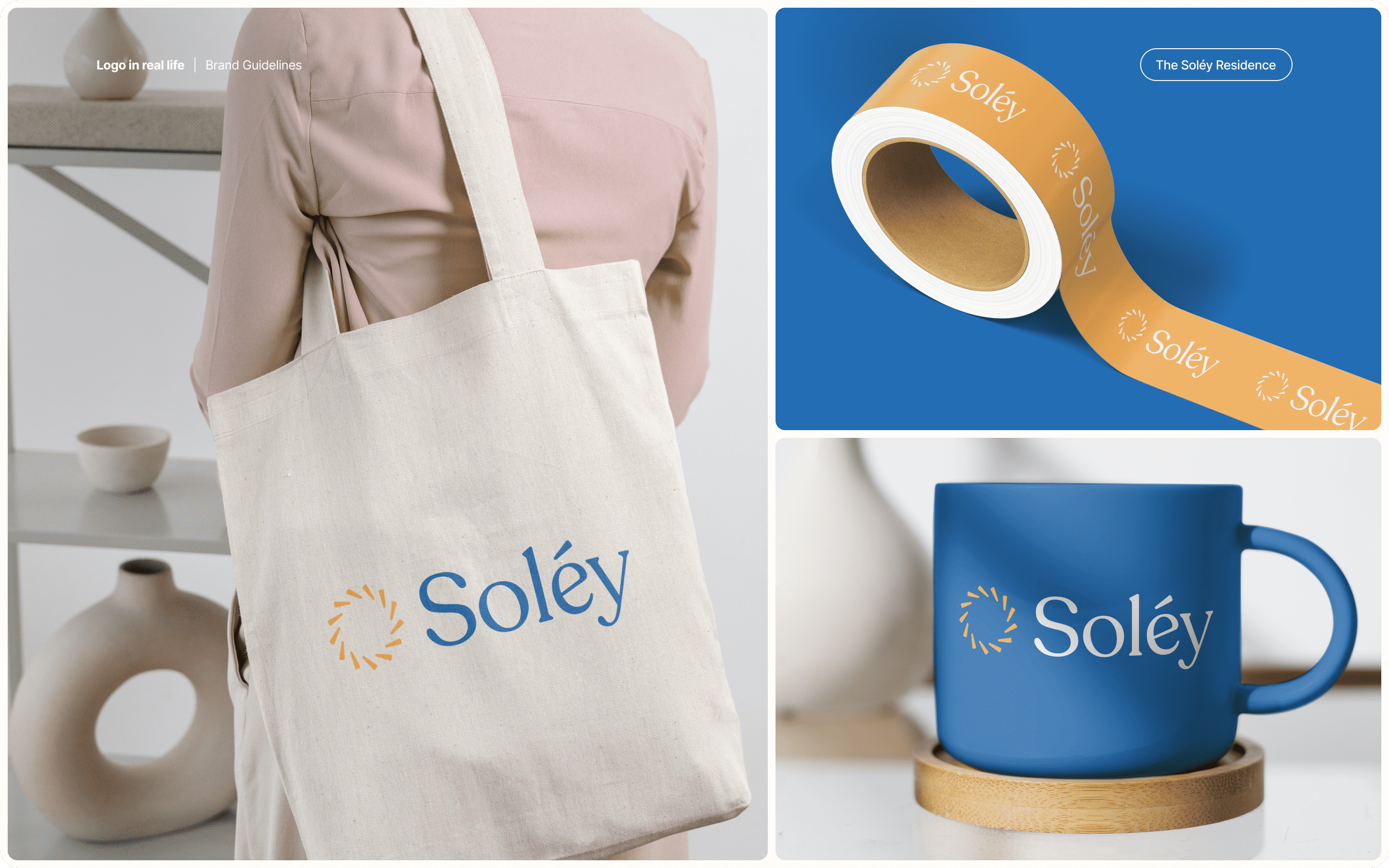
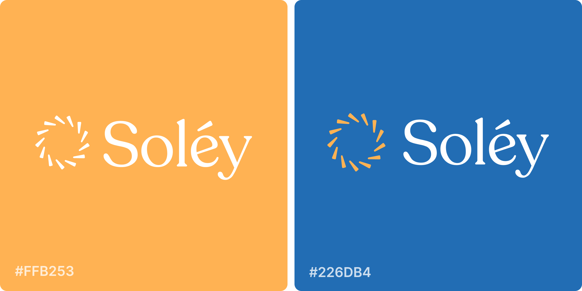
- Logo design: a radiant sun mark paired with a refined serif wordmark, modern and timeless.
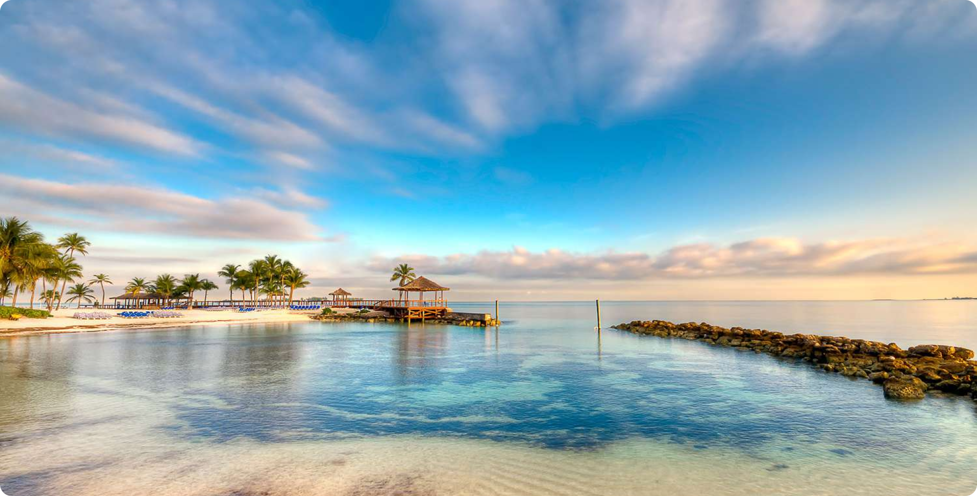
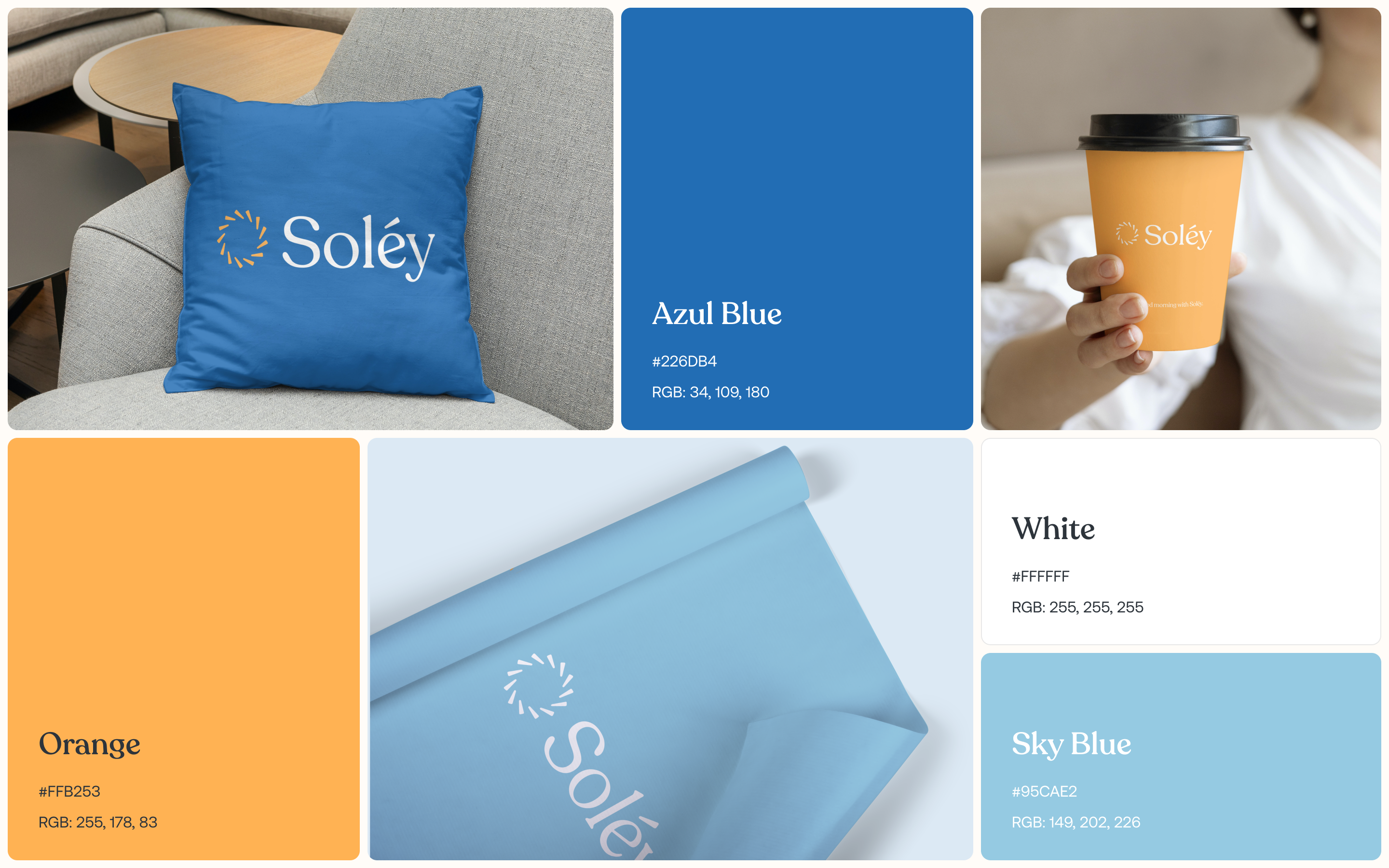
- Color palette: deep ocean blue against warm gold, drawn from Nassau’s coastline and light.
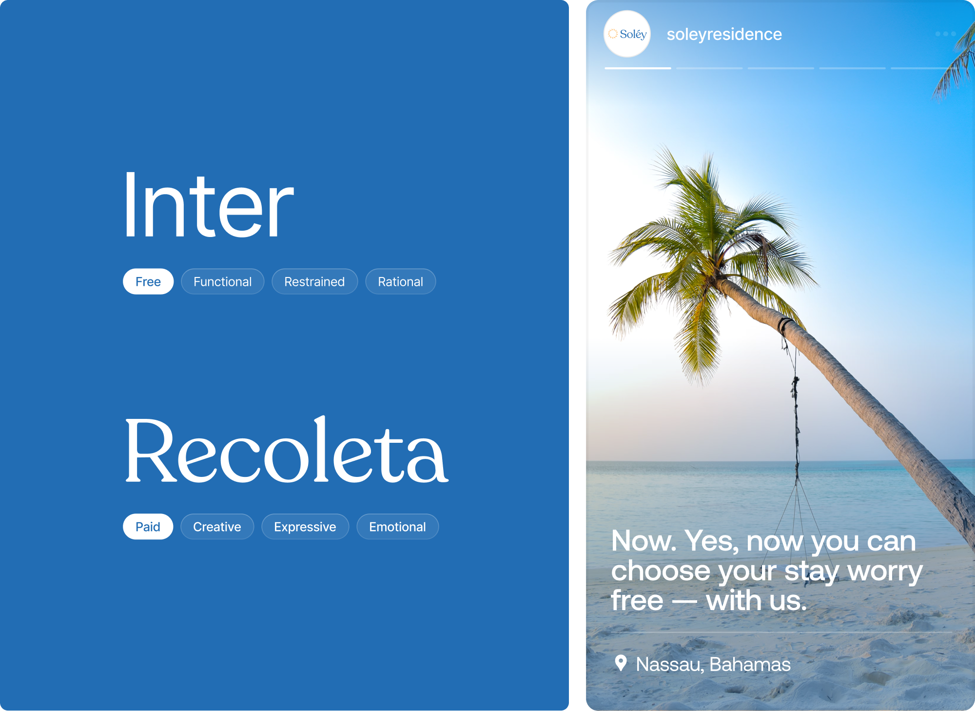
- Typography selection: an elegant serif system that reads as luxury without ornamentation.
- Custom illustrations: bespoke graphic elements that extend the identity beyond the mark.
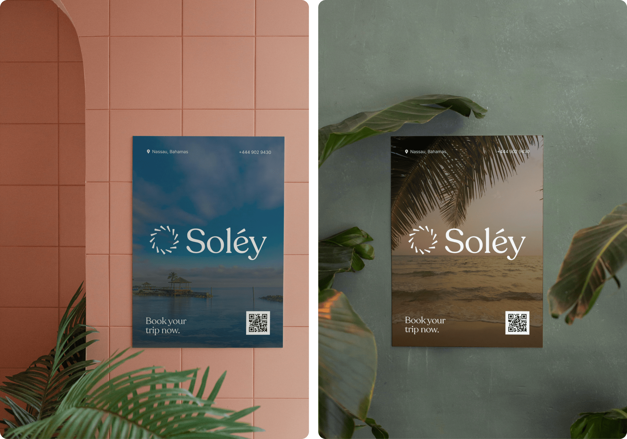
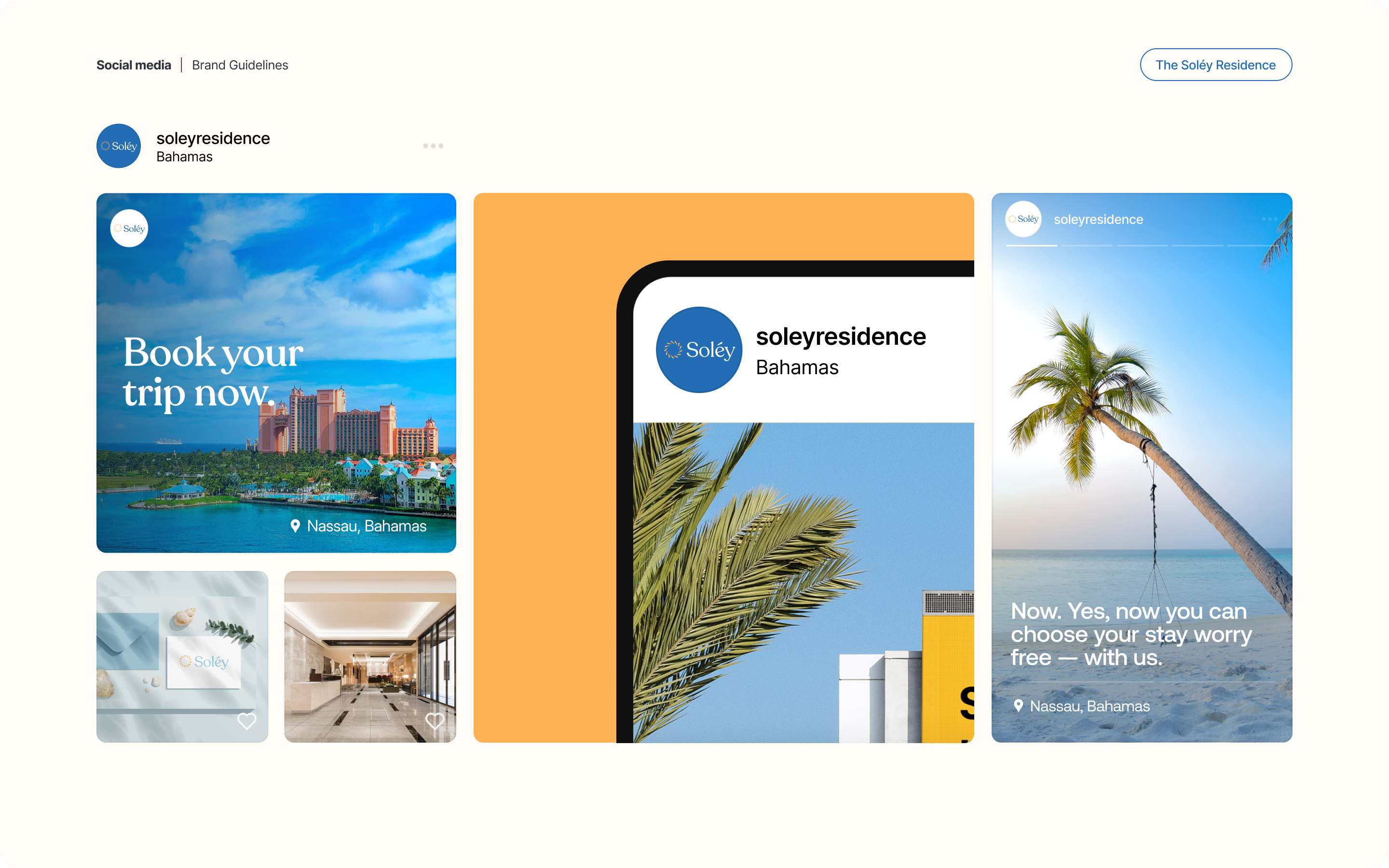
- Brand application: identity carried across print, digital, and development marketing materials.
- Brand guidelines: usage rules, spacing, and color codes to keep execution consistent through a multi-year rollout.
Challenges
A luxury development sells before it exists, so the brand has to carry the entire promise on its own. This identity needed to feel genuinely upscale to an international buyer, stay rooted in Nassau rather than generic tropical, and remain durable across a build timeline measured in years.
Approach
We began with a project brief and market research into the Nassau luxury segment and its buyers. Naming came first, landing on Soléy and the light-filled premise behind it, which then drove the sun mark, palette, and type. We built out brand applications and custom illustrations, refined through client feedback rounds, and closed with guidelines covering rollout across every medium.
Outcomes
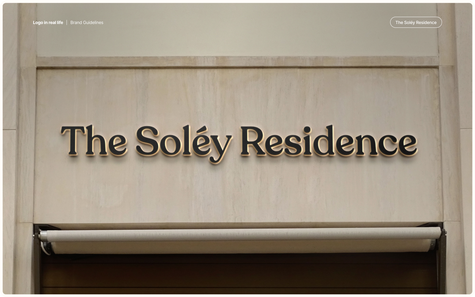
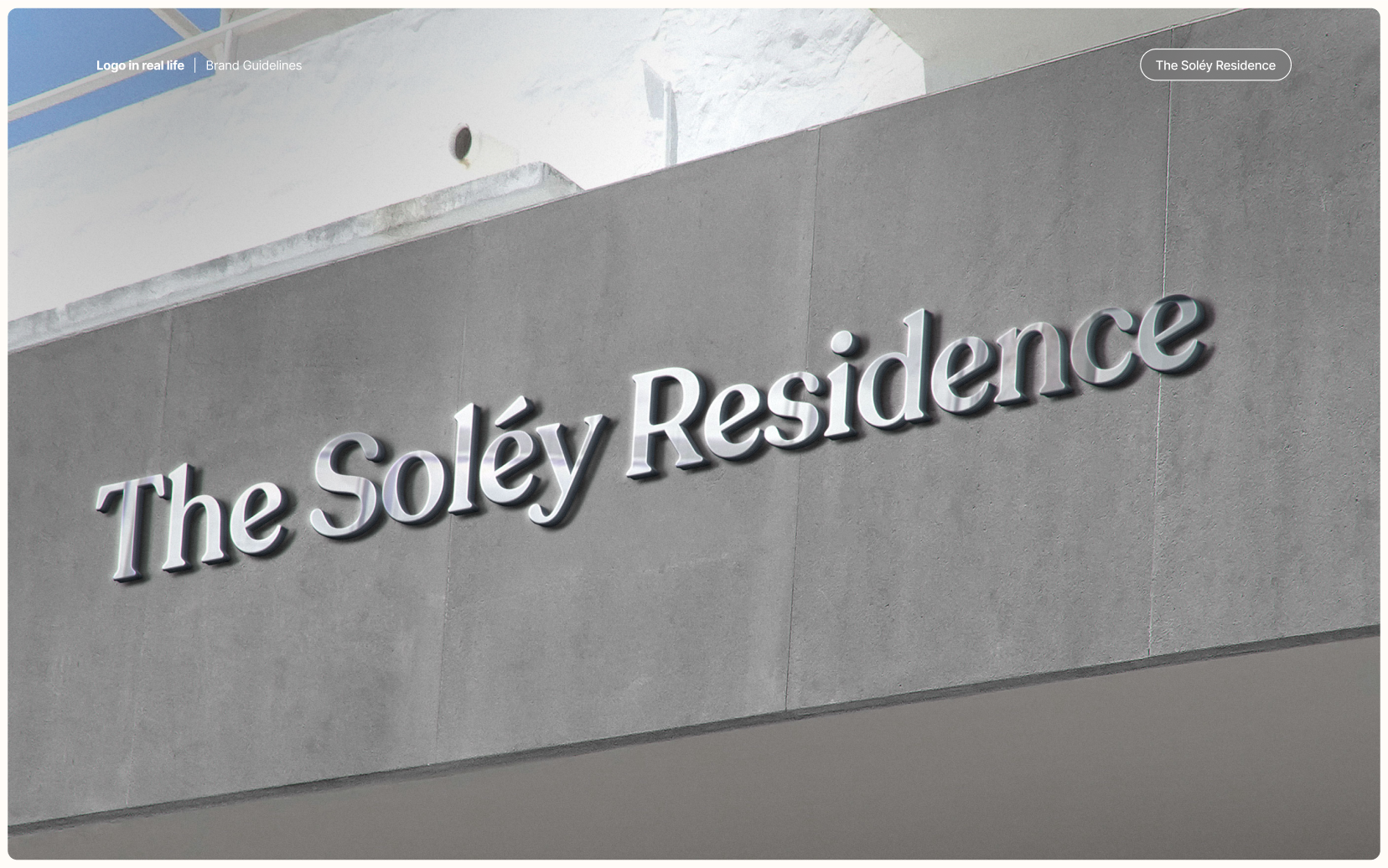
Soléy launched with a complete identity that reads as premium and holds together across every touchpoint. The mark is distinctive enough to own the market and simple enough to survive signage, print, and digital at any scale.


.webp)



.webp)
.webp)






.webp)




.webp)

.webp)

.avif)


.webp)




.png)