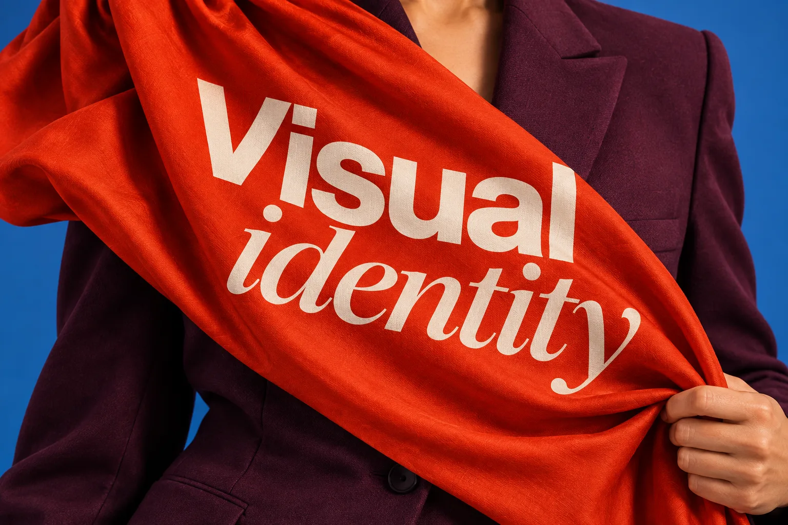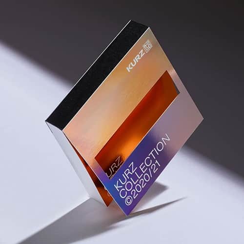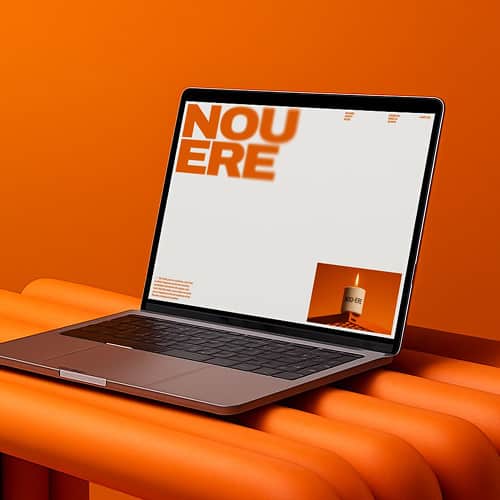
Typography is more than choosing a visually appealing font. Typefaces can contribute semantic cues that affect how people interpret a message, but those associations are not fixed rules. Research on typeface semantics has found that fit between the typeface, visual context and message can influence brand perceptions and memory. The practical goal is to choose typography that supports your brand identity, content and audience rather than assuming one font category automatically creates trust or prestige. For a broader system view, see Brand Vision's guide to visual identity.
Research in the Journal of Consumer Psychology also supports treating typeface as a semantic design cue rather than a universal emotional formula.
The Emotional Impact of Typeface
Serif Fonts: Tradition and Trust
Serif fonts have small strokes attached to the ends of letterforms. They are often associated with editorial, institutional or traditional visual languages, but the effect depends on the specific typeface, layout and brand context. Times New Roman and Garamond, for example, feel very different from many high-contrast display serifs. Even services such as a college admission essay writing service may choose serif typography to support a more formal presentation, but the typeface alone does not establish credibility.
Sans-Serif Fonts: Modernity and Clarity
Sans-serif typefaces omit the projecting serif strokes. Many contemporary interfaces and technology brands use sans-serif systems because they can work well across screens, product interfaces and responsive layouts. That does not mean every sans-serif feels modern or friendly. Width, stroke contrast, geometry, spacing and weight all change the impression, so the typeface should be evaluated inside the actual brand and product environment.
Script Fonts: Elegance and Personality
Script typefaces draw from handwriting and calligraphic forms, so they can feel personal, expressive, formal or historical depending on the design. They are often less suitable for long body copy because complex letterforms can reduce readability at smaller sizes. Used selectively in a logo design, display heading or packaging system, however, a script can become a distinctive brand asset.
Decorative Fonts: Boldness and Playfulness
Highly stylized fonts are built to create a strong visual presence. They can be useful when a campaign or identity needs a specific voice, but they should usually be applied selectively so readability does not suffer. Decorative typography works best when the letterforms reinforce the brand idea rather than competing with the message.
Type and Brand Perception
Creating a Single Brand Identity
The typography a brand chooses becomes part of the wider visual system across websites, social media, packaging and campaigns. Consistent use can support brand recognition. Coca-Cola is a useful correction to the simplistic serif-versus-sans-serif framework: its famous wordmark is based on Spencerian script, and the company continues to treat that script as a core visual asset. Recognition comes from the whole system and its consistent use, not from belonging to a single font category.
Creating Emotional Ties
Typography can contribute to emotional tone, but the response depends on culture, category, language, content and the rest of the design. A geometric sans-serif can feel technical in one system and playful in another. A handwritten style can feel personal in the right context and informal in the wrong one. The useful question is whether the typography reinforces the intended positioning and remains readable for the people who need to use it.
Font Weight and Style
Swaying Emphasis and Tone
Font weight and styles such as bold or italic help create emphasis and hierarchy. Heavier weights can draw attention to headings, labels and calls to action, while italics can distinguish emphasis, titles or quotations when the typeface supports them clearly. In marketing material, the goal is to make priority visible without creating so many competing weights that the page loses structure.
Shaping Brand Voice
Weight can alter perceived tone, but it also changes practical performance. Very light text may lose contrast at small sizes, while very heavy text can dominate a layout. Brand teams should test the full family across real headlines, body copy, navigation and interface states rather than choosing weights from isolated samples.
Typography and Font Pairing
The Art of Font Pairing
Font pairing is the deliberate use of more than one typeface within a system, often one for display text and another for body copy. The goal is not simply contrast. A pairing should make hierarchy clearer, keep long-form text readable and give the brand enough range to work across different formats.
Complementing Contrasts
Contrast is one useful approach, but a serif and sans-serif do not automatically form a good pair. Compare proportions, x-height, stroke contrast, spacing and tone. Two typefaces can differ enough to establish hierarchy while still sharing visual characteristics that make the system feel intentional.
Creating Visual Hierarchy
Font pairing can support a clear visual hierarchy that helps readers distinguish headings, body text, labels and actions. On digital products, that hierarchy should be tested as part of the wider UI and UX design, including small screens, long headings, accessibility settings and real content rather than placeholder text.
Brand Consistency
Typography should also survive real production. Specify approved typefaces, weights, hierarchy, fallback fonts and licensing rules, then test the system across print, presentations, social assets and website design. A coherent type system reduces improvisation and makes the brand easier to reproduce consistently.
Typography is a meaningful part of brand perception and user experience, but its effects are contextual. The psychological effects of different fonts are most useful as hypotheses to test, not fixed rules. Research published in 2025 also found that serif and sans-serif logo effects changed with brand values and design context, reinforcing the need to evaluate typography as part of a complete system rather than in isolation.
Typography is one component of a broader identity system, and design agencies can help connect it to logo, colour, imagery, layout and digital applications. Brand Vision's brand identity design process shows how those decisions fit together from strategy through rollout. If you are reviewing an existing identity or building a new one, Brand Vision can help assess the visual system, including typography, against the places customers actually encounter it.