Walmart’s 2025 Logo Change Was Part of a Broader Brand Refresh
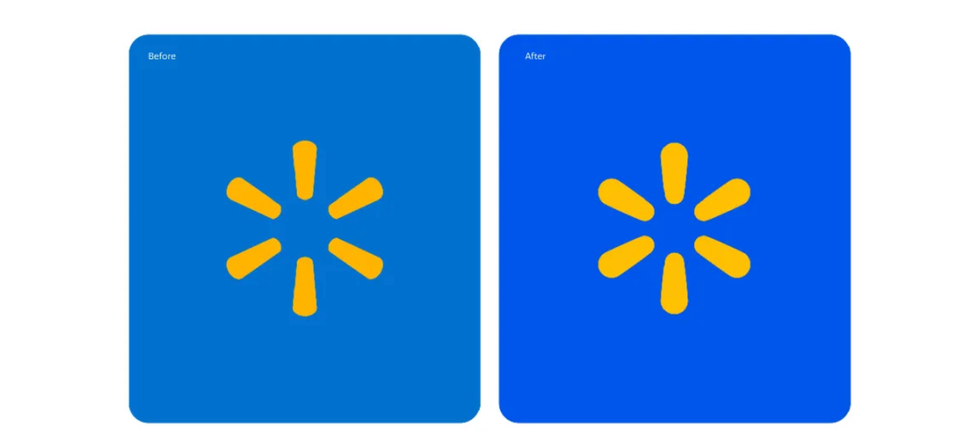
Walmart’s 2025 logo update is easy to miss because the basic structure remains familiar. But the change was not an isolated logo tweak. In its January 13, 2025 announcement, Walmart described the work as a comprehensive brand refresh designed to reflect the company’s evolution while staying connected to its heritage.
The wordmark was redrawn in a modern custom font inspired by Sam Walton’s classic trucker hat. Walmart kept the spark symbol and continued to build around its recognizable blue and yellow palette, now identified as True Blue and Spark Yellow. The result feels updated without asking customers to learn an entirely new visual identity.
What Actually Changed?
- The wordmark became more distinctive through a custom type treatment rather than a complete change in structure.
- The spark remained a central part of the identity, preserving one of Walmart’s most recognizable visual assets.
- The color system stayed rooted in familiar blue and yellow tones, while the broader refresh also introduced updated photography, illustration, and brand voice.
This is closer to a brand refresh than a full rebrand. The recognizable elements stay in place, while the expression around them becomes more current and more consistent across touchpoints.
Why Familiarity Still Matters
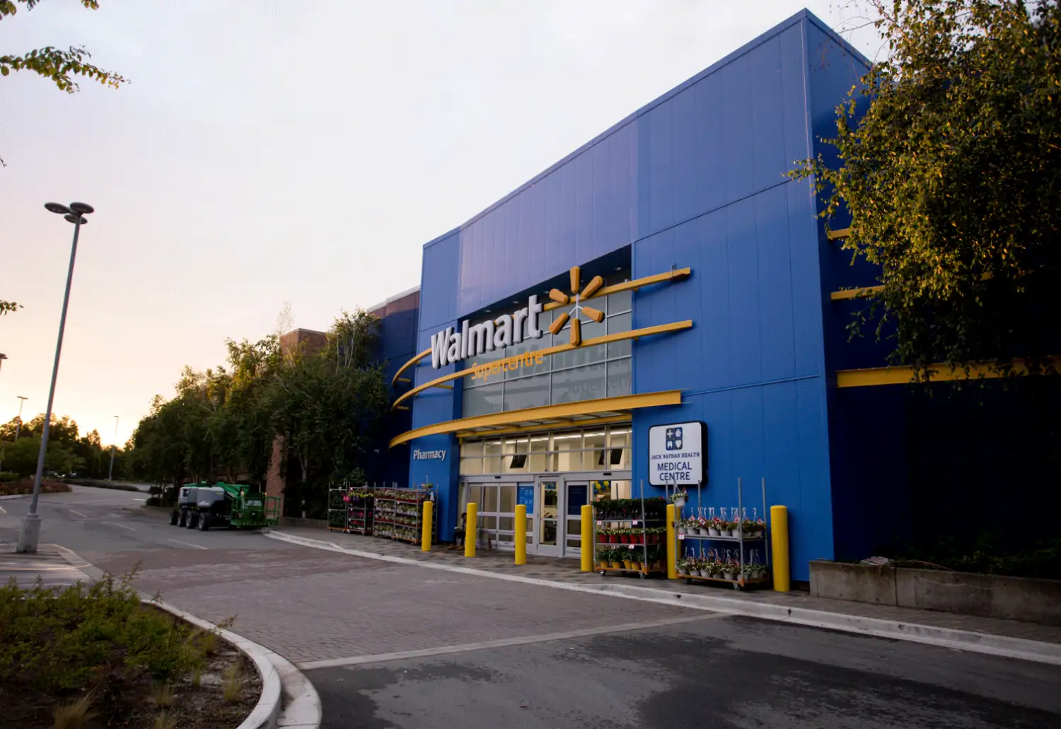
For a retailer operating across stores, ecommerce, apps, packaging, signage, and marketing, visual consistency has practical value. A major departure would have to work across thousands of customer touchpoints. By keeping the core shape, symbol, and colors familiar, Walmart can modernize the system while preserving the cues people already associate with the company.
Walmart also planned the refresh as a gradual rollout. The company said the updated identity would appear across Walmart.com, its app, stores, marketing materials, and corporate channels throughout 2025. That approach makes a restrained logo update especially useful because old and new applications can coexist without looking disconnected.
Final Thoughts
Walmart’s logo change shows how a large brand can evolve without treating every update as a reinvention. The most visible changes are subtle, but they sit inside a broader effort to make the identity feel more contemporary and consistent while protecting established recognition.
If your own mark needs a similar evolution, Brand Vision’s logo design service focuses on refining and redesigning logos while preserving the recognition that is still worth carrying forward.