
Contact Form UX: How to Increase Completion Without Lowering Lead Quality
Updated on
Published on
Most contact forms fail in predictable ways. They ask for too much, explain too little, and leave users unsure about what happens next. The result is quiet form abandonment from people who were ready to talk, plus a second wave of low-quality submissions that waste follow-up time. Strong contact form UX fixes both by reducing friction for real prospects while keeping the form structured enough to protect lead quality.
This is not about making a form “short.” It is about making it feel safe, clear, and worth finishing. When the contact form design is done well, contact form completion rises without turning your inbox into a spam queue. The form becomes a clean handoff from intent to pipeline.
Why Contact Form UX Matters More Than Ever
Completion Is a Revenue Problem, Not a Design Detail
A contact form is a decision point. A user is choosing whether to trade effort and personal information for a response. If the form feels demanding, unclear, or untrustworthy, they leave. That is not a design issue. That is lost revenue and lost momentum.
Good contact form UX also protects your team. It reduces follow-up churn, cuts down on unusable submissions, and creates cleaner inputs for routing and response. If you treat the form like a product surface, your conversion path becomes more stable across campaigns and traffic sources.
If the form is part of a broader experience problem, the fix usually spans layout, messaging, and interaction patterns. That is where a UI UX design agency helps, because you are not only optimizing fields. You are shaping the full moment of commitment.
The Quiet Cost of Form Abandonment
Form abandonment is expensive because it happens late in the journey. These users are not browsing. They are acting. When they stop, something in the form experience signals friction or risk.
Many teams under-measure this because they track only submissions. A better view tracks how many users start, where they hesitate, and what triggers errors. Industry research consistently shows forms can lose users quickly once interaction begins, especially when fields create confusion or extra work (Zuko).

Define Success Before You Touch the Form
The Two Outcomes: Contact Form Completion and Lead Quality
Before you change anything, define two outcomes and treat them as equal:
- Contact form completion: users who start and successfully submit.
- Lead quality: submissions that become real opportunities.
If you optimize only for contact form completion, you can inflate volume while lowering lead quality. If you optimize only for lead quality, you can raise form abandonment and starve the funnel. The right target is improved completion with stable or improved downstream quality.
A simple way to align teams is to map “what we ask” to “what we do with it.” If a field does not change routing, response, or qualification, it is probably a liability. When teams need a clearer measurement baseline, a marketing consultation and audit can help connect form performance to attribution and pipeline outcomes.
.webp)
What “High Quality” Means for Different Teams
Lead quality has to be defined in operational terms. Otherwise, the form becomes a battleground between marketing and sales.
Common definitions of lead quality:
- Sales accepts the lead within a set time window.
- The submission matches an ICP rule set.
- The lead reaches a booked call or qualified stage.
- The message shows real intent, not generic curiosity.
If your business is B2B leaning, it helps to align your form with your response model and qualification workflow. A form optimized for B2B lead quality tends to prioritize clarity and intent signals over heavy data capture. That is also why B2B marketing teams often benefit from simpler forms paired with better post-submit routing.
The Friction Audit: Where Contact Forms Lose People
Field Count and Cognitive Load
Every field adds a decision. Even a basic field can create friction if the user does not understand why it is required. The goal of a friction audit is not to chase minimalism. It is to remove unnecessary effort and ambiguity.
Look for:
- Fields that do not influence routing or follow-up.
- Required fields that feel optional to the user.
- Repeated information requests (name plus full name, phone plus mobile).
- Fields that trigger the most errors.
Research on form usability highlights how extra fields and poorly structured flows increase friction and reduce completion (Baymard). While their work is often cited in checkout contexts, the underlying behavior is the same: users resist unnecessary work at the moment of commitment.
Mobile Friction and Input Fatigue
Contact form UX often fails on mobile first. Long text entry, small tap targets, and mismatched keyboards turn a motivated user into a drop off.
Mobile fixes that reduce form abandonment:
- Use the correct keyboard types for email, phone, and numbers.
- Keep labels visible while users type.
- Avoid multi-part fields when one field works.
- Make the submit button easy to reach and easy to understand.
This is also tied to your site’s overall experience. If the page shifts while loading, or if spacing collapses on small screens, contact form completion drops. That is why form optimization often overlaps with broader web design services decisions.
-1.webp)
Trust Friction and Unanswered “Why”
Users do not abandon only because of effort. They abandon because of doubt. The form creates questions that the page does not answer.
Common questions that drive form abandonment:
- Will someone respond, and how fast?
- What will you do with my info?
- Why do you need my phone number?
- Is this a real company, or a lead trap?
Contact form UX improves when you answer these questions at the moment they matter, with short, plain microcopy near the fields and near the submit button.
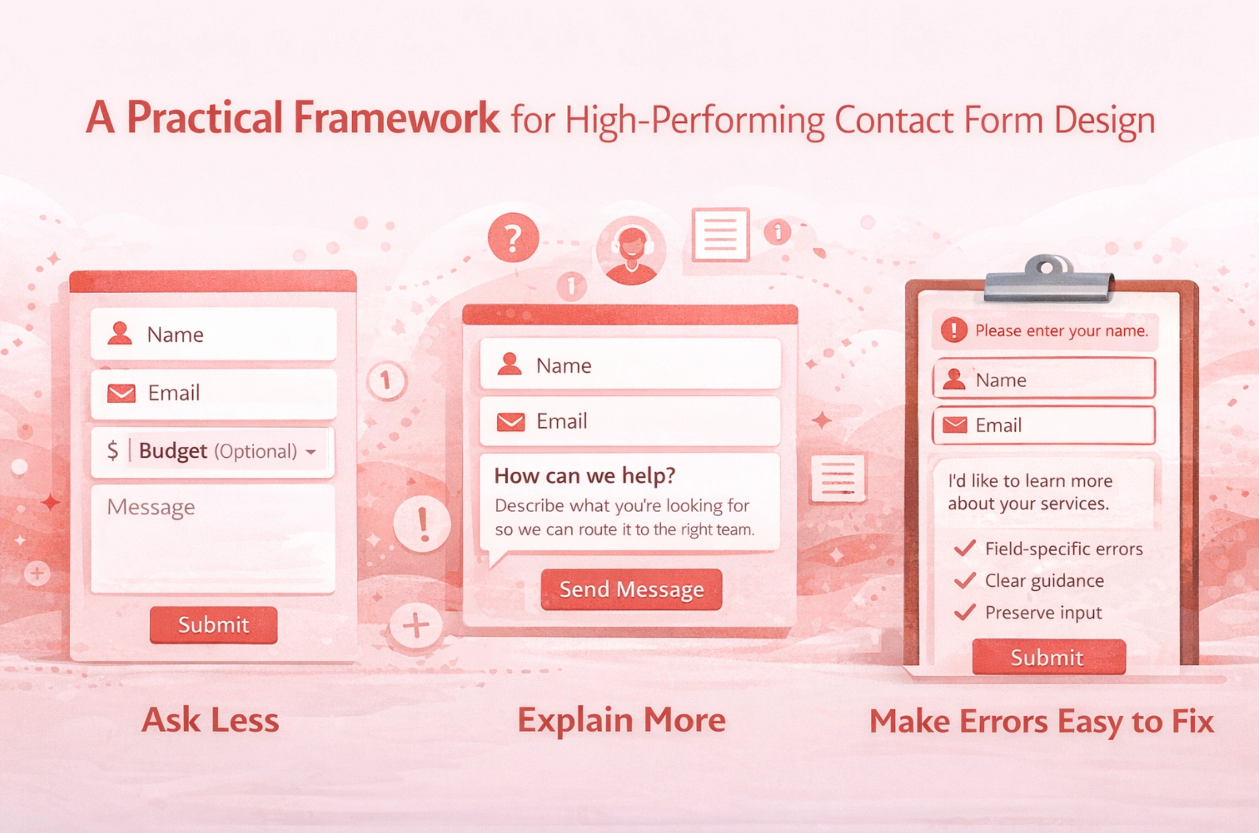
A Practical Framework for High-Performing Contact Form Design
Ask Less, Explain More
“Ask less” is useful, but it is incomplete. The strongest contact form design also “explains more,” in the smallest possible space.
Tactics that improve contact form completion:
- Mark optional fields clearly.
- Add one line of purpose under a sensitive field.
- Replace internal language with user language.
A form does not need to be long to feel heavy. A short form can still create form abandonment if it feels intrusive. This is where brand clarity helps. When a site communicates clearly, the form can stay simple because users already understand the context. That consistency often comes from disciplined branding.
Sequence for Confidence
The order of fields matters because it shapes user confidence. Users should feel progress early and certainty near the end.
A reliable sequence for contact form UX:
- Name and email first.
- Message next, while intent is fresh.
- Optional details after the message.
- Submit with a clear expectation of what happens next.
This sequence improves contact form completion because users invest before hitting heavier questions. It also supports lead quality because the message becomes the center of intent capture, not an afterthought.
Make Errors Easy to Fix
Errors do not always cause form abandonment. Confusing recovery causes form abandonment. When users are forced to guess, they leave.
Good error handling patterns are well-documented:
- Show errors near the relevant field.
- Use clear language that describes the fix.
- Do not rely on color alone.
- Preserve the user’s input so they do not retype it.
NNGroup’s guidance on form errors reinforces these principles, especially clarity and field-level feedback (Nielsen Norman Group).
Field Strategy That Protects Lead Quality
The Minimum Viable Lead
To protect lead quality, you need a minimum viable lead. For many businesses, that is:
- Name
- Message
Everything else is optional unless it directly changes routing or response. If a field is there “just in case,” it usually increases form abandonment without improving lead quality.
A practical filter question to ask internally is: “If we had this field removed, what would break?” If the answer is “nothing,” it is not a required field.
Use Progressive Profiling Instead of Front-Loading
Progressive profiling is one of the cleanest ways to improve contact form completion while keeping lead quality high. You collect only what you need to start a conversation, then collect deeper details later, after trust is established.
Ways to do this without making the experience feel fragmented:
- Ask for details after submission on a thank-you screen.
- Use scheduling as a second step for qualified prospects.
- Send a brief intake link to serious leads.
This reduces form abandonment because step one stays light, and it protects lead quality because higher intent users complete the second step.
When to Add a Qualifying Question
Some forms need a qualifier. The key is choosing one that is high signal and low friction.
High signal qualifiers:
- “What do you need help with?” (single select)
- “Timeline” (simple ranges)
- “Company size” (broad ranges)
Avoid qualifiers that feel like a gate:
- Budget as required, unless that is expected in your market.
- Too many dropdowns that force users into artificial categories.
- A long list of required fields before the user can explain their need.
A good rule is to place qualifiers after the message. That helps contact form completion while still gathering a lead quality signal.
Form Validation, Error Handling, and Microcopy That Reduce Drop Off
Inline Form Validation That Respects Attention
Validation should prevent errors without interrupting flow. Validate too early and you create noise. Validate only at submission, and you create a wall.
Better contact form UX validation patterns:
- Validate after a user leaves a field.
- Keep feedback short and specific.
- Avoid moving the page or shifting the layout when errors appear.
This reduces form abandonment and improves lead quality because you get cleaner inputs, fewer typos, and fewer dead emails.
Error Messages That Move Users Forward
The job of an error message is to close the loop. The user should never wonder what to do next.
Effective error messages:
- State the problem in plain language.
- Provide the exact correction needed.
- Reference the field without blaming the user.
NNGroup’s error message guidance is consistent on clarity and constructive direction (Nielsen Norman Group).
Placeholders, Labels, and Instruction Clarity
Placeholders are not a substitute for labels. When placeholders disappear, users lose context, which increases errors and form abandonment.
Safer contact form design:
- Use persistent labels above fields.
- Add short format guidance below labels when needed.
- Mark required fields consistently.
NNGroup documents why placeholder-only design increases usability problems, especially when users need to confirm entries (Nielsen Norman Group). WCAG also reinforces that users need clear labels and instructions to complete forms correctly (W3C).
Trust Signals, Privacy, and Accessibility in Contact Form UX
Privacy Microcopy That Increases Contact Form Completion
Privacy is part of conversion. If users feel uncertain, contact form completion drops.
Trust microcopy that reduces form abandonment:
- “We’ll reply within 1 business day.”
- “No spam. No sharing.”
- A clear privacy link that is easy to find.
These lines work best when they match the rest of the page’s tone. Consistency matters. If the site is polished and clear, the form feels safer. A clean end-to-end experience is often the difference between a form that converts and one that leaks intent. That is a common pattern across the work we deal with at Brand Vision.
Accessibility Requirements That Also Improve Usability
Accessible forms are usually higher converting forms because they reduce confusion. Clear labels, visible errors, and predictable focus behavior help everyone.
Accessibility checks that also reduce form abandonment:
- Every field has a programmatic label.
- Errors are described in text, not only color.
- Keyboard navigation works across the full form.
- Error summaries point users to the exact fields.
WCAG guidance on error identification is clear on making errors perceivable and understandable (W3C). Some public-sector guidance also reinforces practical input assistance patterns that reduce friction for all users (Digital.gov.bc.ca).
Spam Prevention Without Punishing Real Leads
Honeypots, Rate Limits, and Friction Placement
Spam hurts lead quality, but aggressive controls can hurt contact form completion. The best approach is to add bot friction that humans barely notice.
Low-friction controls:
- Honeypot fields
- Rate limiting per IP or session
- Server side validation and sanitization
- Rules that flag unrealistic completion times
These reduce spam without increasing form abandonment for real users.
CAPTCHA Use Cases and Safer Alternatives
CAPTCHAs can reduce spam but can also create accessibility issues and increase form abandonment. If you use one, treat it as a last resort and measure its impact on contact form completion.
Alternatives to consider:
- Passive bot detection and scoring
- Risk-based challenges only for suspicious traffic
- Post-submit verification for flagged entries
The goal is layered defense, not one heavy gate that punishes qualified users.
Testing and Measurement Without Gaming the Numbers
Metrics That Show True Form Abandonment
To improve contact form UX, track more than submissions. Track the steps where users disappear.
Core metrics:
- Form views
- Form starts
- Contact form completion rate
- Field-level error rate
- Time to complete
- Spam and disqualified rate
This lets you separate “the form is hard” from “the traffic is low intent.” It also helps you protect lead quality when you test changes.
Experiments That Protect Lead Quality
A/B tests are useful, but only if you evaluate downstream outcomes. Otherwise, you will optimize for contact form completion and accidentally degrade lead quality.
Safer experiments:
- Remove one field and compare quality downstream.
- Improve validation and measure error reduction plus completion lift.
- Add privacy reassurance and track changes in form abandonment.
If you are changing the form alongside attribution, routing, or site changes, coordinate with your technical setup so tracking remains stable. For deeper measurement support, teams often involve their analytics and technical partners, including a trusted SEO agency when conversion tracking and channel attribution are closely tied.

A Contact Form UX Checklist You Can Use This Week
Quick Wins
- Remove fields you cannot act on.
- Make labels persistent and easy to scan.
- Mark optional fields clearly.
- Add one line of privacy reassurance near submit.
- Validate inputs without interrupting flow.
- Make error messages specific and calm.
These changes typically reduce form abandonment quickly because they remove friction without changing your qualification logic.
Structural Fixes
- Reorder fields so low friction comes first.
- Place qualifiers after the message field.
- Use progressive profiling for deeper details.
- Improve routing so qualified leads get faster responses.
If your form issues reflect a broader site problem, fix the path, not only the fields. A clean conversion journey is a consistent outcome of strong information design and execution, which is why teams often approach forms as part of overall web design services, not as a standalone widget.
Governance and Maintenance
- Review form performance quarterly, not only when leads drop.
- Maintain a change log so you can connect shifts in lead quality to form edits.
- Monitor spam patterns and adjust controls without adding blanket friction.
- Keep the form aligned with the page promise and brand voice.
Contact form UX is an ongoing system. When the form stays clear, respectful, and measurable, contact form completion rises while lead quality stays protected.
If you want a clear plan to improve contact form completion without trading off lead quality, start with a structured review of the form, the page context, and the follow-up workflow. When you are ready, start a conversation with our team.
When the Form Finally Feels Effortless
Contact form UX is one of the simplest places to win back qualified demand. When contact form design is clear, respectful, and easy to complete, contact form completion rises while lead quality stays protected. You reduce form abandonment, improve trust, and give your team cleaner signals to route and respond.
If you want a contact form that feels effortless for real prospects and still filters out noise, our team can help you assess the full conversion path, refine the interaction details, and align the form with how your business actually qualifies leads. Start a conversation with Brand Vision and we will outline practical improvements you can implement fast and maintain over time.


